Real Estate Website Design – 50 Great Examples 

This collection of real estate web design examples showcases qualities such as: easy navigation and high-resolution images of the properties.

Real estate website design creates a compelling first impression, encouraging leads to subscribe to your emails and inspiring inquiries about your services.

An optimized real estate website design is crucial as it simplifies property listings, enhances customer interactions, and reinforces brand identity. Key features like responsive design, SEO, search functions, and map locations ensure a satisfying user experience, driving business growth.

This two-part guide will first present 50 expertly curated website examples, followed by an exploration of seven essential elements.

1. Millennium Tower

The Millennium Tower home page has a video background, emphasizing the professionalism of the real estate company.


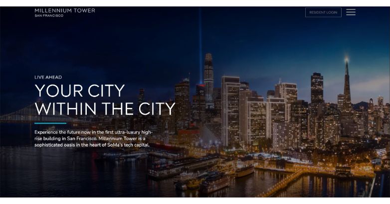
As a stunning masterpiece of sculptured glass, Millennium Tower mirrors the varied luminosity of the San Francisco Bay, enhancing the city’s skyline. The 60-story tower has emerged as an emblem of residential opulence in the Bay Area.

Mediaboom’s bespoke design for the Millennium Tower website immerses visitors into the life of luxury at San Francisco’s premier residence.

The site vividly captures the tower’s stunning aesthetics and exclusive amenities through striking photos and videos. It provides an enticing taste of the exquisite dining at International Smoke and insights into Privé, the tower’s unique social experience.

2. GFI Partners

GFI Partners has a very professional real estate design. A background video is placed on the home page welcoming its visitors


Established in 1997, GFI Partners is a comprehensive real estate consultancy located in Boston, Massachusetts. It has effectively overseen the acquisition, development, and permitting of projects across the United States.

The GFI Partners website, meticulously crafted by Mediaboom, radiates an air of sophistication and modernity, standing apart in the commercial real estate landscape. It showcases GFI’s extensive portfolio of commercial and residential properties, mirroring their unique blend of investment banking and asset management expertise.

Every element, from its striking imagery to responsive development, is tailored to reflect GFI’s diversity and distinctiveness. This is not just a website, it’s a vivid testament to GFI Partners’ ambition and caliber in the realm of property finance and development.

This is commercial real estate web design elevated to an art form.

Contact now Mediaboom to develop your professional real estate website design!

3. Saba Stones

Prominent image showcasing a property constructed by Saba Stones, a general contractor and construction management team.


Saba Stones is a general contractor and construction management company.

Right off the bat, you’ll notice that the website grabs your attention with a large typeface and a full-sized image of a property the team built.

You can get a glimpse of the company services right on the homepage and dig deeper into any service with clear navigation at the top.

4. Edifis

Visually appealing website design of Edifis, a real estate development firm, optimized for both desktop and mobile browsing.


The real estate development firm Edifis has an appealing website that’s as enjoyable to browse on a desktop as on a mobile.

Animated elements translate perfectly on a smartphone, and a dropdown menu, denoted as three lines, is easily accessible.

This is a real estate website design done right.

5. Le Mont

Immersive full-screen video carousel on Le Mont's website, showcasing the vibrant city life of Montreal.


Le Mont’s website pulls you right into Montreal city life, giving you a rich glimpse with a full-screen video carousel.

You can instantly browse available units or learn more about the neighborhood and all the charms and wonders it holds.

Never has a city been better embodied into a website than with Le Mont.

The contact information above the fold takes you to a page to book a call, and a quick scroll down from there reveals all of Le Mont’s contact information so you can sign up for their email list or call them directly. 

6. Compass

The homepage of Compass website functions as a search engine, allowing users to search for available properties.


Does real estate website design always have to focus so much on digital marketing and SEO elements? Not exclusively.

The Compass website gets down to brass tacks, as its homepage operates as a search engine for the properties this real estate firm has available.

Reviewing the Compass sitemap reveals a landing page for each major neighborhood in the states it serves. 

7. Rapleys

Eye-catching and contrasting blue blocks on Rapleys' real estate website, creating a visually captivating design


Bright, bold, and colorful wins the day with Rapleys’ real estate website design.

The use of contrasting blue blocks and colorful imagery immediately captivates attention, while trusted and true website features like a search bar and easy-to-use navigation will surely keep leads on the page.

Each menu option has a drop-down that uses more colorful elements, so this sprightly attitude persists across the entire website.

8. Kobu

Stunning full-sized images of breathtaking villas showcased on Kobu's real estate website, offering a visual feast for users.


Kobu is a real estate firm specializing in hotels and properties.

The company knows how to grab a user’s attention by showcasing full-sized images of breathtaking villas with rental information right in the corner. 

The site even displays sold properties, whetting the appetite of an on-the-fence lead and inspiring them to find another property that catches their eye.

9. Caledon Build

Conventional, timberframe, and bone structure properties offered by Caledon Build, showcasing a range of construction options.


Caledon Build offers conventional, timber-frame, and bone structure properties.

If you’re interested in pursuing its services, it explains its process succinctly to inspire business. Smartly, the website segues into a CTA after presenting information on its three-step build process.

The simple web design with a white background and plenty of empty space allows the full-sized photos spread across the website to shine.

10. Ozarch

Ozarch, a Denver architecture firm, proudly presents a collection of its properties on the homepage.


The Denver architecture firm Ozarch is another fine example of real estate website design to emulate.

The site proudly showcases its properties across its homepage.

Although the navigation seems almost too simple, clicking the option marked Menu reveals fuller navigation. 

You can also utilize the search if you know what you’re looking for already. 

11. Forty Ninth Living

Dynamic rotating video carousel on Forty Ninth Living's website, showcasing interiors and exteriors of their properties.


Forty Ninth Living is another website that masters that “slice of life” atmosphere ala Le Mont.

Instead of Montreal though, Forty Ninth focuses on spotlighting the Chilliwack lifestyle, showcasing a rotating video carousel of the interiors and exteriors of its properties.

The contact link right above the fold takes you to a web form to contact a real estate agent and discuss properties. You can even include your projected budget right in the web form.

12. Corespaces

Corespaces - Real estate website design


How do you optimize your website for mobile when you have full-scale images and videos? Take a page out of the Corespaces book.

The images still rotate on a carousel, but you’re also encouraged to scroll with a small portion of text indicating as much.

The navigation menu is another way to get to where you’re looking on this site, even if you never open your computer. The photos are just as poignant and fun on mobile as they’d be on a desktop.

13. Prestige International

Language selection options on Prestige International's website, allowing users to choose their preferred language for a personalized experience.


The Italian real estate firm Prestige International has seven other language options so you can select one that suits your native tongue.

The homepage’s main attraction is a spotlight effect on various properties with scrolling large-scale text. You can search for properties right on the homepage.

Scrolling further lets you learn more about Prestige as you navigate to the company’s services, join the newsletter, or read relevant magazine articles on the firm. 

14. Re/Max

Re/Max's homepage proudly highlighting their recognition as the most trusted real estate agent in America.


Is there a better-known or more illustrious name in real estate than Re/Max? We had to include them in this list of real estate website design examples. 

Re/Max is known for its red, white, and blue color scheme, which it uses demurely on its website.

Its homepage builds trust by immediately mentioning the accolade of being voted the most trusted real estate agent in America. 

The site also features a search bar above the fold and easy-to-use navigation. 

15. Elevation Vancouver

Elevation, a Vancouver design and construction firm, presents a greyscale website design.


The Vancouver design and construction firm Elevation chose a greyscale effect for its website design.

This is the polar opposite of how Re/Max and other more colorful firms handle their homepages, and it goes to show that color is not a requirement.

The monochrome effect looks stately and professional, especially in conjunction with animated navigation bars, full-screen video carousels, and a circular pointer that acts in lieu of the mouse. 

16. HomeServices of America

HomeServices of America's brand logo, featuring an interlocking H and S in dark gray and maroon.


Minneapolis’ own HomeServices of America is an affiliate of Berkshire Hathaway. That information is included in the simple but appealing brand logo, which is an interlocking H and S in dark gray and maroon.

The site uses a color-block effect that’s especially striking given the white background. 

The contact information is right above the fold, with phone numbers for general information or HomeServices in the top right corner above the navigation.

17. Coldwell Banker

Eye-catching full-sized image of a desirable home displayed as the background on Coldwell Banker's real estate website.


Coldwell Banker is another household name in real estate.

That’s why it’s all the more interesting to examine its real estate website design, which the agency keeps very simple.

A full-sized image of an appealing home sits in the background of the central search bar.

Without any navigation to speak of, you can scroll and get the full Coldwell Banker website experience, browsing available listings, connecting with an agent, or obtaining an estimate.

18. Builder PropTech

Striking and vibrant neon green color scheme on PropTech's website, creating a bold and attention-grabbing visual impact.


Wear it loud and wear it proudly. That’s the PropTech way, as its website is a can’t-miss, in-your-face bold neon green.

Once that homepage hue grabs you and pulls you in, the rest of the site has more muted tones, such as navy blue, so you can better pay attention to the text and images. 

This builder property technology firm knows how to attract attention to its events, and with menu options like Agenda and Speakers, it can generate interest right on its website.

19. Forge Partners

Prominent and oversized cursor on Forge Partners' website, adding a unique visual element and grabbing attention.


The first word that comes to mind when looking at the Forge Partners website is “oversized.” It’s oversized everything immediately, from a large cursor to larger-than-life text.

This is sort of like PropTech’s bright homepage in that it serves as a means to grab attention.

Once you begin browsing the website properly, you’ll notice smaller fonts and fewer explosive elements.

That lets you pay attention to the site design, including a concise navigation bar and social links at the bottom. 

20. Base 3

Navigation menu positioned across the top of Base 3's website, offering easy access to different sections.


The Chicago real estate company Base 3 showcases the heart of Chi-Town with a carousel of full-sized videos.

Its navigation is right across the top, with no drop-downs or menus to speak of. The Portfolio section shows you what Base 3 has worked on. 

Each listing includes a large photo, and if you like what you see, you can click on a listing for more information. 

21. Ryan Serhant

Clean and concise website design on Ryan Serhat's real estate broker website.


What if you’re a real estate broker looking to spotlight your services?

You can follow a real estate website design example like Ryan Serhat’s.

The clean, concise website design with animated elements describes Ryan’s expertise and background. 

By clicking Real Estate, you’re redirected to Serhat’s available listings, with a site design that doesn’t even feel like you left the homepage. 

22. Charbonnel Towns

Proud banner on Charbonnel Towns' website, displaying their Project of the Year prize from 2019.


Charbonnel Towns wastes no time establishing trust with its proud banner showcasing its Project of the Year prize from 2019.

The site also establishes a sense of FOMO by mentioning how “precious few homes remain.”

You can take a few minutes to watch the firm’s short film on the homepage or browse the navigation on the left side of the page. 

23. Zillow

Zillow’s modern site with striking hero image, inviting search bar, and vibrant visuals


Zillow’s real estate website design is all about modern simplicity. 

The moment you land on the homepage, you’re greeted by a sleek, intuitive layout that just feels right. The striking hero image paired with an inviting search bar encourages you to dive straight into your property search. 

Smooth navigation options are strategically positioned at the top, guiding users seamlessly through buying, renting, selling, and loan services. 

Plus, personalized recommendations add a touch of sophistication, while vibrant visuals and an orderly interface underscore Zillow’s dedication to a user-centric experience, making every visit a pleasure.

24. Trulia

Trulia’s welcoming site with family image, bold headline, and prominent search bar.


Trulia’s real estate website design feels like a warm welcome home. 

The homepage features a heartwarming image that evokes a sense of family and comfort, paired with a clear and bold headline that beckons users to explore. 

Additionally, the prominent search bar simplifies property searches, while the straightforward navigation offers easy access to buying, renting, and mortgage services. 

Overall, Trulia’s use of vibrant visuals and clean design elements ensures an enjoyable and user-friendly experience, making it easy for visitors to find a place they’ll love to call home.

25. Realtor.com

Realtor.com's trustworthy site with a sunset backdrop and easy-to-navigate search bar


Realtor.com’s real estate website design immediately conveys professionalism and trust. 

The homepage, adorned with a stunning sunset backdrop, sets a serene tone that complements the prominently placed search bar. 

A clear navigation menu at the top provides essential options like buying, selling, renting, and mortgage services, ensuring visitors can find what they need effortlessly.

Below, categorized sections such as new listings and price reductions facilitate quick browsing. 

This well-organized, visually appealing design reinforces Realtor.com’s standing as a reliable platform for both real estate professionals and home seekers.

26. Redfin

Redfin’s elegant site with twilight scene, search bar, and intuitive navigation


Elegance meets functionality in Redfin’s website design. 

The homepage enchants with a beautiful twilight scene, highlighting a prominent search bar that invites users to discover their perfect home. 

Furthermore, intuitive navigation offers clear options for buying, renting, selling, and mortgage services. 

Redfin emphasizes local expertise through engaging visuals and user-friendly elements, allowing visitors to explore luxury homes and real estate services with confidence. 

Ultimately, this thoughtful design ensures that finding a new home is as enjoyable as living in one.

27. Homes.com

Homes.com's site with a luxurious property backdrop and a large, user-friendly search bar.


Homes.com merges modern aesthetics with seamless functionality on its website. 

The homepage, featuring a beautiful property backdrop, entices users to find a home in a neighborhood they love. 

The large, user-friendly search bar invites immediate interaction, while the site’s clean layout and high-quality images enhance the overall browsing experience. 

Trust indicators, such as endorsements from millions of buyers, and easy access to features like neighborhood exploration and school ratings, solidify Homes.com’s reputation as a reliable and appealing platform for home seekers.

28. Century 21

Century 21’s sleek website with search bar, emphasizing local real estate options.


Century 21’s real estate website design effortlessly blends sophistication with usability, welcoming visitors with a sleek, modern aesthetic. 

As you land on the homepage, you’re greeted by a striking and functional design, complete with a prominent search bar that makes finding homes or agents a breeze. 

The bold headlines and minimalist layout enhance readability and navigation, making it a cinch to explore local real estate options. 

By balancing contemporary visuals with practical features, Century 21’s design shows their commitment to helping you discover a home that perfectly fits your lifestyle.

29. Keller Williams Realty

Keller Williams' warm site design with family image and a user-friendly search bar.


Keller Williams Realty’s property website design is all about warmth and approachability. 

Right from the homepage, you’re greeted with a touching family moment that instantly makes you feel at home. The user-friendly search bar is front and center, guiding you effortlessly toward finding your dream home. 

With clear navigation options for buying, renting, and finding agents, your search is smooth and intuitive. 

The minimalist design, combined with professional visuals, ensures a seamless and engaging experience as you explore real estate options with Keller Williams Realty.

30. Better Homes and Gardens Real Estate

A professional real estate agent standing next to a sold sign in front of a beautiful home


Blending warmth with professionalism, Better Homes and Gardens Real Estate’s website invites users with a welcoming homepage image and a clear headline, “Find Your Home.” 

The design is both engaging and functional, featuring a prominent search bar that facilitates easy property searches.

Navigation is intuitive, providing clear options to explore homes, agents, and offices. 

The vibrant visuals and clean, organized layout make it simple for users to find relevant information and connect with this trusted brand for their real estate needs.

31. RealtyTrac

RealtyTrac's real estate website design featuring foreclosure listings and great deals.


RealtyTrac’s real estate website design stands out with its clean and user-friendly interface. 

The homepage features an inviting backdrop of charming homes, immediately engaging visitors with a search bar and the bold statement, “Find Great Deals in Real Estate.” 

Easy navigation options are provided for exploring properties for sale, foreclosures, recently sold homes, and valuable resources. 

The design is straightforward and efficient, ensuring that both real estate investors and home buyers can find exactly what they need with minimal effort. 

32. Sotheby’s International Realty

Sotheby’s site with luxurious design, high-quality visuals, and a refined search bar.


Sotheby’s International Realty sets the bar high with its website design, exuding elegance through a sophisticated color scheme and high-quality visuals. 

As soon as visitors land on the homepage, they’re greeted with a clear message: “Find a home that suits your lifestyle.” 

The website is not just visually appealing but also highly functional. A refined search bar and intuitive navigation options make it easy for visitors to find exactly what they’re looking for. 

Moreover, the sleek fonts and organized layout reflect Sotheby’s dedication to excellence in real estate website design. 

33. Berkshire Hathaway HomeServices

Real estate website design with a beautiful home backdrop and prominent search bar for Berkshire Hathaway HomeServices


Berkshire Hathaway HomeServices’ website design exudes sophistication and warmth, immediately drawing users in with a beautiful home backdrop. 

The clear and confident headline, “Our network knows great homes,” establishes trust and sets an inviting tone. 

A prominently placed search bar facilitates easy navigation for finding homes, agents, and offices. The top menu provides straightforward access to essential services like buying, selling, and exploring properties. 

Balancing elegance with functionality, the visually appealing layout ensures users can effortlessly explore and find their next dream home through a trusted network.

34. HomeFinder

HomeFinder UK's real estate website design focused on social housing solutions.


HomeFinder’s real estate website design warmly welcomes visitors with a touching image of a mother and child. 

The prominent headline, “Find a new home and make a fresh start,” immediately resonates with users. 

The homepage features a clear call to action with buttons for finding a property and learning how it works.

The overall design is engaging and supportive, making HomeFinder an inviting platform for those seeking permanent social housing solutions.

35. Apartment List

Apartment List's real estate website design with a rental matchmaker interface.


Apartment List’s real estate website design stands out with its vibrant and user-friendly interface. 

The homepage features a bold, purple background with engaging visuals, highlighting its unique “Rental Matchmaker” service. 

The search bar is prominently displayed, making it easy for users to start their apartment hunt. 

The website offers clear navigation to various rental tools, properties for rent, and management options, ensuring a seamless experience for visitors. 

This modern design effectively connects users with the best rental options available.

36. Douglas Elliman 

Real estate website design featuring a luxury property and detailed search options for Douglas Elliman


Douglas Elliman’s website combines elegance with user-friendliness, beginning with a striking property as the hero image. 

The clear and prominent search bar allows for detailed property searches by location, address, zip, or agent. 

Additionally, the navigation menu provides seamless access to services such as buying, renting, selling, and exploring new developments. 

High-quality visuals and a refined layout further enhance the browsing experience, reflecting Douglas Elliman’s dedication to delivering a premium real estate website design service.

37. Corcoran Group

Real estate website design highlighting a unique illustration with a clear headline for Corcoran Group


Corcoran Group’s website catches the eye with its artistic and inviting design, highlighted by a unique illustration that sets a warm and welcoming tone. 

As soon as visitors arrive, they’re greeted with the clear invitation, “Make yourself at home,” which resonates immediately. A prominently featured search bar makes it simple to search for properties by location, address, ZIP, or property ID.

The site’s organization ensures easy access to buying, renting, selling, and exploring new developments, reflecting Corcoran’s dedication to enhancing the real estate experience. 

Their creative and user-friendly approach makes navigating the site enjoyable and ensures accessibility for all users.

38. Weichert Realtors

Real estate website design with vibrant layout and call to action 'The time to sell is now!' for Weichert Realtors.


Weichert Realtors’ website grabs attention with vibrant colors and engaging visuals. 

The bold call to action, “The time to sell is now!” immediately draws users in, setting an energetic tone from the start. Finding properties is made simple with an easily accessible search bar where users can input city, address, or ZIP code.

Additionally, highlighting recent listings and price reductions keeps users informed and engaged, while the clean, modern layout with bright accents ensures a visually appealing and user-friendly experience throughout. 

This approach reflects Weichert Realtors’ commitment to providing a dynamic and accessible platform for buying, selling, and renting properties.

39. ERA Real Estate

Real estate website design with stylish interior backdrop and prominent search bar for ERA Real Estate


ERA Real Estate’s website creates a modern and welcoming ambiance right from the start. The stylish interior design serves as a warm backdrop, perfectly complementing the clear headline, “Find your home.”

Visitors are immediately drawn in by the prominently displayed search bar, which makes property searches effortless. 

High-quality visuals and a clean layout further enhance the user experience, simplifying the process for visitors to explore and discover their ideal home through ERA’s platform. 

This emphasis on usability and aesthetic appeal underscores ERA Real Estate’s commitment to engaging users effectively.

40. ZipRealty

Real estate website design featuring a serene coastal property with search bar for ZipRealty


ZipRealty’s website exudes sleek professionalism, featuring a serene coastal property backdrop that immediately sets a tranquil tone. 

The headline, “SELL – RENT – MANAGEMENT,” succinctly outlines its core services, inviting visitors to explore further. A prominently placed search bar facilitates easy property searches categorized by address, city, or neighborhood.

Emphasizing a minimalist design approach, the website prioritizes user-friendly features, making it an efficient tool for clients seeking personalized real estate website design advice and services. 

This focus on simplicity and functionality underscores ZipRealty’s commitment to engaging users effectively.

41. Realty ONE Group

Real estate website design with a bold black and gold color scheme and multimedia content for Realty ONE Group


Realty ONE Group’s website blends modern sophistication with bold branding, featuring a black and gold color scheme that reinforces its identity as the “UNBrokerage.” 

Moreover, the homepage features dynamic multimedia content, including videos and interactive elements, emphasizing the company’s innovative approach.

Intuitive navigation sections like “Find a ONE,” “Story of ONE,” and “Join the ONE” facilitate easy exploration of services, company culture, and success stories. 

This design merges striking aesthetics with seamless functionality, ensuring a captivating user experience.

42. Windermere Real Estate

Real estate website design with a warm, inviting image of a father and child and search bar for Windermere Real Estate


Windermere Real Estate’s website creates a cozy and inviting atmosphere, focusing on the heartfelt essence of home. 

The homepage features a touching image of a father feeding his baby, paired with the tagline, “It’s more than a home. It’s where your future awaits.” This emotional scene sets the tone for a journey beyond simple property listings.

Navigating the site is straightforward with clean navigation, a prominent search bar, and direct call-to-action buttons for finding homes and connecting with agents. 

Windermere blends emotional appeal with practical efficiency, making it a standout in real estate web design—a perfect blend of comfort and convenience online.

43. Howard Hanna

Howard Hanna homepage with tagline Home Happens Here and search ba


Howard Hanna’s website exudes a family-centric and community-oriented vibe, epitomized by the tagline “Home Happens Here.” 

Moreover, the homepage features a heartwarming image of children playing, fostering a sense of warmth and belonging.

With a prominent search bar and clear call-to-action buttons for buying and selling homes, navigating the site is effortless. Additionally, the green and white color scheme reinforces the brand’s identity. 

The user-friendly layout and advanced search options cater to diverse needs, ensuring a practical and inviting platform for property searches. It’s like finding the perfect neighborhood where every click feels like coming home.

44. JP & Associates 

JP & Associates homepage featuring their extensive network and property search bar


JP & Associates REALTORS (JPAR) website stands out with its extensive network, spanning over 75 locations across 30 states and boasting a team of more than 3,500 agents. 

Additionally, the homepage sports a professional and modern design, set against a dark background featuring a map showcasing their nationwide presence.

Facilitating seamless property searches, the site’s functionality is enhanced without overt mentions. Moreover, emphasizing their growth, industry influence, and partnerships, the hashtag #JPARNATION captures their dynamic approach. 

The sleek and professional design caters to diverse clients, highlighting their robust network and leadership in the real estate industry.

45. First Team Real Estate

First Team Real Estate homepage with team photo and slogan about building dreams


First Team Real Estate’s website exudes a welcoming and professional atmosphere. The homepage showcases a vibrant team photo accompanied by the slogan “You Dream It. 

We Help You Build It.,” highlighting their customer-centric approach. A video section underscores their 48-year legacy of excellence with company achievements and testimonials. 

The clean, modern design, with easy navigation options for home searches and buying and selling services, effectively conveys their commitment to customer satisfaction and extensive experience in the real estate market.

46. United Real Estate

United Real Estate homepage with Find Your Freedom slogan and search options


United Real Estate’s website boasts a sleek and modern design, showcasing a variety of property listings through high-quality images. 

The homepage is centered around their empowering slogan, “Find Your Freedom,” aimed at guiding clients towards achieving their real estate ambitions.

A prominently displayed search bar on the website allows users to explore properties by city, county, postal code, or keyword, with added functionalities for nearby searches and property types. 

The professional and user-friendly layout reflects United Real Estate’s dedication to offering comprehensive real estate services, making it easy for visitors to navigate and find their ideal property.

47. Real Living Real Estate

Real Living Real Estate homepage with search bar and lifestyle advisors message


Real Living Real Estate’s website caters to lifestyle-focused real estate services, embodying the ethos of “The Home of Lifestyle Advisors.” With a stylish, modern interior backdrop on the homepage that reinforces the brand’s sophisticated image, the site sets a welcoming tone.

For property searches, users can easily locate listings by entering city or ZIP code. The layout maintains a clean and organized structure, offering intuitive navigation options for exploring properties, connecting with agents, and accessing other services.

This design seamlessly blends elegance with functionality, ensuring a user-friendly and engaging experience that underscores Real Living Real Estate’s dedication to personalized real estate solutions.

48. NextHome

NextHome homepage with a welcoming message and search bar for agents and offices


NextHome’s website greets visitors with a serene image of a well-maintained home surrounded by lush greenery, creating a sense of tranquility and comfort. 

The homepage prominently displays the welcoming message, “Welcome. Home.” This is followed by a prompt to find an agent or office nearby, ensuring user-friendliness and straightforward navigation.

In addition, the central search bar, highlighted in orange, draws attention and facilitates easy input of search criteria such as name, city, or ZIP. The top navigation menu offers quick access to essential sections like search, franchising, agent careers, news, team, and contact information.

Overall, the design is modern, simple, and effective, aligning well with NextHome’s brand identity as a welcoming and accessible real estate service provider.

49. Fathom Realty

Fathom Realty homepage showcasing a search bar for finding homes and agents


Fathom Realty’s website resonates with trust and reliability, setting the stage through its engaging and professional homepage. 

An image of a confident real estate agent standing beside a “SOLD” sign in front of a picturesque house communicates success and expertise.

The primary call to action, “Find Your Home,” takes center stage, guiding users seamlessly to explore homes, connect with agents, or locate offices effortlessly. Positioned centrally, the search bar simplifies the process by allowing users to input city, address, or ZIP code with ease.

Embracing a clean and contemporary design, complemented by the esteemed Fathom Realty brand, the website creates an inviting atmosphere that assures visitors of competent service tailored to their needs.

50. eXp Realty

eXp Realty homepage with bold move message and real estate professionals


eXp Realty’s homepage design reflects a dynamic and forward-thinking approach to real estate. 

The bold headline “Make Bold Moves with eXp” immediately captures attention, encouraging visitors to think ambitiously about their real estate journey. 

The prominently placed search bar invites users to easily find their desired location, enhancing user experience with its straightforward functionality. 

An accompanying image of smiling professionals signifies a welcoming and supportive atmosphere, suggesting a seamless and positive experience for clients.

Overall, the clean, modern layout and the professional yet friendly imagery effectively communicate eXp Realty’s commitment to innovative and client-centric service.

7 Key Elements for an Effective Real Estate Website Design

How do you build a strong website for your real estate firm? Here are the elements your site must have to attract leads, differentiate yourself from the competition, and drive future business.

1. Responsive Design

The real estate industry is all about helping the customer. Your website should do that from the moment a lead or customer lands on your website by focusing on a responsive design.

According to digital marketing agency InFront Webworks, 94 percent of audiences will judge a website based on whether it has a responsive web design, so don’t forego this element. 

Testimonials build trust, demonstrate customer satisfaction, and can significantly enhance your business reputation

2. Testimonials and Reviews

How do you inspire trust in your real estate business? By peppering your website with reviews and testimonials. Online business mentor Luisa Zhou states that 95 percent of customers in 2023 use reviews to inform their purchasing decisions . That’s almost all customers. 

If you don’t have any reviews or testimonials for your real estate business, message your latest customers and ask if they would leave a review. You might incentivize them to take action by offering a discount or exclusive offer.

SEO graphic. SEO boosts website visibility, drives targeted traffic, increases credibility, and is crucial for online business growth.

3. SEO Elements

Even if you design the perfect real estate website, without SEO, no one will see it. 

You should have researched keywords your audience searches for and splash them across your website (naturally, no keyword stuffing). Write meta descriptions, optimize your images with alt tags, and test your site’s loading speed. 

Real estate businesses benefit especially well from local SEO. This guide to local SEO describes 14 strategies realtors need to rank.

4. Mobile Optimization

A whopping 92.3 percent of people who go online use their phones to do so in 2023, notes Exploding Topics. 

If your site isn’t mobile-ready with a layout that translates to smartphone users, you will miss out on huge swathes of your audience. 

5. Contact Information and Forms

The goal of your real estate website design is to inspire action. Leads might wish to contact you or sign up for your email newsletter. Make it as easy as possible with clear contact information across your homepage.

Create a contact page where you share the relevant information again, from social media handles to phone numbers and email addresses. Include a contact form so those who prefer to reach out to you directly have the option. 

Forms comprise up to 50 percent of leads for some marketing businesses according to WPForms. Your real estate firm could see an influx of leads through forms.  

6. Listings and Guides

A real estate website should always showcase listings of what’s available. This saves the user a click, and they won’t venture to the competition to see what’s for sale in their neighborhood. 

Include full-scale photos and videos to make each property more tantalizing and write optimized copy. Interweave some storytelling into the history of the property, as interested buyers always want to learn more. 

7. Advanced Search

A user might arrive on your website looking for a specific property or wishing to browse for a certain location. The best real estate website design includes an advanced search function baked into the navigation for just these purposes.

Elevate Your Luxury Brand Today

Schedule Your Free Consultation

Seeking to elevate your luxury business? Let Mediaboom guide you. Secure your exclusive, free consultation with our luxury marketing experts today.

Develop Your Real Estate Website with Us

At Mediaboom, we understand what constitutes strong, responsive real estate website design. 

We’re a digital marketing agency that can build you a site that will attract new leads and rise in the ranks.

Contact us today to learn more or get started.

Luxury PR and Marketing – 6 Effective Strategies for 2024

High-end brands should approach marketing, branding and public relations slightly differently than businesses that strive for…

Luxury PR and marketing are essential for upscale brands. In fact, by 2024, the luxury goods market is projected to generate an impressive $368.90 billion in revenue.

That’s why personalized experiences significantly influence the purchasing decisions of luxury consumers.

Luxury PR and marketing help build a brand’s prestige, attract discerning customers, and create an exclusive image. Effective strategies can elevate your brand above the competition, ensuring your luxury offerings stand out.

Ready to dive deeper? Stick around as we uncover the best practices and tips to take your luxury brand to new heights in 2024!

1. Tap Into the Power of Social Media

Calling social media an important inbound marketing tool is an understatement.  A whopping 74% of Generation Z uses Instagram.  About 70% of millennials hop on the “gram” with regularity.  As detailed in this informative piece, millennials are on the prowl for luxury products.

The savvy use of social media platforms demonstrates and reinforces your luxury brand’s unique value to millennials as well as members of other age cohorts. 

Effectively leveraging platforms like Instagram, Facebook, Twitter, and Pinterest can showcase your brand’s unique value. Use these channels to share images and videos of your products, highlighting how your brand ambassadors enjoy them.

Ensure your campaigns feature individuals from your target demographic using and enjoying your products. This helps potential customers visualize themselves with your luxury items, increasing the likelihood of conversion.

The content creator has a special episode with other influencers

2. Collaborate with Influencers to Boost Luxury Branding

In today’s digital age, influencers play a pivotal role in luxury PR and marketing. These individuals have the power to sway the opinions and purchasing decisions of their dedicated followers, making them invaluable for high-end brands.

When you collaborate with influencers who align with your brand’s image, you tap into their established trust and credibility. Their followers see them as authentic voices, so a recommendation or endorsement from them can significantly boost your brand’s appeal.

High-end consumers often seek validation and exclusivity. Influencers can provide that by showcasing your luxury products in aspirational and relatable contexts. This not only enhances brand visibility but also fosters a sense of desirability among potential customers.

Moreover, influencers can create high-quality, engaging content that resonates with your target audience. Their posts, stories, and videos can highlight the unique features and benefits of your products, driving engagement and interest.

Ultimately, partnering with the right influencers can elevate your brand’s status, expand your reach, and attract a loyal customer base that values luxury and exclusivity.

3. Optimize SEO for High-End Brands

High-end brand shoppers use search engines just like anyone else.

While they spend more on luxury goods, SEO is equally crucial for these brands. High earners are just as likely to search for coveted items on Google and other search engines.

Therefore, it makes sense to weave important keywords, key phrases and local identifiers into your company’s online content. 

Implement these industry-relevant keywords into:

  • Blog posts
  • Your homepage
  • Social media
  • Other parts of your company’s online footprint

The optimal keyword saturation rate is 0.5% to 3.5%.  Hit this saturation rate, be patient and a spike in web traffic will result in due time.

The Mediaboom elegant website with clean and professional website design

4. Develop a Stunning Website

SEO is only part of the battle to attract new customers and convert them into loyal brand ambassadors willing to buy your goods/services across the long haul. 

You also need a polished website with a distinct personality. 

The details of your homepage define your company’s online personality. Elements like font, graphics, and customer testimonials are crucial in converting hesitant visitors into loyal customers who return for future purchases.

Above all, your website should make it easy for the visitor to make a purchase.

Include the following on the homepage to encourage visitors to take the important step of converting from prospect into paying customer:

  • Contact form
  • Online order form
  • Persuasive call-to-action

Download Our Latest Whitepaper

The Ultimate Guide to Luxury Digital Marketing

Receive your FREE copy of “The Ultimate Guide to Digital Marketing for Luxury Brands,” to get insights into marketing your high-end products and services for increased sales.

5. Create a Sense of Exclusivity Through an Email List

Exclusivity is vital in luxury PR and marketing. Many luxury brands mistakenly believe their clients are uninterested in email lists or too busy to read them.

Frame your email list as an exclusive perk and current as well as prospective clients will be much more inclined to add their address to the list.  Do not reveal exactly what will be transmitted to those who sign up for your email list. 

Create a sense of mystery and exclusivity and interest in your email newsletter will dramatically increase. 

Furthermore, it is in your interest to alter the content of your email newsletter on a weekly or monthly basis.  Do not simply rehash the same format over and over again, assuming those who sign up for your email list will continue reading or even scanning the messages. 

Be unpredictable:

  • Provide an informative newsletter one week. For example a message from the CEO along with information about discounts the next week and a giveaway the week after. 
  • Be sure to include perks in your weekly/monthly emails. This will encourage subscribers to actually open those messages with regularity. 

It will also help to create a virtual VIP club that provides loyal customers with access to new offerings, events and additional perks through the emailed newsletter.

White sand with overlooking view of the mountains

6. Use Scarcity to Drive Demand

Creating a sense of scarcity can significantly boost demand for your products.

When customers believe an item is in limited supply or highly sought after, they are more likely to make a purchase. Clearly communicate this scarcity, highlighting any unique features or limited availability.

This approach makes customers feel they are acquiring something exclusive, strengthening their connection to your brand.

Limiting initial supply can also generate buzz and anticipation, driving higher demand when more stock becomes available. Additionally, scarcity can increase the chances of your product going viral on social media, as customers share their excitement about securing a rare item.

This approach not only increases immediate sales but also builds lasting customer loyalty.

Reasons why Luxury PR and Marketing are Important

Luxury PR and marketing are crucial for high-end brands to shine in a crowded marketplace. These strategies build your brand’s prestige, attracting discerning customers who value exclusivity and quality.

Effective PR enhances your brand’s image, fostering trust and loyalty among your target audience. Marketing tailored to luxury consumers emphasizes personalized experiences, which are key for retaining customers.

By crafting a strong brand narrative, you increase visibility and engagement. Happy customers then become your best advocates, spreading positive word-of-mouth.

So, investing in luxury PR and marketing isn’t just about selling products; it’s about creating a lasting impression and building relationships that stand the test of time.

FAQs about Luxury PR and Marketing

1. What distinguishes luxury PR from regular PR?

Luxury PR focuses on exclusivity, high-quality storytelling, and a curated brand image to attract affluent clients, unlike regular PR which targets a broader audience.

2. How can luxury brands measure PR and marketing success?

Success can be measured through engagement metrics, sales growth, brand sentiment analysis, and high-quality media coverage.

3. What are common pitfalls in luxury brand PR and marketing?

Common pitfalls include over-saturation and losing exclusivity. Avoid these by targeting niche audiences and maintaining the brand’s prestigious image.

4. How can luxury brands stay relevant to younger audiences?

Engage younger audiences by leveraging social media, forming influencer partnerships, and creating innovative, experiential marketing campaigns.

Do you have more questions?

Do you have more questions about Luxury PR and marketing, or are you seeking expert guidance to enhance your digital marketing strategy?

Contact Mediaboom today to see how our expertise in luxury digital marketing can transform your brand’s online presence and drive exceptional results.

Elevate Your Luxury Brand Today

Schedule Your Free Consultation

Seeking to elevate your luxury business? Let Mediaboom guide you. Secure your exclusive, free consultation with our luxury marketing experts today.

Partner with a Luxury Brands PR Agency

We explored the key strategies for enhancing the online presence of luxury brands, including leveraging SEO, email marketing, and scarcity to drive demand.

Partnering with a luxury brands PR agency like Mediaboom can be the key to distinguishing your brand in a competitive market. By leveraging our specialized services, you can enhance your brand’s allure, attract high-end clients, and achieve sustained growth.

Contact Mediaboom today to start transforming your brand’s presence and success.

PPC for Luxury Hotels – 9 Key Strategies for Optimization

PPC for Luxury Hotels is one of the most powerful Key Strategies you should have to implement a Maximum Growth and ROI for your Hotel.

Luxury hotels can achieve outstanding online visibility and drive direct bookings through Pay-Per-Click (PPC) advertising.

Statistics show that 65 percent of customers click on PPC ads and that paid advertisements have an impressive 200 percent return on investment.

Therefore, it’s clear that PPC is a game-changer.

But what exactly is PPC for luxury hotels?

PPC for luxury hotels involves creating and managing paid search campaigns on platforms like Google Ads to attract potential guests. By targeting specific keywords and demographics, luxury hotels can appear at the top of search results, driving qualified traffic and increasing bookings.

In this article, we’ll explore 9 key strategies for optimization:

  1. Establish Your PPC Goals
  2. Set Your Budget
  3. Perform Keyword Research
  4. Conduct Competitor Research
  5. Structure Your Campaign
  6. Create Your Ad
  7. Design a High-Converting Landing Page
  8. Launch Your Campaign and Review Performance
  9. Conduct A/B Testing

If you’re ready to elevate your luxury hotel’s online presence, keep reading to learn more about each strategy and turn your PPC efforts into a booking powerhouse.

1. Establish Your PPC Goals

Before launching a PPC campaign for your luxury hotel, clearly define your goals.

Determine whether you aim to increase direct bookings, boost brand awareness, or attract high-value guests. Setting specific, measurable, achievable, relevant, and time-bound (SMART) goals will guide your PPC for luxury hotels strategy and help you track progress.

For example, if your goal is to increase direct bookings by 20% over the next three months, break it down into smaller milestones and track weekly progress. Additionally, consider specific targets like a 10% increase in website traffic.

With well-defined objectives, you can allocate resources effectively and measure the success of your luxury hotel ads efforts.

Use tools like Google Analytics to monitor key metrics and adjust your strategy as needed to stay on track.

The tourist plan to book a hotel that prefer to his budget

2. Set your budget

Determining your budget is crucial for a successful PPC for luxury hotels campaign.

Analyze your overall marketing budget and allocate a portion specifically for pay per click advertising. Consider factors like the cost-per-click (CPC) in your market and the potential return on investment (ROI).

Google Ads and Microsoft Ads (a.k.a. Bing Ads), two popular PPC platforms, allow you to set daily budgets for your campaigns.

That way, you don’t overspend.

3. Perform Keyword Research

After setting your goals and budget, the next step is to perform keyword research. Identify the best keywords and phrases that your target audience searches for online.

These keywords are crucial as they determine who sees your ad and the ad’s intent. Start by listing potential search terms your audience might use and consider the intent behind each keyword.

Ask yourself if the searchers are looking to buy or seeking information. Understanding keyword intent helps you optimize your ad copy and landing pages.

Also, focus on long-tail keywords, which are more specific phrases like “luxury hotel packages Ireland” or “pet-friendly luxury hotels.” Targeting long-tail keywords can enhance your campaign by aligning your ad messages with specific user intents, increasing engagement and conversions.

Also, focus on long-tail keywords, which are more specific phrases like “luxury hotel packages Ireland” or “pet-friendly luxury hotels.” Targeting long-tail keywords can enhance your campaign by aligning your ad messages with specific user intents, increasing engagement and conversions.

You can use tools like Google Keyword Planner and SEMrush to discover keyword clusters related to your primary keywords. Integrate these clusters into your SEO strategy to boost organic traffic and improve your PPC campaign’s effectiveness.

This comprehensive approach ensures your ads are relevant and highly targeted, driving better results.

Download Our FREE E-Book

10 Website Mistakes Luxury Brands Should Avoid

Does your luxury website include any of these common mistakes? Learn the secrets to driving more traffic to your luxury website, generating more leads, and ultimately increasing sales.

4. Conduct Competitor Research

You can’t expect to beat the competition if you don’t know what they’re doing in the first place. Research your competitors to see which keywords they bid on and see if you can bid on those same keywords.

One tool you can use for this is SEMrush.

Use the advertising dashboard on the platform, search your competitor’s website URL, click “advertising research”, and see what their top paid keywords are.

Once you identify their paid keywords, identify which ones you want to bid on. Take a look at the ads on that SERP and evaluate the following:

  • Message within the ad
  • Ad design
  • Call-to-action

Once you have an idea of what the ad is conveying, see how you can deliver the message better.

Then, brainstorm how you can provide a better user experience with your ad. This is where competitor research combines data and analysis with creativity.

The tourist enjoys bathing in swimming pool with overlooking view of the sea

5. Structure Your Campaign

Properly structuring your luxury hotel PPC campaign is crucial for its success. A well-organized campaign ensures effective use of your time and resources, maximizing your ad performance.

A typical PPC account includes:

  • Accounts
  • Campaigns
  • Ad groups
  • Keywords

Correct structuring ensures that the right audience sees relevant marketing messages and helps you track key data effectively.

Key tips for successful campaign structuring:

  • Choose relevant topics for your campaigns
  • Allocate your ad budget carefully
  • Avoid having too many ad groups in each campaign
  • Target valuable and relevant keywords

Following these guidelines will help you achieve success and stay within budget for your PPC for luxury hotels campaign.

6. Create Your Ad

Once your PPC for luxury hotels campaign structure is in place, it’s time to create the ad itself. A successful PPC ad is direct, clear, engaging, and resonates with your target audience’s needs. You want users to see the ad and immediately recognize its relevance to them.

For text ads, consider these tips for compelling copy:

  • Understand Your Audience: Know who you’re advertising to and why they’re searching for your targeted keyword.
  • Personalize Your Message: Write in a relatable tone to make users feel more compelled to click on your ad.
  • Highlight Benefits: Clearly state the advantages of your products and services, focusing on what users will gain.
  • Craft Eye-Catching Headlines: Use the keyword in an engaging headline to capture attention within seconds.
  • Be Honest: Avoid exaggeration or false promises; trustworthiness is crucial.

For social media or display ads, incorporate high-quality imagery to capture attention and convey your message effectively.

Depending on your target audience, you might showcase images of your luxury hotel, its amenities, or its stunning views.

This will enhance your luxury hotel ads and increase their impact.

Elevate Your Luxury Brand Today

Schedule Your Free Consultation

Seeking to elevate your luxury business? Let Mediaboom guide you. Secure your exclusive, free consultation with our luxury marketing experts today.

7. Design a High-converting Landing Page

Creating an effective PPC for luxury hotels ad is only half the battle; the landing page is equally crucial.

This dedicated page is where potential guests land after clicking your ad, and it plays a significant role in conversions. With an average conversion rate of 9.7%, an optimized landing page is essential.

Here are key tips for creating an effective landing page:

  • Align with Campaign Goals: Design your landing page based on whether you want visitors to book directly, sign up, or take another specific action.
  • Keep the Design Simple: Avoid overwhelming visitors with clutter. A clean, straightforward design helps them focus on the important elements.
  • Create a Strong Call to Action (CTA): A clear and compelling CTA encourages visitors to take the desired action.
  • Include a Video: Videos can significantly boost engagement and influence visitors to act.
  • Showcase Testimonials and Reviews: Display positive feedback from past guests to build trust and credibility.

These strategies will help you design a landing page that enhances your PPC advertising efforts and boosts your conversion rate.

8. Launch Your Campaign & Review Performance

After setting up your PPC for luxury hotels campaign, launch it and closely monitor its performance.

Use analytics tools like Google Analytics, Google Ads, and SEMrush to track key metrics such as click-through rates, conversion rates, and ROI. Regularly review and adjust your campaign based on these insights.

Analyzing performance data with these tools helps identify areas for improvement, ensuring your luxury hotel ads achieve maximum impact and effectiveness.

Luxury hotel large outdoor pool with breathtaking view of the sea

9. Conduct A/B Testing

A/B testing is essential for optimizing your PPC for luxury hotels campaign.

Create two versions of your ad or landing page with slight variations in elements like headlines, images, or CTAs. Use tools like Google Optimize or Optimizely to run the tests and analyze which version performs better.

This data-driven approach helps refine your luxury hotel ads and improve your overall PPC strategy.

Common PPC Campaign Mistakes

If you’re new to PPC for luxury hotels, you may make a mistake or two along the way. If you aren’t careful, these mistakes could cost you valuable resources. Here are some common PPC campaign mistakes to avoid:

  • Launching a campaign without goals—If you don’t have PPC campaign goals, you won’t have anything to measure your campaign’s performance against. You won’t know if a campaign is successful or not, which could lead to you losing money.
  • Thinking one PPC ad works for all platforms—A PPC ad that works for search may not necessarily work for social and display, two other forms of PPC advertising. Each ad should be tailored for the platform it will be on.
  • Writing brand-centered copy: Your ad copy should be customer-centered, not brand-centered. Focus on what benefits the user.
  • Not tracking the right analytics—Tracking the wrong analytics will either give you inaccurate campaign results or not provide the complete picture of the campaign’s performance. Make sure you know which analytics you need to track and how to access them.

Download Our FREE E-Book

10 Website Mistakes Luxury Brands Should Avoid

Does your luxury website include any of these common mistakes? Learn the secrets to driving more traffic to your luxury website, generating more leads, and ultimately increasing sales.

Why PPC Advertising is Important for Luxury Hotel Marketing

PPC advertising is important for luxury hotel marketing because it does the following:

  • Builds brand awareness
  • Drives engaged traffic to your website or landing page
  • Provides a clearer way to measure advertisement engagement
  • Allows you to retarget previous website visitors

Instead of simply hoping online users see your luxury hotel ad, PPC advertising allows you to target your ad and increase your conversions.

How Much Should You Spend on PPC Advertising?

If you’re wondering how much to spend on PPC for luxury hotels, the answer really depends on factors such as:

  • Your budget
  • Your goals (traffic goals, conversion goals, click goals, etc.)
  • Which keywords you want to target
  • How much revenue you’re aiming to earn

If you have larger, more aggressive goals, it may make sense to spend more by bidding for top competitive keywords—and plenty of them.

PPC can help you reach aggressive goals quicker compared to other online strategies, such as search engine optimization (SEO). Hotel SEO is still important, though, so it’s crucial to strike a balance between the two strategies.

Inside the luxury hotel with elegant interior design

Luxury Hotel PPC Success Stories:

1. The Royal Orchid Hotel

The Royal Orchid Hotel website homepage features large scale imagery, bold headline and booking system with professional website design
Photo Courtesy: The Royal Orchid Hotel

Objective: Increase direct bookings and enhance online visibility.

The Royal Orchid Hotel aimed to boost direct bookings by 20% over six months.

With a monthly budget of $10,000 for PPC advertising, high-intent keywords like “luxury hotel in New York City” were targeted. Compelling ads and high-converting landing pages were created.

After launching and optimizing the campaign, direct bookings increased by 25%, CTR reached 8.5%, and conversion rates hit 12%.

The campaign significantly enhanced online visibility and brand recognition, demonstrating the effectiveness of targeted luxury hotel ads.

2. Four Seasons Hotel

The elegant Four Seasons Hotel website with modern design and high-quality imagery
Photo Courtesy: Four Seasons Hotel

Objective: Boost Bali bookings for budget-conscious luxury seekers

To reignite bookings during Bali’s shoulder season, Four Seasons implemented a strategic PPC campaign targeting cost-conscious luxury travelers.

The initiative used search engine and social media ads to showcase the resort’s beachfront location, private plunge pools, and world-class spa experiences.

A dedicated landing page with limited-time promotions and guest testimonials maximized conversions.

The campaign achieved a 40% increase in click-through rates (CTR), a 25% rise in conversion rates, a 30% boost in bookings, and a 20% revenue increase during this slower period.

This targeted approach enhanced brand awareness and drove significant revenue growth.

3. Mandarin Oriental

The Mandarin Oriental website features large scale imagery destinations with easy navigation menu and modern website design

Objective: Increase direct bookings and elevate online presence in New York

Mandarin Oriental launched a sophisticated PPC campaign to boost direct bookings and enhance its online presence. Targeting affluent travelers with high-intent keywords like “luxury hotel New York” and “5-star hotel NYC,” the campaign highlighted the hotel’s panoramic views, Michelin-starred dining, and personalized service.

A dedicated landing page with high-quality visuals, guest testimonials, and exclusive offers was created. Geo-targeting focused on key markets such as Los Angeles, London, and Tokyo.

Results:

  • 35% increase in click-through rates (CTR)
  • 28% rise in conversion rates
  • 30% growth in direct bookings
  • 22% increase in revenue

This strategic approach significantly boosted bookings and revenue, showcasing the power of a well-executed PPC campaign.

FAQs about PPC for Luxury Hotels

1. Is PPC for luxury hotels worth it?

Yes, PPC for luxury hotels is highly worth it. It allows you to directly target your ideal audience with precision, driving qualified traffic to your website. With well-crafted ads and strategic keyword targeting, PPC can significantly boost bookings and ROI, making it a valuable investment for luxury hotels seeking to enhance their online presence and revenue.

2. What is a good budget for PPC?

A good budget for PPC for luxury hotels varies, but typically ranges from $5,000 to $10,000 per month. This amount allows you to effectively target high-intent keywords, run multiple ad campaigns, and achieve significant results.

3. What is the minimum PPC budget?

The minimum PPC budget can start at around $500 per month, but for luxury hotels aiming to compete effectively, a higher budget is recommended. Starting with at least $1,000 to $2,000 per month allows for better targeting and higher ad placement, leading to improved visibility and more substantial results in attracting high-value guests.

4. How is PPC better than SEO?

Both PPC and SEO have their strengths. PPC offers immediate visibility and quick results, ideal for targeting your audience and gaining top search placement, leading to increased bookings and faster ROI. SEO, on the other hand, builds long-term organic traffic and enhances website credibility. Combining both maximizes your luxury hotel’s online presence and success.

Do You Have Additional Questions?

Do you have more questions about PPC for Luxury Hotels, or are you seeking expert guidance to enhance your ad campaign? Contact Mediaboom today to see how our expertise in luxury hotels digital marketing can transform your brand’s online presence and drive exceptional results.

Elevate Your Luxury Brand Today

Schedule Your Free Consultation

Seeking to elevate your luxury business? Let Mediaboom guide you. Secure your exclusive, free consultation with our luxury marketing experts today.

Should I Hire a PPC Advertising Agency for My Luxury Hotel Brand?

Hiring a PPC advertising agency for your luxury hotel brand is highly recommended for effective campaign management and strategic consulting.

Mediaboom specializes in creating digital advertising strategies that deliver results and leave a positive impression on users. From designing high-converting landing pages to tracking key analytics, Mediaboom ensures success at every stage of your PPC for luxury hotels strategy.

Contact us today to start with smart, effective, and engaging digital marketing services tailored to your luxury hotel ads needs.

B2B Website Design – 50 Professional Examples You Must See

Your website acts as the hub of all your marketing and sales efforts – and you will need to continue to build up marketing channels…

B2B website design examples can serve as a checklist for the features your site should have. Your website, if built correctly, can be a lead gen tool, act as a means of conversions, and boost your sales, so its design is important. What is a good website design in the B2B sphere?

B2B website design should focus on the user experience with easy-to-use navigation, appealing but not overpowering use of colors, clear links, CTAs above the fold, and interactive elements that make the site enjoyable to use.

This guide will act as a showcase of the top B2B site examples. Across a variety of industries and fields, we’ll show you what award-winning B2B websites look like so you can capture some magic in a bottle for your own site!

1. REPUTATION SQUAD

ReputationSquad website has one page scroll design and interactive animations for service company tracking


ReputationSquad website design fits perfectly for the monitoring service company.

Their website offers a unique and interactive experience with a one page scroll design and simple animations that keeps the visitor engaged.

2. HDA Accounting Group

HDA Accounting Group's website homepage features a scrolling video of dentists at work.


Working with dental practice owners, HDA Accounting Group’s website makes its audience clear from the moment you land on its homepage.

There, you’re greeted by a scrolling video showing professional dentists at work.

The subtle use of the bright orange hue that’s featured in the HDA logo makes itself apparent in areas like the company’s phone number on the homepage, CTA buttons, title text, and hyperlinks.

3. HIRE LEVEL

HireLevel's B2B website design showcases a bold contrasting color scheme


HireLevel’s B2B website design uses a bold contrasting color scheme that pulls in the visitor from the start.

These contrasting colors help organize the site’s two focuses, people looking for work and workplaces looking for support.

4. Meraki Global Advisors

Meraki Global Advisors website features an optimized mobile site design.


A sharp, appealing, and optimized mobile site design makes scrolling through the Meraki Global Advisors website a treat.

The navigation on mobile is different compared to the desktop version, with three horizontal lines taking you to the navigation rather than the scrolling navigation bar found on the desktop version.

Both keep navigation simple for an exemplary user experience.

Related articles:

5. ZENDESK

Zendesk website design with fun graphics, animations and overlapping elements.


Zendesk gets straight the point with a strong callout to their mission and company with calls-to-actions to get started with their platform.

The design for the website is also feels unique with fun graphics, animations and overlapping elements that help add personality to the site.

6. Poly-Med

 Poly-Med website design showcases the company's customized solutions for producing absorbable polymers.


Producing absorbable polymers, Poly-Med makes its advantages clear right on its homepage as the company presents all the advantages of its customized solutions.

Although bright purple might seem like a jarring color choice, the limited use of the hue on the website keeps its focus concentrated, guiding the eye to important features such as Poly-Med’s phone number or CTA buttons.

7. POWERWEST

Powerest's -  B2B website design


Powerwest’s website is clear and informative.

They showcase their company well from the start by providing a company overview, services offered and a project section that showcases case studies with a nice callout for their company’s statistics.

Related articles:

8. ROCKA

 Rocka's visually impressive one-page scroll design provides a unique user experience.


Rocka’s B2B website design also uses a one page scroll design that utilizes the whole screen for its design.

This graphically strong website makes Rocka stand out from their competition and makes visiting their site a whole experience.

With their use of bold statements and calls to actions, it encourages the user to explore more of their site.

9. DROPBOX

DropBox - B2B Website Design


Dropbox’s business website is simple and straight to the point.

They showcase their platform well with informative graphics, plan breakdowns, and another nice touch is their testimonial slideshow that showcases well recognized logos and client statements.

Elevate Your Luxury Brand Today

Schedule Your Free Consultation

Seeking to elevate your luxury business? Let Mediaboom guide you. Secure your exclusive, free consultation with our luxury marketing experts today.

10. BENTOBOX

Bentobox B2B Website Design


Bentobox’s website keeps it fun and straightforward by keeping the copy minimal with bold headlines and strong calls to actions.

The color scheme is colorful and the touch of textured elements adds a personal charm to their B2B website design.

11. WEWORK

WeWork website design is focused on clean aesthetics and personalized experience.


WeWork’s website is kept clean with more of a focus on photography that helps set the environment for their company.

They personalize the site for you from the start with a location search engine so you can take a look at what they offer near you.

12. BLUELEAF

Blueleaf website homepage with white background and rainbow gradient accents.


Blueleaf’s website is bright with their use of whitespace and subtle touch of a rainbow gradient to highlight information throughout the site.

Their welcome screen instantly sets the tone for the company with powerful messaging and photography that matches their target audience.

13. ADVANCED DYNAMICS

Advanced Dynamics B2B website design with strong branding using green accents and graphics


Advanced Dynamics B2B website design uses video a little different by having it play through their company logo.

Their branding is strong throughout the site with their brands green used as an accent throughout and their logo used as a graphic element.

The website is made even more personal with photography of their employees and company.

14. Martian Labs

Martian Labs B2B website design features a cool solar system animation with a message overlaid on top.


Serving as one of the best B2B website examples, the Martian Labs website greets you with a cool animation of a solar system with a message overlaid on top: “Launching B2B brands into hypergrowth.”

The use of bright and vivid colors suits Martian Labs’ M.O., but our favorite part of the site is the link in the navigation menu that says Don’t Hire Martian.

That link name and the contents of the entire page are a great use of reverse psychology that could very well inspire readers to hire the team!

Related articles:

15. Overpass

Overpass B2B website with white background, horizontal lines as navigation bar.


If simpler B2B web design is more your style, the next example from Overpass is one to pay attention to.

The site is clean with a white background. Three horizontal lines represent the navigation bar, which does feature some animation when you toggle to it.

Oversized text and clear menu options make the Overpass website not only a smooth browsing experience from your work laptop but when viewed on a smartphone or tablet as well.

16. B2B/2GO

B2B/2GO website design is minimalistic, with cartoon elements and blocks, and an ivory background.


B2B website design is stripped back even more simply through our next example from B2B/2GO.

Inspiring users to try their tool isn’t hard considering how clean this site design is. The B2B/B2GO website combines cartoon elements with blocks and panels, yet the site never feels overwhelming or cluttered due to the plain ivory background.

The use of color is done sparingly but intentionally, especially the green “Request a Demo” CTA button at the top (B2B/2GO’s color scheme is mint green and dark blue).

17. Asana

Asana B2B website design with a clean and simple layout, featuring easy-to-understand navigation and smooth scrolling.


The project management tool Asana is another on our list of great B2B website examples.

Imagine for a moment that you didn’t know the crux of Asana. Its site takes you through all the basic features in an easy-to-understand, smooth way.

The navigation bar at the top–which blends in with the rest of the site–travels as you scroll so you can always link back to the features or pricing of the tool.

The use of CTA buttons is limited but intentional.

18. 11Sight

11Sight website with green gradient color scheme


Customer engagement and video call platform 11Sight has a website that immediately catches your eye thanks to the bright green gradient that serves as the main color scheme.

Once again, you’ll see traveling navigation that sticks with you throughout your scrolling experience to keep pertinent information at hand.

Animating elements such as menu items that move when you hover over them breathe fresh life into the site as well.

19. Dstillery

Dstillery B2B website showcases clean layout, scrolling navigation, search bar, and a long list of brand-name clients to inspire trust.


B2B website design pillars to emulate are seen through and through on the Dstillery site. The site features a clean layout, scrolling navigation, and even a search bar in the navigation. That’s always an excellent feature to include so site visitors can search for exactly what they want.

Dstillery inspires trust by showing off its laundry list of brand-name clients, uses CTAs effectively (but never excessively), and creates what is overall a very seamless browsing experience.

Related articles:

20. Slack

Slack's B2B website design uses a simple layout with a purple color scheme to maintain a professional look.


Like Asana, Slack is a B2B business tool that needs no introduction. Once you log out of your active Slack profile, you’re greeted by a site that effectively uses a hue we’ll call Slack purple while still maintaining a professional air.

A simple navigation bar across the top, complete with a search feature, also showcases two CTAs. One is purple with white text and reads “Talk to Sales” and the one right beside it is white with purple text and says “Create a New Workspace.”

Both CTA buttons make it clear where clicking them takes you, which leads and customers can always appreciate.

21. Leadinfo

Leadinfo - B2B Website Design


Although maybe not harnessed as much in the B2B sphere, the Leadinfo website wisely uses FOMO on its homepage, warning site visitors that “You lost sales today and didn’t even know it.”

That oversized statement appears on each of its pages on the site. The rest of Leadinfo’s site is about preventing the catastrophic outcome of sales loss through their services, which is quite the clever sales tactic!

The Leadinfo website also benefits from a clean, uncluttered design, above-the-fold CTAs, and traveling navigation. It’s pleasant to use through and through.

22. Acme

Acme's B2B website showcasing its automation solutions for warehouses and industrial companies.


One of the best B2B business websites we’re showcasing today is Acme’s, an automation solution for warehouses and industrial companies.

The site design wisely chooses to embrace Acme’s long and storied history, including photos of real Acme workers in their day-to-day lives.

Each page across the site, from Our Partners to News and Contacts features a sepia-toned slideshow of rotating photos that drives home Acme’s unerring dedication to service.

23. Proof Drinks

B2B website design example: Proof Drinks website with image-heavy layout and casual feel.


Proof Drinks’ site is B2B website design at its finest. As you would expect from a food and beverages brand, the site is image-heavy, showcasing the range of Proof’s products nicely.

As each image on the homepage transitions in the carousel, it features an animated effect with rough edges. Those same rough edges appear in images across the site, giving the Proof Drinks website a casual kind of feel.

24. Userback

Userback's B2B website features a striking purple floating grid on a black background.


Userback’s site uses head-turning B2B web design. The homepage is a purple floating grid comprised of dots hovering on a black background. Those design elements expand and change as you scroll while informative text explains Userback’s mission.

The purple and black color scheme–although daring to some B2B companies–works exceptionally well. Shifting from animated elements to simpler blocks and panels also doesn’t create the design whiplash you might have thought it would.

Elevate Your Luxury Brand Today

Schedule Your Free Consultation

Seeking to elevate your luxury business? Let Mediaboom guide you. Secure your exclusive, free consultation with our luxury marketing experts today.

25. Proof

Proof's About page featuring a peaceful animated background of a foggy tree line with numbered and sorted values.


For one of the best B2B about pages on this list, Proof takes the cake.

This global impact intelligence company does get a little wordy on its about page, but the peaceful animated background of a foggy tree line makes the read a more enjoyable one.

Proof also breaks down its values, numbering and sorting them for a more digestible reading experience.

The rest of Proof’s site is just as clean. Kudos to them for maintaining a simple navigation bar considering the sheer number of options within the navigation.

26. Envoy

Envoy's website with a colorful and unique design featuring a smiley face logo and colorful illustrations


Envoy’s logo is already an attention-grabbing one, with the O and Y in the word Envoy meant to convey a smiley face. That unique design touch is present throughout the rest of its site, with colorful illustrations drawn in the same vein.

Using Envoy’s website is designed to be easy. The navigation bar travels with you and doesn’t offer many options to prevent first-time site users from becoming overwhelmed. The “Contact Us” CTA blends right into the navigation, which is a smart design element.

27. Packwire

Packwire - B2b Website Design


Specializing in custom printed packaging and printed boxes, Packwire can go a little more bright with its B2B website design, and that’s exactly what it did.

The salmon pink background fades into more neutral hues as you travel across the site, but the bright, patterned colors that are Packwire’s products stand out the entire time.

Packwire also chooses an interestingly-worded CTA that simply reads “Do it.” Clicking that link lets you design your own Packwire parcel.

Related articles:

28. Stord

Stord's website design features oversized text, scrolling news ticker, and 3D graphics, creating a modern take on a classic internet style.


The old Internet style of Stord’s website is designed to be impactful, and we’d say the company hits the nail right on the head.

From the super-duper oversized use of text on the the homepage to a scrolling news ticker CTA at the top of the page, Stord embraces elements that you simply don’t see in today’s modern websites.

The site is anything but antiquated though, featuring scrolling navigation, great uses of CTAs, 3D graphics, and mobile optimization.

29. Salesforce

The Salesforce website featuring a bold call-to-action, high-quality visuals, vibrant colors and clean design


Salesforce’s website design captivates visitors with its clean, intuitive interface.

Featuring a bold call-to-action on the homepage, it invites users to start a free trial or watch a demo.

High-quality visuals and vibrant colors highlight key messages, while the straightforward layout ensures seamless navigation.

This user-centric approach exemplifies effective B2B website design, making it easy for clients to find relevant information and engage with Salesforce’s offerings effectively.

30. LinkedIn Sales Solutions

The elegant website of LinkedIn Sales Solutions with professionalism and aesthetic design


Combining professional aesthetics with user-friendly functionality, LinkedIn Sales Solutions’ website design stands out.

The homepage prominently features a call-to-action for requesting a demo or starting a free trial.

The polished look, created with clean lines and a muted color palette, is complemented by high-quality images and concise text.

The intuitive layout and clear navigation enhance the user experience, making it easy for B2B clients to explore and engage with the content.

31. Adobe Marketo

The Adobe Marketo website homepage with clean and modern design featuring powerful B2B marketing automation


Adobe Marketo’s sleek, modern website design showcases powerful B2B marketing automation.

The homepage highlights an invitation to watch an overview or take a tour, underscoring a clear call-to-action.

Dynamic graphics and vibrant imagery illustrate key benefits, while a gradient background adds visual appeal.

Intuitive navigation and concise text guide users effortlessly, making it simple to understand and engage with the platform’s offerings.

32. Mailchimp

Mailchimp website with minimalist color scheme, bold typography, clean and engaging design


Mailchimp’s website is clean and engaging, urging visitors to start a free trial with a strong call-to-action on the homepage.

Bold typography and a minimalist color scheme emphasize the key message of turning emails into revenue.

 The intuitive layout, along with strategically placed buttons, guides users seamlessly through the site.

This design emphasizes simplicity and effectiveness, making it easy for businesses to explore Mailchimp’s email marketing solutions, exemplifying effective B2B website design.

33. Hootsuite

The Hootsuite website features a limited time offer, bold colors and dynamic imagery with elegant and engaging website design


Hootsuite’s vibrant and engaging website design is ideal for B2B clients.

The homepage features a limited-time offer prominently, encouraging immediate action. Bold colors and dynamic imagery capture attention, while clear and concise text communicates key benefits.

Interactive elements, such as buttons for starting a free trial, enhance user engagement.

The intuitive layout and appealing visuals facilitate easy exploration of Hootsuite’s social media management tools, effectively driving conversions.

34. Shopify Plus

Elegant Shopify Plus website showcasing a modern and dynamic design with striking call-to-action and easy navigation menu


Showcasing a modern and dynamic design, Shopify Plus emphasizes speed and efficiency right from the homepage.

The bold statement, “Commerce moves fast. Shopify moves faster,” immediately grabs attention, paired with a striking call-to-action encouraging users to get in touch.

The dark background, contrasted with bright buttons, creates a visually impactful experience.

With clear messaging and intuitive navigation, B2B clients can easily explore Shopify’s powerful commerce solutions, enhancing their overall engagement with the platform.

35. IBM

The IBM website with high-quality imagery, professional and simplicity website design


IBM’s website offers a sleek, professional design tailored for B2B clients. Visitors are quickly engaged by a compelling video and a strong call-to-action on the homepage.

Clean lines, ample white space, and high-quality images enhance readability and visual appeal.

The concise messaging effectively communicates the benefits of IBM’s AI-powered marketing strategies.

Intuitive navigation and a well-organized layout ensure users can easily explore and interact with IBM’s extensive offerings.

36. Oracle

The Oracle website homepage features a notable announcement, high-quality visuals and professionalism design


Oracle’s website design exudes sophistication and professionalism, aimed squarely at specific audiences.

The homepage features a notable announcement about a partnership with Google Cloud, underscoring innovation and collaboration.

A modern layout, enhanced with strategic white space, improves readability. High-quality visuals and succinct text effectively convey key messages.

Users can effortlessly navigate the site, guided by clear calls-to-action, making it easy to discover Oracle’s comprehensive cloud solutions and services, exemplifying effective B2B website design.

37. Microsoft Dynamics 365

The Microsoft Dynamics 365 website highlights the latest product, Surface Pro, clear calls-to-action with clean and minimalist website design


Microsoft Dynamics 365 presents a sleek, modern website design tailored for B2B clients.

The homepage highlights the latest product, Surface Pro, with clear calls-to-action for pre-ordering.

Bold imagery and a minimalist layout effectively showcase product features.

The clean design and intuitive navigation enhance the user experience, making it straightforward to explore product offerings and engage with the platform.

This professional, user-centric design encourages both exploration and conversion.

38. SAP

The elegant SAP website with high-quality imagery and professional website design


SAP’s website stands out with its sleek, professional design, perfect for B2B clients.

The homepage features a compelling call-to-action, urging users to delve into AI innovations.

High-quality imagery and a gradient background create an appealing visual experience. The concise text highlights the benefits of SAP’s generative AI, while intuitive navigation guides users seamlessly.

The design underscores SAP’s cutting-edge technology, making it easy for businesses to explore and engage with their advanced solutions.

39. Zoom

The Zoom website highlighting AI-driven productivity enhancement, bold text and high-quality images with user-friendly and modern design


Enhancing workplace productivity, Zoom’s website is both modern and user-friendly, making it ideal for B2B clients.

Highlighting AI-driven productivity enhancements, the homepage features bold text and high-quality images.

Users are seamlessly guided by clear calls-to-action like “Plans & Pricing” and “Discover Zoom Workplace.”

Moreover, the clean and intuitive layout, balanced with white space and vibrant elements, effectively draws attention to key features.

This design ensures that Zoom’s value propositions are communicated effectively, encouraging user engagement and exploration.

Elevate Your Luxury Brand Today

Schedule Your Free Consultation

Seeking to elevate your luxury business? Let Mediaboom guide you. Secure your exclusive, free consultation with our luxury marketing experts today.

40. DocuSign

The elegant DocuSign website with a vibrant and engaging design, featuring a striking gradient background.


With a vibrant and engaging design, DocuSign’s website stands out for clients. The homepage, featuring a striking gradient background and bold text, clearly communicates the core value proposition.

Prominent calls-to-action, such as “Try for Free” and “Get Started,” invite immediate interaction.

Furthermore, the clean layout enhanced by bright colors improves visual appeal and readability.

Intuitive navigation ensures that users can easily find information about solutions and pricing, making the overall design both engaging and action-oriented, exemplifying effective B2B website design.

Related articles:

41. Freshworks

The Freshworks website homepage features AI capabilities alongside high-quality imagery, call-to-action with clean and modern layout


Freshworks offers a vibrant, engaging design perfect for B2B clients. On the homepage, bold and colorful text highlights new AI capabilities alongside high-quality imagery.

Users are seamlessly guided by clear calls-to-action like “Try it Free” and “Demos.”

The clean, modern layout, with intuitive navigation, makes it easy to explore product features and benefits.

Additionally, gradient backgrounds and interactive elements enhance visual appeal, encouraging user engagement and exploration of Freshworks’ offerings.

42. Trello

Trello website with vibrant design, features bold colorful text, engaging graphics and distinct calls-to-action


Trello’s vibrant and intuitive design is tailored for B2B users.

The homepage effectively showcases the platform’s capabilities with bold, colorful text and engaging graphics.

Distinct calls-to-action, such as “Sign up – it’s free!” and “Watch video,” guide users smoothly through the site.

Complemented by a gradient background, the clean layout enhances visual appeal, while intuitive navigation helps users explore features and solutions effortlessly.

This user-centric design promotes easy collaboration and task management for businesses.

43. Monday.com

Monday.com website featuring a bold headline, clear calls-to-action, and minimalistic icons with modern layout


Effective B2B website design is exemplified by Monday.com’s clean and modern layout.

Featuring a bold headline on the homepage, it includes clear calls-to-action like “Get Started” and “Contact Sales.”

The intuitive layout, with organized sections highlighting key features such as work management, CRM, and project management, ensures a seamless user experience.

Moreover, minimalistic icons and ample white space enhance readability and visual appeal.

This professional, user-friendly design encourages businesses to explore and engage with Monday.com’s platform offerings.

44. Xero

The Xero website with blue and white color scheme, user-friendly and professional design


Professional and user-friendly, Xero’s website design makes a great impression on B2B clients.

The homepage immediately emphasizes the main message with bold, clear text and strong calls-to-action such as “Learn what Xero can do” and “Try Xero for free.”

Utilizing a blue and white color scheme, the site exudes professionalism and trustworthiness.

The intuitive navigation and well-organized layout simplify the exploration of Xero’s accounting solutions, making engagement straightforward and user-centric.

45. Zendesk

The Zendesk website homepage features a powerful headline, high-quality imagery and minimalist color palette with modern B2B design


Designed with modern B2B users in mind, Zendesk’s website stands out for its clean and compelling approach.

The homepage features a powerful headline, “AI-first service. Catered to humans,” accompanied by clear calls-to-action like “Start your free trial” and “View demo.”

High-quality imagery combined with a minimalist color palette creates a sleek, professional look.

The intuitive layout and easy navigation enhance the user experience, simplifying the exploration of Zendesk’s AI-powered customer service solutions and encouraging user engagement.

46. Pipedrive

The elegant Pipedrive website featuring pastel green background, bold headline, calls-to-action with simplicity website design


Pipedrive’s website offers simplicity and effectiveness, perfectly suited for B2B clients.

The homepage features a bold headline, underscoring the CRM’s ease of use and efficiency, with prominent calls-to-action like “Try it free.”

The minimalistic design, featuring a pastel green background, provides a calming and professional atmosphere.

Intuitive navigation and a straightforward layout facilitate easy exploration of Pipedrive’s features and benefits.

This design effectively highlights the CRM’s value proposition, driving user engagement and conversion.

47. Box

The Box website features high-quality visuals and interactive elements with professional website design


Box’s sleek and professional website design is tailored for clients. The homepage draws attention with a strong headline, “Simplify how you work,” and clear calls-to-action such as “Get started” and “Contact us.”

High-quality visuals and interactive elements enhance the user experience, while the clean layout and strategic use of white space create a modern look.

Effective B2B website design is exemplified here, with intuitive navigation ensuring that users can easily explore Box’s key features, promoting engagement and showcasing the value of secure, collaborative work environments.

48. Workday

The elegant website of Workday with clean and professional website design


Perfect for B2B clients, Workday’s clean and professional website design makes a strong impact.

The homepage invites users to see the “Plan to Hire” system in action with a compelling headline and clear calls-to-action like “View Quick Demo.”

Organized sections highlight key features and benefits, supported by high-quality visuals and concise text.

The intuitive layout enhances the user experience, making it easy for businesses to explore and engage with Workday’s solutions, effectively communicating the platform’s value proposition.

49. Klaviyo

The Klaviyo website homepage features bold headline and clear calls-to-action with modern design


B2B website design at its finest, Klaviyo’s modern and tailored website captivates with its sleek aesthetic.

The homepage features the bold headline, “Power smarter digital relationships,” paired with clear calls-to-action like “Sign up” and “Get a demo.”

A dark background sharply contrasts with vibrant text and visuals, creating a striking and engaging look.

The clean and intuitive layout makes navigation through platform features and integrations effortless.

Overall, the design highlights Klaviyo’s commitment to personalized customer experiences and real-time data, encouraging user engagement and exploration.

50. Stripe

The Stripe website with dynamic, stripes, and visually appealing design


Dynamic and visually appealing, Stripe’s website design uses a captivating gradient background.

The bold headline, “Financial infrastructure to grow your revenue,” stands out, supported by clear calls-to-action such as “Contact sales” or “Sign in.”

Interactive elements, like payment and revenue tracking visuals, effectively showcase Stripe’s capabilities.

The intuitive layout guides users seamlessly through products and solutions, emphasizing Stripe’s modern and innovative approach.

This design appeals to businesses seeking robust financial solutions, encouraging exploration and engagement.

Elevate Your Luxury Brand Today

Schedule Your Free Consultation

Seeking to elevate your luxury business? Let Mediaboom guide you. Secure your exclusive, free consultation with our luxury marketing experts today.

Getting Started

Every business has a story to tell, and there’s no better place to do so than on your website.

An effective B2B website design will allow your business to work for you 24/7 365.

Your website acts as the hub of all your marketing and sales efforts – and you will need to continue to build up marketing channels in order to drive traffic to the site. Having a fully optimized and well-designed website can make a huge difference in generating more profits for your business.

Contact now Mediaboom to discuss your next B2B website design.

Spa Website Design – 30 Must-See Ideas to captivate your Clients

With the Global Medical Spa Market projected to grow substantially, reaching USD 59.4 Billion by 2033 from USD 17.2 Billion in 2023, the significance of a strong online presence for spas is undeniable.

Spa website design refers to the aesthetic and functional elements incorporated into a website specifically tailored for spa businesses. It encompasses everything from the layout and visual appeal to the ease of navigation and integration of booking systems.

If you want to discover how the right website design can elevate your spa and provide a seamless experience for your clients, keep reading.

1. The Ned Spa (London)

The Ned Spa website with elegant theme designed


The Ned Spa’s website radiates sophistication with its opulent design.

Rich visuals and a polished color scheme create a high-end, inviting atmosphere.

Detailed descriptions of spa services and an easy-to-navigate layout ensure that visitors can explore offerings and book appointments effortlessly.

Why it works: The effectiveness of The Ned Spa’s website design lies in its ability to convey elegance and exclusivity. The luxurious design immediately captivates visitors, while the polished color scheme enhances the upscale feel of the spa.

2. VIO Med Spa

The VIO Med Spa website with aesthetic and clean designed


VIO Med Spa’s website design stands out for its sleek and contemporary aesthetic. Clean lines, vibrant visuals, and a modern color palette come together to evoke a refreshing and professional atmosphere.

Clear service descriptions and user-friendly navigation streamline the visitor’s journey, making it easy to find information and book appointments.

Why it works: The sleek design conveys modernity and professionalism, creating a sense of trust. Vibrant visuals effectively showcase their services, fostering a sense of intrigue and encouraging exploration.

3. The Alpina Gstaad

The Alpina Gstaad elegant website features high-quality imagery and friendly navigation menu with luxurious designed


The Alpina Gstaad’s website enchants visitors with its luxurious and serene design.

High-quality images and an elegant color palette create a tranquil, high-end experience.

Detailed service descriptions and intuitive navigation allow visitors to explore the spa’s offerings and book their appointments with ease.

Why it works: High-quality imagery transports visitors to a world of alpine serenity, while the elegant color palette reinforces the sense of sophisticated relaxation.

4. Cienega Med Spa

The responsive website of Cienega Med Spa with clean and calm color theme


Cienega Med Spa’s website design captivates with its clean layout and calming color palette.

High-quality images and concise, informative text sections help potential clients quickly understand the services offered.

The easy-to-navigate layout and prominent booking buttons ensure a smooth user experience, encouraging visitors to book their rejuvenating treatments effortlessly.

Why it works: The minimalist med spa website design creates a calming and inviting atmosphere, while high-quality images attract attention and concise text informs and engages visitors.

5. The Center for Facial Plastic Surgery

The Center for Facial Plastic Surgery elegant website with professional color scheme and features high-quality imagery


This site exudes sophistication and expertise with its elegant design and professional color scheme.

High-quality visuals and detailed procedure descriptions provide a comprehensive look at the services offered.

The intuitive navigation and prominent call-to-action buttons make it easy for visitors to find information and book consultations effortlessly.

Why it works: The Center for Facial Plastic Surgery prioritizes patient education and informed decision-making. High-quality visuals and detailed procedure descriptions go beyond simple marketing. Instead, they empower visitors with a clear understanding of available options.

6. Epion Clinic

The Epion Clinic website with high-quality visuals and simplicity designed


Epion Clinic’s website is a spa experience in itself. High-quality visuals and soft colors create a luxurious escape, instantly calming your mind as you browse.

The clean layout invites you to explore, while intuitive navigation makes finding the perfect treatment effortless.

Why it works: The luxurious spa website design conveys quality and relaxation. The intuitive layout keeps visitors engaged, detailed service descriptions build trust, and the easy booking process ensures convenience.

7. SkinSpirit

The SkinSpirit elegant website with modern and clean designed


SkinSpirit’s website impresses with a modern, clean design that perfectly balances sophistication and approachability.

The homepage features engaging visuals and concise, informative content that highlights their services.

The straightforward navigation and prominent calls-to-action guide users effortlessly through the site, making it easy to explore treatments and book appointments.

Why it works: The modern design fosters a sense of approachability, inviting visitors to explore their unique needs. Engaging visuals showcase real results, sparking interest and fostering trust in SkinSpirit’s expertise.

8. Skin Lab Aesthetics

The elegant website of Skin Lab Aesthetics feature their services with responsive designed


Skin Lab Aesthetics’ website invites you to step into a world of chic tranquility.

Elegant visuals showcase their services, each image a captivating glimpse into your future radiance.

The serene color palette whispers of relaxation, perfectly complementing their focus on beauty and rejuvenation.

Why it works: This spa website design ignites a spark of inspiration and simplifies the path to achieving your beauty goals. Clear service descriptions ensure a complete understanding of each treatment option. Effortless navigation and prominent booking buttons streamline the process, transforming inspiration into reality with just a few clicks.

9. Refresh Med Spa

The Refresh Med Spa website features high-quality images, friendly navigation menu with responsive designed


Refresh Med Spa’s website design immediately draws visitors in with its vibrant and welcoming layout.

Bright, high-quality images and a refreshing color scheme create a lively atmosphere.

The site features clear, concise information about services and easy-to-use navigation, making it simple for users to find and book treatments.

Why it works: The vibrant design and refreshing color scheme exude an invigorating energy, instantly inviting visitors to explore their services. High-quality images showcase the spa’s offerings in a clear and engaging way, eliminating any confusion.

10. Beautyfix Med Spa

The Beautyfix Med Spa website showcasing their results and expertise


Beautyfix Med Spa’s website fosters a sense of confidence by showcasing results and expertise.

Detailed service pages act as valuable resources, providing visitors with a comprehensive understanding of treatment options.

In addition, the straightforward navigation empowers visitors to effortlessly explore and book appointments.

Why it works: The modern med spa website design conveys a commitment to innovation, reflecting the cutting-edge treatments offered. Crisp visuals go beyond simple aesthetics, showcasing real patient transformations and building trust in Beautyfix’s capabilities.

11. Toronto Cosmetic Surgery Institute

The Toronto Cosmetic Surgery Institute elegant website with professional design and friendly navigation menu


The Toronto Cosmetic Surgery Institute’s website impresses with its elegant and professional design.

The clear, easy-to-navigate layout streamlines the user experience, allowing visitors to explore procedures, access vital information, and ultimately schedule consultations with confidence.

Why it works: This website design prioritizes patient education and informed decision-making. The elegant and professional layout fosters a sense of trust and expertise, putting potential patients at ease. High-quality images showcase the practice’s capabilities, but the true value lies in the detailed procedure descriptions.

12. Rivkin Westside Aesthetics

The Rivkin Westside Aesthetics website with contemporary and clean design


Rivkin Westside Aesthetics’ website captivates with its clean and contemporary design.

The site uses high-quality visuals and a calming color scheme to create an inviting atmosphere.

Informative service pages and intuitive navigation make it easy for visitors to explore treatments and schedule appointments seamlessly.

Why it works: The contemporary website design indicates modernity and sophistication, high-quality visuals draw in visitors. Informative service pages build trust, and intuitive navigation ensures a smooth user experience from exploration to booking.

13. Le Blanc Med Spa

The elegant website of Le Blanc Med Spa with clean and minimalist design


Le Blanc Med Spa’s website impresses with its minimalist and elegant design. Soft colors and high-quality images create a serene and luxurious atmosphere.

The site’s clear service descriptions and easy-to-use navigation help visitors quickly find and book the treatments they desire.

Why it works: This medical spa website design prioritizes clarity and personalization, guiding visitors on a stress-free journey to their desired results. High-quality images and clear service descriptions provide personalized details about each treatment’s benefits and suitability for individual needs.

14. The Aesthetics Center

The Aesthetics Center with detailed service information, friendly navigation menu, and modern design


The Aesthetics Center’s website stands out with its sophisticated and modern design. Sleek visuals and a cohesive color scheme create a polished, professional look.

Detailed service information and intuitive navigation make it easy for visitors to explore treatments and book appointments effortlessly.

Why it works: The sophisticated and modern website design exudes professionalism, instantly conveying the expertise behind their services. This user-centric layout prioritizes efficiency, allowing visitors to invest in their self-care journey with confidence and minimal wasted time.

Elevate Your Luxury Brand Today

Schedule Your Free Consultation

Seeking to elevate your luxury business? Let Mediaboom guide you. Secure your exclusive, free consultation with our luxury marketing experts today.

15. Contour Clinic

The Contour Clinic aesthetic website features their services, patients review and minimalist navigation menu


Contour Clinic’s spa website design immediately engages visitors with its dynamic and polished layout.

Bold visuals showcase the transformative potential of their cutting-edge services, instantly capturing attention and igniting a desire for change.

Why it works: The dynamic spa website design sparks a sense of anticipation and empowers visitors to take action. Clear service listings provide essential details in an easily digestible format, ensuring visitors understand their options with ease. Finally, intuitive navigation allows visitors to effortlessly book appointments.

16. Purity Medical Spa

The Purity Medical Spa elegant website with high-quality imagery, friendly navigation menu and calming colors scheme


Imagine stepping into a haven of serenity – that’s the experience Purity Medical Spa curates online.

Their website captivates with soft, calming colors and high-quality imagery, instantly transporting visitors to a peaceful oasis.

The site also offers detailed service descriptions and straightforward navigation, making it easy for visitors to explore treatments and book appointments.

Why it works: This Medical Spa website design goes beyond aesthetics, fostering a sense of inner peace and guiding visitors on a personalized path to rejuvenation. This approach empowers visitors to feel understood and confident in their self-care journey.

17. Renew Medical Aesthetics

The Renew Medical Aesthetics website with modern and professionalism design


Renew Medical Aesthetics’ website attracts visitors with its modern and sophisticated design.

The use of sleek visuals and a refined color palette conveys a sense of professionalism and quality.

An intuitive navigation ensures a seamless experience, allowing visitors to explore treatments, access vital information, and ultimately book appointments with confidence.

Why it works: This medical spa website design prioritizes transparency and empowers visitors to make informed decisions about their self-care journey. Elegant visuals showcase the potential for transformation, but the true value lies in the detailed service pages.

Download Our Latest Whitepaper

12 Ways to Drive Traffic To Your MedSpa Website

Looking for better ways to bring in new clients? Get insights into growing your medical spa business, attracting new clients, and increasing the awareness of your brand in this 12 step guide.

18. Mirror Image Med Spa

The Mirror Image Med Spa with high-quality images, clear service descriptions, user-friendly navigation menu and professionalism design


Mirror Image Med Spa’s website is a reflection of their commitment to excellence.

The design exudes elegance with a harmonious color scheme and high-quality images, instantly conveying a sense of professionalism.

Clear service descriptions and user-friendly navigation help visitors easily find information and book appointments.

Why it works: The sophisticated med spa website design fosters trust and cultivates a personalized approach, guiding visitors towards their ideal aesthetic. Clear service descriptions go beyond generic explanations, offering valuable insights into how treatments can be tailored to individual needs and goals.

19. Refined Aesthetics

The simplicity website of Refined Aesthetics with clean and modern design


Refined Aesthetics’ website impresses with its clean and modern design. It cuts through clutter to empower visitors in achieving their natural beauty goals with ease.

The sleek layout, combined with high-quality visuals and a sophisticated color palette, creates an upscale atmosphere.

Why it works: Detailed service descriptions provide essential information for informed decisions, while intuitive navigation streamlines the process, allowing visitors to effortlessly explore treatments and book appointments. This user-centric approach empowers visitors to prioritize their self-care journey with confidence and minimal wasted time.

20. The Laser Lounge

The Laser Lounge website features video background, bold colors, friendly navigation menu and has modern design


Forget the sterile white walls of a typical medical spa.

The Laser Lounge’s website throws open the doors to a vibrant world of modern energy.

Bold colors pop from the screen, while striking visuals showcase the latest treatments in a way that’s both eye-catching and informative.

It’s a website that instantly grabs your attention and makes you want to explore further.

Why it works: The vibrant design deviates from the traditional med spa script, igniting excitement and empowering visitors to embrace a modern approach to self-care. Additionally, straightforward navigation ensures an effortless transition from browsing to booking appointments, making the journey to transformation as smooth and exciting as the website itself.

Elevate Your Luxury Brand Today

Schedule Your Free Consultation

Seeking to elevate your luxury business? Let Mediaboom guide you. Secure your exclusive, free consultation with our luxury marketing experts today.

21. Skin by Design Medical Spa

The Skin by Design Medical Spa with features navigation menu, calming color scheme and user-friendly design


Skin by Design Medical Spa’s website stands out with its sophisticated and user-friendly design.

Soft tones and elegant visuals create a calming and luxurious feel.

The site features well-organized service descriptions and intuitive navigation, making it easy for visitors to find what they need and schedule appointments.

Why it works: The sophisticated design weaves a web of trust and tranquility, guiding visitors on a holistic journey to achieving their healthiest skin. Well-organized service descriptions go beyond features, highlighting how each treatment contributes to overall skin health.

22. Pacific Derm

The Pacific Derm with clean color scheme, professional atmosphere and user-friendly navigation menu


Pacific Derm’s spa website design exudes confidence from the first click.

Crisp visuals and a cohesive color scheme create a clean, professional atmosphere that instantly inspires trust.

Think calming ocean breezes and the assurance of expert care – that’s the vibe they’ve captured perfectly.

Why it works: The professional spa website design builds trust and credibility. Detailed service descriptions go beyond simply listing treatments, delving deeper to showcase the expertise behind each offering. This transparency empowers visitors to understand the value proposition and feel confident in choosing Pacific Derm for their skincare needs.

23. Marina MedSpa

The Marina MedSpa elegant website featuring high-quality images, tranquil color scheme and luxurious design


Marina Med Spa’s website exudes elegance and sophistication.

Featuring high-quality images and a tranquil color scheme, it invites visitors to explore its luxurious treatments.

Intuitively organized navigation allows for easy browsing of services and booking appointments. Detailed service pages provide transparent information about each treatment.

Why it works: This med spa website design combines elegance with functionality. Its visually appealing layout and intuitive navigation enhance the user experience, while detailed service descriptions instill confidence in potential clients.

24. Maya Spa

The Maya Spa website featuring minimalist navigation menu, clean color scheme, and high-quality imagery with ethereal design


Step into a sanctuary of serenity at Maya Spa’s website.

Ethereal design washes over you, its nature-inspired elements creating a calming, immersive experience. Lush visuals – think cascading waterfalls or blooming orchids – transport you to a world of peace.

Earthy tones, like calming greens and warm browns, further enhance the feeling of being enveloped by nature’s embrace.

Why it works: The ethereal spa website design evokes tranquility and connection with nature. Lush visuals captivate the audience, while earthy tones enhance the immersive experience.

25. The Aesthetx Clinic

The Aesthetx Clinic aesthetic website featuring user-friendly navigation menu, shop and book now button, and high-quality imagery


The website of The Aesthetx Clinic stands out with its refined and polished design.

The sleek visuals and sophisticated color palette create an atmosphere of elegance and professionalism.

Detailed service descriptions and intuitive navigation make it simple for visitors to discover treatments and schedule appointments.

Why it works: The polished design exudes sophistication and expertise, while the sleek visuals captivate visitors. The refined color palette enhances the professional ambiance, and intuitive navigation ensures a smooth experience.

26. Sheena Kong

The Dr. Sheena Kong's spa website with relaxing color scheme, informative, and luxurious design


Dr. Sheena Kong’s spa website design isn’t just informative, it’s an experience.

Elegant visuals unveil the latest treatments in a captivating way, drawing you in to explore the world of beauty Dr. Kong offers.

The polished color scheme reflects both confidence and a commitment to patient comfort, creating a space that feels as luxurious as the results.

Why it works: The inviting design highlights professionalism and warmth. Elegant visuals entice visitors, while the polished color scheme fosters trust. Additionally, the user-friendly layout facilitates easy navigation, guiding visitors effortlessly through the spa experience.

27. Pacific Plastic Surgery Group

The elegant website of Pacific Plastic Surgery Group featuring service descriptions, information, book appointments and friendly navigation menu with modern design


The Pacific Plastic Surgery Group’s website impresses with its modern and professional design.

High-quality visuals and a cohesive color palette create a sense of trust and expertise.

The site features detailed service descriptions and an intuitive layout, ensuring visitors can easily find information and book appointments.

Why it works: The modern website design underscores professionalism and trust, high-quality visuals captivate visitors, the cohesive color palette enhances the site’s aesthetic, and the intuitive layout ensures a seamless user experience.

28. Tribeca Med Spa

The Tribeca Med Spa website featuring their services, navigation menu and call-to-action button with clean design


Tribeca Med Spa’s website transports you to an oasis of urban sophistication.

Sleek visuals present their services in a contemporary manner, while the color scheme exudes a hint of opulence.

It’s a design that effortlessly embodies chicness, perfectly capturing the essence of their upscale locale.

Why it works: The chic design exudes sophistication and refinement. But it’s not just about beauty – user-friendly navigation makes booking your treatment a breeze.

29. Idan Med Spa

The Idan Med Spa website with clear service descriptions, navigation menu and minimalist design


At Idan Med Spa, their medical spa website design distinguishes itself with a blend of minimalist elegance.

Clear service descriptions and an intuitive navigation menu facilitate effortless exploration of treatments and booking appointments.

Why it works: The success of Idan Med Spa’s website lies in its meticulous attention to design elements. With calming colors and captivating visuals, visitors are drawn into a serene and luxurious ambiance.

30. Miami Skin Spa

The Miami Skin Spa elegant website with video background and responsive design


Miami Skin Spa’s website design captures the city’s vibrancy with a stylish and energetic layout.

Bright visuals showcase their treatments in a fresh, inviting light, while a modern color palette reflects the spa’s commitment to cutting-edge aesthetics.

Why it works: The success of Miami Skin Spa’s website design stems from its ability to convey energy and innovation. Additionally, easy-to-use navigation ensures a seamless experience from browsing to booking, further enhancing the site’s effectiveness.

Inspired? This exploration of 30 stunning spa websites proves design is key. Each example, from opulent to minimalist, showcases how visuals and functionality can elevate your brand and guide visitors seamlessly to booking.

Now, it’s your turn to create a custom website that reflects your spa’s unique essence and leaves a lasting impression online.

8 Must-Have Components for Designing an Effective Spa Website

1. Compelling hero image or video

Alright, picture this: you stroll into a spa, and what’s the first thing you notice?

That’s right – the grand entrance. Similarly, your spa website needs its own grand entrance, and that’s where a compelling hero image or video comes in.

It’s like rolling out the red carpet for your visitors. With high-quality visuals that ooze serenity and calm, it sets the mood right from the get-go, inviting visitors to explore further.

2. Clear and concise navigation

When it comes to spa website design, clear and concise navigation is paramount.

Make sure your menu is well-organized and intuitive, so people can easily navigate to important sections like services, pricing, and booking.

By ensuring smooth sailing through your website, you’ll keep potential clients engaged and more likely to schedule their next spa visit.

3. Easy appointment booking system

Imagine this: you’re browsing through a spa website, eager to book a relaxing treatment. What’s the one thing you want? An easy-peasy booking system, right? Well, that’s exactly what we’re talking about here.

Having a booking system that’s as smooth as silk is crucial for turning curious visitors into loyal clients. Make sure it’s user-friendly, secure, and ready to roll 24/7.

With a hassle-free booking process, clients can schedule their treatments with ease, making their experience all the more delightful and keeping them coming back for more.

Elevate Your Luxury Brand Today

Schedule Your Free Consultation

Seeking to elevate your luxury business? Let Mediaboom guide you. Secure your exclusive, free consultation with our luxury marketing experts today.

4. High-quality photos showcasing spa services and ambiance

High-quality photos showcasing your spa’s services and ambiance are crucial for attracting potential clients. Use professional images that highlight your luxurious treatments, serene environment, and exceptional facilities.

These visuals help visitors envision the relaxing experience they’ll have, making them more likely to book an appointment.

5. Descriptions of treatments and packages

Let’s talk about the heart of your spa website design: the descriptions of your treatments and packages.

Think of them as your storytelling tools, painting a vivid picture for potential clients. It’s all about laying out the benefits, duration, and any special touches each service offers.

By giving visitors all the juicy details, you’re empowering them to make informed choices and boosting their confidence in booking your spa treatments.

6. User testimonials

Let’s now highlight the key players on your spa website: user testimonials.

Think of them as your backstage pass to authentic experiences. These gems give potential clients a sneak peek into what others have loved about your spa.

By showcasing a variety of reviews and testimonials highlighting different services and positive outcomes, you’re building trust and confidence in your brand. It’s like having your satisfied clients do the talking for you, encouraging new visitors to dive right in and book their own slice of relaxation heaven.

Medspa specialist talking to her client via online.

7. Contact information and location

Contact information and location details are vital components of a spa website, ensuring accessibility and convenience for potential clients. Including a clear and easily accessible contact page with phone numbers, email addresses, and a contact form facilitates inquiries and bookings.

Additionally, integrating a map or directions helps visitors locate the spa easily, enhancing the overall user experience and encouraging physical visits.

8. Mobile-friendly design

A mobile-friendly design is essential for a spa website to ensure seamless access and navigation across various devices.

With the increasing use of smartphones and tablets, optimizing the website for mobile viewing enhances user experience and accessibility.

Incorporating responsive design elements, such as flexible layouts and easy-to-use navigation menus, ensures that clients can effortlessly browse services. It also allows them to make bookings and access essential information on the go.

FAQs about Spa Website Design

1. How much does a spa website design cost?

Costs can vary depending on the complexity of the website, the features included, and the designer’s experience level. The budget for a professional custom spa website starts at $16,900.

2. Do I need a website developer or a designer?

Ideally, you’ll want a combination of both. A designer can create the visual aspects of your website, while a developer ensures its functionality and integrates features like online booking.

3. What are the essential pages for a spa website?

Essential pages include a homepage, about us, services, booking, testimonials, and contact information. Consider adding a blog section and a page showcasing spa packages.

4. How often should I update my spa website?

Regularly update your website with fresh content, new promotions, and seasonal offerings. Aim to update content at least quarterly and refresh visuals periodically.

Do you have more questions?

Do you have more questions about Spa Website Design, or are you seeking expert guidance to enhance your online presence with Medspa marketing and design strategies?

Contact Mediaboom today to see how our expertise in website design can transform your brand’s online presence and drive exceptional results.

Elevate Your Luxury Brand Today

Schedule Your Free Consultation

Seeking to elevate your luxury business? Let Mediaboom guide you. Secure your exclusive, free consultation with our luxury marketing experts today.

Partner with a Digital Marketing Agency

Sure, you could tackle medical spa leads yourself. But why go it alone when you can leverage the expertise of specialists who understand the Med Spa market?

Our team of expert website designers can craft a website that reflects your brand’s unique identity, showcasing your Med and Spa services in a way that entices potential clients to book that long-awaited massage, or whatever treatment you offer.

So, skip the website design headache and contact Mediaboom today to attract your ideal clients, and keep those bookings rolling in.

Venture Capital Website Design – 50 Top-Tier Examples 

If you’re a venture capital firm seeking to follow the market trends and grow in 2020, it all begins with a fantastic website…

According to job resource Toptal, in 2018, venture capital investments totaled $254 billion, which was spread across 18,000 startups. In 2020, at least as of the first two months of the year, Alley Watch notes early-stage funding in the United States amounts to $242 million. That said, with the tally completed so early in the year, it seems likely the numbers will outpace 2018’s by a large margin.

If you’re a venture capital firm seeking to follow the market trends and grow in 2024, it all begins with a fantastic website. Today’s most buzzworthy venture capital websites are those that are expertly branded. These sites also have just enough pages and menus as necessary.

Whether you’re in the beginning stages of planning your website or you’re rebranding it, having some examples as inspiration is always nice. That’s why we dug around to find 10 of the best venture capital firm website designs for your perusal. 

1. Argonautic


Design

The design exudes sophistication and finesse, featuring a blend of dark and light tones. The creative aspect primarily focuses on the video showcased in the slider, which is accompanied by a compelling call to action. The typography is crisp and modern, making it easy to read and adding to the overall sense of sophistication.

Investments

The homepage prominently displays an “investing” call to action. By clicking this button, users can explore various investment examples executed by Argonautic.

Portfolio

A dedicated section for the portfolio can be found on the website, enabling prospective clients to discover the comprehensive list of partners who have utilized Argonautic’s services

2. Crosscut 

Stand out with Santa Monica-based firm, Crosscut's clean and bright website design.


Crosscut is a Santa Monica-based firm with a clean, bright website design. The appealing graphics and diagonal color-blocking to match the Crosscut name are just part of what makes them stand out.

Here’s what else is so great about their website. 

Human Elements

With so many venture capital firms on the market, sometimes it’s easy to forget that real people are behind every one of them. Crosscut puts that human focus at the forefront. As you scroll through their homepage, you see photos of people interacting together. 

Social Proof

The founders’ section features photos and quotes from other company founders praising Crosscut. Not only does this add to the human elements as described above, but it vouches for Crosscut’s services. So too does its extensive list of partners. 

Easy Navigation

Crosscut doesn’t make it hard to get around on their website. They have six menu items: Companies, Team, Approach, Stories, Press, and Contact. Besides Stories–another word for their blog–all are very straightforward. 

Related articles:

3. Space Angels

Space Angel's website nails their brand by showcasing a space-explorer theme through background, animations, and a menu named expedition.


Upon first glance at Space Angel’s website, you might think you’ve stumbled upon a site for an aeronautical company, not a venture capital firm. That’s part of what makes this website such a winner. 

Appropriate Theming and Branding 

You can’t call your company Space Angels and not brand it as such. Everything is in-tune here, from the background with the comic-like render of space explorers to a menu called Expedition, which is complete with an animation of a spinning earth. 

Of course, it’s important to note that Space Angels does deal in space venture capital. A wild branding scheme only works if your company does what the branding implies. Otherwise, you’ll confuse and turn off your customers.

Video Elements

If you’re visiting a website for the first time, would you rather watch an introductory video or poke around aimlessly at the menus? Most people would say the former. 

Space Angels has a video front and center on their homepage. It’s not very long, only 1:03, and in it, you can quickly learn about the importance of investing in space.

Conversion Elements

Presumably, after you watch the video, you’ll feel more confident in your decision to work with Space Angels. That’s why the website features an “Apply for membership” button beneath white text asking “Ready to join?”

Even if you’re not quite ready, as you scroll down, the “Learn more” button will tell you all the great reasons why investing in space is such a good idea. 

4. Emergence

Venture Capital website design - an outstanding website design from Emergence.


As an early-stage venture capital firm, Emergence keeps their website simply designed with single-colored backgrounds. It’s the elements splashed across the pages that make things interesting. 

Partner Art Renders 

There are many ways to introduce your firm’s most valuable partners, but Emergence does it right. On the homepage, as you scroll along, you’ll come across several large artistic renders of various people. These are Emergence’s biggest partners, such as the founder of Zoom and the face behind Bill.com. 

You can click links to learn more about any of these inspiring partners, but the way Emergence portrays them is so fascinating. 

Stats and Numbers

Some venture capital firms may hide their numbers, but not Emergence. On their About page, they freely share such information as their IPOs exceeding $500 million, their portfolio companies, and their market cap of portfolio. 

Having this information upfront may incline you to do business with them.

5. Lux Capital

Venture capital website design - LuxCapital uses scientific elements for great branding.


Next, we’ve got a Silicon Valley gem, Lux Capital. Their website grabs you in a big way, so let’s discuss more now. 

Branded, Recurring Design Elements

You don’t have to guess the crux of Lux Capital’s business if you spend a moment on their homepage. Besides their explicit mentions of dealing in technology and science ventures, there are also photos and animated elements of such.

This can be a form of branding in and of itself. You don’t necessarily have to go to the lengths of Space Angels with custom artwork if it doesn’t feel natural for your venture capital firm. If a carousel of photos or animations suits you better but still gets the point across, then it’s more than sufficient.

Video Elements

Besides the animations, Lux also invites you into their world with a video smackdab in the middle of the homepage. The play button is in one corner of the giant X, with the X itself the animations while the unassuming background is pure white.

The play button placement really incentivizes you to click it.

Unique Navigation

Unlike most websites you come across, Lux Capital has its navigation bar on the left side of the website. That’s probably so it doesn’t interrupt the giant X-shaped video element, but it’s yet another part of the venture capital firm’s website that holds your attention. You can even search using the menu.

Related articles

6. Upfront Ventures

Upfront Ventures' simple yet cohesive website design uses vivid graphics with single-colored backgrounds,


The early investment company Upfront Ventures in Los Angeles has a history dating back to 1996. The company has invested over $1 billion since then, but they still keep their website design modern, playful, and visually appealing.

Scaled-Back Web Design

Remember how earlier we mentioned that your venture capital website design shouldn’t be overly complicated if it doesn’t fit your business? Here’s an example of a firm that proves how simpler is better.

Upfront Ventures uses single-colored backgrounds against vivid graphics that change color from page to page. There’s never a lack of cohesion, though. 

Clean Mobile Design

Upfront’s mobile website almost looks better than its desktop version. Those single-colored backgrounds and large menu items are clean and graphically appealing. This will encourage first-time visitors to stay for a while. 

7. Coplex

Venture capital website design - Coplex's website has a straightforward CTA on a purple textured backdrop.


As venture builders, Coplex focuses on innovative enterprises and industry experts. Here’s a glimpse into their website. 

Well-Placed CTA Buttons 

Coplex doesn’t beat around the bush when it comes to their CTAs. Against a purple textured backdrop is their red button that reads “Join our ecosystem.” This button takes you to an opt-in form you’d fill in to become a potential client.

Above that CTA button is a brief explanation of Coplex’s work that may drive some of its future clients to sign up. 

Clearly-Explained Process

If you want to learn a little more about how Coplex operates, they explain this transparently on their website. There, you’ll see three steps to follow to become a Coplex client.

The first step is build, the second is join, and the third is invest. There’s a “Learn more” link under the steps if you need a more thorough explanation of any of them. A well-thought element like this should boost conversions. 

8. Sequoia

Sequoia's website features a people-based design with familiar faces, highlighting their mission.


Sequoia has locations in Tel Aviv, Shanghai, Hong Kong, Beijing, Singapore, New Delhi, Mumbai, Bengaluru, and Menlo Park, California. If you want to take a page out of their book, here are all the elements that really make their website sing.

People-Based Design

You’ll see some familiar faces the moment you log onto the Sequoia homepage, such as Bill Gates and other visionaries. This plays up well with Sequoia’s headline: “We help the daring build legendary companies.”

This people-based theme doesn’t stop there. It’s a recurring one you’ll encounter as you scroll down. Like Emergence’s website, Sequoia highlights their partners in a big way. There are photos of each in black and white with details in red or teal blue. Circles, squares, wavy lines, and other elements are dotted throughout the black and white photo for a nice contrast.

Easy Navigation

Sequoia knows they have great visual elements, so they keep the rest of their website sparse so their graphics can shine. The menu has three categories: People, Build, and Companies. You can see more on the dropdown menu to the right of the homepage, like Jobs, Contact, and Legal. 

If you’re still looking for more information, use the search bar. 

Quick Logins

Once you become a client of Sequoia’s, logging in is fast and easy. On the side menu, underneath the three main menu items, you’ll see two smaller ones in gray text. The first one, Log in, lets you choose whether you’re a limited partner of a part of Sequoia Commons. You’re then redirected to the login page. 

Related articles:

9. First Round

Venture capital website design -  A clean black and white design to look minimal.


Howard Morgan and Josh Kopelman are the founders of First Round in San Francisco. The company was established in 2004, so it’s another long-standing one. Let’s examine their website more closely. 

Name-Based Branding

What’s in a name? When you’re called First Round, a lot. This venture capital firm uses their name for their branding, such as on their homepage. It’s there that you see the statement in large, bold letters that proclaims “We’re called First Round for a reason.”

If your firm already has a great name, then play it up to the fullest on your website.

FAQs 

Another unique element on First Round’s website is their FAQs. These are right on the homepage if you scroll down far enough. You can read answers to questions about investment timing with First Round, the firm’s decision-making process, their investment process, and their terms. 

By the time you’re done combing through all these Q&As, you should be ready to get in touch with First Round as a potential partner. 

Elevate Your Luxury Brand Today

Schedule Your Free Consultation

Seeking to elevate your luxury business? Let Mediaboom guide you. Secure your exclusive, free consultation with our luxury marketing experts today.

10. Polaris Partners

Polaris Partners: -a top-tier VC firm with a focus on healthcare and technology.


Polaris Partners is an expansive venture capital firm with offices in New York, San Francisco, and Boston. They prioritize long-term partnerships in the realms of healthcare and technology. 

Here’s what their website looks like. 

Simple Design

Are you worried you went too basic with your venture capital website design? Polaris Partners shows how simplicity can work best. Their site has a white background and a few images here and there, but nothing overwhelming. This gives you an appealing site that’s a pleasure to navigate. 

Prioritizing Partnerships

You don’t have to look far to see the laundry list of partners Polaris has worked with and continues to do business with to this day. If you want to check out more than just those few examples, there’s a blue Portfolio button that lets you explore even more. 

11. Obvious

Obvious Ventures - Partnering with companies that reimagine trillion-dollar industries.


Obvious Ventures is a San Francisco-based firm that partners with healthy living and food industries. Their site is a testament that going a little over the top with web design can work for some venture capital firms.

Animated Homepage

The entirety of Obvious Ventures’ homepage is one looping animation after another. These give you a clue into the kind of partners Obvious works with, as you see such images as a burger grilling, science equipment being produced, and even a team working on a tech project. 

Large Text 

Once you get past the animations, you’re greeted to large text headlines such as “Let’s reimagine trillion-dollar industries together.” Even if you were just casually scrolling through Obvious’ website, it’s impossible to miss a message such as this.

12. Andreessen Horowitz

Andreessen Horowitz's about page with highlighted keywords


With a burst of vibrant colors and clean typography, Andreessen Horowitz’s website exemplifies top-tier venture capital website design. 

Key information is easily accessible, highlighted to ensure prominence. Moreover, intuitive navigation and responsive design elements adapt smoothly to various devices, providing an excellent user experience. 

This sophisticated design embodies the firm’s innovative and forward-thinking ethos, leaving a lasting impression on visitors.

13. Accel

Accel's homepage featuring a search bar and highlighted text.


Sleek and professional, Accel’s website design focuses on simplicity and elegance.

 A dark background paired with bold white text enhances readability and draws attention to key messages. 

Large, impactful typography and minimalistic navigation options ensure a seamless user experience. 

Vibrant color highlights add dynamism, making the site visually engaging while maintaining a sophisticated look that aligns with Accel’s brand identity.

14. Benchmark Capital

Benchmark Capital's homepage with a focus on financial planning.


Benchmark Capital’s website is a blend of professionalism and invitation, utilizing a deep blue and white color palette. 

Bold, concise typography communicates their value proposition effectively. High-quality imagery and graphics enhance visual appeal and provide a dynamic background. 

User-friendly navigation and prominent call-to-action buttons ensure effortless browsing, guiding visitors to relevant information and services, reflecting Benchmark’s commitment to clarity and client-centric solutions.

15. Bessemer Venture Partners

Bessemer Venture Partners' clean and professional website showcasing venture capital website design.


Bessemer Venture Partners’ website stands out with a clean, bold design emphasizing clarity and professionalism. 

The striking blue and white color scheme, paired with strong typography, conveys confidence and trust. 

Dynamic visual elements like the diagonal header and vibrant imagery add energy without overwhelming the user. 

Straightforward navigation and clear calls to action enhance usability, making it easy for visitors to explore services and insights, showcasing Bessemer’s dedication to empowering audacious entrepreneurs.

16. Greylock Partners

Greylock Partners' homepage emphasizing their first partner approach.


Exuding sophistication and professionalism, Greylock Partners’ website is a prime example of exceptional venture capital website design. 

Featuring a deep blue background and crisp white typography, the minimalistic design emphasizes clarity and focus, with well-placed highlights guiding attention to key information. 

Additionally, seamless navigation and an elegant layout reflect the firm’s dedication to excellence and innovation.

This approach enhances user experience and underscores Greylock’s commitment to being a trusted partner for AI-first companies and visionary entrepreneurs.

17. Union Square Ventures

Union Square Ventures' homepage highlighting their investment focus on transformative markets."


Embracing a sleek and minimalistic design, Union Square Ventures’ website uses ample white space for a clean, modern aesthetic.

 A simple green and black color scheme enhances readability, while bold typography draws attention to key messages. 

The straightforward navigation and uncluttered layout ensure users can quickly find information. 

This design emphasizes USV’s focus on innovation and clarity, effectively communicating their mission to invest in transformative markets.

18. Insight Partners

Insight Partners' homepage with a focus on scaling companies at every stage


Combining modernity with functionality, Insight Partners’ website uses a large, immersive background image to highlight their dynamic approach to scaling businesses. 

Clean, sans-serif typography ensures readability, while bold colors for calls-to-action draw immediate attention. 

Intuitive navigation and strategic information placement create a seamless user experience. 

This design communicates Insight Partners’ commitment to supporting ambitious companies at every growth stage, making the site engaging and informative.

19. General Catalyst

General Catalyst's homepage with the headline 'CHANGE Starts Here'


Striking and impactful, General Catalyst’s website exemplifies outstanding venture capital website design. 

Featuring a minimalist layout with ample white space and bold typography, the site uses gradient colors within the word “CHANGE” to add a dynamic visual element, underscoring their commitment to transformation. 

Additionally, clean navigation and strategic content placement create an intuitive user experience. 

This design powerfully communicates General Catalyst’s mission to drive innovation and change, making a strong impression on visitors.

Elevate Your Luxury Brand Today

Schedule Your Free Consultation

Seeking to elevate your luxury business? Let Mediaboom guide you. Secure your exclusive, free consultation with our luxury marketing experts today.

20. Lightspeed Venture Partners

Lightspeed Venture Partners' homepage featuring key team members.


Lightspeed Venture Partners’ website showcases a clean, modern design focused on visual storytelling

A minimalist layout with large, impactful images of key team members enhances personal connection. Bold, clear typography with phrases like “POSSIBILITY GROWS” catches the eye. 

Soft color gradients and ample white space create a calm, inviting atmosphere. 

This design effectively communicates Lightspeed’s commitment to growth and innovation, providing a visually appealing and user-friendly experience.

21. Index Ventures

Index Ventures' website showcasing diverse team members.


Index Ventures’ website exudes warmth and personality with its clean layout, ample white space, and high-quality images of diverse team members. 

Serif typography for the headline “We invest in who you are, not just what you do” adds elegance and sincerity. 

The minimalist design, combined with a muted color palette, creates an inviting and approachable atmosphere. 

This design reflects Index Ventures’ focus on building strong, personal relationships with their partners.

22. Redpoint Ventures

Redpoint Ventures' site highlighting partnerships with exceptional entrepreneurs.


With a bold and engaging design, Redpoint Ventures’ website stands out as a prime example of venture capital website design through its clean layout and impactful typography. 

Red highlights on a white background draw attention to key messages, creating a dynamic visual hierarchy. 

Additionally, the minimalist approach ensures clarity and ease of navigation, while prominent call-to-action elements guide users intuitively. 

This design reflects Redpoint’s commitment to partnering with exceptional entrepreneurs from the earliest stages, leaving a strong, confident impression.

23. Battery Ventures

Homepage of Battery Ventures showcasing investment in technology companies.


Combining professionalism with modern aesthetics, Battery Ventures’ website features a deep blue color scheme conveying trust and stability. 

Clean, sans-serif typography enhances readability, while strategic color use highlights key messages. 

Geometric design elements add sophistication, guiding the viewer’s eye through the content. 

Straightforward navigation and clear calls to action ensure a seamless user experience, reflecting Battery Ventures’ commitment to investing in technology companies globally.

24. NEA (New Enterprise Associates)

NEA website featuring 'The foundation for new frontiers' headline


Elegance and simplicity define NEA’s website, featuring a soothing pastel color palette that creates a calm, inviting atmosphere. 

Serif typography for the tagline “The foundation for new frontiers” adds sophistication. 

Minimalistic top navigation ensures ease of use, while subtle geometric elements guide the eye through the page. 

This design effectively communicates NEA’s mission of supporting innovative ventures, making the site visually appealing and user-friendly.

25. Menlo Ventures

Menlo Ventures' homepage emphasizing teamwork and investment commitment.


Menlo Ventures’ website captivates with a bold, engaging design, using a crisp layout with a striking orange and black color palette. 

The headline “When we invest, we’re invested” features impactful typography, drawing immediate attention. 

High-quality imagery of the team in action reinforces their hands-on approach.

Clean navigation and clear calls to action ensure a seamless user experience, effectively communicating Menlo Ventures’ dedication to actively supporting their portfolio companies.

26. Matrix Partners

Matrix Partners' minimalist venture capital website design with blue geometric element.


Minimalistic and modern, Matrix Partners’ website is a great example of effective venture capital website design, emphasizing simplicity and clarity. 

Black and white text against a white background ensures readability, while a striking blue geometric element adds sophistication and visual interest.

Additionally, the clean layout and straightforward navigation enhance the user experience, reflecting Matrix Partners’ focus on early-stage investments and collaboration with visionary founders. 

This design communicates their professional and focused approach to venture capital.

27. Trinity Ventures

Trinity Ventures' website showcasing relentless pursuit of vision in venture capital.


Combining professionalism with a personal touch, Trinity Ventures’ website features a clean layout and impactful photography. 

The prominent headline, “Relentlessly pursuing your vision,” is paired with modern sans-serif typography for enhanced readability. Strategic color use, particularly bold yellow accents, highlights key information and creates visual interest. 

User-friendly navigation and a clear layout reflect Trinity Ventures’ dedication to supporting innovative entrepreneurs, ensuring a seamless and engaging user experience.

28. IVP (Institutional Venture Partners)

IVP website with 'Powering Your Pursuit' message and Coinbase partnership.


IVP’s website bursts with energy and innovation, highlighted by a bold blue color scheme. 

The striking typography of “Powering Your Pursuit” immediately catches the eye, complemented by clean, sans-serif fonts for a contemporary vibe. 

Dynamic imagery and interactive elements, such as the prominent search bar, boost user engagement.

Clear navigation and an intuitive layout ensure a seamless experience, reflecting IVP’s dedication to empowering visionary entrepreneurs and driving technological advancements.

29. Foundation Capital

Foundation Capital's website highlighting their dedication to supporting founders.


Foundation Capital’s website is sleek and impactful, featuring a minimalistic layout with bold black typography on a white background for maximum readability.

Vibrant turquoise highlights draw attention to key messages, adding a lively touch. 

Clean navigation and prominent call-to-action buttons enhance the user experience, making it easy to explore their practices and team. 

This design effectively communicates Foundation Capital’s focus on innovation and their commitment to supporting visionary founders.

30. Sequoia Capital

Sequoia Capital homepage with 'We help the daring build legendary companies' headline


Sequoia Capital’s minimalist yet powerful website design is a stellar example of venture capital website design, standing out with its clean layout and ample white space. 

The bold serif typography for the headline “We help the daring build legendary companies” is particularly striking, with “daring” highlighted in green for emphasis. 

Understated colors and simple lines create a sophisticated look, while intuitive navigation enhances usability. 

This design communicates Sequoia Capital’s mission to support ambitious entrepreneurs, making a compelling and elegant visual statement.

31. TCV (Technology Crossover Ventures)

TCV homepage featuring technology investment message and partnership visuals


TCV’s website exudes professionalism and trust with its sleek, modern design and striking blue header. 

A large, central video background immediately grabs attention, showcasing real-world applications of their investments. 

Clean serif typography enhances readability and elegance, while straightforward navigation ensures a seamless user experience. 

This design effectively communicates TCV’s mission to partner with exceptional teams to build category-defining technology companies, creating a visually engaging and informative platform.

32. Sapphire Ventures

Sapphire Ventures' homepage featuring a split-screen layout with the tagline 'Backing Companies of Consequence' and the JFrog logo.


Sapphire Ventures’ website is bold and striking, utilizing a split-screen layout with contrasting black and green sections. 

The headline “Backing Companies of Consequence” uses modern sans-serif typography to make a strong visual impact. 

The green section, featuring the JFrog logo, adds a dynamic element. Straightforward navigation at the bottom ensures easy access to information. 

This design effectively communicates Sapphire Ventures’ commitment to supporting impactful companies, creating a memorable and engaging user experience.

33. Thrive Capital

Thrive Capital's minimalist homepage featuring their logo and a clean design, emphasizing focus and sophistication


Minimalistic elegance defines Thrive Capital’s website, featuring a pristine white background and a simple, centered logo. 

Sparse text and design elements underscore sophistication and focus. 

The subtle typography and discreet placement of the company’s name at the bottom exude understated confidence and professionalism, appealing to discerning clients who value clarity and precision.

34. Craft Ventures

Craft Ventures' homepage featuring bold red imagery and their emphasis on B2B software investing


Craft Ventures’ website is a prime example of venture capital website design, being stark and bold with a black background and striking white text that highlights their focus on B2B software investing. 

Red imagery of hands crafting pottery symbolizes their hands-on approach and expertise in building and scaling SaaS businesses. 

This design conveys strength, precision, and a commitment to success, appealing to entrepreneurs seeking a proven partner for growth.

Elevate Your Luxury Brand Today

Schedule Your Free Consultation

Seeking to elevate your luxury business? Let Mediaboom guide you. Secure your exclusive, free consultation with our luxury marketing experts today.

35. Social Capital

Social Capital's website design with a clean, minimalist aesthetic and a visually striking radial design.


Social Capital’s website blends minimalist aesthetics with dynamic contrasts. 

The left side features a light background with bold black text and a call-to-action button to read their annual letter. 

The right side has a dark background with a visually striking radial design, creating a modern look. 

This design conveys clarity, focus, and innovation, aligning with Social Capital’s mission to advance humanity by solving the world’s hardest problems.

36. 500 Startups

500 Startups homepage with the headline 'We invest in the world's potential,' showcasing their global investment focus.


500 Startups’ website makes a bold statement with “We invest in the world’s potential” prominently displayed in a large, elegant font. 

A dark blue background provides strong contrast to the white and yellow text, enhancing readability and visual impact. 

The clean, modern layout includes easy navigation options for portfolio, venture education, insights, and more. 

This design effectively communicates their mission to drive economic growth through technology investments, highlighting their global perspective.

Related articles:

37. SoftBank Vision Fund

SoftBank Vision Fund's homepage with the headline 'Shared Vision, Amplified Ambition,' emphasizing their collaborative investment approach.


SoftBank Vision Fund’s website is an excellent example of venture capital website design, being clean and modern, featuring the prominent headline “Shared Vision, Amplified Ambition.”

A light, neutral background emphasizes bold, dark text, ensuring high readability. A high-quality image of team members working adds a human element. 

Navigation options like “Work With Us,” “Portfolio,” “Team,” and “Insights” are conveniently placed at the top for easy access. This design communicates SoftBank Vision Fund’s collaborative and ambitious investment approach.

38. DCVC (Data Collective)

DCVC's website highlighting their commitment to deep tech venture capital with prominent green text and an agricultural machinery image.


Bold and straightforward, DCVC’s website emphasizes its focus on deep tech venture capital. 

Bright green text on a neutral background highlights key messages, while a clean, organized navigation menu at the top provides easy access to sections like “Companies,” “About,” “DCVC Bio,” “Team,” “News & Insights,” and “Careers.” 

A background image of advanced agricultural machinery underscores their investment in cutting-edge technology sectors, effectively communicating DCVC’s commitment to deep tech innovation.

39. Greycroft

Greycroft's minimalist homepage showcasing their mission to find and foster the brightest opportunities, exemplifying venture capital website design.


Minimalist and professional, Greycroft’s website focuses on bold, clear presentation. 

The large, sans-serif font for “Greycroft” immediately grabs attention, with the concise tagline “Investors on a mission to find and foster the brightest opportunities” enhancing its impact. 

The clean color scheme of dark green on a light background conveys trust and stability. 

Straightforward contact information at the bottom maintains simplicity, making the site easy to navigate and user-friendly.

40. RRE Ventures

RRE Ventures' homepage with the headline 'We back the best for the distance,' emphasizing long-term partnerships.


RRE Ventures’ website blends modern minimalism with strong typography. 

The headline “We back the best for the distance.” in a large, serif font with blue underlines draws attention to their long-term partnership commitment. 

The clean layout with ample white space enhances readability and focus, while discreetly placed contact information and limited partner login maintain a streamlined look. 

This design exudes professionalism and a forward-thinking approach, ideal for a venture capital firm.

41. Venrock

Venrock's website with the headline 'Build the Future' and images of portfolio companies, reflecting their innovative investment approach


Venrock’s website is a prime example of venture capital website design, showcasing a clean, modern aesthetic with an emphasis on innovation and technology. 

The headline “Build the Future” combines a sans-serif font with handwritten script to highlight creativity and forward-thinking. 

Bold images of portfolio companies provide a visual snapshot of their investments. 

Simple navigation options for “Companies” and “People” ensure easy exploration of their portfolio and team. 

The professional yet approachable design reflects Venrock’s commitment to groundbreaking ventures.

Related articles:

42. NextView Ventures

NextView Ventures' vibrant and engaging website design, emphasizing high-conviction seed stage investing and building the future


Vibrant and engaging, NextView Ventures’ website emphasizes high-conviction seed-stage investments. Bold colors—bright blue, yellow, and red—create an energetic atmosphere. 

Large typography and dynamic layout highlight key messages like “High-conviction seed stage investors” and “Let’s build the future we want to live in.” 

The navigation bar at the top offers clear links to “Approach,” “Team,” “Investments,” “Jobs,” and “Blog,” ensuring easy access to essential information. 

This design reflects NextView Ventures’ commitment to impactful investing.

43. True Ventures

True Ventures' empowering venture capital website design with a focus on supporting extraordinary founders from diverse backgrounds.


True Ventures’ website boasts a clean, modern design that highlights their dedication to empowering diverse founders. 

The bold message, “We empower extraordinary founders from all walks of life,” is prominently displayed in blue typography with a dynamic underline. 

The navigation bar provides quick access to “Portfolio,” “Team,” “Platform,” “.ORG,” “Perspectives,” “Jobs,” and “About,” ensuring users can easily find key information. 

The minimalistic yet impactful aesthetic reflects True Ventures’ commitment to innovation and diversity in entrepreneurship.

44. Lead Edge Capital

Lead Edge Capital's website showcasing high impact growth investing with a minimalist and professional design


Minimalist and professional, Lead Edge Capital’s website features a white background and bold typography, emphasizing their “High Impact Growth Investing” message. 

Strategically placed blue call-to-action buttons direct attention to their approach and CEO testimonials. 

The neatly organized navigation bar offers easy access to their network, press, team, portfolio, testimonials, resources, and job opportunities. 

This design exudes professionalism and trustworthiness, appealing to potential investors and clients alike.

Related articles:

45. Canaan Partners

Canaan Partners' sleek venture capital website design featuring an advanced aircraft image symbolizing innovation


Canaan Partners’ website is a stellar example of venture capital website design, exuding sleek modernity and focusing on visionary investments.

A serene white background is punctuated by a captivating image of an advanced aircraft, symbolizing innovation. 

The bold “Who we are” typography draws immediate attention, complemented by a concise mission introduction. 

The blue “More About Us” button stands out, inviting further exploration. 

Simple top navigation ensures seamless access to team, companies, about, and latest updates. This design encapsulates ambition and clarity, perfectly aligning with their brand ethos.

46. Madrona Venture Group

Madrona Venture Group's clean website design, focused on supporting founders committed to turning the improbable into the proven


Madrona Venture Group’s website radiates simplicity and elegance, targeting founders with bold aspirations. 

A clean white background and prominent typography state, “For the founders committed to turning the improbable into the exceptional.” 

This powerful message stands alone, free of unnecessary visuals. The minimalistic navigation menu at the top right offers links to About, Team, Companies, and Insights. 

The overall design underscores commitment and clarity, perfectly aligning with Madrona’s mission to support visionary founders.

47. CRV (Charles River Ventures)

CRV's website with a bold red background and team photos, highlighting their conviction in investing since 1970.


CRV’s website is bold and engaging, dominated by a striking red background that immediately captures attention. 

The large, white CRV logo is set in a circular format at the top left, balancing the strong visual impact. 

The headline congratulates key team members, adding a personal touch and showcasing recent achievements. 

An embedded image of the team members against a light blue backdrop contrasts well with the red, drawing focus to their Forbes Midas List accolades. 

The design effectively highlights CRV’s commitment to early-stage investments, boasting a track record with notable companies like Airtable and DoorDash.

48. Lerer Hippeau

Lerer Hippeau's modern website design emphasizing their investment in iconic companies that challenge the status quo


Lerer Hippeau’s website presents a bold, modern design against a clean white background, accentuating their clear, impactful messaging. 

The striking headline, “We invest in iconic companies that rattle the status quo,” in black and light gray text, exudes confidence and innovation. 

Below, a neatly organized portfolio showcases vibrant images of their investments, inviting further exploration. 

The minimalist navigation bar ensures easy access to key sections, enhancing the user experience with simplicity and elegance.

49. Forerunner Ventures

Forerunner Ventures' vibrant website design with a bright yellow backdrop and a focus on investing at the intersection of invention and culture.


Forerunner Ventures’ website is an exemplary venture capital website design, seamlessly blending innovation and culture through its striking aesthetics.

A professional dark blue background sets the tone, while a vibrant image of a woman against a bright yellow backdrop captures attention, conveying forward-thinking energy.

The headline, “Investing at the intersection of Invention & Culture,” is elegantly displayed in a modern serif font, highlighting creativity and impact. 

The clean navigation bar provides straightforward access to Investments, Team, Perspectives, and Resources, making the site visually appealing and user-friendly.

50. Khosla Ventures

Khosla Ventures' impactful website with bold typography and a statement about their preference for brutal honesty.


Khosla Ventures’ website commands attention with its striking simplicity and powerful messaging. 

A crisp white background highlights the vibrant purple headline, “Bold, early, impactful ventures,” exuding confidence and forward-thinking energy. 

The stark contrast between the bold purple text and the minimalist black navigation menu underscores clarity and directness. 

A prominent quote, “We prefer brutal honesty to hypocritical politeness,” encapsulates the firm’s philosophy, reflecting their commitment to authenticity and transparency. 

The overall design is clean, modern, and perfectly aligns with the brand’s innovative ethos.

Elevate Your Luxury Brand Today

Schedule Your Free Consultation

Seeking to elevate your luxury business? Let Mediaboom guide you. Secure your exclusive, free consultation with our luxury marketing experts today.

Conclusion

Venture capital firms must do all they can to stand out from the competition. Besides exceptional service, you should also spiffy up your website so its design is functional and attractive. 

The 10 examples provided in this article prove that there’s not one particular way to excel at web design for your firm. Remember to choose the elements that feel the most “you” for a website that resonates with your audience.

Contact now Mediaboom to talk about your venture capital website design!

Travel Website Design – 50 Examples to Fuel Client’s Wanderlust

The best travel website design includes responsiveness, visual elements, and clear navigation. Learn more about what’s needed with examples.

Travel website design is a must, with more than 71 percent of businesses having a website in 2023 and even more expected to join the web in 2024. However, any thrown-together online presence won’t do it. You must follow website design best practices to retain traffic and convert leads.

How do you create the perfect travel site design?

The best travel website design should be visually appealing, using eye-catching elements to attract the attention of potential customers. The design should embrace simplicity, with smart use of white space. The site should be responsive, mobile-optimized, and navigable to enhance the user experience, with a call to action above the fold.

The following 15 examples of website design across the travel industry showcase the above attributes especially well. Let them inspire your own designs moving forward.

1. Musha Cay

Exceptional travel website powered by Mediaboom


Nirvana is only steps away from Musha Cay on Copperfield Bay. The luxury resort sought Mediaboom’s services to create immersion and increase vacation bookings. Mediaboom provided search engine optimization, animation, website development, and website design services.

The custom animations on its website feature crystal-clear sands, a white beach umbrella perched on a sand bar, beach chairs for two, and blue lapping ocean on either side. The clear, white-clouded sky overhead completes this picture of paradise. 

2. Aspen Luxury Concierge

The Aspen Luxury Concierge website, created by Mediaboom


The Colorado concierge firm Aspen Luxury Concierge perfectly encapsulates the Aspen lifestyle, bringing it to property owners and travelers who want a taste of the extraordinary.

ALC chose Mediaboom to improve its marketing and travel website design. Through a combination of a branded newsletter, paid Google ads, content marketing, SEO, and website design, ALC experienced major results.

The site’s conversions increased by almost 55 percent, and the average open rates of its emails jumped by 50 percent. ALC also attracted over 118 percent more new organic users to its improved website. 

3. Luxo Italia

Luxo Italia's luxury travel website was designed by Mediaboom


Luxo Italia has some of the best web design. Mediaboom’s work with this luxury travel agency strove to establish Luxo Italia as the ultimate personalized travel resource for those seeking vacations to Italy.

Mediaboom provided strategizing, copywriting, and SEO optimization services. The copywriting, published across its website, used specific keywords to improve the travel agency’s authority. Between Mediaboom’s SEO and marketing efforts, Luxo Italia’s reputation rose.

Email outreach and content marketing were other important parts of the equation, expanding this multi-channel marketing campaign.

4. Nelson Travel

Nelson Travel Home Page with an eye catching hero image and user-friendly navigation bar.


Nelson Travel specializes in holiday experiences that are a step above the ordinary. Full-screen homepage videos showcase the wild safaris and frozen tundras you can explore while taking a vacation with them, whetting your appetite.

The navigation has a creative copy, using the What, Where, and When menus. For example, under What, you can choose a specialized vacation destination. The Where section features all the Nelson Travel destinations, while the When provides creative travel ideas by month.

The Enquire CTA button uses the same color and font as the rest of the site layout, but its placement in the upper right corner makes it stand out.

5. Antaeus Travel Group

Antaeus Travel website with a clean design, clickable floating bubbles, and an eye-catching slogan.


For more than 30 years, Antaeus Travel Group has provided multinational travel management and assistance. Its wide-reaching services include leisure, marine, corporate, and offshore travel.

Its website takes a simplistic approach to spotlighting its many services, with a black background and large copy that reads, “On Board. On Time. Anytime. Worldwide.” There are also clickable floating bubbles for each of its niches.

The navigation menu is two horizontal lines in the center of the homepage, which takes you to about, career, synopsis platform, contact, and social links. Despite the more complex and innovative website layout, it loads quickly and is mobile-optimized

6. Priceline

Priceline site as an example of one of the best travel industry website providing a superior user experience.


Priceline is a site that needs no introduction. We’re featuring it here not because of it’s popularity, but because it’s one of the best travel website design examples around.

The design elements are kept exceptionally simple and sparse, using white space well. The navigation at the top makes it simple to search for specific travel functions, such as experiences, cruises, flights, cars, hotels, or travel bundles.

Booking a trip couldn’t be simpler. You can navigate on the homepage between the above services, inputting your travel and check-in/check-out dates and the number of passengers you’ll be with.

7. Trip

Trip site home page layout with full-page backgrounds and an effective call to action.


Everything about the Trip.com website experience generates excitement, from its full-page backgrounds of exotic travel locales to its bright uses of colors. Trip establishes trust in its services from the onset, using terms like “secure payment” and “support in approximately 30 seconds.”

You don’t have to click any pages to navigate to travel, hotel, and rental experiences – just scroll. Each section shows you three options, such as three major hotels, accompanied by images. Then, besides those options, there is a CTA to learn more about travel destinations or rooms.

8. Viator

Viator five-star travel agency website design with auto-scrolling carousel to attract potential customers.


Like Priceline, Viator is another travel website with a reputation that precedes itself. Part of that has to do with its five-star website design. Viator’s site lures you in with an auto-scrolling carousel of travel images showing all the fabulous places you could be visiting when you use their service.

Viator builds social proof by mentioning how it has more than 140,000 4.3-star reviews from Trustpilot and offers services like free cancelations after booking and reserve now, pay later flexible service.

This site is an excellent example of how white space can benefit a website design. The simple white background allows the images of dream vacations to pop up, inspiring more clicks.

9. Rome2Rio

Rome2Rio website home page as an example of well designed website for the travel industry.


Rome2Rio is a great example of travel website design. This service lets you browse attractions, landmarks, and locales to help you plan your travel route.

The homepage uses colorful graphics in hues like purple, teal, and orange to showcase how many bus routes, train lines, ferries, and flight paths it can connect you to. These bright, vibrant elements stand out even more against the white background.

The Rome2Rio website doesn’t have any navigation to speak of on the desktop or mobile version. You simply scroll to find the information and resources you’re looking for, then start scheduling your trip logistics.

10. L.A. Family Travel

L.A. Family Travel home page website with its tagline and visually appealing video carousel.


With its tagline of “Adventures for Real Families” and video carousel of kids and adults on ziplining and snowboarding adventures, L.A. Family Travel creates a family-centric vibe on its website in a matter of seconds.

The site accelerates social trust by mentioning all the publications and outlets that have featured it, from The New York Times to Parents and Forbes.

The website design is minimal, with a white background and a blue social bar. The dropdown menus let you learn more about L.A. Family Travel’s services or plan family adventures, romantic vacations, and trips for moms.

Clicking “Travel Tips” takes you to the site’s blog, which is full of family-centric content.

11. Niarra Travel

Niarra Travel homepage with its simple navigation menu and interactive design elements on a green background.


Niarra Travel has one of the best travel websites design for its interactive elements. On its dark green homepage, you have the option to watch an explainer video on Niarra’s services or scroll down to learn more about this London-based travel company that hosts Kenyan, Costa Rican, and South African travel experiences.

In its efforts to approach travel differently, Niarra also approached travel website design differently, and with stunningly good effects. The navigation menu is kept purposely simple, and the Inquire button remains atop the fold no matter which option you select on the page.   

12. BRU&BRU

BRU&BRU well-designed website homepage with a full-size video carousel featuring exciting adventures.


Discover the difference of the “exclusive travel designer” BRU&BRU through its sleek, well-designed website. Greeting you when you visit the homepage is a full-size video carousel featuring adventures by sea and by land available through this travel agency.

Its Travel Stories option regales you with photos and firsthand accounts of experiences at some of the most renowned destinations around the world. CTA buttons that read “I Want to Go” in contrasting orange make it easy to click and begin planning your next getaway.

13. Cubania Travel

Cubania travel website showing an effective tagline with travel tips to inspire adventurous customers.


Cubania invites you to experience your next vacation “the Cuban way.” Those words greet you loud and clear on the site’s homepage, with the word “Cuban” in large font and bright red. Behind the copy is a scrolling video of people kayaking, sightseeing, cycling, and experiencing Cuba’s vibrant culture.

All the information you could be curious about as you plan your trip is available under the “Need to Know” section, while its “Stories” section takes you straight to insider information and travel tips. 

14. Mr and Mrs Smith

An exclusive travel agency website home page with a simple sign up form for a perfect user experience.


Join the club at Mr and Mrs Smith, a luxury and boutique hotel travel club. The site personifies luxury around every corner, from the cursive brand logo to the upscale imagery. If you’re not yet a member of the club but contemplating becoming so, the club’s phone number is well above the fold.

The Join the Club link is also right at the top, making it simple to sign up when you’re ready. The mobile version features membership benefits as you scroll, which are designed to further entice you. This site is also impressive for its loading speed, which is lightning-fast on mobile and desktop.

Elevate Your Luxury Brand Today

Schedule Your Free Consultation

Seeking to elevate your luxury business? Let Mediaboom guide you. Secure your exclusive, free consultation with our luxury marketing experts today.

15. Couchsurfing

Couchsurfing website design showing a user-friendly Login form visitors have to sign up to become members.


Connect with travelers with the same passions and routes as you on Couchsurfing, a resource for expanding your travels and friends’ list. You can explore many aspects of the site as a visitor, but Couchsurfing requires a membership, like Mr and Mrs Smith.

You can review Couchsurfing’s safety policy, tips, and FAQ before joining. Couchsurfing also has its community values and stories available for perusing.

The site design is clean and inviting, using bright colors like blue and orange and implementing white space effectively.

16. Trivago

Simple and well-designed Trivago travel website design, with search bar and visually appealing featured hotel.


Comparing hotel prices is a difficult business, which is what Trivago is for. You can search for homes, apartments, and hotels, finding the most affordable deals from across the internet.

The Trivago web-browsing experience is kept intentionally simple, proving that travel website design doesn’t always have all the bells and whistles. The site has plenty of white space to facilitate easier searching.

The use of images is very purposeful and is designed to whet your travel appetite. You can see photos of glimmering cities, cool hotel pools, refreshing mountainsides, and dream-like beachside views. 

17. Sawday’s

Sawday’s home page with a top navigation menu and search navigation bar for a great user experience.


The UK travel resource Sawday’s exists to cultivate travel experiences that “bring together people and places of spirit and character for meaningful experiences.” Furthering this goal is a well-designed, easily navigable website.

The top navigation bar, which travels with you as you scroll, features an About page, places to stay, trip-planning resources, and Inspiration and Stories options. You can also use the homepage to search for locations and add travel dates and guests.

Sawday’s uses a muted but modern color scheme with dark gray, pale teal, and beige across its website.

18. TripAdvisor

TripAdvisor as an example of the best travel website design with lots of features and a clean layout for a great UX.


Travel planning is made easy with TripAdvisor. Its website lets you launch a travel search above the fold, browsing vacation rentals, restaurants, activities, hotels, and or a bit of everything. The bright, minty green color of the TripAdvisor logo–the classic owl–recurs in the Search button.

Otherwise, you’ll see a purposeful lack of color on the site. The white background allows mouthwatering photos of food and breathtaking images of cityscapes and rural travel locales to stand out. This is a classic travel website design tactic that works remarkably well.

19. Booking.com

Booking.com website with clean, user-friendly travel design, and navigation menus.


A vibrant and welcoming atmosphere greets users on Booking.com’s homepage, showcasing a diverse group of friends in a cozy, stylish setting.

The clean, user-friendly travel website design offers prominent navigation for stays, flights, and car rentals.

A bold headline invites users to find their perfect stay, with an intuitive search bar and enticing offers streamlining the booking process.

The layout seamlessly blends vivid imagery with functional elements, ensuring an engaging user experience.

20. Expedia

The website of Expedia has a modern design and high-quality imagery


Expedia’s homepage impresses with a sleek, modern design focused on functionality and ease of use.

A prominently placed central search bar invites users to enter travel details and offers options to add flights or cars.

The clean layout, enhanced by ample white space, improves readability.

Below the search bar, exclusive member offers and visually appealing destination images entice users to explore beyond typical stays.

Straightforward navigation ensures a seamless user experience.

21. Lonely Planet

Elegant Lonely Planet website with high-quality full screen images and friendly navigation menu


Lonely Planet’s homepage captivates visitors with vibrant, full-screen images of picturesque destinations, evoking a sense of adventure and discovery.

The prominent headline invites users to uncover “story-worthy travel moments.

Straightforward navigation, with clear categories for destinations, planning, and inspiration, enhances the clean design.

Compelling visuals encourage exploration, while easily accessible search and save functions improve usability and engagement.

22. Condé Nast Traveler

The Condé Nast Traveler website features a high-quality visual, top navigation bar and minimalist design.


Exuding sophistication and elegance, Condé Nast Traveler’s homepage features a minimalist design that emphasizes high-quality visuals.

The top navigation bar offers clear categories such as inspiration, destinations, and places to stay, ensuring easy access to content.

An enticing banner ad for luxury Milanese hotels adds a touch of exclusivity.

Below, curated articles with stunning imagery invite readers to explore unique travel experiences, enhancing the site’s luxurious appeal.

Download Our FREE E-Book

10 Website Mistakes Luxury Brands Should Avoid

Does your luxury website include any of these common mistakes? Learn the secrets to driving more traffic to your luxury website, generating more leads, and ultimately increasing sales.

23. Airbnb

The elegant website of Airbnb with central search bar, friendly categories, and high-quality images.


Airbnb’s homepage is visually striking, captivating users with its vibrant travel website design.

The central search bar, flanked by categories like stays, experiences, and online experiences, ensures easy navigation.

High-quality images prominently display featured listings, such as unique stays and celebrity-hosted events. Icons representing different stay categories enhance user engagement.

The clean, modern layout, combined with intuitive functionality, invites users to explore diverse accommodation options seamlessly.

24. VRBO

The calm and simplicity website of VRBO with central search bar and essential features


Calm and simplicity define Vrbo’s homepage, featuring a serene background image and the reassuring headline, “Relax, you’re booking a Vrbo.

The clean, intuitive design includes a central search bar for destinations, dates, and travelers. Quick access to essential features like trip planning and property listings is provided through the top navigation.

The overall aesthetic prioritizes user comfort and ease of booking, enhancing the vacation planning experience.

25. Get Your Guide

The Get Your Guide website features inspirational headline, key categories, and modern design


GetYourGuide’s homepage engages visitors with a visually striking background image of travelers exploring a cultural site.

The inspirational headline, “Travel memories you’ll never forget,” sets the tone. Key categories like culture, food, nature, and sports are easily accessible, enhancing navigation.

A prominent search bar ensures ease of use, while icons for wishlist, cart, and profile streamline the user experience.

The design combines compelling visuals with intuitive functionality, inviting users to explore unforgettable experiences.

26. Klook

Elegant website of Klook featuring image of hot air ballons with central search bar, easy navigation menu and user-friendly design


A vibrant and cheerful image of hot air balloons greets users on Klook’s homepage, encapsulating a sense of adventure and joy.

The central search bar invites exploration of destinations and activities.

The straightforward travel website design, with prominently displayed categories like destinations, tours, and attraction tickets, enhances usability.

The tagline, “Your world of joy,” reinforces the theme of happiness and discovery.

The user-friendly and visually appealing design encourages exploration and engagement.

Elevate Your Luxury Brand Today

Schedule Your Free Consultation

Seeking to elevate your luxury business? Let Mediaboom guide you. Secure your exclusive, free consultation with our luxury marketing experts today.

27. Context Travel

The Context Travel website with high-quality imagery, user-friendly interface and modern design


Sophisticated and refined, Context Travel’s homepage caters to the intentional explorer.

The contemplative headline, “See the world in Context” sets the tone. High-quality imagery and a user-friendly interface facilitate easy tour booking by selecting city, dates, and participants.

Personalized, enriching journeys are emphasized, highlighted by stellar reviews and a high rating.

The elegant, engaging design is tailored to discerning explorers.

28. Intrepid Travel

The Intrepid Travel website homepage features image of explorers enjoying an outdoor tour with clean design.


Inviting and dynamic, Intrepid Travel’s homepage features a vibrant image of explorers enjoying an outdoor adventure.

The bold slogan, “Good Trips Only,” sets a positive and adventurous tone. A central search bar allows users to input destinations and dates with ease.

The clean navigation bar offers quick access to destinations, travel methods, deals, and more.

The modern, user-centric design promotes exploration and engagement.

29. Adventurous Kate

The Adventurous Kate website with welcoming introduction, simplicity and clean design


Adventurous Kate’s homepage offers a personal touch with a welcoming introduction from Kate herself.

The clean, simple travel website design and friendly tone foster connection.

High-quality images of Kate’s journeys enhance visual appeal, while straightforward navigation with clear links to about, blog, destinations, and resources ensures ease of use.

The design is approachable and supportive, aimed at empowering women to explore safely and confidently.

30. The Blonde Abroad

The elegant website of The Blonde Abroad featuring serene imagery with calm design and user-friendly navigation


Elegance and tranquility define The Blonde Abroad homepage, featuring a soft color palette and serene imagery.

The design exudes calm and wanderlust, with a welcoming message prominently displayed. Clear, user-friendly navigation links to destinations, types of trips, lifestyle, and photography.

The sophisticated, visually appealing aesthetic encourages exploration of travel resources and personal stories.

31. Expert Vagabond

The Expert Vagabond website homepage features a dynamic imagery with energetic element designs


Bold and adventurous, Expert Vagabond’s homepage features a dynamic image of Matt, the site’s creator, in a rugged landscape.

The headline, “Explore Your World,” invites visitors to dive into experiences and tips. User-friendly design with prominent buttons for the blog and information about Matt.

Energetic design elements, including bright orange accents and clear navigation links to destinations, tips, gear, and nomadic life, create an engaging and inspiring aesthetic perfect for adventure enthusiasts.

Download Our FREE E-Book

10 Website Mistakes Luxury Brands Should Avoid

Does your luxury website include any of these common mistakes? Learn the secrets to driving more traffic to your luxury website, generating more leads, and ultimately increasing sales.

32. Travel Lemming

The Travel Lemming website homepage featuring a bold headline and collage of traveler photos with informative and friendly design


Travel Lemming’s homepage is engaging and community-focused, featuring a collage of traveler photos that highlight its human-centric approach.

The bold headline, “Travel guides by locals & experts,” emphasizes authenticity and expertise.

The search bar invites users to explore destinations easily, while the navigation bar provides quick access to news, tips, and more.

Friendly and informative design encourages users to delve into personalized experiences curated by knowledgeable locals and experts.

33. Responsible Travel

The elegant website of Responsible Travel featuring a stunning image of nature with straightforward navigation and user-friendly design


Adventure and ethical exploration shine on Responsible Travel’s homepage, featuring a stunning image of the Northern Lights.

The bold headline, “Our holidays are more enjoyable because they do good,” underscores their commitment to responsible tourism.

The travel website design includes a search bar that allows users to filter by country, date, and holiday type.

Straightforward navigation with clear links to destinations, holiday types, and guides. Visually striking, user-friendly design promotes sustainable and meaningful experiences.

34. Travel Off Path

The Travel Off Path website homepage featuring the latest news and popular blogs with easy navigation menu and clean design


Sleek and modern, Travel Off Path’s homepage focuses on delivering the latest news and popular blogs.

Bold headlines and stunning imagery draw attention to trending stories.

Straightforward navigation offers clear links to news, destinations, and premium content.

The prominently placed search bar invites users to explore various topics.

Clean and professional, the design makes it easy for users to stay informed and inspired about trends.

35. Rough Guides

The Rough Guides elegant website featuring welcoming image, informative headline and user-friendly design


Rough Guides’ homepage bursts with vibrancy, featuring a welcoming image of local experts.

The headline, “Discover the world with tailor-made trips by local experts,” emphasizes personalized experiences.

A user-friendly design includes a prominent search bar for selecting a country and planning trips.

Clear navigation links to ideas, tailor-made trips, destinations, and the blog ensure ease of access. Inviting and colorful, the overall aesthetic promotes stress-free, customized planning with local expertise.

Elevate Your Luxury Brand Today

Schedule Your Free Consultation

Seeking to elevate your luxury business? Let Mediaboom guide you. Secure your exclusive, free consultation with our luxury marketing experts today.

36. Culture Trip

The Culture Trip website homepage featuring a lively street image with aesthetic and clean design


Culture Trip’s homepage is vibrant and inviting, showcasing a lively street scene with a call-to-action, “Your Gateway To Unique Adventures.

The design emphasizes exploration with options to explore trips and discover guides.

Easy access to travel guides, trips, private trips, and deals is provided through a well-structured navigation bar.

Visually appealing with a modern aesthetic, the site encourages users to embark on unique and memorable travel experiences.

A bright banner highlights current promotions, adding urgency and excitement.

37. Trafalgar

The Trafalgar website homepage featuring a beautiful sunset view of a coastal city with user-friendly and clean website design


Trafalgar’s homepage is visually appealing, featuring a stunning sunset view of a coastal city.

A prominent headline offers savings on September tours.

The clean and user-friendly travel website design includes a central search bar to easily find trips and dates.

Clear navigation links to destinations, ways to go, deals, and inspiration enhance user experience.

Professional and inviting, the overall aesthetic emphasizes the benefits of booking early to secure savings on tours.

38. Gadventures

The Gadventures elegant website features a cheerful image of travelers, informative headline, and clean website design


Dynamic and vibrant, G Adventures’ homepage features a cheerful image of travelers enjoying a scenic destination.

The headline, “Bring on the world with small group adventures,” highlights personalized experiences. Clean design with a prominent search bar aids in planning journeys.

Straightforward navigation links to destinations, styles, and deals enhance usability. Lively and inviting, the overall aesthetic promotes the excitement and camaraderie of small group adventures.

39. Travel + Leisure

Travel + Leisure homepage features vivid imagery, clean navigation categories, and simplicity website design


Sleek and sophisticated, Travel + Leisure’s homepage showcases vivid imagery that draws readers into luxury experiences.

Clean navigation categories include Trip Ideas, Destinations, and World’s Best. Prominent ads for high-end resorts and deals enhance the premium feel.

The layout balances visual appeal with informative content, making it ideal for discerning explorers seeking inspiration and expert advice.

40. Zicasso

The elegant website of Zicasso features stunning destination imagery, top navigation menu and friendly search bar with luxury website design


Designed to inspire luxury travel, Zicasso’s homepage features stunning destination imagery and a clear call to action.

The top navigation menu categorizes destinations, ideas, and services for easy access.

A prominent search bar encourages visitors to specify their dream vacation, highlighting personalized planning by specialists.

Clean and elegant, the overall layout emphasizes bespoke experiences.

41. Virtuoso

The Virtuoso website homepage with high-quality imagery of destinations an luxury design


Virtuoso’s homepage exudes luxury and expertise with high-quality imagery of destinations and a well-structured layout.

The travel website design provides easy access to various categories like Travel Advisors, Destinations, Hotels, and Cruises via the top navigation menu.

The main section features engaging content like guides and essential tips, aimed at upscale travelers.

Sophisticated and user-friendly, the design reinforces Virtuoso’s brand as a premium network.

42. Insight Vacations

Insight Vacations website homepage features a navy-blue header with easy navigation menu, search bar, contact options and clean design


Insight Vacations’ website features a deep navy blue header with easy navigation, a search bar, and contact options.

A vibrant scenic image with a bold promotional headline and CTA showcases the main banner.

Below, a search function allows destination and date selection, enhancing user convenience. Visually appealing and user-friendly, the overall design promotes ease of use and engagement.

43. Travel Noire

The Travel Noire website features dark-themed, clear navigation links, search bar and large scale background image


Travel Noire’s website features a dark-themed header with clear navigation links and a search bar.

A large background image highlights a prominent city guide title. Below, the latest news section provides updated travel content.

Visually striking, the design emphasizes high-quality imagery and easy access to guides and news, enhancing the user experience.

44. Tour Radar

The elegant website of Tour Radar with user-friendly layout, search bar and easy navigation links


Tour Radar’s clean and user-friendly layout features a prominent search bar for destinations, dates, and adventure types.

Navigation links and customer support information are conveniently located in the header.

A vibrant background image highlights travel destinations, complemented by calls-to-action for deals.

The design emphasizes ease of navigation and visually appealing imagery to attract users.

Download Our FREE E-Book

10 Website Mistakes Luxury Brands Should Avoid

Does your luxury website include any of these common mistakes? Learn the secrets to driving more traffic to your luxury website, generating more leads, and ultimately increasing sales.

45. Backroads

The Backroads website featuring a large hero image with top navigation bar and modern website design


Backroads’ vibrant and inviting travel website design showcases a large hero image highlighting a destination.

The top navigation bar includes links to Destinations, Activities, and other key sections.

Prominent calls-to-action encourage exploration and engagement. Clean and user-friendly, the design focuses on stunning visuals and easy access to information.

46. Black Tomato

The Black Tomato website featuring full-screen hero imagery with top navigation bar and minimalist design


Black Tomato’s website captivates with a stunning full-screen hero image of a ship, overlaid with a tagline and a call-to-action button.

The top navigation bar offers links to Destinations, Experiences, and other sections.

Minimalist and visually engaging, the design uses large, immersive imagery to captivate users and encourage exploration.

47. Sustainable Travels

Sustainable Travels website features a full-screen image of a tropical island, simple navigation bar and clean website design


Sustainable Travel International’s design features a vibrant, full-screen image of a tropical island, with a prominent overlay message emphasizing their mission.

The navigation bar is simple, offering links to Individuals, Businesses, and Destinations.

Bold, contrasting colors and large images create an impactful and visually engaging user experience, highlighting their commitment to sustainability.

48. The Planet D

The Planet D website features a full-screen background image of a stunning landscape with clean layout


The Planet D’s design showcases a full-screen background image of a scenic landscape, highlighting adventure.

Navigation links to Blog, Destinations, Experiences, and more are in the header. The bold, central message, “Adventure is for Everyone,” is paired with a search bar.

Vibrant images and clean typography engage and inspire visitors.

49. Red Savannah

Red Savannah travel website features an image of a luxury hotel with friendly navigation bar and minimalist design


Red Savannah’s travel website design features a top-down image of a luxury yacht, evoking exclusivity.

The navigation bar offers options for Destinations, Luxury Villas, and more, with contact details prominently displayed.

Minimalist and sophisticated, the design uses high-quality imagery to appeal to affluent travelers seeking premium experiences.

50. Be My Travel Muse

The Be My Travel Muse website features a serene desert image with clear navigation bar and elegant website design


Be My Travel Muse’s design features a serene desert backdrop with a solo explorer, embodying adventurous solo journeys.

The clear navigation bar includes categories like Blog, YouTube, and Destinations.

A warm welcome message and a personal note from Kristin, the founder, invite visitors to subscribe, enhancing engagement and personal connection.

FAQs

What should be included in a travel website?

A travel website should feature high-quality imagery, intuitive navigation, detailed destination guides, booking options, customer reviews, and engaging travel content. Mediaboom’s services ensure these elements are seamlessly integrated, providing a sophisticated design and user-friendly experience to attract and retain visitors.

How do I get ideas to design a travel website?

Generate ideas for designing a travel website by exploring industry trends, analyzing competitor sites, and identifying your brand’s unique selling points. Mediaboom offers expert guidance and creative solutions, delivering bespoke designs that align with your brand’s vision and target audience preferences.

How much does it cost to get someone to design a travel website?

The cost to design a travel website varies based on its complexity and features. Mediaboom provides customized packages tailored to your needs, ensuring high-quality design and functionality. Our team offers a detailed quote after understanding your specific requirements and goals.

How do you create travel content?

Creating travel content involves researching destinations, crafting engaging narratives, and using high-quality visuals. Mediaboom’s content marketing services include SEO-optimized articles, blog posts, and multimedia content that highlight your offerings, attract traffic, and enhance user engagement.

Elevate Your Luxury Brand Today

Schedule Your Free Consultation

Seeking to elevate your luxury business? Let Mediaboom guide you. Secure your exclusive, free consultation with our luxury marketing experts today.

Hire a Digital Marketing Agency Now

The digital marketing specialists at Mediaboom can help you create a winning travel website design.

We’re backed by years of service and a legacy of excellence with some of the biggest names in the travel industry.

We’ll build an eye-catching web design with an appealing color palette, a call to action, and elements that augment the user experience. Get started with Mediaboom today.

Commercial Real Estate SEO – 10 Expert Tips to Drive More Leads

Isn’t it amazing to think that SEO can skyrocket your return on investment (ROI) by up to 1,389% for real estate businesses?

With commercial property investments reaching impressive heights worldwide, a strong SEO strategy could be just what you need to dramatically increase your lead generation and sales.

Commercial Real Estate SEO improves website visibility and search engine rankings, targeting specific customer segments and attracting qualified leads. Through strategic keyword usage and optimized content, it not only boosts conversions but makes your properties more accessible and appealing to prospective buyers.

Curious about how it all works?

Keep reading to uncover the strategic benefits of SEO for real estate and get practical tips on how to put these strategies into action effectively.

1. Identify Your Target Audience

Identifying your target audience is a critical first step in any successful SEO strategy, especially when utilizing real estate content marketing.

It’s essential to pinpoint exactly who your ideal clients are – be they investors, businesses looking for office space, or brokers – and understand their specific needs and preferences.

This insight allows you to tailor your website content, keywords, and marketing efforts to directly address their interests, significantly improving engagement and increasing the likelihood of conversions.

2. Conduct Thorough Keyword Research

Keyword research is the cornerstone of effective SEO. In commercial real estate, it means figuring out what terms and phrases potential clients are typing into search engines when they’re looking for properties.

Start by using tools like Google Keyword Planner or SEMrush to find these relevant keywords. These tools can show you exactly what people are searching for and how often.

Once you have a list of keywords, strategically weave them throughout your content. This will boost your site’s visibility and attract more qualified leads, putting you a step ahead of the competition.

Real Estate website highlights their luxury property

3. Optimize Your Website Content

Optimizing your website content is crucial for SEO success in commercial real estate.

Make sure your content is clear, compelling, and directly addresses the needs of your target audience.

Use the keywords you’ve researched strategically. Integrate them naturally into your text, focusing on key areas such as titles, headings, meta descriptions, and the first 100 words of your pages.

Don’t forget to include keywords in subheadings and image alt texts.

Remember, the goal is readability, so avoid keyword stuffing.

Additionally, keep your content updated regularly to reflect the latest market trends and property listings. This not only maintains relevance but also helps improve your search engine rankings, keeping you ahead of the competition.

4. Showcase High-Quality Property Listings

High-quality property listings are vital for attracting and retaining interest in your commercial real estate offerings.

Each listing should feature detailed descriptions, high-resolution images, engaging videos and essential property features that highlight its unique advantages.

Make sure your content is SEO-optimized with relevant keywords to boost your search rankings.

Additionally, keep your listings updated with current information and available properties.

Regular updates enhance user engagement and improve your site’s SEO performance, helping you stand out in the competitive real estate market.

Download Our FREE E-Book

10 Website Mistakes Luxury Brands Should Avoid

Does your luxury website include any of these common mistakes? Learn the secrets to driving more traffic to your luxury website, generating more leads, and ultimately increasing sales.

5. Create Valuable Content


Creating valuable content that educates and informs your target audience is a powerful strategy in commercial real estate SEO.

Focus on producing high-quality articles, blog posts, and guides that address common questions and challenges faced by your clients.

Think of your content as a conversation starter—something that sparks interest and keeps readers coming back for more.

Add internal links to related pages on your site and external links to reputable sources to boost your credibility.

Engaging, keyword-optimized content not only boosts your search rankings but also establishes your brand as a trusted authority in the field. Remember, good content is like a magnet—it attracts, engages, and retains your audience.

6. Ensure a Seamless User Experience on Mobile

Making sure your website is mobile-friendly is crucial for commercial real estate SEO.

Think about it—most of your audience is browsing on their phones. A seamless user experience on mobile can significantly boost engagement and retention rates.

You want your site to work flawlessly on smartphones and tablets, so focus on optimizing for responsiveness, speed, and easy navigation.

Not only will this make your users happy, but it will also improve your site’s search rankings, as Google loves mobile-friendly sites.

In the end, a mobile-friendly site is like having a welcoming storefront—everyone wants to come in and stay awhile.

Elegant house with modern designed featured on Real Estate Commercials

7. Build Backlinks to Increase Credibility and Authority

Building backlinks is key to boosting your website’s credibility and authority in commercial real estate SEO.

Think of high-quality backlinks from reputable sites as gold stars that signal to search engines that your content is valuable and trustworthy.

Start by acquiring links from industry-related blogs, news sites, and directories to enhance your commercial property SEO.

Engage in guest posting on well-known industry websites and create shareable content that others will want to link to.

Join industry forums and collaborate with influencers to gain valuable backlinks. Use tools like Ahrefs, SEMrush, or Moz to identify backlink opportunities and track your progress.

By building your site’s authority through backlinks, you can improve your search engine rankings and attract more qualified traffic to your listings. It’s like having a well-connected network that vouches for you, driving more eyes to your content.

8. Optimize for Local SEO

Attracting nearby businesses and investors is key. Start by ensuring your website has accurate NAP (Name, Address, Phone) details on every page, especially in the footer.

Talk about local market trends, news, and events in your content. Sprinkle local keywords naturally in your titles, headings, meta descriptions, and image alt texts.

Use Google Business Profile to manage your online presence and ask your happy clients to leave positive reviews—they really boost your local rankings.

Get listed in local business directories and collaborate with local businesses and influencers to build local backlinks.

Show up at community events and sponsor local organizations to increase your local visibility.

By boosting your local SEO, you can improve your visibility in local searches, bring more targeted traffic to your site, and enhance your overall commercial real estate SEO efforts.

It’s like becoming the neighborhood’s go-to expert—everyone knows where to find you!

Elevate Your Luxury Brand Today

Schedule Your Free Consultation

Seeking to elevate your luxury business? Let Mediaboom guide you. Secure your exclusive, free consultation with our luxury marketing experts today.

9. Monitor Your SEO Performance

Keeping an eye on your results is crucial for effective SEO in commercial real estate.

Regularly check your SEO performance to see which strategies are hitting the mark. Start with Google Analytics to track your keyword rankings and analyze user behavior.

Dive into metrics like bounce rate, session duration, and pages per session to see how engaged your visitors are.

Use SEMrush to keep tabs on your site speed and backlink quality, spotting areas for improvement. Don’t forget to use Google Search Console to catch and fix any technical SEO issues, like broken links or crawl errors.

By staying on top of your SEO efforts, you can make smart decisions to boost your search engine optimization, ensuring long-term success and better search engine results for your commercial real estate listings. It’s like having a roadmap to guide you to your destination.

10. Stay Updated

Keeping up with the latest trends is crucial in the ever-evolving world of commercial real estate SEO.

SEO trends and algorithms change frequently, which can impact your real estate website’s performance.

Make it a habit to educate yourself on the latest search engine optimization best practices, digital marketing trends, and industry news.

Follow SEO blogs, attend webinars, and engage in industry forums to stay ahead of the curve.

By keeping your strategies current, you ensure your CRE SEO efforts remain effective, helping you maintain high rankings in search engine results and driving more traffic to your commercial real estate listings.

By using these 10 proven commercial real estate SEO strategies, you can significantly boost your online presence and attract more targeted traffic.

As you refine your approach and stay updated, you’ll see your search rankings improve, helping establish your brand as a trusted authority.

Now, let’s delve into why SEO is so important for commercial real estate and how it can truly elevate your business’s success.

Inside view of Real Estate commercial property during night time

Why SEO is Important for Commercial Real Estate

In a competitive market, standing out online can make all the difference. Imagine more potential clients discovering your listings without you lifting a finger.

By enhancing your online presence, SEO helps attract the right audience, leading to higher engagement and more opportunities to close deals.

Let’s dive into why SEO is so important in the real estate industry.

Increased Visibility and Organic Traffic

Getting noticed online is crucial for success in commercial real estate.

SEO helps your listings appear at the top of search results, making it easier for potential clients to find you. When more of the right people visit your site, your exposure goes up, and so do your chances of closing deals.

Boosting your online visibility means more opportunities for engagement and growth in a competitive market.

It’s like having the best location on a busy street—everyone sees you first.

Attract Qualified Tenants and Investors

Drawing in the right tenants and investors is key in commercial real estate, and SEO is your secret weapon.

By optimizing your online presence, SEO makes sure your property listings land in front of people actively searching for commercial real estate opportunities.

This targeted visibility means you’re connecting with serious prospects who are more likely to convert.

Effective SEO strategies build a robust pipeline of high-quality tenants and investors, fueling your business growth. It’s like casting a net in just the right spot—you’ll catch the best fish every time.

Download Our FREE E-Book

10 Website Mistakes Luxury Brands Should Avoid

Does your luxury website include any of these common mistakes? Learn the secrets to driving more traffic to your luxury website, generating more leads, and ultimately increasing sales.

Generate Leads and Boost Conversions

Generating leads and boosting conversions are essential for success in commercial real estate.

SEO helps attract potential clients actively searching for properties, driving targeted traffic to your site. By optimizing your content and keywords, you can capture the interest of serious buyers and tenants.

This increased visibility not only brings in more leads but also improves the likelihood of conversions, ultimately enhancing your business growth and profitability.

Build Brand Awareness and Credibility

Establishing a strong brand reputation and fostering trust among potential clients is crucial for success in commercial real estate. Optimizing your online presence through effective SEO strategies is key to achieving these goals.

High-ranking content showcases your expertise, making you a go-to resource in the industry.

This attracts more visitors and positions your brand as a credible authority, fostering long-term relationships and driving business growth.

Moreover, a well-designed website enhances your brand’s image. When SEO is combined with sleek and professional website design, it not only improves user experience but also boosts your site’s credibility.

This powerful combination helps set the stage for increased visibility and trustworthiness.

Real Estate property with black and white theme and large outdoor pool

Cost-Effective Marketing Strategy

Compared to traditional advertising, SEO provides a long-term, cost-effective solution.

While pay-per-click ads can be effective for short-term gains, their costs can quickly add up. Conversely, SEO provides lasting benefits by driving organic traffic to your site even after your initial investment.

With careful planning and consistent optimization, SEO becomes a sustainable marketing strategy that yields ongoing returns.

Tracking Your Commercial Real Estate SEO Efforts

Tracking your commercial real estate SEO efforts is crucial for gauging the success of your strategies.

A data-driven approach helps you refine your tactics, ensuring continuous growth and better results in a competitive market.

Key Metrics for Tracking Your Commercial Real Estate SEO Performance

  • Website Traffic: Monitor the number of visitors to your site over time, particularly focusing on organic traffic sourced from search engines.
  • User Engagement Metrics: Track the average time visitors spend on your site, bounce rate (percentage of users leaving after viewing only one page), and pages per session to gauge how effectively your content resonates.
  • Keyword Rankings: Keep an eye on how your website ranks for target keywords and any shifts in these rankings on search engine results pages (SERPs), as this is a key metric for assessing your site’s visibility and SEO performance.
  • Lead Generation and Conversions: Evaluate how well your website is turning visitors into leads through form submissions, inquiries, or other forms of engagement.

Analyzing Website Traffic and User Engagement

Reviewing traffic sources and user behavior reveals how potential clients find and interact with your website.

Are they coming from organic searches, referrals, or paid campaigns? How do they navigate through your content?

Dive into the data to see which pages keep visitors hooked and which ones send them running.

This insight is like having a map to understand what works and what needs a little tweak.

Identifying the most engaging pages and those with high exit rates will highlight areas to improve or refine, helping you keep visitors engaged and coming back for more.

Elevate Your Luxury Brand Today

Schedule Your Free Consultation

Seeking to elevate your luxury business? Let Mediaboom guide you. Secure your exclusive, free consultation with our luxury marketing experts today.

Monitoring Ranking for Target Keywords and Conversions

Regularly check how your website ranks for your target keywords. Higher rankings usually mean more clicks, so staying on top is crucial.

Use SEMrush to track your keyword positions over time and see how you stack up against the competition.

With position tracking in SEMrush, you get daily updates on your keyword rankings. Plus, the tool’s keyword difficulty metric helps you find low-hanging fruit—keywords you can target with ease.

At the same time, keep an eye on how many website visitors are converting into leads. Google Analytics is your best friend here.

Set up conversion goals to track specific actions like form submissions, phone calls, or downloads.

By combining these insights, you can fine-tune your SEO and conversion strategies, making sure your website not only attracts visitors but also turns them into valuable leads for your commercial real estate business.

It’s like having a well-oiled machine that keeps running smoothly and efficiently.

Measuring ROI and Optimizing Your SEO Strategy

To gauge your return on investment (ROI), compare the cost of your SEO efforts with the value generated from conversions. For instance, how many leads have been acquired through organic search, and what is their average value?

Use this data to identify which elements of your SEO strategy deliver results and refine those that aren’t for continuous improvement.

By tracking these metrics and analyzing performance data, you can effectively measure the success of your SEO efforts and optimize your strategy to align with your commercial real estate business goals.

Case Studies of Commercial Property SEO Strategies

1. Millennium Tower San Francisco

The website of Millennium Tower San Francisco shows on different gadgets with features their luxury property


Mediaboom partnered with Millennium Tower San Francisco, a luxury high-rise condominium complex, to enhance its online visibility aimed at high-net-worth individuals.

We conducted an SEO audit and targeted long-tail keywords for high-end San Francisco properties, achieving significant results.

Optimizing their virtual tours to highlight the tower’s luxurious amenities and stunning views made their website more appealing.

We also teamed up with luxury lifestyle publications and secured backlinks from local real estate websites, which shot their search rankings up.

This strategy led to a noticeable increase in inquiries and site visits, speeding up the leasing of their upscale units.

2. Hughes Marino

The Hughes Marino website with simplicity designed


Mediaboom partnered with Hughes Marino to enhance their digital presence through a detailed SEO audit.

We optimized their website with keyword analysis and on-page improvements, aligning content with market needs.

This overhaul boosted search rankings and increased organic traffic, attracting more tenant representation clients.

We also enhanced their content marketing with insightful blogs and comprehensive guides, improving visibility.

Strategic updates like new pages and improved site speed further established Hughes Marino as a leader in commercial real estate.

These case studies show how a targeted SEO strategy can position your real estate business to reach your audience, increase brand visibility, and generate qualified leads.

FAQs about Commercial Real Estate SEO

1. What are the biggest challenges of SEO for commercial real estate?

The biggest challenges include high competition for valuable keywords, local SEO complexities, maintaining accurate property listings, and adapting to evolving search engine algorithms.

2. How long does it take to see results from commercial real estate SEO?

Results typically take 3 to 6 months, which involves gradually improving rankings, refining content, and acquiring backlinks to build authority and increase organic traffic.

3. How can I build backlinks to my commercial real estate website?

Contributing to industry blogs, listing properties on reputable directories, collaborating with partners, and sharing valuable insights can help you gain backlinks. These strategies will also attract authoritative sources to reference your content.

4. How often should the SEO strategy for a commercial real estate website be reviewed or updated?

Review and update your SEO strategy at least quarterly to keep pace with algorithm changes, performance data, and evolving market trends.

5. Do I need an SEO specialist for my commercial real estate business?

While not required, an SEO specialist can significantly improve your strategy and performance by offering expert guidance, identifying key opportunities, and providing comprehensive SEO services to boost your website’s search engine visibility.

Do you have more questions?

Do you have more questions about commercial real estate seo, or are you seeking expert guidance to enhance your digital marketing strategy?

Contact Mediaboom today to see how our expertise in search engine optimization for real estate can transform your brand’s online presence and drive exceptional results.

Elevate Your Luxury Brand Today

Schedule Your Free Consultation

Seeking to elevate your luxury business? Let Mediaboom guide you. Secure your exclusive, free consultation with our luxury marketing experts today.

Partner with Experts in Commercial Real Estate SEO

Commercial Real Estate SEO is a powerful tool enabling you to connect with your target audience, secure high-quality leads, and meet your business objectives.

By teaming up with a digital marketing agency that specializes in commercial real estate SEO, you can create a winning strategy tailored just for you. We know the ins and outs of the industry and can help you stand out in a crowded market.

If you want to explore how an SEO marketing strategy can enhance your brand’s potential, contact us today!

Social Media for Luxury Brands – Set Your Brand Apart

It seems that luxury brands have been less willing to jump into the social media landscape. If that’s you, you’re missing out. Luxury brand customers are active in social media, and that is where you need to be. Here is where you shape how the world sees…

It seems that luxury brands have been less willing to jump into the social media landscape.

If that’s you, you’re missing out.

Luxury brand customers are active in social media, and that is where you need to be. Here is where you shape how the world sees your brand.

Social media for luxury brands is an avenue where luxury digital marketers can reach and interact with their loyal followers. Luxury brands can promote their products and announce new offerings to a wide audience with social media channels.

Through social networks, upscale providers can connect with clients on an emotional level, differentiate their brand, and build a loyal following.

Read on to find out why you must still be active on social media with your luxury brand.

12 Effective Strategies for Social Media for Luxury Brands

1. Influencer Partnerships

Influencer Partnerships are vital for luxury brands on social media.

Collaborating with influencers who share a brand’s values and aesthetic significantly boosts reach and credibility.

These partnerships introduce the brand to new audiences within trusted and engaging environments. It’s about enhancing visibility, trust, and aspiration.

A well-matched influencer collaboration can elevate a luxury brand, making it more desirable to an audience that values the influencer’s recommendations.

This strategy effectively communicates exclusivity and authenticity, appealing to luxury consumers.

Example

Emma Chamberlain’s transition from a YouTube star to a luxury icon illustrates the power of influencer partnerships.

Starting in 2016, her authentic vlogging style captured a significant audience. By 2019, she had partnered with Louis Vuitton for Paris Fashion Week, leading to an ambassador role.

In 2022, she also became a Cartier ambassador.

Her story shows how influencers can propel luxury brands into the spotlight, bridging digital fame with high fashion.

The Louis Vuitton Instagram profile highlights their luxury fashions
Photo Courtesy: Louis Vuitton

2. Exclusive Content Teasers

Exclusive Content Teasers are a key strategy for luxury brands aiming to create buzz and anticipation on social media.

By offering sneak peeks or limited previews of upcoming collections, products, or events, brands can ignite curiosity and excitement among their audience.

This tactic taps into the audience’s fear of missing out (FOMO) and builds a sense of exclusivity and privilege around accessing the brand’s offerings.

Whether it’s a glimpse of a new collection through an Instagram story or a teaser for a behind-the-scenes look at a luxury event, exclusive content makes followers feel like insiders, deepening their engagement and loyalty to the brand.

This approach set  the stage for successful launches and campaigns.

Example

Here’s an example of an intriguing teaser for Instagram that piques curiosity without revealing too much!

  • Platform: Instagram
  • Content: Post a close-up video of a hand gently caressing luxuriously soft fabric. The video could be slow-motion and feature subtle light reflecting off the material.
  • Text: “Indulge in a touch of the extraordinary. A new chapter in comfort unfolds soon. #StayTuned”

This short teaser effectively uses visuals and limited information to spark excitement about a new product, likely a clothing item.

It leaves followers wanting more and keeps them engaged until the official reveal.

Download Our Latest Whitepaper

The Ultimate Guide to Luxury Digital Marketing

Receive your FREE copy of “The Ultimate Guide to Digital Marketing for Luxury Brands,” to get insights into marketing your high-end products and services for increased sales.

3. Storytelling through Visuals

This approach uses compelling imagery and videos to convey the brand’s history, values, and the craftsmanship behind each product.

Through high-quality visuals, brands can create emotional connections, telling stories that resonate with their audience’s aspirations and lifestyle.

This method is especially powerful in the luxury segment, where the appeal often lies in the brand’s narrative and the exclusivity of its offerings.

By showcasing the meticulous process of creation, from the designer’s sketch to the final product, or highlighting the brand’s participation in prestigious events, luxury brands can elevate their perceived value and foster a deeper appreciation among their followers.

Visual storytelling transforms products into symbols of a desirable lifestyle, encouraging followers to envision themselves as part of the brand’s narrative.

Example

Burberry’s “The Tale of Thomas Burberry” exemplifies storytelling through visuals.

This cinematic campaign, shared on social media, delves into the brand’s heritage, featuring a short film that narrates the founder’s history and the brand’s key historical moments.

With high-quality cinematography and a notable cast, the campaign vividly brings to life Burberry’s legacy and innovation, particularly highlighting the iconic trench coat.

4. Limited Edition Releases

By announcing products available in restricted quantities for a short period, brands can create a sense of urgency among their audience.

This tactic leverages the scarcity principle, making the item more desirable due to its limited availability.

Sharing announcements, countdowns, and previews of these releases on platforms like Instagram or Twitter can amplify the buzz, encouraging quick action from potential buyers.

This strategy not only boosts immediate sales but also enhances the brand’s allure by offering something unique and exclusive to their most dedicated followers.

The Supreme limited edition luxury bags with Louis Vuitton
Photo Courtesy: Supreme X Louis Vuitton

Example:

Supreme’s collaboration with Louis Vuitton showcased the power of limited edition releases.

In 2017, they launched a collection that blended streetwear with high fashion, available only in select pop-up stores worldwide.

The anticipation was fueled by strategic social media teasers, leading to long queues and the collection selling out immediately.

This partnership exemplified how limited availability, coupled with a unique collaboration, can turn fashion items into must-have pieces, elevating the brands’ status in the luxury and streetwear markets.

5. Interactive Contests and Giveaways

Interactive contests and giveaways are effective tactics for luxury brands to engage their audience on social media.

By organizing competitions or offering exclusive products as prizes, brands can encourage participation and interaction among their followers.

This strategy creates a fun and dynamic way for consumers to connect with the brand, potentially attracting a broader audience.

Additionally, contests and giveaways can be tailored to highlight new products, celebrate milestones, or simply reward loyal customers, further reinforcing the brand’s image and fostering a sense of community among its audience.

Example:

The Rolex’s #EveryRolexTellsAStory campaign

Rolex’s #EveryRolexTellsAStory campaign is a prime example of an interactive contest that engaged luxury consumers.

Participants were invited to share personal stories about what their Rolex watch meant to them, using the designated hashtag on social media platforms.

The campaign generated extensive user-generated content, deepening the emotional connection between the brand and its audience.

This strategy illustrates how interactive contests can foster community, engagement, and brand loyalty in the luxury sector.

6. High-Quality Aesthetic Branding

This strategy involves creating visually appealing content that reflects the brand’s values, quality, and exclusivity.

By consistently presenting high-quality images, videos, and graphics, luxury brands can communicate their attention to detail and commitment to excellence.

This visual branding helps set the tone for the brand’s online presence, making it instantly recognizable and differentiating it from competitors.

Aesthetic branding on social media can transform followers into brand advocates, as they share the content within their networks, extending the brand’s reach and reinforcing its status in the luxury market.

Example:

Gucci's Instagram feed, optimized for luxury social media marketing

Gucci’s Instagram feed exemplifies high-quality aesthetic branding.

By curating a mix of vibrant product shots, artistic collaborations, and behind-the-scenes footage, Gucci creates a visually cohesive and compelling narrative.

Each post reflects the brand’s innovative spirit and luxury status, using a distinctive style that blends modernity with heritage.

Gucci’s mastery of aesthetic branding on social media has set a benchmark in the luxury industry, showing how consistent, high-quality visuals can captivate and connect with a global audience.

7. Behind-the-Scenes Access

This strategy involves sharing content that reveals the making of products, the brand’s creative process, or exclusive events, offering followers a glimpse into aspects of the brand they wouldn’t normally see.

This transparency and openness can humanize the brand, making it more relatable and strengthening the connection with its audience.

It allows followers to feel like part of an exclusive club, deepening their loyalty and interest.

Behind-the-scenes content can include everything from the craftsmanship involved in creating a product to preparations for a fashion show, enhancing the perception of the brand’s quality and attention to detail.

The Chanel website featuring their stories
Photo Courtesy: Chanel

Example:

Chanel’s “Inside CHANEL” series provides a perfect example of offering behind-the-scenes access.

Through beautifully produced videos shared on social media and their website, Chanel takes viewers on a journey through its rich history, design process, and the creation of its iconic products, like the Chanel No. 5 perfume.

This initiative not only educates followers about Chanel’s heritage and craftsmanship but also deepens their emotional connection to the brand.

By pulling back the curtain, Chanel enhances its luxury appeal, showcasing the meticulous attention to detail and creativity that goes into every piece.

8. Personalized Customer Engagement

This tactic involves interacting with followers in a tailored and individualized manner, recognizing their preferences, and responding to their needs in real-time.

By using data and insights to craft personalized messages, recommendations, or experiences, luxury brands can make each follower feel valued and understood.

This level of personalization enhances the customer experience, encouraging loyalty and advocacy.

Personalized engagement can range from responding to comments with a personal touch to offering exclusive recommendations based on past interactions.

It’s a way for luxury brands to stand out by showing they value their customers as individuals, not just as part of a target market.

Download Our Latest Whitepaper

The Ultimate Guide to Luxury Digital Marketing

Receive your FREE copy of “The Ultimate Guide to Digital Marketing for Luxury Brands,” to get insights into marketing your high-end products and services for increased sales.

Example:

A tactic utilized by luxury brands on social media involves inviting followers to share personal style preferences or upcoming event details via direct messaging.

 In response, the brand provides tailored outfit suggestions, drawing from their latest collections.

This strategy of direct, personalized engagement not only underscores the brand’s commitment to exceptional customer service but also enhances the perception of luxury and exclusivity.

9. Collaborations with Other Luxury Brands

This tactic involves partnering with brands that share a similar target market but offer complementary products or services.

By combining strengths, these collaborations can create unique, limited-time offerings that generate excitement and buzz on social media.

Such partnerships often result in innovative products or experiences that wouldn’t be possible independently, providing followers with something new and exclusive.

These collaborations are not just about pooling resources but also about blending aesthetics and brand philosophies to create something truly unique.

It can significantly enhance brand visibility, attract new customers, and deepen engagement with existing followers by offering them fresh and intriguing content.

Example:

A notable example is the collaboration between luxury watchmaker TAG Heuer and the automobile manufacturer Porsche.

Together, they launched a special edition watch, the TAG Heuer Carrera Porsche Chronograph, celebrating the shared heritage and values of precision, performance, and luxury.

Announced through a strategic social media campaign, this collaboration melded TAG Heuer’s watchmaking excellence with Porsche’s racing legacy, offering fans and collectors a unique piece that symbolizes the partnership’s strength.

The Rolex Facebook profile featuring their luxury watches
Photo Courtesy: Rolex

10. Cross-Platform Integration

Seamless Cross-Platform Integration is essential for luxury brands looking to maintain a cohesive and unified brand image across all social media channels.

This strategy involves synchronizing content, messaging, and aesthetics across platforms such as Instagram, Facebook, Twitter, and Pinterest, ensuring that regardless of where the audience engages with the brand, they receive a consistent experience.

Effective cross-platform integration allows luxury brands to amplify their reach, making it easier to track campaigns’ performance and understand audience behavior across different social networks.

By presenting a unified brand story and visual identity, luxury brands can strengthen their brand recognition, enhance user engagement, and ensure a smooth transition for consumers moving between platforms.

Example:

A luxury fashion brand implements cross-platform integration by launching a seasonal campaign that spans Instagram, Facebook, Pinterest, and YouTube.

They share high-resolution campaign images on Instagram, detailed product stories on Facebook, inspirational mood boards on Pinterest, and behind-the-scenes videos on YouTube.

 Each platform offers a unique aspect of the campaign while maintaining a consistent theme, visual style, and messaging.

This approach ensures that followers encounter a unified brand experience, enhancing recognition and engagement across social channels.

Elevate Your Luxury Brand Today

Schedule Your Free Consultation

Seeking to elevate your luxury business? Let Mediaboom guide you. Secure your exclusive, free consultation with our luxury marketing experts today.

11. Luxury Lifestyle Blogging

Through blog posts, brands can share insights into the luxury lifestyle, including trends, behind-the-scenes looks at events, interviews with designers, and tips on embodying the luxury lifestyle.

This content not only positions the brand as an authority in the luxury market but also enhances its SEO, driving organic traffic to the website.

By providing valuable and interesting content, luxury brands can foster a community of loyal followers who aspire to the lifestyle the brand represents.

This approach helps in building a deeper emotional connection with the audience, encouraging them to invest in the brand not just for its products but for the lifestyle it promotes.

Example:

The Hermès podcast

Hermès utilizes luxury lifestyle blogging through its platform, Le Monde d’Hermès.

The blog features stories behind their iconic designs, artisan profiles, and the craftsmanship that goes into creating their products.

Additionally, it explores the luxury lifestyle, with articles on equestrian sports, silk scarf tying techniques, and exclusive events.

Sharing these stories across their social media channels, Hermès strengthens its brand narrative and fosters a deeper relationship with its audience.

12. Emphasis on Craftsmanship and Detail

Emphasis on Craftsmanship and Detail is a critical strategy for luxury brands to distinguish themselves on social media.

By showcasing the meticulous work and expertise that go into creating their products, brands can highlight their commitment to quality and the artisanal value of their offerings.

This strategy involves sharing close-up images, videos of the production process, and stories about the artisans behind the products.

Such content also elevates the brand’s status by underlining the uniqueness and exclusivity of its creations.

Focusing on craftsmanship and detail reinforces the brand’s luxury identity, appealing to consumers who value quality and are willing to invest in products that are made to last and carry a story of excellence.

Example:

Rolex showcases its emphasis on craftsmanship and detail by sharing videos and images of its watchmaking process on social media.

These posts highlight the precision, skill, and time invested in creating each timepiece, from intricate gear assembly to meticulous hand-finishing.

By demonstrating the painstaking attention to detail and dedication to quality, Rolex not only educates its audience about what makes their watches worth the investment but also reinforces the brand’s legacy of excellence.

The Cartier luxury watch with gold and black color combinations

Crafting Captivating Content for luxury brands on social media

Let’s explore how each type of visual asset can elevate a luxury brand’s presence online, highlighting the craftsmanship and unparalleled quality at the heart of their identity.

Images

For luxury brands, high-quality images are essential in conveying the brand’s essence and attention to detail.

Use professional photography to showcase products in a way that highlights their materials, design, and craftsmanship.

Employing a consistent visual style and theme across images strengthens brand identity.

Additionally, incorporating lifestyle shots that depict the product in use can help audiences visualize the luxury experience, making the product more desirable and relatable.

Videos

Videos offer a dynamic way to tell the brand’s story and showcase its products.

Behind-the-scenes looks at the creation process, interviews with designers, and product launches can create an emotional connection with the audience.

Luxury brands should focus on high production values to reflect their premium nature.

Short, engaging videos that highlight the uniqueness and exclusivity of the products can captivate viewers and encourage shares, increasing brand visibility.

The Chanel carousel posts on Instagram featuring their luxury fashions
Photo Courtesy: Chanel Official

Carousel Posts

Carousel posts allow luxury brands to tell a story or showcase a product from multiple angles, providing a more comprehensive view.

Use this format to highlight different features of a product, share a collection, or tell a brand story across several images or videos.

Carousels can engage users longer, encouraging them to interact by swiping through the content, which can lead to higher engagement rates.

User-Generated Content (UGC)

Encouraging and sharing UGC can add authenticity and trust to luxury brands.

Showcase satisfied customers using your products in real-life situations.

This not only provides social proof but also strengthens the community around the brand.

However, it’s important to maintain quality control and ensure that the shared content aligns with the brand’s luxury image and standards.

Augmented Reality (AR)

AR offers an innovative way for luxury brands to enhance their social media presence.

Use AR filters or features to let potential customers “try on” products virtually or provide immersive experiences that highlight the brand’s heritage or craftsmanship.

AR can make luxury products more accessible to a broader audience, allowing them to experience the brand in a new and engaging way, potentially driving interest and sales.

Elevate Your Luxury Brand Today

Schedule Your Free Consultation

Seeking to elevate your luxury business? Let Mediaboom guide you. Secure your exclusive, free consultation with our luxury marketing experts today.

How to use social media to promote luxury brands

Navigating the diverse landscape of social media platforms requires a strategic approach tailored to each channel’s unique audience and strengths.

Let’s delve into how luxury brands can harness these platforms to magnify their online presence.

Instagram

Instagram is the visual storefront for luxury brands, attracting a younger, image-conscious audience seeking inspiration and aspirational content.

Best practices include using high-resolution images, short and captivating videos, and Instagram Stories to showcase the brand’s lifestyle, latest collections, and behind-the-scenes content.

Utilizing Instagram’s shopping feature can also drive direct sales, making it easier for followers to purchase featured products.

Facebook post of Prada featuring Prada Ambassador Kelvin Harrison, Jr. wears luxury fashions
Photo Courtesy: Prada

Facebook

Facebook’s diverse user base makes it ideal for storytelling and community building.

Luxury brands should focus on creating shareable content that resonates emotionally, such as exclusive event livestreams and detailed product stories.

Facebook Groups can also foster a sense of community among brand enthusiasts, encouraging discussions and loyalty.

Pinterest

With its focus on inspiration, Pinterest attracts users planning luxury purchases.

Brands can leverage this platform by creating visually rich pins and curated boards that highlight their products in lifestyle contexts.

Using keywords in pin descriptions can improve searchability and drive traffic to the brand’s website.

YouTube

YouTube is perfect for deep-diving into the brand’s story and craftsmanship through high-quality video content.

This platform appeals to an audience interested in the intricacies of luxury products and the brand’s heritage.

Creating documentary-style videos, product reviews, and tutorials can engage viewers and keep them coming back for more.

Download Our Latest Whitepaper

The Ultimate Guide to Luxury Digital Marketing

Receive your FREE copy of “The Ultimate Guide to Digital Marketing for Luxury Brands,” to get insights into marketing your high-end products and services for increased sales.

LinkedIn

LinkedIn targets professionals and industry insiders, making it suitable for content that emphasizes the brand’s history, craftsmanship, and industry leadership.

Sharing insights, company news, and professional achievements can enhance the brand’s prestige and attract a high-net-worth audience.

X (Twitter)

X’s real-time nature makes it ideal for updates, customer service, and engaging directly with followers.

Luxury brands can use Twitter to share news, participate in relevant conversations, and handle customer inquiries promptly.

This platform is great for building a responsive and approachable brand image.

Crafting Captivating Content for luxury brands on social media

Creating captivating content for luxury brands on social media requires a strategic approach that emphasizes quality and exclusivity.

Here some Tips for Effective Luxury Social Media Content:

  • Images: Use high-quality, professionally shot images to showcase the exclusivity and craftsmanship of your products.
  • Videos: Create cinematic videos that tell a compelling story about your brand, emphasizing luxury and elegance.
  • Carousel Posts: Utilize carousel posts to provide a detailed view of your products, highlighting different angles and features.
  • User-Generated Content (UGC): Encourage satisfied customers to share their experiences and tag your brand, adding authenticity and trust.
  • Augmented Reality (AR): Implement AR features to allow customers to virtually try on products or see how items would look in their environment, enhancing engagement.

By leveraging these formats, luxury brands can engage their affluent audience more effectively, tapping into their desire for premium, unique, and immersive experiences.

This approach not only enhances brand perception but also drives deeper connections with discerning consumers.

The Instagram profile of Gucci and Dior featuring their luxury products

The Benefits of Social Media for Luxury Brands

Leveraging social media is essential for luxury brands aiming to maintain a competitive edge. This strategy offers numerous advantages, from increased brand visibility to gaining valuable customer insights. Let’s explore the key benefits in detail.

Increased Brand Visibility and Awareness

Social media platforms are fantastic for boosting a luxury brand’s visibility. By sharing visually stunning content and running strategic campaigns, you can really show off your brand’s unique offerings and rich heritage.

Regular posting and using luxury-related hashtags can enhance your reach even more. Plus, collaborating with other high-end brands and jumping into trending conversations can give your brand the recognition it deserves.

This way, you can attract a global audience and solidify your place in the market.

Enhanced Customer Engagement and Loyalty

Engaging with your audience on social media is a game-changer for building customer loyalty.

By creating interactive posts and responding to comments and messages, you can forge deeper connections with your customers. Think about hosting exclusive online events, live Q&A sessions, and sharing behind-the-scenes content—these efforts make your customers feel special and valued.

Over time, this proactive engagement not only encourages repeat business but also turns satisfied customers into passionate brand advocates.

Elevate Your Luxury Brand Today

Schedule Your Free Consultation

Seeking to elevate your luxury business? Let Mediaboom guide you. Secure your exclusive, free consultation with our luxury marketing experts today.

Direct Communication and Personalized Experiences

Social media gives luxury brands a unique opportunity to communicate directly with customers, creating personalized experiences that resonate.

By tailoring your content and responses to individual preferences, you can significantly enhance customer satisfaction. Personalized recommendations, exclusive offers, and special content make your customers feel appreciated. Using direct messaging for customer service and gathering feedback builds even stronger connections.

This level of personalization fosters a sense of exclusivity, making your customers feel like part of an elite community.

Data-Driven Insights and Market Analysis

Social media is a treasure trove of valuable insights for luxury brands.

By diving into engagement metrics and customer behavior patterns, you can refine your marketing strategies and product offerings. Social media analytics tools help you understand what content your audience loves the most.

Staying on top of these insights keeps you ahead of industry trends and market demands.

Plus, monitoring competitors and listening to consumer feedback on social platforms provides a clearer market landscape, helping you make informed decisions and stay competitive.

Women handed the Christian Dior luxury bag

Exclusive Brands in an Inclusive World

While luxury brands usually appeal to an affluent few, social media bridges the gap between the elite and average income earners. Most luxury brands have two customer types: aspirational and actual.

Actual customers are wealthy individuals actively using your products or services. They recognize quality and are highly engaged.

Aspirational customers are your future actual clients. GWI describes them as those who strive for more in life, enjoy learning new skills, and are career-oriented. They seek brands that offer a comprehensive experience. Many aspirational customers will make smaller purchases, enhancing your brand’s reputation and expanding exposure to their social networks.

While most of your clients come from the elite group, your online presence can expand your audience, making your exclusive brand accessible to a broader base.

Think Strategically

The social media landscape is evolving rapidly, making it crucial for companies to establish a strong presence.

Each platform has its strengths and weaknesses, so choose the ones that best suit your brand. Reputation is key, and social media marketing for luxury brands is an excellent tool for building it.

Consider the following tips to enhance your social media presence:

Quality Over Quantity

Focus on producing high-quality, consistent content rather than flooding feeds with posts. With the immense volume of social media activity, quality content helps your brand stand out.

Timing Is Everything

Research the best times to post on each platform to maximize visibility. For instance, Hootsuite suggests posting on Facebook between 1 pm and 3 pm and on Instagram between 6 am and 12 pm.

Content Strategy Calendar

Develop a content schedule to ensure regular, impactful posts. Tools like Hootsuite and Buffer can help manage posts across platforms, allowing you to focus on content creation.

Blogging – Twice the Reward

Use your blog to provide valuable content that can be shared on social media.

Work with your agency to be sure the proper meta-tagging is in the post, so the title, description, and images engage your audience when they see it on your timeline.

A well-executed blog post on Facebook or LinkedIn will reward you with a measurable boost in website traffic. Ideally, this will lead to greater customer engagement and brand awareness.

Case Studies

ASPEN LUXURY CONCIERGE

Luxury Instagram profile for Mediaboom client: Aspen Luxury Concierge


Aspen Luxury Concierge aimed to enhance their Instagram presence.

They tailored a strategy involving audience analysis, high-quality content creation, and strategic hashtags. By showcasing their services through stunning visuals and engaging stories, they increased visibility and engagement.

Targeted Instagram ads and active community management further amplified their reach. As a result, Aspen Luxury Concierge saw significant growth in followers, engagement, and website traffic.

To complete their digital marketing strategy, they collaborated with Mediaboom on SEO and email marketing, further strengthening their digital presence and overall marketing efforts.

GUARDIAN JET

Luxury Instagram profile for Mediaboom client: Guardian Jet


Guardian Jet, a leader in aviation consulting, partnered with Mediaboom to enhance their YouTube presence.

We produced a dynamic company overview video that combined custom animation and narrative storytelling to showcase Guardian Jet’s services, history, and values. The video featured high-quality animations and clips of the Managing Partners, providing a personal touch and engaging viewers.

This approach not only captured attention but also effectively communicated Guardian Jet’s expertise.

As a result, this content boosted engagement, increased brand awareness, and enhanced Guardian Jet’s digital presence, attracting clients.

FAQs about Social Media for Luxury Brands

I. Which platforms do Gucci & Louis Vuitton use?

Both dominate Instagram, Twitter, Facebook, and YouTube. They also utilize Pinterest and regional platforms like Weibo in China.

II. What is the  Most Followed Luxury Brand?

It’s a close race! Louis Vuitton and Gucci often top the charts on various platforms, with Chanel following closely.

III. Is TikTok Good for Luxury Brands?

Yes, for reaching younger demographics. Short videos showcase products creatively, and influencer marketing allows targeted reach.

IV. What Social Media Does Chanel Use?

Chanel is active on Instagram, Twitter, Facebook, YouTube (including their “Inside Chanel” series), and Pinterest. They also utilize Weibo in China.

V. Does Prada Use Social Media?

Yes, Prada has a presence on Instagram, Twitter, Facebook, YouTube (showcasing campaigns and runway shows), and Pinterest. They’re also on Weibo in China.

VI. Why Isn’t Bottega Veneta on Social Media?

Under Daniel Lee’s creative direction, Bottega Veneta chose to withdraw from mainstream social media, focusing on a more exclusive brand image.

Do you have more questions?

Do you have more questions about Social Media for Luxury Brands, or are you seeking expert guidance to enhance your marketing strategy? Contact Mediaboom today to see how our expertise in luxury digital marketing can transform your brand’s online presence and drive exceptional results.

Elevate Your Luxury Brand Today

Schedule Your Free Consultation

Seeking to elevate your luxury business? Let Mediaboom guide you. Secure your exclusive, free consultation with our luxury marketing experts today.

Team Up with a Luxury Brand Social Media Agency

Navigating the social media landscape can be challenging, but it’s essential for building a strong brand reputation.

Think of social media experts as your co-pilots, guiding you through the digital world and helping you reach your most exclusive clients. With our expertise, you can make the most of social media’s potential and watch your luxury brand thrive.

Contact Mediaboom today to elevate your social media presence and grow your luxury brand.

Luxury Content Marketing – Today’s Biggest Brands Promotion

As a modern luxury brand, you understand how stiff the competition is. In promoting yourself to new and potential customers alike, you probably use various marketing methods to stand out. These include email marketing, social media marketing, and digital…

According to a study, 74% of companies report that content marketing increases their lead generation efforts, emphasizing its heightened importance for luxury brands.

Luxury content marketing leverages high-quality materials emphasizing exclusivity and personalized experiences. By presenting sophisticated, detail-oriented content, this strategy enhances brand perception and fosters stronger customer relationships among affluent audiences.

Keep reading to discover how luxury content marketing can elevate your brand.

Burberry is promoting its luxury brand through content marketing

How Luxury Brands are Using Content Marketing

Now that we’ve explained what content marketing is, how do luxury brands use it?

Audience Segmentation

Like with many other forms of marketing, a luxury content marketing campaign begins with audience segmentation. 

When introducing your luxury brand to consumers, you want to ensure you reach out to only those who are the most receptive. 

These people may already treat themselves to other luxury products regularly, so they’re more willing to spend on these goods, perhaps even buying yours.

If you use customer relationship management or CRM software, then you can easily queue up a list of all your contacts in one convenient place. 

From there, scoring your leads based on their behavior acts as a good indicator of those you might want to focus on.

Luxury Marketing Thrives on Reaching the Rught Audience. 

Here’s how to target high-potential customers for your brand with audience segmentation:

  • Start with Segmentation: Similar to other marketing efforts, begin by segmenting your audience. Focus on those most receptive to luxury goods – they’re likely already indulging in similar products and may be open to yours.
  • Leverage CRM Data (if applicable): If you have CRM software, use it to identify potential customers. Analyze their past behavior to pinpoint who to target. 

For instance, when a lead subscribes to your newsletter, opens your emails, visits your blog, or follows you on social media, they earn points for a better overall score.

Those are the leads you want as customers.

These prospects don’t always skew older, either. We recently wrote an informative post on luxury brand target audiences, be sure to read it. This audience includes Generation Z, today’s current youngest generation, as well as millennials and some older consumers who straddle the line between millennials and Generation X.

When you know your audience, you can begin crafting your content marketing campaign.

Craft your content marketing campaign

As an example, data has found that millennials quite enjoy videos. They also prefer seamless, interactive experiences, something else to keep in mind.

Luxury brands are highly visual, so the opportunity to showcase products through images and videos makes content marketing a viable means of promotion. The viral nature of social media is another can’t-miss element.

After all, as a small business resource The Manifest found in a 2019 report, each generation is on social media.

Market your content on social media

Generation Xers are mostly outside of the luxury brand target market, but not all. 

Up to 81 percent of people in this older generation log onto social media at least once daily. Millennials, who didn’t grow up with social but have had it for years, also hungrily consume social media.

Most of them, 88 percent, check Facebook, Twitter, Instagram, and the like every day.

They’re beaten only by Generation Z, as 89 percent of them are on social media daily. When you consider that this generation hasn’t ever had to live without social media, these findings aren’t so surprising.

Some of your target audience is even more engaged on social media than others. The Manifest notes that 79 percent of millennials and 77 percent of Generation Z are on social media more than once each day.

Here’s how the social platform usage breaks down among these two audience groups:

  • YouTube: 86 percent of millennials and 89 percent of Generation Z
  • Instagram: 71 percent of millennials and 74 percent of Generation Z
  • Snapchat: 52 percent of millennials and 68 percent of Generation Z
  • Facebook: 87 percent of millennials and 36 percent of Generation Z
  • Twitter: 42 percent of millennials and 29 percent of Generation Z
  • Pinterest: 42 percent of millennials and 26 percent of Generation Z

This is good news for luxury brands, as YouTube, Instagram, and Snapchat are three of the most visually driven social media platforms out there.

Lamborghini is applying new luxury brand content marketing techniques on its blog.

Examples of luxury brand content marketing

Through this article, you now have some ideas and pointers on how to get started with your own luxury content marketing campaign. Still, you could use some ideas. 

Well, look no further. 

We’ve combed the Internet to find some fantastic examples of videos, blog posts, and other content that luxury brands have used as the basis of their content marketing campaigns.

Luis Vuitton is promoting is luxury products through content marketing

Burberry Kiss Campaign

Burberry’s email campaign wasn’t just lipstick selection! 

Back in 2013, fashion brand the brand rolled out their Kiss campaign. It tied into their then-new line of lipsticks. 

You can watch a video that outlined the campaign here through Burberry’s YouTube channel.

This interactive email campaign allowed you to choose a color of the luxury brand’s new lipstick. You then got to pucker up and really kiss your smartphone. Burberry took a digital imprint of your mouth in the color of lipstick you chose.

Then, you could send this virtual kiss to anyone you wanted via email.

Partnering with Google, they let you virtually “kiss” your phone, sending the digital imprint on a journey via Google Maps. 

This interactive, immersive experience (a hit then, a hit now) catered to luxury consumers’ desire for engagement, letting them leave their mark in a unique way.

It could be worth trying something similar for your own luxury brand if possible.

Louis Vuitton content marketing campaign - LV NOW

LV NOW

Louis Vuitton is a fashion brand that needs no introduction.

The luxury brand  keeps you in the loop with LV Now, their curated online magazine. 

Read about hot fashion news, exclusive interviews, and even video campaigns for new lines. 

Their focus on chic visuals and insider tidbits (like a recent (RED)-supporting candle) mirrors the luxury brand’s overall experience.

You’re already writing content for your blog anyway, or at least, you should be.

If it’s a natural fit for your brand, then you can stylize the blog more like a digital magazine that’s on-trend like LV Now.

Burberry luxury brand content marketing campaign

Burberry’s Art of the Trench Campaign

Here’s another interesting example of luxury content marketing: Burberry’s Art of the Trench campaign. This campaign celebrated their iconic trench coat and leveraged the power of user-generated content (UGC).

A Social Media Revival

Launched around 2016, Art of the Trench was a revival of a previous Burberry campaign.

This time, they cleverly utilized the image-friendly platform Tumblr.

Tumblr’s support for videos, images, and text posts made it a perfect fit for showcasing user-generated content.

A Living Document of Style

As Burberry stated, their Art of the Trench page was “a living document of the trench coat and the people who wear it.

Anyone who owned a Burberry trench coat could submit photos of themselves wearing it, becoming part of this online community.

While the campaign appears to have ended in 2017, the user-generated content remains on the platform.

The Power of Simplicity

The beauty of this campaign lies in its simplicity.

Burberry let their iconic product speak for itself, with no heavy-handed promotion. The trench coat’s timeless style, suitable for both men and women across various looks, was perfectly demonstrated by real customers through their photos.

This approach is a powerful testament to the enduring appeal of the Burberry trench coat.

A Timeless Inspiration

Even though the campaign might be over, its effectiveness and focus on user-generated content remain an inspiration for marketers today.

Burberry’s Art of the Trench campaign proves that user-generated content can be a powerful tool to showcase a product’s versatility and enduring style.

Barneys luxury brand content marketing campaign: The Window

The Window

In the same vein as LV Now is The Window, Barneys’ own content hub/blog.

Here, they count down their hottest looks and accessories through list posts, write inspiring profiles on their designers, and try to intrigue you to do a little shopping as well.

Over on the right side of the page, they have a constantly updating area called “the latest pick from the fashion office.” Not only do you get to see the fashion garment in question, but you get a small description of the item and, of course, a shopping link.

Should you keep scrolling to the bottom of the page, you’ll see the “we adore” section with a rolling list of recommended Barneys looks. Beneath that is their featured video. While we think the video could do better being more prominent on the page—and definitely above the fold—the elements here all combine beautifully into one consistently effective luxury content marketing blog.

Barneys’ blog offers a “latest pick” section with product details and a shopping link. 

Scrolling down reveals “we adore” recommendations and a featured video (though placement could be improved). 

This mix creates a visually appealing and informative luxury content experience. 

Luxury Content Marketing Projects:

Aspen Luxury Concierge


Mediaboom partnered up with a luxury concierge service called Aspen Luxury Concierge to create a high-end content marketing strategy that is ideal for anyone on the hunt for an extravagant trip. 

We made sure to focus on creating enticing content for potential Aspen travelers who are searching through Google.

With this in mind, it would be super valuable to understand user intent and take advantage of SEO best practices. 

By doing so, Mediaboom positioned ALC as a master when it comes to the Aspen experience. This not only increased organic traffic by 118%, but established ALC as a trusted resource within the luxury travel community.

Guardian Jet


Guardian Jet had a robust marketing campaign with Mediaboom to boost their digital presence and educate potential customers on private jet ownership. 

Our content strategy included:

  • Articles on the aircraft buying process and private travel benefits.
  • Downloadable guides offering insights into plane ownership.
  • Videos showcasing the luxury of flying on a private jet.

These diverse content pieces positioned Guardian Jet as trusted advisors, appealing to high-net-worth individuals seeking an upgrade from first class. 

By providing valuable information and showcasing the luxury of private jet travel, Guardian Jet effectively captured the attention and interest of their target audience.


FAQs

I. How does luxury content marketing vary from regular ones?

While traditional content marketing focuses on the pragmatic value of a product, luxury content marketing is more than that. It’s about stories, emotional connection, and exclusivity. Stunning visuals showcase products and the aspirational lifestyle they unlock.

II. Which platforms are best for luxury content marketing?

Instagram is obviously at the top of our list since it’s all about visuals! Pinterest and YouTube are also great platforms to include in your strategies but don’t underestimate well-thought-out email campaigns and exclusive online experiences when you’re trying to create an emotional bond with a consumer.

III. How do I incorporate storytelling in my luxury content marketing strategy?

Go beyond your brand’s story… Tell stories about the creative process behind each product or service, talk about what makes them special or how difficult it is to make them — anything that makes people feel that they’re part of something unique.

IV. What type of content resonates with luxury audiences?

You’ll want to aim towards making your audience desire what you have to offer. Give them insights into how things work behind the scenes, interviews with ambassadors who use your brand and limited-edition release announcements are just some examples of how you can get there.

5. How do I measure success when it comes to my luxury content marketing strategy?

Keeping track of website traffic and social media engagement is always key — especially when you’re trying to create awareness for a brand. You should also be looking for increases in inquiries from high-net-worth individuals interested in your offers as these are much more likely to convert.

Do you have more questions?

Mediaboom is an expert in creating customized luxury content marketing strategies that will give results. Reach out to us now! We offer free consultations so you can see what your brand is really capable of!


Hire A Luxury Content Marketing Agency

Luxury consumers in today’s market crave an experience, something beyond just a product. 

This is where content marketing shines. 

By crafting captivating stories and using stunning visuals, you can elevate your brand image and forge genuine connections with your audience. 

Look to leaders like Louis Vuitton, Barneys, and Burberry for inspiration. 

They’ve become masters of storytelling and engagement in the luxury space. Through their examples, you can craft your own luxury content marketing campaign to achieve your desired goals.

Contact Mediaboom now to start your luxury content marketing strategy!

Wine Website Design – 30 Must-See Examples for 2024

Did you know that half of consumers form their first impression of a business based on its website design?

Your winery website design can be a game-changer, transforming your online presence and capturing the hearts of potential clients.

What makes a wine website design special?

A wine website design stands out by focusing on creating visually appealing and functional websites for wineries. It combines aesthetics, user experience, and e-commerce features to engage visitors and boost sales.

Ready to be inspired? Keep reading to discover 30 must-see wine website design ideas for 2024.

1.  Epoch Estate Wines

The Epoch Estate Wines website features video background, easy navigation menu, their story with aesthetic design


Epoch Estate Wines’ website blends modern aesthetics with rustic charm, reflecting their rich heritage.

The homepage features stunning vineyard visuals and easy navigation, guiding visitors smoothly through their story, wines, and events.

Why it works: This design combines captivating imagery with user-friendly navigation. The modern look aligns with the brand’s sophistication, while the intuitive layout facilitates easy access to information and purchases.

2.  Kerry Hill Winery

The Kerry Hill Winery website featuring large scale image of vineyards with a modern design


Kerry Hill Winery’s website layout showcases a beautiful blend of earthy authenticity and modern design.

The homepage welcomes visitors with stunning vineyard views and highlights their unique offerings, such as live music and outdoor seating.

Why it works: The inviting imagery and clear layout make it simple for visitors to learn about the winery, enhancing engagement and encouraging longer visits.

3.  Moet & Chandon

The elegant website of Moet & Chandon features large scale image of wine, easy navigation, and luxurious design


Moët & Chandon’s website is the epitome of luxury and elegance.

The website’s sleek design and high-end visuals perfectly align with the luxury brand image.

Why it works: Intuitive navigation and engaging content keep visitors captivated, encouraging them to delve deeper into the brand’s offerings and make purchases. This seamless blend of aesthetics and functionality enhances user engagement and brand loyalty.

4.  Long Meadow Ranch

Long Meadow Ranch website highlights their offerings, food and wine, easy navigation with modern design


Long Meadow Ranch’s website exudes a perfect blend of rustic charm and modern sophistication.

The homepage highlights their diverse offerings, from farm-to-table dining to sustainable winemaking.

Why it works: The seamless integration of beautiful imagery with easy navigation makes exploring Long Meadow Ranch’s offerings a delight. This combination of visual appeal and functionality enhances the user experience, driving deeper engagement and fostering a connection with the brand.

5.  Iterum Wines

The Iterum Wines elegant website with high-quality images and modern clean layout


Iterum Wines features a sleek and modern website design that captures the essence of their brand.

The homepage greets visitors with high-quality images and a clean layout, using storytelling to showcase their family history, wines, and experiences.

Why it works: The minimalist design and striking visuals draw visitors in, while the intuitive navigation keeps them engaged. This combination makes it simple for users to explore the brand’s unique story and products, enhancing engagement and driving sales.

Elevate Your Luxury Brand Today

Schedule Your Free Consultation

Seeking to elevate your luxury business? Let Mediaboom guide you. Secure your exclusive, free consultation with our luxury marketing experts today.

6.  Merus Wines

The Merus Wines website with high-quality visuals, aesthetic color scheme, and minimalist design


Merus Wines’ website exudes luxury and exclusivity with its sleek, minimalist design.

High-quality visuals and a dark, sophisticated color scheme set the tone, reflecting the brand’s premium status.

Why it works: Intuitive navigation and engaging content keep visitors captivated, encouraging them to explore more and make purchases. This seamless blend of style and usability ensures a compelling user experience, enhancing brand loyalty.

7.  Wente Vineyards

The Wente Vineyards website features vineyards visuals and user-friendly navigation menu with elegance modern design


Wente Vineyards’ website showcases the charm and elegance of California wine country.

With stunning vineyard visuals and an easy-to-navigate layout, it highlights their sustainable practices, wine selections, and rich history.

Why it works: This wine website design combines beautiful imagery with user-friendly navigation, making it easy for visitors to immerse themselves in the Wente story. The site’s inviting design encourages exploration of their tasting experiences, events, and membership options.

8.  Moet Hennessy Wine Estates

The Moet Hennessy Wine Estates website highlighting their wine estate collection, high-quality imagery, and easy navigation menu


Moët Hennessy Wine Estates’ website is a visual feast, highlighting their global wine estate collection.

Each page features stunning photography and rich content that tells the story of their diverse terroirs and innovative winemaking techniques.

Why it works: High-quality visuals and intuitive navigation enhance user engagement, encouraging deeper exploration of their global wine offerings and fostering a strong connection with visitors.

9.  Ara Wines

The Ara Wines website with clean, elegant design and high-quality images


Ara Wines’ website is a stunning showcase of Marlborough, New Zealand’s beauty.

Featuring breathtaking vineyard vistas and a clean, elegant design, it highlights their pure, sustainably crafted wines.

Why it works: Captivating visuals paired with user-friendly navigation immerse visitors in the Ara Wines experience. This engaging design makes it easy to explore the brand’s heritage and products, encouraging deeper connections and boosting wine purchases.

10. Soter Vineyards

The Soter Vineyards elegant website featuring their stunning design, biodynamic farming, wines, and tasting experiences


Soter Vineyards’ website captivates with its blend of luxury and earthy charm.

Featuring stunning visuals and an elegant design, it showcases their biodynamic farming, exquisite wines, and unique tasting experiences.

Why it works: The site’s beautiful imagery and easy navigation draw visitors in and keep them engaged. This combination of visual appeal and user-friendliness enhances the overall experience, making it enjoyable for visitors to discover more about the vineyard’s offerings and programs.

11. Masi Tupungato

The Masi Tupungato website featuring stunning vineyards, wines descriptions, and insights for sustainable practices with elegant design and high-quality images


Masi Tupungato’s website exudes a unique blend of Argentinian soul and Venetian style.

The site features stunning vineyard visuals, detailed descriptions of their wines, and insights into their sustainable practices.

Why it works: Masi Tupungato’s wine website design captivates visitors with stunning visuals and an intuitive layout. This immersive experience seamlessly guides users through their journey, sparking a desire to explore further.

12. Feudi di San Gregorio

The Feudi di San Gregorio elegant website featuring their intertwines and winemaking with high-quality visuals and clean design


Feudi di San Gregorio’s website elegantly intertwines art and winemaking.

The design features high-quality visuals and a clean layout, showcasing their commitment to sustainable practices and unique wine offerings.

Visitors are invited to explore their story, wines, and art collaborations through seamless navigation and engaging content.

Why it works: The website’s design merges artistic elements with intuitive navigation, crafting a truly immersive experience. This harmonious blend of beauty and functionality keeps visitors engaged, drawing them deeper into the exploration.

13. MonksGate

The elegant website of MonksGate featuring vineyards, user-friendly navigation, and visual appeal with modern design


MonksGate Vineyard’s website beautifully captures the essence of their family-run winery.

With inviting visuals and an easy-to-navigate design, it showcases their estate wines, sustainable practices, and unique visitor experiences.

The site’s warm, rustic charm reflects the vineyard’s personal touch and dedication to quality.

Why it works: The effective blend of visual appeal and ease of use makes exploring MonksGate’s offerings enjoyable, encouraging visitors to spend more time on the site and increasing interest in their products.

14. Yquem

The Château d'Yquem’s website with elegant design, high-quality imagery, and seamless navigation menu


Château d’Yquem’s website exudes luxury and sophistication, reflecting the prestige of this historic vineyard.

High-quality imagery, elegant design, and seamless navigation invite visitors to explore the rich heritage, exquisite wines, and exclusive experiences offered by the estate.

Why it works: The luxurious design and detailed content perfectly align with the brand’s high-end image. Intuitive navigation and captivating visuals create an immersive experience, engaging visitors and encouraging deeper exploration of Château d’Yquem’s offerings.

15. Benza

The Benza elegant website with video background featuring their stunning vineyards, informative descriptions and user-friendly navigation menu


Benza Vineyards’ website captures the essence of Oregon’s Willamette Valley with a mix of rustic charm and modern elegance.

The site features stunning vineyard visuals, detailed wine descriptions, and insights into their unique terroir.

Why it works: This wine website design seamlessly blends modern elegance with captivating vineyard visuals. A marriage of style and substance that allows visitors to effortlessly navigate the site and delve deeper.

16. Oliver Winery

The Oliver Winery website featuring elegant vineyards and wines imagery, their offerings, and friendly navigation menu with aesthetic design


Oliver Winery’s website beautifully blends engaging visuals with an inviting design.

Featuring stunning imagery of their vineyards and wines, it highlights their diverse offerings and commitment to quality.

Why it works: The vibrant imagery and inviting design immediately draw visitors in. This engaging layout encourages visitors to learn more about the winery, increasing their interest and likelihood of engagement.

17. White Walnut Estate

The White Walnut Estate website featuring stunning vineyards, premium wines, navigation menu and modern design


White Walnut Estate’s website captures the serene beauty of Oregon’s Willamette Valley.

The site features stunning vineyard imagery and a sleek, modern design that highlights their premium wines, sustainable practices, and unique visitor experiences.

Why it works: The captivating visuals paired with a modern, user-friendly layout make it easy for visitors to navigate. This combination highlights the estate’s offerings effectively and entices visitors to explore further, boosting engagement and interest in their wines and experiences.

Elevate Your Luxury Brand Today

Schedule Your Free Consultation

Seeking to elevate your luxury business? Let Mediaboom guide you. Secure your exclusive, free consultation with our luxury marketing experts today.

18. Jordan Winery

The Jordan Vineyard and Winery website featuring stunning vineyard visuals, wines, culinary experiences, and refined design


Jordan Vineyard & Winery website radiates elegance and hospitality.

Featuring stunning vineyard visuals and a refined design, it highlights their exquisite wines, culinary experiences, and sustainable practices.

Why it works: The refined design elegantly showcases their offerings, while high-quality visuals draw visitors in. The intuitive navigation makes it easy for visitors to explore and appreciate the winery’s exquisite selections and experiences, increasing engagement and interest.

19. Whitehall Vineyard

The Whitehall Vineyard website features stunning vineyard visuals and a clean layout


The site features stunning vineyard visuals and a clean layout, showcasing their premium wines, sustainable practices, and unique visitor experiences.

Easy navigation helps visitors explore their story, shop wines, and learn about their wine club and “Adopt a Vine” program.

Why it works: Less is more! Whitehall lets their breathtaking vineyard views do the talking. This instant immersion conveys their winemaking passion and idyllic setting, while clean design keeps the focus on the beauty and the wines.

20. Andante Vineyard

The Andante Vineyard elegant website with high-quality imagery, and serene design


Andante Vineyard’s website captures the essence of tranquility and elegance.

With beautiful imagery and a serene design, it highlights their estate wines, unique vineyard experiences, and musical inspirations.

Why it works: A symphony of visuals and usability. Andante wine website design captivates with beauty and guides visitors intuitively. This user-friendly elegance encourages exploration and strengthens brand connection.

21. Maryhill Winery

The Maryhill Winery website highlights their wine collections, vineyard and special events with clean design


Maryhill Winery’s website beautifully showcases the rich flavors of Washington State wines.

With a clean and elegant design, it highlights their diverse wine collections, vineyard tours, and special events.

Why it works: Elegance meets ease. Maryhill highlights wines with clean design, while intuitive navigation keeps visitors engaged. This user-friendly experience fosters exploration and strengthens brand connection.

22. Black Stallion Winery

The Black Stallion Winery website featuring high-quality visuals, award winning wines, visitors experiences, and wine club benefits with refined website design


Black Stallion Estate Winery’s website embodies elegance and sophistication.

Featuring high-quality visuals and a refined design, it highlights their award-winning wines, visitor experiences, and wine club benefits.

Why it works: The thoughtful design captures attention and guides visitors seamlessly through the site. A blend of visual appeal and practical navigation enhances user engagement, making it enjoyable to explore the winery’s offerings.

23. Chateau Ste. Michelle

The Chateau Ste. Michelle website featuring elegant visuals and a refined design


Chateau Ste. Michelle’s website exudes sophistication and charm, reflecting the prestige of Washington’s oldest winery.

Featuring elegant visuals and a refined design, it highlights their diverse wine collections, historical significance, and unique visitor experiences.

Why it works: Stunning visuals paired with an intuitive layout captivate visitors. The elegant design and user-friendly navigation make exploring their offerings enjoyable, drawing visitors in and encouraging them to discover more about the winery’s rich history and exquisite wines.

24. Domaine Carneros

The Domaine Carneros elegant website featuring high-quality imagery, wines, and refined design


Domaine Carneros’ website radiates elegance and sophistication, befitting its reputation as a premier California estate winery.

Featuring stunning chateau imagery and refined design, it highlights their méthode traditionelle sparkling wines and estate Pinot Noir.

Why it works: This wine website design weaves a spell with luxurious visuals and a refined layout. An effortless navigation, paired with the captivating visuals, invites users to delve deeper. They can explore the winery’s offerings and discover the stories behind their exquisite wines and unique experiences.

25. Duchman Family Winery

The Duchman Family Winery website highlights their wines, tasting experience, and special events with clean and user-friendly design


Duchman Family Winery’s website reflects the charm of Texas Hill Country.

Featuring inviting visuals and a clean, user-friendly design, it highlights their estate wines, tasting room experiences, and special events.

Why it works: Engaging imagery paired with a straightforward layout captivates visitors. This thoughtful design combines visual appeal with functionality, enhancing the browsing experience and making it easy for users to discover and enjoy the winery’s offerings and events.

26. Willamette Valley Vineyards

Willamette Valley Vineyards elegant website with stunning vineyard photos and clean design


Willamette Valley Vineyards’ website is a feast for the eyes, capturing the essence of Oregon’s wine country.

Gorgeous vineyard photos draw you in, while the clean design makes it easy to explore their sustainably crafted wines.

Why it works: The engaging visuals immediately draw visitors in, while the intuitive layout ensures they stay to learn more and plan their visit. This approach makes exploring their offerings a delightful experience.

27. Rombauer Vineyards

The Rombauer Vineyards website featuring their award-winning wines, tasting experiences, and history with welcoming design


Rombauer Vineyards’ website radiates joy and warmth, embodying the essence of their family-owned winery.

Featuring vibrant visuals and a welcoming design, it highlights their award-winning wines, unique tasting experiences, and rich history.

Why it works: The combination of lively imagery and intuitive navigation makes exploring Rombauer’s offerings delightful. This engaging wine website design keeps visitors captivated, encouraging them to learn more about the wines and the Rombauer family story.

28. Hedges Family Estate

The Hedges Family Estate website featuring informative descriptions, Shop Online and Visit Us button with elegant design


Hedges Family Estate’s website beautifully reflects their dedication to biodynamic farming and premium winemaking on Red Mountain.

Featuring stunning vineyard visuals and an elegant design, it highlights their rich heritage, diverse wine collections, and unique visitor experiences.

Why it works: Inviting visuals and a straightforward layout create an engaging browsing experience. This thoughtful design not only captures attention but also simplifies navigation, making it easy for visitors to discover and enjoy the winery’s offerings, from wines to events.

29. Bradshaw Vineyards

The Bradshaw Vineyards website featuring stunning vineyard imagery and clean design


Bradshaw Vineyards’ website captures the essence of their hands-on approach and dedication to quality winemaking.

With beautiful vineyard imagery and a clean, straightforward design, it highlights their premium Pinot Noir, Chardonnay, and Sauvignon Blanc, alongside their sustainable farming practices.

Why it works: Striking vineyard imagery immediately draws visitors in, while the straightforward design ensures easy navigation. The focus on sustainability and premium wines educates and engages users, encouraging them to explore more.

30. Clos Pegase

The elegant website of Clos Pegase featuring high-quality imagery, architectural marvel, wines, unique tasting experiences and clean design


Clos Pegase’s website exudes elegance and sophistication, mirroring its acclaimed Napa Valley estate.

With beautiful imagery and a clean design, it highlights their architectural marvel, estate-grown wines, and unique tasting experiences.

Why it works: The blend of stunning visuals and intuitive navigation makes exploring Clos Pegase’s offerings delightful. This engaging design encourages visitors to dive deeper into their experiences, from architectural tours to exclusive wine tastings, enhancing overall user satisfaction.

A great wine website design does more than look good—it boosts leads and sales.

Effective design, engaging content, and clear calls to action turn casual visitors into loyal customers, driving conversions and sales.

FAQs about Wine Website Design

1. What features should a wine website include to enhance user experience?

A wine website should feature intuitive navigation, high-quality imagery, detailed wine descriptions, customer reviews, and an easy-to-use shopping cart. These elements create a seamless and engaging user experience.

2. How can social media be effectively integrated into a wine website?

Integrate social media by adding share buttons, embedding feeds, and promoting exclusive content. This encourages user interaction, increases brand visibility, and drives traffic between your site and social platforms.

3. What are the challenges of wine website design and how can they be addressed?

Challenges include ensuring mobile responsiveness, optimizing for speed, and creating an intuitive layout. Address these by using responsive design, compressing images, and conducting user testing to refine the site’s usability.

4. What features should I include to make it easy for customers to purchase wine online?

Include a user-friendly shopping cart, multiple payment options, detailed product pages, and a streamlined checkout process. These features simplify the buying experience, encouraging more online purchases.

Do you have more questions?

Do you have more questions about Wine Website Design, or are you seeking expert guidance to enhance your marketing strategy? Contact Mediaboom today to see how our expertise in digital marketing can transform your brand’s online presence and drive exceptional results.

Elevate Your Luxury Brand Today

Schedule Your Free Consultation

Seeking to elevate your luxury business? Let Mediaboom guide you. Secure your exclusive, free consultation with our luxury marketing experts today.

Partner with a Specialized Digital Marketing Agency

Crafting a captivating wine website design is an investment in your winery’s online presence. It’s the cornerstone of your digital marketing strategy.

By partnering with a specialized digital marketing agency, you gain access to a team of experts who understand the unique needs of the wine industry.

At Mediaboom, we can translate your brand story into a visually stunning and user-friendly website, ensuring a seamless user experience that fosters exploration and conversion.

So, if you want to enhance your brand’s potential, contact us today!

Email Marketing for Travel Agents – Drive More Conversions

According to a study, email marketing generates 40% more revenue per customer for travel businesses than social media.

Indeed, email marketing for travel agents can significantly drive sales, enhance brand visibility, and nurture client relationships. By creating personalized offers, leveraging dynamic content, and using automation tools, travel agents can achieve higher engagement rates and conversion rates, ultimately leading to increased revenue and long-term customer loyalty.

Read the full article to learn effective email marketing strategies for travel agents.

Building Your Travel Agent Email List

Building a robust email list is the foundation of effective email marketing for travel agents.

Here are some key strategies to get you started:

Capture Leads Through Your Website and Social Media

To start, capturing leads through your website and social media platforms is essential.

By using engaging lead magnets, such as free travel guides or exclusive deals, you can encourage visitors to subscribe to your email list.

Additionally, ensure that sign-up forms are prominently placed on your website and include call-to-action buttons on your social media posts to maximize visibility.

Offer Valuable Incentives for Sign-Ups

Offering valuable incentives can significantly boost your email sign-ups.

For instance, you can provide discounts, special promotions, or exclusive content to new subscribers.

By giving something of value, you create an immediate benefit for users, making them more likely to join your email list.

Aerial view of luxury hotel with large outdoor pool

Partnering with Complementary Businesses

Finally, partnering with complementary businesses can help expand your reach.

Collaborate with local hotels, tour operators, or travel gear shops to cross-promote each other’s services.

These partnerships allow you to tap into a broader audience, accelerating the growth of your email list.

Engaging Your Audience

Engaging your audience effectively is crucial for the success of your travel agents email marketing campaigns.

Here are some strategies to help you connect with your subscribers:

Subject Lines that Grab Attention

First, crafting subject lines that grab attention is essential.

A captivating subject line can determine whether an email gets opened or overlooked.

Use curiosity, urgency, or personalization to entice your readers to click.

Download Our FREE E-Book

10 Website Mistakes Luxury Brands Should Avoid

Does your luxury website include any of these common mistakes? Learn the secrets to driving more traffic to your luxury website, generating more leads, and ultimately increasing sales.

Boost Engagement with Impactful Images and Videos

Next, boost engagement by incorporating impactful images and videos in your emails.

Visual content can capture your audience’s interest and convey your message more effectively than text alone.

Ensure that your images and videos are high-quality and relevant to your content.

Personalize Offers with Dynamic Content

Moreover, personalizing offers with dynamic content can significantly increase engagement.

Customize your emails to align with the interests and behaviors of your subscribers.

This could involve personalized travel recommendations or customized itineraries, making your offers more appealing and relevant.

Provide Educational Resources

Providing educational resources is another effective strategy.

Share valuable information, such as travel tips, destination guides, or industry insights, to position yourself as an expert and build trust with your audience.

Educational content can keep your subscribers engaged and coming back for more.

A luxury trip to Italy offered through email marketing as a limited time offer.

Limited Time Offers

Additionally, limited-time offers can create a sense of urgency and prompt immediate action.

Highlight exclusive deals or promotions that are available for a short period.

This tactic can drive quick responses and boost conversions.

Testimonials & Reviews

Including testimonials and reviews in your emails can build credibility and trust.

Share positive feedback from satisfied clients to demonstrate the value of your services.

Social proof can persuade potential customers to choose your travel agency.

Call-to-Actions

Finally, clear and compelling call-to-actions (CTAs) are vital.

Guide your readers on what to do next, whether it’s booking a trip, signing up for a newsletter, or contacting you for more information.

Effective CTAs can drive conversions and help achieve your marketing goals.

Elevate Your Luxury Brand Today

Schedule Your Free Consultation

Seeking to elevate your luxury business? Let Mediaboom guide you. Secure your exclusive, free consultation with our luxury marketing experts today.

Why Email Marketing Matters in the Travel Industry

Understanding why email marketing for travel agents is vital can help you leverage its full potential.

Here are some key reasons:

Personalized Offers and Itineraries

Firstly, email marketing allows you to send personalized offers and itineraries to your clients.

By tailoring your messages to their preferences and past behaviors, you can provide relevant and appealing options that increase engagement and conversions.

Building Long-Term Customer Relationships

Secondly, it is excellent for building long-term customer relationships.

Regular communication helps you stay connected with your clients, fostering loyalty and encouraging repeat business.

By consistently providing value, you can turn one-time travelers into lifelong customers.

A travel agent's client is checking the latest travel offers in their email inbox.

Cost-Effective Promotion and Communication

Moreover, email marketing is a cost-effective way to promote your services and communicate with your audience.

Compared to traditional advertising methods, it offers a higher return on investment.

You can reach a large number of people at a fraction of the cost, making it ideal for travel agents.

Measurable Results and Feedback

Additionally, it provides measurable results and feedback.

Using advanced analytics, you can monitor open rates, click-through rates, and conversions.

This data allows you to assess the effectiveness of your campaigns and make informed decisions to optimize future efforts.

Download Our FREE E-Book

10 Website Mistakes Luxury Brands Should Avoid

Does your luxury website include any of these common mistakes? Learn the secrets to driving more traffic to your luxury website, generating more leads, and ultimately increasing sales.

Timely Updates and Alerts for Travelers

Finally, email marketing enables you to send timely updates and alerts to travelers.

Whether it’s last-minute deals, itinerary changes, or travel advisories, you can keep your clients informed and engaged.

Timely communication helps enhance the travel experience and build trust with your audience.

Streamline Email Marketing with Automation

Automation can significantly enhance the efficiency and effectiveness of your email marketing efforts for travel agents.

Here’s how to streamline your campaigns:

Welcome Emails for New Subscribers

Firstly, sending welcome emails to new subscribers is crucial.

These emails set the tone for your relationship, providing a warm introduction and valuable information about your services.

Automated welcome emails guarantee that each new subscriber gets a prompt and consistent greeting.

Tourist browse the Grand Hotel for option to stay

Post-Trip Follow-Ups & Re-Engagement Strategies

Next, implementing post-trip follow-ups and re-engagement strategies can help maintain client interest.

Send automated emails to thank clients for their business, request feedback, and offer future travel suggestions.

Re-engagement emails can rekindle interest among inactive subscribers, encouraging them to book again.

Scheduling Seasonal Promotions in Advance

Moreover, scheduling seasonal promotions in advance can optimize your marketing efforts.

Plan and automate your emails to coincide with peak travel times and special occasions.

This ensures timely delivery of your promotional content, maximizing its impact and reach.

Analyzing Performance with Automated Tools

Finally, analyzing performance with automated tools is essential for continuous improvement.

Use these tools to track key metrics such as open rates, click-through rates, and conversions.

Automated analytics provide valuable insights, helping you refine your strategies and achieve better results.

Elevate Your Luxury Brand Today

Schedule Your Free Consultation

Seeking to elevate your luxury business? Let Mediaboom guide you. Secure your exclusive, free consultation with our luxury marketing experts today.

Tracking Your Email Marketing Results

Accurate tracking of your email marketing results for travel agents is essential to measure success and make data-driven improvements.

Here’s how to effectively monitor your campaigns:

Open Rates, Click-Through Rates & Conversions

Firstly, monitoring open rates, click-through rates, and conversions is crucial.

These metrics provide insights into how well your emails are performing.

High open rates indicate effective subject lines, while strong click-through rates and conversions show that your content is engaging and compelling.

Analyzing Data to Optimize Your Campaigns

Next, analyzing the collected data helps optimize your campaigns.

Use the insights gained from your metrics to identify what works and what doesn’t.

This can involve tweaking subject lines, adjusting email content, or changing the timing of your sends.

Continuous analysis and refinement will lead to improved performance and better results.

The tourists check in in the luxury hotel for their travel trips

Advanced Email Marketing Techniques for Travel Agents

To further enhance your email marketing efforts, consider implementing advanced techniques.

Here are two effective strategies:

Segmentation: Targeting the Right Travelers with the Right Message

Firstly, segmentation allows you to target the right travelers with the right message.

By dividing your email list into smaller, more specific groups based on criteria like travel preferences, past behavior, or demographics, you can create highly relevant and personalized content.

This increases engagement and conversion rates.

Download Our FREE E-Book

10 Website Mistakes Luxury Brands Should Avoid

Does your luxury website include any of these common mistakes? Learn the secrets to driving more traffic to your luxury website, generating more leads, and ultimately increasing sales.

A/B Testing: Experimenting to Optimize Performance

Next, A/B testing is a powerful tool for optimizing performance.

By experimenting with different versions of your emails—such as subject lines, images, or call-to-actions—you can determine what resonates best with your audience.

Continuous testing and analysis help you refine your approach, leading to more effective email marketing campaigns for travel agents.

Examples of Successful Travel Agent Email Marketing Campaigns  

#1 Example

The Tours email marketing featuring white sand beach with crystal clear water
Photo Courtesy: Envato Email Template

Tropical Tours launched a highly engaging email campaign targeting beach lovers.

The email featured stunning images of tropical destinations, an enticing call-to-action (“Discover Your Dream Destination”), and a limited-time offer for discounted travel packages.

This campaign effectively increased click-through rates and conversions by providing visually appealing content and a compelling value proposition.

#2 Example

The Xplore email marketing campaign highlights their family-friendly resort.
Photo Courtesy: Envato Email Template

Xplore created a successful email campaign promoting their family-friendly resort.

The email highlighted key amenities with captivating images, a strong headline (“Resort for the Whole Family, All Year Round”), and a clear call-to-action (“Book Now”).

By emphasizing the resort’s appeal to families and providing easy booking options, Xplore saw a significant boost in bookings and customer engagement.

#3 Example

Email marketing campaign of the Traveler with aesthetic and elegant design
Photo Courtesy: Envato Email Template

Tralever designed an email campaign showcasing exotic destinations around the world.

The email included breathtaking images, an engaging headline (“Explore the World’s Most Beautiful Places”), and a prominent call-to-action (“Book Now” and “Rooms & Suites”).

By highlighting unique travel experiences and providing clear action steps, Tralever successfully increased customer interest and bookings.

Case Study

Aspen Luxury Concierge

Email Marketing for Travel Agents: An Example from the Aspen Luxury Concierge Case Study


Mediaboom partnered with Aspen Luxury Concierge to elevate its email marketing strategy.

Through targeted email outreach and a branded newsletter, we achieved a 50% improvement in email open rates and a 54% boost in conversions.

This strategy helped Aspen Luxury Concierge build stronger client relationships and significantly increase engagement.

FAQs about Email Marketing for Travel Agents

i. What kind of content should I include in my travel agent email newsletters?

Your travel agent email newsletters should include a mix of valuable content such as exclusive travel deals, destination guides, travel tips, customer testimonials, and engaging visuals. Additionally, consider incorporating personalized travel recommendations and itineraries to make your emails more relevant and appealing to your subscribers.

ii. How often should I be sending emails to my subscribers?

The frequency of your emails should balance keeping your audience engaged without overwhelming them. Typically, sending emails once a week or bi-weekly is effective for travel agents. However, the optimal frequency can vary depending on your audience’s preferences and the nature of the content you provide.

iii. My emails aren’t getting many opens. How can I improve my subject lines?

To improve your email open rates, craft compelling and intriguing subject lines. Use personalization, such as the recipient’s name, and create a sense of urgency or curiosity. A/B testing different subject lines can also help identify what resonates best with your audience.

iv. How can I make sure my travel agent emails are mobile-friendly?

To ensure your emails are mobile-friendly, use a responsive email design that adapts to different screen sizes. Keep your email layout simple, use larger fonts, and ensure that buttons and links are easily clickable on mobile devices. Testing your emails on various mobile devices before sending them out is also crucial.

Do you have more questions?

If you have more questions or need further assistance with your email marketing strategy, feel free to contact us. At Mediaboom, we specialize in creating effective email marketing campaigns tailored for travel agents. Let us help you enhance your marketing efforts and achieve your business goals.

Elevate Your Luxury Brand Today

Schedule Your Free Consultation

Seeking to elevate your luxury business? Let Mediaboom guide you. Secure your exclusive, free consultation with our luxury marketing experts today.

Conclusion

Email marketing is essential for travel agents, driving sales, enhancing brand visibility, and building client relationships.

Use personalized offers, engaging content, and automation to optimize your campaigns. Apply these strategies to boost your marketing efforts and achieve your business goals.

Contact Mediaboom for specialized email marketing services tailored to travel agents and unlock the full potential of your marketing strategy.

Luxury Hotel Social Media Marketing – 10 Strategies to Win in 2024

Want to know the best ways to improve your luxury hotel social media marketing? Check out our top 10 marketing strategies and tips to use!

Did you know that 75% of travelers turn to social networks as their primary source of travel inspiration?

In the luxury hotel industry, leveraging these platforms is essential for attracting and engaging with potential guests.

What is Luxury Hotel Social Media Marketing?

Luxury hotel social media marketing involves using platforms like Instagram, Facebook, and Twitter to showcase your hotel’s unique offerings, engage with guests, and build a strong online presence. It’s all about creating a connection that turns followers into loyal guests.

In this article, we’ve put together a list of the top 10 social media marketing strategies.

Keep reading if you want to boost your hotel’s online presence and attract more guests.

1. Know Your Target Audience

This is Rule Number One for any business, but it’s especially important for luxury hotels. Who are the guests you’re trying to attract?

What kind of experiences do they want to have at your hotel?

Once you know the answers to these questions, you can start creating targeted content on the platform that will speak directly to your ideal customer.

2. Optimize Your Website

If you want to take your luxury hotel social media marketing strategy up a notch, optimize the website.

Data shows that 48% of global website visits come from mobile phones.

Adapting to your customers’ digital habits by having a mobile-friendly site will help make a great first impression on potential customers.

Also, updating the site will make it easier for potential customers to find you on search engines.

Click here for our article on Hotel SEO, making their first experience as frictionless as possible.

Tourists love to stay in luxury hotels after seeing the optimized social profile

3. Strategize Campaigns Based on Seasonality

Luxury hotels are busiest during peak travel seasons like summer and winter. But that doesn’t mean you should only be active on social media during those times.

Your content strategy should reflect the changes in seasonality.

For example, during the winter you should focus on promoting your hotel with marketing campaigns as a romantic getaway, while during the summer you’ll want to focus on your family-friendly activities.

4. Offer Brand Exclusivity

One of the things that makes luxury hotels so special is that they offer an exclusive experience.

You need to make sure that comes across loud and clear in your social media content.

We’ve written about why your values impact your hotel branding.

Be sure to promote special deals and packages that are only available to your followers.

Highlight the VIP treatment that guests will receive when they stay at your hotel.

Basically, let your followers know that they’re getting something that nobody else can get.

Download Our FREE E-Book

10 Website Mistakes Luxury Brands Should Avoid

Does your luxury website include any of these common mistakes? Learn the secrets to driving more traffic to your luxury website, generating more leads, and ultimately increasing sales.

5. Use a Specific Strategy for Each Social Media Channel

With so many different social media channels out there, it’s important to have a specific strategy for each one.

What works on Instagram might not work on Facebook, and vice versa.

Figure out which channels are most popular with your target audience and then tailor your photos, videos, and other content accordingly.

6. Invest in Professional Photography

If your hotel’s Instagram feed is filled with iPhone snaps, it’s time to invest in some professional photography.

Hiring a professional to help you take photos or videos of your hotel’s rooms, amenities, and surroundings will make all the difference in the world.

Ensure that every image or video you share reflects your hotel’s luxury and is of the highest quality.

Once potential customers see beautiful pictures that portray your hotel as a welcoming and luxurious place to stay, they will be far more likely to make a reservation.

Inside the luxury hotel with eco-friendly design

7. Establish a Sense of Community

In addition to investing in professional photography, you should also focus on curating user-generated content (UGC).

When people experience the luxury of your hotel for themselves, they’re going to want to share photos and videos on Instagram or Facebook.

Encourage them to tag you in their photos so you can share them on your own social media platforms and attract potential guests.

Not only does this help establish a sense of community around your brand, but it also gives you free content to share!

8. Use Hashtags Strategically

Hashtags are a great way to reach new people on social media—but only if you use them correctly.

Stuffing your posts with as many hashtags as possible might seem like a good idea, but it will actually just come across as desperate and spammy.

Instead, make sure to plan in your social media marketing campaign that you use a few well-chosen hashtags that are relevant to your brand and target audience.

For example, we’ve shown how to reach luxury travelers, so hashtags like #luxurytravel or #luxuryhotel are a good fit.

Elevate Your Luxury Brand Today

Schedule Your Free Consultation

Seeking to elevate your luxury business? Let Mediaboom guide you. Secure your exclusive, free consultation with our luxury marketing experts today.

9. Collaborate with Influencers

We’ve said it before: “Rather than promote your hotel, promote a lifestyle.”
Working with influencers is an excellent method to promote the lifestyle of your upscale hotel while expanding your social media following.

Look for influencers who have loyal followings and who reflect the luxury image you want to project.

You don’t want to be linked with someone whose actions could harm the reputation of your company.

Scare away potential guests, therefore it’s crucial to make sure the influencer you choose shares your beliefs.

10. Respond Quickly to Comments and Complaints

In the hospitality industry, customer service is key—and that extends to social media as well. If someone leaves a negative comment or review on one of your posts, respond quickly and courteously.

We’ve touched on this before, don’t get into an argument or try to defend yourself; just apologize and offer to help rectify the situation offline. 

Once someone has something nice to say about your hotel, be sure to thank them and share their testimonial! A little kindness goes a long way on social media (and in life).

Read on for our tips on how to tailor your luxury hotel social media marketing content for the top five social media platforms you must be using.

Select the Best Social Media Platform for Your Luxury Hotel

In the luxury hotel industry, social media is an essential tool for driving brand awareness and customer engagement.

But with so many different platforms, it can be hard to know which ones are right for your business.

Since 61% of social media interactions, in North America, occur through mobile technology it’s crucial you choose the right platforms.

To help you choose the right platform to use for your social media strategy, we’ve compiled a list of the top five social media platforms you should use.

Facebook

Example of a Facebook page optimized for luxury hotel social media marketing

With over 2.9 billion monthly active users, Facebook is by far the largest social media platform in the world.

And for luxury hotels, it’s a great platform for promoting special offers and deals, as well as connecting with guests so they can provide testimonials about their stay.

Here are more of our tips on how to get the best from Facebook.

Instagram

Example of a Instagram page optimized for luxury hotel social media marketing

Instagram, often seen as a younger, trendier version of Facebook, is rapidly gaining popularity among luxury brands.

This platform’s visual-centric nature makes it ideal for hotels, as it allows you to share stunning images and videos that showcase the unique experiences your property offers.

Aspen Luxury Concierge, for instance, leveraged Instagram to significantly boost its online presence.

By posting high-quality photos and engaging videos of their luxurious accommodations, amenities, and local attractions, they attracted a sophisticated audience seeking premium experiences.

This approach not only increased their follower count but also drove direct bookings from the Platform.

YouTube

A video-sharing platform that’s often underutilized by hotels, with over 2.6 billion active users, it’s a powerful tool for reaching potential guests.

YouTube offers a great way to share behind-the-scenes footage, promotional videos, and video storytelling.

Hilton, for instance, leveraged this by sharing high-quality, compelling stories about their luxurious properties.

These captivating narratives attracted a sophisticated audience, significantly increasing their follower count and engagement.

We’ve highlighted the importance of video storytelling in this article.

LinkedIn

The Marriott Hotels LinkedIn Profile optimized for luxury hotel social media marketing

Although it’s not typically thought of as a social media platform, LinkedIn is actually a great tool for connecting with potential guests and creating relationships with B2B influencers in the hospitality industry.

LinkedIn users like statistics but the data shows that when statistics are paired with a relevant picture, retention jumps to 25%.

So, on LinkedIn use your unique visuals to connect with potential guests.

Pinterest

The Hilton Pinterest profile featuring different luxury hotels and tourist attractions

Last but not least is Pinterest, a visual-based platform that’s perfect for sharing photos and videos of your hotel property.

It’s also a great place to connect with potential guests who are planning their travel arrangements and looking for inspiration on where to go.

There you have it: five social media platforms that every luxury hotel should be using.

By utilizing these platforms, you can reach new guests, promote special offers and deals, and much more.

So, what are you waiting for? Start using them today!

Download Our FREE E-Book

10 Website Mistakes Luxury Brands Should Avoid

Does your luxury website include any of these common mistakes? Learn the secrets to driving more traffic to your luxury website, generating more leads, and ultimately increasing sales.

Case Studies: Luxury Hotels Social Media Strategies

Now you know all the best hotel social media marketing strategies.

Let’s look at some case studies, exploring two luxury hotels’ social media campaigns: JW Marriott and Hilton Hotel & Resorts.

JW Marriott

The JW Marriott website featuring their luxury hotel


JW Marriott Hotels excels in social media marketing by creating vibrant and engaging content. On Instagram, they share stunning visuals and high-quality images that make followers dream of their luxurious locations.

On Facebook, they dive deeper with longer posts and videos, sharing guest stories, behind-the-scenes peeks, and updates about their properties. This approach fosters a strong sense of community and connection.

They also collaborate with influencers and encourage guests to share their own experiences. This authentic, user-generated content helps build trust and amplify their brand presence.

By tailoring their content to each platform, JW Marriott effectively engages their audience and boosts brand awareness

Hilton Hotels & Resorts

The Hilton Hotels & Resorts Facebook profile


Hilton Hotels & Resorts excels in social media marketing by creating an immersive travel experience.

They highlight travelers and the significance of the destination using professional photography, community engagement, and video storytelling.

Hilton tailors content for each platform: LinkedIn features business-related content, Facebook shares longer destination videos, and Instagram showcases destination glamor shots, local employees, and company milestones.

This platform-specific approach ensures consistent branding while reaching the right audience with the right message.

FAQs about Luxury Hotel Social Media Marketing

1. What are the 4 P’s of marketing in the hotel industry?

The 4 P’s are Product (services offered), Price (rates and packages), Place (location and distribution channels), and Promotion (advertising and marketing strategies).

2. How can luxury hotels measure the success of their social media marketing?

Luxury hotels can measure success by tracking metrics like engagement rates, follower growth, website traffic from social media, and booking conversions from social media campaigns.

3. How often should luxury hotels post on social media?

Luxury hotels should aim to post on social media at least 3-4 times per week to maintain engagement and visibility, but posting daily can yield even better results.

4. What are the emerging trends in social media marketing for luxury hotels?

Emerging trends include leveraging user-generated content, using immersive technologies like VR, focusing on personalized marketing, and engaging with potential guests through live streams and stories.

Do you have more questions

Do you have more questions about Luxury Hotel Social Media Marketing, or are you seeking expert guidance to enhance your Marketing Strategy? Contact Mediaboom today to see how our expertise in luxury digital marketing can transform your brand’s online presence and drive exceptional results.

Elevate Your Luxury Brand Today

Schedule Your Free Consultation

Seeking to elevate your luxury business? Let Mediaboom guide you. Secure your exclusive, free consultation with our luxury marketing experts today.

Partner with Experts in Hospitality Marketing

Creating a robust social media presence is vital for any luxury hotel aiming to attract new guests and build brand loyalty.

By implementing the strategies and tactics outlined above, you can elevate your hotel’s social media marketing efforts to new heights. For even greater success, consider partnering with a specialized agency like Mediaboom.

Your brand’s success is our priority. Contact us today to discover how our digital marketing experts can help your luxury hotel shine online and reach its full potential.

Digital Marketing for Travel Industry – 8 Strategies for Success

In an industry as dynamic and competitive as travel, standing out online is crucial. According to the Trends Global Survey, 80% of global travelers surveyed feel it’s important to be able to book their trips entirely online,

This makes digital marketing strategies for travel industry the game-changer that can elevate your visibility and directly connect you with travelers looking for their next experience.

Digital marketing for travel industry refers to all online efforts to promote your travel brand, tours, or destinations. This includes your website, social media presence, targeted advertising, and more. It’s about reaching your ideal audience at the right time with the content they crave.

Ready to make 2024 your best year yet in the travel industry?

Let’s dive deeper into our 8 proven strategies that will elevate your travel business.

The 8 Best Digital Marketing Strategies for the Travel Industry

Whether you’re a seasoned pro or just starting out, these 8 tips will help you attract more travelers, boost engagement, and grow your brand.

1. Website Development

Your website is the cornerstone of digital marketing for the travel industry.

A well-designed website not only attracts potential travelers but also converts them into loyal customers, enhancing your brand’s reputation and boosting bookings.

Actionable Tips:

  • User-Friendly Design: Make sure your website is easy to navigate with clear menus and quick access to important information. For example, Airbnb’s website uses a simple design that guides users effortlessly to find and book accommodations.
  • High-Quality Visuals: Use high-resolution images and videos to showcase destinations. Visual content can significantly enhance user engagement. National Geographic’s travel site effectively uses stunning visuals to capture the essence of various locations.
  • Clear Calls-to-Action (CTAs): Use compelling CTAs such as “Book Now,” “Explore Our Destinations,” or “Contact Us for More Info” to guide visitors toward making a booking. Ensure CTAs are visually distinct and prominent.
  • Booking System Integration: Integrate a seamless and secure booking system with real-time availability and multiple payment options. Booking.com provides a great example of an efficient booking system.
  • Testimonials and Reviews: Showcase customer testimonials and reviews to build trust and credibility. Highlight positive experiences and encourage customers to leave feedback. TripAdvisor is known for its extensive user-generated reviews, which greatly influence traveler decisions.

By implementing these tips, your website can effectively attract and convert visitors, driving success for your travel business.

Website Development Success Story: Musha Cay

Mediaboom crafted a captivating website for Musha Cay, elevating its allure as a luxurious Caribbean retreat.

We combined artistic design, bespoke animations, and SEO to immerse visitors in the island’s magic.

Our dedication transformed Musha Cay into not just a destination, but an ethereal experience, drawing praise for its exceptional presentation.

The Musha Cay website with responsive website designed and features their breathtaking travel destinations

2. Search Engine Optimization

Search engine optimization (SEO) is crucial for digital marketing in the travel industry.

Effective SEO strategies drive organic traffic, increasing your visibility and credibility.

Partner with SEO experts to stay ahead in the competitive travel market and ensure your website reaches its full potential.

Actionable Tips:

  • Identify and use relevant keywords: Tools like Google Keyword Planner and SEMrush can help you find the best keywords to target.
  • Local SEO: Optimize your site for local search to attract nearby travelers. Include your business address, local landmarks, and region-specific keywords. Ensure your Google Business Profile is up-to-date.
  • On-Page SEO: Optimize your title tags, meta descriptions, headers, and images with relevant keywords. Ensure your URLs are clean and descriptive.
  • Site Speed: Improve your website’s loading speed by compressing images, and leveraging browser caching. Fast-loading pages are crucial for retaining visitors and improving search rankings.
  • Mobile Optimization: Ensure your site is mobile-friendly since many users search for travel information on their phones.
  • Backlink Strategy: Build a strong backlink profile by earning links from reputable travel blogs, news sites, and industry publications. Backlinks from high-authority sites like National Geographic or Travel + Leisure can significantly boost your SEO.
  • Technical SEO: Regularly audit your website for technical issues such as broken links, duplicate content, and crawl errors.

SEO Success Story: Aspen Luxury Concierge

By implementing a comprehensive SEO strategy, we helped Aspen Luxury Concierge, a high-end travel service, achieve a remarkable 9,530% increase in organic traffic.

This growth was driven by targeted keyword research, local SEO optimization, and enhancing mobile-friendliness.

3. Content Marketing

Content marketing is a cornerstone of digital marketing for the travel industry.

It’s all about creating engaging content that captures the hearts and minds of potential travelers, transforming them into loyal customers.

Here’s how to take your content marketing strategy from “meh” to “magnificent”:

  • Go beyond the brochure: ditch the dry destination descriptions. Instead, weave captivating stories that paint a picture of unforgettable experiences.
  • Experiment different content formats: spark inspiration with stunning travel videos, educate with informative destination guides, and keep wanderlust alive with engaging blog posts.
  • Become a travel guru: share valuable travel tips and insights that position you as a trusted authority. This could include insider packing hacks, budgeting advice for specific destinations, or hidden gem recommendations.
  • Leverage the power of storytelling: people connect with stories. Share travel narratives from satisfied customers, showcase the human side of your destinations.

Download Our FREE E-Book

10 Website Mistakes Luxury Brands Should Avoid

Does your luxury website include any of these common mistakes? Learn the secrets to driving more traffic to your luxury website, generating more leads, and ultimately increasing sales.

4. Email Marketing

Email marketing is a vital component of digital marketing for the travel industry.

Leveraging an email marketing service allows you to craft personalized emails that captivate potential travelers, keeping your audience informed about exclusive promotions, new destinations, and valuable travel tips.

Use segmentation to target specific customer groups with tailored content.

Incorporate compelling visuals and clear calls-to-action to drive conversions. Regular newsletters can build a loyal subscriber base and keep your brand top-of-mind.

By tracking performance metrics, you can refine your strategy to improve open rates and click-through rates, ultimately increasing bookings and enhancing customer loyalty.

5. Paid Advertising

Paid advertising is essential in digital marketing for the travel industry. Use platforms like Google Ads, Facebook, and Instagram to target your ideal audience with precision.

Consider paid advertising as the express lane on the customer acquisition highway. It allows you to present your travel offerings to specific demographics and drive relevant traffic to your website.

Actionable Tips:

  • Target Specific Demographics: Use the detailed targeting options on platforms like Facebook and Instagram to reach specific demographics.
  • Leverage Google Ads: Use Google Ads to target adventure-seeking millennials by focusing on keywords related to adventure travel.
  • Use Retargeting Campaigns: Implement retargeting campaigns to reach visitors who have shown interest in your offerings but haven’t booked yet.
  • Highlight Unique Selling Points: Use paid ads to highlight what makes your travel offerings unique. For instance, if you offer eco-friendly travel packages, emphasize this in your ads to attract environmentally-conscious travelers.
  • Seasonal Promotions: Run seasonal ad campaigns to take advantage of peak travel times. Promote special deals and discounts during holidays or vacation seasons to increase bookings.

Paid Advertising Success Story: Villa Le Castel

To elevate Villa Le Castel’s visibility among luxury travelers, we launched a targeted paid search campaign.

Precise keyword research and compelling ad copy highlighted the villa’s appeal.

An optimized landing page showcased its amenities with clear calls-to-action. This strategy significantly boosted direct inquiries and bookings.

Travel social media marketing using Facebook Ads

6. Social Media Marketing

Social media marketing is a game-changer in digital marketing for the travel industry.

Platforms like Instagram, Facebook, and Twitter allow you to showcase stunning visuals, share user-generated content, and engage directly with potential travelers.

Utilize targeted ads, captivating stories, and interactive posts to build a loyal following.

By leveraging social media, you can boost brand awareness, drive traffic to your website, and create a vibrant community around your travel brand. Stay active and responsive to maximize your reach and impact.

7. Video Marketing

Video content marketing is a powerful tool in digital marketing for the travel industry.

Create captivating videos that showcase destinations, highlight travel experiences, and feature customer testimonials. Use platforms like YouTube and social media to reach a broader audience.

Engaging videos can inspire potential travelers, driving traffic to your website and increasing bookings. Incorporate SEO strategies by using relevant keywords and tags to enhance visibility.

High-quality video content not only boosts engagement but also builds trust and authenticity, making your travel brand stand out in a competitive market.

Elevate Your Luxury Brand Today

Schedule Your Free Consultation

Seeking to elevate your luxury business? Let Mediaboom guide you. Secure your exclusive, free consultation with our luxury marketing experts today.

8. Influencer Marketing

Influencer marketing capitalizes on the power of digital word-of-mouth.

By collaborating with social media influencers, you can:

  • Reach a larger audience
  • Gain credible endorsements
  • Have popular travel enthusiasts share their positive experiences with your brand to their large following of engaged fans

Whether it’s a YouTube vlog featuring your adventure tour or an Instagram post of an influencer lounging in your beach resort, influencer marketing can boost your brand visibility and credibility in the travel market.

Monitoring and Analyzing Data for Informed Decision Making

Monitoring and analyzing data helps you make informed decisions, optimize strategies, and understand your audience better.

Let’s see how data-driven insights can transform your digital marketing efforts, keeping you ahead in the competitive travel industry.

Website Traffic

Understanding your website traffic is crucial for informed decision-making in digital marketing for the travel industry.

Use tools like Google Analytics to track visitor behavior, identify popular pages, and monitor traffic sources.

Analyzing this data helps you understand what attracts and retains visitors, allowing you to refine your content and marketing strategies.

Overlooking view of the sea from luxury hotel with large outdoor pool

Booking Conversions

Tracking booking conversions is like having a secret superpower in the travel business.

By analyzing user behavior data, you can gain valuable insights into the user journey, pinpointing where visitors convert into customers and identify any roadblocks hindering conversions and ultimately, bookings.

Transform insights into action with clear calls to action (CTAs) that compel visitors to book.

Craft irresistible offers that highlight the value of your travel experiences.

By focusing on what drives conversions, you can significantly increase bookings and ensure a smooth customer journey.

Lead Generation

In the travel industry, a steady stream of qualified leads is the fuel that propels your business forward.

By analyzing data, you can identify which marketing strategies are most effective at attracting potential customers and turning them into valuable leads.

Here’s where the magic happens: captivating content that sparks interest and targeted campaigns reaching the right audience.

Craft these elements strategically, with calls to action tailored to different user segments, to capture their attention and encourage them to take the next step.

Don’t let those leads gather dust! Implement personalized follow-up strategies that provide relevant information and keep your travel offerings top-of-mind.

By optimizing your lead generation tactics, you can cultivate a robust pipeline of engaged potential travelers, ultimately boosting your booking rates and driving business success.

Download Our FREE E-Book

10 Website Mistakes Luxury Brands Should Avoid

Does your luxury website include any of these common mistakes? Learn the secrets to driving more traffic to your luxury website, generating more leads, and ultimately increasing sales.

Engagement Metrics

Building strong relationships with potential travelers is the heart of success in the travel industry.

Tracking engagement metrics across social media and email marketing allows you to see exactly how your audience interacts with your content.

Likes, shares, comments, opens, clicks, and conversions:

These are the data points that unlock valuable insights into what resonates with your audience.

By analyzing these metrics, you can refine your campaigns for maximum impact.

The key is tailoring your approach based on what truly captivates your audience.

This allows you to spark deeper connections, ultimately driving better results for your travel business.

Brand Awareness

In today’s competitive travel market, staying top-of-mind with potential customers is crucial. Here’s how tracking brand awareness metrics empowers your success.

Online reviews and ratings are your window into public perception.

They reveal areas for improvement and highlight what resonates with travelers. Social media mentions, shares, and hashtag usage paint a clear picture of your brand’s reach and influence.

Positive reviews and high engagement are hallmarks of a strong brand presence.

Analyze these metrics to refine your marketing strategies and ensure your travel brand stays at the forefront for potential customers.

Remember, a well-recognized brand fosters trust, loyalty, and ultimately, more bookings.

Aerial view of luxury hotel with elegant outdoor pool

Return on Investment (ROI)

Measuring Return on Investment (ROI) is crucial for evaluating the effectiveness of your digital marketing strategies.

Track key metrics such as conversion rates, customer acquisition costs, and overall revenue generated from marketing campaigns. Analyze data from various channels, including social media, email, and paid advertising, to determine which efforts yield the highest returns.

By continuously monitoring and adjusting your strategies based on ROI insights, you can optimize your marketing budget, improve campaign performance, and ensure your travel business achieves maximum profitability.

This proactive approach helps you stay competitive and make informed decisions for sustained growth.

Search Engine Ranking

Monitoring your search engine ranking and keyword positions is essential for optimizing digital marketing for the travel industry.

Use tools like Google Analytics and SEMrush to track your rankings for relevant keywords. Analyze which keywords drive the most traffic and conversions, and identify areas for improvement.

Staying on top of your search engine rankings ensures your travel brand remains competitive and easily discoverable online.

Elevate Your Luxury Brand Today

Schedule Your Free Consultation

Seeking to elevate your luxury business? Let Mediaboom guide you. Secure your exclusive, free consultation with our luxury marketing experts today.

Customer Acquisition Cost (CAC)

Understanding Customer Acquisition Cost (CAC) is vital for optimizing your marketing budget in the travel industry. Calculate CAC by dividing your total marketing expenses by the number of new customers acquired.

Regularly monitor this metric to identify cost-effective strategies and eliminate underperforming ones. Analyzing CAC helps you allocate resources more efficiently, ensuring you attract quality leads without overspending.

By keeping CAC in check, you can maximize profitability and achieve sustainable growth for your travel business, turning marketing investments into tangible results.

Target audience for travel industry

Understanding your target audience is key to crafting effective marketing strategies in the travel industry. Different segments have unique needs and preferences, and tailoring your approach to each can significantly boost engagement and conversions.

Let’s explore the primary segments.

Family Traveler

Family travelers seek convenience, safety, and memorable experiences for all ages.

Highlight family-friendly destinations, accommodations with amenities like kid’s clubs and babysitting services, and activities that cater to both children and adults. Emphasize value packages that include meals and entertainment.

By addressing the specific needs of families, you can create compelling offers that ensure a stress-free and enjoyable vacation for everyone.

A tourist enjoys bathing in luxury outdoor pool with overlooking view of the sea

Solo Traveler

Solo travelers look for flexibility, safety, and opportunities for personal growth.

Showcase destinations known for their solo-friendly environments, offer tips for solo travel, and highlight unique experiences such as guided tours and cultural immersions.

Providing resources on local safety, solo travel communities, and customizable itineraries can make your offerings more attractive to this independent and adventurous segment.

Luxury Traveler

Luxury travelers desire exclusivity, comfort, and personalized experiences.

Promote high-end accommodations, bespoke tours, and premium services such as private jets and concierge services. Highlight exclusive destinations, fine dining, and unique experiences that offer privacy and indulgence.

Tailor your messaging to emphasize the exceptional quality and attention to detail that luxury travelers expect, ensuring they see your offerings as the ultimate in sophistication and relaxation.

The tourists enjoy relaxing on outside with overlooking view of the sea

Adventure Traveler

Adventure travelers seek excitement, challenges, and unique experiences.

Focus on destinations that offer activities such as hiking, diving, and extreme sports. Highlight package deals that include equipment rentals, guided tours, and safety measures.

Use vivid imagery and engaging content to showcase the thrills and adventures that await, appealing to their desire for exploration and adrenaline-packed journeys.

Make it clear that your offerings provide both adventure and safety, ensuring unforgettable experiences.

FAQs about Digital Marketing for Travel Industry

1. How does digital marketing apply to the tourism industry?

Digital marketing helps the tourism industry reach potential travelers through online channels like social media, email, and search engines. It involves promoting destinations, services, and experiences to a global audience, enhancing visibility and engagement.

2. How do you market in the travel industry?

Market in the travel industry by using a mix of SEO, content marketing, social media, email campaigns, and paid advertising. Focus on showcasing unique experiences, engaging visuals, and customer testimonials to attract and retain travelers.

3. What is the best marketing strategy for a travel agency?

The best marketing strategy for a travel agency includes leveraging SEO, content marketing, social media engagement, and personalized email campaigns. Highlight unique travel experiences and customer testimonials to build trust and attract clients.

4. How do you attract travel customers?

Attract travel customers by creating engaging content, using SEO to improve visibility, leveraging social media platforms, and running targeted ad campaigns. Offer personalized deals and exceptional customer service to build loyalty and drive bookings.

Do you have more questions?

If you have more inquiries about digital marketing for the travel industry or need further assistance, feel free to reach out. We’re here to provide the insights and information you need.

Elevate Your Luxury Brand Today

Schedule Your Free Consultation

Seeking to elevate your luxury business? Let Mediaboom guide you. Secure your exclusive, free consultation with our luxury marketing experts today.

Hire a Digital Marketing Agency to Enhance your Travel Business

We explored key digital marketing strategies for the travel industry, including website development, SEO, social media marketing, content marketing, and data analysis.

Partnering with Mediaboom ensures your travel business leverages these strategies effectively. We can help you attract more travelers, increase bookings, and boost your brand’s online presence.

Ready to elevate your travel business? Contact Mediaboom today!

Luxury Brand Identity – 7 Key Strategies for Standing Out in 2024

Are You a Luxury Brand Looking To Take Your Business to the Next Level? Click Here To Explore These Methods for a Successful Luxury Brand Identity.

In 2024, 70% of luxury consumers prioritize brands that reflect their values, according to Bain & Company.

So, what really defines Luxury Brand Identity?

Luxury brand identity is about how you want to be seen, including your associations, positioning, and personality. Unlike brand image, which is how customers see you now, your identity is what you aim to project.

Here’s how to boost your high-end brand image:

  • Craft compelling ad language
  • Design a unique logo
  • Pick a memorable brand name
  • Use colors and shapes to elevate product presentation

Are you ready to master the art of luxury brand identity?

Stick around for expert tips and best practices to elevate your luxury business.

How To Create a Luxury Brand Identity

There are several ways to create a luxury brand identity to benefit your business. From knowing your audience to market analysis, they can deliver top-notch methods to improve your business.

It’s vital to do plenty of research on the market and consumers. Check out the competition, know your audience, and survey them to understand what they like. It’s also about focusing on the core design elements to help your business be memorable and stand out.

1. Know Your Audience

Know your luxury customers and identify what’s important to them. Knowing your audience can benefit you since the services, support, and content can match their needs. Keep your audience in mind as you develop products and services to help meet their pain points.

This is also how you foster long-term relationships with your clients and consumers. It also helps to build brand loyalty and define your brand’s identity.

To better know your audience, conduct surveys sent by email, review analytics, create buyer personas, and monitor audience feedback. Experiment with content for your products and services to see which performs best.

Women photo shoot in front the Dior shop

2. Market Analysis

Market analysis is an assessment of your business’s target market and competition. To stand out in the luxury industry, brand managers will project the success to expect when introducing your brand and its products.

It includes quantitative data such as the actual size of the market. Consider the price that luxury customers will pay for products, as well as their desires, values, and buying motives.

It can help you reach new markets, tailor products, optimize marketing efforts, change the direction of your business, and much more. To get started, you’ll need to perform market research and analytics.

Market analytics is when you study the metrics of your marketing efforts. This could include social media engagement, sign-ups, purchases, etc.

Whereas market research is gathering information about a target market. This includes the behavior and needs of the consumers.

3. Develop Your Luxury Brand Design

Develop your luxury brand identity through typography, colors, shapes, forms, and more. Understand color psychology and how each option will evoke a certain emotion. Careful consideration of colors could make your brand more recognizable. Ideally, you’ll want six colors in your visual branding.

Product packaging is vital in defining luxury. The packaging needs to convey your brand’s story.

To create a winning design, take your typography, logo, colors, and come up with packaging options. Take a look at your competitors to see what they’re doing well and not.

Typography is the design of the text. Choose a font for quotes, body text, subtitles, titles, and highlighted text. Ensure that the font is compatible with every platform you use. These platforms could include social media, your website, and offline branding.

Download Our Latest Whitepaper

The Ultimate Guide to Luxury Digital Marketing

Receive your FREE copy of “The Ultimate Guide to Digital Marketing for Luxury Brands,” to get insights into marketing your high-end products and services for increased sales.

4. Create the Logo

Creating the logo is one of the most important aspects of your brand identity. You can have a high-quality logo designer help your luxury business stand out from the crowd.

A logo needs to be easy for your audience to remember and reel them in. It needs to properly identify your business as well.

The logo must include the shapes, colors, fonts, and other visual cues of your business. Logos also build professionalism and trust.

5. Create Guidelines and Templates for Your Luxury Business

Brand guidelines are a brand style for your business. They are rules on how to communicate your brand identity.

It lays out the visual details and notes on the company’s voice. These notes could also include the company’s tone and what to do and not do.

It can include the voice, typography, logos, color palette, and other imagery. Brand guidelines and templates will ensure that your company’s familiarity will stay the same across various platforms.

The Rolex luxury watch with gold and green color combinations

6. Define Your Luxury Brand Voice and Tone

Define your luxury brand voice and tone to ensure that it stays the same across various platforms. Having a luxury brand identity allows consumers to recognize and remember you.

Think about the tone and voice you want to convey that matches your business and its goals. Consider personalization in your messaging whenever possible for your audience.

7. Shape Your Narrative With Storytelling

Brand stories allow you to connect with your consumers. It’s a way to introduce your brand or share product information. Luxury storytelling allows you to make a memorable and lasting impression on consumers.

Include details such as the brand’s morals, customers’ purchasing trends, and other information. It should lead them through a story. Don’t include information irrelevant to a customer’s buying decision.

Storytelling allows you to trigger emotions in your audience, increasing their chances of buying. Think about their pain points and how your product can solve them.

It also allows you to engage with customers on a deeper level. Create a lasting memory through storytelling that leaves the consumer remembering your products and brand.

Lastly, storytelling could create customer loyalty. Once that connection is made, they’re more likely to purchase from you again.

Elevate Your Luxury Brand Today

Schedule Your Free Consultation

Seeking to elevate your luxury business? Let Mediaboom guide you. Secure your exclusive, free consultation with our luxury marketing experts today.

What Defines a Luxury Brand?

A luxury brand denotes a high level of quality, whether through high price tags or exclusivity. Luxury brands can be found in the automotive, hospitality, retail, and other sectors.

High creativity and refinement are also key components of a luxury brand identity. It’s an experience or product that’s beautiful, unique, memorable, and delightful. It could also include meaning, ethics, and the values and morals of your brand.

Higher-Quality

Luxury brands use higher-brand materials that’ll last longer than competitors. You’ll find authentic craftsmanship that’s second to none. Luxury products and services are created by top professionals who value using the highest quality.

Top Designs

Building a luxury brand identity is much easier with top designs and aesthetics in products and services. Luxury items should stand out from the crowd, showcasing their uniqueness and superior quality. Their aesthetic should effectively communicate the high standards they represent.

A women wear a luxury black bag by the Louis Vuitton

Rarity

Common items aren’t luxury products. If it’s more difficult to own, then it might be luxury. Products that are a dime a dozen aren’t from the luxury industry. Intricately designed products aren’t necessarily luxury; luxury products stand out from the crowd.

Download Our Latest Whitepaper

The Ultimate Guide to Luxury Digital Marketing

Receive your FREE copy of “The Ultimate Guide to Digital Marketing for Luxury Brands,” to get insights into marketing your high-end products and services for increased sales.

Case Studies

1. MT SAN FRANCISCO

      The MT San Francisco website featuring their luxury hotel


      Mediaboom partnered with Millennium Tower San Francisco to enhance its luxury brand identity through a fully responsive, custom-designed website.

      The site features stunning visuals, insights into exclusive amenities like International Smoke and Privé, and interactive digital brochures. We created logos for Privé and CORE, Millennium Tower’s fitness center, and designed luxurious business cards with embossed logos and foiled edges.

      Our comprehensive strategy successfully positioned Millennium Tower as San Francisco’s premier luxury residence, enhancing online presence, increasing engagement, and strengthening brand recognition.

      2. K CAPITAL

        The K CAPITAL website highlights their services, with aesthetic design


        Mediaboom collaborated with K Capital, a private equity group with over $600M in revenue, to create an extraordinary website.

        The new site incorporates geometric patterns from the logo, custom calls-to-action, and unique image treatments, providing a cohesive look and feel. Parallax sections, video backgrounds, and a fully responsive design set this website apart from competitors.

        Our strategic approach enhanced K Capital’s online presence, showcasing their expertise in real estate and private equity investments and positioning them as leaders in their industry.

        3. RUNWAY GROWTH CAPITAL

          The elegant website of Runaway Growth Capital with professional design


          Mediaboom partnered with Runway Growth Capital to refresh their brand and overhaul their website.

          We provided a new professional look, modernized the logo with navy blue and bright green accents, and created a brand standards guide. The new website features a bold design, custom photography, and new content, including a section for Success Stories.

          Our comprehensive strategy enhanced Runway Growth Capital’s online presence, effectively communicating their sophistication and success in helping clients.

          FAQs about Luxury Brand Identity

          1. How can social media influence my luxury brand identity?

          Social media can amplify your brand’s identity by showcasing your values, aesthetics, and exclusive offerings. Consistent and engaging content helps build a strong, recognizable presence.

          2. What role does storytelling play in luxury brand identity?

          Storytelling connects your brand with consumers on an emotional level. It highlights your brand’s values, heritage, and unique selling points, making it memorable and engaging.

          3. How can influencer partnerships enhance my luxury brand identity?

          Collaborating with influencers can extend your brand’s reach and credibility. Influencers who align with your brand values can authentically introduce your brand to their audience.

          5. What are some common mistakes in developing a luxury brand identity?

          Common mistakes include inconsistency, neglecting market research, overcomplicating design elements, and failing to communicate clear brand values. These errors can dilute your brand’s perceived value.

          6. How do luxury brands maintain exclusivity?

          Luxury brands maintain exclusivity by limiting product availability, using high-quality materials, and crafting unique, personalized experiences. This creates a sense of rarity and desirability.

          Do you have more questions?

          If you have more inquiries about luxury brand identity or need further assistance, we’re here to help. Contact Mediaboom today to see how our expertise in luxury branding can transform your company’s online presence and drive exceptional results.

          Elevate Your Luxury Brand Today

          Schedule Your Free Consultation

          Seeking to elevate your luxury business? Let Mediaboom guide you. Secure your exclusive, free consultation with our luxury marketing experts today.

          Hire an Agency Specialized in Luxury Brand Identity

          By now, it should be clear how vital your luxury brand identity is for the success of your business.

          If you are ready to take your luxury brand to the next level, we can help your brand shine and connect with your audience on a deeper level.

          Employing a team of experts will help maximize your company’s potential. To get started, reach out to the Mediaboom team to take full advantage of our various design minds.