Luxury Travel Website Design – 50 Inspiring Examples

By: Frank DePino | September 28, 2026


Loading the Elevenlabs Text to Speech AudioNative Player...
Luxury travel website design should help visitors understand what makes a hotel, destination, or travel service worth considering and make the next step easy to find.
For hotels and resorts, that usually means presenting rooms, amenities, experiences, rates, and availability clearly. For travel agencies, the website also needs to communicate destination knowledge, trip options, advisor expertise, and how the planning process works.
The 50 luxury travel websites below provide examples of different approaches to photography, video, navigation, page layouts, booking tools, and content presentation.
When looking for luxury travel website design inspiration, pay attention to how each site handles:
- Photography and video that show the property, destination, or experience
- Room, property, package, or itinerary comparisons
- Navigation that keeps important information easy to find
- Booking or inquiry buttons placed where visitors need them
- Mobile layouts that preserve the main actions and information
- Content that answers practical questions before a visitor books or contacts the company
Is Your Hotel Showing Up in ChatGPT?
Travelers are increasingly using AI tools to research destinations before they ever reach a booking site. See how your hotel appears in these AI-generated answers, where competitors or OTAs may be gaining visibility, and whether there are opportunities to strengthen your presence.
1. David Copperfield’s: Musha Cay
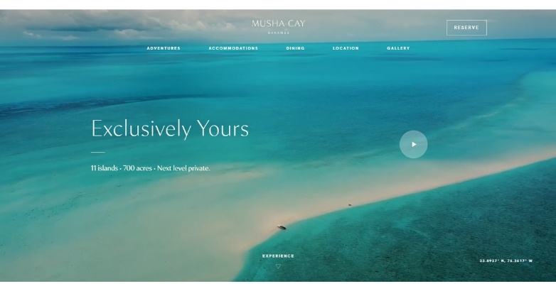
Paradise awaits at the Islands of Copperfield Bay in Musha Cay, another site the Mediaboom team designed. The site design immediately wins you over with short videos of the islands in a rotating carousel.
Furthermore, the website delivers a single-scroll experience so while you can click the navigation bar, you can also learn about the vacation destination simply by scrolling.
Full-sized background images greet you on each page. They act as a preview of the top-notch vacation experience that could be just around the corner!
What makes it stand out
- Full-screen rotating video carousel evokes exclusivity and fantasy
- Single-scroll functionality mimics a luxury brochure experience
- Immersive full-background imagery sets a premium tone immediately
2. Seven on Shelter Island
A Mediaboom-designed site and at the top of our travel agency website examples, Seven on Shelter Island is a bed and breakfast in New York.
The website exemplifies the quaint atmosphere and charm of this B&B with enticing images of the resort grounds and amenities.
The traveling navigation bar includes a “Reserve Now” CTA, while the clean white and blue color scheme is airy, fresh, and wholly inviting.
When you more deeply explore the navigation bar, the “Reserve Now” CTA reappears, which is a smart design touch.
What makes it stand out
- Floating navigation with repeating CTA enhances user flow
- Color palette supports a clean, tranquil luxury vibe
- Visual storytelling through property imagery creates a personal escape
3. Nap Luxury Guesthouse
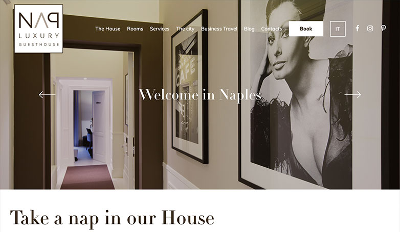
The Nap Luxury Guesthouse embodies a refined luxury travel website design, welcoming visitors with its sophisticated simplicity and elegance.
The site’s palette of neutral tones mirrors the tasteful interior design of the guesthouse, creating a seamless visual experience that extends from the digital space to the physical rooms.
An interactive slideshow on the homepage elegantly showcases the guesthouse’s offerings, inviting potential guests to explore the services and exquisite interiors with just a click, further enhancing the allure of a serene stay in Naples.
What makes it stand out
- Minimalist design reflects understated elegance
- Neutral tones build visual consistency with the physical experience
- Slideshow emphasizes exclusivity without overwhelming
4. Sailing Collective

Sailing Collective’s luxury travel website design invites adventure with a striking full-screen image that captures the essence of exploration.
The crisp, clear visuals of the sail and the mountainous backdrop evoke the thrill of the sea and the call of the horizon.
A minimalist navigation complements the expansive feel of the open waters, expanding upon interaction to reveal a curated selection of journeys.
Each trip is presented with its own evocative photography, paired with succinct calls-to-action, guiding visitors effortlessly towards embarking on their own sailing adventure.
What makes it stand out
- Full-screen imagery captures the thrill of luxury adventure
- Interactive navigation expands only when needed, preserving aesthetic
- Curated photography pairs luxury with exploration
5. UVE
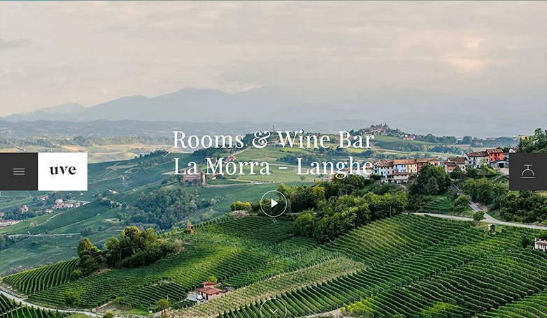
UVE Rooms & Wine Bar’s travel agent website design captivates with an idyllic landscape that promises serene getaways amidst the rolling vineyards of La Morra – Langhe.
The homepage, featuring a play button for a video tour, offers an immersive preview of the experience, drawing visitors into the picturesque world of UVE.
With its refined use of interactive animations and exquisite photography, the website encapsulates the essence of luxury travel, inviting connoisseurs and adventurers alike to indulge in the exclusive retreat that UVE provides.
What makes it stand out
- Video preview delivers a digital tasting of the travel experience
- Luxury is amplified through polished visuals and animations
- Pairing of boutique charm and sleek design reflects refined branding
6. Knai Bang Chatt
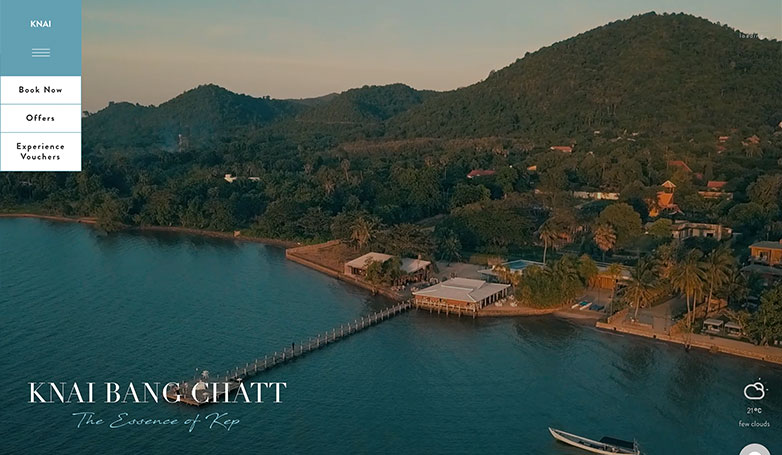
Knai Bang Chatt’s luxury travel web design exudes sophistication with its aerial footage that provides a panoramic view of the serene coastal setting.
The website’s elegant typography and polished imagery effectively communicate the exclusive nature of the resort.
A unique and thoughtful addition to the welcome screen is the live weather update, offering a glimpse into the current climate of the destination, enhancing the immersive experience.
Testimonials are prominently featured, adding a layer of trust and reinforcing the resort’s reputation for providing exceptional luxury experiences.
What makes it stand out
- Live weather feature adds real-time engagement
- High-end typography reinforces luxury credibility
- Thoughtful layout communicates serenity and exclusivity
7. Sensai Lana’i

Hawaii’s Sensai Lana’I resort goes sparse on the navigation menus, which is quite a unique feature in a luxury travel website design.
You can learn more about the brand’s retreats, and the brand’s history or look for availabilities. As you scroll down past the full-screen videos, you can explore more elements of the site like information on retreats.
This enables smart booking decisions.
What makes it stand out
- Stripped-down navigation gives space to storytelling
- Strategic video placement sets a relaxed, upscale pace
- Interactive scroll reveals the brand gradually, building desire
8. Telluride, Colorado

Telluride’s website helps paint the picture for them with a stunning landscape photo on the home screen.
The visitor also has the option in the navigation to switch the season to summer, so you can see the town in both seasons.
Another nice touch is their section for booking that you can find right on the home screen, making it easier for the visitor to make a reservation and encouraging them to do so at the same time.
What makes it stand out
- Seasonal toggle personalizes the experience
- Immediate booking feature supports action-driven design
- Visual elements dominate, echoing destination grandeur
9. LHW

LHW lures you right in on its homepage with a rotating carousel of luxurious travel images, from stunning views like those in the image above to gorgeous, relaxing vistas that will make you want to pack up your bags right away.
To further incentivize you, navigation options like “Find a Hotel,” “Get Inspired,” or “Offers” make it exceptionally easy to plan your getaway. You can even search for available rooms at the top of the page.
What makes it stand out
- Actionable homepage with multiple decision paths
- Immersive image carousel drives aspirational travel
- Seamless hotel search enhances user convenience
10. Y.CO
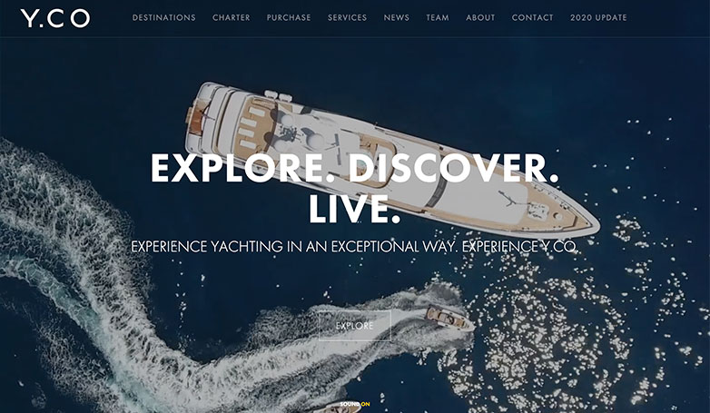
Y.CO’s luxury travel web design is a masterclass in elegance and functionality, inviting visitors to ‘Explore. Discover. Live.’
The website showcases an overhead shot of a lavish yacht cutting through the azure waters, setting the stage for an exclusive yachting experience.
The clean, organized grid layout ensures ease of navigation, prompting further exploration into the depths of the site.
The destination page stands out with its interactive map feature, providing a visually engaging and user-friendly way to discover and plan a luxurious escape at sea.
What makes it stand out
- Interactive yacht exploration fosters a sense of ownership
- Dynamic destination map modernizes trip planning
- Crisp layout aligns with luxury yacht market expectations
11. Casa Angelina

Casa Angelina’s website is sophisticated with use of simple animations, white space and stunning photography.
The most important thing is showcasing your property and Casa Angelina does it right by putting a focus in providing strong imagery of their resort.
Another nice touch is having their navigation fixated to the right as you scroll along with a “Book Now” button that’s always easy accessible to the visitor.
What makes it stand out
- Clean white space and muted tones evoke luxury calm
- Fixed side navigation with CTA ensures constant engagement
- Focused resort visuals keep users anchored to the experience
12. Relais Toscana

Another strong example of luxury travel website design is Relais Tuscana, which relays the traveling experience in Tuscany in such a way that you almost feel like you’re there already.
The website uses vibrant, vivid photos of the Tuscany vacationing experience to whet your appetite.
When you decide to book a stay, the traveling navigation bar with the “Book Online” link (complete with a bell icon) is waiting right there.
What makes it stand out
- Warm, vivid photography romanticizes the Tuscan experience
- Subtle bell icon adds personality and thematic charm
- Booking access floats with the user, reducing friction
13. Turtle Island

Fiji’s Turtle Island resort immediately seeks to inspire trust in the website visitor by mentioning the resort received the distinction of being called the top resort in 2022 by Conde Nast Traveler. This makes it one of the best travel website examples of how to combine storytelling with trust signals.
Further, the navigation bar at the top features a reviews section so you can begin reading up.
The proximity of that menu option to the “Book Now” CTA button is quite smart, as you can jump from one to another.
What makes it stand out
- Immediate social proof via awards and reviews builds trust
- CTA proximity to reviews supports instant conversion
- Recognition-first design strategy captures elite credibility
14. Turneffe Island Resort

Turneffe’s luxury travel website design pulls you right in with a montage video and an immersive layout.
The video helps illustrate some of their best features along with full screen imagery that helps you dive into the island’s environment.
If you want to stand out from your competition, Turneffe’s website is the perfect inspiration.
What makes it stand out
- Cinematic homepage video creates emotional immersion
- Island atmosphere is captured through ambient interactivity
- Scroll-responsive layout mimics journey through the destination
15. Villa Feltrinelli
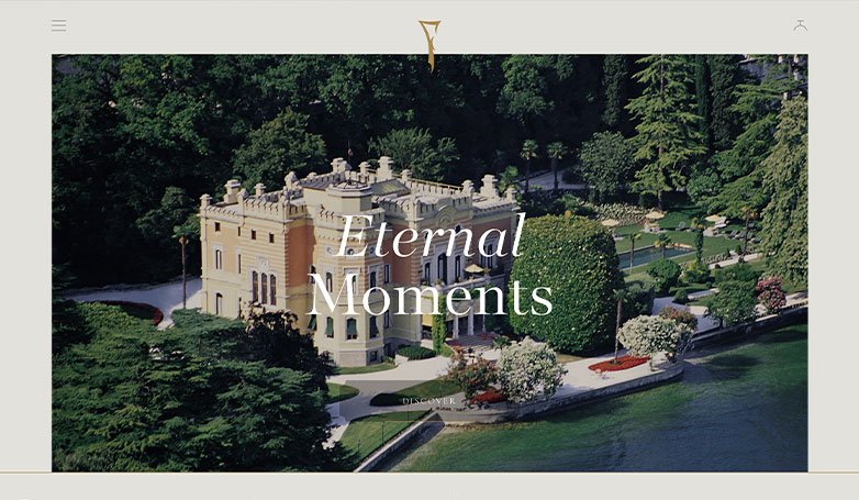
Villa Feltrinelli’s luxury travel website design stands out from their competition with an interactive web design and story telling style layout.
It starts off like a book with just welcome screen to start and when you click “Discover” it expands the website into a horizontal scroll design, telling a story of the villa with short blurbs and beautiful photography.
If you’re looking for a different way to draw in visitors and immerse them into your website, this is the way to go.
What makes it stand out
- Interactive horizontal scroll mimics a curated gallery tour
- Storytelling through design builds luxury narrative
- Blurb-style content personalizes and humanizes the brand
16. Baglioni Hotels

As masters of high-end travel sites, Baglioni Hotels & Resorts in Italy has an especially easy-to-use website worth spotlighting here.
The top navigation bar–which features options like a journey configurator, Italian dining, and a contrasting “Book Now” CTA button–travels with you as you scroll through rich travel photos, mouthwatering images of meals, and dreamy shots of available suites.
The bottom of the page makes it easy to connect, as you can sign up for Baglioni’s newsletter or check out their socials.
What makes it stand out
- Bold “Book Now” CTA contrasts elegantly against luxury design
- Seamless scrolling with anchored navigation enhances UX
- Emotional visuals of food and suites emphasize five-star living
17. Carrier

Carrier’s luxury travel web design is a testament to understated elegance, featuring a lush, tropical backdrop that whispers the allure of the unknown with the phrase, “The importance of elsewhere…”
The site’s use of dark tones and whitespace crafts a modern and sophisticated ambiance, while the straightforward photography invites contemplation and wanderlust.
Navigation is made effortless with a bold, clear menu, complemented by convenient quick links for immediate communication and search functionality, epitomizing the seamless luxury experience Carrier offers to its discerning travelers.
What makes it stand out
- Monochrome tones signal refined simplicity
- Language choices elevate exclusivity (“The importance of elsewhere…”)
- Prominent communication tools support concierge-level service
18. Dharma Group

As one of the best luxury travel websites, Dharma Group deservedly earns a spot on this list.
Typifying the “lifestyle and charm” it proclaims on its homepage, the full-sized rotating carousel of hotel images allows you to step into the world of Dharma before you book.
Promising the “best rate guaranteed,” you can book your accommodations right on the homepage.
The booking option also appears as you scroll down, giving you another opportunity to lock in your spot and exceptional rate.
What makes it stand out
- Immediate rate reassurance removes booking hesitation
- Rotating hero carousel presents the brand’s scope
- Strategic CTA placement makes it easy to commit
19. Bulgari Hotels & Resorts
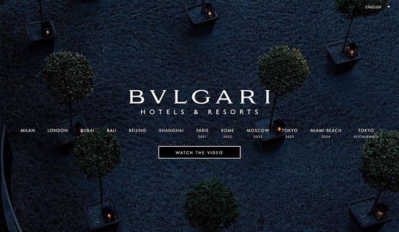
Bulgari Hotels & Resorts’ luxury travel website design exudes sophistication and elegance with its dark, moody aesthetic that instantly captivates the viewer.
The site’s interface is immaculate, with a seamless navigation structure that elegantly highlights each of their global locations. The interactive experience is enhanced as images dynamically change upon hovering, providing a tantalizing glimpse into the distinctive atmosphere of each hotel.
The prominent invitation to “Watch the Video” entices visitors to dive deeper into the opulent world of Bulgari, offering a visual feast that encapsulates the brand’s commitment to luxury and excellence.
What makes it stand out
- Hover-sensitive visuals create an interactive browsing luxury
- Dark aesthetic evokes opulence and high fashion
- Encourages exploration through layered image presentation
20. Quellenhof

Luxury travel website design doesn’t get much better than Quellenhof, a luxury resort near Italy’s Lake Garda.
To provide the five-star experience the hotel promises, its website offers 360-degree views of Italian vacation destinations.
The traveling navigation bar at the bottom of the page is for booking inquiries.
That it stays with you means it’s easy to request information about suites and rooms when you see something on the site that inspires you to take action.
What makes it stand out
- 360-degree imagery creates spatial immersion
- Bottom-fixed booking CTA makes conversion instant
- Page structure mirrors an ultra-personal concierge approach
21. Nira Alpina
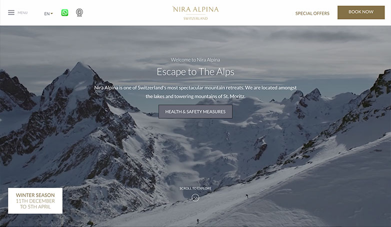
Nira Alpina’s website offers an extraordinary look into the mountain retreat with an immersive video, stunning photography and simple explanations of their resort so the visitor can fully understand who they are and what they have to offer.
With strong calls-to-action that are found throughout the site, the user is encouraged to dive deeper into the website and also offers easy ways to get something booked with them.
What makes it stand out
- Video background brings mountainous serenity to life
- Clear, purposeful CTAs placed strategically throughout
- Information design simplifies luxury storytelling
22. Spice Island Beach Resort
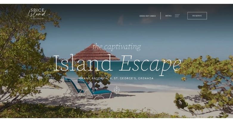
Exemplifying the best travel website design, Spice Island Beach Resort pulls you in with romantic, alluring full-screen video clips showcasing what life on the islands is truly like.
The resort’s phone number is well above the fold, as is the CTA button for reservations for those who are ready to book a stay.
Those who still need more convincing can dig into the meaty dropdown menu showcasing a gallery, accommodations, resort inclusions, and more.
What makes it stand out
- Full-screen video sets tone for romantic escapism
- High visibility CTAs for instant conversion
- Multi-layered menu creates a “choose-your-own-adventure” UX
23. Emerald Maldives

The Maldives doesn’t have to incentivize you to take a vacation there, but the Emerald Maldives Resort & Spa website does a fantastic job of doing so anyway.
Establishing trust immediately, the website features its recently received rewards from such major travel resources as Tripadvisor and Booking.com.
We also quite appreciate the “Become a Friend” link at the top of the navigation, which allows you to become an exclusive member of the resort club and details all the benefits.
What makes it stand out
- Immediate trust established via third-party awards
- Loyalty-building “Become a Friend” membership callout
- Seamless blend of brand story and user utility
24. Salinas Maragogi

A vacation should be fun, whimsical, and exotic.
Salinas Maragogi, an all-inclusive resort in Brazil, brings all the wonder of vacationing in another country to life with its website design.
The colors are the first thing that will pull you in, what with the bright yellows and oranges the website uses so effectively.
As you navigate from option to option, a small orange squiggle follows you and highlights the option you selected.
Fun uses of tropical graphics also prove that a luxury travel website design doesn’t have to be quite so serious all the time.
What makes it stand out
- Vibrant colors create emotional engagement
- Interactive UI elements enhance memorability
- Luxury with playfulness, breaking industry norms
25. Calabash Cove Resort & Spa

Serving the St. Lucia area, Calabash Cove Resort & Spa invites you to escape with its well-designed website.
The resort understands how people are motivated by reviews, which is why it proudly displays its current rating right on its homepage. The distinct yellow “Check Rates & Availability” CTA button is well-placed and attracts the eye right to it.
The navigation bar travels with you, including the smaller dark gray navigation bar that invites you to learn more about the resort’s travel agents and booking policy.
What makes it stand out
- Strategic use of review scores to influence booking
- Bright, standout CTA drives visibility and urgency
- Floating mini nav bar ensures context and trust
26. The Brando
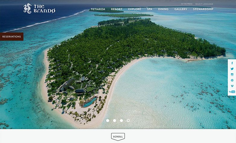
The Brando’s website is bright and fun just like their brand and island resort.
It stands among the best travel agent website examples due to its strong visual focus and seamless social integration.
By putting a focus into their imagery, the user is instantly impressed with their resort and can get an understanding of the experience on the island.
Another nice touch is their social media sidebar. It provides links to all their social media platforms, another way to gain more lead generation and new visitors.
What makes it stand out
- Social integration for organic lead generation
- Visual-first layout aligns with aspirational luxury
- Instant wow factor with high-res homepage imagery
27. One&Only Reethi Rah

This Maldives resort makes it simple to step into the lap of luxury and stay there for as long as your vacation lasts.
The navigation bar is built right into the homepage, as when you hover over options like “Newsletter” or “Resorts,” a white navigation bar appears.
The previously white “Book Now” CTA button instantly becomes black with white text, which is a smart design move!
What makes it stand out
- Dynamic hover animation elevates interactivity
- Smart use of color inversion enhances CTA visibility
- Integrated menu design feels bespoke and fluid
28. Ventana Big Sur

A smart element of luxury travel website design is a full-screen video showcasing your travel destination, something that Ventana Big Sur utilizes.
The short, looping video showcases the whimsical, romantic nature of this part of California. It includes the fine dining, gorgeous outdoor exploration, and resort amenities available to you if you reserve a room.
The full-screen photos of the suites and amenities match the vibe of the homepage.
What makes it stand out
- Cinematic video loop brings California’s mystique to life
- Bold visuals maintain emotional continuity sitewide
- Suite photography builds luxury desire step-by-step
29. Ikos Oceania

Vacationing in Greece has never been so easy as with Ikos Oceania.
It has among the best travel website designs with large, bright aerial photography of the resort and surrounding area, animated website elements as you scroll, and traveling navigation.
You can learn more about Ikos Oceania’s concept, what’s included with your stay, and what offers the hotel currently has available.
The “Book Now” button above the fold is perfectly placed, while the social channels at the bottom let you better explore the resort’s branding.
What makes it stand out
- Large aerial imagery commands instant awe
- Animated design injects movement without clutter
- Social channel links foster trust and extended engagement
30. COCOS Hotel Antigua Resort

The imaginative website design of COCOS in Antigua is another travel website example worth emulating. We love the recurring use of color.
The robin’s egg blue seen in COCOS’ logo makes subtle but smart appearances across the entire website, from the chat button hue to the CTA buttons, text links, and the bar for checking hotel availability.
The dark brown–the secondary hue in the brand logo–is used more subtly.
What makes it stand out
- Consistent use of brand colors elevates elegance
- Color-coded interactivity improves usability and memory
- Seamless balance of luxury and personality
31. Pitch Luxury Tents

Pitch’s website does it a little differently than more traditional luxury websites.
Their use of illustrations help give their brand more personality while helping them stand out from the competition.
Having the illustrations also helps create a story with informative graphics and a simple step by step overview of their process and products.
What makes it stand out
- Illustrated design reinforces niche and creativity
- Step-by-step format simplifies luxury for new customers
- Differentiation through brand personality in design
32. Mandarin Oriental Como

Experience the best of Lake Como at Mandarin Oriental Como, which impresses upon you what the good life will be like as soon as you land on its website. The mobile version is especially enchanting, with large-scale imagery of the hotel, descriptive copy, and a navigation bar that follows your progress as you scroll.
That navigation bar features a search option, a sign-in link, a language setting, and a Book CTA button. The button is in brick red, which contrasts the white, black, and gold color scheme the rest of the site uses.
Many of the site’s CTA buttons feature the same color scheme, which instantly attracts the eye toward the button. Discover more of what fuels travel purchasing decisions with this roundup of travel website design from Mediaboom.
What makes it stand out
- Brick-red CTA contrasts with refined gold/black scheme
- Smart mobile UX reflects luxury on smaller screens
- Persisting navigation maintains access to key actions
33. Untold Japan

As the Untold Japan website says, this travel agency can help you “sense the wonder.” Its luxury travel website design is on-brand, with a copy that reads “experience Japan like never before” and describes “curated…bespoke tours.”
The white navigation bar is kept sparse, with the Untold Japan logo, an Enquire CTA button, and a three-lined navigation menu you can click to unfurl. What’s interesting about this site design is that the Enquire button is white with the rest of the menu. Elsewhere, the CTA buttons are black with white text, an inverse of the rest of the site.
The overly simple site design and primary use of white creates a clean, neat, concise browsing experience.
What makes it stand out
- Sparse design speaks to cultural minimalism
- Unique CTA color logic separates key actions
- Narrative copy invites emotional connection to Japan
34. Carillon Miami

The wellness resort and spa Carillion Miami has a travel agency website worth remembering. Potential customers are drawn to its design elements, vibrant colors, and full-sized videos of tropical palms against a multicolored sunset and perfectly blue glassy pools.
You have two CTA buttons for booking that are above the fold. The left is a long gray button that reads Book Spa, while the second button lets you set your arrival and departure date, with a Book Your Stay button in white below.
The navigation menu includes many options but remains neat and traversable, letting your dig deeper into the resort’s experiences, events, dining, Wellness & Beach Club, and offers.
What makes it stand out
- Dual booking buttons above the fold improve action rates
- Sunset and pool imagery convey wellness and luxury
- Color contrast and layout hierarchy guide the user’s path
35. Passalacqua

Passalacqua is an Italian travel agency with an excellent website. Dive deep into its luxury travel website design, which pays homage to the hotel’s long legacy dating back to the 18th century.
If the homepage copy doesn’t whet your appetite enough, you can click the About Us link on the top navigation bar, which scrolls with you as you experience the site. On the other side of that link is a Book Now menu.
Otherwise, you can scroll through the homepage to learn more about the hotel before securing your stay.
What makes it stand out
- Historic storytelling anchors visual and written design
- Scroll-triggered booking aligns with brand journey
- Heritage-based layout builds legacy appeal
36. BlueParallel

BlueParallel offers private luxury tours across the Polar regions, Mediterranean, and Latin America. The site establishes its award-winning legacy immediately. It showcases some of its awards on the homepage, such as a Luxury Lifestyle prize in 2024.
Further, BlueParallel’s website copy emphasizes its long-term history of more than 20 years. The accolades create social proof, driving trust in potential customers.
The navigation bar scrolls as you do, with dropdowns for learning more about its various travel destinations. You can also discover more about the BlueParallel team, read the blog, or review its videos.
When you’re ready, a Start Planning CTA button in teal blue (which contrasts the white website) makes it easy to connect. Additionally, a white button outlined in dark blue with the resort’s phone number is readily available for immediate contact.
What makes it stand out
- Awards and accolades create instant credibility
- Teal and blue palette subtly reinforces trust and calm
- Clear planning CTA prompts decisive engagement
37. Le Domaines De Fontenile

The gorgeous European resort Les Domaines de Fontenille promises “a special journey, both physical and intellectual, sensory and initiatory.” That’s a big guarantee, but it has the travel agency website design to back it up.
Its site is evocative with a carousel of large images of the hotel and the gorgeous European countryside, information on each of the hotels under its umbrella, and clear, simple navigation.
The top menu options are smart inclusions, with a contrasting CTA button to book. Additionally, links to redeem a gift card or shop at the e-shop are provided.
What makes it stand out
- Artful image carousel connects elegance with serenity
- Booking button contrast is subtle yet visible
- E-shop and gift card add luxury ecommerce element
38. Cap d’Antibes Beach Hotel

The five-star hotel on the French Riviera, Cap d’Antibes Beach Hotel, drips in luxury and has great web design to prove it. Its vibrant imagery captures the essence of relaxation, with pink beach chairs and umbrellas overlooking the shore. In the distance, palm trees sway, already having you dreaming of your next vacay.
The copy explains that the resort has 35 suites and rooms and spotlights the resort’s premium location near Nice and Cannes. The eye-catching and visually attractive color combination of white and orange elsewhere across the site creates a tropical vibe.
When you click the three horizontal lines on the homepage, you’ll see a menu with a large typeface where you can learn more about the hotel, rooms, and restaurants. A booking link atop the fold travels with you as you explore the site.
What makes it stand out
- Strong lifestyle visuals create emotional entry point
- Clean design supports a high-end coastal vibe
- Color integration enhances brand memorability
39. Wentworth Travel

The Australian travel agency Wentworth Travel has an exceptional desktop and mobile-optimized site. Its luxury travel website design on mobile shrinks the large-scale imagery but still sticks to the base white and blue color scheme.
Fascinatingly, the mobile version doesn’t have a navigation menu, although the desktop version does, and it’s fully loaded with about, corporate, specials, news, and a booking link.
Wentworth’s mobile design has a booking button to the left of the page that travels as you visit the site so you can book right away.
What makes it stand out
- Mobile-first experience with simplified actions
- Floating booking button improves ease of conversion
- Desktop layout reinforces trust and professionalism
40. Boutique Japan

Boutique Japan’s travel website design satisfies the need for unique user experiences. The luxury travel agents’ expertise are mentioned front and center, as is its award-winning service. The vibrant images showcasing what kinds of experiences you can have if you visit Japan through this service would whet the appetite of any travel lover.
The website’s navigation menu is exceptional. It’s black with a simple Boutique Japan logo (including a red dot like what’s seen on the Japanese flag) and several menu options: Trips, The Process, About, Blog, Testimonials, and Contact. There’s also a search option.
Although this luxury travel website example doesn’t have a booking link above the fold, there are many CTA buttons across the site in bright red to grab attention.
What makes it stand out
- Rich visuals bring Japanese culture to the forefront
- Red CTAs contrast strategically for conversion
- Logo and nav bar design mirror cultural cues
41. Aman Resorts

Aman Resorts’ website exudes calm and sophistication, setting a tranquil tone from the moment you arrive.
The minimalistic layout, combined with soft, neutral colors, emphasizes a refined aesthetic that aligns with Aman’s focus on serene, exclusive experiences.
The subtle, full-screen imagery creates an immersive experience, inviting potential guests to imagine themselves in the peaceful surroundings Aman is known for.
What makes it stand out
- Minimalism reflects brand values of peace and privacy
- Soft tones evoke calm and exclusivity
- Scrolling becomes a meditative experience, mirroring the resort’s ethos
42. Six Senses

Immersing visitors in a world of wellness and natural beauty, the website design draws attention from the very first glance.
The homepage features a captivating full-screen image set within a warm-toned, calming interior, perfectly conveying the brand’s dedication to holistic experiences.
A central call-to-action invites users to explore various properties, while an easily accessible “Book Now” button remains prominent in the top corner.
The streamlined design, combined with evocative language, guides users through a seamless booking experience.
What makes it stand out
- Wellness-first visuals reinforce brand identity from the start
- Central CTA aligns with the brand’s holistic, user-focused design
- Clean layout and calming tones reflect a tranquil, luxury lifestyle
43. Onefinestay

Onefinestay’s luxury travel website design offers an inviting introduction to its exclusive vacation rentals with a picturesque, full-screen image of a serene villa.
The headline, “Enjoy the finest luxury rentals,” sets an elegant tone, enhanced by a clean and modern layout.
A search bar is prominently placed on the homepage, allowing users to easily input destination, dates, and guest count, streamlining the booking process.
The navigation options at the top offer quick access to destinations, offers, and guest support, reinforcing the site’s focus on providing a tailored, high-end experience.
What makes it stand out
- Prominent search bar encourages instant interaction
- Minimalist layout amplifies premium property visuals
- Typography and UI echo concierge-style sophistication
44. Rosewood Hotels & Resorts

Capturing attention with a serene, full-screen video of a scenic lake and its surroundings, the website creates a calming, immersive experience for visitors.
The deep blue background complements a top navigation bar that offers easy access to key sections like Hotels, Offers, Events, and Residences.
A prominently placed “Check Rates” button simplifies the booking process, while the tagline “Discover the world differently” subtly invites exploration.
This understated elegance, combined with high-quality visuals, aligns with the brand’s identity, appealing to travelers in search of unique, refined experiences.
What makes it stand out
- Full-screen scenic video sets a serene tone
- Deep blue theme builds a premium, trustworthy atmosphere
- Navigation and booking CTA merge effortlessly into luxury experience
45. Belmond

Belmond’s luxury travel website design brings elegance and allure with a full-screen video that draws visitors into its unique offerings.
The homepage emphasizes Belmond’s rich storytelling approach with the headline “Belmond Legends” and a “Discover the Legends” button, inviting users to explore the brand’s iconic properties and experiences.
The streamlined top navigation bar provides access to Destinations, Experiences, Packages & Tours, Signature Suites & Villas, and more, creating an effortless browsing experience.
What makes it stand out
- Story-driven layout with immersive video opens emotional connection
- “Discover the Legends” CTA ties seamlessly into brand narrative
- Simplified nav bar with strong imagery keeps exploration intuitive
46. Soneva

Soneva’s luxury travel website design reflects its commitment to sustainability and elegance with a serene, minimalist layout.
The homepage features a calming visual with soft, natural colors that evoke a sense of tranquility.
A prominent “Reserve” button in the upper right ensures easy access to booking. This clean design, paired with subtle animations, embodies Soneva’s ethos of luxurious yet environmentally mindful travel experiences.
What makes it stand out
- Eco-luxury branding reflected in every design choice
- Soft tones and whitespace enhance calm and clarity
- Subtle transitions add depth without distracting from content
47. Four Seasons Private Retreats

Emphasizing exclusivity and elegance, the website features a bold blue background and large, refined typography that draws attention to the title “Four Seasons Private Retreats.”
A central search bar enables users to effortlessly explore available villas and residences, enhancing the user experience.
A prominently displayed “Check Rates” button simplifies the booking process, while the sophisticated layout reflects the brand’s identity, inviting visitors to experience unparalleled luxury and privacy.
What makes it stand out
- Bold visual contrast emphasizes exclusivity and privacy
- Prominent search bar facilitates effortless discovery
- Clear hierarchy of CTAs supports a frictionless booking process
48. Cheval Blanc

Cheval Blanc’s website design captures the elegance of Paris with a breathtaking full-width image of the cityscape, featuring the iconic Eiffel Tower and the Seine River.
The clean, minimalist navigation bar at the top allows easy access to sections like Rooms & Suites, Culinary Arts, Wellness & Relaxation, and Events, enhancing the user’s journey.
A discreet “Check Availabilities” booking widget is placed at the bottom right of the screen, making reservations effortless without intruding on the visual experience.
What makes it stand out
- Parisian elegance captured in refined, cityscape visuals
- Non-invasive booking widget respects the user’s visual experience
- Intuitive navigation complements minimalist luxury feel
49. COMO Hotels and Resorts

Capturing a sense of tropical joy and relaxation, the website showcases a stunning beach image with a pastel overlay that sets a celebratory, leisurely tone.
The central message, “Share the Joy,” is complemented by a prominent button inviting visitors to explore year-end festivities. Minimalist top navigation includes essential links and a “Book” button, maintaining a clean, focused layout.
The soft color palette and inviting visuals perfectly align with the brand’s refined, relaxed luxury, drawing visitors into a serene world of picturesque experiences.
What makes it stand out
- Pastel overlays evoke relaxation and modern celebration
- “Share the Joy” messaging adds warmth to brand voice
- Balanced layout combines emotional and visual luxury effectively
50. Anantara Hotels, Resorts & Spas

Anantara Hotels & Resorts’ luxury travel website design immerses visitors in a sense of adventure and elegance, featuring a captivating full-screen image of a desert landscape with camels traversing sand dunes.
The top navigation menu is comprehensive, covering various offerings like Destinations, Experiences, Dining, Spa & Wellness, and Private Jets.
The phrase “Begin your journey in…” further enhances the theme of exploration, inviting guests to experience Anantara’s unique, world-class destinations.
What makes it stand out
- Adventure-themed design with desert visuals stirs wanderlust
- Layered top navigation supports rich, experience-driven UX
- “Begin your journey” phrasing activates emotional decision-making
Luxury Travel Web Design Services
The examples above show that there is no single formula for luxury travel website design. Hotels, resorts, tour operators, and travel agencies have different offers and different booking processes.
The website should be built around those differences. A resort may need detailed accommodation pages and an integrated booking engine, while a luxury travel agency may need destination pages, sample itineraries, advisor information, and an inquiry form.
Here are the main areas to consider when planning or redesigning a luxury travel website.
Customized Website Design
Custom website design gives travel brands more control over how their accommodations, destinations, experiences, and services are presented.
The structure should reflect what visitors need to compare before making a decision. For a hotel, this may include room types, amenities, dining, offers, and availability. For a travel agency, it may include destinations, sample trips, travel styles, and the planning process.
A luxury travel website template can be a practical starting point for simpler websites, but it should still support the content, booking tools, and page types the business requires.
Responsive and Mobile-Friendly Layouts
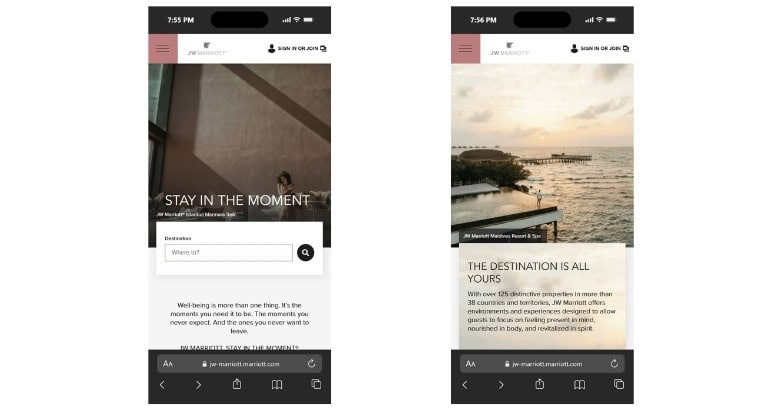
Travelers may research a trip on one device and book on another, so the main website functions need to work properly across screen sizes.
On mobile, visitors should still be able to:
- Compare rooms, properties, or trips
- Open menus without covering important content
- Read rates, inclusions, and other trip details
- Select dates where applicable
- Complete a booking or inquiry
- Contact the company
Mobile testing should focus on these tasks rather than simply checking whether the desktop design fits on a smaller screen.
High-Quality Visuals and Graphics
Photography and video help visitors understand what they are considering booking.
For hotels and resorts, that can include rooms, property grounds, restaurants, pools, spas, nearby scenery, and activities. Travel agencies can use destination photography, sample experiences, guides, and trip imagery to give visitors a clearer idea of what they can arrange.
Images should also serve a purpose. A large photograph of a suite is more useful when visitors can identify which room category it represents.
Media files should be prepared for the web so image quality does not come at the expense of page speed.
User Experience Design
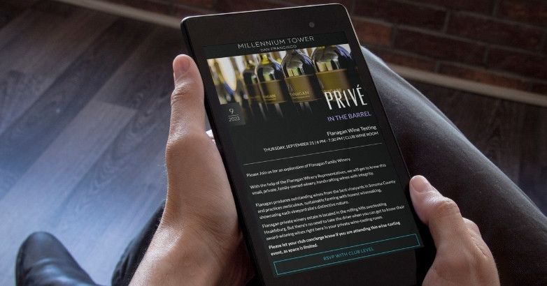
Good user experience comes down to how easily visitors can find information and complete the next step.
A visitor should not have to search through several pages to understand basic details such as:
- What the company offers
- Where the property or trip is located
- Which accommodation or trip options are available
- What is included
- How to check availability
- How to make a reservation or inquiry
Typography, spacing, buttons, forms, and interactive elements should support those tasks rather than adding unnecessary complexity.
Color Schemes
Color should come from the brand and the experience being presented rather than from a fixed idea of what a luxury website should look like.
The examples above range from dark, minimal palettes to bright destination-focused designs. Both approaches can work when the colors are consistent with the brand and maintain readable text, clear buttons, and enough contrast.
The goal is not to make every luxury travel website look the same. The visual system should make the brand recognizable while keeping the website easy to use.
Navigation Menus
Travel websites often contain a large amount of information, making navigation especially important.
A hotel website may need links for rooms, dining, experiences, spa services, offers, and reservations. Luxury travel agency website design may require destinations, trip types, sample itineraries, the planning process, and contact options.
Keep the labels specific. Visitors should understand what they will find before clicking.
Important actions such as checking availability, booking a stay, or starting an inquiry should also remain easy to reach from the main navigation.
Download Our FREE Guide
Attract More Travelers & Boost Bookings With Our Hospitality Digital Marketing Guide
Uncover how travel brands are using content, SEO, and paid media to reach ideal audiences, build loyalty, and increase direct engagement across the booking journey.
Integration of Booking and Reservation Systems
The booking process should match the way the business sells travel.
Hotels and resorts usually need visitors to choose dates, compare available rooms, review rates, and complete a reservation.
Custom travel companies often work differently. If an itinerary requires consultation, the website should make it easy to submit an inquiry and provide the information an advisor needs to start planning.
Whichever system is used, moving from the website to the booking or inquiry process should feel like a clear continuation of the same task.
Engaging Content Presentation
Luxury travel websites need more than photography.
Visitors may also need room dimensions, occupancy limits, inclusions, itinerary details, transfer information, dining options, cancellation policies, or information about the planning process.
Break this information into sections that are easy to scan rather than placing long blocks of copy on the page.
Use photography, video, tables, lists, and other formats when they make information easier to understand. The format should depend on the information being presented.
SEO for Search Visibility
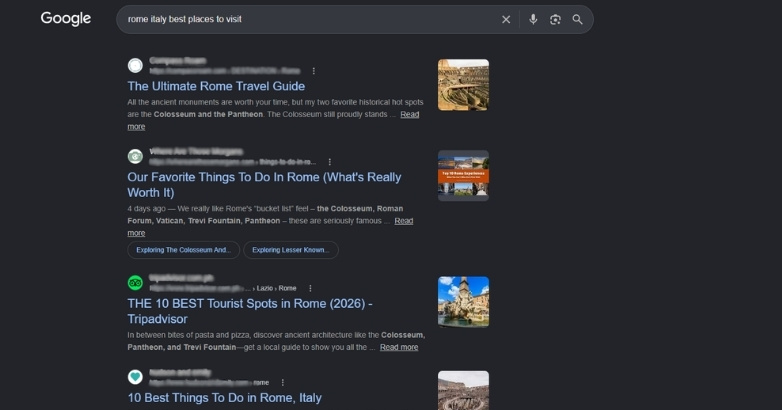
SEO should be considered when the website structure and content are planned.
Important accommodations, destinations, services, experiences, and trip types may require their own pages if people actively search for them.
Each important page should have a clear topic, descriptive title and headings, useful internal links, and enough original information to answer the visitor’s search.
Image file sizes, page speed, mobile usability, internal linking, and website architecture should also be considered during the design process rather than addressed only after launch.
Luxury Travel Website Design FAQs
I. What should a luxury travel website include?
A luxury travel website should explain what the business offers, show the property or travel experience clearly, and make the next step easy to find.
For hotels and resorts, important elements usually include accommodation pages, amenities, experiences, rates or offers, availability, and a reservation path.
Travel agencies may instead need destination pages, sample itineraries, advisor information, testimonials, and an inquiry process.
II. What should luxury travel agency website design include?
Luxury travel agency website design should help visitors understand both the destinations available and how the agency plans a trip.
Useful content can include destination guides, sample itineraries, different travel styles, advisor profiles, past client experiences, and an explanation of the planning process.
The main CTA should also match the service. For customized travel, starting an inquiry is often more appropriate than presenting a traditional booking button.
III. Should you use a luxury travel website template or custom design?
A luxury travel website template can work for a smaller website with straightforward content and booking requirements.
Before choosing one, check whether it supports the page types, imagery, forms, mobile layouts, and booking systems the business needs.
Custom design becomes more useful when the website has several property types, unusual booking requirements, custom integrations, or a page structure that cannot be fitted comfortably into a standard template.
IV. What do the best travel website design examples have in common?
The best travel website design examples make it easy to understand the offer, find relevant information, and take the next step.
Their visual styles can be very different. What matters is how photography, written content, navigation, and booking tools work together to answer the questions visitors have before making a travel decision.
Elevate Your Hospitality Brand Today
Schedule Your Free Consultation
Seeking to elevate your business? Let Mediaboom guide you. Secure your exclusive, free consultation with our digital marketing experts today.
Hire a Luxury Travel Web Design Agency
Luxury travel website design should reflect the way your business actually sells travel.
A hotel may need to make room comparison and direct booking easier. A travel agency may need to explain its expertise and turn destination research into qualified inquiries.
Mediaboom works with hospitality and travel brands on website design, development, SEO, content, and digital marketing.
Contact Mediaboom to discuss your luxury travel website design project.
WHAT OUR CLIENTS SAY
By: Frank DePino
Frank DePino is the Principal and Founder of Mediaboom, a top hotel marketing agency partnering with leading hotel and hospitality brands. With 30+ years of experience, he has led strategic digital initiatives for names including Four Seasons, Ritz-Carlton, JW Marriott, Millennium Partners, and Guardian Jet. Frank helps hospitality businesses strengthen brand presence, drive qualified leads, and elevate guest experiences through website design, SEO, content marketing, and paid media. Under his leadership, Mediaboom is a trusted partner for brands pursuing measurable digital growth in a competitive hospitality landscape.