

50 Best Travel Website Design Examples

By: Frank DePino | May 4, 2026
Loading the Elevenlabs Text to Speech AudioNative Player...
Looking for the best travel website design examples?
The strongest travel websites do more than look good. They use smart travel website UI and structured travel website layout to help visitors find the right trip fast, build trust early, and move users from inspiration to booking with as little friction as possible.
In this guide, you’ll find 50 travel website design examples across hotels, OTAs, tour brands, vacation rentals, and travel publishers. For each one, we break down what works and what your brand can borrow.
If you are designing a travel website, focus on three things first: a clear value proposition, mobile-friendly booking paths, and trust signals placed close to decision points. These patterns sit at the core of effective travel website UI design.
Here are the top 50 travel website design examples for hotels that you can use as inspiration!
- Musha Cay
- Aspen Luxury Concierge
- Memorable
- Nelson Travel
- Antaeus Travel Group
- L.A. Family Travel
- Bawah Reserve
- BRU&BRU
- Mr and Mrs Smith
- Zicasso
- Virtuoso
- Black Tomato
- Red Savannah
- Booking.com
- Expedia
- Priceline
- Trip.com
- TripAdvisor
- Trivago
- Rome2Rio
- Viator
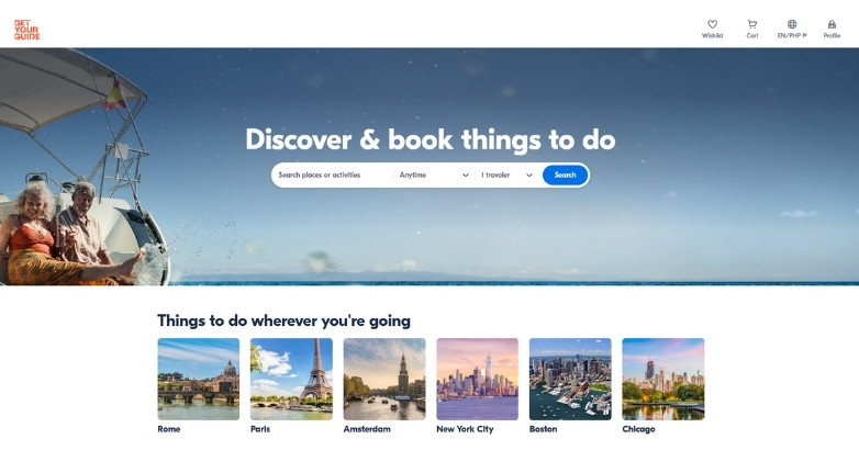
- GetYourGuide
- Klook
- Context Travel
- Intrepid Travel
- Trafalgar
- G Adventures
- Insight Vacations
- Tour Radar
- Backroads
- Cubania Travel
- Responsible Travel
- Sustainable Travels
- Airbnb
- VRBO
- Couchsurfing
- Sawday’s
- Adventurous Kate
- The Blonde Abroad
- Expert Vagabond
- The Planet D
- Be My Travel Muse
- Lonely Planet
- Condé Nast Traveler
- Travel Lemming
- Travel Off Path
- Rough Guides
- Culture Trip
- Travel + Leisure
- Remote Lands
Download Our FREE Guide
Attract More Travelers & Boost Bookings With Our Hospitality Digital Marketing Guide
Uncover how travel brands are using content, SEO, and paid media to reach ideal audiences, build loyalty, and increase direct engagement across the booking journey.
What makes a good travel website design?
A good travel website design makes trip planning feel easy, trustworthy, and fast. It should help users understand what the brand offers, find the right trip or stay quickly, and get enough detail to make a decision without hunting through the site.
The strongest travel websites usually do these things well:
- Put search or booking in a prominent spot
- Use travel-specific filters
- Show enough detail to support decisions
- Place reviews and trust signals near key actions
- Make mobile browsing simple
- Use visuals to support the offer, not distract from it
- Make policies, inclusions, and next steps easy to find
Let’s get into the examples!
Luxury travel brands, planners, and boutique stay sites
These are the most aspirational, premium-looking examples. They are strong for layout, imagery, tone, and high-ticket positioning.
1. Musha Cay
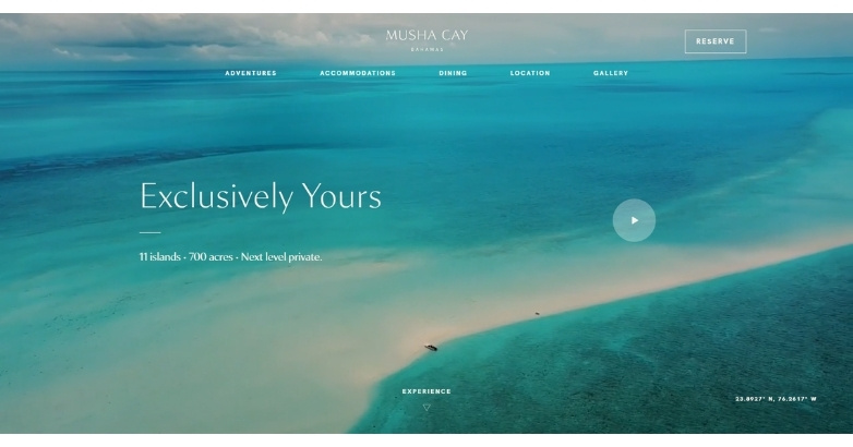
It pulls you into a private island escape from the first second, using cinematic visuals and slow pacing that reflect exclusivity, privacy, and high-end travel expectations.
What makes it stand out:
- Cinematic visuals that place the destination at the center of the experience
- Minimalist layout that communicates exclusivity without excess
- Smooth transitions that create a relaxed, high-end browsing journey
Best fit for: Luxury resorts and private island brands seeking a premium digital presence.
2. Aspen Luxury Concierge

It presents high-end concierge services with clarity and confidence, using clean design and focused messaging that speak directly to affluent travelers seeking personalized experiences.
What makes it stand out:
- Service-first structure that highlights offerings without overwhelming the user
- Refined typography and spacing that reinforce a premium feel
- Clear navigation that makes complex, custom services easy to explore
Best fit for: Luxury concierge and bespoke travel services targeting affluent clients.
3. Memorable
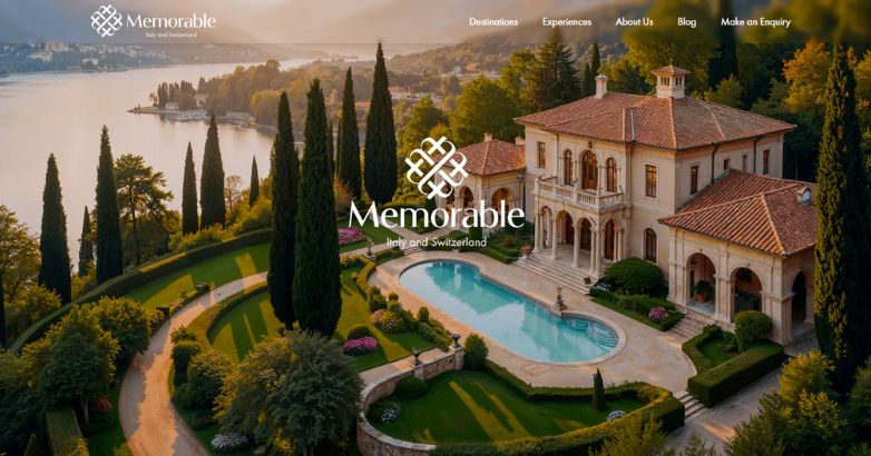
It presents luxury travel as a personal, high-touch experience, using refined storytelling, destination-led content, and inquiry-focused design to guide visitors toward a custom trip.
What makes it stand out:
- Elegant storytelling that makes the journey feel personal, not packaged
- Destination sections for Italy, Switzerland, Lake Como, Sicily, Tuscany, Venice, and other high-end travel areas
- Inquiry-led flow that fits bespoke luxury travel instead of instant booking
Best fit for: Luxury travel planners and boutique tour operators focused on tailor-made European journeys.
4. Nelson Travel

It delivers a polished and approachable experience, combining clear structure with engaging visuals that make trip planning feel simple and trustworthy.
What makes it stand out:
- Balanced layout that blends destination imagery with practical information
- Straightforward navigation that helps you find trips quickly
- Consistent branding that builds trust across every page
Best fit for: Travel agencies focused on accessible, well-organized trip planning services.
5. Antaeus Travel Group

It communicates expertise and global reach through a structured design that balances detailed offerings with a polished, professional presentation.
What makes it stand out:
- Content-rich layout that organizes complex travel services clearly
- Strategic use of imagery to support destination credibility
- Professional tone that reinforces authority and industry experience
Best fit for: Established travel firms offering multi-destination and full-service planning.
6. L.A. Family Travel
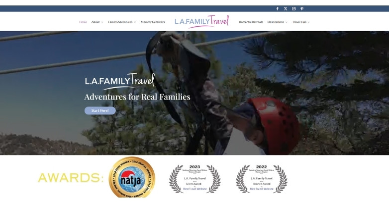
It creates a welcoming and informative experience that speaks directly to families, blending practical planning tools with a friendly, trust-building design.
What makes it stand out:
- Family-focused messaging that addresses real travel needs and concerns
- Easy-to-follow layout that simplifies trip planning for busy parents
- Warm, approachable visuals that make the brand feel reliable and relatable
Best fit for: Family-focused travel agencies and planners targeting parents and group trips.
7. Bawah Reserve
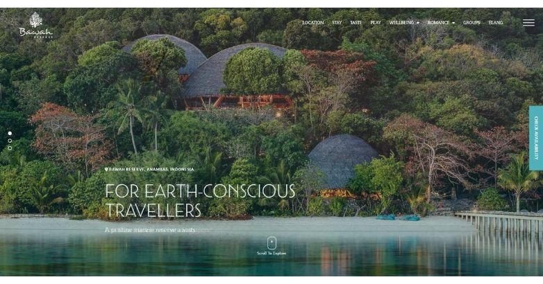
It immerses you in a remote, eco-luxury escape through rich visuals and fluid storytelling that reflect exclusivity, nature, and sustainability.
What makes it stand out:
- Full-screen imagery that highlights untouched landscapes and crystal-clear waters
- Minimal interface that keeps focus on the destination and experience
- Smooth scrolling that mirrors a calm, uninterrupted island journey
Best fit for: Eco-luxury resorts and sustainable travel brands targeting premium travelers.
8. BRU&BRU
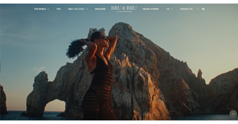
It blends modern editorial design with bold visuals, creating a stylish and immersive experience that appeals to design-conscious travelers.
What makes it stand out:
- Magazine-inspired layout that feels curated and visually engaging
- Bold typography that adds personality and brand distinction
- Strong use of imagery that balances lifestyle and destination appeal
Best fit for: Boutique travel brands targeting style-driven, experience-focused travelers.
9. Mr and Mrs Smith
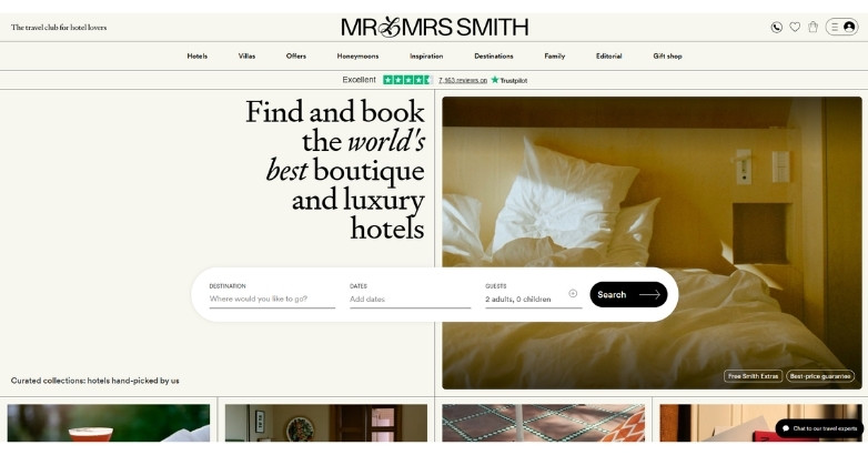
It combines curated travel discovery with a polished booking experience, using editorial storytelling and smart UX to guide you from inspiration to reservation.
What makes it stand out:
- Curated, editorial-style content that builds trust and inspires exploration
- Seamless blend of storytelling and booking functionality
- Clean, modern interface that makes browsing and filtering effortless
Best fit for: Boutique hotel platforms and curated travel marketplaces focused on discovery and bookings.
10. Zicasso
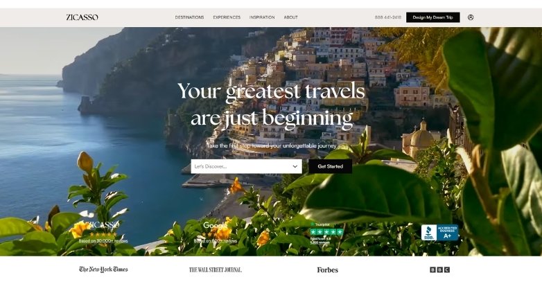
It builds trust through a structured, content-rich experience that guides you toward personalized trips with clarity and credibility.
What makes it stand out:
- Expert-driven framework that connects you with vetted travel specialists
- Clear step-by-step journey that simplifies custom trip planning
- Strong use of testimonials and reviews to reinforce trust
Best fit for: Custom travel platforms focused on personalized, expert-planned experiences.
11. Virtuoso

It showcases authority in luxury travel through a refined design and structured content that highlights its global network and exclusive access.
What makes it stand out:
- Network-driven layout that emphasizes partnerships and global reach
- Polished visuals that reinforce a high-end, trusted brand image
- Organized content that balances inspiration with professional credibility
Best fit for: Luxury travel networks and agencies focused on partnerships and exclusive experiences.
12. Black Tomato
It delivers a bold, story-led experience that turns travel into aspiration, using striking visuals and confident messaging to position each journey as one-of-a-kind.
What makes it stand out:
- Narrative-driven design that focuses on experiences over destinations
- High-impact visuals that create emotional engagement and curiosity
- Distinct brand voice that feels exclusive, modern, and adventurous
Best fit for: High-end travel brands focused on unique, experience-led journeys.
13. Red Savannah
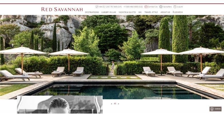
It balances inspiration with clarity, using refined visuals and structured content to guide you through bespoke travel experiences with confidence.
What makes it stand out:
- Clean, editorial layout that blends storytelling with practical details
- Curated imagery that highlights destinations in an authentic, elevated way
- Clear pathways that make complex, tailor-made travel feel accessible
Best fit for: Bespoke travel agencies focused on curated, high-touch experiences.
Elevate Your Hospitality Brand Today
Schedule Your Free Consultation
Seeking to elevate your business? Let Mediaboom guide you. Secure your exclusive, free consultation with our digital marketing experts today.
OTAs, metasearch, and booking platforms
These are the strongest examples for search-first UX, filtering, comparisons, and fast decision-making. Baymard’s travel guidance makes this group especially important because booking prominence and travel-specific filters are major weak spots across many travel sites.
14. Booking.com

It delivers a highly efficient booking experience, using data-driven design and intuitive navigation to help you find and reserve stays with speed and confidence.
What makes it stand out:
- Conversion-focused layout built for quick search and decision-making
- Powerful filtering system that simplifies large volumes of options
- Trust signals like reviews and ratings that support confident bookings
Best fit for: Large-scale travel platforms focused on fast, high-volume bookings.
15. Expedia

It streamlines complex travel planning into a single, user-friendly platform, helping you book flights, hotels, and packages with ease.
What makes it stand out:
- All-in-one booking system that combines multiple travel services
- Smart recommendations that guide users toward better choices
- Clean, functional interface designed for quick comparisons
Best fit for: Travel platforms offering bundled bookings and end-to-end trip planning.
16. Priceline
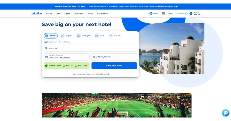
It focuses on value-driven travel with a streamlined interface that helps you quickly find deals and make cost-effective booking decisions.
What makes it stand out:
- Deal-centric design that highlights discounts and special offers upfront
- Simple search flow that reduces friction in the booking process
- Clear pricing visibility that builds confidence in budget decisions
Best fit for: Travel platforms focused on deals, discounts, and budget-conscious travelers.
17. Trip.com

It delivers a fast, mobile-first experience with a structured interface that helps you search, compare, and book travel services with minimal friction.
What makes it stand out:
- Mobile-optimized design that supports on-the-go booking behavior
- Integrated platform that connects flights, hotels, and transport options
- Clear deal presentation that encourages quick decision-making
Best fit for: Global travel platforms focused on mobile users and seamless multi-service bookings.
18. TripAdvisor

It builds trust at scale by combining user-generated content with a structured interface that helps you make informed travel decisions quickly.
What makes it stand out:
- Review-driven design that prioritizes real traveler feedback
- Strong filtering and ranking system that simplifies choice overload
- Seamless mix of inspiration, planning, and booking elements
Best fit for: Travel platforms focused on reviews, comparisons, and user-driven decision-making.
19. Trivago

It simplifies hotel search by focusing on comparison, helping you quickly find the best rates across multiple booking platforms.
What makes it stand out:
- Comparison-first design that highlights price differences clearly
- Clean interface that keeps the focus on search results and deals
- Fast filtering options that help narrow choices efficiently
Best fit for: Travel platforms centered on price comparison and deal discovery.
20. Rome2Rio
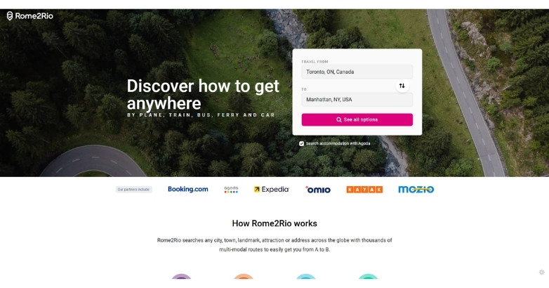
It turns complex travel logistics into a simple, visual journey, helping you understand routes, costs, and transport options at a glance.
What makes it stand out:
- Route-focused interface that maps out multiple transport options clearly
- Visual journey breakdowns that simplify multi-step travel planning
- Integrated pricing insights that support smarter decision-making
Best fit for: Travel tools focused on route planning and multi-transport trip coordination.
Tours, activities, and guided travel sites
This group shows how travel sites handle itineraries, inclusions, trip detail pages, reviews, and trip-type browsing. Many of these platforms offer strong travel website design ideas around structuring complex travel information.
21. Viator
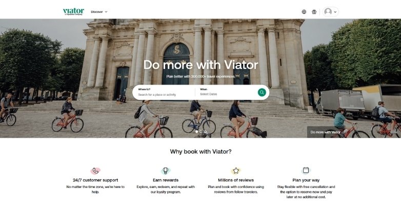
It makes discovering and booking travel experiences simple, using a clean, conversion-focused design that guides you from browsing to booking with ease.
What makes it stand out:
- Experience-first layout that highlights tours, activities, and attractions
- Strong use of reviews and ratings to build trust and credibility
- Clear booking flow that reduces friction and speeds up decisions
Best fit for: Travel platforms focused on tours, activities, and experience bookings.
22. GetYourGuide
It creates a smooth path from discovery to booking, using a clean interface and strong visuals that make exploring activities feel fast and intuitive.
What makes it stand out:
- Activity-focused layout that prioritizes experiences over destinations
- Strong visual cards that make browsing engaging and easy
- Streamlined booking process that supports quick, confident decisions
Best fit for: Travel platforms centered on tours, activities, and instant bookings.
23. Klook

It delivers a mobile-first, action-driven experience that makes booking activities fast, intuitive, and tailored for modern travelers.
What makes it stand out:
- Bright, engaging interface that highlights deals and popular experiences
- Mobile-optimized flow designed for quick, on-the-go bookings
- Clear categorization that helps users discover activities with ease
Best fit for: Travel platforms targeting mobile users and activity-based bookings.
24. Context Travel
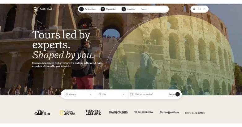
It positions educational travel at the forefront, using a content-rich design that highlights expert-led experiences and builds intellectual credibility.
What makes it stand out:
- Knowledge-driven layout that emphasizes expert guides and deep learning
- Clean structure that balances storytelling with informative content
- Subtle, refined design that reflects a thoughtful and academic tone
Best fit for: Travel brands focused on educational, expert-led cultural experiences.
25. Intrepid Travel
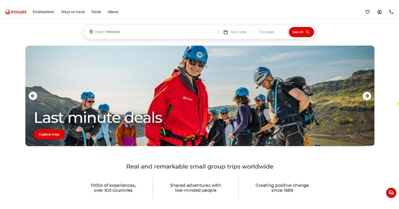
It communicates purpose-driven travel through a dynamic and engaging design that highlights small-group adventures and responsible tourism.
What makes it stand out:
- Experience-led layout that focuses on trips, not just destinations
- Bold visuals that reflect adventure and cultural immersion
- Clear messaging that reinforces sustainability and ethical travel values
Best fit for: Adventure travel brands focused on small-group and responsible tourism.
26. Trafalgar
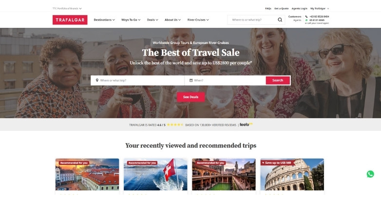
It delivers a polished and structured experience that highlights guided tours clearly, helping you explore and compare trips with confidence.
What makes it stand out:
- Tour-focused layout that organizes trips by destination and style
- Strong imagery that showcases group experiences and destinations
- Clear navigation that supports easy browsing and trip comparison
Best fit for: Guided tour companies focused on structured, group travel experiences.
27. G Adventures
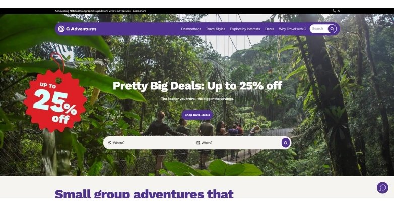
It brings energy and purpose into travel planning, using a vibrant and structured design that highlights community-driven trips and authentic experiences.
What makes it stand out:
- Adventure-focused layout that showcases trips with personality and clarity
- Bold colors and visuals that reflect excitement and cultural connection
- Clear trip categorization that helps you find experiences by travel style
Best fit for: Adventure travel brands focused on small-group, experience-driven journeys.
28. Insight Vacations
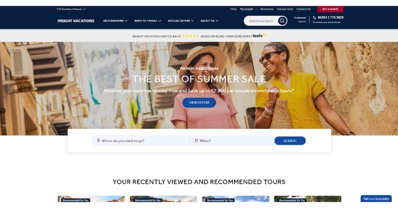
It presents premium guided travel through a refined and structured design that emphasizes comfort, detail, and curated experiences.
What makes it stand out:
- Elegant layout that highlights high-end tours and destinations
- Strong visual storytelling that reflects comfort and sophistication
- Well-organized trip details that support confident decision-making
Best fit for: Premium guided tour brands focused on comfort and curated experiences.
29. Tour Radar
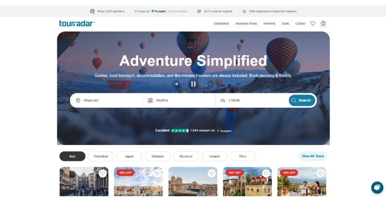
It simplifies multi-operator tour discovery with a clean, marketplace-style design that helps you compare and book guided trips with ease.
What makes it stand out:
- Marketplace layout that aggregates tours from multiple providers
- Strong filtering tools that make comparing trips quick and intuitive
- Clear pricing and reviews that support confident booking decisions
Best fit for: Travel marketplaces focused on comparing and booking multi-operator tours.
30. Backroads
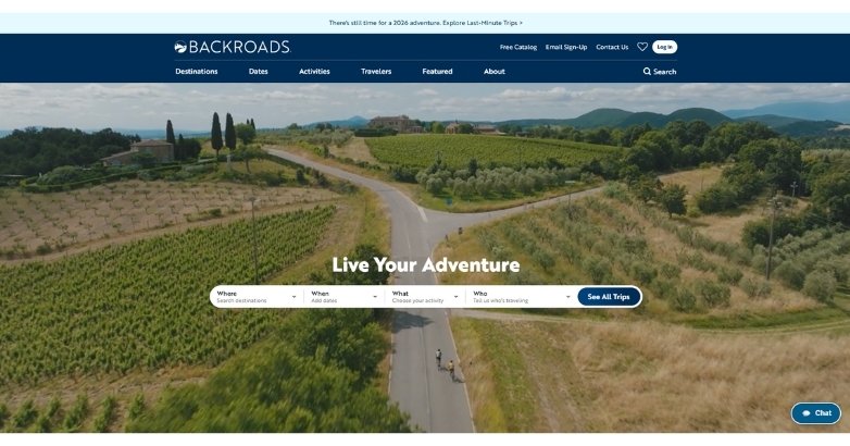
It showcases active travel through a clean and energetic design that highlights outdoor experiences while keeping trip details clear and easy to explore.
What makes it stand out:
- Experience-driven layout that focuses on biking, walking, and adventure travel
- Bright, engaging visuals that reflect movement and outdoor energy
- Well-structured trip pages that balance inspiration with detailed itineraries
Best fit for: Active travel brands focused on biking, hiking, and adventure experiences.
31. Cubania Travel
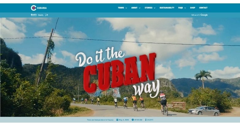
It presents culturally rich travel through a clear and inviting design that highlights authentic local experiences while keeping navigation simple.
What makes it stand out:
- Culture-focused layout that emphasizes people, history, and local experiences
- Warm visuals that reflect the destination’s character and atmosphere
- Straightforward structure that makes trip options easy to explore
Best fit for: Niche travel brands focused on cultural and destination-specific experiences.
32. Responsible Travel

It clearly communicates purpose-driven travel, using a content-focused design that highlights ethical choices and builds trust with conscious travelers.
What makes it stand out:
- Mission-led layout that puts sustainability and ethics front and center
- Informative content that educates users on responsible travel choices
- Clean structure that balances inspiration with practical trip options
Best fit for: Travel platforms focused on sustainable and ethical tourism.
33. Sustainable Travels
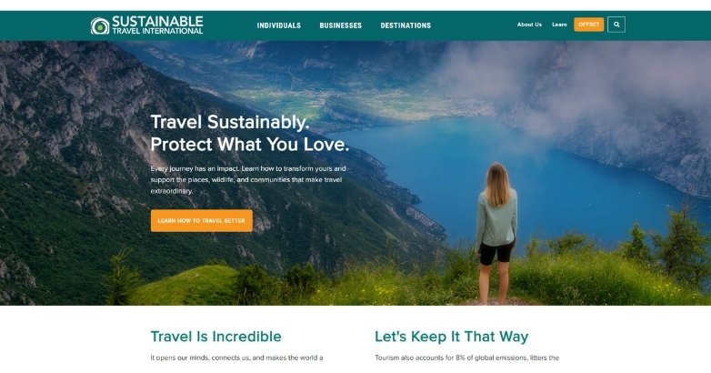
It promotes eco-conscious travel through a clean and informative design that highlights sustainability without overwhelming the user.
What makes it stand out:
- Purpose-driven layout that focuses on responsible travel options
- Educational content that explains sustainable choices clearly
- Simple navigation that makes eco-friendly trips easy to find
Best fit for: Travel brands focused on eco-friendly and sustainable experiences.
Download Our FREE Guide
Attract More Travelers & Boost Bookings With Our Hospitality Digital Marketing Guide
Uncover how travel brands are using content, SEO, and paid media to reach ideal audiences, build loyalty, and increase direct engagement across the booking journey.
Vacation rentals, alternative stays, and community platforms
These examples are useful for trust-building, listing design, host or property discovery, and non-hotel accommodation models.
34. Airbnb
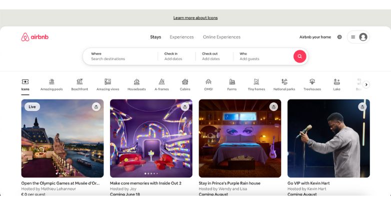
It creates a seamless and engaging booking experience, using a clean, user-focused design that makes discovering unique stays simple and intuitive.
What makes it stand out:
- Search-first interface that helps you find stays quickly
- Strong visual listings that highlight unique properties
- Smooth booking flow that builds trust and reduces friction
Best fit for: Platforms focused on unique accommodations and peer-to-peer bookings.
35. VRBO
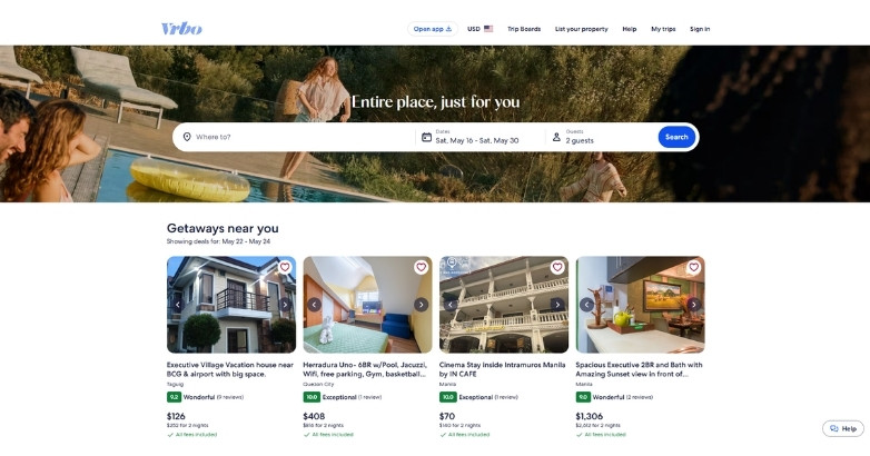
It delivers a straightforward and family-oriented booking experience, using a clean layout that makes finding entire vacation homes quick and reliable.
What makes it stand out:
- Property-focused design that highlights full-home rentals clearly
- Practical search filters tailored for families and group travel
- Trust-building elements that support confident booking decisions
Best fit for: Vacation rental platforms focused on whole-home stays for families and groups.
36. Couchsurfing

It focuses on community-driven travel, using a simple and social design that encourages connection, trust, and authentic local experiences.
What makes it stand out:
- Community-first layout that highlights hosts and traveler profiles
- Social features that promote interaction and cultural exchange
- Minimal design that keeps the focus on people, not transactions
Best fit for: Travel platforms centered on community, cultural exchange, and budget-friendly stays.
37. Sawday’s
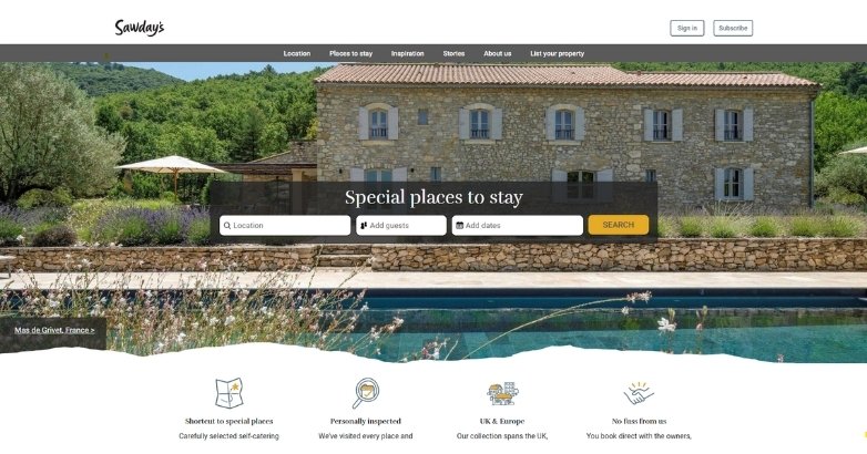
It delivers a charming, editorial-style experience that highlights unique stays through curated storytelling and a warm, inviting design.
What makes it stand out:
- Story-driven layout that focuses on character and individuality
- Handpicked feel that builds trust and authenticity
- Soft visuals and typography that create a relaxed browsing experience
Best fit for: Boutique travel platforms focused on curated, character-rich stays.
Travel blogs and creator-led brands
These are best for personal branding, readability, editorial layout, trust-building through voice, and content-led conversion.
38. Adventurous Kate

It builds a personal and relatable travel experience, using a blog-style design that connects with readers through storytelling and practical advice.
What makes it stand out:
- Personality-driven layout that reflects a strong personal brand
- Content-rich structure that blends guides, tips, and stories
- Clear navigation that helps users explore destinations and topics easily
Best fit for: Travel blogs and personal brands focused on storytelling and practical travel advice.
39. The Blonde Abroad

It combines lifestyle branding with travel content, using a polished, visually cohesive design that appeals to modern, style-conscious travelers.
What makes it stand out:
- Strong visual identity that reflects a consistent personal brand
- Content-driven layout that blends travel guides with lifestyle inspiration
- Clean navigation that makes exploring destinations and tips effortless
Best fit for: Travel blogs and influencer brands focused on lifestyle-driven content.
40. Expert Vagabond
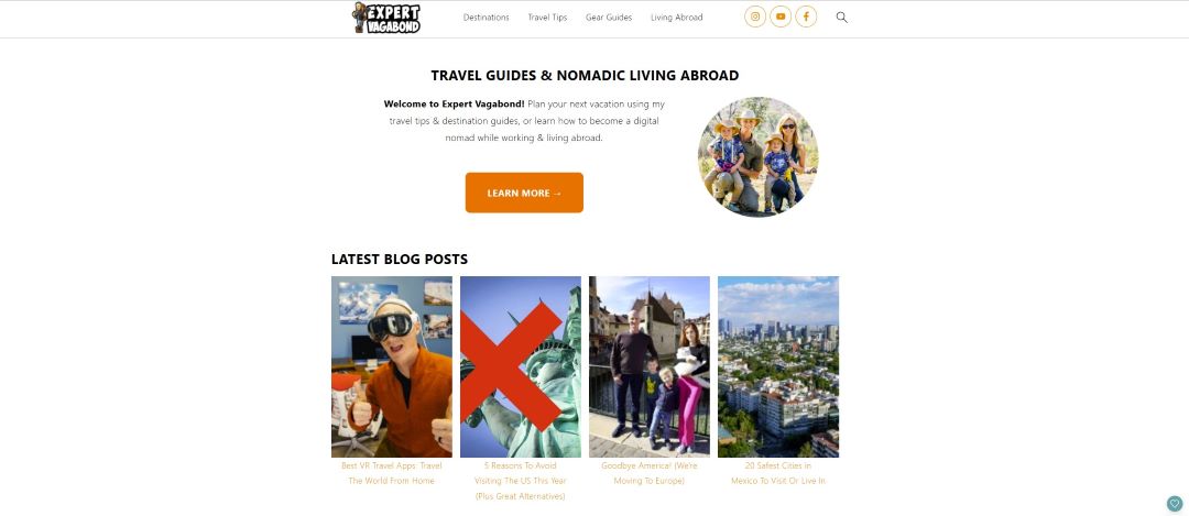
It blends adventure storytelling with practical travel advice, using a bold and engaging design that keeps you exploring content with ease.
What makes it stand out:
- Adventure-driven layout that highlights real-world travel experiences
- Strong visual storytelling that captures action and exploration
- Well-organized content that balances guides, tips, and personal stories
Best fit for: Travel blogs focused on adventure storytelling and practical travel guides.
41. The Planet D

It combines professional travel storytelling with a structured blog format, creating a trustworthy and engaging experience built on real-world expertise.
What makes it stand out:
- Experience-led content that showcases firsthand travel insights
- Clean, organized layout that supports easy content discovery
- Strong use of visuals that reinforce credibility and storytelling
Best fit for: Travel blogs focused on expert advice and experience-driven content.
42. Be My Travel Muse

It creates a personal and trustworthy experience, using a clean blog design that blends storytelling with actionable travel advice tailored to solo travelers.
What makes it stand out:
- Personal brand focus that builds connection and credibility
- Content-rich layout that mixes guides, tips, and real experiences
- Soft, approachable design that makes content easy to read and explore
Best fit for: Travel blogs focused on solo travel and experience-based storytelling.
Elevate Your Hospitality Brand Today
Schedule Your Free Consultation
Seeking to elevate your business? Let Mediaboom guide you. Secure your exclusive, free consultation with our digital marketing experts today.
Travel publishers and editorial brands
These are strong references for content hierarchy, destination discovery, topic organization, and large-scale editorial UX.
43. Lonely Planet
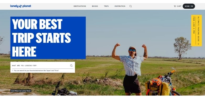
It combines trusted travel expertise with a modern, content-driven design that helps you explore destinations with confidence and depth.
What makes it stand out:
- Guide-focused layout that organizes destinations, tips, and itineraries clearly
- Strong editorial content that reflects authority and global experience
- Seamless navigation that supports both inspiration and trip planning
Best fit for: Travel platforms focused on expert guides and destination research.
44. Condé Nast Traveler

It delivers a premium editorial experience, combining high-end visuals with authoritative storytelling that inspires and informs discerning travelers.
What makes it stand out:
- Magazine-style layout that blends luxury imagery with in-depth articles
- Strong brand voice that reflects expertise and global authority
- Seamless content flow that keeps you engaged across features and guides
Best fit for: Travel publications and brands focused on luxury, editorial storytelling, and global inspiration.
45. Travel Lemming

It focuses on helpful, easy-to-digest travel content, using a clean and practical design that guides you toward reliable recommendations and guides.
What makes it stand out:
- Content-first layout that prioritizes guides, tips, and resources
- Simple structure that makes information quick to find and follow
- Trust-focused approach that highlights helpful, user-oriented content
Best fit for: Travel blogs focused on practical guides and accessible recommendations.
46. Travel Off Path

It delivers timely, trend-focused travel content through a clean and direct design that helps you stay informed and act quickly.
What makes it stand out:
- News-style layout that highlights trending destinations and updates
- Clear content structure that makes articles easy to scan
- Strong focus on current travel insights that drive engagement
Best fit for: Travel blogs focused on news, trends, and timely destination updates.
47. Rough Guides
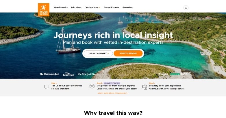
It combines trusted travel expertise with a bold, content-driven design that helps you explore destinations through practical, experience-based insights.
What makes it stand out:
- Guide-focused structure that organizes destinations and itineraries clearly
- Strong editorial voice that reflects authority and long-standing credibility
- Engaging visuals that support exploration without distracting from content
Best fit for: Travel platforms focused on expert guides and in-depth destination insights.
48. Culture Trip
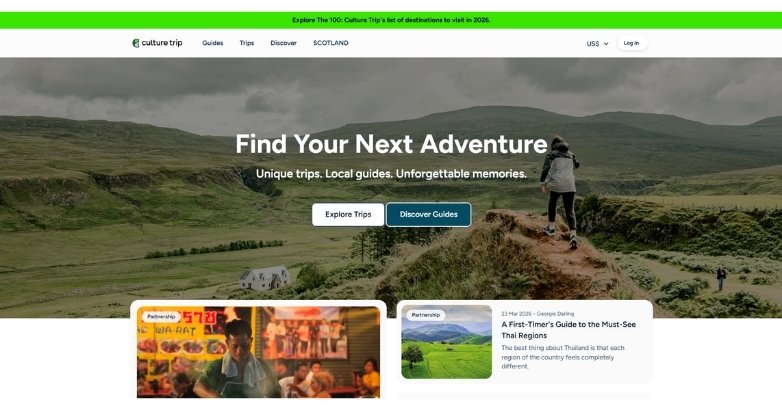
It blends travel inspiration with cultural storytelling, using a visually rich and editorial design that keeps you engaged across destinations and topics.
What makes it stand out:
- Content-driven layout that mixes travel guides with cultural insights
- Strong visual storytelling that highlights local experiences and perspectives
- Smooth navigation that encourages discovery across categories and regions
Best fit for: Travel platforms focused on culture, storytelling, and curated local experiences.
49. Travel + Leisure

It delivers a premium editorial experience, combining high-quality visuals with authoritative content that inspires and informs your travel decisions.
What makes it stand out:
- Magazine-style layout that blends storytelling with destination guides
- Strong visual hierarchy that highlights featured content and trends
- Consistent branding that reinforces credibility and global authority
Best fit for: Travel publications focused on inspiration, trends, and expert insights.
50. Remote Lands
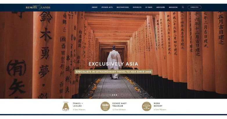
It creates a refined and visually immersive experience, using cinematic imagery and elegant layouts to appeal to luxury travelers seeking curated journeys and exclusive destinations.
What makes it stand out:
- Sophisticated visual design with high-end destination photography
- Clean page layouts that keep travel content easy to explore
- Strong editorial presentation that elevates the brand experience
Best fit for: Luxury travel brands focused on premium experiences and visually driven storytelling
Download Our FREE Guide
Attract More Travelers & Boost Bookings With Our Hospitality Digital Marketing Guide
Uncover how travel brands are using content, SEO, and paid media to reach ideal audiences, build loyalty, and increase direct engagement across the booking journey.
What the best travel websites do well
The strongest travel websites repeat the same winning patterns, even when the visual style differs. These patterns define the best travel websites design across industries.
They make the main action obvious
For hotel brands, OTAs, and tour companies, the main action is usually search or booking. 30% of travel accommodation sites do not make booking search the primary homepage content, even though that is often the user’s main task.
They support real decision-making
Travel users need more than inspiration. They need details that help them compare options and commit. Up to 83% of sites do not always provide detailed tour information, 57% do not always show a map on tour detail pages, and 85% do not always link to third-party reviews.
They use filters that match travel behavior
Travel search is not the same as general ecommerce search. Users often want filters such as star rating, trip type, dates, cancellation terms, amenities, and family fit. 40% of sites do not provide popular travel-specific filters.
They balance inspiration with clarity
Travel is emotional, so visual storytelling matters. But the homepage still has to say what the site offers and where the user should go next. Homepage should guide users toward their goals with clarity and reflect the brand and site offerings at the same time.
They are easy to scan
Users scan pages rather than reading them line by line. There are strong gains in measured usability when web writing is concise, scannable, and objective rather than promotional. That matters for travel pages, where users are often comparing options quickly.
Best practices for travel website design
Great travel web design is not just about attractive visuals. It is about helping people choose and book with confidence.
Here are the main best practices to follow:
Put booking or search high on the page
If the site is meant to drive bookings, the search or booking path should be visible early. Users should not need to scroll past large brand statements or oversized media just to start planning. Baymard’s travel research flags this as a common issue.
Use travel-specific filters
Travel users often need very specific filters to narrow choices fast. These can include price, dates, property class, trip type, amenities, cancellation terms, accessibility, or family suitability. Missing filters can directly push users away from the site.
Give enough detail before the click gets expensive
A travel website should answer the questions that affect purchase decisions. That can include itinerary details, room details, inclusions, timing, meeting points, policies, and location context. Thin pages make travel decisions harder and weaker.
Use maps and location context where place matters
Location is central in travel. Maps, proximity cues, meeting points, and neighborhood context often help users decide faster, especially for tours, hotels, and local experiences. Baymard specifically calls out missing maps as a weak spot on many travel sites.
Show trust signals near decisions
Reviews, ratings, transparent policies, and links to third-party review sources help reduce doubt at the moment of decision. Baymard found that outside review links are missing on many travel sites.
Keep writing clear and factual
Travel pages often slip into mood-heavy marketing language. NN/g’s usability work found that concise, scannable, objective writing performs better than promotional writing. On this page, that means example descriptions should explain what works and why, not just praise the design.

Common Travel Website Design Mistakes to Avoid
Common mistakes include:
- Treating the homepage like a mood board instead of a conversion page
- Hiding booking search below large videos or oversized headers
- Using generic testimonials without outside review links
- Making tour detail pages too thin
- Burying key policies, inclusions, or meeting-point details
- Using mobile layouts that make filters and dates hard to use
FAQs
I. What should a travel website include?
A travel website should include a clear value proposition, easy navigation, strong imagery, visible search or booking paths, detailed trip or property information, reviews, and clear policies. If the site sells tours or experiences, maps and meeting-point details also matter.
II. What makes a good travel website design?
A good travel website design helps users move from inspiration to action without confusion. It should combine strong visuals with clear structure, useful filters, mobile-friendly layouts, and enough detail to support booking decisions.
III. Why is mobile design so important for travel websites?
Travel research and booking often happen on phones, so a poor mobile experience creates friction early. Google’s travel research has highlighted the importance of fast, easy-to-use mobile experiences, and Booking.com has said 1 in 2 traveler journeys starts on mobile.
IV. How many travel website examples should I review before a redesign?
Review enough examples to spot patterns, not just visual styles. A shortlist across OTAs, hotel brands, tour operators, vacation rentals, and travel publishers usually gives a better reference set than copying only direct competitors.
V. Should a travel website focus more on inspiration or booking?
Most travel websites need both, but the balance depends on the business model. Luxury and editorial brands may lean more on storytelling, while OTAs, hotels, and tour operators usually need faster search, filtering, and booking paths closer to the top of the page.
Elevate Your Hospitality Brand Today
Schedule Your Free Consultation
Seeking to elevate your business? Let Mediaboom guide you. Secure your exclusive, free consultation with our digital marketing experts today.
Need help with travel website design?
If you’re planning a redesign, Mediaboom helps travel brands build websites that look strong, load well, and guide users toward inquiry or booking.
We work on travel website strategy, UX, design, and content so your site does more than just look polished.
Get started with Mediaboom today.
WHAT OUR CLIENTS SAY
By: Frank DePino
Frank DePino is the Principal and Founder of Mediaboom, a top hotel marketing agency partnering with leading hotel and hospitality brands. With 30+ years of experience, he has led strategic digital initiatives for names including Four Seasons, Ritz-Carlton, JW Marriott, Millennium Partners, and Guardian Jet. Frank helps hospitality businesses strengthen brand presence, drive qualified leads, and elevate guest experiences through website design, SEO, content marketing, and paid media. Under his leadership, Mediaboom is a trusted partner for brands pursuing measurable digital growth in a competitive hospitality landscape.