

Luxury Hotel Website Design – 52 Examples You Shouldn’t Miss

By: Frank DePino | November 20, 2025
Loading the Elevenlabs Text to Speech AudioNative Player...
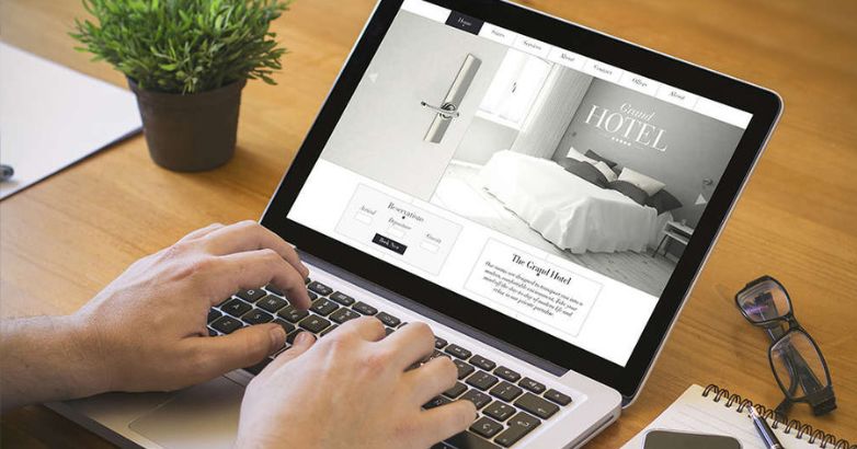
In the luxury hospitality industry, every second counts — a split-second on your website can either captivate a potential guest or send them elsewhere. A successful luxury hotel website design goes beyond aesthetics; it’s a seamless blend of visual sophistication, intuitive navigation, and user‑focused functionality that reflects the exclusivity and elegance of the property.
Consider this: nearly half of hotel bookings were made via mobile devices in 2023 (Travel Daily News), underscoring how essential mobile‑optimized, user-friendly websites have become for capturing direct reservations.
A high-end hotel website should not only showcase stunning rooms, world-class amenities, and signature services, but also deliver immersive experiences through:
- High‑resolution imagery and video tours that evoke the hotel’s ambiance
- Personalized content tailored to different guest segments and travel preferences
- Responsive, mobile-first design to ensure flawless browsing across devices
- Intuitive booking systems that simplify reservations and maximize conversions
- Optimized loading speed and technical SEO to attract and retain organic traffic
- Clear branding and storytelling that conveys the hotel’s unique personality and luxury promise
This article dives into how leading luxury hotels turn their websites into digital lobbies — interactive, persuasive spaces that inspire bookings and loyalty. Explore our curated collection of 52 top luxury hotel website designs worldwide to see how elegance, usability, and functionality combine to create unforgettable online experiences.
1. Aman Resorts
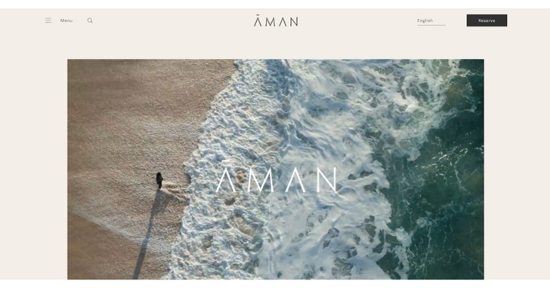
Quiet waves, generous space, and meditative pacing define Aman’s digital sanctuary. Minimalism here becomes a language of peace.
What makes it stand out
- Refined restraint and flow
- Luxury through simplicity
- Timeless brand presence
2. The Peninsula
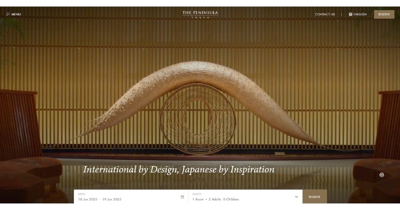
Golden symmetry and refined motion channel Japanese precision and grace. Each scroll feels like a meditative passage through heritage and design mastery.
What makes it stand out
- East-meets-West refinement
- Luxury expressed through stillness
- Impeccable balance in form and flow
3. St. Regis
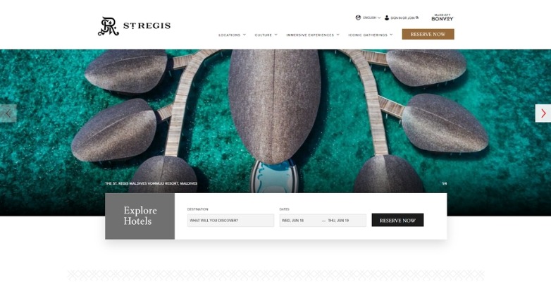
A legacy of luxury presented through immaculate structure and muted refinement. Each visual breathes opulence without excess.
What makes it stand out
- Consistent brand sophistication
- Seamless blend of form and function
- Elevated photography and typography balance
4. Oetker Collection
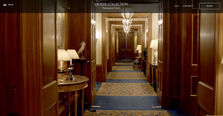
Polished wood, golden light, and quiet grandeur set the stage for this collection of iconic hotels. The design feels timeless—classic hospitality meeting digital grace.
What makes it stand out
- Cinematic video storytelling
- Palette that conveys warmth and prestige
- Elegant simplicity across navigation
5. La Mamounia
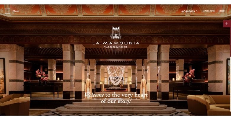
Majestic interiors and golden hues evoke the splendor of Marrakech. Every frame feels like an entrance into a storied palace reborn online.
What makes it stand out
- Mobile-first elegance
- Immersive video presentation
- Organized content with refined hierarchy
6. Badrutt’s Palace
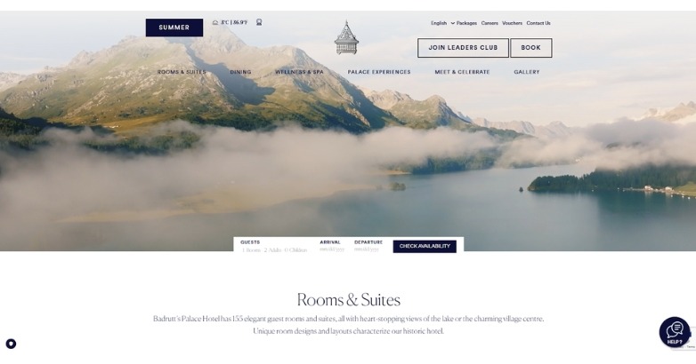
A seamless video background and calm color palette set an opulent yet welcoming tone. The structured layout and subtle motion reflect precision and prestige in equal measure.
What makes it stand out
- Heritage meets modern polish
- Layout that guides effortlessly
- Refined visuals, quiet confidence
7. Burgenstock Resort
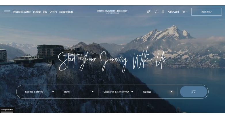
Set above Lake Lucerne, the site mirrors alpine grandeur with refined simplicity. Its design balances cinematic scale with exceptional usability.
What makes it stand out
- Consistent experience across mobile and desktop
- Clear hierarchy in a content-rich layout
- Live, real-time engagement features
8. Blue Lagoon
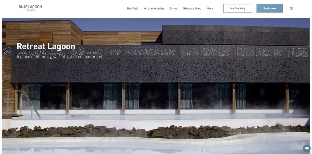
Sweeping mountain vistas and elegant typography create a sense of warmth and refuge. Subtle navigation and soft imagery make each interaction feel personal.
What makes it stand out
- Comfort framed in sophistication
- Airy visuals that breathe calm
- Understated Alpine charm
9. Baur Au Lac
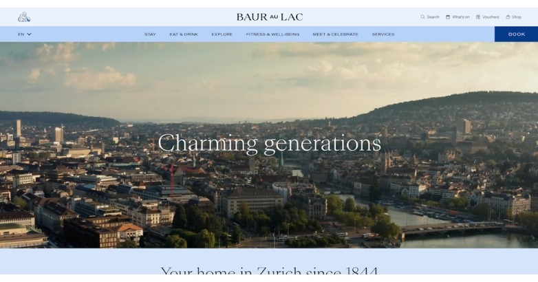
Old-world grandeur reinterpreted through modern precision. Each frame feels curated, connecting Zurich’s legacy with a sense of quiet luxury.
What makes it stand out
- Timeless narrative through visuals
- Balanced blend of heritage and innovation
- Elegant tone supporting brand prestige
10. Hotel d’Angleterre
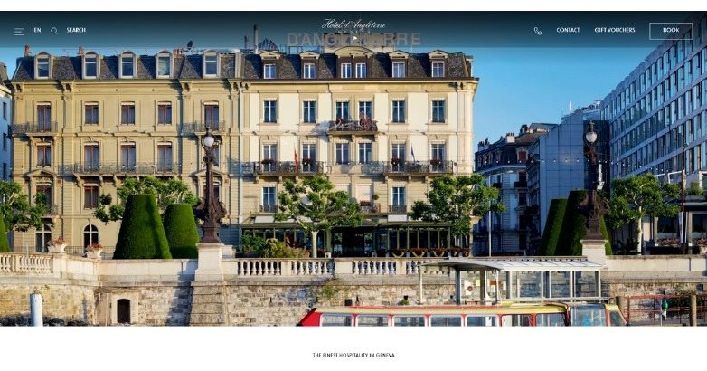
Classic Swiss sophistication meets modern digital grace. The design unfolds with calm rhythm, much like the hotel’s lakefront view.
What makes it stand out
- Strong architectural photography
- Harmonious color and typography pairing
- Subtle motion maintaining poise and order
11. Resplendent Ceylon
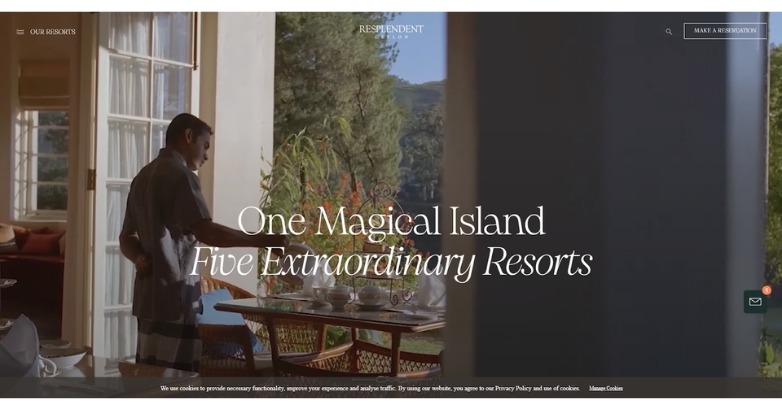
A sweeping video introduction immerses visitors in Sri Lanka’s natural beauty before a word is read. The clean layout and graceful typography make sophistication feel effortless.
What makes it stand out
- Video that tells the story instantly
- Understated elegance throughout
- Luxury presented with warmth
12. Palace Merano
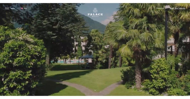
Verdant gardens and soft alpine light define this refined wellness retreat. Every transition feels composed, grounded, and centered on natural balance.
What makes it stand out
- Wellness philosophy expressed visually
- Harmonious natural palette
- Graceful motion and minimal structure
13. Adriatic Luxury Hotels
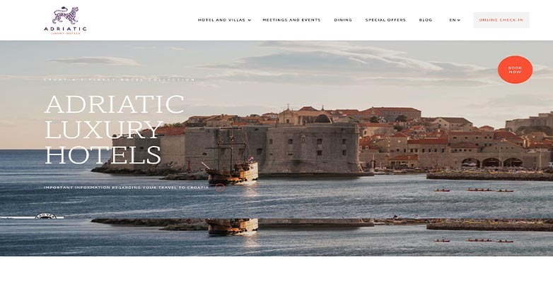
Sweeping coastal visuals paired with cinematic video sequences capture the grandeur of Dubrovnik. The polished layout and subtle motion evoke the refined experience of staying there.
What makes it stand out
- Striking seaside atmosphere
- Video that sets the tone instantly
- Premium design with cinematic flair
14. 7132 HOTEL
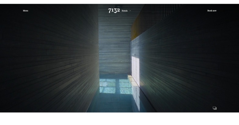
Dark hues, soft light, and cinematic pacing create a mood of introspective luxury. Every transition feels deliberate, reflecting the property’s architectural precision.
What makes it stand out
- Minimalism with emotional weight
- Architecture translated to digital form
- Quiet confidence in every frame
15. Casa Angelina
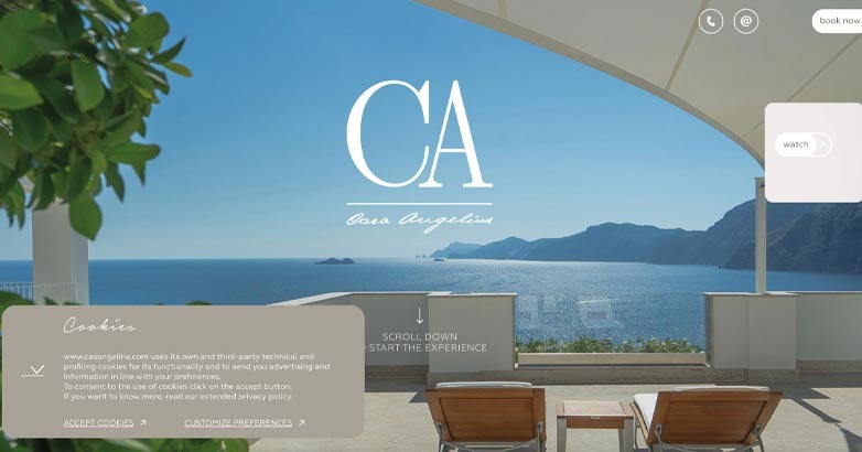
Perched above the Amalfi Coast, Casa Angelina’s website mirrors its cliffside serenity with calm whites and airy composition. Simple fonts and smooth visuals convey luxury through restraint.
What makes it stand out
- Minimalism done with purpose
- Every detail breathes elegance
- Quiet design that feels exclusive
16. Marina Inn at Grande Dunes
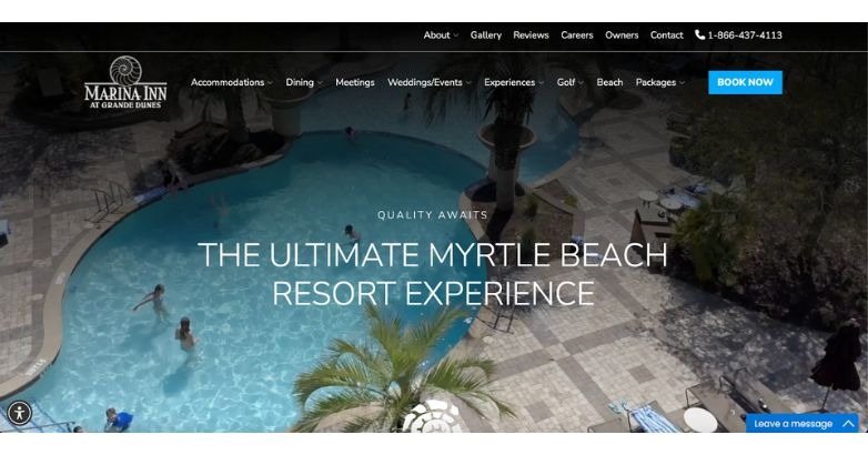
A tranquil aerial pool view framed by lush greenery sets a warm, resort-first impression. Clean typography and soft blues give the design an elegant, coastal feel that’s easy to browse.
What makes it stand out
- Hero that draws you in instantly
- Refined colors that echo the setting
- Relaxed, upscale presentation
17. Musha Cay
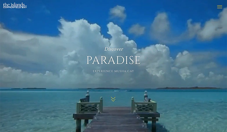
Full-screen island vistas and calm ocean tones set a dreamy, private-escape mood. The spacious, white-space layout lets short lines of copy and cinematic imagery do the talking.
What makes it stand out
- Destination-first hero
- Space that lets images breathe
- Luxury vibe without clutter
18. Seven on Shelter Island
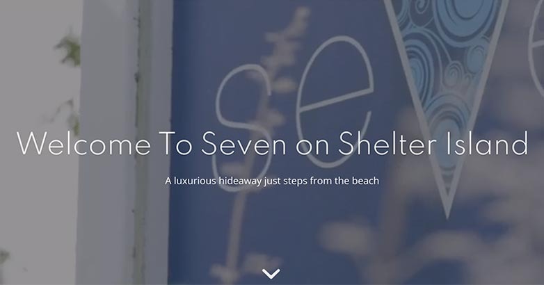
A soft-focus hero with refined typography delivers understated New York elegance. Generous white space and crisp imagery keep the page airy and inviting.
What makes it stand out
- Gentle, upscale first impression
- White space that signals class
- Photography that piques curiosity
19. The Sea Pines Resort
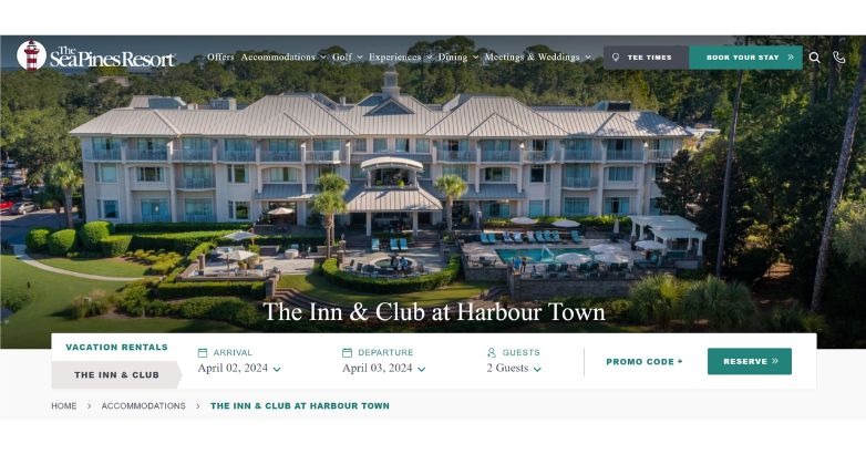
A welcoming property shot sits on a bright, pared-back canvas that spotlights the grounds. The headline claim—“The No. 1 Luxury Hotel on Hilton Head Island”—adds authority from the start.
What makes it stand out
- Clear promise up front
- Big, high-res visuals
- Simple, uncluttered pages
20. We Care Spa
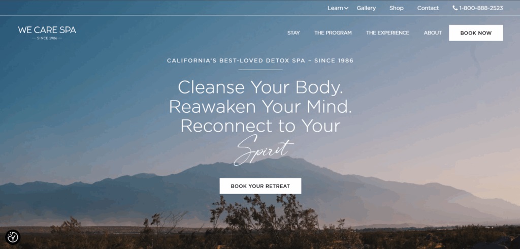
A serene desert backdrop paired with minimal, soothing visuals mirrors the spa’s detox philosophy. The homepage immediately conveys peace with muted earth tones, refined typography, and a calming user flow that invites deeper exploration.
What makes it stand out
- Clean aesthetic aligned with wellness branding
- Natural tones and imagery reinforce the spa’s mission
- Effortless navigation that reflects a stress-free experience
21. Can Ferrereta
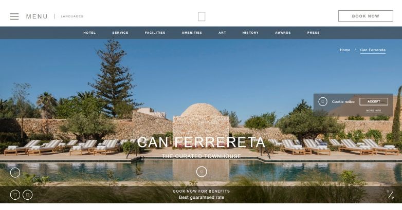
Warm Mediterranean imagery and soft natural tones mirror the serenity of Mallorca. The design’s open layout and balanced photography highlight both heritage and comfort.
What makes it stand out
- Dreamlike island mood
- Honest, unfiltered imagery
- Refined simplicity that feels personal
22. Swiss Deluxe Hotel
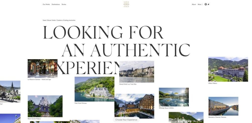
Bold typography and gallery-style spacing create a striking, art-driven first impression. Floating hotel images and disciplined minimalism give the site a confident, high-end rhythm.
What makes it stand out
- Design that feels like an exhibition
- Typography that commands presence
- Elegant restraint, purely Swiss
23. Palazzo Manfredi
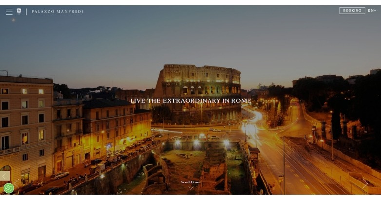
Golden hues and evening city views immerse visitors in Rome’s timeless charm. The site’s animations and color-blocked design add movement without sacrificing luxury.
What makes it stand out
- Visual storytelling through light
- Sophisticated yet approachable tone
- Understated motion that adds depth
24. Heritage Le Telfair
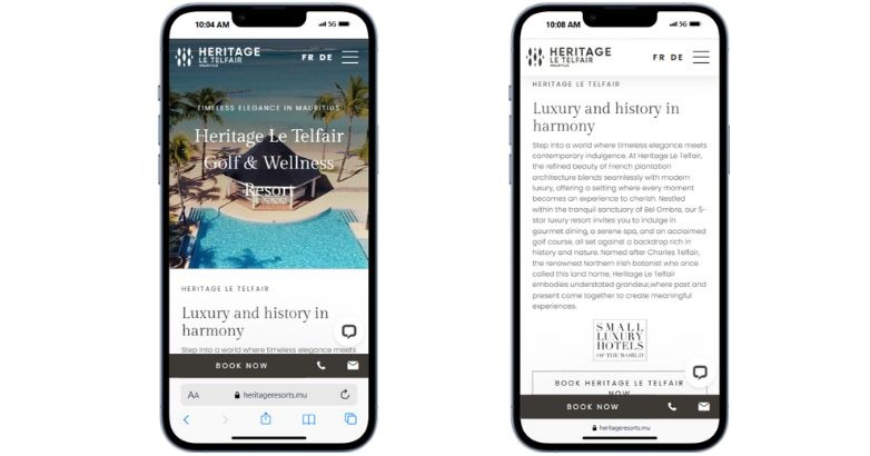
A mobile-first layout and refined visuals make this Mauritian resort feel seamless on any device. Video carousels and crisp typography balance luxury with usability.
What makes it stand out
- Built beautifully for mobile
- Visual flow without overload
- Clear, refined digital luxury
25. Particulier Montmartre
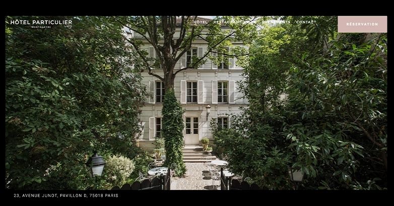
Framed by lush Parisian greenery, this site pairs bold typography with fluid animations to tell a quiet story of intimacy and art. Each scroll reveals the hotel’s personality with cinematic pacing and poetic restraint.
What makes it stand out
- Storytelling through subtle motion
- Visual rhythm that feels personal
- Parisian charm in digital form
26. Hounds Tooth Inn
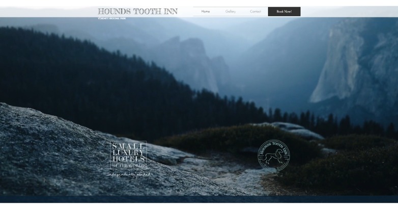
Set against Yosemite’s mountain scenery, the site combines cinematic imagery with timeless elegance. Soft transitions and natural tones convey warmth and boutique authenticity.
What makes it stand out
- Nature as the design’s centerpiece
- Understated sophistication
- Genuine charm that feels handcrafted
27. Wake Medellín
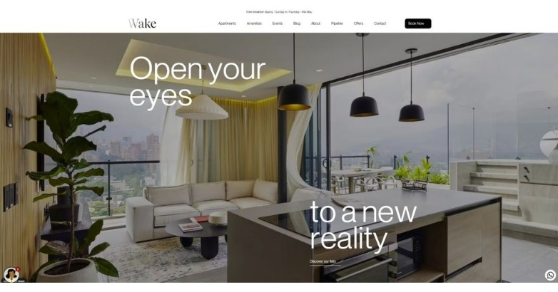
Sleek visuals and bold typography create a pulse of modern urban life. The mix of light gradients and crisp interiors gives off a confident, city-luxury energy.
What makes it stand out
- Fresh, contemporary mood
- Sharp visuals with local flair
- Cool tone balanced by warmth
28. Le Mirabeau
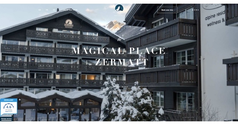
Snow-dusted alpine imagery and refined typography convey quiet prestige. The restrained design reflects family-run authenticity blended with timeless elegance.
What makes it stand out
- Heritage meets modern calm
- Every element feels deliberate
- Serene visuals that invite trust
29. SAMSARA UBUD
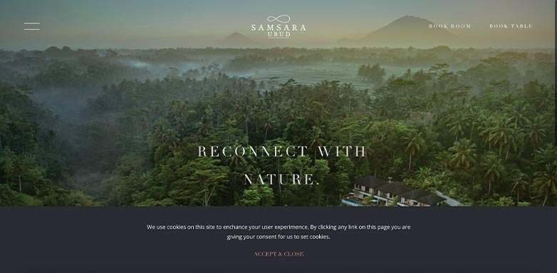
A sweeping aerial view of the forest sets a tone of peace and renewal. The high-contrast design and subtle transitions turn scrolling into an experience of its own.
What makes it stand out
- Immersion from the first frame
- Serenity captured through contrast
- Sophisticated balance of light and dark
30. The Longfellow
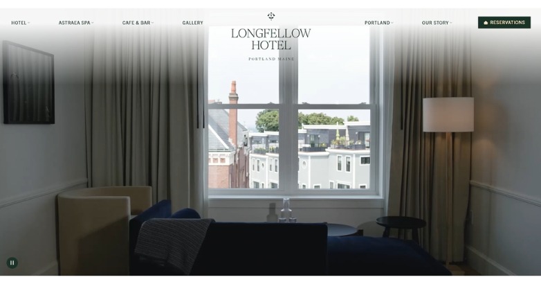
Soft cinematography and muted interiors evoke Portland’s quiet sophistication. Every element—from typography to pacing—feels calm, intimate, and deeply personal.
What makes it stand out
- Elegance through understatement
- Design that feels lived-in
- A digital mirror of New England charm
31. Campbell Gray Hotels
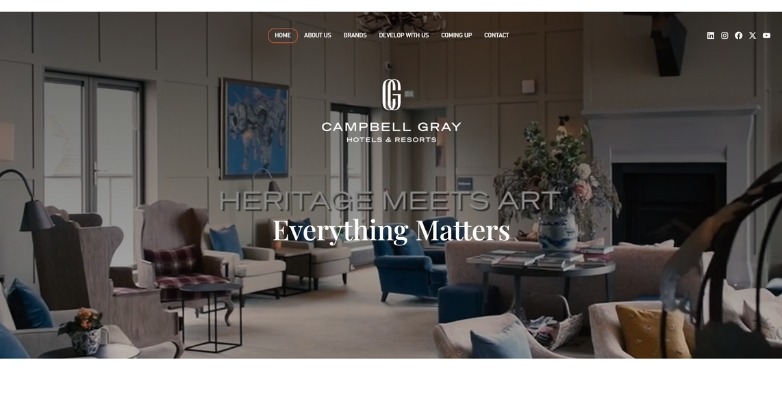
This site pairs cinematic visuals with refined structure to highlight a global luxury portfolio. Its tone is confident yet warm, reflecting timeless sophistication across every property.
What makes it stand out
- Cohesive storytelling across brands
- Cinematic presentation with polish
- Classic luxury translated online
32. Villa di Piazzano
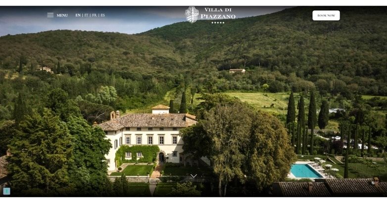
Turquoise waves and minimalist design create a serene sense of place from the first frame. Every detail—scroll flow, typography, and tone—feels handcrafted for calm immersion.
What makes it stand out
- Coastal luxury in motion
- Minimalism that breathes
- Visual rhythm that soothes
33. La Valise
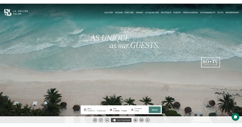
Sweeping Tuscan imagery and timeless typography bring Renaissance charm to life. Its balance of airiness and warmth captures the essence of countryside sophistication.
What makes it stand out
- Authentic heritage appeal
- Refined details, effortless flow
- Tuscany told through design
34. EL MÔDERNE HOTEL
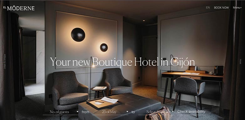
Muted tones and clean geometry frame an atmosphere of contemporary calm. A looping video backdrop adds quiet sophistication, matching the hotel’s boutique ethos.
What makes it stand out
- Modern elegance without excess
- Seamless motion that invites focus
- A cinematic welcome that lasts
35. KNAIBANG CHATT HOTEL
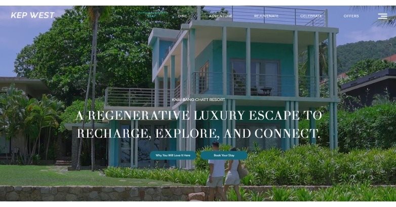
Sweeping coastal visuals and calm tones express the resort’s sustainable luxury ethos. The minimalist layout and fluid transitions reflect both serenity and purpose.
What makes it stand out
- Sustainability told through design
- Elegant calm from first view
- Heritage and modernity in balance
36. 11 Mirrors Hotel
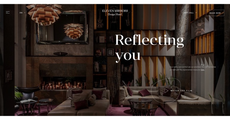
Reflective textures and warm lighting create a sense of modern opulence rooted in Ukrainian design. Each frame feels deliberate—sophisticated without excess.
What makes it stand out
- Distinct visual identity
- Luxury through composition, not clutter
- Confident, cinematic mood
37. Gecko Hotel & Beach Club
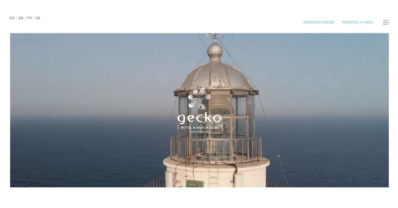
Clean, sunlit visuals and a soft white layout evoke coastal ease. Simple typography and teal accents lend a breezy, modern personality.
What makes it stand out
- Effortless beachside charm
- Fresh palette that feels alive
- Simplicity that relaxes the viewer
38. The Marlton Hotel
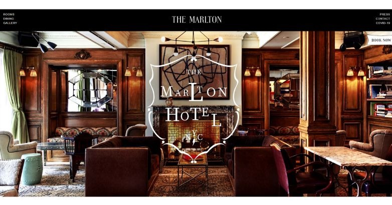
Rich wood interiors and warm tones channel old-world New York sophistication. The site’s cozy imagery and tactile design make heritage feel intimate.
What makes it stand out
- Character in every detail
- Warmth that feels lived-in
- Classic style, smartly presented
39. 137 Pillars House
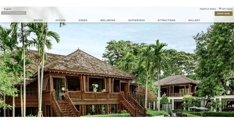
Verdant imagery and wooden textures bring Thai heritage to the foreground. The clean design and abundant photography highlight elegance rooted in tradition.
What makes it stand out
- Culture expressed with restraint
- Warm tones, timeless appeal
- Harmony between history and polish
40. Ultima Collection
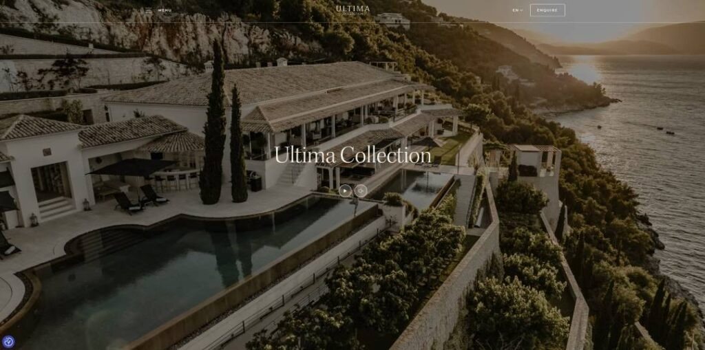
Golden-hour imagery and refined typography turn each scroll into a cinematic experience. The balance of soft tones and editorial pacing evokes timeless grandeur.
What makes it stand out
- High-end storytelling flow
- Classic luxury, modern clarity
- Every frame feels collectible
41. LeCrans
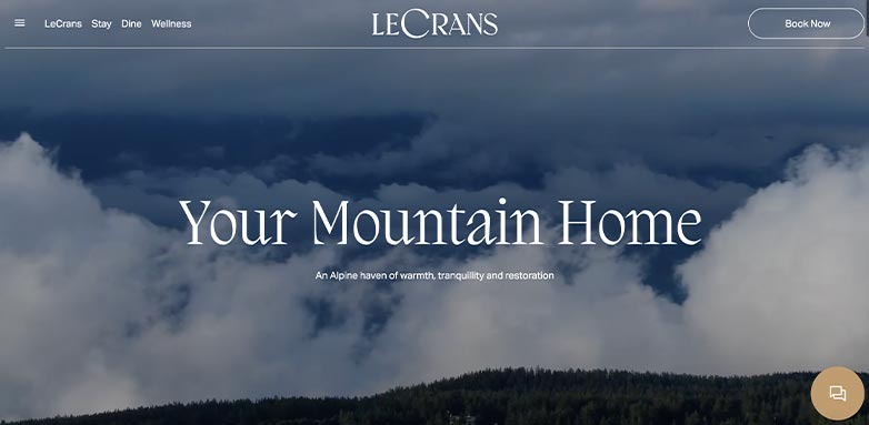
Cool blues, volcanic textures, and minimalist design immerse visitors in Nordic tranquility. Every element mirrors the spa’s meditative experience.
What makes it stand out
- Minimalism done with depth
- Color that defines mood
- Quietly immersive design
42. Borgo Santandrea
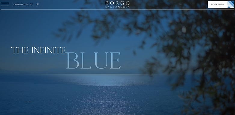
Gentle sea tones and olive silhouettes set a scene of Mediterranean serenity. The scrolling flow and cinematic transitions elevate coastal luxury to art.
What makes it stand out
- Effortless Italian elegance
- Serenity in every motion
- A view that feels infinite
43. Xigera Safari Lodge
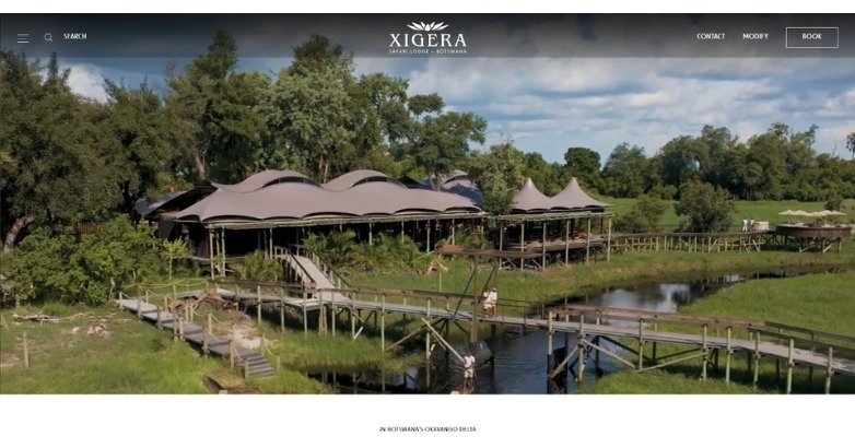
Sweeping aerial views and soft earth tones immerse you in Botswana’s wild beauty. Every detail—from the curved lines to quiet typography—reflects balance between luxury and nature.
What makes it stand out
- Storytelling through landscape
- Organic design that feels alive
- Seamless harmony of elegance and ecology
44. A77 Suites
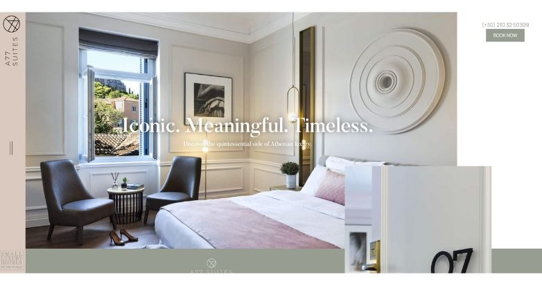
Soft light, sculptural decor, and muted tones showcase Athenian refinement. A clever split navigation design adds modern intrigue to timeless sophistication.
What makes it stand out
- Subtle innovation in layout
- Minimalism with Greek soul
- Elegant restraint that lingers
45. Deer Path Inn
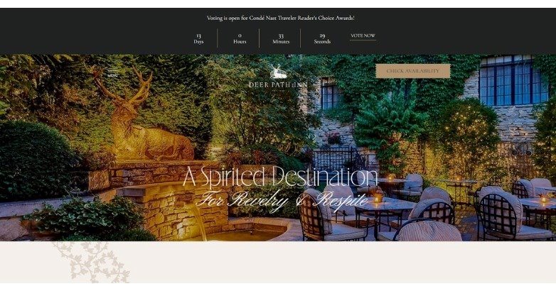
Warm lighting and ivy-covered stone instantly transport visitors to an English-inspired retreat. The design pairs historical charm with a modern, intuitive layout.
What makes it stand out
- Heritage meets usability
- Refined color palette with purpose
- Timeless hospitality in digital form
46. Aguas de Ibiza
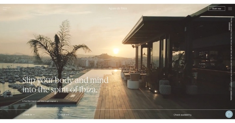
Soft sunlight and sea tones carry the relaxed rhythm of Ibiza. The site captures Mediterranean luxury through serene motion and clean modern styling.
What makes it stand out
- Immersive visuals and fluid navigation
- Pastel palette that evokes calm
- Modern refinement with local spirit
47. Aira Hotel
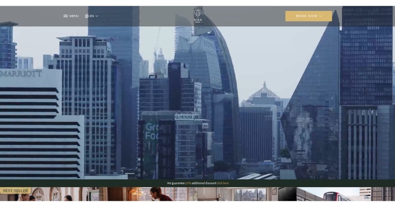
Bangkok’s pulse meets polished design in this cinematic, high-contrast layout. It’s vibrant, structured, and unmistakably cosmopolitan.
What makes it stand out
- Strong visual storytelling
- Premium aesthetic with intuitive UX
- Refined balance between motion and clarity
48. Hotel Neptun
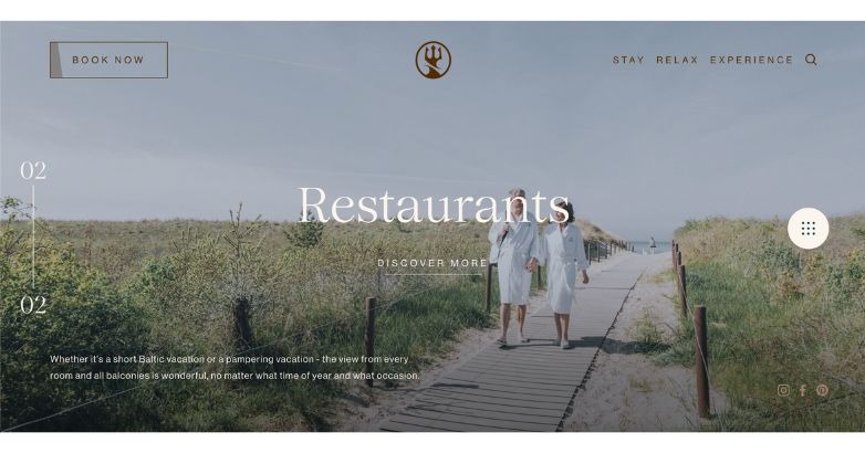
Soft coastal light and muted tones carry the calm rhythm of the sea. Every detail, from the imagery to the copy, echoes the hotel’s maritime soul.
What makes it stand out
- Seamless ocean-inspired storytelling
- Minimal color palette with focus on texture
- Integrated navigation for effortless flow
49. Hotelrutei
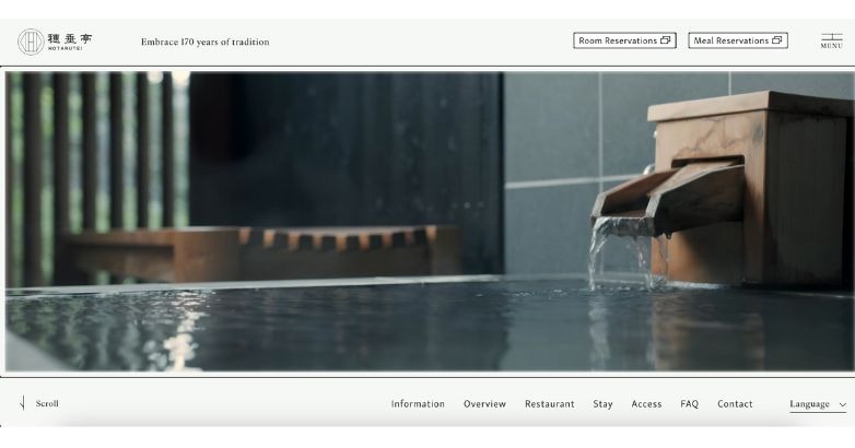
Centuries of heritage meet modern serenity in this beautifully restrained Japanese design. The interface feels timeless, precise, and steeped in ritual.
What makes it stand out
- Elegant use of white space and subtle motion
- Cultural storytelling through form and texture
- Clarity in navigation and functionality
50. Monastik Suites
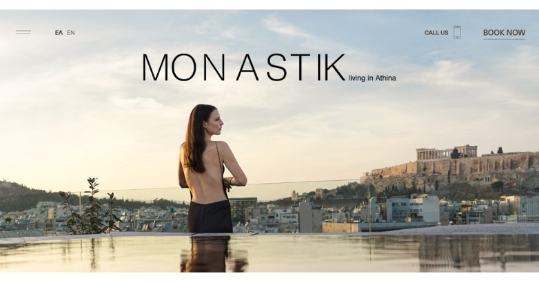
A serene blend of modern minimalism and Athenian heritage. Each frame captures the balance between architecture, art, and atmosphere.
What makes it stand out
- Refined design grounded in place
- Seamless use of light and geometry
- Sophisticated tone with visual calm
51. Altitude Jakarta
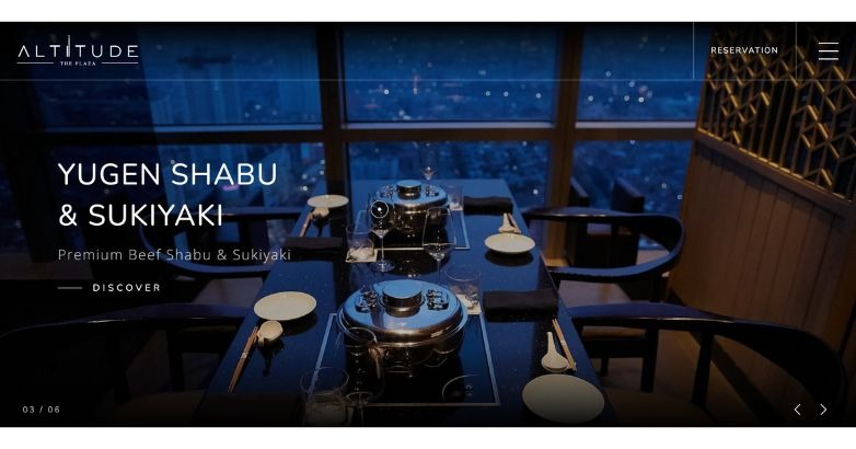
An immersive digital experience that mirrors Jakarta’s high-rise luxury. The dark, tactile visuals and responsive design invite exploration with every click.
What makes it stand out
- Engaging interactive navigation
- Dramatic visual storytelling
- Cohesive atmosphere through color and motion
52. Latitude Suites
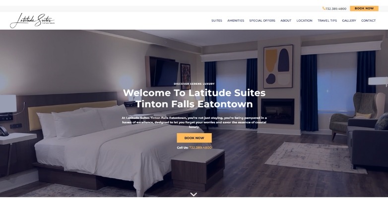
A neutral palette and minimalist room photography create a quiet, boutique feel. Clean type and balanced spacing keep attention on comfort and design details.
What makes it stand out
- Calm, modern look
- Rooms presented as the star
- Copy that stays out of the way
Fundamental Elements of a Luxury Hotel Website Design
Those were certainly inspiring examples of web design for hospitality industry. Next, it’s time to build your own.
So what should a hotel website have?
Let’s get into each part.
Size and Scale
The first disparity is the size and scale. Boutique hotels are usually smaller, with 100 rooms max. Luxury hotels, oppositely, can have hundreds to thousands of rooms per building, and may be part of a national or international chain. The size of boutique hotels lends them a more exclusive feel, like an undiscovered gem. Staying in one feels like a true retreat.
Elegant Interface
Design elements should complement your brand. A boutique hotel’s website design should look elegant from the homepage to the landing pages.
Large-scale imagery of life at the hotel, luxury-minded copy, and colors that evoke a posh lifestyle (like browns, tans, golds, and black), will create the desired look your site needs.
High-Quality Imagery
Your luxury site also benefits from high-quality imagery, including videos and images. Full-sized carousels were recurring across the best hotel website designs from the last section.
If you add media to your site, the images and videos should be high-res and edited well to create a seamless flow, a standard often guided by a hotel marketing agency. That can encourage potential guests to stay on the site longer.
Easy Reservation Process
The faster and more efficient it is for potential guests to check out, the likelier they are to do it. Place CTA buttons for booking above the fold, especially when working with a hotel marketing agency to improve conversions. Use contrasting colors opposite the main color scheme for your luxury site to help the buttons stand out even more.
The copy for the CTA buttons should be simple and straightforward. Explain what will happen if a potential customer clicks a button. For example, “Book Now” tells a visitor that clicking the link will take them to a booking page.
Seamless User Experience
The user experience is paramount to successful luxury hotel website design. Many elements of a hotel’s website design can improve UX, including finessing your CTAs, improving your website loading speed, limiting the number of pages on the site, using mobile optimization, and creating a functional, easy-to-use navigation menu.
On the note of site speed, it should be ultra-fast, like two seconds or fewer. However, most websites load in around eight seconds. If yours takes longer than that, especially on mobile, you will lose that website visitor.
Concise and Persuasive Copywriting
Luxury hotel website design is a marriage between visual and written elements. Your copy should weave your story across paragraphs like stitching together a tapestry. Use emotive, bold imagery to captivate the reader’s attention and imagination.
Rely on headings to break up text, which shouldn’t be in large blocks. Images and bullet points can also divide copy. Proofread the copy before it goes live, letting a second set of eyes review it so it’s free of typos and grammar mistakes.
Learn more about storytelling as part of destination marketing, then check out our guide to storytelling for hotels.
Mobile-Friendly Optimization
With more than half of a website’s traffic emanating from mobile devices in 2024, a non-optimized website will lose tens of thousands if not millions of potential guests.
A mobile-optimized site should replicate the seamless browsing experience a user gets on desktop but on mobile. Test your site design before it goes live, improving elements that need more optimization.
Target Market
The target market of boutique and luxury hotels also vary. The latter targets a larger audience since it has the space for more accommodation, whereas the former has a smaller and more specific market. This goes back to a boutique hotel’s ability to personalize and diversify its services and style, making them a popular stay for those who believe that lodging is as important a part of the vacation experience as itinerary.
Hotel Website Design Best Practices
Building your boutique website design requires abiding by these rules.
Captivating Visual Identity
Boutique lodging digital interface design must have a distinct visual identity that brings in visitors and keeps them scrolling and reading for long enough to book. As the examples earlier showcased, a boutique hotel can build its visual identity through large-scale image and video carousels.
The visuals should showcase the resplendence of the hotel grounds, the beauty of the interior, and the wonder of the lodging experience, from dining to spa services and golf.
Seamless User Experience
Up to 88 percent of internet users are unlikely to come back to your website if it delivers a poor user experience. Responsive design for boutique hotel owners is one example of what you should focus on; here are some more UX areas to prioritize:
- Well-placed CTA links and buttons
- Easy-to-use navigation
- Tailored boutique hotel site architecture, including visual architecture
- Mobile optimization
- Consistency across the entire site
- Design simplicity
Compelling Content Strategy
Visual storytelling for boutique hotel sales isn’t the only way to weave your narrative into your website design. You can also use emotive copy that draws people in, crafting experiences dedicated to relaxation, adventure, and fun depending on the crux of your brand.
Integration of Booking Engine and Reservation Management
The best boutique hotel website design allows clients to book right from your website. Perhaps you have a booking engine on your homepage or a reservation management system above the fold. These elements must be integrated seamlessly into your site design to encourage more bookings.
Optimizing for Search Engines
Boutique hotels may only target a limited audience but cannot ignore search engine optimization. So, which SEO elements does your site require? Here’s a rundown.
- Internal linking
- Keyword research
- Mobile optimization
- Fast loading speed
- Alt text for images
- Meta descriptions
- Webpage titles
- Backlinking
- URL structure
- Schema markup
- Image optimization
- Local SEO
Embracing Technology and Innovation
The hospitality industry never sleeps, so innovative design for boutique hotel platforms requires tracking industry and technology changes and deciding when and how to integrate them into your website layout. If you don’t, you give your competitors a chance to usurp your spot.
Why Website Design is Crucial for Boutique Hotels
Boutique hotel website design can drive the following results:
- Strengthening your brand identity
- Creating engagement and differentiation
- Maximizing your revenue
- Captivating with visual storytelling
- Introducing mobile optimization for tomorrow’s traveler
- Building a positive reputation
Take a look at Mediaboom’s roundup of luxury travel website design examples for more sites in which to cherry-pick ideas.
Current 2025 Design Trends and Future Trends in Luxury and Boutique Hotel Websites
What does the future of boutique hotel web design hold? Here are some noteworthy trends to keep on your radar.
1. Minimalism
The luxury boutique hotel web development examples showcased earlier widely utilized minimalist designs that allow visual elements like photos to stand out. White backgrounds were standard, as were refined hues such as ivory and beige.
2. Harnessing Immersive Visuals
Visuals are a must when branding and marketing your hotel, but not just stock photos of people enjoying themselves. The trend is immersive visuals, which aren’t limited to only photos. Videos are an excellent way to grab attention and drive visitors through the site.
3. Storytelling for Brand Narrative
Visual storytelling for boutique hotel sales connects people with your story. You can expect more fact retention, between 60 and 70 percent, versus only five to 10 percent when your information is presented solely as stats.
Your story is also what makes your boutique hotel unique, which is another reason to utilize this element to the fullest.
4. Prioritizing the User-Friendly Experience
User-friendly boutique hotel homepage design continues to remain a top priority for hospitality brands trying to make a name for themselves. Without focusing on UX, your site has little chance of connecting with potential customers, as they will leave and likely won’t return.
Future Trends
Beyond those established luxury boutique hotel web development trends, the following are also on the rise:
- Immersive technologies such as virtual reality tours, which give people a lifelike experience of a stay at your boutique hotel before they book.
- Sustainability and eco-friendly design that meets the green demand, especially in the travel industry as a whole.
- AI and personalization to craft more tailored guest experiences, elevating the tailored approach boutique hotels are known for.
- Voice search optimization, the next digital frontier in search, which requires prioritizing more conversational keywords.
Hotel Website Design Agencies to Hire
Selecting the right partner to craft or refresh your hotel’s digital front door can directly impact direct bookings, average daily rate, and overall guest satisfaction. The agencies below have proven hospitality expertise, award‑winning creative, and technology stacks built to drive measurable revenue.
- Mediaboom – Hospitality‑oriented marketing agency with 23 years of experience. Mediaboom fuses cinematic storytelling with performance-driven web builds then backs the site with SEO, CRO, and paid-media programs.
- O’Rourke Hospitality Marketing – A specialised web and digital partner working solely with independent properties and small groups. Clean, mobile-first sites are launched inside a full-funnel programme that links search, paid media and content to a streamlined booking flow, while transparent post-launch dashboards show the revenue tied to every tactic.
- VERB Interactive – A Nova Scotia agency famed for immersive resort sites and omnichannel performance marketing. By uniting visually lush design with enterprise integrations for PMS, loyalty and e-commerce, VERB creates aspirational journeys that remain engineered for conversion for high-end brands such as Ritz-Carlton Reserve and other nature-inspired collections.
- Spherical – A New York creative house devoted to lifestyle and luxury hospitality. Brand strategy, web design, editorial storytelling and social activation are delivered on a modular platform that scales from single boutiques to multi-property collections while letting each hotel’s personality shine.
- Tambourine – More than a marketing agency, Tambourine offers a full-stack commercial platform. Custom design is layered with a proprietary booking engine, real-time personalisation, metasearch feed management and media buying— all stewarded by revenue strategists who trace every visit back to profit.
- TravelClick (Amadeus Web Solutions) – Now within Amadeus Hospitality, this group delivers turnkey and custom sites that plug straight into the iHotelier central reservation system. Merchandising widgets, rate-parity messaging and deep analytics sit on a responsive framework, giving brands unified oversight of standards and revenue from a single dashboard.
- D-EDGE Hospitality Solutions – The Accor-owned tech suite pairs creative web design with its reservation and distribution backbone. Sites arrive pre-wired for the D-EDGE CRS, fully responsive and equipped with SEO, tracking and accessibility by default, keeping commercial data and web performance inside one ecosystem.
- Milestone Inc. – A technology-led agency whose SEO-first content-management system anchors every build. Mobile-oriented layouts, ADA-compliant components, rich schema and omnichannel campaigns extend reach, while continuous optimisation inside the Milestone CMS keeps sites aligned with search updates and Core Web Vitals.
- Net Affinity – Dublin-based provider of a unified stack covering website design, its own booking engine, digital campaigns and gift-voucher e-commerce. Every element is engineered around a guest-centric philosophy: clear navigation, adaptive rates and marketing automation that turns lookers into bookers and frees hotel teams to focus on service.
- Blue Magnet Interactive – A Chicago agency that positions the hotel website as the hub of a wider digital ecosystem. Developers craft fast, responsive, SEO-friendly sites with conversion-focused architecture, while specialists manage search, media, social and reputation to keep the direct-traffic pipeline flowing— all through close, transparent account service.
FAQs
What makes a luxury hotel website design stand out?
Luxury hotel website design should stand out through its use of high-quality visuals, intuitive navigation, and exclusive content that reflects the unique brand and experience the hotel offers. It’s not just about looking premium but also providing a seamless, user-friendly experience that showcases the hotel’s amenities, accommodations, and unique selling propositions. Elegant typography, a sophisticated color palette, and immersive video or virtual tours can also elevate the user’s experience.
How important are visuals in luxury hotel website design?
Visuals are extremely important in luxury hotel website design. High-resolution images and videos that showcase the hotel’s rooms, facilities, and surroundings play a crucial role in capturing the attention of potential guests. They help convey the quality and ambiance of the hotel, aiding visitors in imagining themselves enjoying the luxury experience. Interactive elements like 360-degree views and virtual tours can further enhance engagement and interest.
What should be considered for user experience (UX) in luxury hotel website design?
For UX, luxury hotel websites should focus on simplicity, ease of navigation, and speed. The booking process should be straightforward and secure, with clear calls to action (CTAs). Websites should be mobile-responsive, considering many users book travel through mobile devices. Personalization, such as recommended packages or rooms based on user behavior, can also improve the UX by making visitors feel uniquely valued.
How can a luxury hotel website design reflect brand identity?
A luxury hotel’s website design should reflect its brand identity through consistent use of logos, color schemes, typography, and imagery that align with the hotel’s positioning and personality. The tone of the content, the style of the visuals, and even the layout can convey the brand’s values and the type of experiences guests can expect. Storytelling elements that share the history, mission, or unique aspects of the hotel can also reinforce brand identity.
What are the best practices for optimizing a luxury hotel website for search engines (SEO)?
SEO best practices for luxury hotel websites involve using relevant keywords throughout content, optimizing meta tags (title, description), ensuring fast loading times, and aligning strategy with a hotel marketing agency. Quality, original content like travel tips or destination guides boosts search rankings. Technical SEO, such as mobile responsiveness and secure browsing (HTTPS), is crucial. Building backlinks from reputable travel sites enhances authority and visibility in search results. Implementing these principles in website design can attract and convert high-value clients, ensuring a memorable first impression and seamless booking experience.
Are There Additional Questions on Your Mind?
Here at Mediaboom, we’re equipped to address all your additional questions and guide you through creating a luxury hotel website that truly represents your brand. Reach out to us to discover how we can assist in enhancing your online presence.
Conclusion
A luxury-hotel website is more than a showroom, it’s the first handshake with every future guest.
The great hotel website design examples and tactics we’ve covered prove that striking imagery, intuitive paths, and a clear brand story can turn fleeting attention into direct bookings.
Treat your site as you would your lobby: refine every detail, refresh it often, and let it reflect the elevated experience awaiting on-property.
Mediaboom’s luxury marketing agency offers digital marketing solutions tailored for developing your high-end hotel website, reinforcing your premium brand identity. Secure your exclusive, free consultation with our hotel marketing agency today. Contact our experts today to discuss your needs.
By: Frank DePino
Frank DePino is the Principal and Founder of Mediaboom, a top hotel marketing agency partnering with leading hotel and hospitality brands. With 30+ years of experience, he has led strategic digital initiatives for names including Four Seasons, Ritz-Carlton, JW Marriott, Millennium Partners, and Guardian Jet. Frank helps hospitality businesses strengthen brand presence, drive qualified leads, and elevate guest experiences through website design, SEO, content marketing, and paid media. Under his leadership, Mediaboom is a trusted partner for brands pursuing measurable digital growth in a competitive hospitality landscape.


