
Luxury Fashion Website Design – 50 Brilliant Examples

By: Frank DePino | July 18, 2024
Loading the Elevenlabs Text to Speech AudioNative Player...
The luxury fashion niche is one that’s filled with cutthroat competition, both in the physical and virtual world, making it vital to bring in a hotel marketing agency that understands how to position elite brands effectively across digital platforms.
Brands spare no expense when it comes to creating high-end stores because this is what attracts the big spenders. Smart brands apply this same principle in luxury fashion website design by collaborating with a hotel marketing agency that can infuse strategic branding tactics into every visual and interactive element. After all, the only way to attract the attention of affluent clients online is with a website that oozes class, elegance, and value.
Like with everything else, there is a right way and a wrong way to get things done.
Here, we focus on 30 luxury brands that have gone all out to ensure that their websites match their reputation, because in the world of fashion, status is damn nearly everything.
1. TOD’S
Minimalist, user-friendly design
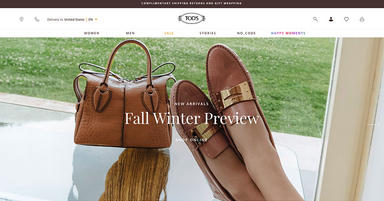
Tod’s engages its users with a landing page that’s simply laid out to maximize ease of navigation.
The neutral beige color scheme is what makes their visuals pop. However, it is their use of stunning images to list the most popular categories on the landing page that captures the attention of visitors. This is what prompts them to hit the “Discover More” button.
By targeting clients based on gender and personal needs, Tod’s ensures that all their visitors can find what they’re looking for straight away even without engaging with the search bar.
Placing eye-catching visuals on the landing page engages the visitors’ attention immediately.
However, it is the integration of these images with the site’s most popular categories and elegantly positioned “Discover More” buttons that turn their visitors into leads.
Everything is classy, minimalist, and stunningly laid out. Giving visitors the freedom to shop around or go straight to what they want is key to driving up conversion rates.
Is Your Hotel Showing Up in ChatGPT?
Travelers are increasingly using AI tools to research destinations before they ever reach a booking site. See how your hotel appears in these AI-generated answers, where competitors or OTAs may be gaining visibility, and whether there are opportunities to strengthen your presence.
2. VERAWANG
Use of visuals and hierarchy

Verawang showcases its ability to instill elegance in their website using classy visuals relevant to each category.
User experience is superb because site responsiveness is smooth, which makes it easy for visitors to locate what they need in a cinch.
Each category rests on a separate tab, and each tab features a stunning background image and elegant yet straightforward text. Under each category, Verawang picks out the highlights and lists them right on the tab. This layout makes it easier for visitors to launch product-specific, time-specific, or category-specific searches straight from the landing page.
Sticking with white font over a black background is a classy decision, and the creative arrangement of categories gives visitors a wonderfully smooth and straightforward shopping experience.
For sure, this is a great example of luxury fashion website design.
3. HARPER & JONES
Creative typographic treatment

It is hard not to read through the entire landing page of Harper & Jones.
Call it crafty or creative, but this men’s clothier brand explains their mission in the briefest, most eye-catching manner possible, urging the visitor to find out as much as they can before leaving the site.
It’s a strategy that employs the use of simplicity and quirky design with large fonts, handmade scribbles, and chuckle-worthy anecdotes – a recipe designed to capture the attention of their target audience.
There’s not much in the way of visuals save for the image banner, but the message on the landing page is still loud and clear enough to prompt the visitor to click on the dropdown menu. Here, they are guided towards “Appointments,” “Showrooms,” “Pricing,” and even “Testimonials,” among others.
This site makes full use of a design that relies on text to send its message, and it does it with large, bold text and an attention-grabbing color scheme.
4. LUXURY WOOD ITALY
Mobile Optimization and Elegant Visuals
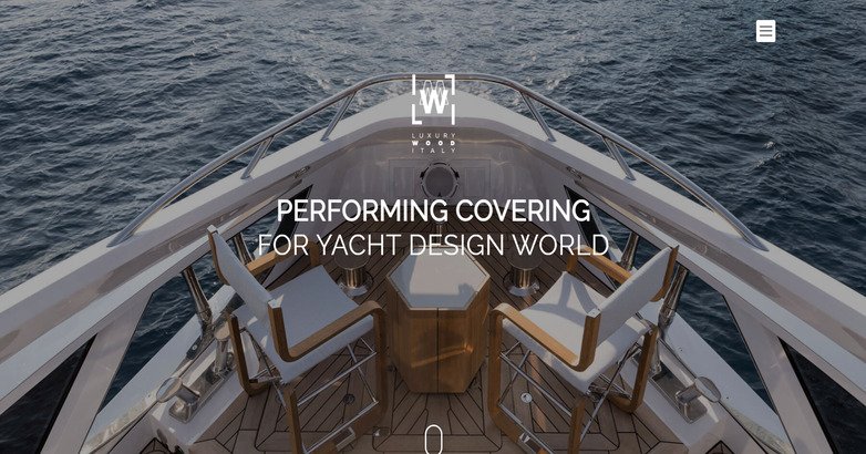
This is a brand whose website embodies its vision through and through.
Here’s why the Italian Wood website is not just stunning, but also practical:
- High-end visuals – marketing designer shades has got to be one of the trickiest feats to pull off, but Italian Wood does it quite succinctly. How do they achieve this? Using crisp, visually satisfying images of their products. Customers want to know that they’re trading their hard-earned cash for real value, and nothing screams elegance more than visually appealing photos
- Minimalism – rather than bombard customers with an endless list of products, they’ve chosen to keep it simple. The landing page guides visitors to just four of their designer shades. According to psychology, giving people fewer choices empowers them to make a decision faster and with more certainty.
- Mobile optimization – high-end visuals, coupled with fewer choices on a mobile device, equals high conversion rates. Mobile users need only swipe from left to right on the landing page to access their products. At the top, a dropdown menu leads to more options, and a shopping bag icon directs prospective customers to the checkout. Simple, quick, and extremely effective.
5. STINE GOYA
Interactive Elements

Stine Goya takes uniqueness to the next level with their interactive landing page.
Rather than showcase individual items, they highlight entire outfits so that the visitor is compelled to shop for more than just one thing.
Utilizing a stylish magazine-like layout, Stine Goya allows visitors to browse through image galleries showcasing trendy outfits while listing the prices of the individual pieces below each image. This way, visitors can decide to buy the gear as a whole or focus their attention on select items.
Stine Goya’s method is simple yet effective because it inspires visitors to splurge on entire outfits rather than single items. This promotes a lot of return business because aside from offering luxury products, they unwittingly dish out advice on how best to rock the pieces.
Need help with your luxury fashion website?
Let’s discuss how we can help you achieve better results online.
GET STARTED NOW
6. BURBERRY
Engaging Video Integration

Burberry’s luxury fashion website design embraces the use of conciseness with carefully placed fashion elements.
A video journal takes new users through their latest collections, which, as human nature dictates, is a more effective way to spread and promote the retention of new information.
Burberry targets the shopper that knows what they’re looking for.
Simple gender-classified categories offer quick and easy navigation through the site, while an enticing “Discover the Campaign” button lures visitors to view their most popular collections.
Burberry’s website design is all about building a solid customer base. The campaign collection inspires new visitors to leave their email address for updates or to create an account for purchases. Either choice helps grow their customer base, inspiring repeat visits, and ultimately leading to more conversions.
7. HOGAN
User Experience
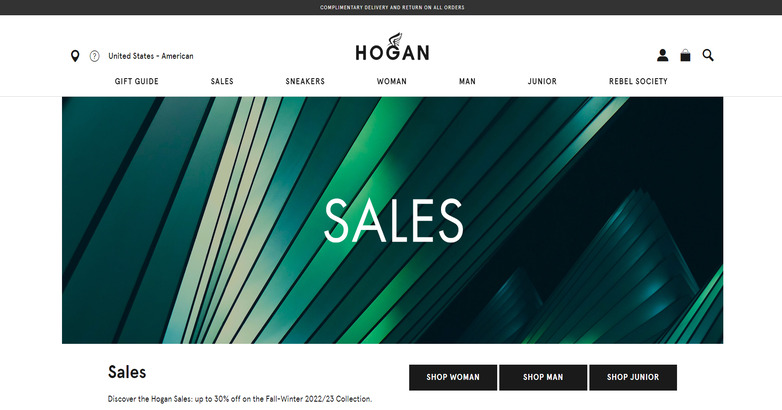
Hogan’s website is a no-muss-no-fuss kind of deal that allows visitors to scan through the new arrivals based on gender.
Again, it is evident that the luxury brand understands the value of minimalism, and because of it, their website looks attractive yet uncluttered and easy to navigate through.
Hogan uses visuals sparingly but correctly, using images to distinguish categories for a better browsing experience. However, what stands out is their choice to go with a sidebar menu as opposed to the traditional dropdown. Minimalist icons on the left allow visitors to access a dropdown menu, favorite items, add to cart, access their account, or even pick a store.
Convenience is a trait shared by the most visited websites, and Hogan’s luxury fashion website design has it in abundance. Users can navigate effortlessly through categories and access information with one click no matter what part of the website they’re in. That makes for superb user experience.
Elevate Your Hospitality Brand Today
Schedule Your Free Consultation
Seeking to elevate your business? Let Mediaboom guide you. Secure your exclusive, free consultation with our digital marketing experts today.
8. KITON
Personalized Visuals

Kiton adopts a highly visual approach in their website design.
Their landing page has a scrapbook-like feel to it that is endearing and quite personal, albeit with just a touch of high fashion sense.
A picture speaks a thousand words, and Kiton has embraced this power to the max. The use of images to set apart each category is a powerful way to entice the subconscious mind of their visitors. They deploy a simple, almost homey approach in their imagery as well, opting for seemingly random images as opposed to models and high definition snaps.
Navigating through their site is not even half a task because everything you might want is within sight. Everything else is hidden away in a neatly placed dropdown, which stands next to a search icon. Kiton may not ooze the elegance and luxury associated with top designer brands, but they more than makeup for it with their site’s ease of navigation.
9. CALICANTO
Modern & Simple Design

Calicanto let their pictures do the talking for them.
A landing page elegantly decorated with high-end visuals is enough to attract even the most nitpicky luxury shoppers. However, it is their straight-to-the-point approach that turns those visits into sales.
Calicanto waste no time on introductions (they save all that for the dropdown menus) but instead go straight to showcasing their high quality bags right on the landing page.
Although the pictures are as classy and elegant as they come, it is their presentation that attracts the eye.
Plastered on a pure white background, Calicanto makes use of slideshow technology to create images that glide into view as the user scrolls down their website. Paired with light, elegant font, this website oozes luxury like nothing else does and can seize the attention of fashion connoisseurs with absolute ease.
10. MANOLO BLAHNIK
Sophisticated Design

A prime example of visual integration done right, Manolo Blahnik’s website’s strengths lies in the application of visual artistry and elegant calligraphy.
This luxury fashion website puts the brand’s best foot forward (pun unintended) by showcasing their top picks in sophisticated style right on the homepage.
The website is exceptionally minimalist yet highly sophisticated, and this comes from the creative use of imagery to create a lifelike showcase of shoes right on the screens of their visitors.
Besides being extremely attractive, their website is easy to navigate, a huge plus for a website with a catalogue of this magnitude. Everything else is neatly stacked away in a top-left menu button, while on the right, the visitor can access their cart and checkout if they wish to.
Manolo Blahnik’s website represents, in many ways, a perfect marriage of style and functionality.
11. WOOTEN
Storytelling

Australia’s luxury shoemakers Wootten know a thing or two about shoes, but the same can also be said of their knowledge on attracting visitors online.
Their website tells the story of how their handmade products come to be—something that appeals to customers with a taste for authentic handcrafted
items.
A “Behind the Scenes” banner greets customers and tells them the story of how the luxury brand creates their pieces. Below it, Wootten skips straight to the meat of the matter, listing their top products one after the other with their respective prices underneath.
Of course, visitors can click on the menu to learn more about their heritage, but allowing them to order bespoke products straight from the homepage maximizes their ability to cash in on customers who need their products custom-made quickly. Wootten don’t use a lot of fancy bells and whistles. Theirs is a simple website to carry their message of homemade luxury and handcrafted perfection to their loyal customers online.
12. CHRISTIAN LOUBOUTIN
Interactive & Engaging Elements

Christian Louboutin is a globally recognized luxury brand that embraces simplicity and elegance in all their doings.
Their luxury fashion website design embraces this philosophy and adds a sprinkle of mystery to turn heads; a strategy that works wonders if done correctly.
Other than a glamorous banner slideshow and the title of their latest collection, their homepage contains little else. This uncluttered design invites visitors to click on the menu to find out more, but for those looking for deals, the website offers a field where they can quickly submit their email addresses and be on their way.
The faster your visitors get to what they want, the more likely it is that they will come back, and that is what Christian Louboutin has ensured with their visually stunning yet simply laid out website.
13. FENDI
Targeted User Experience
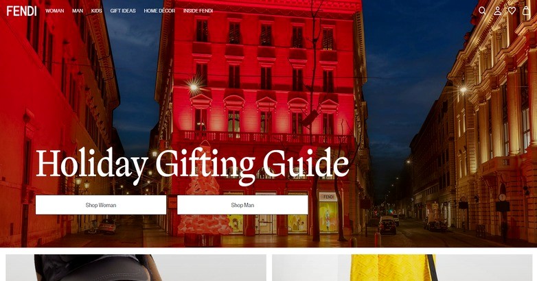
Fendi’s luxury fashion website design takes on a different approach – one that’s location-oriented.
Whether you want to shop or explore, they allow you to do so based on region, making it easier to shop by location.
To that effect, their website is as uncluttered as they come. It makes use of stunning visuals and easy navigation to invite visitors to look around. The landing page contains not just a listing of the popular categories, but also products of interest, and various luxury collections.
Putting everything in one place makes finding products easy for customers, but it is their simple categorization of items that makes searching for products on the site a breeze.
14. SALVATORE FERRAGAMO
Stunning Visuals

The Ferragamo website is a visual marvel that combines excellent images with a classic layout that’s easy to navigate. Rather than hide away their category list in dropdown menus, they have elected to lay it out stylishly on the homepage, so that the new visitor can see what they are offering at first glance. This website works because of the following features:
- Unique catalogue layout – the choice to neglect tedious lists and instead go with picture tabs proves wise because of visitors digest imagery faster than text. Content is accurate but brief, allowing a quick overview of each category for faster navigation.
- Classic visual integration – sometimes simplicity works best, and Ferragamo illustrates that by sticking with classic still images rather than videos and slideshows. The effect is still significant on the visitor mainly since each image corresponds to a category.
15. Gucci

The Gucci website captivates visitors with a high-resolution, full-screen image that showcases its luxurious products.
The minimalist navigation and prominent brand name emphasize elegance and exclusivity.
The serene, underwater theme enhances the visual appeal, while intuitive interactive elements ensure a seamless user experience, perfectly balancing aesthetic and functionality, embodying Gucci’s high fashion and sophistication.
WHAT OUR CLIENTS SAY
16. Valentino

Featuring a clean, sophisticated design, the Valentino website immediately captures attention with a full-width banner showcasing a luxury handbag.
Users benefit from the top navigation bar offering various product categories and a store locator, enhancing accessibility.
With its minimalistic approach to luxury fashion website design, the site emphasizes the product image and includes a subtle call-to-action button for a seamless user experience.
The muted color palette and high-quality imagery perfectly reflect the brand’s luxurious status.
17. Dolce & Gabbana

Presenting a sophisticated split-screen design, the Dolce & Gabbana website immediately draws attention to two main fashion collections.
The top navigation bar is comprehensive, offering categories like fashion, beauty, and home goods, enhancing user experience.
The elegant models and muted background highlight the luxury apparel, while clear calls-to-action invite users to explore further.
The overall minimalist yet refined aesthetic underscores the brand’s high-end appeal.
18. Prada

Embracing minimalism, Prada’s website places its Women’s Summer Collection at the forefront with a sleek, stylish model and a chic handbag.
Navigation is intuitive, with categories like women, men, and bags neatly arranged at the top.
The abundant white space and refined fonts enhance the brand’s elegance, ensuring a sophisticated and timeless online presence. High-quality visuals further reinforce Prada’s luxury appeal.
19. Alexander McQueen

With a dramatic and moody aesthetic, the Alexander McQueen website showcases its Women’s AW24 Pre Collection prominently.
The use of dark, brooding visuals aligns with the brand’s edgy and avant-garde image. Navigation elements are discreetly positioned at the top right, allowing the powerful imagery to take center stage.
This design choice enhances the overall impact, making the luxury fashion website design bold and memorable while reflecting the strategic insights a hotel marketing agency brings to premium user experiences.
The strategic use of space and contrast highlights the high-end nature of the brand, appealing to itstarget audience.
20. Chanel

Featuring a sleek and elegant layout, the Chanel website highlights its iconic Bleu de Chanel fragrance with a striking hero image.
The top navigation bar, cleanly organized with categories like haute couture and high jewelry, ensures ease of access.
This minimalist design, combined with high-quality visuals and subtle typography, exudes luxury and sophistication.
The overall presentation reinforces Chanel’s timeless elegance and high-end branding.
21. Jimmy Choo

The Jimmy Choo website captivates with a vibrant image of a shimmering shoe from the Summer 2024 collection.
Users are greeted by a straightforward navigation bar categorizing products for women, men, and more.
The clean design is complemented by high-quality visuals and an intuitive “Shop Now” button, ensuring an elegant and seamless browsing experience that reflects the brand’s luxurious essence.
22. Givenchy

Givenchy’s website captures attention with a serene beach scene that exudes elegance and tranquility.
The top navigation bar, with options for women, men, and gifts, is sleek and unobtrusive.
The minimalist black background emphasizes the luxurious feel, while the high-quality video engages users immediately.
This sophisticated luxury fashion website design, focusing on simplicity and visual impact, aligns perfectly with Givenchy’s prestigious brand identity.
23. Hermes

Hermès employs a timeless and elegant design, featuring a monochrome hero image that captures a serene, sophisticated atmosphere.
The top navigation is clean and functional, with options for account and cart easily accessible. The use of ample white space, combined with high-quality visuals, enhances the luxurious feel.
This minimalist approach effectively underscores Hermès’ commitment to elegance and quality, inviting users to explore their collections in a refined online setting.
24. Balenciaga

Balenciaga’s website instantly grabs attention with its vibrant, neon-lit street scene promoting the Spring 25 Collection.
The navigation bar at the top is streamlined, providing easy access to various product categories such as women, men, and gifts.
The bold, colorful imagery reflects the brand’s avant-garde and urban chic style, creating an engaging and dynamic user experience.
This visually striking design aligns with Balenciaga’s innovative and fashion-forward identity.
25. Yves Saint Laurent

Saint Laurent’s website showcases a sleek split-screen design featuring a chic handbag on the left and a stylish model on the right.
The navigation is minimal yet effective, with categories like shop women and shop men easily accessible.
High-quality imagery and a subdued color palette emphasize the brand’s luxury.
The clear calls-to-action encourage exploration of the new Summer 24 collection, highlighting Saint Laurent’s sophisticated and timeless appeal, exemplifying exceptional luxury fashion website design.
Elevate Your Hospitality Brand Today
Schedule Your Free Consultation
Seeking to elevate your business? Let Mediaboom guide you. Secure your exclusive, free consultation with our digital marketing experts today.
26. Louis Vuitton

Louis Vuitton’s website features a dynamic, full-screen video showcasing the Cruise 2025 collection.
The simple, clean navigation bar ensures easy access to various sections like menu and search.
The high-quality video and elegant typography emphasize the brand’s luxurious appeal.
This modern and immersive design captures the essence of Louis Vuitton’s sophistication, inviting users to explore and engage with the latest fashion show.
27. Dior

Dior’s website greets visitors with a split-screen layout that highlights fashion and accessories on one side and fragrance and beauty on the other.
The clean, elegant navigation at the top offers easy access to these categories. High-quality images and minimal text ensure the focus remains on the products.
This sophisticated design underscores Dior’s luxury and commitment to beauty and style, providing a seamless browsing experience.
28. Versace

Versace’s website features a clean and stylish design with a bold hero image promoting the La Vacanza 2024 collection.
The top navigation bar is comprehensive, offering easy access to various categories like bags, women, and home & lifestyle. The high-quality image and subtle color palette enhance the luxurious feel.
Clear calls-to-action, such as “Shop Women’s” and “Shop Men’s,” guide users effectively, reflecting Versace’s commitment to fashion-forward elegance and user-centric luxury fashion website design.
29. Ralph Lauren

Ralph Lauren’s website features a serene image of a lighthouse, promoting their Memorial Day Event.
The top navigation bar is comprehensive, offering categories like men, women, and kids & baby, making it easy to explore.
The elegant typography and coastal imagery align with the brand’s classic American aesthetic.
Clear promotional text and accessible navigation enhance the user experience, reflecting Ralph Lauren’s timeless elegance and lifestyle brand positioning.
30. Tom Ford

The Tom Ford website exudes bold sophistication with its split-screen layout, featuring high-contrast black and white images for fashion and accessories, and vibrant imagery for fragrance and beauty.
The minimalist top navigation ensures focus remains on the striking visuals.
This dramatic design effectively conveys Tom Ford’s luxurious and edgy brand identity, inviting users to explore its premium offerings in an elegant yet impactful online environment.
31. Bottega Veneta

Capturing the essence of luxury fashion website design, Bottega Veneta’s site boasts a clean, minimalist layout emphasizing visual clarity and ease of use.
The muted background enhances the vibrant aqua outfits, creating a striking visual contrast. High-resolution images convey the brand’s commitment to quality and craftsmanship.
Furthermore, the site’s sophisticated approach ensures a seamless and enjoyable online shopping experience, making each product detail stand out with elegance and precision.
32. Oscar de la Renta

Integrating elegance and functionality, Oscar de la Renta’s website blends a clean, sophisticated design with interactive elements elevating the user experience.
For instance, the homepage displays a captivating runway image introducing the Pre-Spring 2025 collection, set against a serene garden backdrop.
This visual narrative invites users into the world of high fashion.
A well-organized navigation bar offers easy access to various categories, ensuring seamless exploration of the site’s offerings.
33. Balmain

Harnessing bold visuals and a warm, earthy color scheme, Balmain’s website creates an instantly captivating experience.
The homepage features a striking image of a model framed by rugged palm trunks, backlit by a dramatic sunset.
This visual storytelling reflects the brand’s adventurous and luxurious spirit, strategically drawing attention to the newest collections.
Additionally, the bold imagery and design elements ensure a focus on fashion and style, highlighting Balmain’s unique aesthetic.
34. Loro Piana

Offering a serene and immersive experience, Loro Piana’s luxury fashion website design mirrors the brand’s reputation for luxury and tranquility.
The homepage features a deeply evocative image capturing a moment of subtle introspection against a blurred marine backdrop.
This choice, combined with a muted color palette, evokes calm and sophistication.
Moreover, the site’s elegant layout and high-quality visuals highlight the Resort 2024 collection, reinforcing Loro Piana’s commitment to timeless elegance.
35. Celine

A striking blend of artistic expression and modern minimalism defines Celine’s website design.
Attention is captured through a close-up, highly textured image of a model’s face dominating the homepage.
This conveys an intimate, almost raw aesthetic reflecting the brand’s focus on bold, emotional engagement.
Additionally, the layout is clean and straightforward.
A navigation menu offers uncluttered access to various sections, emphasizing the brand’s sophisticated yet accessible approach.
36. Moncler

Conveying the brand’s luxurious approach to outdoor and winter wear, Moncler’s website features a captivating visual of a model in a relaxed pose.
This exudes a casual yet sophisticated aura.
The backdrop blends urban and abstract elements, complementing the modern style of the clothing.
Moreover, the clean interface highlights new arrivals and ensures a fluid, engaging user experience that showcases the brand’s innovative designs and seasonal collections.
Is Your Hotel Showing Up in ChatGPT?
Travelers are increasingly using AI tools to research destinations before they ever reach a booking site. See how your hotel appears in these AI-generated answers, where competitors or OTAs may be gaining visibility, and whether there are opportunities to strengthen your presence.
37. Chloé

Masterfully blending iconic Parisian landscapes with contemporary fashion, Chloé’s website epitomizes elegance through a dynamic homepage image.
The image features the Eiffel Tower backdrop and a model in motion.
This striking visual captures the essence of the Chloé Fall 2024 collection, emphasizing fluidity and modern femininity.
Furthermore, the layout is both elegant and functional, maintaining a chic and artistic feel while inviting users to explore Chloé’s world through its visually captivating presentation.
38. Maison Margiela

Embracing a minimalist aesthetic, Maison Margiela’s luxury fashion website design allows the products to stand out with stark simplicity.
The homepage utilizes a close-up image focusing on the details of a luxurious handbag, showcasing the brand’s commitment to craftsmanship and design.
Additionally, the muted background ensures the product remains the focal point.
This highlights new arrivals and reinforces Maison Margiela’s reputation for innovative, refined high fashion.
39. Valextra

Visually engaging, Valextra’s website features a clean and modern aesthetic that emphasizes their unique small leather goods.
The homepage displays high-quality images of models showcasing colorful glasses cases, cleverly using the product as both a fashion statement and practical accessory.
Moreover, a crisp white background ensures the vibrant colors of the leather pop, drawing immediate attention.
Seamless integration of navigation at the top makes it easy for customers to explore categories, balancing functionality with stylish presentation.
40. Etro

Beautifully conveying the essence of a dreamy Italian summer, Etro’s website showcases the latest collection with a captivating homepage image.
This visual captures natural textures and vibrant flora, setting a vivid backdrop for the sophisticated products featured.
Furthermore, such a design invites viewers into a luxurious yet grounded narrative, enhancing the allure of the Etro Summer 2024 collection.
Streamlined navigation at the top ensures effortless exploration of categories like Women, Men, and Fragrances.
41. Missoni

Perfectly capturing the vibrant and lively spirit of its beachwear collection, Missoni’s luxury fashion website design features an engaging homepage with models enjoying a seaside setting.
The use of candid, joyful imagery under the night sky adds authenticity and allure to the apparel, inviting viewers to envision themselves in these moments.
Additionally, the vibrant visuals and dynamic design elements highlight the colorful patterns and unique styles, creating an immersive and delightful browsing experience.
42. Emilio Pucci

Leveraging a sophisticated and artistic approach, Emilio Pucci’s website immediately engages visitors with a striking portrait of a model adorned in vibrant, patterned attire reflecting the brand’s signature style.
Set against a neutral background, the image accentuates the bold colors and intricate designs of the clothing and accessories.
Moreover, the sleek and modern interface showcases Pucci’s flair for high fashion and artistic expression, making each page a visually stimulating experience.
43. Philipp Plein

Embodying the brand’s edgy and vibrant aesthetic, Philipp Plein’s website showcases a bold homepage image featuring models in stylish, embellished outfits.
The striking contrast highlights the exclusive nature of the Summer Sale, focusing on the quirky details and luxurious textures of the clothing.
Complemented by a sleek, dark theme, the visual storytelling enhances the allure of the products.
Moreover, the bold design elements and high-impact visuals create an immersive shopping experience that encourages exploration and engagement.
44. Dries Van Noten

Epitomizing artistic minimalism, Dries Van Noten’s luxury fashion website design features a dark, moody backdrop that highlights the colorful and textured clothing from the SS25 Men’s Show.
This design choice enhances the visual impact, drawing the viewer’s eye to the vivid colors and unique designs on display.
Furthermore, the clean, modern layout includes a streamlined navigation menu providing easy access to sections such as Women, Men, Fragrance, and Shows.
This simplifies the browsing experience and focuses on fashion.
45. Alaïa

Reflecting the brand’s philosophy of timeless elegance and meticulous attention to detail, Alaïa’s website features a striking monochrome image of a model poised in high fashion.
The homepage emphasizes the sophisticated silhouette and intricate accessories that define Alaïa’s style.
Additionally, the clean and refined design highlights the beauty of Alaïa’s collections, showcasing the brand’s commitment to craftsmanship and aesthetic simplicity.
This elegant presentation enhances the overall browsing experience, making it both smooth and engaging.
46. Dsquared2

Bold and attention-grabbing, Dsquared2’s website perfectly mirrors the brand’s edgy and playful fashion ethos.
The homepage features an evocative close-up image focusing on distinctive branded underwear against a casually urban backdrop.
This emphasizes a youthful irreverence and fashion-forward attitude.
This visual narrative encourages visitors to explore Dsquared2’s diverse and vibrant collections.
Prominently displayed, the navigation offers clear paths to products across categories like Men, Women, and Kids, enhancing the shopping experience.
47. Acne Studios

Showcasing their flair for minimalist elegance, Acne Studios’ luxury fashion website design prominently displays a serene and sophisticated image of a model in a chic, casual outfit.
The large, bold typeface of the logo serves as a central focal point, reinforcing the brand identity against a clean, uncluttered background.
Subtly integrated into the layout, the navigation provides seamless access to categories like Woman, Man, and New Arrivals without overwhelming the visual experience.
This emphasizes modern, understated luxury.
48. Thom Browne

Capturing the unique and theatrical essence of the brand, Thom Browne’s website features a dramatic homepage with a model in an elaborate outfit and headpiece.
This emphasizes the artistry of the Couture 2024 collection.
This striking visual against an ornate venue backdrop blends the traditional with the avant-garde.
Furthermore, the bold design elements and creative presentation highlight Thom Browne’s craftsmanship.
This invites visitors to explore the collection and learn about the brand’s philosophy.
49. Kenzo

Brilliantly capturing the essence of the brand, Kenzo’s website features an expansive, lively homepage image portraying a fashion show in a bustling Parisian setting.
This photo embodies the vibrant and cultural spirit of Kenzo, set against a picturesque Parisian landscape, inviting visitors into Kenzo’s world with a dynamic and immersive view.
Additionally, the vibrant visuals and engaging content enhance the user experience, emphasizing Kenzo’s global and inclusive approach.
50. Rag & Bone

A testament to luxury fashion website design, Rag & Bone’s site combines modern and classic elements.
The homepage split-screen showcases the latest men’s and women’s collections, offering a visually striking and intuitive browsing experience.
Furthermore, the minimalistic aesthetic, coupled with high-quality imagery, exudes effortless sophistication.
This design caters to a discerning clientele, highlighting the brand’s commitment to luxury and style while maintaining a contemporary edge.
WHAT OUR CLIENTS SAY
FAQs
What are the key elements of a luxury fashion website design?
Key elements include high-quality imagery, minimalist and elegant layouts, intuitive navigation, rich visual storytelling, and seamless integration of interactive features to enhance the user experience.
How can high-resolution images enhance a luxury fashion website design?
High-resolution images showcase the intricate details and craftsmanship of fashion items, creating a visually appealing experience that conveys the brand’s commitment to quality and luxury.
Why is a minimalist aesthetic important in luxury fashion website design?
A minimalist aesthetic ensures that the focus remains on the fashion products, reducing visual clutter and enhancing the overall elegance and sophistication of the website, which aligns with the luxury brand image.
How does user experience (UX) influence luxury fashion website design?
Excellent UX is crucial in luxury fashion website design as it ensures that the website is easy to navigate, aesthetically pleasing, and engaging, providing a seamless and enjoyable shopping experience that reflects the brand’s high standards and the expert strategy of a hotel marketing agency.
What role does visual storytelling play in luxury fashion website design?
Visual storytelling helps create an immersive experience by conveying the brand’s narrative and values through striking visuals, compelling videos, and artistic layouts, which resonate with the audience and enhance the brand’s allure.
Do you have more questions?
If you have more questions or need expert assistance in creating a luxury fashion website design, contact Mediaboom for professional guidance and services.
Elevate Your Hospitality Brand Today
Schedule Your Free Consultation
Seeking to elevate your business? Let Mediaboom guide you. Secure your exclusive, free consultation with our digital marketing experts today.
Luxury fashion website design – Is there a common theme?
There’s certainly a shared theme among all the websites listed here, and that is luxury and resplendence. For luxury websites, creating a high-end image is more of a requirement than a uniqueness. Whether it is through the integration of visuals, videos, or stunning calligraphic art, this requirement must be met.
Ease of navigation is by no means less important. How quickly your visitors can surf through your website determines the quality of their user experience. This calls for creativity, of course, and we’ve seen sites elect different means to meet this end.
Perhaps the most important to note is that all luxury fashion websites bear a specific trait unique to only them.
Without this, they cannot stand out, and if they don’t stand out, visitors won’t be compelled to keep coming back after the first visit. After all, the business of luxury requires a keen creative eye and impeccable taste. All this must be represented in the website design.
Contact now Mediaboom to create an outstanding luxury fashion website design!
By: Frank DePino
Frank DePino is the Principal and Founder of Mediaboom, a top hotel marketing agency partnering with leading hotel and hospitality brands. With 30+ years of experience, he has led strategic digital initiatives for names including Four Seasons, Ritz-Carlton, JW Marriott, Millennium Partners, and Guardian Jet. Frank helps hospitality businesses strengthen brand presence, drive qualified leads, and elevate guest experiences through website design, SEO, content marketing, and paid media. Under his leadership, Mediaboom is a trusted partner for brands pursuing measurable digital growth in a competitive hospitality landscape.