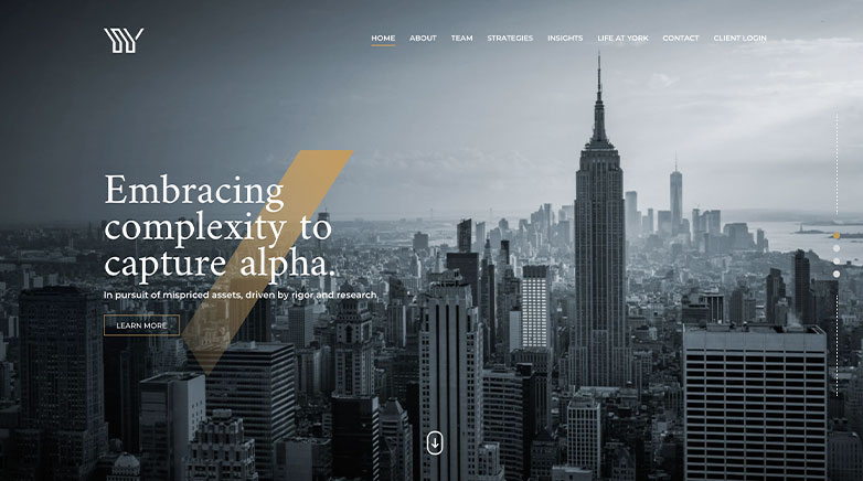
Hedge Fund Websites – 10 Must-See Examples
There are a multitude of ways to connect with prospective clients with one of the most important being your website.
Your website works 24/7, 365 days of the year to continually produce new sales for your firm. Whether you need to promote your services, all of for existing customers to login, or want to showcase your latest work, your website is a great place to start.
Why Do You Need to Update Your Hedge Fund Website Design?
The are many reasons why hedge fund websites are constantly being updated with new designs and functionalities. Hedge funds must be able to adapt to meet their clients where they are – and that starts with their website. As more and more prospective clients go digital, so too must your Hedge Fund.
Ahead, we’ll review 10 of the best of hedge fund websites to see what makes them stand out amongst the competition.
1. Sphera

Sphera’s website simple yet intriguing. They keep the design simple by just sticking to the use of blue tones and whitespace throughout the site. However, they take it out of the box by making their website more interactive with responsive animation and hover effects.
2. Empyrean

Empyrean’s has one of the most elegant and professional hedge fund websites. Most of the photography is kept black and white which helps the information stand out better. The lead into the website is also strong with content that helps set the tone for who Empyrean is as a company.
Related articles:
3. Long Ridge

Long Ridge’s website feels organic and breaks the more traditional style of web design. With overlapping elements, simple animations and strong calls to action, their website represents their company in a strong and sophisticated manner.
4. Bridgewater

Bridgewater’s website is all about keeping you informed. Right off the bat, they share with you their insights that helps paint a more personal picture of their company. The design is kept simple to help you focus on the content better.
Elevate Your Luxury Brand Today
Schedule Your Free Consultation
Seeking to elevate your luxury business? Let Mediaboom guide you. Secure your exclusive, free consultation with our luxury marketing experts today.
5. BNY Mellon
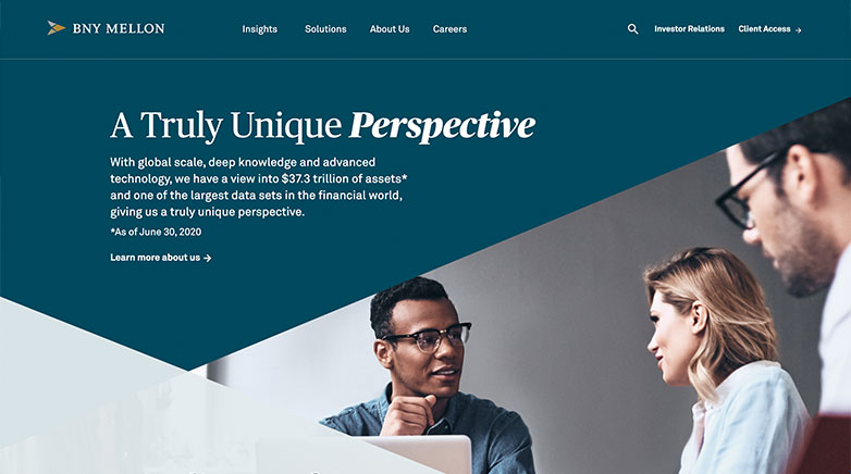
BNY Melon’s website is bold and strong with their use of contrasting colors, valuable statistics and informative content that is kept brief to entice the visitor to learn more. They utilize their homepage to help portray who they are through shared insights, their solutions and their global impact.
Related articles:
- Private Equity Marketing
- SEO for Private Equity Firms
- Financial Services Website Design
- Venture Capital Website Design
6. Two Sigma
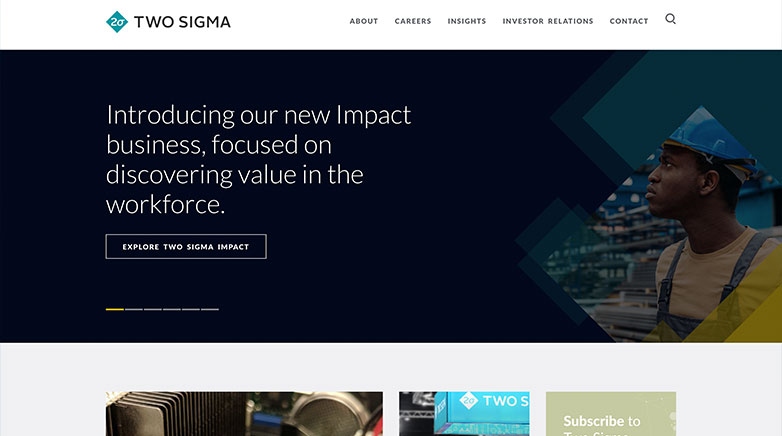
Two Sigma’s website is easy to navigate with a simple navigation and quick links on the homepage to help you get to where you need to go.
7. MLP
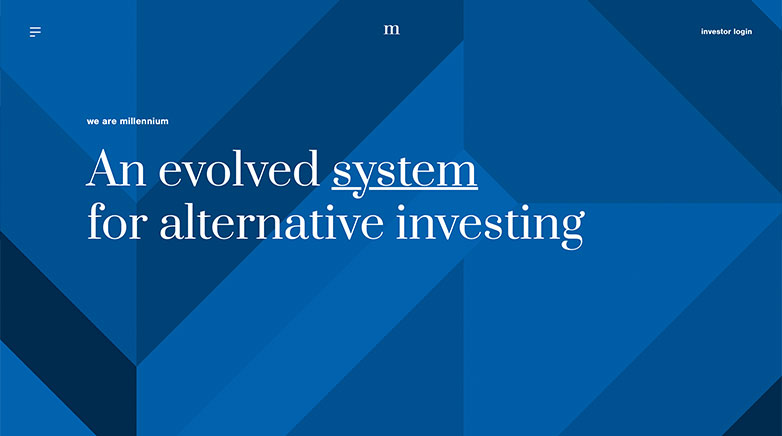
MLP’s hedge fund website skips the use of photography and puts their focus on using uncomplicated graphic elements and strong typography. MLP sticks to the important information by detailing their success with strong statistics, snapshotting their investment approach and showcasing their company environment.
8. Black Rock

Black Rock’s website feels bold and modern with their use of whitespace and strong color palette. This bold color scheme helps call out and accent important information. Another nice touch is their addition of search bar in the navigation and filter on their homepage that helps get you straight where you need to go.
Related articles:
- Digital Marketing For Venture Capital
- Venture Capital Branding
- Digital Marketing for Financial Services
- Financial Services Inbound Marketing
9. Citadel

Citadel use of a video on their welcome screen helps add depth to their website and creates an immersive environment. With strong headlines and calls to actions, Citadel entices to the visitor to dive deeper in their site to learn more.
10. York

York’s hedge fund website feels clean and sophisticated with their neutral color palette and strong use of whitespace. The information is kept clean in a well organized grid format. Another strong element is their use of a mobile style menu as you scroll down the page. The navigation opens up in a full screen menu that is easy to follow and the hamburger icon switches to match their logo, a fun touch that keeps their website unique and personal.
Elevate Your Luxury Brand Today
Schedule Your Free Consultation
Seeking to elevate your luxury business? Let Mediaboom guide you. Secure your exclusive, free consultation with our luxury marketing experts today.
Where to Get Started With Your Hedge Fund Website Design
As you can see in all the websites that were reviewed in this article, there are plenty of design considerations and functionalities to think about when designing your website.
In order to stand out amongst the competition and to connect with prospective clients, your hedge fund must look to embrace these.
Contact now Mediaboom and talk with us about your project!
READY TO IGNITE YOUR MARKETING STRATEGY?


