

Financial Services Website Design – 50 Examples to Emulate

By: Frank DePino | July 12, 2024
Loading the Elevenlabs Text to Speech AudioNative Player...
In the financial services industry, helping people with credit cards, maintaining their finances, and making smart financial decisions is essential, and insights from a hotel marketing agency can inspire financial brands to enhance how they communicate these benefits online.
Crafting a website that effectively communicates these services can seem daunting, but with the right design approach informed by a hotel marketing agency’s perspective, it becomes a clear path to engagement and conversions.
Explore what constitutes exceptional financial services website design with 50 cutting-edge examples and discover how a hotel marketing agency blends design and strategy to inspire superior digital experiences. Whether your brand is professional or friendly, you’ll find the inspiration and ideas you need ahead.
Is Your Hotel Showing Up in ChatGPT?
Travelers are increasingly using AI tools to research destinations before they ever reach a booking site. See how your hotel appears in these AI-generated answers, where competitors or OTAs may be gaining visibility, and whether there are opportunities to strengthen your presence.
1. Morgan Stanley

Clear, clean design so you can get to what you need faster
Morgan Stanley is one of the most premier financial institutions in the country. Founded in 1935, this investment bank headquartered in New York City has such an illustrious legacy that the company doesn’t feel inclined to pull out a lot of bells and whistles with its web design. Let’s explore further.
Clean User Experience
Morgan Stanley’s homepage skips the background colors, leaving theirs a pristine white. Their site also goes light on the graphics, adding them when it emphasizes the point of the content or adds human elements to finances.
Simple Navigation for Getting Where You Want to Go
On Morgan Stanley’s website, you can navigate to a page for all their services, including investment management, research, sales and trading, capital markets, investment banking, and wealth management.
All those menus might seem difficult to neaten, but they’re anything but messy.
In the “What We Do” dropdown, Morgan Stanley lists each of its services in a sub-dropdown. You can then hover over any sub-menu and read more in a text box to the right before you click.
Convenient Client Logins
To the top right of any page on Morgan Stanley’s website, you’ll find the client logins. These include logins for Matrix, the Research Portal, StockPlan Connect, and Morgan Stanley Online. Choose any login from the dropdown and then sign right in.
2. Adison Partners
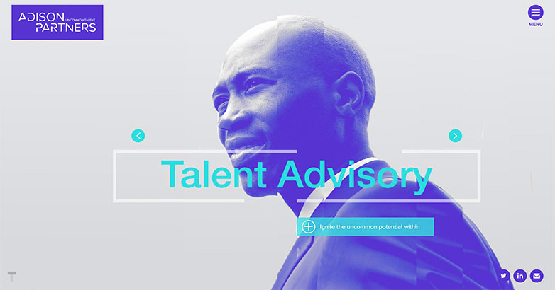
Colorful, modern graphics and animations
Next is Adison Partners, which describes themselves as a “boutique talent management consulting firm” that favors “uncommon talent.” With their left-field approach, you’d expect a financial services website design that’s equally as attention-grabbing, and Adison Partners doesn’t disappoint.
Cohesive Color Scheme
It takes seconds upon landing on Adison Partners’ website to discover their color scheme: bright, rich purple and teal blue. Most of their graphics and backgrounds display in purple with teal text.
Such a vivid combination of colors is sure to lure in even the most curious site visitor and encourage them to stick around.
Smooth Animated Elements
Adding further to the beauty of its web design is Adison Partners’ use of animated elements. On the homepage, the images of people (in the trademark purple), shift and cut out.
As you click from menu to menu on the website, you’ll see the same effect play out here.
Great Mobile Responsiveness
All the mobile elements on Adison Partners’ website load clean, neat, and quick.
Nothing looks squished or out of place, which makes browsing their website on mobile as much of a delight as doing it on a desktop computer.
3. Goldman Sachs
Hundreds of years of history, none of the clutter
Another major financial corporation with a great website that we want to talk about is Goldman Sachs. Since 1869, Goldman Sachs has been a trusted financial services company in areas like investment banking, securities underwriting, prime brokerage, asset management, securities, and investment management.
Here’s a closer look at their website and what makes it tick.
Unobstructed Navigation
Like Morgan Stanley earlier, Goldman Sachs has a lot of history and even more services. Their menu placement is on the left side of the website rather than the right, with three lines denoting the dropdown menu.
As you click the dropdown, you’re greeted to a series of categories: Our Firm, What We Do, Insights, Citizenship, Careers, Investor Relations, and Media Relations. This is also where you’ll find Goldman Sachs’ client logins.
Each menu has sub-dropdowns you can explore by clicking the menu once. The black text against the white background color of the menu keeps this crucial part of the website pristine and easy to use.
Mobile Previewing
Here’s a unique feature on Goldman Sachs’ website that you might want to consider adding to your own. Rather than make you go on your smartphone or tablet to type in the web address and preview the mobile site that way, Goldman Sachs has a mobile preview feature right on their desktop site.
4. KeyBank

Effective yet simple branding
As a KeyCorp subsidiary, KeyBank is a Cleveland, Ohio-based financial institution and regional bank. It’s in the top 20 banks in the country, so their website is certainly worth looking into. Here are the elements we thought most stood out.
Branding Throughout
KeyBank has a simple yet effective logo: a key. That key appears on their homepage and every subpage, including What Is Financial Wellness? and Banking 101.
Also adding brand cohesion is the red, gray, and white color scheme that’s recurring throughout.
Handy Search Feature
If you’d rather skip the menus and navigation, right at the top of any of the pages on KeyBank’s website is a search bar. It says “I am looking for…” as a default, but as soon as you start typing, that text is erased.
You can even filter your search results so you get the tailored content you’re looking for.
5. Runway Growth Capital

Modern design with clear Calls-To-Action
Runway Growth Capital is a leading venture debt provider that has done a great job showcasing who they are, what work they’ve done, and how they can help you. There are multiple items of their financial services website design that work well including the use of social proof, success stories, strong calls-to-action, and more.
Ideal CTA Placement
Runway’s website immediately grabs the user’s attention with a prominent “Let’s Connect” call-to-action placed right in the middle of the homepage. Along with this CTA, Runway provides alternate ways to convert on their website such as downloading a fact sheet, signing up for their newsletter and contacting their team members directly.
Color Scheme
The implementation of neon green in a subtle manner provides a great accent color – highlighting important information throughout the website. Runway Growth has a very well established brand which makes the entire website feel connected.
Interactive Elements
Runway engages the user with interactive elements on the site.
Upon arriving a background video and animated image capture the user’s attention. Small elements throughout the site such as simple fade-in effects and motion effects on hover help bring life to this website.
6. NerdWallet

Banking web design made easy
Although it’s a far newer institution that began in 2009, NerdWallet has made a tremendous name for itself in the years since. NerdWallet’s tone is a little different than the other financial services we’ve discussed so far. Let’s take a deeper dive into their site now.
Friendly Tone
The staff at NerdWallet want to make managing your finances less of a hassle. They uncomplicate what can be an otherwise difficult matter by keeping their copy simple and friendly. They also categorize their services right on the homepage, letting you choose where you need money help without navigating. The options include savings, personal loans, mortgage, student loans, insurance, investing, and credit cards.
Top-Down, Organized Navigation
With so many services under one company umbrella, NerdWallet’s site could look cluttered if they didn’t streamline their menu. Fortunately, that’s not the case. The site menu is at the top left of the page, with dropdowns for any of the eight categories.
Ideal CTA Placement
NerdWallet’s homepage has a handful of CTAs you can learn a thing or two from. The first CTA is for the app. In one section on the homepage, NerdWallet explains the app and then has a green CTA button that says “Get started.”
Further down on the page, if you’re looking to sign up for a credit card through NerdWallet, you can choose your credit score via a dropdown and then select the financial factors you care most about in a second dropdown. These include zero-percent, low interest, travel, rewards, building credit, and cash back. You have to click the “Find cards” CTA button (also green) to proceed.
Elevate Your Hospitality Brand Today
Schedule Your Free Consultation
Seeking to elevate your business? Let Mediaboom guide you. Secure your exclusive, free consultation with our digital marketing experts today.
7. Brightwood Capital Advisors
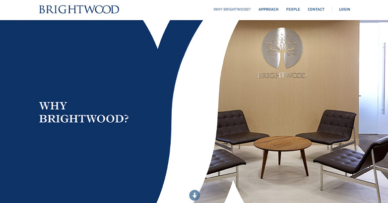
Scrolling navigation + traveling graphics = an enjoyable user experience
Brightwood Capital Advisors is a New York-based financial advisory firm that also has offices in Dallas, Philadelphia, Minneapolis, Beverly Hills, and Chicago. From the very first second you click onto their website, Brightwood grabs you. Let’s discuss why.
Oversized, Traveling Graphics
Brightwood’s website greets you with its tree logo in white on a blue background. The double Os in the word Brightwood then expand, leading you to the homepage.
That graphical trick isn’t the only one up Brightwood’s figurative sleeve. Those double Os, which make an infinity sign, pop up again as you scroll. The graphics seem to travel with you as you explore the website, which is certainly one way to make an impact.
Scrolling Navigation
Brightwood Capital Advisors lets you scroll through everything on their website from top to bottom, touching on each of the site’s menus as you do.
This is a time-saving approach that might appeal to your customer base. Rather than clicking through a myriad of menus, they can just keep scrolling until they find what they need.
Easily Accessible Menus and Logins
Of course, you want to give your audience options. That’s why Brightwood’s website retains its menu across the top of the page no matter how much or little scrolling you do. Their login link remains as well, letting you conveniently click to it anytime to log in.
8. Pearl Capital
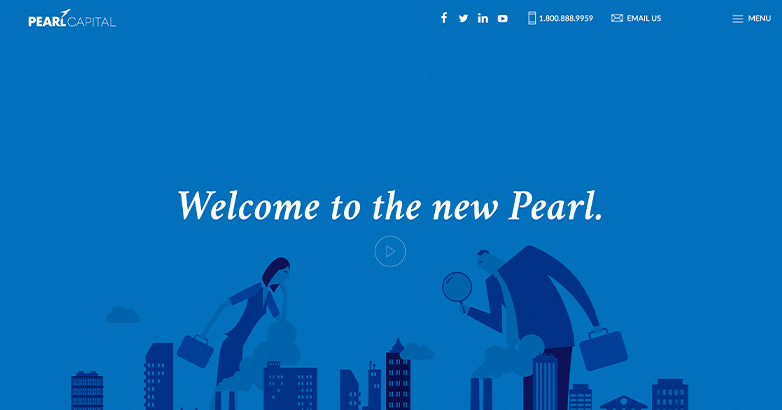
Cartoon graphics in a professional atmosphere
Since 2010, New Jersey’s Pearl Graphics has offered fintech financial guidance. Their website is one of the more graphically pleasing ones, so if you’d like to take a more artistic approach to your own financial services website design, you might use Pearl Capital as an inspiration.
Fun, Cartoony Graphics Throughout
Pearl Capital punches up its copy throughout its site with graphics. On the homepage is a cartoon of a businessman and businesswoman overlooking a city. The man is holding a magnifying glass since the people are Godzilla-sized. The same graphic appears in full size on Pearl Capital’s about page.
Further down on the homepage, Pearl Capital has an animated graphic of a Superman-like hero, then illustrative graphics explaining its white label solutions and syndication programs. The art, although not super serious, doesn’t take away from Pearl Capital’s messaging in the least.
Easily Accessible Contact Info
If you want to reach out to Pearl Capital to do business with them, this financial institution doesn’t make it hard at all. Even as you navigate from page to page, you can always click Pearl Capital’s social links (including YouTube, LinkedIn, Twitter, and Facebook) or a link to their email. Sandwiched between those links, you’ll find Pearl Capital’s phone number so you can dial them up quickly.
Related articles:
- Digital Marketing for Financial Services
- Marketing Investment Funds
- Digital Marketing For Venture Capital
9. Pangea Money Transfer
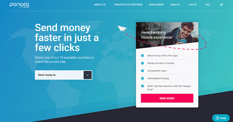
A humanized approach inspires trust
Pangea Money Transfer is a service akin to PayPal, which many people already know and love. Competing with such a big name as PayPal is far from easy, but Pangea holds its own more than well.
Here are some noteworthy elements from their website.
Graphics Promote Trust
Throughout Pangea’s website, you’ll find images of close-knit families and smiling people. Graphics like these inspire trust through the human element.
Smart CTA Placement
Pangea works hard to convert its site visitors into app users. Above the fold on the homepage is a neon pink CTA button that says “Send money”. This button is placed after a benefits list of using Pangea’s service.
That CTA is present for a second time midway down the page. Also, as you begin scrolling through Pangea’s website, their menu CTA that reads “Send money” becomes pink, inviting you to click it.
10. BNY Mellon
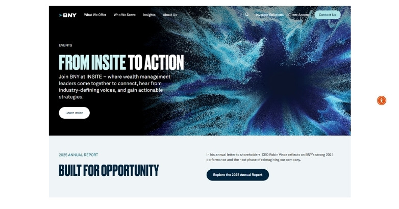
Upscale use of graphics
BNY Mellon brings a polished, global feel to financial services through a website that feels modern and refined. Today, BNY Mellon is a major banking services holding company with deep roots and broad expertise.
Their colorful website breathes some life into financial services. Let’s take a look.
Eye-Catching Graphics
From the angular images on the homepage with swatches of vertical lines to the images of cityscapes, office meetings, and real employees throughout the rest of the site, the graphic placement on BNY Mellon’s site is impressive. Against a white background, the graphics grab but don’t pull your attention away from the copy or navigation.
Rich Client Login Menu
Specializing in wealth management, investment management, and investment services, BNY Mellon has many, many services. Rather than dedicate a dropdown to client logins, they have a whole page. This is quite fitting.
Here, you can find the login you’re looking for in categories like wealth management, treasury services, NEXEN services, liquidity services, foreign exchange, depositary receipts, corporate trust, capital markets, asset servicing, and alternative investments.
11. Stripe
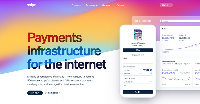
Colors and modernity suited to its audience
The last financial services website design example we want to talk about is Stripe’s. This San Francisco-based company was founded in 2009 and offers online payment processing for both large and small businesses.
Color Everywhere
Logging upon Stripe’s website is like looking at a rainbow. The colors shift and move like in a lava lamp, making for a homepage that certainly knows how to get a point across.
Case Studies for Conversions
One way to get a potential customer off the fence is with case studies. At the bottom of Stripe’s homepage is a use cases section that encompasses enterprises, marketplaces, platforms, and SaaS. You can read a few case studies in any of these industries to see how Stripe could work for you as a customer.
Stripe also has a page where it proudly lists its current customers, including some bigger names, to further inspire user confidence.
12. BlackRock

When you visit BlackRock’s financial services website, it instantly grabs your attention with its sophisticated and clear design.
As soon as you land on the homepage, you’re greeted by a bold and engaging message, complemented by a high-quality image of Larry Fink set against a vibrant, abstract background. This personal touch keeps things professional yet approachable.
Clear, concise menu options guide users to essential sections like “About Us” and “Investor Relations.”
Additionally, the strategic use of white space ensures a clean look, enhancing readability and user experience. BlackRock’s approach masterfully balances corporate professionalism with visual appeal, making it both inviting and informative.
13. Vanguard

Vanguard’s website doesn’t just present information; it makes you feel like more than just a customer.
The bold red color grabs your attention right away, highlighting their message: “At Vanguard, you’re more than just an investor, you’re an owner.” This creates a sense of connection.
Additionally, a friendly picture of a smiling family adds a personal touch.
Furthermore, finding what you need is easy, with navigation designed for different user types, like personal investors and retirement plan participants.
Vanguard’s website seamlessly combines clear visuals with user-friendly features, making it both informative and engaging.
14. T. Rowe Price

T. Rowe Price’s financial services website design takes a unique approach, standing out with its dynamic and engaging visuals.
For instance, the homepage prominently showcases a vibrant partnership with the Baltimore Orioles. This injects a sense of community spirit.
The homepage features bold, contrasting colors against a sleek, dark background that highlights the main content area. In addition, high-resolution images of athletes further convey a sense of energy and teamwork, while clean, sans-serif typography ensures readability.
Overall, T. Rowe Price effectively achieves this balance by combining a professional financial narrative with a lively, community-focused appeal.
15. Fidelity Investments

Fidelity Investments’ website prioritizes a clean and user-friendly experience, emphasizing both simplicity and accessibility.
Right from the start, the homepage features a welcoming image of a smiling family, instantly fostering trust and relatability. Continuing this theme, the consistent use of green and white throughout conveys a fresh, professional look.
Clear calls to action like “Open an account” and “Start here” guide users effortlessly through their financial journey. In addition, the neatly organized navigation menu provides quick access to essential services like accounts, planning advice, and market research.
By combining these elements, Fidelity Investments’ website beautifully combines warmth and efficiency, making financial planning approachable and straightforward
Is Your Hotel Showing Up in ChatGPT?
Travelers are increasingly using AI tools to research destinations before they ever reach a booking site. See how your hotel appears in these AI-generated answers, where competitors or OTAs may be gaining visibility, and whether there are opportunities to strengthen your presence.
16. Prudential Financial

Prudential Financial’s website takes a direct and impactful approach. The homepage grabs attention with a bold headline, “You’re About to Retire. Now What?” This question immediately addresses the audience’s primary concern.
However, the design also conveys a sense of trust and reassurance. The calming blue background is paired with a welcoming image of a smiling retiree. Furthermore, clear, concise calls to action like “Learn more” facilitate easy navigation.
Adding to the user-friendliness, the efficiently organized navigation bar provides quick access to insurance, investments, and retirement tools. This site seamlessly blends informative content with a supportive, approachable feel, enhancing user experience.
17. AXA

AXA’s financial services website is all about elegance and forward-thinking innovation. When you land on the homepage, you’re greeted by a stunning aerial image that sets the tone for global reach and sustainability.
Right off the bat, you’ll notice a headline highlighting AXA’s collaboration with the Solar Impulse Foundation, showcasing their commitment to sustainability. The clean, minimalist layout, with plenty of white space, makes everything easy to read and navigate.
Overall, the strategic use of visuals and text tells a compelling story of AXA’s mission and values, making the site both informative and engaging.
18. Allianz

Allianz’s financial services website is modern and impactful.
Right away, a bold, high-resolution image of a sports figure symbolizes strength and reliability, grabbing your attention. Moreover, the dark background makes the vibrant orange jersey pop, drawing your focus instantly.
Furthermore, a clean, minimalist navigation bar provides easy access to key areas like “About us,” “Investor Relations,” and “Sustainability.”
In summary, this site perfectly conveys Allianz’s commitment to excellence and innovation, creating a visually compelling and user-friendly platform that truly resonates with visitors.
Related articles:
- Financial Services Inbound Marketing
- Hedge Fund Websites
- Bank Website Design
19. AIG (American International Group)
AIG’s website is sleek and professional, using a cohesive blue color scheme that exudes trust and stability.
The homepage prominently showcases the latest company achievements with clear, bold headlines like “AIG Reports Strong First Quarter 2024 Results.” High-quality imagery of executives adds a personal touch, reinforcing the company’s leadership and credibility.
The efficiently organized navigation bar offers direct links to key sections such as “Risk Solutions,” “Claims,” and “Investor Relations.”
This clean, minimalist site ensures visitors can quickly access important information, reflecting AIG’s commitment to transparency and excellence.
20. Nationwide

Nationwide’s financial services website puts members first, making this clear with the bold headline, “Members first,” highlighted in contrasting colors.
The deep blue background gives a sense of reliability and security, while the clean white text ensures everything is easy to read.
The navigation bar is straightforward, offering quick access to various financial products and services. Plus, the call to action, “More about membership,” is prominently placed to encourage user engagement.
Overall, this site expertly combines clarity and accessibility, reinforcing Nationwide’s commitment to prioritizing its members’ needs and enhancing their experience.
21. Transamerica

Transamerica’s website offers a welcoming and informative experience, centered on holistic financial well-being.
The homepage showcases a heartwarming image of a couple enjoying life, accompanied by the inspiring headline, “Live Your Best Life.” The design features a clean white background with blue accents, providing a fresh and professional appearance.
The site is easy to navigate, with quick links to key services like retirement, investments, and insurance. Prominent calls to action, such as “See Why We’re Here,” invite users to learn more about the company’s offerings.
By blending emotional appeal with intuitive functionality, this site ensures a positive and engaging user journey.
22. New York Life

Deeply heartfelt and user-friendly, New York Life’s website encapsulates the company’s caring mission.
The homepage features a touching image of a mother hugging her child, reinforcing the message, “More than a policy. An act of love.”
A clean white background with subtle blue accents ensures a serene and professional look. Navigation is straightforward, with clear sections like “What we offer,” “How we help,” and “Who we are,” allowing users to find information effortlessly.
The prominent “Get Started” button encourages immediate engagement. This site balances emotional resonance with functional clarity, making it both moving and practical.
23. Northwestern Mutual

Vibrant and inviting, Northwestern Mutual’s financial services website immediately draws visitors in with a joyful image of a parent and child playing on the beach.
The message, “Welcome to a Better Way to Money,” paired with a clear call to action, “Get started,” sets a positive, forward-looking tone. In addition, using blue and yellow throughout conveys trust and optimism.
Navigation is intuitively organized, providing easy access to crucial services like financial planning, insurance, and investments.
Overall, this site successfully blends engaging visuals with user-friendly functionality, creating an approachable and trustworthy digital presence that resonates with users.
24. MetLife

MetLife’s financial services website is both professional and welcoming.
An image of a diverse team in lively discussion emphasizes the company’s commitment to inclusivity and collaboration. The clean, white background with subtle blue and green accents creates a modern look.
Navigation is straightforward, offering easy access to key areas like solutions, support, and resources. Highlighting their recognition in Fortune’s “100 Best Companies to Work For” adds credibility.
This site effectively combines a professional aesthetic with an approachable, human touch, enhancing user experience and building trust.
25. Liberty Mutual

Liberty Mutual’s website stands out with its clean and straightforward approach, emphasizing convenience and savings.
The homepage features the tagline, “Only pay for what you need,” highlighting the company’s value proposition. Plus, a white background with yellow accents creates a bright, welcoming atmosphere aligned with the brand’s identity.
Additionally, simple navigation offers clear links to shop insurance, file claims, and access customer support. Furthermore, interactive icons for auto, home, condo, and renters insurance make finding products easy.
Finally, the intuitive layout and straightforward call to action ensure a seamless, user-friendly experience.
26. Travelers Insurance

Travelers Insurance’s website effectively showcases the brand’s dedication to protection and reliability.
The homepage features diverse images, from tender family moments to professionals in action, symbolizing their wide range of services.
A clean white background with red accents aligns with the brand’s identity. Navigation is well-organized, offering quick access to individual and business insurance, claims, and preventive resources.
Overall, this site balances emotional appeal with functional efficiency, ensuring a user-friendly and trustworthy experience.
Is Your Hotel Showing Up in ChatGPT?
Travelers are increasingly using AI tools to research destinations before they ever reach a booking site. See how your hotel appears in these AI-generated answers, where competitors or OTAs may be gaining visibility, and whether there are opportunities to strengthen your presence.
27. John Hancock

John Hancock’s financial services website blends heartwarming visuals with a functional layout, showcasing the brand’s dedication to enhancing life quality.
The homepage features a touching image of a grandfather dancing with his granddaughter, paired with the tagline “Longer. Healthier. Better.”
Moreover, this combination creates a strong emotional connection with visitors. Additionally, a clean white background with soft, contrasting colors ensures clarity and focus. Furthermore, prominent calls to action, such as “Get started today,” guide users effectively.
This layout balances warmth and usability, making financial planning approachable and engaging.
28. Betterment
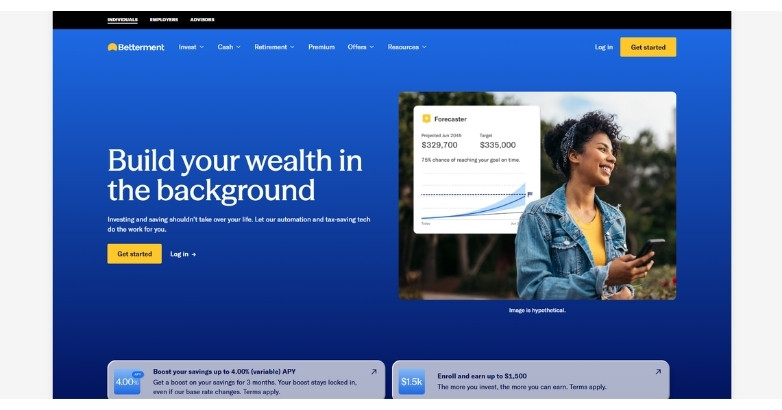
Betterment’s financial services website design focuses on simplicity, clarity, and user engagement.
The homepage communicates its value within seconds, explaining how users can grow wealth through automated investing tools.
A minimalist layout, paired with bold typography and strategic whitespace, keeps the experience focused and easy to navigate.
Interactive elements and guided flows help users explore services like retirement planning, investing, and cash management without feeling overwhelmed.
Clear calls to action like “Get Started” and “Start Investing” move users toward conversion with ease.
This website is a strong example of how financial brands can use clean design and intuitive UX to make complex financial concepts approachable and actionable.
Related articles:
- Financial Services Marketing Agency
- Private Equity Website Design
- Venture Capital Website Design
29. Raymond James Financial

Raymond James’ financial services website exudes sophistication and strategic thinking, reflecting its status as a leader in financial services.
The serene image of a couple admiring their modern home on the homepage sets a tone of aspiration and success. Key messages like “Consider uncommon sources of risk as wealth grows” and “Think beyond traditional asset classes” encourage thoughtful engagement.
The clean, minimalist navigation bar offers easy access to wealth management, corporate services, insights, and advisor opportunities.
This site masterfully combines elegant visuals with strategic messaging, creating a refined and intuitive user experience.
30. Edward Jones

Edward Jones’ financial services website is inviting and insightful, emphasizing a personal touch.
The homepage features a warm image of a family, with the message, “The key to being rich is knowing what counts.” Additionally, the call to action, “Find your match,” highlights personalized service. The clean, white background with bold yellow accents draws attention to key elements.
Moreover, straightforward navigation offers easy access to sections like investment services, market news, and insights.
This site effectively balances emotional appeal with practical information, creating a user-friendly and engaging experience.
31. SoFi
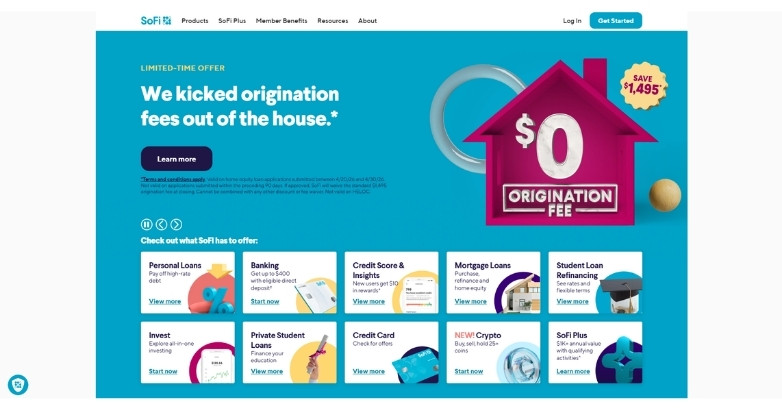
SoFi’s financial services website design stands out with a clean, modern interface built for clarity and engagement.
The homepage uses bold headlines and simple messaging to explain complex financial products in seconds. This makes it easy for users to understand offerings like loans, investing, and banking tools.
Bright visuals and a consistent color palette create a friendly, approachable feel that appeals to younger audiences and digital-first users.
Navigation is streamlined, guiding visitors to key services without confusion. Clear calls to action like “Get Started” and “Check Your Rate” drive conversions.
This website is a strong example of how financial brands can combine simplicity, strong UX, and conversion-focused design to connect with today’s users.
32. Principal Financial Group

Principal Financial Group’s website is all about guidance and support.
The homepage shows a relatable couple managing their finances, under the headline, “Your path through market swings,” instantly connecting with visitors. The soft blue tones create a calming atmosphere.
In addition, clear navigation takes users to key sections like investing, insurance, and retirement.
This site blends relatable visuals with straightforward information, boosting user confidence and engagement.
33. Pacific Life

Pacific Life’s financial services website design exemplifies an inviting and vibrant approach, featuring a full-width hero image that immediately captures attention.
Bright, high-quality visuals of happy families and scenic backgrounds convey a sense of joy and security.
The clean, white background enhances readability, while strategic blue accents align with the brand’s identity, evoking trust and professionalism.
Simple, intuitive navigation menus and clear call-to-action buttons, such as “Login” and “More,” ensure a user-friendly experience, guiding visitors seamlessly through their financial journey.
34. Manulife Financial

Manulife Financial’s financial services website is both modern and engaging, utilizing a warm, welcoming color palette.
The homepage features a dynamic hero section with impactful imagery and concise, compelling messages. The left-hand vertical navigation bar simplifies user access to various sections such as insurance, investments, and support.
Prominent call-to-action buttons like “Read our report” and “Learn more” guide visitors effectively.
The layout is spacious and organized, enhancing the user experience by presenting essential information in an easily digestible format, all while maintaining a professional yet approachable feel.
35. Sun Life Financial

Sun Life Financial’s website is designed for ease and professionalism.
The homepage features a hero image with a touching personal story, using muted colors that convey trust and warmth. Key sections are easily accessible via the top navigation bar, with prominent and inviting call-to-action buttons like “Watch now.”
The layout balances informative content with plenty of white space, making navigation effortless.
Overall, the user-friendly design reinforces Sun Life’s commitment to client-centered service.
36. Zurich Insurance Group

Zurich Insurance Group’s website captures attention with a sleek, minimalist design.
The homepage showcases a striking hummingbird image, symbolizing agility and focus. The muted colors and ample white space create a calm, professional vibe.
Navigation is streamlined via a top menu bar, offering quick access to key sections. Intuitive call-to-action buttons highlight essential tools and services, ensuring a smooth user experience.
Zurich’s site clearly communicates their global presence and dedication to tailored insurance solutions.
Related Articles.
- SEO for Venture Capital
- Private Equity Firm Lead Generation
- Paid Advertising for Private Equity Firms
- Bank Marketing
37. Chubb Limited

Chubb Limited’s financial services website design is a harmonious blend of sophistication and functionality, using bold colors and clean typography to engage visitors.
The homepage features a striking yellow banner with a strong call-to-action that immediately draws attention.
Navigation is straightforward, with sections dedicated to Businesses, Individuals & Families, and Agents & Brokers, ensuring a seamless user experience.
In sum, the design combines elegance with practicality, offering a polished and professional user experience.
WHAT OUR CLIENTS SAY
38. Swiss Re

Swiss Re’s website stands out with its clear and in-depth approach.
The homepage features a dramatic aerial image, setting a serious tone for the “SONAR 2024” report on emerging risks. Additionally, the minimalist yet comprehensive navigation offers quick access to Risk Knowledge, Sustainability, and Corporate Solutions.
Furthermore, the site blends a professional look with user-friendly elements, making the visitor experience both informative and engaging.
Overall, Swiss Re’s design showcases their expertise and reliability through impactful visuals and structured content.
39. Marsh & McLennan Companies

Marsh & McLennan Companies’ website combines sleek aesthetics with strong functionality. The homepage impresses with a gradient backdrop in rich blues and purples, creating a professional yet inviting vibe.
Additionally, a bold headline for the “Global Risks Report 2024” grabs attention instantly. A clear call-to-action button invites visitors to explore the report. The top navigation bar is well-organized, making it easy to access Insights, Solutions, and Investors sections.
Ultimately, this design effectively blends visual appeal with user-friendly navigation, highlighting Marsh & McLennan’s expertise.
40. Willis Towers Watson

Willis Towers Watson’s website showcases a blend of modern sophistication and dynamic visuals.
The homepage captures attention with a high-impact rocket engine image, symbolizing power and innovation. Additionally, the vibrant WTW logo, with its gradient hues, stands out against a crisp white background.
Moreover, bold typography emphasizes key messages like “Managing risk demands flexibility and dynamism,” accompanied by a prominent call-to-action button.
Ultimately, this site harmoniously blends bold visuals with streamlined functionality, reflecting the company’s forward-thinking ethos.
41. Aon

Aon’s website design embraces minimalism with bold impact, featuring a powerful, straightforward message: “Aon is in the Business of Better Decisions.”
The design leverages a dark background to make the white, large-font text stand out, ensuring immediate attention.
A vibrant red call-to-action button contrasts sharply, encouraging engagement.
On the right, a split screen guides users to explore capabilities, insights, and Aon’s story, enhancing navigational clarity.
The clean, modern layout reflects Aon’s commitment to providing clear, actionable solutions in a complex industry, merging aesthetics with functionality seamlessly.
42. Franklin Templeton Investments

Franklin Templeton Investments’ website greets users with a striking blue banner, instantly drawing attention.
Notably, the site segments visitors into Individual Investor, Financial Professional, and Institutional Investor categories, each neatly boxed with descriptions. This user-centric approach ensures easy navigation.
Additionally, the minimalist design, bold typography, and ample white space create an intuitive experience.
The clean, modern layout underscores Franklin Templeton’s dedication to providing straightforward, tailored financial solutions, making the site both accessible and user-friendly.
43. Invesco

Invesco’s website immediately grabs attention with its bold blue header, showcasing the latest assets under management announcement.
The use of vibrant blue not only commands attention but also conveys a sense of trust and stability.
The page is well-structured, featuring clear navigation links to important sections like About Us, News and Insights, Investor Relations, and Careers.
The image of a focused professional adds a human touch, reinforcing Invesco’s commitment to its clients.
Overall, the layout balances informative content with visual appeal, making the site both functional and engaging.
44. Janus Henderson Investors

Janus Henderson Investors’ website design effectively conveys a sense of collaboration and optimism with its bold header stating “Investing in a Brighter Future Together.”
The background image of people moving forward, bathed in warm sunlight, adds a dynamic and positive vibe.
The navigation bar at the bottom is clearly segmented for different types of investors—Financial Professionals, Individual Investors, and Institutional Investors—making it easy for visitors to find their relevant section.
The use of modern typography and a balanced color scheme enhances readability and user engagement, making the site both inviting and professional.
45. Oaktree Capital Management

Oaktree Capital Management’s website impresses with natural imagery and a clear mission.
A lush green tree backdrop symbolizes growth and stability, while bold typography highlights their commitment to superior investment results and integrity.
In addition, the streamlined navigation menu provides quick access to “About,” “Strategies,” and “Insights.” A prominent “Learn More” button encourages deeper engagement.
Altogether, this design is both visually appealing and functionally efficient, ensuring a seamless user experience.
46. KKR & Co.

KKR & Co.’s website is an engaging blend of modern aesthetics and motivational messaging.
The homepage features a striking yellow abstract shape against a white background, drawing attention to the bold question, “What will we accomplish, together?”
This prompts visitor engagement and collaboration.
Complemented by a prominent blue circular button inviting users to “View Our Story,” the clean, minimalist layout adds an interactive element.
Simple yet dynamic, the site focuses on fostering a sense of partnership and forward-thinking innovation, making it both visually appealing and functional.
47. The Carlyle Group

The Carlyle Group’s financial services website exudes sophistication and clarity, featuring a deep blue background that conveys stability and trust.
The central message, emphasizing their commitment to creating long-term value, is prominently displayed in a large, elegant font.
Minimalist navigation on the left side allows for easy access to essential sections such as “Our Firm,” “Our Approach,” and “Our Insights,” ensuring a seamless user experience.
Clean and professional, the site reflects Carlyle’s stature as a global investment firm dedicated to its investors, communities, and stakeholders.
This design effectively combines elegance with practicality, enhancing overall user engagement.
48. Blackstone Group

Blackstone Group’s website showcases modern minimalism with a stark black background, exuding elegance and authority.
The homepage features bold, white typography and succinct messaging that highlight their future-focused business approach. Plus, high-quality executive visuals add a personal touch, while the streamlined top navigation bar offers easy access to key sections like “The Firm,” “What We Do,” and “Our Impact.”
This sleek design effectively conveys Blackstone’s dedication to excellence and innovation in the financial sector.
49. Ameriprise Financial

Ameriprise Financial’s website features a fresh, modern design with a crisp white background and calming blue accents.
To start, the homepage highlights a call-to-action for personalized financial advice, using engaging typography and friendly vector-based illustrations.
The well-organized layout and top navigation tabs ensure users can easily find information on products, financial goals, and news. Conveniently, the login section is prominently placed for easy access.
In general, this site effectively conveys trust and professionalism while being user-friendly.
50. Jackson National Life

Jackson National Life’s website design exudes warmth and reliability, featuring a soothing beige backdrop with vibrant red accents that command attention.
The homepage highlights key financial products with bold typography, ensuring clarity and focus.
Engaging images of diverse, smiling individuals foster a sense of community and trust.
The navigation is streamlined with dropdown menus, facilitating effortless access to detailed information about annuities and financial planning.
Prominent calls-to-action like “Explore Market Link Pro Suite” guide users seamlessly through their financial journey, enhancing user engagement and satisfaction.
FAQs
What key elements should be included in the design of a financial services website?
Essential elements include clear navigation, strong security features, mobile responsiveness, customer login portals, and detailed service information. Incorporating trust signals like client testimonials, certifications, and industry affiliations can also enhance credibility.
How important is mobile responsiveness for a financial services website?
Mobile responsiveness is crucial as a significant portion of users access financial services on mobile devices. A responsive design ensures the website looks and functions well on all screen sizes, enhancing user experience and engagement.
What security features are essential for a financial services website?
Key security features include SSL certificates for encrypted communication, secure login processes, regular security audits, and compliance with regulations like GDPR or PCI DSS. Implementing two-factor authentication and regular software updates are also vital.
How can a financial services website improve user experience (UX)?
Improving UX involves simplifying navigation, ensuring fast load times, using clear and concise language, and providing easy access to customer support. Offering educational resources, like blogs and FAQs, can help users make informed decisions and increase engagement.
What role does content play in the design of a financial services website?
Content is pivotal in building trust and educating clients. High-quality content, such as informative articles, detailed service descriptions, and interactive tools (like calculators), can help attract and retain clients. Regularly updating the content also helps in maintaining SEO rankings and providing value to users.
Do you have more questions?
If you have more questions or need further assistance with your financial services website design, please feel free to contact us at Mediaboom.
Elevate Your Hospitality Brand Today
Schedule Your Free Consultation
Seeking to elevate your business? Let Mediaboom guide you. Secure your exclusive, free consultation with our digital marketing experts today.
It’s Time to Consider Updating Your Financial Services Website Design
As a financial services company, be that a bank, a money transfer platform, or an investment firm, you want to differentiate your company while maintaining a professional air.
The 50 examples of fantastic financial services web design show that towing this line is quite easy when you apply creative principles similar to those used by a hotel marketing agency to make visual storytelling and user experience work together. You too can create a website that boosts conversions and grows your audience base using these examples as an impetus.
Contact now Mediaboom to create an outstanding financial services website design!
By: Frank DePino
Frank DePino is the Principal and Founder of Mediaboom, a top hotel marketing agency partnering with leading hotel and hospitality brands. With 30+ years of experience, he has led strategic digital initiatives for names including Four Seasons, Ritz-Carlton, JW Marriott, Millennium Partners, and Guardian Jet. Frank helps hospitality businesses strengthen brand presence, drive qualified leads, and elevate guest experiences through website design, SEO, content marketing, and paid media. Under his leadership, Mediaboom is a trusted partner for brands pursuing measurable digital growth in a competitive hospitality landscape.