
Private Equity Website Design – 50 Outstanding Examples

By: Frank DePino | July 2, 2024
Loading the Elevenlabs Text to Speech AudioNative Player...
A private equity firm website is an important stepping stone to continued success, and insights from a hotel marketing agency can help highlight storytelling elements that resonate with high‑value visitors.
A well‑designed website lets the firm tell their story, promote their brand, and generate new business, similar to how a hotel marketing agency leverages messaging and design to elevate visibility and conversions.
If your private equity firm is creating its first website or doing a redesign, the examples we’re about to show you are all great ones to take inspiration from, especially when paired with the strategic guidance of a hotel marketing agency to refine messaging and UX.
They include crucial design elements like portfolios, team pages, investment criteria, and more.
1. Graham Partners
Clean, simple design and smooth scrolling

The first website on our list is for Graham Partners, a private equity firm founded in 1988. They specialize in advanced manufacturing businesses and industrial technology.
Image/Type Treatment
Upon clicking onto the site, you’re greeted with a stunning graphic of a medical professional at work accompanied by Graham’s slogan: “greatness isn’t born. It is built.”
Graham has more of these full-sized, attention-grabbing images on each page on their site, including their approach page, team, portfolio, and about pages. This lends the website a clean cohesion throughout.
Client Login
Should you become a client of Graham Partners, you’ll need to log into their website. Their client login portal is visible on the homepage at the top righthand corner. That makes logging in far less time-consuming.
User Experience
These elements all lend the Graham Partners website a great user experience. This private equity website design is organized in such a way that finding the information you need doesn’t take long.
2. Runway Growth Capital
Vivid colors create a recurring color scheme

Runway Growth Capital has worked with such partners as eSilicon, AllClear ID, Placecast, Drawbridge, and Mobius Imaging, generating $560 million in total loan commitments over time. What is it about their website that works so well?
Conversion Elements
Immediately, Runway seeks to gain your interest (and potentially your business) with a well-placed Let’s Connect button smack-dab in the middle of the homepage. This takes you to their contact page, where you can then send them an email through their website.
Image/Type Treatment
Although we can’t show you in the image above, that cityscape that takes up the majority of Runway Growth Capital’s homepage animates. It goes from showing iconic scenes like the Golden Gate Bridge to an overhead shot of a bustling city street.
Contrasting with the electric green details, this is impactful.
Further down the page, that dark blue and neon green color scheme continues in unison, providing the design basis Runway’s website follows on all its other pages. The slanted image style as seen above recurs as well, although with a solid blue background, not an animated one.
While neon colors can be a risky choice for the main color scheme, Runway Growth Capital shows how it can be done. If the contrasting color is muted enough, you get a website that catches the eye rather than acts as an eyesore.
Navigation
Runway doesn’t implement an endless scroll, but their navigation is still easy.
3. HGGC
Building blocks design style shows the steps to success

At first glance, the HGGC website looks rather understated, especially compared to the other private equity website designs we discussed thus far. Yet with a closer examination, a clear theme emerges: stacked images and text boxes that almost look like building blocks.
Image/Type Treatment
The layout on HGGC’s about page as displayed above is a great example of this, but it’s also evident on their portfolio, team, and even their media and outreach pages. Not only does keeping every element on your website in literal boxes like this lend itself to a cleaner design, but it does look like building blocks.
These “blocks,” so to speak, seem like they’re stacking upwards on most of HGGC’s pages.
This ascent brings to mind a successful climb, just like the kind of success HGGC’s many clients have experienced through working with the firm. Whether intentional or not, it’s an intelligent design choice through and through.
Content Tone
Simple explanations of business and services makes reading through HGGC’s website pleasant.
User Experience
Although HGGC’s website has a more basic style, the focus on the user experience is clear from their homepage to the outreach page and every other page in between.
4. Insight Partners
A white background makes colorful design elements pop

Our next private equity firm website with an exemplary design is Insight Partners.
Conversion Elements
You can quickly connect with Insight Partners in two ways without scrolling. First, there’s their contact page link at the top, and next, the social feed on the homepage. By clicking a recent tweet from Insight Partners or the Twitter logo itself, you’re redirected to their Twitter account.
Should you want to follow them or even seek out their other social media profiles from there, you’re on the right path.
Image/Type Treatment
Like HGGC, Insight Partners organizes its page elements into neat blocks. Yet this time, there’s color-coding in such hues as teal, orange, and red.
Insight’s onsite page is in a similar style, introducing even more colors per themed box. These include darker hues such as purple and navy blue. What makes this Private Equity Website Design work so well is the pristine and simple white background.
A darker background would make those equally dark boxes get lost. Overcomplicating the background with an image or design would also look too busy and cluttered.
Insight Partners is more about letting their company’s lineage speak for itself rather than going too graphics-heavy. And while they do stay colorful throughout their website, it’s not to the point of distraction.
User Experience
The bright blocks we described in the last section are more than just visually appealing. They lend to Insight Partners’ overall website design and user experience, enhancing both. You don’t struggle to find what you’re looking for when everything is so neatly color-coded, labeled, and organized.
5. Artemis Private Equity
Showing their range of clients through visualization

Artemis Private Equity is a firm that works with many clients and industries. While they could have told you that outright by dropping names, they prefer to show their clientele breadth through images as well.
Image/Type Treatment
Artemis shows the various industries they work with, among them medical, specialty chemicals, science, energy, defense, automotive, aerospace, and industrial automation. Each has an accompanying photo for increased visualization.
That makes the extensiveness of Artemis’ work that much more noteworthy.
User Experience
Artemis’ close focus on the industries and areas they work in gives you a clear picture without even doing much reading. Adding to that user experience is the use of related images to drive home points on their homepage. Take, for instance, what looks like an image of a missile.
This breaks up two homepage sections: “The Target” and “The Bullseye,” in which Artemis lays out its goals.
Navigation
Artemis keeps each page simple, prohibiting endless scrolling so you can quickly get to the information you need. When combined with their industry-centric images, navigating to just the right page or section of their website takes moments to do.
6. LightBay Capital
Simplicity wins the day

Founded in Los Angeles, LightBay Capital relies on what they call a “flexible capital approach” as applied to middle-market investing. Let’s look a little closer at their website.
User Experience
LightBay Capital takes a no-frills approach to its private equity website design.
They hit all the boxes, too, such as the inclusion of a portfolio, a team page, and their investment criteria. It’s all just against a simpler backdrop of rolling homepage photos, a white background, and the perfect amount of text.
Image/Type Treatment
Look at their Strategy page as an example, which you can see in the image above.
The photo of the park at sunrise is that much more striking because no other elements are competing for attention. This lets potential clients dig into LightBay’s investment criteria as well as the other information on their website without getting bogged down by images.
Mobile Responsiveness
Despite the complexity and size of the images used throughout their site, LightBay’s mobile website remains crisp, concise, and clean. You lose the rotating images on the homepage but gain a site that scrolls easily and doesn’t compress a single element.
7. Sterling Partners
A great method for highlighting a huge private equity team

Sterling Partners hails from Chicago, where they first opened their doors in 1983. By 2015, the Sterling Partners Opportunity Fund was established between Sterling and Strada Education Network.
Here’s an overview of their website.
Image/Type Treatment
The homepage of Sterling’s website greets you with a photo of a cityscape and several related links to the business Sterling conducts. These links are in a large, bold, white text that stands out against the complex image.
Navigation
You could navigate your way from one part of Sterling’s website to another by clicking, or you can start on their homepage and scroll from there.
As you do, you’ll see each page, including what the private equity firm looks for, their team, news, and their contact information.
8. Vista Equity Partners

Arresting visuals and videos drive the firm’s concepts home
Vista Equity Partners boasts more than two decades of experience in enterprise software investing. Their capital commitments are somewhere in the ballpark of $57 billion. Here’s a closer look at their website.
Conversion Elements
You needn’t go off Vista Equity Partners’ homepage to see a slew of conversion elements. At the bottom of their page is a social link to the company’s LinkedIn profile. You can also sign up for the mailing list on the homepage.
Video
A that’s two and a half minutes long and features stunning visuals while providing a glimpse into Vista’s potential as a partner.
Navigation
Like several of the private equity investment firm websites we’ve covered, it’s possible to scroll through the entirety of Vista’s website without leaving the homepage. As you scroll, the top menu items vanish, although you can always click a sidebar (denoted as three teal lines) to the right of the page to bring the menu back at any time.
9. Alpine Investors
Oversized text grabs and holds your attention

Alpine Investors is a San Francisco private equity firm that follows a philosophy called PeopleFirst. This keeps their focus on the people side of the business as much as the financial side. Let’s see how this philosophy is reflected on their website.
Image/Type Treatment
The first thing you notice about Alpine Investor’s private equity website design is that they go big. Like, huge. Not only with the images, but with the text as well, which is oversized to the point where you can’t miss it.
You can see an example on their homepage above, but Alpine doesn’t stop there.
Their about page has the same style, with oversized text highlighting Alpine’s greatest successes.
Navigation
The largeness of Alpine Investors website makes the navigation links apparent. The about, team, and portfolio pages are right at the top of the page and in big enough type that you can easily click them.
User Experience
Due to their design choices, Alpine Investors’ website gives you a different user experience than most we’ve talked about. That alone makes this private equity firm stand out, and it’s mostly for making a brave font choice on their site.
10. Audax Private Equity
Graphs and charts prove a legacy of achievement

The last private equity firm we want to cover is Audax Private Equity, which was founded in 1999 and today is based in both San Francisco and Boston.
Conversion Elements
If you’re contemplating doing business with Audax, you can download their fact sheet right on their homepage. This gives you an overview of the company with more charts, figures, and numbers.
Image/Type Treatment
Audax’s site is laden with images, but it’s the charts and graphs that are really worth discussing. These show the firm’s growth over time, including areas like market growth, people and systems, revenue acceleration, and add-on acquisitions.
In the image you see above, that’s an overview of Audax’s market growth, which has exceeded $6 billion.
User Experience
Some companies are shy about sharing their numbers, but not Audax Private Equity.
They lay out this information on the table like a poker player with a good hand. This should inspire confidence in all the partners and even potential partners of Audax.
11. Carlyle
Interactive elements and color cohesion unite

The Carlyle Group is a financial services, alternative asset management, and multinational private equity firm that has managed $376 billion.
Inclusion of Animated Elements
The single-scroll experience of Carlyle’s website gives a site visitor the opportunity to see every animated element, from a ripple-like puddle of circles on the homepage to a moving image carousel and full-screen video.
Effective Color Palette
Carlyle’s website sticks with a pale blue color palette but, between all the varying elements, never comes across as one-note.
Easy Navigation
You can scroll through the entirety of Carlyle’s website without clicking even once, allowing you to see the whole site even if you’re quickly passing by.
12. HiGro Group
Prioritizing clean, clear design

New York’s HiGro Group is another example of private equity websites to emulate. Here’s why.
Crisp, Clean Website Layout
HiGro’s website uses dark teal blocks with white panels overlaid with text across every page on its site, delivering a clean user experience.
Ultra-Simple Navigation
HiGro only offers three menu options on its navigation bar. A user isn’t bombarded with 12 navigation options right out of the gate, which makes finding what they want a lot easier.
This element also contributes to the site’s clean design.
Mobile Friendliness
The mobile version of HiGro’s site loads just as nicely as it does on a desktop device, and that’s with the inclusion of animated elements.
13. Bain Capital
A people-centric approach

The Boston-based private investment firm Bain Capital deals in real estate, life sciences, impact investing, public equity, credit, venture capital, and private equity.
People-First Design
From the moment you land on the Bain Capital homepage, you’ll notice the large aerial photo of people walking across a green field, but that’s not all.
More photos of people are interlaid across the page to showcase the many specialties that Bain Capital has.
Traveling Navigation Bar
If getting carried away when browsing, a traveling navigation bar is always a handy feature to have, and it’s one that Bain Capital’s site deserves credit for.
No matter which page on the site you click on, the navigation bar always follows.
Searchable Navigation
Also on the note of navigation, the search bar atop the navigation makes it easy for a user to find what they’re looking for if they don’t see it in the menu options.
14. Forum Asset Management
Powerful use of text

One of the best private equity websites by far is Forum Asset Management, a New York financial planner, developer, investor, and alternative asset manager that specializes in infrastructure, private equity, and real estate.
Large-Set Text Makes an Impact
How do you get your message across in the realm of private equity website design? Large text is certainly one way to do it!
The homepage of the Forum Asset Management website sets the stage for what’s to come, but other pages across the site feature similarly-sized big text designed to grab any user’s attention.
Smart Use of Dark Colors
Bold colors can sometimes be dark, but there’s not always a need to offset the hues. The site combines both maroon red and dark gray and the colors don’t feel too oversaturated or clash-y.
Effective Use of Animated Elements
Forum Asset Management also adds animated elements for scrolling through the navigation or jumping from page to page. These elements lend the site some visual interest and increase the user experience.
Related articles:
- Hedge Fund Websites
- Hedge Fund Marketing
- Bank Website Design
15. Blackstone
Storytelling in Business

New York alternative investment management company Blackstone has more than three decades in the private equity industry and a website that invokes just as much professionalism.
An Unfolding Story
From the full-screen carousel of short videos on the homepage to a section of the site spotlighting partners and another section on the site about its businesses, Blackstone tells a story as you browse through its site.
Search Feature in the Navigation Bar
A good private equity website design should feature a search function, especially on a site that offers a lot in the navigation menu such as Blackstone’s.
Good Use of Images
The simple white background of the Blackstone website might have come across as a little too simple if not for the variety of images splashed across the various pages on the site.
16. EQT
Clean, zippy website design

Since 1994, EQT AB Group has worked with clients in Asia Pacific, North America, and Europe in areas like venture capital, growth equity, real estate, infrastructure, and private equity.
Language Settings
Atop the fold of the EQT site, you have the option to set the language to either English or Swedish. That’s a unique feature you don’t see often in private equity websites.
Simplified Navigation
Rather than a navigation menu, the navigation bar on the EQT site features two options, a magnifying glass to represent the search feature, and three horizontal lines that bring down the more expansive navigation should you wish to see it.
This stripped-back design is very effective.
Good Use of Colors
Primarily, the EQT site is white, but the bright orange features throughout add a zest and peppiness to the user experience that is sure to enchant first-time site visitors and repeat visitors alike.
17. TA Associates
Showcasing a lasting legacy
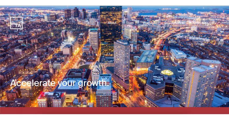
As one of the first modern United States private equity firms, TA Associates is a legacy company that specializes in minority recapitalizations and buyouts. Here’s why it’s among the best private equity firm websites.
Inspiring Trust Along the Way
The intentional design elements of TA Associates’ homepage are meant to inspire your trust. Just by quickly scrolling down the homepage, you can read more about their hundreds of investments (totaling $36 billion), learn about the TA Associates office locations, or check out the latest news about the firm.
Convenient Navigation
The navigation bar of the site travels with you, scrolling from the top to the bottom of any page. If you want to get back to the homepage quickly, all you have to do is click the TA logo on the top left of the page.
18. Silver Lake
Technology-driven

Established in 1999, Silver Lake specializes in technology industries and industries related to technology.
Specialty-Focused
You don’t have to guess what Silver Lake specializes in when you visit its website. The full-screen video carousel makes it clear that the answer is technology, as does the homepage copy.
Stats to Drive Business
You also don’t have to go far to learn about all the impressive accomplishments the Silver Lake team has achieved over the years, such as its annual portfolio company revenue (into the billions), its aggregate portfolio enterprise value, and its assets under committed capital and management.
It’s all right there on the homepage.
Cursor-Based Site Navigation
The cursor style of Silver Lake’s website makes navigating easy but more so, quite a fresh and interesting experience.
19. Oaktree Capital Management
Making it clear what sets it apart

Achieving the milestone of $164 billion in investments in 2022, Oaktree Capital Management is another on our list of private equity websites worth paying attention to.
Social Handles Above the Fold
For first-time site visitors or customers interested in following along with the Oaktree journey, the company’s YouTube, Facebook, LinkedIn, and Twitter profiles are easily accessible right on the homepage.
Navigation Two Ways
Not only does Oaktree’s website use the traditional drop-down navigation menu style (the menu also travels with you), but you can see all the navigation a second way as well.
At the bottom of the page, all the navigation menu items are unpacked so you can easily click what you want.
Crisp and Professional
Oaktree wants to inspire trust in its premium investment services, and its clean, well-organized website more than achieves that goal. The site both looks and feels professional.
Is Your Hotel Showing Up in ChatGPT?
Travelers are increasingly using AI tools to research destinations before they ever reach a booking site. See how your hotel appears in these AI-generated answers, where competitors or OTAs may be gaining visibility, and whether there are opportunities to strengthen your presence.
20. Accel-KKR
Journey-focused

Also focusing on technology, Accel-KKR is a private equity firm based in California that has managed more than $14 billion worth of assets.
Making It About the Journey
Framing its services as “advancing your journey,” Accel-KKR’s homepage features a winding road surrounded by cliffsides and open water to further drive home the point.
This imagery shows up elsewhere on the website as well!
Video
If you’d rather watch the story of Accel-KKR unfold before your eyes, you have the option to check out a video. This is an immersive way to learn about the firm and might be preferable among some users compared to reading a bio.
Case Studies
Accel-KKR also has a section on its website dedicated solely to its case studies. Customers and would-be customers alike can learn how the firm has improved the lives of their clients and then contact Accel-KKR to get started.
21. Brookfield
Setting a global stage

Brookfield Asset Management is an alternative investment management company based in Canada. To date, the company has managed more than $725 billion in assets.
By the Numbers
Here’s another private equity website design example that showcases pertinent numbers right on the homepage. You can quickly glean Brookfield’s AUM, number of operating employees, number of locations, and how many years the firm has been in business as owner-operators.
Easy Login
Should you hire Brookfield for your financial services, the site’s homepage features a login for clients built into the navigation bar above the fold. The navigation bar also travels with you as you scroll.
Language Settings
You can also configure the language settings when browsing Brookfield’s site above the fold, choosing from Japanese, Chinese, Portuguese, French, English, and more.
22. Apollo Global Management
Services simplified

Dealing in real assets, private equity, credit, and investment management, Apollo Global Management has, as of 2022, managed $512.8 billion.
No Complex Language Here
Apollo breaks down the complex topic of private equity with a clear overview of the services it offers as well as accompanying images.
Dual Navigation Bars
You’ll find not one but two navigation bars for selecting just what you need when on the Apollo website.
The top navigation bar features a login option and contact info while the second navigation bar has more standard fare like an about page. That navigation bar also features a search function.
23. Advent International

Advent International’s private equity website design is the epitome of refined elegance and dynamic visual appeal.
Right from the start, visitors are greeted by a vibrant, full-screen video that seamlessly transitions between compelling images—instantly drawing you in.
The sleek, minimalist typography pops against the rich background, making every message clear and stylish.
It’s a design that perfectly balances sophistication with functionality, showcasing Advent International’s prestigious brand image.
24. AEA Investors

Radiating a welcoming and professional aura, AEA Investors’ website features a clean design and warm color palette.
The homepage highlights a high-resolution image of a diverse, engaged team, reinforcing the message that “Relationships Matter.”
Bold, modern typography against a soft, neutral background ensures readability and emphasis.
The intuitive navigation at the top provides seamless access to essential sections like “Investment Groups” and “Portfolio,” making it easy for users to explore and engage with the content.
25. Altas Partners

Altas Partners’ website captures attention with a breathtaking full-screen background image of solar panels set against a vibrant blue sky, symbolizing innovation and sustainability.
The clean, white sans-serif typography stands out sharply, making everything easy to read. Plus, the minimalist design keeps the focus on what matters, with intuitive navigation links like “About Us” and “Our Businesses” right where you need them.
Overall, the strategic use of space and color creates a serene, yet professional atmosphere, perfectly reflecting Altas Partners’ commitment to elevating leaders and fostering growth.
26. American Securities

When you land on American Securities’ website, the first thing you notice is its clean, minimalist design that just exudes confidence.
Right on the homepage, a powerful statement in bold, serif typography catches your eye, reinforcing their commitment to long-term partnerships and core values.
The soft, light background makes everything easy to read and keeps you focused. Plus, the top navigation bar is super sophisticated, giving you effortless access to sections like “Our Firm” and “Companies.”
This site perfectly balances elegance and functionality, creating an inviting and trustworthy online presence.
27. Apax Partners

Apax Partners’ website is all about modern and dynamic aesthetics.
First, you’ll notice the striking floating sphere against a gradient background, which immediately catches your eye. The soft, pastel tones create a calm yet engaging visual experience, drawing you in without overwhelming you.
Additionally, the clean, sans-serif typography, combined with ample white space, ensures the interface remains clutter-free and easy to navigate.
Overall, this design exudes innovation and growth, perfectly aligning with Apax Partners’ mission to inspire and elevate businesses.
28. Ardian

When you first visit Ardian’s website, it blends modernity with tradition beautifully.
Right off the bat, a full-screen video of professionals in action grabs your attention, instantly showcasing a vibrant corporate culture.
The bold, sans-serif typography in white and red pops against the dynamic background, making everything clear and striking.
This design isn’t just visually stimulating—it’s also super functional, perfectly highlighting Ardian’s status as a global leader in private investment.
29. Ares Management

Commanding and authoritative, Ares Management’s private equity website design features a full-screen cityscape backdrop, conveying a sense of scope and ambition.
The sophisticated serif typography in crisp white sharply contrasts with the muted blue background, ensuring clarity.
The layout is structured and clean, and the straightforward top navigation bar makes it super easy to find sections like “Our Business” and “Investor Resources.”
Plus, the strategic use of color and typography perfectly reinforces Ares Management’s reputation as an elegant and functional global investment manager.
Related articles:
- Venture Capital Branding
- SEO for Venture Capital
- Financial Services Website Design
30. Argosy Private Equity

Argosy Private Equity’s website exudes professionalism and clarity through its clean, straightforward design.
Right from the homepage, you’ll notice the striking mix of serif and sans-serif typography that really underscores their commitment to principles.
There’s also a monochrome team image that adds a personal touch, making it feel more trustworthy.
Plus, those bold red buttons just invite you to explore more. Overall, this design perfectly blends text and visuals, making it both informative and visually appealing.
31. Avista Capital Partners

Avista Capital Partners’ website makes a strong impression with a high-resolution image of healthcare professionals, highlighting their sector focus.
The bold yellow text, such as “ADVANCE OUTCOMES,” stands out vividly against the dark background, adding vibrancy.
A streamlined top navigation bar facilitates easy access to “Approach” and “Portfolio.”
This design achieves a perfect balance between professional gravitas and visual appeal, underscoring Avista’s commitment to growth and value in healthcare.
32. Baird Capital
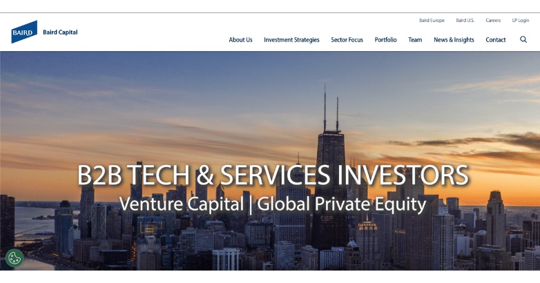
Baird Capital’s website instantly sets a tone of ambition and sophistication.
As you land on the homepage, the stunning sunset cityscape catches your eye, and the bold white typography stands out perfectly against this vibrant backdrop, emphasizing their B2B tech and services investment focus.
Navigating the site is straightforward with the clean, user-friendly top navigation bar that gives you quick access to “Investment Strategies” and “Team.”
This design masterfully uses high-quality imagery and color to capture attention and effectively communicate Baird Capital’s global reach and expertise.
33. BC Partners

BC Partners’ private equity website design exudes sophistication with its professional layout.
Highlighted by an image of business professionals in a modern, well-lit office, it immediately sets a high standard.
Furthermore, the clean white background enhances the bold blue typography, emphasizing their mission to expand global leaders’ capabilities.
Overall, this visually appealing and accessible design effectively communicates BC Partners’ dedication to excellence and strategic growth.
34. BlackRock Private Equity Partners

Combining bold design with professional elegance, BlackRock Private Equity Partners’ website features a high-contrast black background with striking white typography, ensuring key information stands out.
A vivid manufacturing process image adds a dynamic visual element, showcasing their industry engagement.
The clean, streamlined navigation bar offers easy access to sections like “Investment Strategies” and “Insights & Education.”
This design balances visual impact with functionality, highlighting BlackRock’s leadership in private equity.
Elevate Your Hospitality Brand Today
Schedule Your Free Consultation
Seeking to elevate your business? Let Mediaboom guide you. Secure your exclusive, free consultation with our digital marketing experts today.
35. Blue Point Capital Partners

Blue Point Capital Partners’ website truly stands out with its minimalist design focused on team collaboration.
First, the high-quality black-and-white portraits of team members on the homepage create a personal and trustworthy atmosphere.
Additionally, the deep blue sidebar navigation is intuitive, providing quick links to “Who We Are” and “Our Portfolio.” The contrast between the monochrome images and vibrant blue elements captures attention while conveying professionalism and transparency.
Overall, this design underscores Blue Point’s commitment to partnership and excellence in private equity.
36. Centerbridge Partners

Centerbridge Partners’ website features a clean, modern design that emphasizes value creation.
Right on the homepage, a high-resolution video of professionals in a sleek office setting reinforces a dynamic, forward-thinking ethos.
Additionally, bold white typography overlays the video, making the message “Bridging Perspectives, Creating Value” stand out prominently.
Altogether, this design combines visual appeal with functional navigation, effectively communicating Centerbridge’s expertise and strategic vision.
37. Cerberus Capital Management

Cerberus Capital Management’s private equity website design captivates with a bold, high-impact aesthetic.
The homepage’s dark background, accentuated by vibrant neon streaks, creates a dynamic, modern look. Bold white typography highlights key messages like “Your partner to improve performance and drive value,” ensuring clarity.
Plus, the clean navigation bar at the top offers easy access to “Our Firm” and “Proprietary Operating Capabilities.”
This design conveys Cerberus’s commitment to innovation and excellence, making a powerful statement to visitors.
38. Charlesbank Capital Partners

Charlesbank Capital Partners’ website grabs your attention right away with its stunning sunset cityscape of a waterfront, radiating both warmth and sophistication.
The bold serif typography in white stands out beautifully against this scenic backdrop, highlighting their focus on middle-market companies.
As you explore, the clean top navigation bar makes it easy to find sections like “Team” and “Portfolio,” ensuring a smooth browsing experience.
This strategic blend of imagery and text creates a balanced, professional look, effectively showcasing Charlesbank’s dedication to creating value in the middle market.
39. Clearlake Capital Group

Clearlake Capital Group’s website immediately catches your eye with its high-tech, futuristic design, highlighting their focus on operational improvement.
The homepage features a close-up image of advanced technology components, evoking a sense of innovation and precision.
The bold white typography overlaid on this image drives home their emphasis on operations, people, and strategy.
This design perfectly showcases Clearlake’s dedication to using cutting-edge technology and strategic management to achieve operational excellence.
40. CVC Capital Partners

When you visit CVC Capital Partners’ website, you’re greeted by a serene, nature-inspired backdrop that perfectly captures their global reach.
The homepage features a soft-focus image of a blooming field, symbolizing growth and flourishing partnerships.
Elegant white text overlays this tranquil scene, conveying their mantra, “Truly global, always local.” This phrase highlights their balance between a worldwide presence and local expertise.
The minimalist top navigation makes it simple to find vital sections like ‘Strategies’ and ‘Sustainable Value,’ offering an intuitive user experience that aligns with their sophisticated brand identity.
41. Francisco Partners

Francisco Partners’ website exudes modern sophistication, mirroring their focus on technology companies.
The homepage features a sleek, digital-themed background with abstract data visualizations, creating a high-tech ambiance.
The phrase “A Performance Advantage for Technology Companies” stands out in a striking blue gradient, underscoring their expertise and competitive edge.
The clean layout and intuitive navigation bar at the top ensure easy access to essential sections like “Approach” and “Investments,” enhancing user experience with a contemporary elegance.
42. Genstar Capital

Genstar Capital’s website design beautifully captures an entrepreneurial spirit through its dynamic and modern aesthetic.
The homepage showcases a cityscape image, creatively segmented into vertical bars, symbolizing growth and expansion.
Bold text in a clean, sans-serif font emphasizes their mission to empower companies to “think big, move fast.”
Overall, the sleek layout, complemented by a minimalist navigation bar at the top, provides an intuitive user experience, perfectly reflecting their innovative approach within the private equity space.
43. GTCR

GTCR’s website immediately sets a professional and sophisticated tone.
As you land on the homepage, you’re greeted by a video of a managing director, which adds a personal touch and helps build trust. The minimalist design, filled with ample white space, makes everything easy to navigate.
Plus, the streamlined navigation bar ensures you can find what you need without any hassle.
Elegant typography combined with muted colors enhances both readability and aesthetic appeal, perfectly reflecting the firm’s commitment to building value through leadership and strategic investments.
44. H.I.G. Capital

When you visit H.I.G. Capital’s website, you’re instantly drawn in by a striking aerial video of a bustling cityscape that sets a dynamic tone.
Right away, the bold white text of the tagline “Power of the Platform” pops against a blue overlay, highlighting the firm’s expansive and robust capabilities.
This modern, visually engaging design clearly showcases H.I.G. Capital’s innovative approach and their commitment to driving value through strategic investments.
It’s a perfect blend of visual appeal and powerful messaging.
45. Hellman & Friedman

Hellman & Friedman’s website is all about elegance and focus.
Right from the start, a stunning landscape image of the Golden Gate Bridge enveloped in morning mist sets a high bar, conveying stability and timeless strength. The serene visual instantly draws you in.
The tagline “Do one thing & do it well” stands out prominently, highlighting the firm’s dedication to excellence.
This clean and professional design makes a lasting impression on visitors, reflecting the brand’s sophisticated image.
46. Kelso & Company

Kelso & Company’s website uses a striking visual of the New York City skyline at sunset, symbolizing strength and longevity.
The prominent headline, “Celebrating 40 Years of Alignment and Partnership,” immediately communicates the firm’s long-standing presence and commitment to collaboration.
The layout is clean and modern, with a minimalist top navigation bar featuring options like “Get to Know Us” and a search function, ensuring user-friendly navigation.
The overall design is professional and engaging, reflecting Kelso & Company’s esteemed position in the private equity sector.
47. KKR

KKR’s website immediately catches your eye with its clean, modern design that packs a punch.
The prominent headline, “Delivering outcomes,” really stands out, especially with that dynamic, abstract yellow graphic adding a vibrant touch.
The minimalist navigation at the top right makes it super easy to find your way around. It’s straightforward but so effective, perfectly showcasing KKR’s commitment to results and innovation.
The whole aesthetic is professional and sophisticated, perfectly mirroring KKR’s esteemed reputation in the private equity sector.
48. Leonard Green & Partners

Leonard Green & Partners’ website greets you with a serene image of Los Angeles, emphasizing their local presence.
The design is clean and professional, featuring a simple navigation bar at the top for easy browsing. Plus, the prominently placed “Investor Login” button ensures quick access for investors.
This scenic background not only reinforces their connection to Los Angeles but also conveys stability and reliability.
Overall, the design effectively highlights their focus on collaboration and agile decision-making in the private equity sector.
49. LLR Partners

When you land on LLR Partners’ website, you’re immediately greeted by a striking, minimalist design.
The bold headline “Partners” grabs your attention right away, set against a clean, white background that exudes clarity and professionalism. Plus, a friendly photo of a team member adds a personal touch and underscores their commitment to partnership.
The concise text highlights their belief in creating value through collaboration and invites you to check out their 2024 Growth Guide.
This design radiates trust and approachability, making it ideal for a firm dedicated to fostering growth.
50. Madison Dearborn Partners

Madison Dearborn Partners’ website exudes sophistication and professionalism.
The clean, white background on the homepage enhances readability and focus, while a prominent image of executives in conversation conveys trust and expertise. The text is clear and concise, highlighting their impressive investment accomplishments.
Navigating the site is easy with a simple and intuitive navigation bar, offering quick access to sections like About, Sectors, and Investments.
This design effectively showcases their stature and reliability in the investment world, fostering confidence and engagement from visitors.
WHAT OUR CLIENTS SAY
FAQs
What are the key elements of an effective private equity website design?
An effective private equity website design should include a clean and professional layout, intuitive navigation, high-quality imagery, clear and engaging content, and responsive design to ensure a seamless user experience across all devices.
Why is a responsive design important for private equity websites?
Responsive design is crucial for private equity websites because it ensures the site is accessible and user-friendly on all devices, including desktops, tablets, and smartphones. This adaptability helps maintain a positive user experience and keeps potential investors engaged, regardless of how they access the site.
How can a private equity website enhance trust and credibility?
A private equity website can enhance trust and credibility by featuring professional design elements, showcasing high-quality images of the team and portfolio companies, including client testimonials, and providing detailed information about the firm’s history, values, and investment strategy.
What role does content play in private equity website design?
Content plays a pivotal role in private equity website design by communicating the firm’s value proposition, investment philosophy, and success stories. Well-written content helps engage visitors, provides essential information, and supports SEO efforts to increase visibility in search engines.
How can SEO be integrated into private equity website design?
SEO can be integrated into private equity website design by using relevant keywords throughout the site, optimizing images with alt text, ensuring fast load times, and creating high-quality, informative content that attracts and retains visitors. Additionally, a well-structured site with clear headings and metadata improves search engine rankings.
Do you have more questions?
If you have more questions or need further assistance with private equity website design, we’re here to help. At Mediaboom, we create sophisticated, impactful websites tailored for private equity firms. Contact us today to learn how we can enhance your online presence. Let’s elevate your brand together!
Elevate Your Hospitality Brand Today
Schedule Your Free Consultation
Seeking to elevate your business? Let Mediaboom guide you. Secure your exclusive, free consultation with our digital marketing experts today.
Conclusion
A private equity firm’s website design is a valuable opportunity to educate and intrigue visitors, encouraging them to reach out and possibly start business dealings.
With so many firms coming up all the time, it’s important to focus on showcasing dynamism, engagement, and expertise on the website, a strategy refined by a hotel marketing agency to make your online presence stand out.
Contact now Mediaboom to discuss your private equity website design!
By: Frank DePino
Frank DePino is the Principal and Founder of Mediaboom, a top hotel marketing agency partnering with leading hotel and hospitality brands. With 30+ years of experience, he has led strategic digital initiatives for names including Four Seasons, Ritz-Carlton, JW Marriott, Millennium Partners, and Guardian Jet. Frank helps hospitality businesses strengthen brand presence, drive qualified leads, and elevate guest experiences through website design, SEO, content marketing, and paid media. Under his leadership, Mediaboom is a trusted partner for brands pursuing measurable digital growth in a competitive hospitality landscape.