
Venture Capital Website Design – 50 Top-Tier Examples

By: Frank DePino | June 26, 2024
Loading the Elevenlabs Text to Speech AudioNative Player...
According to job resource Toptal, in 2018, venture capital investments totaled $254 billion, which was spread across 18,000 startups. In 2020, at least as of the first two months of the year, Alley Watch notes early-stage funding in the United States amounts to $242 million. That said, with the tally completed so early in the year, it seems likely the numbers will outpace 2018’s by a large margin.
If you’re a venture capital firm seeking to follow the market trends and grow in 2024, it all begins with a fantastic website. Today’s most buzzworthy venture capital websites are those that are expertly branded. These sites also have just enough pages and menus as necessary.
Whether you’re in the beginning stages of planning your website or you’re rebranding it, having some examples as inspiration is always nice. That’s why we dug around to find 10 of the best venture capital firm website designs for your perusal.
1. Argonautic
Design
The design exudes sophistication and finesse, featuring a blend of dark and light tones. The creative aspect primarily focuses on the video showcased in the slider, which is accompanied by a compelling call to action. The typography is crisp and modern, making it easy to read and adding to the overall sense of sophistication.
Investments
The homepage prominently displays an “investing” call to action. By clicking this button, users can explore various investment examples executed by Argonautic.
Portfolio
A dedicated section for the portfolio can be found on the website, enabling prospective clients to discover the comprehensive list of partners who have utilized Argonautic’s services
2. Crosscut

Crosscut is a Santa Monica-based firm with a clean, bright website design. The appealing graphics and diagonal color-blocking to match the Crosscut name are just part of what makes them stand out.
Here’s what else is so great about their website.
Human Elements
With so many venture capital firms on the market, sometimes it’s easy to forget that real people are behind every one of them, much like the personalized approach a hotel marketing agency brings to hospitality branding. Crosscut puts that human focus at the forefront. As you scroll through their homepage, you see photos of people interacting together.
Social Proof
The founders’ section features photos and quotes from other company founders praising Crosscut. Not only does this add to the human elements as described above, but it vouches for Crosscut’s services. So too does its extensive list of partners.
Easy Navigation
Crosscut doesn’t make it hard to get around on their website. They have six menu items: Companies, Team, Approach, Stories, Press, and Contact. Besides Stories–another word for their blog–all are very straightforward.
Related articles:
- Digital Marketing For Venture Capital
- Venture Capital Branding
3. Space Angels

Upon first glance at Space Angel’s website, you might think you’ve stumbled upon a site for an aeronautical company, not a venture capital firm. That’s part of what makes this website such a winner.
Appropriate Theming and Branding
You can’t call your company Space Angels and not brand it as such. Everything is in-tune here, from the background with the comic-like render of space explorers to a menu called Expedition, which is complete with an animation of a spinning earth.
Of course, it’s important to note that Space Angels does deal in space venture capital. A wild branding scheme only works if your company does what the branding implies. Otherwise, you’ll confuse and turn off your customers.
Video Elements
If you’re visiting a website for the first time, would you rather watch an introductory video or poke around aimlessly at the menus? Most people would say the former.
Space Angels has a video front and center on their homepage. It’s not very long, only 1:03, and in it, you can quickly learn about the importance of investing in space.
Conversion Elements
Presumably, after you watch the video, you’ll feel more confident in your decision to work with Space Angels. That’s why the website features an “Apply for membership” button beneath white text asking “Ready to join?”
Even if you’re not quite ready, as you scroll down, the “Learn more” button will tell you all the great reasons why investing in space is such a good idea.
4. Emergence

As an early-stage venture capital firm, Emergence keeps their website simply designed with single-colored backgrounds. It’s the elements splashed across the pages that make things interesting.
Partner Art Renders
There are many ways to introduce your firm’s most valuable partners, but Emergence does it right. On the homepage, as you scroll along, you’ll come across several large artistic renders of various people. These are Emergence’s biggest partners, such as the founder of Zoom and the face behind Bill.com.
You can click links to learn more about any of these inspiring partners, but the way Emergence portrays them is so fascinating.
Stats and Numbers
Some venture capital firms may hide their numbers, but not Emergence. On their About page, they freely share such information as their IPOs exceeding $500 million, their portfolio companies, and their market cap of portfolio.
Having this information upfront may incline you to do business with them.
5. Lux Capital

Next, we’ve got a Silicon Valley gem, Lux Capital. Their website grabs you in a big way, so let’s discuss more now.
Branded, Recurring Design Elements
You don’t have to guess the crux of Lux Capital’s business if you spend a moment on their homepage. Besides their explicit mentions of dealing in technology and science ventures, there are also photos and animated elements of such.
This can be a form of branding in and of itself. You don’t necessarily have to go to the lengths of Space Angels with custom artwork if it doesn’t feel natural for your venture capital firm. If a carousel of photos or animations suits you better but still gets the point across, then it’s more than sufficient.
Video Elements
Besides the animations, Lux also invites you into their world with a video smackdab in the middle of the homepage. The play button is in one corner of the giant X, with the X itself the animations while the unassuming background is pure white.
The play button placement really incentivizes you to click it.
Unique Navigation
Unlike most websites you come across, Lux Capital has its navigation bar on the left side of the website. That’s probably so it doesn’t interrupt the giant X-shaped video element, but it’s yet another part of the venture capital firm’s website that holds your attention. You can even search using the menu.
Related articles:
6. Upfront Ventures

The early investment company Upfront Ventures in Los Angeles has a history dating back to 1996. The company has invested over $1 billion since then, but they still keep their website design modern, playful, and visually appealing.
Scaled-Back Web Design
Remember how earlier we mentioned that your venture capital website design shouldn’t be overly complicated if it doesn’t fit your business? Here’s an example of a firm that proves how simpler is better.
Upfront Ventures uses single-colored backgrounds against vivid graphics that change color from page to page. There’s never a lack of cohesion, though.
Clean Mobile Design
Upfront’s mobile website almost looks better than its desktop version. Those single-colored backgrounds and large menu items are clean and graphically appealing. This will encourage first-time visitors to stay for a while.
7. Coplex
As venture builders, Coplex focuses on innovative enterprises and industry experts. Here’s a glimpse into their website.
Well-Placed CTA Buttons
Coplex doesn’t beat around the bush when it comes to their CTAs. Against a purple textured backdrop is their red button that reads “Join our ecosystem.” This button takes you to an opt-in form you’d fill in to become a potential client.
Above that CTA button is a brief explanation of Coplex’s work that may drive some of its future clients to sign up.
Clearly-Explained Process
If you want to learn a little more about how Coplex operates, they explain this transparently on their website. There, you’ll see three steps to follow to become a Coplex client.
The first step is build, the second is join, and the third is invest. There’s a “Learn more” link under the steps if you need a more thorough explanation of any of them. A well-thought element like this should boost conversions.
8. Sequoia

Sequoia has locations in Tel Aviv, Shanghai, Hong Kong, Beijing, Singapore, New Delhi, Mumbai, Bengaluru, and Menlo Park, California. If you want to take a page out of their book, here are all the elements that really make their website sing.
People-Based Design
You’ll see some familiar faces the moment you log onto the Sequoia homepage, such as Bill Gates and other visionaries. This plays up well with Sequoia’s headline: “We help the daring build legendary companies.”
This people-based theme doesn’t stop there. It’s a recurring one you’ll encounter as you scroll down. Like Emergence’s website, Sequoia highlights their partners in a big way. There are photos of each in black and white with details in red or teal blue. Circles, squares, wavy lines, and other elements are dotted throughout the black and white photo for a nice contrast.
Easy Navigation
Sequoia knows they have great visual elements, so they keep the rest of their website sparse so their graphics can shine. The menu has three categories: People, Build, and Companies. You can see more on the dropdown menu to the right of the homepage, like Jobs, Contact, and Legal.
If you’re still looking for more information, use the search bar.
Quick Logins
Once you become a client of Sequoia’s, logging in is fast and easy. On the side menu, underneath the three main menu items, you’ll see two smaller ones in gray text. The first one, Log in, lets you choose whether you’re a limited partner of a part of Sequoia Commons. You’re then redirected to the login page.
Related articles:
- Hedge Fund Websites
- Hedge Fund Marketing
9. First Round
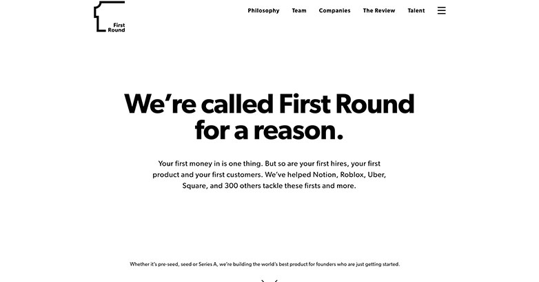
Howard Morgan and Josh Kopelman are the founders of First Round in San Francisco. The company was established in 2004, so it’s another long-standing one. Let’s examine their website more closely.
Name-Based Branding
What’s in a name? When you’re called First Round, a lot. This venture capital firm uses their name for their branding, such as on their homepage. It’s there that you see the statement in large, bold letters that proclaims “We’re called First Round for a reason.”
If your firm already has a great name, then play it up to the fullest on your website.
FAQs
Another unique element on First Round’s website is their FAQs. These are right on the homepage if you scroll down far enough. You can read answers to questions about investment timing with First Round, the firm’s decision-making process, their investment process, and their terms.
By the time you’re done combing through all these Q&As, you should be ready to get in touch with First Round as a potential partner.
Is Your Hotel Showing Up in ChatGPT?
Travelers are increasingly using AI tools to research destinations before they ever reach a booking site. See how your hotel appears in these AI-generated answers, where competitors or OTAs may be gaining visibility, and whether there are opportunities to strengthen your presence.
10. Polaris Partners

Polaris Partners is an expansive venture capital firm with offices in New York, San Francisco, and Boston. They prioritize long-term partnerships in the realms of healthcare and technology.
Here’s what their website looks like.
Simple Design
Are you worried you went too basic with your venture capital website design? Polaris Partners shows how simplicity can work best. Their site has a white background and a few images here and there, but nothing overwhelming. This gives you an appealing site that’s a pleasure to navigate.
Prioritizing Partnerships
You don’t have to look far to see the laundry list of partners Polaris has worked with and continues to do business with to this day. If you want to check out more than just those few examples, there’s a blue Portfolio button that lets you explore even more.
11. Obvious

Obvious Ventures is a San Francisco-based firm that partners with healthy living and food industries. Their site is a testament that going a little over the top with web design can work for some venture capital firms.
Animated Homepage
The entirety of Obvious Ventures’ homepage is one looping animation after another. These give you a clue into the kind of partners Obvious works with, as you see such images as a burger grilling, science equipment being produced, and even a team working on a tech project.
Large Text
Once you get past the animations, you’re greeted to large text headlines such as “Let’s reimagine trillion-dollar industries together.” Even if you were just casually scrolling through Obvious’ website, it’s impossible to miss a message such as this.
12. Andreessen Horowitz

With a burst of vibrant colors and clean typography, Andreessen Horowitz’s website exemplifies top-tier venture capital website design.
Key information is easily accessible, highlighted to ensure prominence. Moreover, intuitive navigation and responsive design elements adapt smoothly to various devices, providing an excellent user experience.
This sophisticated design embodies the firm’s innovative and forward-thinking ethos, leaving a lasting impression on visitors.
13. Accel

Sleek and professional, Accel’s website design focuses on simplicity and elegance.
A dark background paired with bold white text enhances readability and draws attention to key messages.
Large, impactful typography and minimalistic navigation options ensure a seamless user experience.
Vibrant color highlights add dynamism, making the site visually engaging while maintaining a sophisticated look that aligns with Accel’s brand identity.
14. Benchmark Capital

Benchmark Capital’s website is a blend of professionalism and invitation, utilizing a deep blue and white color palette.
Bold, concise typography communicates their value proposition effectively. High-quality imagery and graphics enhance visual appeal and provide a dynamic background.
User-friendly navigation and prominent call-to-action buttons ensure effortless browsing, guiding visitors to relevant information and services, reflecting Benchmark’s commitment to clarity and client-centric solutions.
15. Bessemer Venture Partners

Bessemer Venture Partners’ website stands out with a clean, bold design emphasizing clarity and professionalism.
The striking blue and white color scheme, paired with strong typography, conveys confidence and trust.
Dynamic visual elements like the diagonal header and vibrant imagery add energy without overwhelming the user.
Straightforward navigation and clear calls to action enhance usability, making it easy for visitors to explore services and insights in the same way a hotel marketing agency structures high-converting digital experiences, showcasing Bessemer’s dedication to empowering audacious entrepreneurs.
16. Greylock Partners

Exuding sophistication and professionalism, Greylock Partners’ website is a prime example of exceptional venture capital website design.
Featuring a deep blue background and crisp white typography, the minimalistic design emphasizes clarity and focus, with well-placed highlights guiding attention to key information.
Additionally, seamless navigation and an elegant layout reflect the firm’s dedication to excellence and innovation.
This approach enhances user experience and underscores Greylock’s commitment to being a trusted partner for AI-first companies and visionary entrepreneurs.
17. Union Square Ventures

Embracing a sleek and minimalistic design, Union Square Ventures’ website uses ample white space for a clean, modern aesthetic.
A simple green and black color scheme enhances readability, while bold typography draws attention to key messages.
The straightforward navigation and uncluttered layout ensure users can quickly find information.
This design emphasizes USV’s focus on innovation and clarity, effectively communicating their mission to invest in transformative markets.
18. Insight Partners

Combining modernity with functionality, Insight Partners’ website uses a large, immersive background image to highlight their dynamic approach to scaling businesses.
Clean, sans-serif typography ensures readability, while bold colors for calls-to-action draw immediate attention, a strategy often refined through the expertise of a hotel marketing agency.
Intuitive navigation and strategic information placement create a seamless user experience.
This design communicates Insight Partners’ commitment to supporting ambitious companies at every growth stage, making the site engaging and informative.
19. General Catalyst

Striking and impactful, General Catalyst’s website exemplifies outstanding venture capital website design.
Featuring a minimalist layout with ample white space and bold typography, the site uses gradient colors within the word “CHANGE” to add a dynamic visual element, underscoring their commitment to transformation.
Additionally, clean navigation and strategic content placement create an intuitive user experience.
This design powerfully communicates General Catalyst’s mission to drive innovation and change, making a strong impression on visitors.
Elevate Your Hospitality Brand Today
Schedule Your Free Consultation
Seeking to elevate your business? Let Mediaboom guide you. Secure your exclusive, free consultation with our digital marketing experts today.
20. Lightspeed Venture Partners

Lightspeed Venture Partners’ website showcases a clean, modern design focused on visual storytelling.
A minimalist layout with large, impactful images of key team members enhances personal connection. Bold, clear typography with phrases like “POSSIBILITY GROWS” catches the eye.
Soft color gradients and ample white space create a calm, inviting atmosphere.
This design effectively communicates Lightspeed’s commitment to growth and innovation, providing a visually appealing and user-friendly experience.
21. Index Ventures

Index Ventures’ website exudes warmth and personality with its clean layout, ample white space, and high-quality images of diverse team members.
Serif typography for the headline “We invest in who you are, not just what you do” adds elegance and sincerity.
The minimalist design, combined with a muted color palette, creates an inviting and approachable atmosphere.
This design reflects Index Ventures’ focus on building strong, personal relationships with their partners.
22. Redpoint Ventures

With a bold and engaging design, Redpoint Ventures’ website stands out as a prime example of venture capital website design through its clean layout and impactful typography.
Red highlights on a white background draw attention to key messages, creating a dynamic visual hierarchy.
Additionally, the minimalist approach ensures clarity and ease of navigation, while prominent call-to-action elements guide users intuitively.
This design reflects Redpoint’s commitment to partnering with exceptional entrepreneurs from the earliest stages, leaving a strong, confident impression.
23. Battery Ventures

Combining professionalism with modern aesthetics, Battery Ventures’ website features a deep blue color scheme conveying trust and stability.
Clean, sans-serif typography enhances readability, while strategic color use highlights key messages.
Geometric design elements add sophistication, guiding the viewer’s eye through the content.
Straightforward navigation and clear calls to action ensure a seamless user experience, reflecting Battery Ventures’ commitment to investing in technology companies globally.
24. NEA (New Enterprise Associates)

Elegance and simplicity define NEA’s website, featuring a soothing pastel color palette that creates a calm, inviting atmosphere.
Serif typography for the tagline “The foundation for new frontiers” adds sophistication.
Minimalistic top navigation ensures ease of use, while subtle geometric elements guide the eye through the page.
This design effectively communicates NEA’s mission of supporting innovative ventures, making the site visually appealing and user-friendly.
25. Menlo Ventures

Menlo Ventures’ website captivates with a bold, engaging design, using a crisp layout with a striking orange and black color palette.
The headline “When we invest, we’re invested” features impactful typography, drawing immediate attention.
High-quality imagery of the team in action reinforces their hands-on approach.
Clean navigation and clear calls to action ensure a seamless user experience, effectively communicating Menlo Ventures’ dedication to actively supporting their portfolio companies.
26. Matrix Partners

Minimalistic and modern, Matrix Partners’ website is a great example of effective venture capital website design, emphasizing simplicity and clarity.
Black and white text against a white background ensures readability, while a striking blue geometric element adds sophistication and visual interest.
Additionally, the clean layout and straightforward navigation enhance the user experience, reflecting Matrix Partners’ focus on early-stage investments and collaboration with visionary founders.
This design communicates their professional and focused approach to venture capital.
27. Trinity Ventures

Combining professionalism with a personal touch, Trinity Ventures’ website features a clean layout and impactful photography.
The prominent headline, “Relentlessly pursuing your vision,” is paired with modern sans-serif typography for enhanced readability. Strategic color use, particularly bold yellow accents, highlights key information and creates visual interest.
User-friendly navigation and a clear layout reflect Trinity Ventures’ dedication to supporting innovative entrepreneurs, ensuring a seamless and engaging user experience.
28. IVP (Institutional Venture Partners)

IVP’s website bursts with energy and innovation, highlighted by a bold blue color scheme.
The striking typography of “Powering Your Pursuit” immediately catches the eye, complemented by clean, sans-serif fonts for a contemporary vibe.
Dynamic imagery and interactive elements, such as the prominent search bar, boost user engagement.
Clear navigation and an intuitive layout ensure a seamless experience, reflecting IVP’s dedication to empowering visionary entrepreneurs and driving technological advancements.
29. Foundation Capital

Foundation Capital’s website is sleek and impactful, featuring a minimalistic layout with bold black typography on a white background for maximum readability.
Vibrant turquoise highlights draw attention to key messages, adding a lively touch.
Clean navigation and prominent call-to-action buttons enhance the user experience, making it easy to explore their practices and team.
This design effectively communicates Foundation Capital’s focus on innovation and their commitment to supporting visionary founders.
30. Sequoia Capital

Sequoia Capital’s minimalist yet powerful website design is a stellar example of venture capital website design, standing out with its clean layout and ample white space.
The bold serif typography for the headline “We help the daring build legendary companies” is particularly striking, with “daring” highlighted in green for emphasis.
Understated colors and simple lines create a sophisticated look, while intuitive navigation enhances usability.
This design communicates Sequoia Capital’s mission to support ambitious entrepreneurs, making a compelling and elegant visual statement.
31. TCV (Technology Crossover Ventures)

TCV’s website exudes professionalism and trust with its sleek, modern design and striking blue header.
A large, central video background immediately grabs attention, showcasing real-world applications of their investments.
Clean serif typography enhances readability and elegance, while straightforward navigation ensures a seamless user experience.
This design effectively communicates TCV’s mission to partner with exceptional teams to build category-defining technology companies, creating a visually engaging and informative platform.
32. Sapphire Ventures

Sapphire Ventures’ website is bold and striking, utilizing a split-screen layout with contrasting black and green sections.
The headline “Backing Companies of Consequence” uses modern sans-serif typography to make a strong visual impact.
The green section, featuring the JFrog logo, adds a dynamic element. Straightforward navigation at the bottom ensures easy access to information.
This design effectively communicates Sapphire Ventures’ commitment to supporting impactful companies, creating a memorable and engaging user experience.
33. Thrive Capital

Minimalistic elegance defines Thrive Capital’s website, featuring a pristine white background and a simple, centered logo.
Sparse text and design elements underscore sophistication and focus.
The subtle typography and discreet placement of the company’s name at the bottom exude understated confidence and professionalism, appealing to discerning clients who value clarity and precision.
34. Craft Ventures

Craft Ventures’ website is a prime example of venture capital website design, being stark and bold with a black background and striking white text that highlights their focus on B2B software investing.
Red imagery of hands crafting pottery symbolizes their hands-on approach and expertise in building and scaling SaaS businesses.
This design conveys strength, precision, and a commitment to success, appealing to entrepreneurs seeking a proven partner for growth.
WHAT OUR CLIENTS SAY
35. Social Capital

Social Capital’s website blends minimalist aesthetics with dynamic contrasts.
The left side features a light background with bold black text and a call-to-action button to read their annual letter.
The right side has a dark background with a visually striking radial design, creating a modern look.
This design conveys clarity, focus, and innovation, aligning with Social Capital’s mission to advance humanity by solving the world’s hardest problems.
36. 500 Startups

500 Startups’ website makes a bold statement with “We invest in the world’s potential” prominently displayed in a large, elegant font.
A dark blue background provides strong contrast to the white and yellow text, enhancing readability and visual impact.
The clean, modern layout includes easy navigation options for portfolio, venture education, insights, and more.
This design effectively communicates their mission to drive economic growth through technology investments, highlighting their global perspective.
Related articles:
- SEO for Venture Capital
- Marketing Investment Funds
37. SoftBank Vision Fund

SoftBank Vision Fund’s website is an excellent example of venture capital website design, being clean and modern, featuring the prominent headline “Shared Vision, Amplified Ambition.”
A light, neutral background emphasizes bold, dark text, ensuring high readability. A high-quality image of team members working adds a human element.
Navigation options like “Work With Us,” “Portfolio,” “Team,” and “Insights” are conveniently placed at the top for easy access. This design communicates SoftBank Vision Fund’s collaborative and ambitious investment approach.
38. DCVC (Data Collective)

Bold and straightforward, DCVC’s website emphasizes its focus on deep tech venture capital.
Bright green text on a neutral background highlights key messages, while a clean, organized navigation menu at the top provides easy access to sections like “Companies,” “About,” “DCVC Bio,” “Team,” “News & Insights,” and “Careers.”
A background image of advanced agricultural machinery underscores their investment in cutting-edge technology sectors, effectively communicating DCVC’s commitment to deep tech innovation.
39. Greycroft

Minimalist and professional, Greycroft’s website focuses on bold, clear presentation.
The large, sans-serif font for “Greycroft” immediately grabs attention, with the concise tagline “Investors on a mission to find and foster the brightest opportunities” enhancing its impact.
The clean color scheme of dark green on a light background conveys trust and stability.
Straightforward contact information at the bottom maintains simplicity, making the site easy to navigate and user-friendly.
40. RRE Ventures

RRE Ventures’ website blends modern minimalism with strong typography.
The headline “We back the best for the distance.” in a large, serif font with blue underlines draws attention to their long-term partnership commitment.
The clean layout with ample white space enhances readability and focus, while discreetly placed contact information and limited partner login maintain a streamlined look.
This design exudes professionalism and a forward-thinking approach, ideal for a venture capital firm.
41. Venrock

Venrock’s website is a prime example of venture capital website design, showcasing a clean, modern aesthetic with an emphasis on innovation and technology.
The headline “Build the Future” combines a sans-serif font with handwritten script to highlight creativity and forward-thinking.
Bold images of portfolio companies provide a visual snapshot of their investments.
Simple navigation options for “Companies” and “People” ensure easy exploration of their portfolio and team.
The professional yet approachable design reflects Venrock’s commitment to groundbreaking ventures.
Related articles:
- Financial Services Website Design
- Financial Services Inbound Marketing
42. NextView Ventures

Vibrant and engaging, NextView Ventures’ website emphasizes high-conviction seed-stage investments. Bold colors—bright blue, yellow, and red—create an energetic atmosphere.
Large typography and dynamic layout highlight key messages like “High-conviction seed stage investors” and “Let’s build the future we want to live in.”
The navigation bar at the top offers clear links to “Approach,” “Team,” “Investments,” “Jobs,” and “Blog,” ensuring easy access to essential information.
This design reflects NextView Ventures’ commitment to impactful investing.
43. True Ventures

True Ventures’ website boasts a clean, modern design that highlights their dedication to empowering diverse founders.
The bold message, “We empower extraordinary founders from all walks of life,” is prominently displayed in blue typography with a dynamic underline.
The navigation bar provides quick access to “Portfolio,” “Team,” “Platform,” “.ORG,” “Perspectives,” “Jobs,” and “About,” ensuring users can easily find key information.
The minimalistic yet impactful aesthetic reflects True Ventures’ commitment to innovation and diversity in entrepreneurship.
44. Lead Edge Capital

Minimalist and professional, Lead Edge Capital’s website features a white background and bold typography, emphasizing their “High Impact Growth Investing” message.
Strategically placed blue call-to-action buttons direct attention to their approach and CEO testimonials.
The neatly organized navigation bar offers easy access to their network, press, team, portfolio, testimonials, resources, and job opportunities.
This design exudes professionalism and trustworthiness, appealing to potential investors and clients alike.
Related articles:
- Private Equity Marketing
- Financial Services Marketing Agency
45. Canaan Partners

Canaan Partners’ website is a stellar example of venture capital website design, exuding sleek modernity and focusing on visionary investments.
A serene white background is punctuated by a captivating image of an advanced aircraft, symbolizing innovation.
The bold “Who we are” typography draws immediate attention, complemented by a concise mission introduction.
The blue “More About Us” button stands out, inviting further exploration.
Simple top navigation ensures seamless access to team, companies, about, and latest updates. This design encapsulates ambition and clarity, perfectly aligning with their brand ethos.
46. Madrona Venture Group

Madrona Venture Group’s website radiates simplicity and elegance, targeting founders with bold aspirations.
A clean white background and prominent typography state, “For the founders committed to turning the improbable into the exceptional.”
This powerful message stands alone, free of unnecessary visuals. The minimalistic navigation menu at the top right offers links to About, Team, Companies, and Insights.
The overall design underscores commitment and clarity, perfectly aligning with Madrona’s mission to support visionary founders.
47. CRV (Charles River Ventures)

CRV’s website is bold and engaging, dominated by a striking red background that immediately captures attention.
The large, white CRV logo is set in a circular format at the top left, balancing the strong visual impact.
The headline congratulates key team members, adding a personal touch and showcasing recent achievements.
An embedded image of the team members against a light blue backdrop contrasts well with the red, drawing focus to their Forbes Midas List accolades.
The design effectively highlights CRV’s commitment to early-stage investments, boasting a track record with notable companies like Airtable and DoorDash.
48. Lerer Hippeau

Lerer Hippeau’s website presents a bold, modern design against a clean white background, accentuating their clear, impactful messaging.
The striking headline, “We invest in iconic companies that rattle the status quo,” in black and light gray text, exudes confidence and innovation.
Below, a neatly organized portfolio showcases vibrant images of their investments, inviting further exploration.
The minimalist navigation bar ensures easy access to key sections, enhancing the user experience with simplicity and elegance.
49. Forerunner Ventures

Forerunner Ventures’ website is an exemplary venture capital website design, seamlessly blending innovation and culture through its striking aesthetics.
A professional dark blue background sets the tone, while a vibrant image of a woman against a bright yellow backdrop captures attention, conveying forward-thinking energy.
The headline, “Investing at the intersection of Invention & Culture,” is elegantly displayed in a modern serif font, highlighting creativity and impact.
The clean navigation bar provides straightforward access to Investments, Team, Perspectives, and Resources, making the site visually appealing and user-friendly.
50. Khosla Ventures

Khosla Ventures’ website commands attention with its striking simplicity and powerful messaging.
A crisp white background highlights the vibrant purple headline, “Bold, early, impactful ventures,” exuding confidence and forward-thinking energy.
The stark contrast between the bold purple text and the minimalist black navigation menu underscores clarity and directness.
A prominent quote, “We prefer brutal honesty to hypocritical politeness,” encapsulates the firm’s philosophy, reflecting their commitment to authenticity and transparency.
The overall design is clean, modern, and perfectly aligns with the brand’s innovative ethos.
Elevate Your Hospitality Brand Today
Schedule Your Free Consultation
Seeking to elevate your business? Let Mediaboom guide you. Secure your exclusive, free consultation with our digital marketing experts today.
Conclusion
Venture capital firms must do all they can to stand out from the competition, applying the same strategic thinking a hotel marketing agency uses to differentiate brands in crowded markets. Besides exceptional service, you should also spiffy up your website so its design is functional and attractive.
The 10 examples provided in this article prove that there’s not one particular way to excel at web design for your firm. Remember to choose the elements that feel the most “you” for a website that resonates with your audience.
Contact now Mediaboom to talk about your venture capital website design!
By: Frank DePino
Frank DePino is the Principal and Founder of Mediaboom, a top hotel marketing agency partnering with leading hotel and hospitality brands. With 30+ years of experience, he has led strategic digital initiatives for names including Four Seasons, Ritz-Carlton, JW Marriott, Millennium Partners, and Guardian Jet. Frank helps hospitality businesses strengthen brand presence, drive qualified leads, and elevate guest experiences through website design, SEO, content marketing, and paid media. Under his leadership, Mediaboom is a trusted partner for brands pursuing measurable digital growth in a competitive hospitality landscape.