

Bank Website Design – 50 Top Samples of Banking Websites

By: Frank DePino | September 12, 2022
Loading the Elevenlabs Text to Speech AudioNative Player...
The banking industry has been around for a long time – and so have their websites. Just as innovative designers in hospitality bring fresh perspective to guest experiences, a hotel marketing agency understands how to refresh digital presence with superb functionality that engages users, increases brand awareness and converts prospective clients.
Below is a list of 50 of the best bank website designs you must see, and many of these examples illustrate design principles that a hotel marketing agency leverages to create immersive, conversion‑focused digital experiences.
Is Your Hotel Showing Up in ChatGPT?
Travelers are increasingly using AI tools to research destinations before they ever reach a booking site. See how your hotel appears in these AI-generated answers, where competitors or OTAs may be gaining visibility, and whether there are opportunities to strengthen your presence.
1. KEYBANK
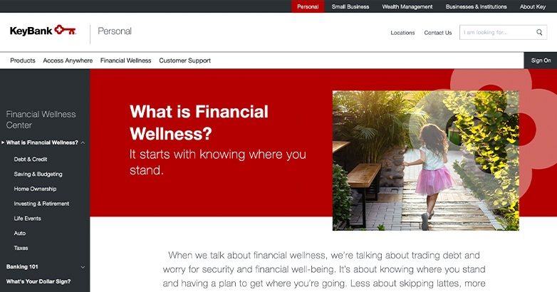
KeyBank, a KeyCorp subsidiary, is a Cleveland, Ohio-based financial institution and regional bank.
Their branding is simple yet effective: a key for their logo, that appears on their homepage and every subpage, and a cohesive, bold color scheme of red, gray, and white.
2. GUILFORD SAVINGS BANK
Guilford Savings Bank’s website utilizes their brand colors well throughout the site not only in page elements but in their photography as well.
Their imagery also features GSB related content that adds a more personal touch to their site.
3. ALLIANT
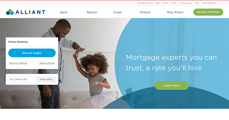
Alliant’s bank website design makes use of the circles from their logo throughout the site by using overlapping circle elements to have a rounded design for their buttons.
4. WELLSFARGO
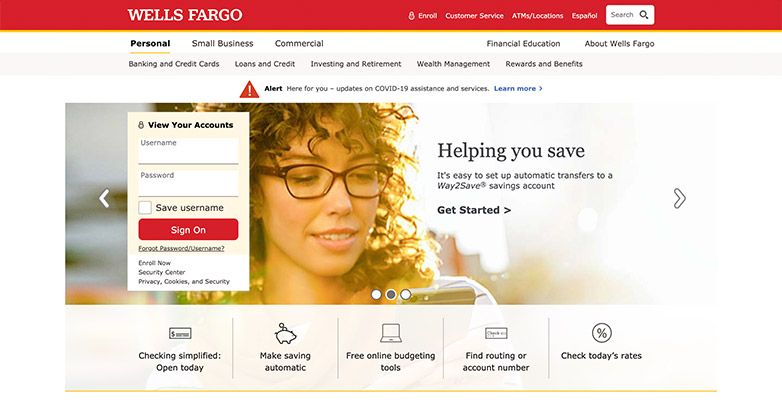
Wells Fargo’s website is responsive and makes it easy for the customer to navigate on all devices.
Making sure people can easily navigate your site on all platforms is always important, a strategy also emphasized by a hotel marketing agency when optimizing hospitality websites for direct engagement and bookings.
5. BBVA

BBVA’s website combines professional photography and vector graphics that create a professional but approachable feel.
Their use of blues and overlays adds contrast and gives a clear message of what their brand is.
6. SANTANDER

Santander’s brand is simple and to the point.
The entirety of the site is mostly white which lets their red pop and be the main element throughout.
7. Monzo
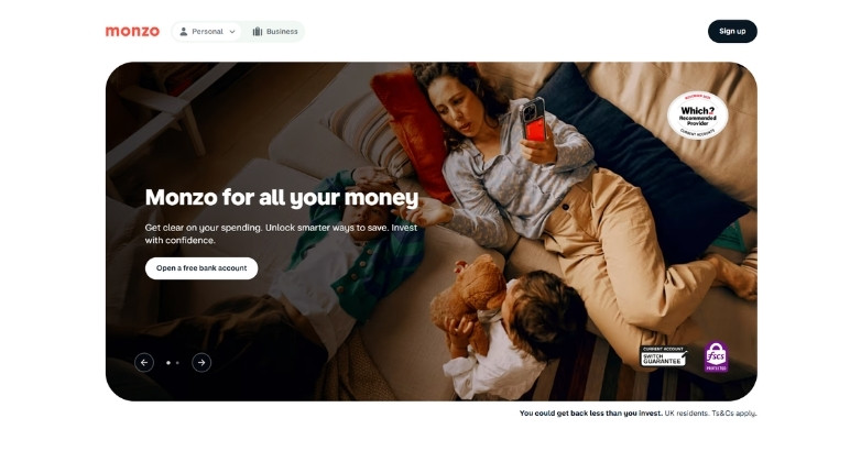
Monzo’s site feels more modern than traditional banking websites. They use bright colors and simple illustrations instead of a formal corporate look.
This can be a great way to make banking feel friendlier and easier to understand.
8. Chime
Chime’s bank website design stands out with a modern, approachable interface built for everyday users.
A bright color palette, paired with friendly visuals, creates an inviting experience that feels less intimidating than traditional bank websites.
Navigation is simple and direct, guiding users to features like spending accounts, savings, and early direct deposit without confusion.
9. BYLINE

Byline’s site uses darker elements in their site which is different from the other light and airy sites we previously saw.
Using black and white photography at the beginning of each page helps make their orange pop and creates a professional and serious feel.
10. MIZUHO

Mizuho’s site is visually stunning and intrigues you right away with the use of a full-screen video.
This use of full-width imagery is seen throughout the site as well as continuously using rectangular callouts.
11. SEASONS
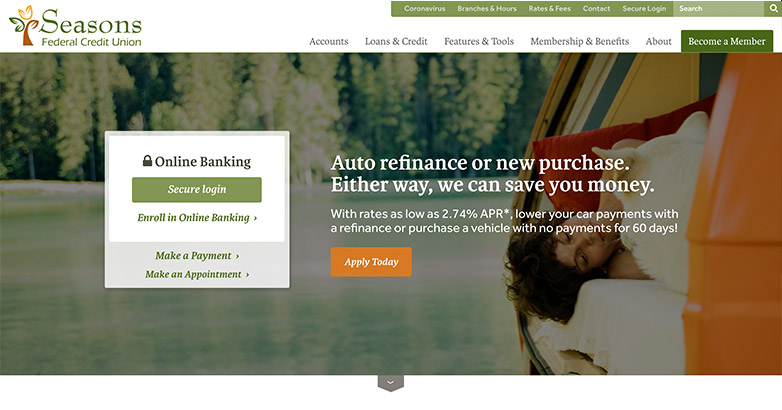
Season’s Bank website design is approachable from the start with their use of outdoor photography and a neutral color palette that ties the whole brand together.
12. HUNTINGTON
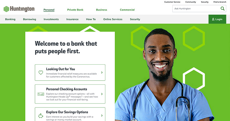
Huntington’s website is bold and fun.
Their brand is cohesive by using their green throughout the site as well as utilizing their icon from the logo as an element throughout.
13. GATEWAY BANK

Gatweway Bank’s website makes great use of video and stunning photography throughout their site.
Their brand’s color scheme is neutral with a pop of rusty red that makes the website feel fun yet comfortable.
14. FIELD & MAIN
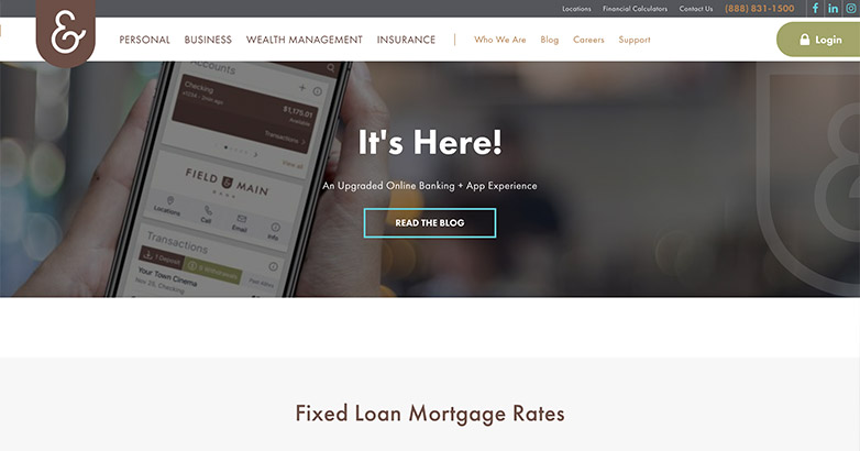
Field & Main’s website makes use of their icon from their logo throughout the site, applying it over photos and using it as an element behind the text.
Their site is also easy to navigate with their use of white space and simple photography.
15. FIRST HORIZON
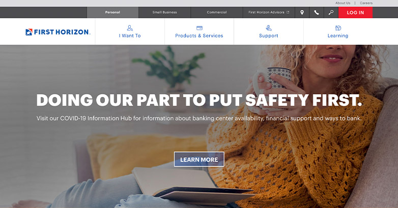
First Horizon’s website applies the brand’s blue throughout the site making it a dominant element all over.
Along with using their blue, they consistently use grid elements that help organize information but also add an extra detail to the page.
16. WEBSTER
Webster bank site is simple and sleek. They use their brand colors sparingly along with black and white photography that helps their colors pop.
17. DISCOVER
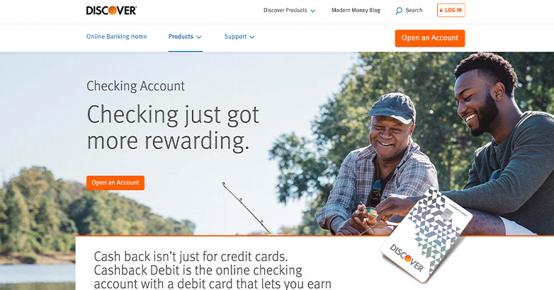
Discover keeps their website simple yet makes use of out-of-the-box elements like overlapping graphics, and adding subtle animations.
They also use their brand’s orange as more of an accent than a dominant color that helps keep the site feel clean yet energized.
18. AFRASIA

Afrasia’s bank website design certainly makes an experience when you visit.
They utilize scroll animations throughout while encasing the design into a white border that stays while you navigate.
19. CHARITY BANK
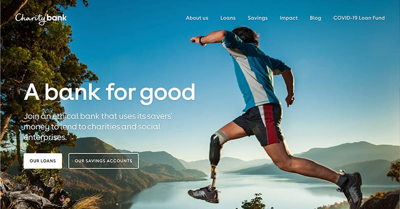
Charity Bank’s website use of full screen imagery and elements that let you immersive yourself into the page.
Their fun use of colors ties back into their brand and represents the charities they give back to.
Elevate Your Hospitality Brand Today
Schedule Your Free Consultation
Seeking to elevate your business? Let Mediaboom guide you. Secure your exclusive, free consultation with our digital marketing experts today.
20. TD BANK
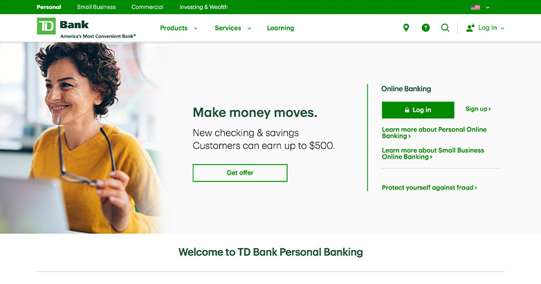
TD Bank’s brand’s green a dominant throughout their site, making use of the color as much as they can without making it overwhelming.
TD Bank keeps it simple and to the point with no excessive elements, just simple imagery and iconography.
21. VISTA BANK
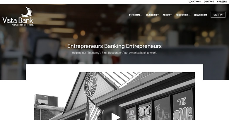
Vista Bank’s website not only uses video elements on the welcome screen but through the site as well to better illustrate who they are as a company.
They utilize video well as a design element but also as a way to better provide information to their clients.
22. SALEM CO-OPERATIVE
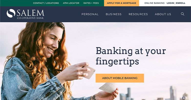
Salem Co-Operative’s brand is fun and professional. Their brand colors complement each other well and help add contrast to their site.
Along with using their brand’s color scheme dominantly throughout, they use full-width components that really make the website feel full and utilized to its full extent.
23. JPMorgan Chase & Co.

Another contender for the best banking website design is the JPMorgan Chase & Co. site.
The design of this site is clean and uncomplicated, with a simple white background and text above the fold in lieu of a navigation bar.
A block-style layout keeps the website design seamless as you go from the careers page to the company’s annual report and news stories.
24. Lone Star National Bank

The South Texas Lone Star National Bank has a bank website design to emulate. What helps it rank among the best bank websites is its easy navigation and great use of brand colors.
Those colors–blue, gray, and white–are subtly represented throughout the site, lending great cohesion.
The traveling navigation bar complete with a search function and an option to find an ATM and banking center offers customers more of what they need.
25. U.S. Bancorp

U.S. Bancorp’s website is a stellar sample banking website, so we had to include it.
You’ll first notice the humanistic approach that the banking company took with its site design, as there are many photos of smiling people.
The clean white background makes the red CTA buttons stand out that much more. The red happens to match one of the three colors of the U.S. Bancorp logo (the other two are white and blue).
26. Avidia Bank

The unique bank website design that Avidia Bank utilizes is why it’s cemented its spot on this list.
The site is a lot more colorful than most bank websites and features 3D character mascots like the characters you’d see in a Pixar movie.
These characters follow you as you click from page to page.
27. United Community Bank

Also embracing the humanistic approach is the United Community Bank, the next on our list of the best bank websites.
This clean site with a white background showcases an image of a family taking a walk outside with options on the homepage for personal or business accounts.
CTA buttons above the fold that are built into the navigation feature login and open an account options.
A drop-down menu, denoted by three horizontal lines, lets you learn more about the United community, the bank’s history, careers, and much more.
28. Truly Financial

The Truly Financial site design proves that you can incorporate a literal rainbow of colors and still have a bank website that looks clean, crisp, and professional.
The key is to use pastel versions of the colors, apply them sparingly, and keep the bulk of the site simple with a white background and black CTA buttons.
29. Capitol Bank

The bank website design of Capitol Bank might inspire your own banking website.
The bright shade of blue overlays photos of bank staff as you click from page to page. The site also features two navigation bars atop one another.
The first bar is a very slim bar in the same blue color with links for personal or business banking accounts, the Capitol Bank phone number, and a link to open an account.
The second, larger navigation bar in black and white features standard dropdowns like mortgages, about, contact, and private banking. Both navigation bars scroll with you.
30. BankWAW

If you’re still looking for sample bank website designs, BankWAW in Australia is a good one to check out.
The site features a carousel of scrolling images that are all people-centric.
This site also uses more color than most bank websites, with dark blue navigation, light blue opt-in forms, and even a salmon pink fixed rate calculator.
31. Banner Bank

Banner Bank’s navigation bar is rather simple in comparison to the other sites we’ve looked at, but that’s because the homepage features all the navigation options about midway down the page as clickable links.
This makes sense considering the navigation bar at the top does not travel as you jump from one page to another.
32. Customers Bank

Wrapping up our bank website design examples is Customers Bank.
Although lengthy web pages can feel like information overload as you scroll, Customers Bank keeps its pages neat and concise with social-media-style boxes that can redirect you elsewhere on the site, including pages for loans or instant payments.
33. Bank of America

Bank of America utilizes a sophisticated red and white design. The top banner prominently displays the logo and a convenient search bar.
The main navigation bar, featuring a red background and white text, clearly categorizes services like “Personal” and “Wealth Management.”
Below, rotating banners showcase credit card images and benefits. The login section is strategically placed on the right, providing easy access for existing customers.
34. Citibank

Citibank’s website design boasts a sleek, professional layout with a predominantly blue and white color scheme.
The homepage features a prominent promotional offer highlighted with bold text and clear call-to-action buttons. The navigation is designed to be straightforward, ensuring users can easily access various banking services.
A well-placed login section enhances user convenience.
35. PNC Bank

PNC Bank’s website design is vibrant and dynamic, characterized by a bold orange and blue color scheme.
The homepage prominently displays a large promotional banner with clear, actionable buttons.
The comprehensive navigation menu covers a wide range of banking services. Modern graphics and engaging images enhance the user experience, reinforcing PNC Bank’s innovativebrand identity.
36. Truist Bank

Truist Bank’s website features a modern and stylish design with a purple and white color scheme. The homepage showcases a significant promotional offer with clear call-to-action buttons.
The navigation menu is extensive, covering various banking services.
Lifestyle-oriented images add a personal touch, while the conveniently placed login section emphasizes accessibility and user convenience.
37. Capital One

Capital One’s website design is lively and engaging, utilizing a bright blue and white color scheme.
The homepage features a summer-themed promotional banner with bold text and compelling call-to-action buttons.
The intuitive navigation ensures easy access to a variety of banking services. A prominently placed login section guarantees convenience for returning customers.
38. Citizens Bank

Citizens Bank’s website design offers a clean, user-centric layout dominated by green and white hues.
The homepage showcases a prominent promotional offer using bold text and clear call-to-action buttons.
The navigation is designed for simplicity, allowing users to effortlessly find various banking services.
A strategically placed login section enhances user convenience.
39. Regions Bank

Regions Bank’s website features a modern and approachable design with a green and white color scheme.
The homepage emphasizes a key promotional message with bold text and clear call-to-action buttons.
The navigation is intuitive, making it easy for users to access different banking services.
A prominently placed login section ensures convenience for users.
WHAT OUR CLIENTS SAY
40. M&T Bank

M&T Bank’s website design presents a clean, professional look with a green and white color palette.
The homepage highlights a promotional offer using bold text and clear call-to-action buttons.
The navigation is straightforward, facilitating easy access to various banking services. A prominently positioned login section ensures user convenience.
41. Synovus Bank

Synovus Bank’s website design is engaging and clean, with a predominantly red and white color scheme.
The homepage features a highlighted promotional offer with bold text and clear call-to-action buttons.
The navigation is simple and direct, making it easy for users to find various banking services. A well-placed login section ensures user convenience.
42. Woodforest National Bank

Woodforest National Bank’s website design is clean and functional, featuring a green and white color scheme.
The homepage highlights a promotional offer with bold text and clear call-to-action buttons.
The navigation is straightforward, allowing users easy access to various banking services. A prominently placed login section ensures user convenience.
43. HSBC Bank USA

HSBC Bank USA’s website design exudes professionalism with its clean layout and predominantly red and white color scheme.
The homepage prominently displays a promotional offer with bold text and clear call-to-action buttons.
The navigation is straightforward, allowing easy access to a variety of banking services.
A well-placed login section ensures user convenience.
44. Huntington National Bank

Huntington National Bank’s website features a clean, functional design with a green and white color palette.
The homepage highlights a promotional offer using bold text and clear call-to-action buttons.
The navigation is designed to be straightforward, providing easy access to various banking services.
A prominently placed login section enhances user convenience.
45. Ally Bank

Ally Bank’s website design is modern and clean, utilizing a predominantly purple and white color scheme.
The homepage features a highlighted promotional offer with bold text and clear call-to-action buttons.
The navigation is simple and intuitive, ensuring easy access to different banking services.
A prominently positioned login section ensures user convenience.
46. TD Ameritrade

Charles Schwab’s website design is clean and professional, featuring a blue and white color scheme.
The homepage welcomes users with a prominent message in bold text and clear call-to-action buttons.
The navigation is straightforward, allowing easy access to various financial services.
A well-placed login section ensures user convenience.
47. Barclays Bank USA

Barclays Bank USA’s website design is modern and clean, with a predominantly blue and white color scheme.
The homepage showcases a promotional offer with bold text and clear call-to-action buttons.
The navigation is straightforward, providing easy access to various banking services.
A prominently placed login section ensures user convenience.
48. Navy Federal Credit Union

Navy Federal Credit Union’s website design features a clean, user-friendly layout with a predominantly blue and white color scheme.
The homepage highlights a promotional offer with bold text and clear call-to-action buttons.
The navigation is straightforward, providing easy access to various banking services. A login section is prominently placed, ensuring user convenience.
49. Patelco Credit Union

Patelco Credit Union’s website design features a clean, modern layout with a predominantly red and white color scheme.
The homepage highlights a promotional offer with bold text and clear call-to-action buttons.
The navigation is straightforward, providing easy access to various banking services. A login section is prominently placed, ensuring user convenience.
50. PenFed Credit Union

PenFed Credit Union’s website design features a clean, engaging layout with a predominantly blue and white color scheme.
The homepage highlights a promotional offer with bold text and clear call-to-action buttons.
The navigation is straightforward, providing easy access to various banking services.
A login section is prominently placed, ensuring user convenience.
Elevate Your Hospitality Brand Today
Schedule Your Free Consultation
Seeking to elevate your business? Let Mediaboom guide you. Secure your exclusive, free consultation with our digital marketing experts today.
Update Your Bank Website Design
If your bank does not utilize the traits listed above, then it is time to consider a refresh.
Making updates to your website will help your business in a multitude of ways such as increasing brand consistency and converting prospective clients.
Contact Mediaboom, a hotel marketing agency, to talk about your next bank website design!
By: Frank DePino
Frank DePino is the Principal and Founder of Mediaboom, a top hotel marketing agency partnering with leading hotel and hospitality brands. With 30+ years of experience, he has led strategic digital initiatives for names including Four Seasons, Ritz-Carlton, JW Marriott, Millennium Partners, and Guardian Jet. Frank helps hospitality businesses strengthen brand presence, drive qualified leads, and elevate guest experiences through website design, SEO, content marketing, and paid media. Under his leadership, Mediaboom is a trusted partner for brands pursuing measurable digital growth in a competitive hospitality landscape.