
Construction Website Design – 50 Industry Examples

By: Frank DePino | April 5, 2024
Loading the Elevenlabs Text to Speech AudioNative Player...
Are you looking for inspiration to create or enhance your construction website?
Construction website design refers to the creation and optimization of online platforms that showcase the capabilities and projects of construction firms. These websites are designed to be visually appealing, mobile-optimized, and SEO-friendly to effectively engage potential clients.
Explore our comprehensive guide featuring 50 exceptional designs to find inspiration for your next project.
1. Eco Residency

The EcoResidency website features a clean, modern aesthetic and a hero image that captures its eco-friendly ethos.
Its intuitive layout with a structured menu facilitates effortless navigation through the site’s rich content on sustainability. The visual appeal is enhanced by a neutral color scheme, high-quality imagery, and white space, creating a sleek user experience.
A contrasting ‘Partner with Us’ button stands out, inviting user interaction and connection.
Collectively, these elements combine to form a user-friendly and engaging digital platform that mirrors EcoResidency’s dedication to sustainable living.
2. RBC Homes

The RBC Homes website exemplifies digital prowess in construction, merging sophisticated design with functionality.
It reflects RBC’s home building expertise through well-organized sections for Custom Homes, Remodeling, Architectural, and Interior Design.
Featuring engaging videos, the site showcases RBC’s quality, craftsmanship, and wide range of services, from building dream homes to renovations and protection, catering to various homeowner needs.
Mediaboom’s expertise in digital strategy, supported by a hotel marketing agency perspective, significantly enhanced RBC Homes’ brand and online presence with a refined user experience, highlighting the brand’s legacy and commitment to coastal living.
3. GFI Partners

GFI Partners, a premier real estate advisor in Boston, collaborated with Mediaboom on a website reflecting their real estate investment and development prowess.
Mediaboom designed a sleek, modern website that highlights GFI’s extensive portfolio of commercial and residential properties.
The challenge was to showcase GFI’s unique mix of investment banking and asset management, making the site a visually engaging platform with striking imagery and custom responsive development.
This site distinctively presents GFI’s projects and expertise, underlining their industry leadership in a user-friendly, innovative manner.
If you also are looking to create a construction website that showcases your services and attracts potential clients, let us combine construction expertise with insights from a hotel marketing agency to build a website that showcases your services and attracts potential clients.
Is Your Hotel Showing Up in ChatGPT?
Travelers are increasingly using AI tools to research destinations before they ever reach a booking site. See how your hotel appears in these AI-generated answers, where competitors or OTAs may be gaining visibility, and whether there are opportunities to strengthen your presence.
4. Epstein
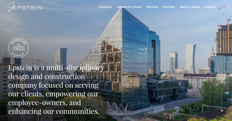
Epstein’s homepage artfully combines video content and interactive design to celebrate their centennial legacy.
This dynamic blend of historical narrative and modern technology captivates visitors, creating a seamless and immersive brand experience.
Moreover, the use of video enhances engagement, weaving together Epstein’s history, ethos, and vision into a compelling visual story.
Furthermore, the site’s design emphasizes their commitment to excellence, merging creativity with advanced technology.
Strategic storytelling underpins the video, reinforcing their identity and inviting visitor interaction. Consequently, for brands aiming to replicate Epstein’s impactful approach, Mediaboom offers expert guidance in crafting websites that resonate deeply with audiences.
5. Westlake
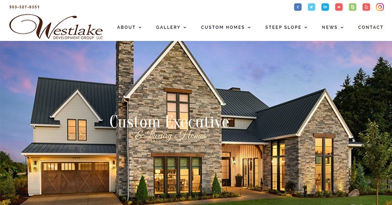
Cross-channel communication has become pivotal for brands to maximize market presence, with construction website design as vital platforms.
- Digital platforms showcase brand offerings and craft resonant narratives.
- Westlake Development Group integrates social media for engagement on their site.
- Seamless Facebook and Instagram integration on their homepage encourages active audience participation.
- Content curation across channels weaves Westlake’s brand story into consumer experiences, building relationships and trust.
Westlake’s strategy elevates their brand within the consumer’s digital realm, transforming their website from a service lister to an engaging narrative space. Their approach fosters a community of followers, bringing the brand’s story to life.
6. KP LaMarco
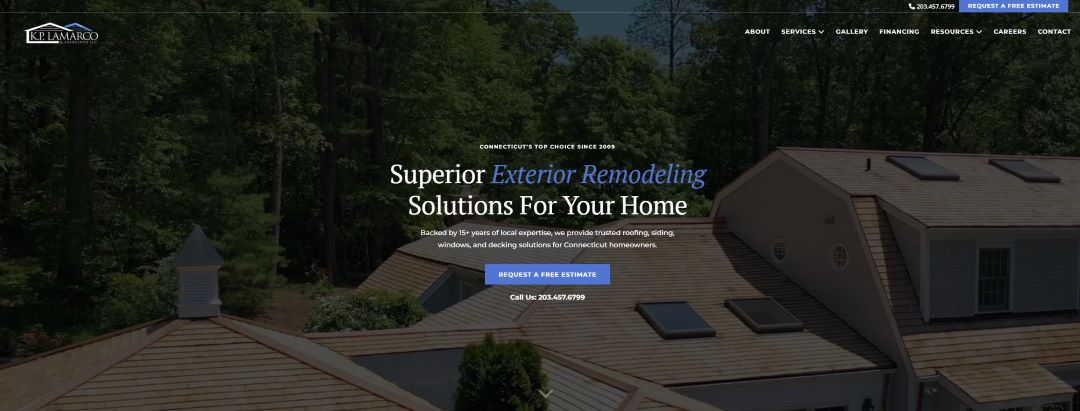
KP LaMarco’s website design incorporates a clean, modern aesthetic with an emphasis on user experience.
The layout is intuitive, offering easy access to various services, including project management and construction consulting.
The hero section uses high-quality visuals that highlight their construction projects, while the navigation is streamlined for fast access to detailed information. With SEO-optimized content and fast load times, KP LaMarco’s site ensures potential clients can easily find the services they need.
The overall design balances professionalism with approachability, making it a prime example of an effective construction website.
7. National Roofing
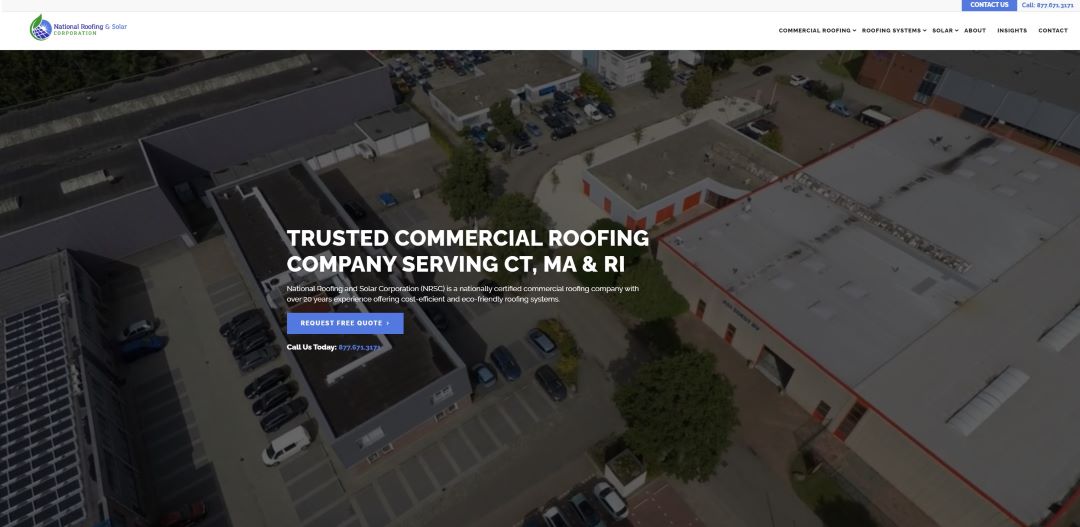
This website blends functionality with sleek design to showcase their roofing and solar services.
The clean interface, coupled with an easy-to-navigate menu, ensures users can quickly access key service areas, from roof installation to solar energy solutions.
The bold use of imagery conveys trust and expertise in the roofing industry, while interactive elements, like the “Request a Quote” feature, encourage immediate customer engagement.
National Roofing’s website is designed with user experience in mind, delivering fast loading speeds and mobile optimization, making it a go-to resource for customers seeking top-notch roofing services.
8. JDG Constructions
Motion design

The JDG Constructions website combines architectural elegance with digital finesse, setting a high standard for construction web design.
- Engages visitors with sleek motion design that marries aesthetics with functionality.
- Provides a seamless user journey across the site, from homepage to menu animations.
- Showcases commitment to quality and detail, reflecting the brand’s narrative.
- Connects with the audience through a narrative that builds trust and credibility.
JDG Constructions’ site transcends mere digital space, offering a cohesive and pleasing user experience that encapsulates the brand’s ethos and elevates industry web standards.
By intertwining their brand story with strategic advertisements, JDG Constructions establishes a profound connection with their audience, thereby enhancing customer relationships and reinforcing their stature in the contractor industry.
In essence, the JDG Constructions website is more than just a digital space; it’s a cohesive, user-centric, and aesthetically pleasing environment that effectively communicates the brand’s ethos. Moreover, it elevates the standard for construction website design.
Contact Us Today
Ready to elevate your construction website? Contact Modiaboom for expert assistance in creating a compelling digital presence that truly reflects your brand’s story.
Let’s build something remarkable together!
9. Ghafari
Clear navigation

In the crucial digital space where first impressions are lasting, Ghafari’s website sets a high standard with its user-friendly navigation.
Additionally, it combines aesthetic appeal with functional design at the forefront of its homepage, enhancing the overall user experience.
- Features an intuitive, prominently placed navigation bar
- Organized layout for easy access to company history and projects
- Navigation that enhances storytelling and emphasizes brand clarity
Ghafari’s site exemplifies how strategic design can create an inviting, credible online presence that not only meets immediate needs but also fosters a deeper brand connection.
10. Desert Star Construction
Showcase page
In the dynamic construction industry, Desert Star Construction’s showcase page exemplifies excellence.
It offers a narrative-rich portal that highlights their superior construction practices and commitment to quality.
Consequently, visitors are engaged through a seamless introduction to the brand’s portfolio, featuring vivid photos, intuitive navigation, and cohesive design.
This setup builds trust and encourages interactive exploration, showcasing the company’s legacy and potential for future projects.
Additionally, the entire experience is designed to inspire and inform, making it effortless for users to envision how Desert Star Construction can transform their contractor aspirations into reality.
11. JOVA Construction
Brand cohesion

This is a website for construction that totally gets the concept of brand cohesion. JOVA’s website uses the same color scheme, fonts, and messages throughout the website.
That’s important for multiple reasons. For starters, it makes the brand, as a whole, look put together and clean.
No matter where you go on the website, you know it’s JOVA through and through.
Additionally, the cohesive luxury branding also works well for the user, as they won’t be startled by a jarring page difference, giving them a seamless experience from start to finish.
12. VEC
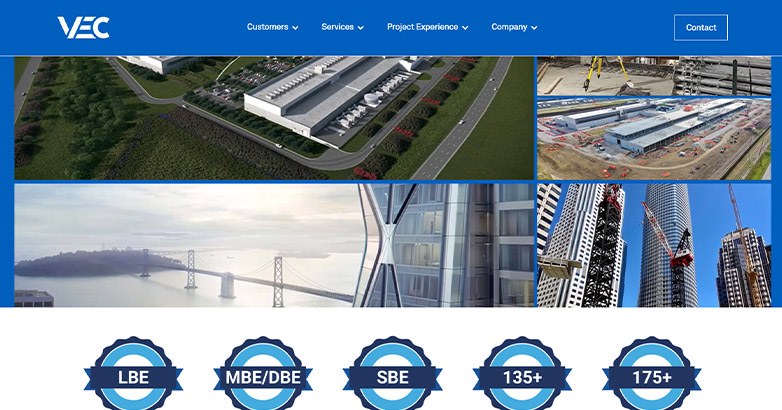
Many About Us pages detail a company’s history and values, effectively enhancing brand storytelling.
What distinguishes VEC’s About Us page is the compelling story it shares immediately, describing how the company simplified a partner’s project.
VEC’s website stands out not only for its design but for how it communicates this message. It skillfully combines a customer testimonial with a clear brand position statement, captivating visitors and inviting deeper engagement with their general contracting services.
The language used is not only encouraging but also inspiring, reflecting the brand’s values and resonating with stakeholders in construction projects.
This aspect of the website is engaging and informative, highlighting the qualities that distinguish VEC in the competitive construction and contracting industry.
13. Snyder Construction Group
News page

Building websites should look for ways to organically grow their websites, and one way to do that is to create content and have a solid content marketing strategy developed with support from a hotel marketing agency.
Snyder Construction Group has some great content on their News page that bodes well for a content marketing strategy.
For instance, they have a piece on important questions to ask a general contractor before hiring one. This is a great piece they can share on social media, in an email newsletter, and on other channels.
They also have some articles about their own endeavors, showing the world they’re up to exciting things.
Need assistance creating a winning contractor website? Reach out to Mediaboom today and let us help you craft a website that sets you apart from competitors.
Related articles:
14. CJS Builders
Projects page

Effectively showcasing a portfolio of remarkable projects is essential.
CJS Builders excels in this, presenting a compelling narrative on their website’s Projects page.
This section is more than a display; it weaves project details with visual representations, offering deep insights into their capabilities.
Consequently, highlighting collaborations with prestigious brands enhances their reputation, demonstrating their ability to handle significant projects with finesse.
Additionally, by combining sophisticated narratives with vivid imagery, CJS Builders not only showcases their expertise but also strengthens their credibility in the construction domain.
15. Costello Construction
Powerful simplicity

Costello Construction’s homepage exemplifies effective design by being direct and visually appealing.
It seamlessly combines user-friendliness with a narrative of expertise and exceptional performance. The no-nonsense approach skillfully blends visual allure with succinct content, ideal for visitors seeking quick information.
Furthermore, this design streamlines navigation and integrates the brand’s story, enhancing credibility and fostering connections. Additionally, the layout highlights their experience and building prowess, showcasing their commitment to excellence in the construction industry.
Is Your Hotel Showing Up in ChatGPT?
Travelers are increasingly using AI tools to research destinations before they ever reach a booking site. See how your hotel appears in these AI-generated answers, where competitors or OTAs may be gaining visibility, and whether there are opportunities to strengthen your presence.
16. McCownGordon Construction
Project Planning Tool

McCownGordon Construction’s website stands out for its focus on user experience.
A key element is their Project Planning Tool, which seamlessly integrates into the design. This innovative feature streamlines the process for both clients and the company.
Clients can avoid lengthy “Contact Us” forms by using the tool, simplifying project initiation.
McCowGordon, in turn, gains valuable insights into user needs, allowing them to prepare tailored materials for initial interactions.
This win-win situation reflects the company’s commitment to customer-centric solutions.
17. Mosaik Design
Blog content
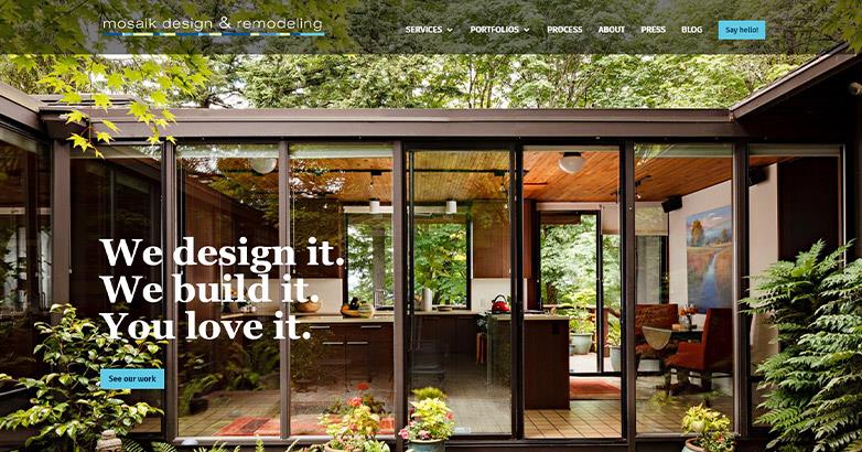
Mosaik Design’s blog brilliantly showcases the power of content marketing in home design and remodeling.
With meticulously curated articles, they establish themselves as experts, offering more than just information.
Their posts on topics like life-adaptable remodeling and innovative kitchen organization provide valuable insights, enriching their narrative and emphasizing their dedication to enhancing home life.
This strategy does more than inform—it crafts a compelling story that resonates with readers, enhancing the brand’s credibility.
Furthermore, these posts serve as catalysts for diverse marketing strategies, underlining the importance of a strategic content approach that establishes authority and fosters lasting customer relationships in the construction and design industry.
18. IMC Construction
Video testimonials

Client testimonials are effective social proof tools for any service company, and the more personal they are, the better.
Their effectiveness amplifies when they exude a personal touch, resonating deeply with prospective clients, especially for service-oriented firms in sectors like construction.
Recognizing this, IMC Construction elevates its customer testimonials, and with collaboration from a hotel marketing agency, transcends conventional methods by incorporating video testimonials that enhance brand credibility.
This innovative approach allows viewers to connect with the authentic faces and voices behind the accolades, enhancing the credibility of their narrative.
Moreover, these testimonials not only showcase the company’s exemplary work but also the genuine enthusiasm and appreciation of their clients.
By weaving the brand’s story into these testimonials, IMC Construction fosters stronger customer relationships and establishes a robust reputation within the construction industry, setting a new paradigm in showcasing client experiences on construction website design.
19. Castle Homes
Stunning photography
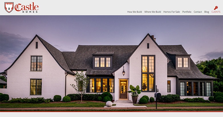
Many contractor website design are heavy with images of their work, but Castle Homes’ stunning photographs help set their website apart from the rest.
The pictures give you a sense of classic luxury that’s accessible and achievable. These beautiful images also show how well the company can design and execute on its projects.
And, despite the subject matter of each photo differing, you can easily tell they’re meant to be on the same website and are from the same company.
20. Wight & Company
People page
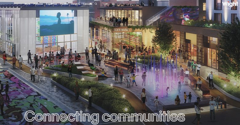
People want to know there are actual people behind a construction company.
It’s refreshing to see the engineers, managers, and designers who make the magic happen, which is exactly what Wight & Company does on their People Page.
They create a more personal connection by spotlighting the staff and introducing users to them before any construction inquiries happen.
Additionally, the staff bios are also a nice touch—not only do they add a personal touch, but they also establish legitimacy within the company by highlighting their expertise.
21. Culpepper Construction
Eye-catching video

Culpepper Construction’s website captures attention with its eye-catching opening video on the homepage.
This innovative video, paired with stunning visuals of contractor work, intricately weaves a visual narrative that showcases the essence of construction with finesse.
It not only captivates the imagination but also fuels curiosity, prompting viewers to explore the company’s capabilities further.
This approach transforms a simple visit into an immersive experience, enhancing user engagement.
By seamlessly blending artistry with practical functionality, Culpepper Construction sets a new standard for construction websites, clearly distinguishing itself in the industry and elevating user interaction.
22. McKinstry
Build the Future page

McKinstry’s Build the Future page helps set it apart from other construction website design on the internet.
It does an excellent job of displaying some of the company’s core values and highlights an important part of its brand story: the future.
Users who also value sustainability and inclusion will connect with their spotlighted values, and as such, will align more with the brand.
Brand loyalty is crucial for any company in any industry, including construction.
Related articles:
23. Belmark & Nightingale
Clean design

What makes Belmark & Nightingale a great website for construction is how clean its design is.
It’s cohesive and well laid out, giving users the chance to easily navigate where they want to go.
It’s not overfilled with fluff text or images—it shows users what the company does well and provides key company information.
The nice design and aesthetic tie it together with a neat bow.
24. Rogers O’Brien
Value-driven copy

What separates a good construction website from a great construction website?
The copy. The right web copy leads the user in, captures their attention, and truly makes a connection with them.
That’s exactly what happens with Rogers O’Brien’s homepage copy. The copy is value-driven, using language that makes users feel inspired and uplifted.
It also does a stellar job of highlighting the company’s values, including safety, quality, and innovation.
Moreover, they also emphasize the importance of building relationships with their customers, which lets users know they truly care about collaboration, not just business.
The right words drive the right actions.
25. Millbrook Construction
Visual appeal

Millbrook Construction’s website is one of those building websites that grabs your visual attention from the very start.
They make a bold statement, ironically, by not making statements at all on their homepage.
Instead, they utilize captivating visuals of their work to show web visitors how great their constructions are.
If people do want to learn more, they use the navigation tool in the upper right corner to easily direct them where they need to go.
Visually appealing, combined with easy navigation, make it a standout website.
26. ADCO
Well-balanced homepage design

ADCO’s website features a well-balanced homepage design, starting with a strong header showcasing the team behind their construction projects.
The site expertly alternates between image and text segments, each distinct yet cohesive, exemplifying craftsmanship and attention to detail.
This balance, a challenge for many contractor sites, is seamlessly maintained, combining aesthetic appeal with reliability and expertise, making ADCO a standout in the digital construction landscape.
27. McCarthy
Comprehensive navigation

Construction website design can be jam-packed with helpful information, which is why it’s important for contractor companies to have great navigation on their website.
The better the navigation, the easier it is for users to get the information they need. McCarthy’s website has several layers of navigation, getting granular with major pillars like “Projects” and “Client Experience”.
Getting granular works with this design because it’s well organized, making it simple but helpful to use.
You get the right information you need in a timely manner, enhancing the overall user experience.
28. Toll Brothers
Stunning visuals draw you right in
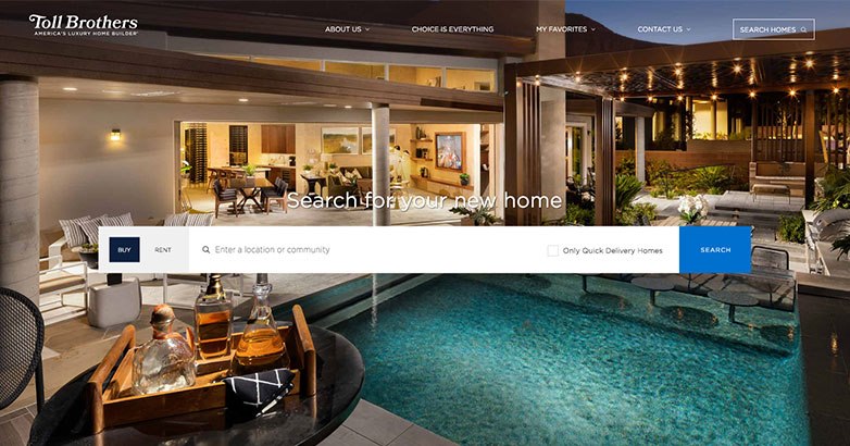
From the moment you click the Toll Brothers website, you get treated to a rotating slideshow of some of the most opulent properties on earth.
These are all homes made and sold by Toll Brothers, who call themselves “America’s luxury home builder.”
You have to go below the fold (that is, the content that appears on the page before scrolling) before Toll Brothers begin patting themselves on the back.
For instance, they mention that they’ve achieved the accolade of landing atop the World’s Most Admired Companies list by FORTUNE Magazine for five years running.
Below that, they showcase their history, their long list of happy customers, and other benefits to working with them.
If you keep scrolling, Toll Brothers has yet another area of their site dedicated to searching for your next home from them.
Consequently, by the time you’ve reached this point, you’re surely convinced that going with Toll Brothers is the best choice for you.
29. Sweenor Builders
Showcasing a legacy of construction excellence

Although Sweenor Builders specializes in the kind of amazing homebuilding that could only earn them a spot on this list, that’s not the angle they take on their website.
Instead, you’ll notice several black and white visuals of their architects in action. These photos are interspersed with lovely homes.
Their projects page is clean and easily accessible, displaying the company’s past projects in bright, vivid, large thumbnails you can click on. You can then learn more about each property, including videos of the building in progress in some cases.
The service page of the Sweenor Builders website harkens back to their homepage. It’s got the same black and white photos of real architects and contractor workers.
This more humanistic approach helps personalize their website and reminds you that you’re working with real people here, not a faceless company.
Contractor websites that offer a unique perspective and provide insight into the company can make them stand out from the competition.
30. Hill Construction Co.
A focus on luxury

The homepage of Hill Construction Co.’s site is as shown above. There are other scrolling images that will sate your appetite for luxury, but it’s kept purposely sparse. On each image, in the center, is that repeating slogan: “your partner in luxury homebuilding.”
It’s only when you click away from the homepage that you can learn more on what Hill Construction Co. is all about.
Their portfolio is laid out in the clean, neat design style that Sweenor Builders also used.
Interestingly, it’s Hill Construction Co.’s Approach page that’s one of the best on their site.
It explains their construction process from beginning to end, including the predesign, pre-construction, construction, and post-construction phases.
We also quite like the phrase on their contact page: “let’s build something beautiful.”
Let Mediaboom help you build a construction website that showcases your services and attracts potential clients.
Related articles:
Elevate Your Hospitality Brand Today
Schedule Your Free Consultation
Seeking to elevate your business? Let Mediaboom guide you. Secure your exclusive, free consultation with our digital marketing experts today.
31. Farrell Building Company
Full-screen animations captivate

Crazy Egg notes that the average Internet user stays on a website for 15 seconds or less, underscoring the importance of capturing their attention quickly.
Farrell Building Co. does this effectively with engaging video clips on their website, featuring serene bodies of water and tennis games.
The site’s streamlined navigation includes just an About page, a Homebuyer’s menu, and a Broker’s menu, simplifying the user experience.
Farrell Building Co. showcases four property types: rentals, build to suit, custom homes, and signature homes, making it easy for homebuyers and contractors to explore and find their ideal property efficiently and enjoyably.
32. Luxury Simplified
Quaint illustrations are utterly charming

Charleston-based Luxury Simplified exemplifies its name through a website that blends simplicity with elegance.
Instead of immediate graphics, the homepage welcomes visitors with short videos showcasing Charleston’s scenic beauty, setting an immersive tone.
As you scroll, quaint illustrations of homes against a black-and-white backdrop create a striking visual contrast.
Furthermore, these illustrations, accompanied by concise, compelling copy, guide users seamlessly through the site’s different segments, from construction services to vacation rentals.
This thoughtful design transforms the site into a gateway, enhancing user engagement and reflecting the power of well-crafted digital spaces in the contractor industry.
33. Millennium Partners
Attention on cityscapes

As a contractor company where the design possibilities are endless, sometimes it’s best to put certain imagery into people’s heads. In the case of Millennium Partners, they do this exceptionally well. Just take one glimpse at their website and you can see what kind of imagery they’re going for: cityscapes.
The background of their website is a gorgeous photo of a cityscape at sunset. Next to the about page link on their homepage as well as a review of their properties, Millennium Partners adds yet more iconic city images. These include Miami, New York, and San Francisco.
Meanwhile, although their website lacks a lot of menus, Millennium Partners makes it easy to check out the properties they’ve worked on, including links to these current buildings’ respective websites. Their contact page is also very accessible, so it’s simple to begin a working relationship today.
34. Linesight
A neat division of a variety of services

A construction company that offers a wealth of services could easily get bogged down trying to explain everything they do in a visually appealing way. Linesight offers a great example of how to keep all those categories tidy.
On their expertise page, they have sections dedicated to their program management, project management, project controls, cost management, supply chain management, health and safety, consultancy, and procurement services.
Each category is clickable and has small illustrations to make them stand out more. We especially like the man in a hardhat for health and safety.
Should you not feel like scrolling, you can also reach the expertise page and others (like a projects page and an about page) by clicking the drop-down menu at the top. Another great feature of this website is how Linesight showcases all the properties they’ve built on a real world map.
35. Maman Corp.
Interactivity rules the day
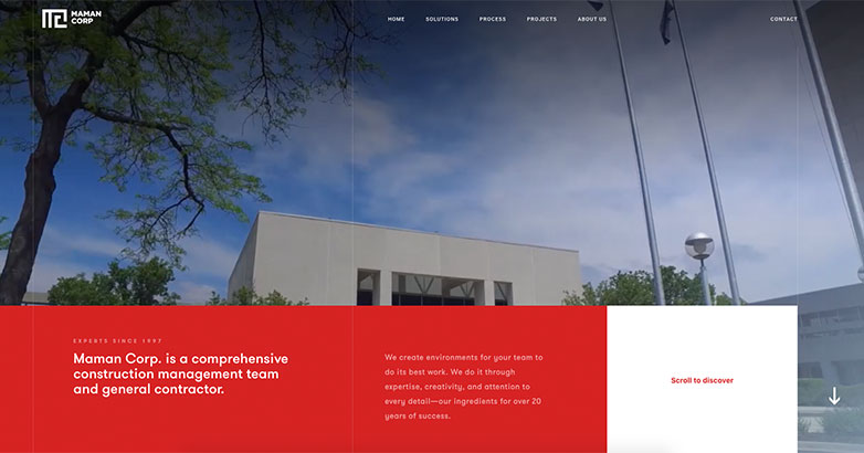
One way to keep users engaged on construction website design is to make the entire thing interactive. That’s the route taken by Maman Corp. If you look to the right side of the above image, it says “scroll to explore,” then has a big red arrow you can’t miss. They want to you to journey through their website, or, as Maman Corp says, to “explore it.”
Sure, there’s a dropdown menu to the right of their homepage, but it’s kind of like spoiling the fun early. Instead, by clicking that red arrow, you can venture through seven pages, including the company’s backstory, their commitment to clients, their company vision, and more. If you watch any of the pages for long enough, it switches to a video and then back again.
On each of those seven pages, you can click any links that catch your fancy, or you can always just continue your journey to the end. At that point, you can click back up or repeat the whole Maman site journey again.
WHAT OUR CLIENTS SAY
36. Wadia Associates
Living up to their tagline
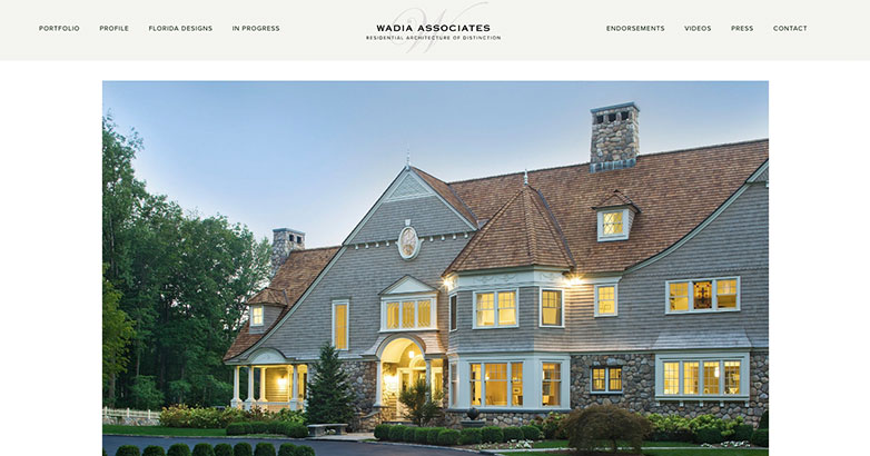
If you’re going to say that you create “residential architecture of distinction,” then your customers and clients are going to expect that to be true.
Wadia Associates cuts through the pretenses and shows you right away what you can expect from their services.
The dazzling mansion that greets you on their homepage proves the company lives up to the hype.
Also on their homepage is a great feature: an almost nine-minute explainer video on Wadia Associates. We also appreciate the endorsements section of their site, as that’s something we’ve yet to see the other construction company websites on this list do.
37. Oslo
A based co-living website

Unless you work with one of these contractor companies yourself, then you don’t quite get to see any buildings as they’re erected.
Well, that’s not the case with OSLO. As you scroll down through their site, you can partake in an interactive element: seeing a digital building from start to finish.
OSLO starts with a question, saying “what is co-living?” After answering,
continues by providing more information about their business.
For example, it is possible to find out more about the design of the apartment, its particular characteristics, and all this is supported by a video.
The site also collects important testimonies of those who lived in their buildings. At the same time, Oslo offers several locations where each client can start their co-living experience.
38. Hutchinson Builders
A social feed visualized

Australian construction company Hutchinson Builders was founded in 1912, so they have quite a lengthy history.
Additionally, they’re also an incredibly modern company, as you can see through their visual feed. It’s not the first thing you come upon on their website, as that’s a scrolling portfolio of their projects.
We quite enjoy the social feed section though, for a few reasons. For one, it incentivizes clients and customers to give Hutchinson Builders a follow on social media. It also makes the company more transparent.
Should you want to stay abreast of what’s going on with Hutchinson Builders, their always-updating social feed is a pretty great way to do it.
Each image is also interactive. In the case of Instagram posts, you can hover over the image and see the caption and hashtags.
39. Redrow
A commitment to exclusivity

We’ve already discussed branding, but UK construction company Redrow excels in this area.
Their homepage features a captivating tagline: “People say new homes are all the same…They don’t know Redrow.”
This statement offers an aura of exclusivity and invites you to explore the unique opportunities Redrow provides.
On the website, the “My Redrow” section is crucial for potential homebuyers.
Signing up grants early access to new homes and exclusive insights, enhancing the buying experience.
The site also includes the “Buying with Redrow” section, showcasing detailed branding with features like Redrow TV and valuable buying tips, demonstrating Redrow’s commitment to providing an immersive and informative customer experience.
40. John Weiland Homes
Interactive tools for the perfect home

Many of these construction website designs have used interactivity to their benefit, with John Weiland Homes no exception.
Their interactive element includes furniture planning tools, elevation tools, and a floor plan tool. Each of these tools is free to use without opting into anything. You just visit the John Weiland Homes website and begin clicking.
The level of detail included in such a free tool is seriously impressive. Take, for instance, the furniture planning tool.
You can go room by room, filling the living room, bedroom, dining room, entertainment room, kitchen dining room, and more with furniture.
Furthermore, you also have the freedom to decorate up to two floors. Not only can you get lost for hours playing with these tools, but then when you have your house set up, you know just which company can build it for you.
Related articles:
41. The Boldt Company
Built on clarity
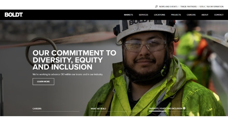
Sometimes, a construction website works best when it feels direct and easy to follow.
This is the case with The Boldt Company. Their strong project imagery and clean layout help communicate experience without making the site feel crowded.
We also must note their markets and services sections, as they organize healthcare, industrial, and commercial work in a simple way.
The result is a professional website that builds trust through clear structure and focused messaging.
42. Turner Construction Company
Sleek Connectivity

The website design showcases a sleek, modern layout with a dynamic hero image of urban construction projects, highlighted by the bold tagline “Building What Matters To You.”
It features streamlined navigation with clear links to “Our Company,” “Services,” and “Projects,” alongside direct calls-to-action such as “Contact Us” and “Become a Subcontractor.”
An interactive element invites users to explore or initiate their projects, supported by a professional color scheme of blues, grays, and whites.
43. MATT Construction
California Chic

The MATT Construction website design features a vibrant and detailed hero image of a construction site, emphasizing the company’s active involvement in building meaningful spaces throughout California.
The headline “BUILDING MEANINGFUL SPACES THROUGHOUT CALIFORNIA” is prominently displayed, underscoring their regional focus.
Navigation is straightforward with tabs for Projects, Services, About, Careers, Blog, and Press.
A search icon and a special notice about MATT’s response to COVID-19 are also included, ensuring easy access to important information and updates.
44. Barton Design Group
Tallahassee Elegance

The Barton Construction website design greets visitors with a striking hero image featuring a bustling construction site, vividly portraying the company’s active role in Tallahassee’s development.
Emphasized by the bold statement, “Construction Company in Tallahassee – Building trust by aspiring to be perfect!”, it sets a tone of commitment and precision.
The top menu is neatly organized, offering quick access to pages like Home, Services, Projects, About, and Contact, alongside a direct phone contact option, enhancing user accessibility and trust.
A call-to-action button, “View Our Work,” invites further engagement by showcasing their portfolio.
45. Skanska USA Building
Global Design Fusion

The Skanska USA Building website features an engaging hero image capturing two construction workers in discussion, emphasizing teamwork and meticulous planning.
The headline “Shape the way the world lives, moves and connects” alongside a compelling call to action, “Work with us,” invites professionals to join their mission.
The clean navigation bar includes options for “What we deliver” and “Who we are,” supplemented by quick-access links for Media, Careers, and Contact.
This layout is designed to attract skilled individuals eager to impact society through their work.
46. DPR Construction
Design Excellence

The DPR Construction website design opens with a compelling hero image of workers in vibrant safety gear, capturing the essence of active project sites.
Prominently featured is the bold declaration, “We Exist to Build Great Things,” which underscores their dedication to handling highly complex and technical projects.
The layout is user-friendly, featuring a clear “View Projects” call-to-action button that encourages visitors to explore their extensive portfolio.
The search icon and neatly arranged menu ensure easy navigation, enhancing the user’s experience on the site.
47. The Beck Group
Leadership Aesthetics

The Beck Group’s website presents a striking visual with a featured magazine cover highlighting their CEO and the company’s recognition at the 2024 Commercial Real Estate Awards.
The top navigation bar is sleek and minimalistic, providing easy access to sections like “About Beck,” “Portfolio,” “People,” “Beck Think,” and “Locations.”
A search function, along with visible links for contact and careers, emphasizes accessibility and engagement with site visitors, reinforcing Beck’s commitment to industry leadership and transparency.
48. Gilbane Building Company
Collaborative Frameworks

The Gilbane Building Company website features a vibrant hero image from a ribbon-cutting ceremony, emphasizing their community involvement and teamwork.
The banner headline proudly states “Gilbane is a leading global builder and real estate developer,” setting a tone of authority and expertise.
The top menu is streamlined for easy navigation with tabs like Building, Development, Markets, Projects, About, and more, including a ‘Partner With Us’ option, enhancing collaboration opportunities.
This layout not only highlights their scale but also their commitment to fostering relationships and excellence in construction.
49. Lendlease
Urban Aesthetics

The Lendlease website boasts an impressive hero image of Sydney’s skyline at dusk, showcasing their significant urban projects.
The site’s layout is clean and modern, with a navigation bar that includes comprehensive sections like “About us,” “What we do,” “Projects,” “Careers,” and “Sustainability.”
The inclusion of an “Insights” button and a search feature provides easy access to detailed information, making it straightforward for visitors to explore Lendlease’s services and contributions to global development.
This design effectively communicates the scale of their operations and their commitment to innovative building solutions.
50. Clark Construction Group
Cultural Design Mastery

The Clark Construction Group website displays a compelling hero image of the National Air and Space Museum revitalization, illustrating their involvement in significant cultural projects.
The headline “Building What Matters” underscores their commitment to impactful construction.
Navigation is straightforward with tabs like “About Us,” “Our Work,” “Business With Us,” “Build Your Career,” and “News,” offering comprehensive insights into the company’s operations and opportunities.
This layout effectively showcases Clark’s dedication to enhancing important public spaces through their specialized construction expertise.
FAQs
Should a construction company have a website?
Yes, it’s essential. A website establishes an online presence, builds credibility, acts as a marketing tool, provides a competitive advantage, and offers accessibility and convenience for potential clients.
What are the essential features of a construction website design?
A construction website should have a professional design that reflects the brand’s reliability and expertise. Essential features include a project gallery, detailed service pages, client testimonials, a contact form, and mobile responsiveness to ensure accessibility on all devices.
Can a construction website include interactive elements?
Yes, incorporating interactive elements like virtual tours of past projects, interactive maps of service areas, and online appointment booking can enhance the user experience. These features make the site more engaging and can help potential clients visualize the quality and scope of your work.
How can SEO be optimized on a construction website
SEO can be optimized by incorporating relevant keywords like “construction services” and specific geographic locations into the website’s content, meta descriptions, and titles. Regularly updating the site with fresh content, such as blog posts and project updates, also boosts SEO performance.
How do you write content for a construction website?
Content for a construction website should be crafted by focusing on understanding the audience, showcasing expertise, providing valuable information with clear language and visuals, and including clear calls to action.
Do you have a specific question?
Do you have a specific question about construction website design? Contact Mediaboom today to discuss how we can help elevate your online presence and drive more business to your construction company.
Elevate Your Hospitality Brand Today
Schedule Your Free Consultation
Seeking to elevate your business? Let Mediaboom guide you. Secure your exclusive, free consultation with our digital marketing experts today.
Conclusion
Construction website design serves as dynamic platforms to demonstrate industry prowess beyond digital brochures.
The 41 featured sites in this article illustrate that advanced features and a curated portfolio can enhance a site’s impact, attracting contractors and clients. A focus on quality and engagement turns your site into an engaging showcase of your work’s caliber.
If you need help creating a successful construction website, don’t hesitate to contact Mediaboom: let us help you create a website that stands out in today’s competitive digital landscape.
By: Frank DePino
Frank DePino is the Principal and Founder of Mediaboom, a top hotel marketing agency partnering with leading hotel and hospitality brands. With 30+ years of experience, he has led strategic digital initiatives for names including Four Seasons, Ritz-Carlton, JW Marriott, Millennium Partners, and Guardian Jet. Frank helps hospitality businesses strengthen brand presence, drive qualified leads, and elevate guest experiences through website design, SEO, content marketing, and paid media. Under his leadership, Mediaboom is a trusted partner for brands pursuing measurable digital growth in a competitive hospitality landscape.