
Real Estate Investor Website Design – 50 Must-See Sites

By: Frank DePino | October 30, 2024
Loading the Elevenlabs Text to Speech AudioNative Player...
Whether you’re a small real estate investor or an established one, separating yourself from the competition is one of the best ways to keep increasing your customer base, much like the strategic positioning delivered by a hotel marketing agency.
The first thing you can do to stand out is create an easy-to-use, well-designed website that clearly portrays the services you provide, following the same conversion-focused principles used by a hotel marketing agency.
Below are 50 of the best examples of successful real estate investor website design. Each site has unique features to them that make them stand out – and you can use them as inspiration as you seek to create your own stunning website.
1. GFI Partners
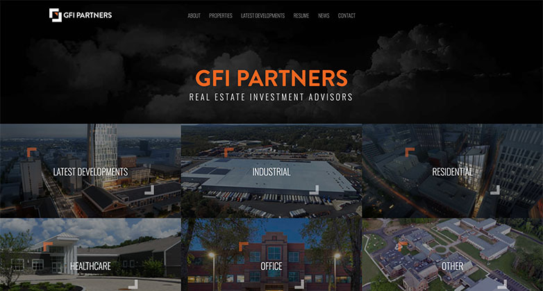
GFI Partner’s real estate investor website design is very sleek and modern – using dark overlays, seamless animations and bold font choices.
Their website makes it easy for the user to understand exactly what services they provide, successful projects they’ve completed, and history about their firm, reflecting the clarity and storytelling approach often guided by a hotel marketing agency.
Is Your Hotel Showing Up in ChatGPT?
Travelers are increasingly using AI tools to research destinations before they ever reach a booking site. See how your hotel appears in these AI-generated answers, where competitors or OTAs may be gaining visibility, and whether there are opportunities to strengthen your presence.
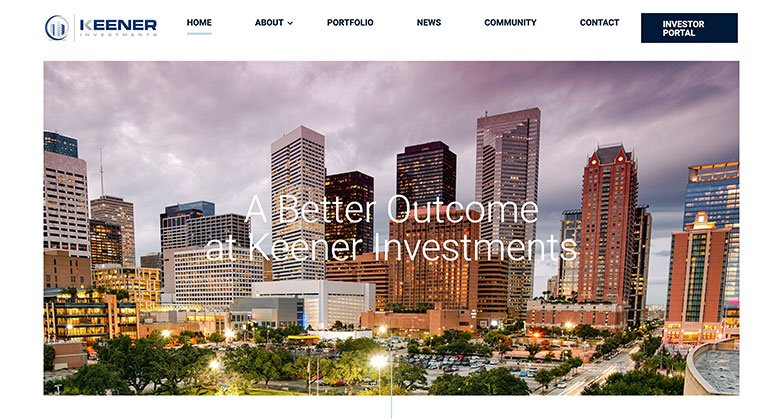
2. Keener Investments

Keen Investment’s website is sleek and lively. Right when you enter the website, an animation plays on the welcome screen and as you scroll, the elements animate into the page as well.
Keener keeps it simple by utilizing white space with strong images.
3. Oxford Properties
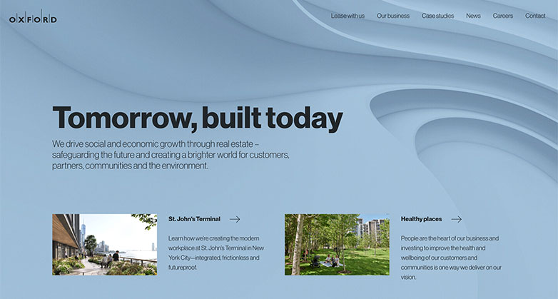
Oxford’s real estate investor website design is simple yet fun. They take advantage of the full width of the page along with high quality imagery and a colorful neutral color palette.
Their use of textured architecture for backgrounds also adds an extra touch of personality to the site.
4. Roofstock
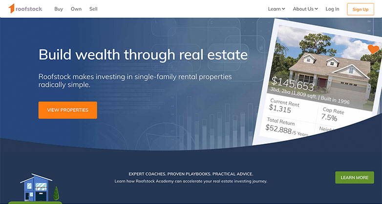
Roofstock use of graphics and playful colors carries their brand and makes the visitor feel welcomed.
The use of graphics adds better visuals to the page and helps the visitor follow information better.
5. RXR Realty
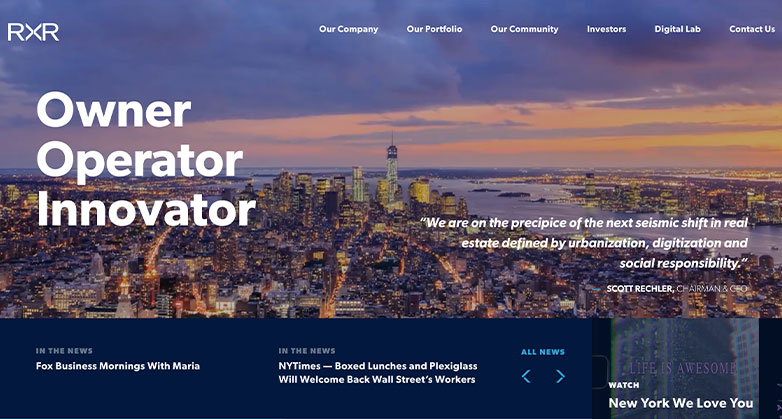
RXR’s website feels professional and protrudes success. Their use of blues adds contrast to the page along with using a video on the welcome screen.
Not only does their brand feel professional but their use of stats on their homepage also helps show how successful they are as a company.
6. HIX Snedeker

HIX Snedeker’s real estate investor website design is certainly out of the box. Along with using an interactive element behind the welcome text, their homepage showcases their work well in a stacked gallery style.
Displaying your case studies on the homepage will show right away the kind of work your company does and if done like HIX Snedeker’s, it will show the expanse of work you’ve done across the nation or globe!
7. Beacon Communities
Beacon’s website utilizes their brand’s orange well by using it in calls-to-action, on image and link hovers, and for headlines.
This good use of their colors makes their brand feel cohesive throughout. Another nice touch is their addition of a testimonial slider at the bottom of the page that helps bring authenticity to the brand.
8. VN Star
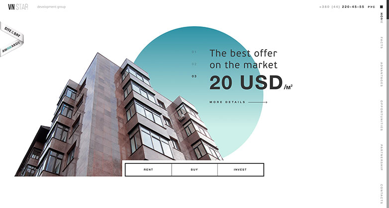
VN Star’s website uses interactive elements and animations to really make the site stand out.
They’re use of their company’s statistics helps tell their company’s story and shows the span of their work. Reference VN Star’s website if you’re looking to stand out from competitors and think outside of the box.
9. Passco
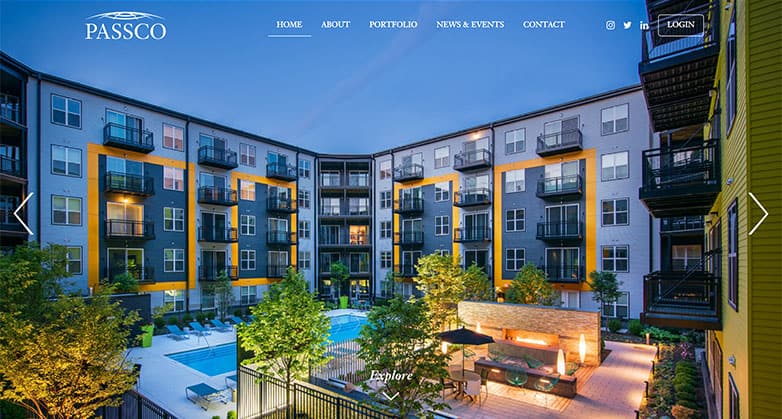
Passco’s site uses stunning saturated imagery that helps showcase their work.
A simple site along with strong photography helps keep the visitor visually intrigued but also able to get the information they need easily.
Elevate Your Hospitality Brand Today
Schedule Your Free Consultation
Seeking to elevate your business? Let Mediaboom guide you. Secure your exclusive, free consultation with our digital marketing experts today.
10. RealtyMogul
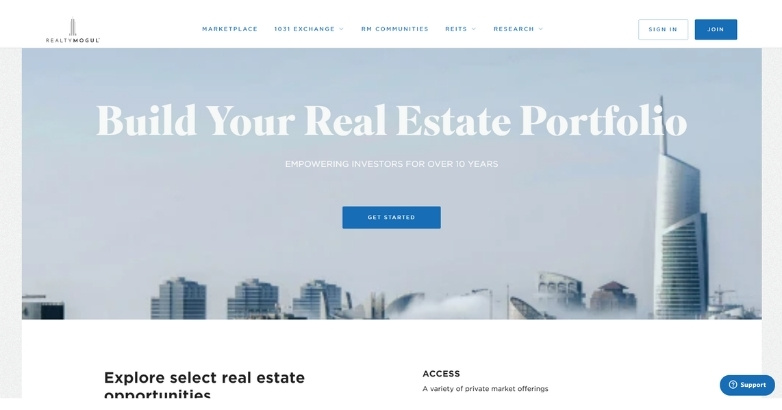
RealtyMogul’s real estate investor website design focuses on clarity, trust, and usability.
The homepage quickly explains how users can invest in real estate online, using simple messaging and structured sections. This helps new investors understand the platform without confusion.
11. Spirit Investment Partners
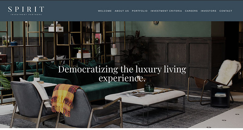
Spirit’s website has strong photography that contrasts well with their brand’s color scheme.
Adding their mission adds a nice touch on their homepage, this helps show who they are as a company and adds personality.
12. St. Philips
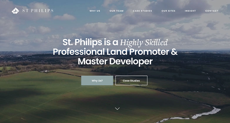
St. Philips’s homepage uses a simple zoom effect on its hero image, which helps add an extra effect without being too distracting.
Their information is organized well into a grid format and their brand color scheme is carried out consistently through the website.
13. Longpoint
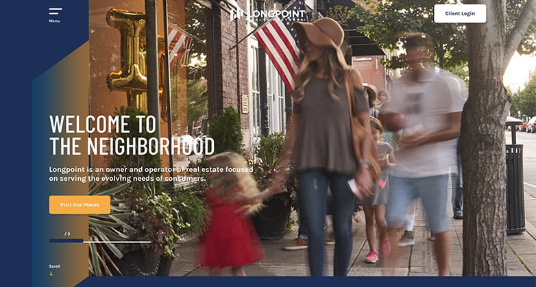
Longpoint website uses their brand’s color palette strongly throughout, utilizing it in gradients, call-to-actions, and headlines.
Another nice touch is their callout for the client login at the top so it is easily accessible once you enter the site.
14. Houzez

Locale Advisors homepage is strong because they offer a selection of videos as well as a gallery for their properties.
This helps the visitor get important information right away and pushes the visitor to explore more of the website.
They also use most of their own photography which helps add a more personal touch to their brand.
Related Article:
- Marketing Strategies in Real Estate Developer
- Property Marketing
15. Amanat
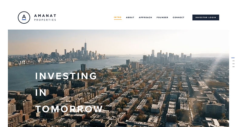
Amanat real estate investor website design is simple and well organized. They use a single-page design so you don’t have to dig through the site to find the information you need.
The information is overviewed well with statistic callouts, a graphic map to show the locations of projects, and a short paragraph for each section.
16. MREIC
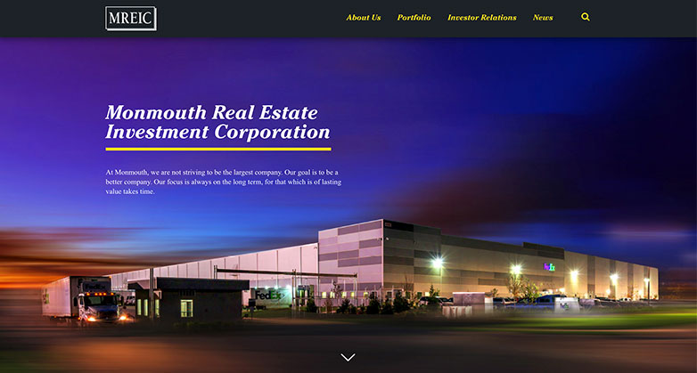
MREIC’s website uses darker tones and contrasts that well with pops of colors throughout in their photography, links and information callouts.
Their portfolio shows a map of the U.S. that helps showcase the expanse of their work and also has a small animation to add an extra touch to the page.
17. Hines
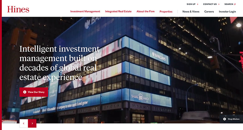
Hines website design is strong with their use of white and red creating a nice balance of simple yet bold.
Their use of largest text callouts also helps add contrast and showcases important details well.
They also organize their information well by separating them into strips on the page, this helps create call outs and add extra elements to your site.
18. Black Creek Group

Black Creek Group’s color scheme is subtle, making use of a grey-blue color palette that is also overlaid on top of their imagery to further carry their brand.
They use grids through the site that helps section off information but also to add an extra element of design to the page.
19. Fundrise

Fundrise real estate investor website design uses graphics and strong imagery.
Instead of using standard images, they take it the next level by adding by overlapping images, animations, color overlays and vector graphics all while keeping the information organized and simple.
Along with their strong use of photography, they utilize their brand’s orange to add a pop to their site and help call out information.
Related Article:
20. Veritas
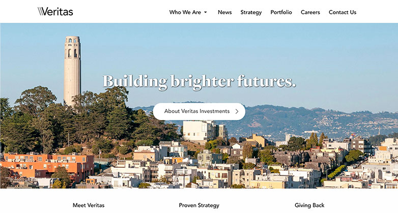
Veritas site feels personal and has a lot of personality. A San Francisco based company, they make sure it’s known this is where there work is done and showcases how important the community is to them with information callouts on their community involvement, company culture and history in the area.
21. Synapsed
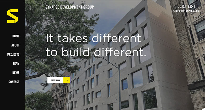
Synapsed makes their site fun with their bold color scheme, angled elements and their left-aligned navigation.
They use a single page design to keep the information simple and easy to follow.
Another fun touch is their hover effect over their team photos, starting with a professional headshot that changes to a goofy photo, something that definitely adds extra personality to your site!
22. CA Ventures

CA Venture’s website uses scroll effects well by having static images where the information moves as you scroll through the page.
Their homepage is also strong because they call out their company’s stats, showcase their services and industries they work in, feature specific projects and have a testimonial from the chief executive officer on their company’s culture.
23. Kennedy Wilson

Kennedy Wilson real estate investor website design has a nice contrast off blue and orange, only using the orange sparingly to call out information.
They mainly keep their website in a blue theme, that includes calls to actions, photography, and background elements.
Along with a strong brand, Kennedy Wilson adds a nice touch of filter option on their properties page to help you find the projects in the area related to you.
24. WE Development
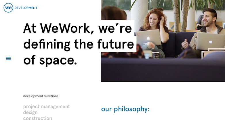
WE’s website is modern and fun. They use a video for the welcome screen but not in the traditionally full screen manor.
WE, use animations, staggered elements and scrolling effects that makes their site more interactive.
They also use fun colorful color scheme that is paired well with their use of whitespace.
WHAT OUR CLIENTS SAY
25. Prologis
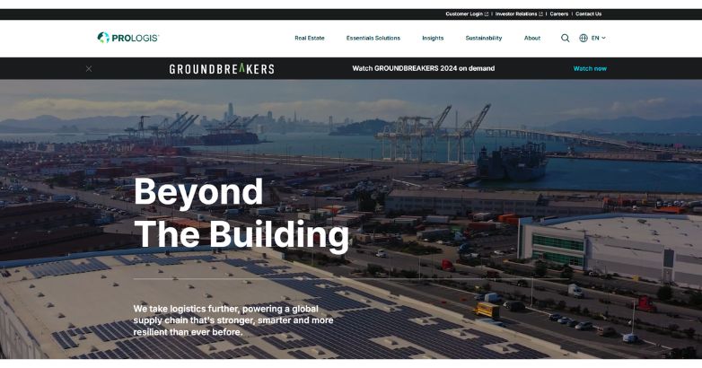
With a bold headline, “Beyond The Building,” Prologis captures attention by spotlighting innovation and eco-consciousness.
The sleek design seamlessly integrates sections on Real Estate and Sustainability, complemented by a solar panel background that reinforces their green initiatives.
A featured “Groundbreakers 2024” banner draws users in, presenting Prologis as a trailblazer in sustainable logistics and real estate solutions.
26. Equity Residential
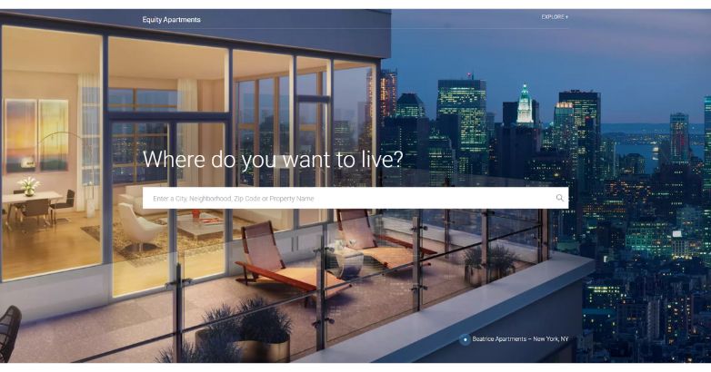
Equity Residential’s approach to real estate investor website design invites engagement with a straightforward question: “Where do you want to live?”
This welcoming call-to-action, paired with a user-friendly search bar, guides visitors to explore options by city or property.
A chic city-view balcony image sets a luxurious tone, perfectly aligning with Equity’s upscale apartment offerings, and reinforces a refined, lifestyle-oriented experience.
27. Starwood Capital Group
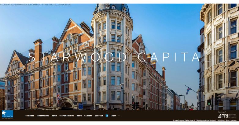
Exuding prestige, Starwood Capital Group’s website combines elegance with simplicity.
A striking image of the Radisson Blu Edwardian Bloomsbury Street Hotel in London provides a backdrop for the minimalist layout, with “Starwood Capital” boldly displayed to convey authority.
The dark navigation bar seamlessly leads users to sections like Investments and Responsibility, underscoring their commitment to high-impact, ethical investments.
28. Cortland
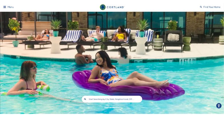
Cortland’s site welcomes visitors with a lively video background that highlights vibrant, communal living. Centered is a user-friendly search bar for finding apartments by location, making exploration easy.
The airy, clean design emphasizes Cortland’s focus on modern, connected lifestyles, while a “View All Markets” feature further enhances browsing for those interested in multiple regions.
29. The Carlyle Group
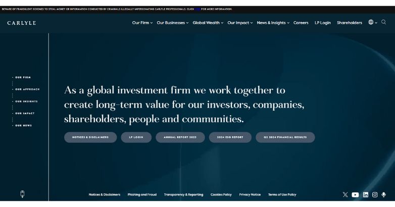
The Carlyle Group’s approach to real estate investor website design emphasizes stability and trust through a dark blue backdrop, showcasing a refined aesthetic aimed at long-term value creation for both investors and communities.
Key sections like “Our Approach” and “Our Impact” highlight their commitment to responsible investing, while easily accessible buttons for reports and login portals enhance usability, ensuring a smooth experience for stakeholders.
30. Nuveen Real Estate
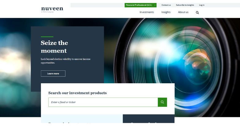
Nuveen Real Estate’s website invites users to “Seize the moment,” a bold message that aligns with their proactive approach to market opportunities.
A background image of a camera lens signifies focus and precision.
Well-organized sections like Investments and Insights offer accessible resources, while a prominent “Learn More” button encourages deeper exploration, fostering user engagement.
Related Article:
- Real Estate Branding
- Real Estate Investor Marketing
31. CIM Group
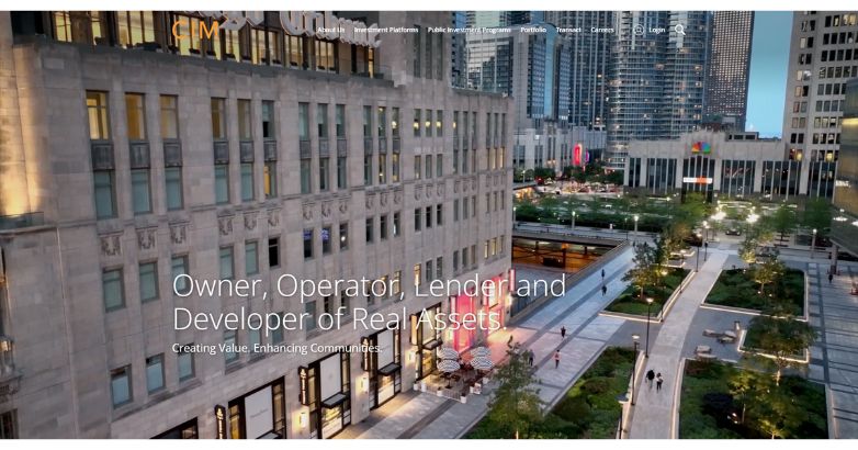
With an urban skyline backdrop, CIM Group’s site captures their focus on developing, operating, and lending in urban real assets.
The tagline “Creating Value. Enhancing Communities” conveys their commitment to community growth, and streamlined navigation makes sections like Investment Platforms easy to explore.
The transparent, modern layout aligns with their urban-oriented mission.
32. BentallGreenOak
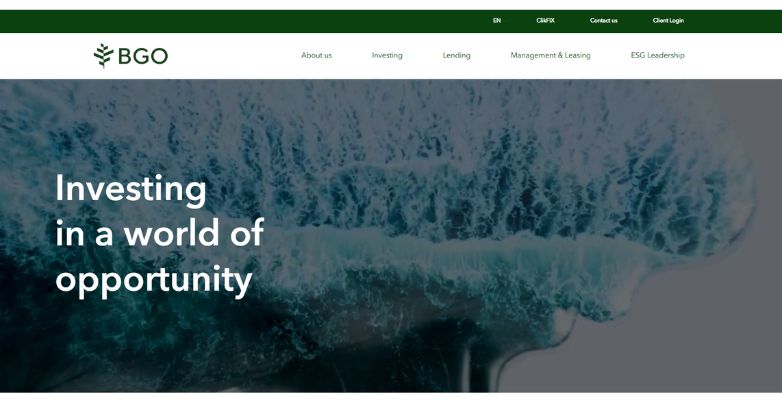
BentallGreenOak’s website, featuring an ocean wave background and the tagline “Investing in a world of opportunity,” conveys a vision of sustainable, impactful investment.
The green-themed navigation reflects their eco-conscious values, with sections on Investing, Lending, and ESG Leadership that underscore their commitment to environmental stewardship and diversified investment strategies.
33. Heitman
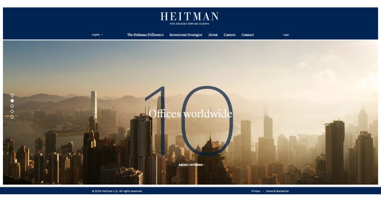
Heitman’s real estate investor website design highlights their global presence with a city skyline image and the message “10 Offices Worldwide.”
A professional, navy-blue theme fosters trust, while clear navigation to sections like Investment Strategies underscores their dedication to client service spanning over five decades.
The overall design and messaging reflect Heitman’s expertise and reliability in global real estate investments.
34. Related Companies
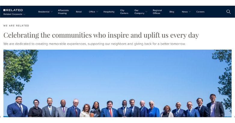
With a welcoming headline, “Celebrating the communities who inspire and uplift us every day,” Related Companies’ website fosters a sense of connection and community.
The clean design and urban skyline backdrop emphasize their development focus, while sections for Residential, Office, and Hospitality simplify navigation.
Their message of giving back reflects a commitment to creating positive, lasting neighborhoods.
35. Ivanhoé Cambridge
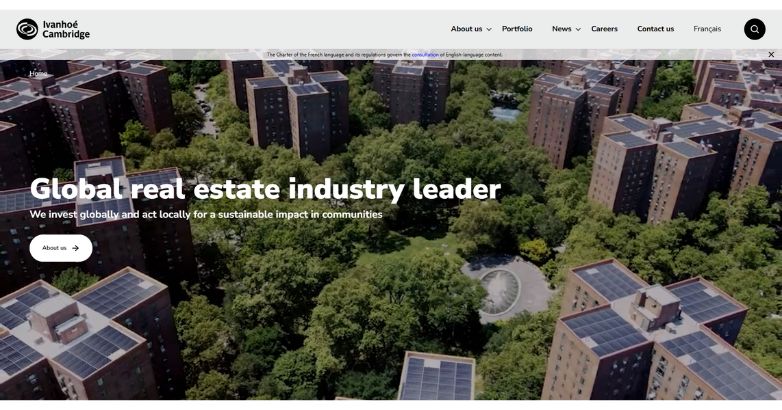
Positioning themselves as a “Global real estate industry leader,” Ivanhoé Cambridge’s site features a compelling background video that humanizes their mission of sustainable, community-focused investments.
Intuitive navigation links for Portfolio and News enhance accessibility, supporting their global vision and local action approach.
36. LaSalle Investment Management
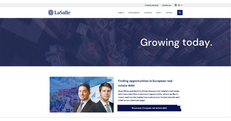
The succinct tagline “Growing today” on LaSalle’s site highlights their investment philosophy, set against a subtle aerial view of urban growth.
Minimalist in design, the site prioritizes easy access to sections like Insights and Sustainability, reinforcing LaSalle’s commitment to responsible, progressive investing.
37. Crow Holdings
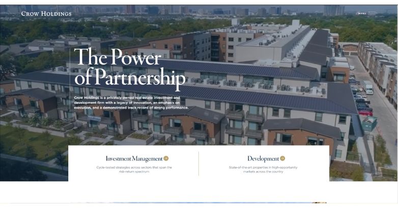
Crow Holdings’ approach to real estate investor website design features a prominent aerial view of commercial properties, underscored by the headline “The Power of Partnership.”
This visual and message emphasize collaboration, while sections like Investment Management and Development showcase their extensive expertise.
The site’s design invites users to explore their legacy of innovation, reinforcing Crow Holdings’ reputation in real estate investment and development.
38. TA Realty
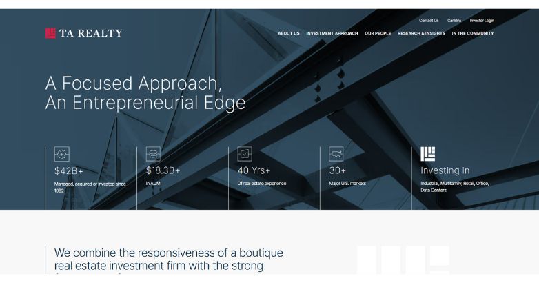
Emphasizing a “Focused Approach, An Entrepreneurial Edge,” TA Realty’s website blends professionalism with industry insights.
Key metrics, like “$42B+ Managed,” are displayed prominently, establishing credibility.
Navigation to Investment Approach and Research & Insights is streamlined, with icons illustrating their expertise across property types, including Industrial, Multifamily, and Data Centers.
39. PGIM Real Estate
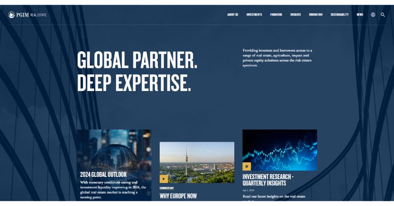
Emphasizing its global reach and expertise, PGIM Real Estate’s website pairs bold typography with a deep blue background to convey authority.
A concise description outlines their diverse investment offerings, while the clean design and accessible navigation add to the site’s professional, trustworthy feel.
Related Article:
40. CBRE Global Investors
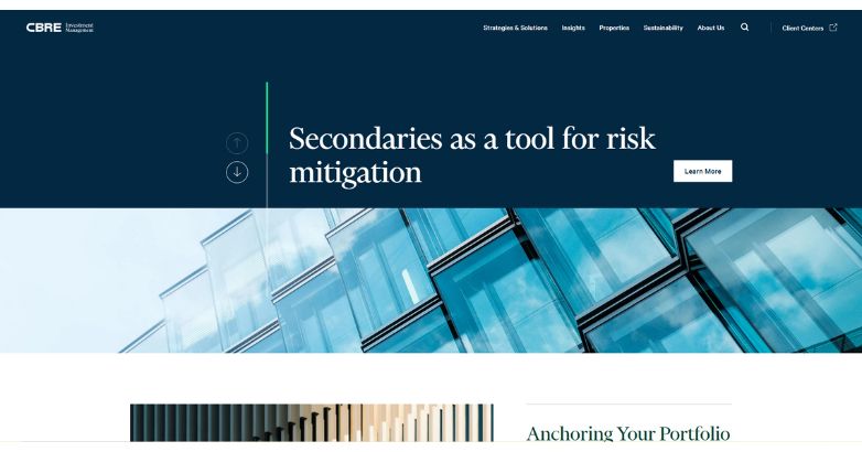
CBRE Global Investors leverages real estate investor website design to highlight strategic insights, as seen in the headline “Secondaries as a tool for risk mitigation,” which underscores their expertise in risk management.
A deep blue background combined with modern visuals conveys sophistication, while clear navigation options, including Strategies & Solutions and Sustainability, streamline exploration and enhance user experience.
41. Greystar
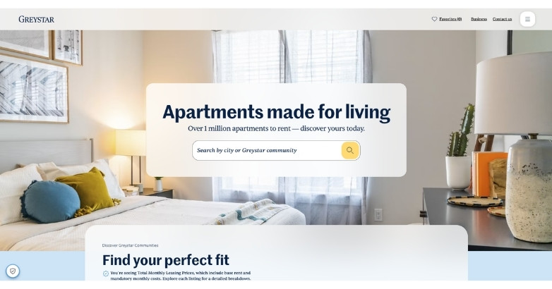
Greystar’s real estate investor website design feels professional, modern, and easy to navigate.
The homepage clearly communicates the company’s global expertise across investment management, development, and rental housing.
Strong imagery of residential communities helps visitors connect the brand with quality living spaces and long-term value.
The design also uses clean navigation, focused messaging, and investor-friendly content to build trust fast.
This makes Greystar a strong example for real estate investors who want to present scale, credibility, and market expertise online.
42. Crescent Communities
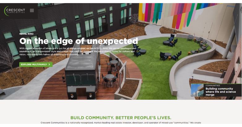
Embracing creativity and inclusivity, Crescent Communities’ site tagline, “On the edge of unexpected,” sets a vibrant tone.
Imagery of open, communal spaces reflects their commitment to creating culture-rich environments. This aligns with their mission to build spaces that enhance community and quality of life.
43. Invesco Real Estate
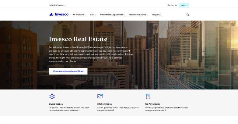
Invesco Real Estate’s real estate investor website design reflects a disciplined investment approach, showcasing 40 years of expertise and commitment to client service.
The professional layout, along with clear, targeted messaging, reinforces Invesco’s reputation for stability and strategic growth within the real estate sector.
44. Ares Management
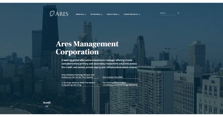
Positioning itself as a leader in alternative investments, Ares Management’s website showcases expertise across credit, real estate, private equity, and infrastructure.
The clean, structured layout supports a professional tone, appealing to investors seeking diversified, strategic opportunities in global markets.
45. Bridge Investment Group
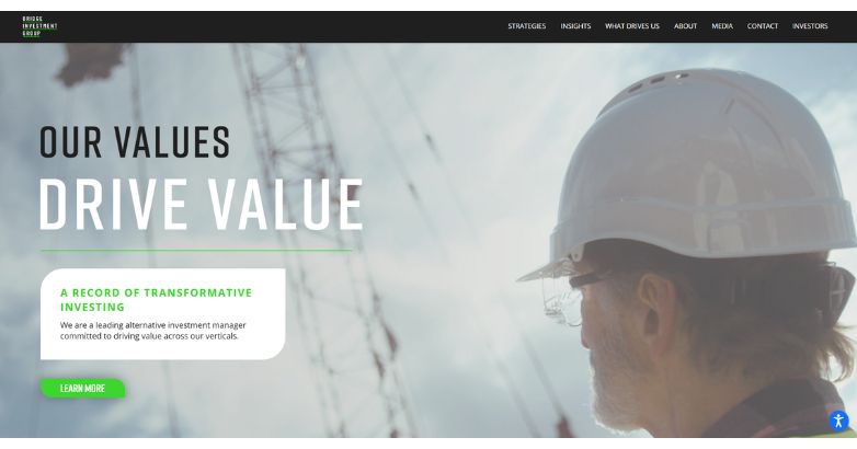
With the slogan “Our Values Drive Value,” Bridge Investment Group’s site emphasizes transformative investing.
Background images of construction scenes reflect a hands-on approach, aligning with their mission to create lasting, community-focused investments that integrate growth and social responsibility.
46. JBG SMITH
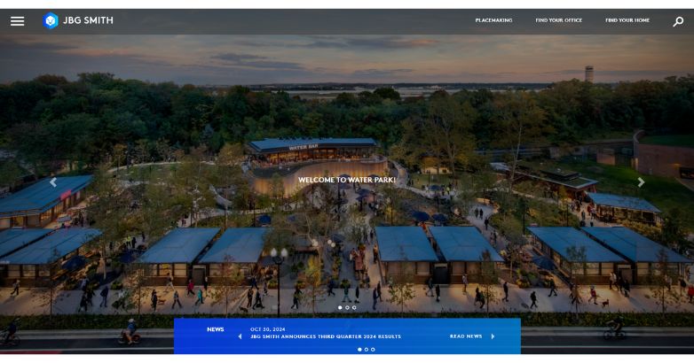
JBG SMITH’s site highlights community-driven urban development through vibrant visuals of spaces like Water Park, embodying their “placemaking” focus.
Tools for finding office and residential spaces enhance user experience, aligning with their commitment to revitalizing urban areas and fostering community engagement.
47. Rockpoint Group
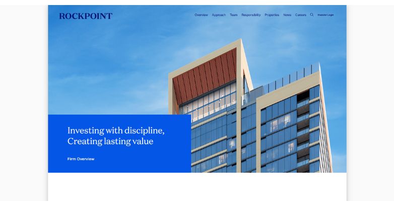
Rockpoint Group’s real estate investor website design features a minimalistic aesthetic with a high-rise building backdrop, conveying a sense of stability and professionalism.
The tagline “Investing with discipline, Creating lasting value” encapsulates their focus on reliable, value-driven investments, appealing to clients seeking strategic growth and long-term security.
48. Thor Equities
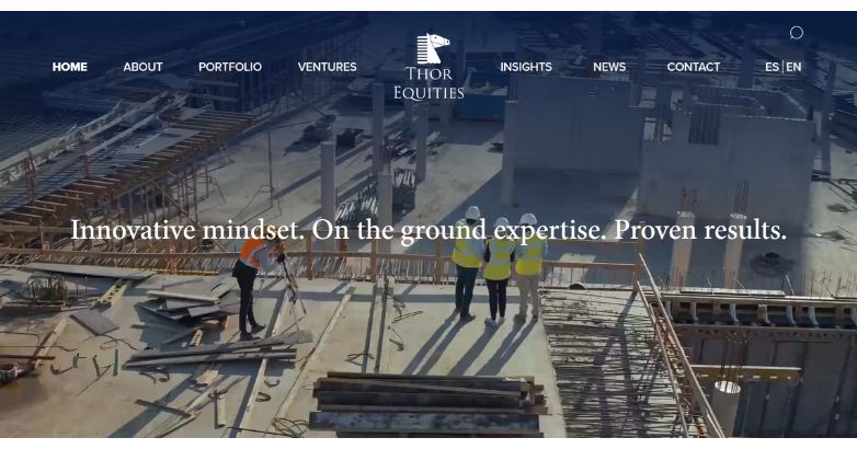
With the tagline “Innovative mindset. On the ground expertise. Proven results,” Thor Equities emphasizes a hands-on, practical approach to real estate investment.
Images of active construction sites showcase their direct involvement in value creation, appealing to clients seeking innovative, real-world investment expertise.
49. The Widewaters Group
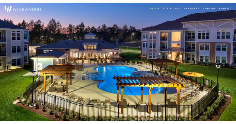
Widewaters Group’s website exudes sophistication, focusing on high-quality imagery and a minimalist design to showcase its luxurious properties.
This refined aesthetic highlights their commitment to developing upscale, seamlessly integrated spaces.
With an emphasis on quality and elegance, Widewaters appeals to clients seeking reliable, high-end real estate investment.
50. Allied Partners
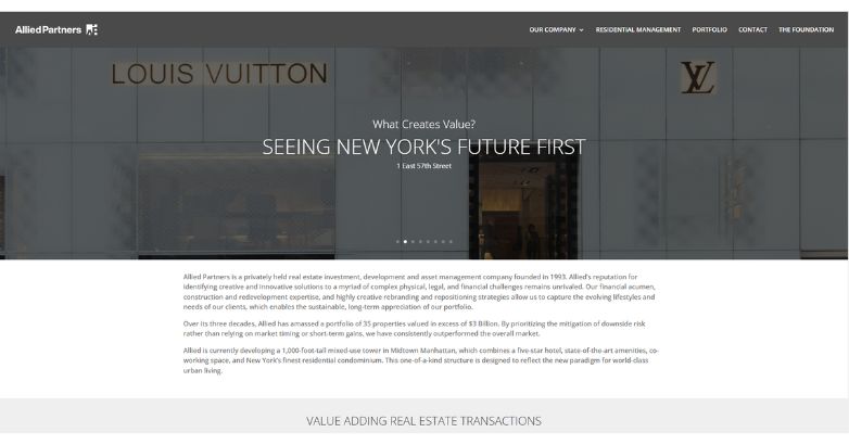
Allied Partners’ real estate investor website design emphasizes a forward-thinking approach, showcasing their expertise in New York City’s prime real estate market.
The tagline, “Seeing New York’s Future First,” aligns with their commitment to innovation and sustainable value creation.
The overall design reflects a strategic focus, appealing to investors seeking long-term appreciation and impactful investment opportunities.
Elevate Your Hospitality Brand Today
Schedule Your Free Consultation
Seeking to elevate your business? Let Mediaboom guide you. Secure your exclusive, free consultation with our digital marketing experts today.
Getting Started With Your Site
As a real estate investment company, you want to differentiate your company while maintaining a professional look, a balance that a hotel marketing agency consistently helps brands achieve. The 50 examples above show that achieving this goal is attainable. To get started with your site, contact Mediaboom to learn how we can transform your website into a revenue driving tool that works for you.
By: Frank DePino
Frank DePino is the Principal and Founder of Mediaboom, a top hotel marketing agency partnering with leading hotel and hospitality brands. With 30+ years of experience, he has led strategic digital initiatives for names including Four Seasons, Ritz-Carlton, JW Marriott, Millennium Partners, and Guardian Jet. Frank helps hospitality businesses strengthen brand presence, drive qualified leads, and elevate guest experiences through website design, SEO, content marketing, and paid media. Under his leadership, Mediaboom is a trusted partner for brands pursuing measurable digital growth in a competitive hospitality landscape.