
Innovative Medspa Website Design that Converts

By: Frank DePino | April 24, 2024
Introduction
The medical spa industry has experienced significant growth within the last few years. This growth is the result of the increasing number of cosmetic treatment options for beauty enhancement and the proliferation of wellness awareness and trends worldwide. With an increasing tech-perceptive consumer base, having a great medical spa website design is a must, just like in any other industry.
An effective website is your digital representative and will be responsible for most of your business’s first impressions.
1. WILLOW MEDSPA
Video Integration and Staff Information Implementation

Willow MedSpa has mastered the art of incorporating visual content into a website. Many website managers struggle with integrating video content as a standard component of their site content workflow. Willow MedSpa features a high quality custom video at the top of the homepage.
Their implementation is an effective method of capturing the attention of the audience.
People digest the information they see and hear much faster than the information they read. It also makes the website stand out from the competition. Willow Med Spa’s video incorporation on the homepage is effective since it:
- Delivers their message quickly
- Introduces visitors to their products and services
- Engages the website visitors
- Entertains the target audience
- Gives the MedSpa a personality
- Encourages regular visits to the site
- Strengthens the bond with visitors
Another great aspect of the Willow Med Spa website is the team section. Today, most consumers feel more comfortable when they know that they are dealing with real people. This is so important in the med spa industry.
Willow MedSpa gets this by implementing full profile staff photos, names, and positions. Showing the team’s faces helps create a better connection with the consumers. It helps make the website more personable when visitors can see who they will be interacting with. This, in turn, increases the conversion rate of the website.
2. LASERAWAY
Clear Guidance

There are a few things you seek to achieve when you visit a medical spa website. You may want to inquire about or access information regarding MedSpa services. You may also want to book an appointment to procure the services. For these objectives or any others, you will want to know where to go when you arrive at the website. Laseraway’s website is effective at providing clear guidance for users to find the information they seek. The website accomplishes these goals in three main ways:
- A simple and user-friendly navigation system
- Call-to-Actions that directly take users to information that interests them
- A well-formatted and organized uncluttered layout.
Related articles:
- Medical Spa Target Audience
- Medical Clinic Marketing
- Medical Device Marketing
- Medical Spa Marketing Companies
3. BEAUTIFIX MEDSPA
Quality Content and Calls-to-Action (CTA)

At the first point of contact when visitors arrive at a website, the content should deliver essential information. It should achieve this while being as brief as possible. Beautifix Med Spa’s website checks all boxes when it comes to quality content.
The website does not beat around the bush with irrelevant salesy information. The website immediately dives into what the Med Spa has to offer, which is what online visitors will be searching for. It is easy to tell that the content of the website has been planned with the ideal customer’s point of view in mind.
Some of the important content and information that the website includes are:
- Services: A brief and well-structured overview of the services offered
- Special Offers: Effective landing pages that describe treatment details as well as special offers
- Visual Proof: Visual examples of the MedSpa services offered and the possible results
- Social Proof: Recognition of good work in the form of reviews, testimonials, media features, and awards
- Content Creation: Blog posts, videos, and infographics, which offer valuable and relevant information concerning topics of interesting to the target customers
Beautifix Med Spa’s content is simple, to the point and provides value. Incorporating these aspects into website content helps improve its ability to attract, retain, and convert more quality clients.
Beautifix MedSpa’s website compounds this effect by utilizing a brief and action-oriented Call-to-Action (CTA). The website’s CTA is easy to find due to the above, the fold placing and is visually striking.
This is because it employs a color that contrasts that of the homepage’s color scheme while managing to fit in with the overall website design. The CTA compels visitors to explore deeper into the website and has been designed to move them further down the funnel.
Download Our Latest Whitepaper
12 Ways to Drive Traffic To Your MedSpa Website
Looking for better ways to bring in new clients? Get insights into growing your medical spa business, attracting new clients, and increasing the awareness of your brand in this 12 step guide.
4. QAZI CLINIC
Website Navigation

The first thing you will notice when you visit the Qazi Clinic website is how easy it is to navigate the site. The website’s great navigation system makes it easy for users to move around the site. Navigation is crucial since, according to studies conducted by Forrester Research, businesses lose 50 % of potential sales as a result of users not finding the right information.
Below are some key aspects that make Qazi Clinic’s website navigation system stand out:
- It is Logical – Qazi Clinic’s navigation system makes sense and is easy to use. A first-time visitor can easily find the information they need.
- It is Intuitive – the navigation system considers how users think, the steps they would take to find what they are looking for, and then caters to exactly that.
- It is Structured – The website conveniently organizes links under headings and subheadings. This structure allows the user to move around the site faster and easier.
- It is Simple, Clear, and Distinct – navigating Qazi Clinic’s website is overall a positive experience due to its simplicity and clarity. The site also makes it obvious where the main navigation is.
- It is Responsive – Today, people access websites through a wide range of devices. Qazi Clinic’s navigation functions uniformly across all platforms. It scales well to different screen sizes while maintaining a similar structure.
5. CURE DAILY
Targeted Homepage

A website’s homepage is the virtual front door to your business. Cure Daily seems to understand that the first moments after a visitor arrives at a website may affect the business positively or negatively. Cure Daily’s website homepage is well designed to make the best impression possible to the ideal med spa customers.
The overall homepage design features photo and video imagery that the target customers will find appealing. The homepage displays properly on both the desktop and mobile platforms while keeping the same format and layout.
Cure Daily’s homepage also communicates what it is the MedSpa does as well as the value it offers to the customers.
It does so in a brief but compelling way with brief, clear, and distinct primary and secondary CTAs above and below the fold. The homepage also introduces additional resources such as news and podcasts on the websites. It provides an easy way to access these additional resources.
Cure Daily’s homepage is highly targeted since it encourages a visitor to dive further into the website almost immediately upon arrival. This leads to increased click-through rates from high quality leads.
Elevate Your Luxury Brand Today
Schedule Your Free Consultation
Seeking to elevate your luxury business? Let Mediaboom guide you. Secure your exclusive, free consultation with our luxury marketing experts today.
Related articles:
6. SONASKIN
Information Architecture and Layout

Information architecture is one of the most neglected aspects of proper website design. One look at the Sona med spa’s website reveals that the design took into account information architecture. How information on a website is presented and organized is crucial for good usability and user experience.
Proper information architecture was vital for Sona MedSpa’s website since it provides a wide range of information and resources to engage and attract the target market. This website could very easily have been a pain to read through had it not been for the great implementation of link labels.
The website’s sections and categories have been carefully planned. The information therein is presented in a manner that makes it easy for visitors to find.
You can easily skim through the content to quickly find the services that are relevant to your needs.
The content is broken down into blocks with headings and subheadings. As such, the website manages to provide a lot of information without making the user feel overwhelmed.
7. EDEN MEDSPA NY
Overall design and functionality

Eden MedSpa’s website design is a reflection of the company, its products, its services, and ultimately, its brand. The website is professional, polished, visually appealing, and functional. These factors are extremely important if you seek to realize success in the online domain today.
Eden MedSpa’s website features an uncluttered layout that allows white space and incorporates quality photos to great effect. The MedSpa’s message shines through upon the first look at the website.
More importantly, the website works fast, correctly, and as a user would expect.
It is responsive and all the tabs and clickable meaning it has been built to web standards. This is exhibited in all the web pages as should be since any of them could be a customer’s first or only point of contact. Accessing information regarding the services that Eden MedSpa offers is easy and enjoyable since there are no slow, broken, or poorly developed areas.
Related articles:
8. HUDSON MEDICAL
Conversion Elements

If a website asks nothing of visitors, then they will surely do nothing. One of the primary functions of a business website is to convert visitors into high quality leads that ultimately become paying customers. Hudson Medical’s website implements conversion elements perfectly and avoids appearing too aggressive or salesy.
The site employs a smart chat pop-up strategy that ensures they do not inconvenience the user. Hudson Medical’s chat pop-ups only show up after a user has clicked on a service link. This way, users are less likely to react negatively to chat pop-ups since they have already shown interest in the services.
Hudson Medical’s website also utilizes an effective primary CTA at the top of the website just below the navigation menus.
The site opts for generic “contact us” and “book now” CTAs that most internet users are already used to. Trying to reinvest the wheel when it comes to CTA can confuse your visitors. In addition, the service links change colors when visitors hover over them, thus encouraging them to click.
9. LIKHA Aesthetic Clinic
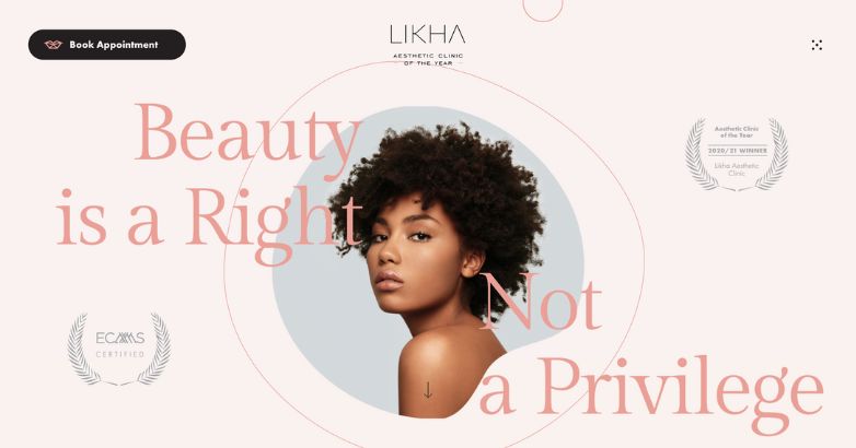
LIKHA Aesthetic Clinic flawlessly executes an interactive website design. With unmatched visual appeal, this medical spa website takes the user experience to the next level. Prospective clients truly go on a journey with an inviting pink color scheme and branded experience.
It is clear LIKHA Aesthetic Clinic understands its target audience. They translate this knowledge into a memorable medspa website design. A clear CTA to book an appointment lives on the top of the page, outlined in a contrasting color.
The medical spa website design doesn’t mess around with showcasing credibility. Certifications and awards decorate the landing page. In a hyper-competitive environment like medical spas, an optimized web design coupled with clear
Related articles:
10. Asterie Clinic

Asterie Clinic offers another medspa website design with a unique interactive experience. The design is clean—as you would expect from a top-tier aesthetic clinic website design. As you scroll down, a video begins to play, offering a detailed glimpse into Asterie Clinic.
With a medical spa website design, it is sometimes challenging to stand apart from competitors. A video with key brand imagery is one way to deliver a clear brand vision.
A clean and polished website design doesn’t mean you can’t play with color or shapes. Asterie Clinic’s color scheme incorporates pops of pink and purple to highlight key information. For instance, upon hover or as a visitor moves from page to page.
On top of this visual appeal, the website also incorporates softer curved edges. These two elements together offer an inviting web presence. Before even booking an appointment, you already have an idea of the service and experience you’ll receive.
11. Shafer Plastic Surgery

While many brands strive to radiate approachable luxury, very few truly knock it out of the park. This is a rare case of a medspa website flawlessly showcasing a polished but inviting presence.
Furthermore, it is clear Shafer Plastic Surgery understands its target audience. These two marketing assets together make for powerful brand messaging. The website includes language like “fly in for surgery” and a clear CTA to “request a consultation.” This is “approachable luxury” in action.
Shafer Plastic Surgery’s website design also showcases the power of a testimonial. Unlike other websites where you may have to dig for reviews, they highlight their credibility front and center. The combination of testimonials and accreditations on the homepage provides a positive user experience.
12. Alisha Louise Aesthetics

Alisha Louise Aesthetics delivers a classic Medspa website design experience. The website features a clean, polished, and informative design.
In today’s digital-first landscape, potential customers may move on to competitors if key information isn’t available. While some aesthetic clinic website designs hide pricing, Alisha Louise Aesthetics is forthcoming with the information. Their “price list” menu item allows customers to explore risk-free, without the pressure of contacting the practice.
Their polished design delivers a seamless experience for prospective clients.
Download Our Latest Whitepaper
12 Ways to Drive Traffic To Your MedSpa Website
Looking for better ways to bring in new clients? Get insights into growing your medical spa business, attracting new clients, and increasing the awareness of your brand in this 12 step guide.
Related articles:
13. Gawley Plastic Surgery

As with other plastic surgery websites, Gawley Plastic Surgery leads with luxury. From the typography to the imagery, there is no denying this is one of the best medical spa websites.
Even the language utilized makes it clear they accounted for search engine optimization (SEO). For instance, “cosmetic surgery,” “aesthetic plastic surgery,” and “board-certified Arizona plastic surgeons.”
However, one thing that differs with this website design is the CTA button side placement. Instead, Gawley Plastic Surgery showcases its phone number front and center. They also incorporate embedded contact forms to request a consultation.
14. Biomed Spa

Biomed Spa takes video marketing to the next level. In this case, front and center on the website’s landing page. This creative approach transports prospective clients to an old Hollywood photoshoot. Even before reading any website copy, you can guess this is a medical spa located in Beverly Hills, California.
Even the aesthetic clinic website design’s color scheme plays into the old Hollywood trope. Gold accent colors accentuate clean imagery and simply black text.
15. Nassif Med Spa

Nassif Med Spa stands out from competitors with one of the best medspa websites. Their website takes a bold approach to an aesthetic color scheme with strategically placed purple accents.
The world-renowned medical spa showcases several CTAs. The first is double contact buttons, the first in the website menu, and the second on the bottom of the page. They leave no room for confusion on how to connect and schedule a consultation.
The second CTA is a pop-up to listen to their new podcast, Demystifying Beauty. A podcast is a powerful way to capture prospective clients. Even if they aren’t yet ready to work with you, you can nurture them by providing value so you’re top of mind for the future.
Related articles:
16. Margot European Spa

Margot European Spa screams vacation with pops of welcoming turquoise. This medspa website stands out from others because of the bright color scheme.
The user experience exudes more relaxation spa offerings like massages, facials, and manicures. A banner on the top of the website provides prospective clients with a phone number, email, and spa address.
17. Trifecta Med Spa

Have you searched for medspa images or videos online before booking an appointment? If so, you’ll love these medical spa design ideas. Trifecta Med Spa immediately captures attention with a video guiding you through their New York office.
The video scrolls in the background with two CTA buttons. The first prompts visitors to “book now,” while the other shows all office locations.
Open up the menu for a design experience, unlike anything we’ve seen before. As you scroll over the various offerings, images emerge showing before and after photos.
18. Innovative MedSpa

Innovative MedSpa strays slightly away from your standard medspa website. With pops of purple and tan, the website actively captures attention.
As you scroll through the website, you realize Innovative MedSpa does just that: innovates. Even with their website design, Innovative MedSpa incorporates new website features to add to the user experience. One example is the “About” page, which features not only provider headshots and names—but also their Instagram handles.
Elevate Your Luxury Brand Today
Schedule Your Free Consultation
Seeking to elevate your luxury business? Let Mediaboom guide you. Secure your exclusive, free consultation with our luxury marketing experts today.
Final thoughts on Medspa Website Design
Overall, a well designed, visually appealing, responsive, and optimized website is necessary for the growth of a MedSpa business. It is a tool that is employed to realize certain business objectives.
In this regard, effective website design is one that engages and encourages visitors to take an intended course of action. The featured websites excel at these and other crucial aspects of medical spa website design.
Contact now Mediaboom to develop an outstanding website design!
By: Frank DePino
Frank DePino is Principal and Founder of Mediaboom. Since 2002, Frank has led Mediaboom’s award-winning staff of creative and technical professionals, building the most effective marketing and advertising solutions for its clients.


READY TO IGNITE YOUR MARKETING STRATEGY?


