
Medical Practice Website Design – 50 Remarkable Websites

By: Frank DePino | July 4, 2024
Medical practice website design is more important than ever. Did you know that more than 70% of adults look for healthcare information online? It is no surprise that healthcare is also digitizing in this fast-paced era of technology, just like all other domains.
Even if your organization is mostly physician referred, individuals will look for your site before scheduling an appointment.
Therefore, poor online visibility can be a major deal-breaker. So, to assist you, we’ve deeply analyzed the types of sites that attract visitors effectively.
Therefore, we have devised an all-inclusive list of the top 50 medical practice website design ideas so that you may get a clear idea regarding what’s best!
1. Baylor Scott and White

Baylor Scott & White Health is a neat and user-friendly website with clear menu bars and features.
That makes it simple for patients to access same-day care. It is convenient to pay medical bills, enroll in courses, and examine medical records.
Patients can rapidly access areas of interest by using the site’s navigation. Below that, the website provides vital safety guidelines in the context of the COVID-19 epidemic.
Moreover, this website is also available in Spanish, which is not so widespread on medical sites.
2. Arkansas Surgical Hospital

Arkansas clinic’s site opens with contact details and the exact location of the facility.
As a result, patients will not even need to visit the Contact Us page. This website also has put critical advice about the safety measures of the COVID-19 pandemic.
Patient ratings are one of the most potent sections of a medical website. Since prospective medical patients regularly rate testimonials.
This is one of their most sought-after information sources. Therefore, the website’s colors and styles are unobtrusive. Plus, there is a navigation menu above the break to help patients discover what they need.
3. Northwestern Medicine

Northwestern Medicine has a beautiful design. This isn’t overpowering or overwhelming, as are many medical practice website designs.
They use the menu to categorize website and social media reference visitors. After the page break, this also employs very CTAs to target audiences who know where they want to go on the site.
This convenience is a vital component of any medical practice website design. Because visitors must be in a rush to get what they are looking for.
Their website is linked to various social media accounts such as Twitter and Instagram.
4. Rush University Medical Center

Rush University Medical Center performs an outstanding job of engaging its audience with health-related information.
With an easy-to-use website, rush employs well-written articles on a variety of topics.
That includes health conditions, organizational news and publications, health-related events, and workshops. Additionally, they feature their posts on-site from social media.
On each page, their website offers quick and simple navigation, clear information, and pleasant images.
This feature relieves the visitors’ anxieties. In addition, the site is extraordinarily mobile-friendly and offers a fantastic customer experience.
Related articles:
5. Qazi Clinic
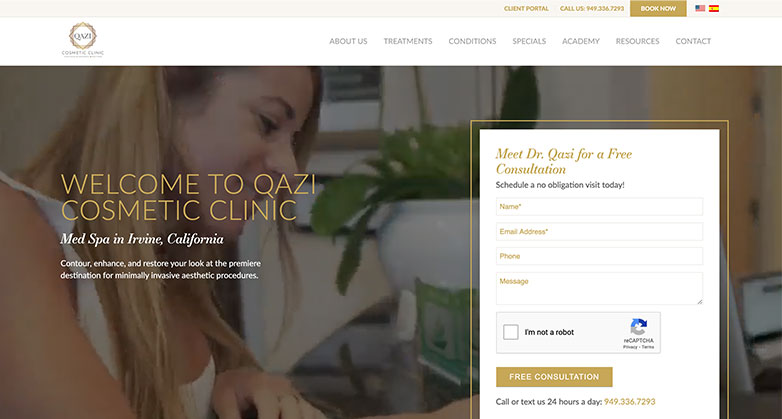
Qazi clinic has a stunning website with beautiful color contrast. The navigation system at Qazi Clinic is intuitive and straightforward to use.
The website organizes links neatly into headers and subsections. This structure enables the user to navigate the site more quickly and easily.
Because of its simplicity and clarity, navigating the Qazi Clinic website is an overall favorable experience.
It adjusts easily to multiple screen sizes while keeping the same layout.
The ‘Patient Reviews’ area of this website is remarkable because new medical patients review testimonies daily.
6. Children’s National

Nothing beats a cute kid photo to advertise your services, but this home page offers even more.
The Find a Doctor button is prominent, and the “Search Service” tab includes highly targeted pediatric specialties.
When dealing with a child’s discomfort, handicap, or bewilderment, it saves you time and energy.
The links to different services are bold, strong, and immediately distinct, making it simple to take action.
Any doubts about authenticity are quickly dispelled by the US News & World Report and Magnet Nurses ratings.
7. Rest Assured

The Rest Assured was designed to meet WCAG 2.0 AA accessibility standards.
The site is accessible to all users, which is always a wise decision for businesses in any field.
This website was built with “convenience,” the main factor in mind. That includes components such as large, high-contrast fonts and simple keyboard navigation.
The Rest Assured website also makes good use of alt text on all photos.
That screen readers and other text-to-speech applications use to read and define content correctly. This feature is primarily for the blind.
8. IU Health

IU Health has an attractive website due to its intense colors usage.
In addition, it does a fantastic job of delivering a broad keyword search function to its users.
Healthcare care, news and events, providers, and locations are the factors that can be used to narrow down on-site searches.
In the left margin, the site displays a list of recent searches.
That allows users to trace their browsing history readily. In addition, special search tools for Providers, Medical Services, and Locations appear in the header menu.
9. Mayo Clinic

Without a doubt, Mayo Clinic is among the best medical centers out there.
The hospital is also at the top of its game to properly present health information to website users.
This website is simple yet effective and user-friendly.
In addition, Mayo Clinic prominently displays an extensive overview of Diseases and Conditions on its site.
Health issues can be investigated using an alphabetic conditions listing or the Mayo Clinic’s complete symptom checker.
Mayo Clinic also has featured content issues ranging from cardiac arrhythmia to organ transplants, with expert knowledge by its doctors.
Related articles:
Elevate Your Luxury Brand Today
Schedule Your Free Consultation
Seeking to elevate your luxury business? Let Mediaboom guide you. Secure your exclusive, free consultation with our luxury marketing experts today.
10. Mercy Health

Mercy Health’s website clarifies that they promote themselves as a healthcare leader in Cincinnati and the nearby region.
An amazing user experience by the combination of huge images and motion to engage the user.
With just the front page, this website captures Mercy Health’s voice and style. But then successfully carries it across the rest of the website.
They also run a blog with a variety of health insurance stories to attract new users via search engines.
11. Royal Adelaide

The website of this hospital gives a wonderful first impression in terms of design and provides a memorable experience.
The way the CTAs are extremely simply structured while remaining near the top of the page is a big takeaway from this website.
For example, in huge lettering, one of the CTAs asks, “Do You Have an Emergency?”
Apart from hooking the visitor, it conveys a sense of genuine concern for users.
Most importantly, this site adheres to its brand feel and narrative, innovative in the healthcare market.
12. Knoxville Pediatric Associates

KPA’s website welcomes visitors with a slider of photographs of smiling children.
The menu contains a link to “Meet Our Practitioners.”
Which takes you to a page with a picture of each physician, their name, favorite color, and famous cartoon character.
It’s a terrific approach to make a potentially frightening issue more welcoming and entertaining.
On the upper side of the website, the bar allows you to pay bills. The about us website has detailed information about their hospital and its mission.
13. PeterMac

A medical center, PeterMac is widely regarded as Australia’s foremost cancer research, education, and treatment facility.
The website has a comprehensive menu with categories and sub-categories. PeterMac’s website has a responsive design and good performance.
It contains beautiful fonts, and the purple color combination makes the site stand out.
This website also includes diverse languages, which is not always the case with medical practice website design.
They also have a blog with a variety of topics covered to attract new users by search engines.
14. Virtua Health

The branding and images on Virtua Health’s website are pretty impressive. The content is provided in a simple yet exciting style.
To highlight the benefits of their organization and the stories of the people they help.
Their homepage includes image galleries and unique iconography.
This theme has a clean and easy-to-navigate interface.
Recent blog entries and social media posts keep the content fresh and engaging for returning readers. The donation page is in a minimalistic style, with a lovely header image and simple form fields.
15. VIDANT HEALTH

The use of bright colors and joyous imagery by Vidant Health offers a welcoming appeal for a hospice website.
The entire web design is really attractive, and the layout is simple. The content is consumable for readers due to the excellent balance of text and visuals.
Their website has a “Pay my bills” feature, highlighted at the top right of the navigation menu.
The News and Events page is blog format, making it simple for Vidant to submit frequent updates.
16. Cleveland Clinic

The white tagline above a photograph of a medical employee following successful treatment reads, “Access Anytime, Anywhere.”
That’s how you make one of the country’s top institutions less frightening and more approachable.
The buttons for FIND A DOCTOR, GET DIRECTIONS, and APPOINTMENTS & ACCESS are prominent but not flashy in color or type.
The News and Events page is in a blog-type format.
Whether you want to read a specialist’s bio, download directions, or book appointments, this site makes it simple and friendly.
17. Venturi Healthcare

Venturi Healthcare’s website is immaculate and minimalistic.
The breathtaking banner photos appeal to the organization’s Burnaby.
Also, the website’s white space usage helps break up the content and graphics in an easy-to-follow manner.
As well, the typographic design and color palette contributes to the organization’s branding.
Venturi does an excellent job of directing users through their website’s material.
The website design has a straightforward navigation menu and a bold call-to-action in the header.
18. SR Split Rock
The SR Split Rock homepage grabs your attention right away with an eye-catching banner highlighting their objective.
The objective of the health facility is prominently presented, and the navigation is easy. That makes it simple for patients to explore the site.
The branding is what really sticks out on the site. It is spotless and crisp, with the fonts and colors complementing the logo design perfectly.
SR split rock employs image galleries and testimonial sliders on the homepage to lead site visitors through their offerings.
19. Harlem Center

The bright, eye-catching design communicates a positive message and high-quality positive imagery across the site.
In addition, the website contains information about their services and a timetable.
There is also extensive information on a variety of physical issues.
It is one of the top medical practice website design due to its relaxing color schemes and welcoming pictures.
This alleviates the patient’s concerns. Plus, the site is mobile-friendly and offers a superb user experience.
Related articles:
20. Avera

Avera’s website successfully represents competency and value delivery. The above-the-fold region of their website allows you to discover everything.
That includes a location, acquiring doctor information, access portals, and paying bills.
Their phone number prominently displays in the top navigation bar. This icon is interactive, allowing visitors to call immediately from their website.
One of their website’s most prominent features is its lack of clutter. It successfully emphasizes the necessary actions that they want their visitors to take.
As a result, a massive portion of their monthly visitors converts.
21. Acute Medical Services

This site made our list because of its dynamic homepage banner, stunning graphics, and amazing background.
The design further nourishes by the use of powerful wording in the banners. In addition, the high-quality background of the website complements the content and color design on each page.
Everything is provided in great detail to ensure that visitors receive the information they seek.
Because of its basic, clean design, its webpage prioritizes engagement over other things.
At the lower right, quick connections to important information and emergency contacts are highlighted.
22. Johns Hopkins Medicine

Exuding a serene and professional vibe, the Johns Hopkins Medicine website exemplifies effective medical practice website design.
It features a prominent banner image of two hands clasped together, symbolizing care and compassion.
Its clean, minimalist layout, complemented by ample white space, ensures a distraction-free browsing experience.
Tucked neatly in the top corner, the navigation menu maintains the page’s simplicity.
With a color palette of blue and white, the site conveys trust and reliability, while the easy-to-read font enhances overall usability, making essential information readily accessible.
23. Sutter Health

Sutter Health’s vibrant and welcoming website interface prominently displays a banner image of a smiling individual, exuding positivity and care.
Against a soothing teal background, the bold tagline “Exceptional care never stops.” reinforces the commitment to patient wellness.
Key functionalities like ‘Find a Doctor’ and ‘My Health Online’ login are easily accessible.
The clean, modern layout, along with strategic use of color, enhances navigation, making the site user-friendly and visually appealing.
24. Beaumont Health

Beaumont Health’s website boasts a sleek, professional design with a strong emphasis on branding.
The bold, centralized logo against a dark blue background instantly captures attention, while the tagline “The new name for Beaumont” clearly communicates the rebranding.
Navigation is straightforward, with options like ‘Find a Doctor’ and ‘Make an Appointment’ prominently displayed. The clean layout, modern font, and strategic use of white space ensure an intuitive and user-friendly experience.
Elevate Your Luxury Brand Today
Schedule Your Free Consultation
Seeking to elevate your luxury business? Let Mediaboom guide you. Secure your exclusive, free consultation with our luxury marketing experts today.
25. Sharp HealthCare

Embracing a warm, approachable design, Sharp HealthCare’s website exemplifies excellent medical practice website design.
It prominently features a smiling doctor against a lush green backdrop, with the tagline “Health care made easy” underscoring the site’s user-friendly approach.
At the top, the navigation bar offers easy access to essential services like ‘Find a doctor’ and ‘Same-day care.’
The clean and inviting layout, combined with strategic white space and calming colors, enhances the overall user experience.
26. Henry Ford Health System

Henry Ford Health’s website masterfully blends modern aesthetics with user-centric functionality.
The homepage showcases a compelling image of a young athlete holding a soccer ball, spotlighting patient success stories.
The bold tagline “The Road to Recovery” directs users to explore further.
Streamlined navigation with options like ‘Doctors,’ ‘Locations,’ and ‘Services’ ensures ease of access.
The professional blue and white color scheme, alongside a clean design, provides a reassuring and engaging user experience.
27. Mayo Clinic Health System

Mayo Clinic Health System’s website radiates warmth and empathy, starting with a touching image of an elderly man being embraced, symbolizing personalized care.
The prominently displayed tagline “Specialty care made personal” highlights their commitment to individualized patient care.
An intuitive navigation bar offers easy access to services, providers, and locations.
The clean, modern layout, enriched with high-quality images, enhances the user experience, making the site visually appealing and user-friendly.
Related articles:
28. Norton Healthcare

Norton Healthcare’s website presents a bright and welcoming design, embodying an effective medical practice website design.
Featuring a joyful image of two friends embracing, the site radiates warmth and positivity.
A prominent search bar asks, “How can we help?” facilitating easy access to information.
Key services such as ‘Online Bill Pay,’ ‘Request Appointment,’ and ‘Cost Estimate’ are prominently displayed for convenience.
The soothing light blue color palette and clean layout create a user-friendly interface, enhancing the overall browsing experience.
29. Advocate Aurora Health

Showcasing a welcoming and inclusive design, Advocate Aurora Health’s website features a joyful image of a couple embracing, exuding warmth and positivity.
The prominent announcement “We’re now a part of Advocate Health” stands out against a dark background, ensuring immediate attention.
The navigation bar provides easy access to essential sections like ‘Find a Doctor’ and ‘Pay a Bill.’
With a clean layout and strategic use of color, the site enhances readability and user experience, making it both informative and engaging.
Related articles:
30. Swedish Medical Center

Swedish Medical Center’s website showcases a compassionate and inviting design, highlighted by a heartfelt image of a mother and child.
The welcoming message “We have a new look” is prominently displayed, signaling a fresh, unified brand with Providence.
A user-friendly navigation bar offers quick access to essential services like ‘Find a Doctor’ and ‘Pay My Bill.’
The clean, modern layout and soothing color palette enhance readability and user engagement, making the site both informative and comforting.
31. Hartford HealthCare

Featuring a focused and professional design, Hartford HealthCare’s website exemplifies outstanding medical practice website design.
Highlighted by a thoughtful image of an elderly man, it effectively conveys care and attention.
The guiding headline “Start Here” directs visitors to vital services, emphasizing safety and reliability.
Essential options like ‘Find a Doctor’ and ‘Online Bill Pay’ are prominently displayed for easy access.
The clean, straightforward layout, combined with a calming color scheme, enhances the user experience, making the site both reassuring and efficient for visitors.
32. Wake Forest Baptist Health

Wake Forest Baptist Health’s website presents an inviting and user-friendly design, highlighted by a cheerful image of a patient using a smartphone, which emphasizes connectivity and ease of use.
The headline “A New, Improved Patient Portal Is Here” is prominently displayed, guiding users to explore the upgraded features.
Quick access to essential services like ‘Find a Provider’ and ‘Get Care’ is provided through the navigation bar.
The clean layout and soothing color scheme enhance user experience, making the site both informative and engaging.
33. Sentara Healthcare

Sentara Healthcare’s website showcases a clean, modern design, highlighted by a vibrant image of a man stretching outdoors, which conveys health and well-being.
The prominent tagline “Care When You Need It” emphasizes accessibility and support. A straightforward navigation bar offers quick access to essential sections like ‘Find a Doctor’ and ‘Schedule Appointment.’
With ample white space and a soothing color palette, the layout is user-friendly, enhancing readability and making the site both inviting and efficient for visitors.
34. Northwell Health

With a dynamic and engaging design, Northwell Health’s website exemplifies excellent medical practice website design.
Highlighted by a vibrant image of a smiling woman radiating positivity and health, it captures attention.
The bold headline “Raising health for more New Yorkers than anyone” prominently showcases their extensive reach and impact.
The user-friendly navigation bar offers quick access to sections like ‘Find & book care’ and ‘Patient portal.’
A clean layout, complemented by strategic use of color, enhances readability and user experience, making the site both informative and welcoming.
35. Houston Methodist

Houston Methodist’s website features a clean and professional design, emphasized by an image of a researcher in a lab, which underscores their commitment to medical leadership.
The tagline “The difference between practicing medicine and leading it” prominently captures attention and conveys their healthcare leadership.
Easy access to sections like ‘Find a Doctor’ and ‘Services & Specialties’ is provided through the navigation bar. The straightforward layout and calming color scheme enhance readability and user experience, ensuring the site is both informative and reliable.
36. Providence St. Joseph Health

Providence St. Joseph Health’s website presents a compassionate and user-centric design, highlighted by a warm image of a mother and child.
The call-to-action “Schedule a Screening” is prominently displayed, encouraging proactive health management.
The intuitive navigation bar provides easy access to sections like ‘Find a Doctor’ and ‘Services.’
The clean layout, along with a calming color palette and ample white space, enhances readability and user experience, making the site both inviting and efficient for visitors.
Related articles:
37. Essentia Health

Essentia Health’s website showcases a clean and approachable design, exemplifying effective medical practice website design.
Featuring a comforting image of a mother caring for her child, it emphasizes at-home care. The banner “Care from the comfort of home” reinforces their focus on accessible online care.
With straightforward access to sections like ‘Services & Specialties’ and ‘Doctors & Providers’ through the navigation bar, the user-friendly layout and bright, engaging color scheme enhance readability, making the site both welcoming and efficient for visitors.
38. MedStar Health

MedStar Health’s website offers a vibrant and welcoming design, highlighted by an image of diverse healthcare professionals that conveys inclusivity and trust.
The prominent search bar and the guiding question “What can we help you find?” assist users in easily locating services.
Quick access to essential sections like ‘Healthcare Services’ and ‘Patient Portal’ is provided through the navigation bar.
The clean layout, coupled with bold colors and intuitive design, enhances user experience, making the site both engaging and user-friendly.
39. Bon Secours Mercy Health

Bon Secours Mercy Health’s website features a professional and impactful design, highlighted by a stunning cityscape backdrop that conveys a sense of community and reach.
The bold headline “Extending health care access, quality and innovation” encapsulates their mission.
Easy access to sections like ‘Our Ministry’ and ‘Our Focus’ is provided through the intuitive navigation bar.
The clean layout and strategic use of color enhance readability, making the site both informative and engaging for visitors.
40. Atrium Health

Atrium Health’s website presents a welcoming and engaging design, exemplifying outstanding medical practice website design.
Featuring a heartfelt image of two people sharing a joyful moment, it captures warmth and connection.
The bold headline “#1 in Charlotte” and prominently displayed awards underscore their excellence.
With easy access to sections like ‘Find a Provider’ and ‘Medical Services’ through the navigation bar, the clean layout, soothing color palette, and user-friendly interface enhance the overall user experience, making the site both informative and inviting.
41. Ascension Health

Ascension Health’s website is characterized by a clean and professional design, highlighted by a comforting image of a nurse interacting with a young patient, which underscores personalized care.
The prominent tagline “Personalized care when and where you need it” captures their commitment to accessibility.
Intuitive navigation offers quick access to sections like ‘Find a Doctor’ and ‘Services and Specialties.’
The clean layout, combined with a soothing color scheme, enhances readability and user experience, making the site both informative and welcoming.
Elevate Your Luxury Brand Today
Schedule Your Free Consultation
Seeking to elevate your luxury business? Let Mediaboom guide you. Secure your exclusive, free consultation with our luxury marketing experts today.
42. St. Luke’s Health System

St. Luke’s Health System’s website features a clean and professional design, highlighted by an image of a masked healthcare professional, emphasizing safety and expertise.
The prominent search bar with the prompt “How can we help you today?” guides users to easily find information.
The navigation bar is straightforward, offering quick access to sections like ‘Health Services’ and ‘MyChart.’ With a calming color scheme and user-friendly layout, the site enhances readability, making it both informative and welcoming.
43. Common Spirit

Common Spirit’s website presents a warm and welcoming design, exemplifying effective medical practice website design.
Featuring a central image of two smiling women, it emphasizes their motto “Hello humankindness.” The navigation bar includes options like ‘Find Care,’ ‘Patient Tools,’ and ‘Our Services,’ offering easy access to essential information.
A prominently placed search bar allows users to find providers, specialties, and locations efficiently.
The calm and professional color palette enhances the site’s approachable and compassionate feel, while the layout remains user-friendly and organized.
44. BJC HealthCare

BJC HealthCare’s website showcases a clean, modern design with a welcoming image of a healthcare provider and a young patient.
The tagline “We treat your health like it’s the most important thing in the world” emphasizes their commitment to patient care.
The top navigation bar provides easy access to ‘Medical Services,’ ‘Locations,’ and ‘Patients & Visitors.’
A prominent search bar and ‘Get Care’ button ensure users can quickly find the information they need. The professional and calming blue and white color scheme enhances the user experience.
45. Novant Health

Novant Health’s website design emphasizes personalized, family-oriented healthcare.
The homepage features a warm, inviting image of a parent and child embracing, reflecting the site’s focus on family health.
The headline “Expect Remarkable for You and Your Family” reinforces this commitment. Key sections like ‘Appointments,’ ‘Locations,’ and ‘Services’ are easily accessible via the top navigation bar.
The primary call-to-action button, “Find a Primary Care Doctor,” encourages users to take immediate steps towards their health journey.
Soft purple and white tones create a calming and professional aesthetic, enhancing the user experience.
Related articles:
46. AdventHealth

AdventHealth’s website design focuses on holistic and compassionate healthcare, exemplifying outstanding medical practice website design.
The homepage features an uplifting image of a child learning to ride a bike, aligning with the tagline “Never Underestimate the Human Spirit.” Key functions like ‘Schedule Appointment,’ ‘Find Doctors,’ and ‘Medical Services’ are prominently displayed.
The primary call-to-action buttons, “Find a Doctor” and “Learn More and Find Care,” encourage immediate engagement. Calming blue tones and modern design elements foster trust and user-friendly navigation.
47. LifePoint Health

LifePoint Health’s website design emphasizes comprehensive healthcare delivery.
A welcoming image of healthcare professionals and patients graces the homepage, aligning with the tagline “Great care lives here.”
Key sections like ‘Who We Are,’ ‘What We Do,’ and ‘Locations’ are prominently displayed, ensuring easy navigation.
The vibrant colors and user-friendly layout foster engagement and trust, reflecting LifePoint Health’s commitment to serving patients and communities across the healthcare continuum.
48. McLaren Health Care

McLaren Health Care’s website focuses on user convenience and accessibility.
The homepage features a welcoming greeting, “Hello. How can we help?” with direct links to essential services like booking appointments, finding doctors, locating facilities, and bill payment.
The clean layout and friendly imagery create a positive first impression.
The top navigation bar offers quick access to various sections, including Services, Physicians, Hospitals, and Patient Information, emphasizing McLaren’s commitment to efficient and patient-centered care.
49. HealthPartners

HealthPartners’ website emphasizes simplicity and accessibility, exemplifying effective medical practice website design.
The homepage showcases a welcoming image with the tagline “Healthy, made easy,” highlighting their commitment to effortless healthcare.
The top navigation bar provides easy access to essential sections like About, Services, Blog, Careers, and Contact.
The clean and inviting layout, combined with vibrant imagery, reflects HealthPartners’ dedication to patient-centric care.
Key functionalities, such as signing in, are prominently displayed, making it convenient for users to manage their healthcare needs efficiently.
50. Parkview Health

Parkview Health’s website design emphasizes warmth and support, reflecting their commitment to patient care.
The homepage features a heartwarming image with the tagline “Discover better care,” highlighting their focus on quality healthcare.
The top navigation bar provides easy access to sections like Find a Doctor, Locations, Medical Services, Patients & Visitors, and Health Resources.
The clean, user-friendly layout, combined with inviting imagery, underscores Parkview Health’s dedication to guiding patients through their health journey with expertise and compassion.
FAQs
I. What are the key elements of a successful medical practice website?
A successful medical practice website should include essential elements such as clear navigation, patient testimonials, doctor bios, appointment scheduling, secure patient portal access, mobile responsiveness, and adherence to HIPAA regulations.
II. Why is it important for a medical practice to have a professionally designed website?
A professionally designed website enhances credibility and trust among patients. It provides a platform to showcase services, expertise, and patient care philosophy effectively. It also improves patient engagement through features like online appointment scheduling and health information access.
III. What should be considered when designing a medical practice website for patient privacy and HIPAA compliance?
Designers must ensure that patient information is securely handled and transmitted. This involves using secure servers, encrypting sensitive data, limiting access to patient information, and complying with HIPAA guidelines for website content and communications.
IV. How can a medical practice optimize its website for search engines (SEO)?
SEO optimization for medical websites involves using relevant keywords (e.g., medical specialties, treatments), creating informative and engaging content, optimizing meta tags and descriptions, ensuring fast load times, mobile responsiveness, and obtaining high-quality backlinks from reputable sources.
V. What are some common mistakes to avoid in medical practice website design?
Common mistakes include cluttered or confusing navigation, outdated or irrelevant content, lack of mobile responsiveness, slow loading times, poor integration with patient management systems, insufficient security measures, and neglecting to regularly update information such as doctor profiles and clinic hours.
Do you have more questions?
Contact Mediaboom for expert advice and consultation on designing a modern, effective medical practice website.
Elevate Your Luxury Brand Today
Schedule Your Free Consultation
Seeking to elevate your luxury business? Let Mediaboom guide you. Secure your exclusive, free consultation with our luxury marketing experts today.
Conclusion
Many private hospitals have mediocre and unhelpful websites. A well-designed website will set you apart in this market.
Unlike other businesses that utilize social media to generate buzz, healthcare providers want a website to assist people in distress.
Each of the healthcare websites described here focuses on usability and has a practical design philosophy.
That makes them the top medical and hospital websites. If you work in the medical field, these are excellent inspirations for your website.
Contact now Mediaboom to develop your Medical Practice Website Design.
By: Frank DePino
Frank DePino is Principal and Founder of Mediaboom. Since 2002, Frank has led Mediaboom’s award-winning staff of creative and technical professionals, building the most effective marketing and advertising solutions for its clients.


READY TO IGNITE YOUR MARKETING STRATEGY?


