
Accounting Website Design – Top 50 Stellar CPA Examples

By: Frank DePino | November 14, 2023
Accounting website design is more than just a digital presence: it’s a unique chance for your firm to bring its personality to the forefront, solidify its brand identity, and showcase the distinct qualities that set your company apart. Crafting a well-designed CPA firm website is vital to making a lasting impression on potential clients.
But what exactly should be included in your accounting website’s design?
A truly remarkable website for professional accountants needs to balance aesthetic appeal with functionality. CPA firm websites should present a clean, elegant interface, avoiding clutter even when hosting multiple menus. For CPA website design, incorporating distinct CTAs, especially above the fold, is vital for engaging visitors. Additionally, optimizing your site for mobile users is essential in our mobile-first era. When crafting the best accounting website design, infusing bold colors can reflect your firm’s character, provided they maintain a professional tone. Remember, an effective web design for your accounting firm should blend style with practicality seamlessly.
To help you navigate this creative process, we’re excited to share our top 50 examples of standout accountant websites. This guide is designed to highlight key design elements that work exceptionally well and explain their impact. Our aim is to provide you with ample inspiration and actionable ideas to elevate your own accounting website’s design.
Use this post as your creative launchpad and a practical guide to design an online space that resonates deeply with your audience and authentically represents the unique character of your firm.
Let’s dive in!
1. HDA Accounting Group

Upon visiting HDA Accounting Group’s website, it becomes immediately apparent that they’re a cut above the typical accounting firm.
For you, a dental practice owner, envision a team deeply versed in your financial nuances, offering custom accounting services, profit-driven reports, and thorough tax strategies. HDA Accounting Group, catering to a broad spectrum of U.S. dental practices, from nascent ones to expansive multi-site operations, offers exactly that.
Their recent CPA firm website redesign marks a significant advancement. Developed by Mediaboom, it smoothly navigates you through pivotal conversion points, culminating effortlessly in HDA’s appointment booking process.
Visualize a CPA website design that transcends mere information delivery. It captivates with dynamic videos, bold color choices, and contemporary typography, distinguishing HDA Accounting Group in the realm of dental accounting.
The results
With our help, the site has seen a remarkable +19.3% increase in organic traffic, a +23.6% improvement in bounce rate, and an impressive +17% in website conversions.
So, what are you waiting for? Don’t let your practice’s potential go untapped!
Experience the difference a specialized accounting firm can make. Visit HDA Accounting Group’s website now, and if you’re inspired to elevate your own digital presence, contact Mediaboom, the digital marketing agency behind this transformative project.
Elevate Your Luxury Brand Today
Schedule Your Free Consultation
Seeking to elevate your luxury business? Let Mediaboom guide you. Secure your exclusive, free consultation with our luxury marketing experts today.
2. Wouch, Maloney & Co. LLP

Wouch, Maloney & Co., LLP is a seasoned certified public accounting firm in Pennsylvania. With over 30 years in the business, their expertise spans across diverse industries like construction, real estate, and insurance, offering specialized services tailored to each sector.
Imagine a website that not only showcases this vast expertise but also mirrors the firm’s dynamic and growth-oriented culture.
That’s where Mediaboom, your go-to digital marketing agency, steps in.
Our collaboration with Wouch Maloney was a game-changer. We undertook a comprehensive website overhaul, transforming their online presence into a sleek, SEO-optimized platform that speaks directly to their target audience.
Think of a website that’s a perfect blend of professionalism and innovation. As you scroll through Wouch Maloney’s site, you’ll notice the navigation bar’s intriguing color transition from monochrome to a striking dark red and white, mirroring the site’s overall theme. This is not just a website; it’s a statement of the firm’s commitment to excellence and adaptability.
But that’s just the beginning.
Our roles encompassed website design and development, lead generation, and a robust SEO strategy. We dove deep into keyword research, website ranking analysis, and both on and off-site SEO implementation.
The result?
To streamline Wouch Maloney’s sales funnel, we integrated ActiveCampaign’s sales-funnel, enabling them to manage contacts efficiently. With custom automations and email segmentation using ActiveCampaign CRM, we ensured that Wouch Maloney’s marketing funnel was as sharp as their accounting skills.
Moreover, for their paid advertising strategy, we initiated a precision-targeted Google Paid Advertising Campaign. This campaign remarkably boosted conversions by 76% and increased impressions by a notable 115%, all while cutting the cost per conversion by a striking 71%.
Are you ready to elevate your firm’s digital presence with a website that not only looks stunning but also delivers results? If so, consider a CPA firm website designed to enhance your brand’s visibility.
Our CPA website design expertise focuses on crafting the best accounting website design, ensuring your site stands out.
Contact Mediaboom, and let’s create an accounting website design that sets you apart.
3. St. Clair CPAs

Imagine a website that not only showcases your firm’s expertise but also effortlessly connects with new clients.
That’s precisely what we achieved with St. Clair CPA Solutions.
Our collaboration resulted in a website that embodies growth and client engagement, with a stunning increase of 171% in total traffic, a massive 327% boost in organic traffic, and an impressive 246% rise in mobile traffic.
At Mediaboom, we don’t just design websites; we craft digital experiences.
Our role in this transformative journey included website design, strategic planning, copywriting, development, and search engine optimization. For over three years, we’ve been a trusted agency partner for St. Clair CPA Solutions, focusing on personalized user experiences and digital strategies for improved usability.
Results:
Their website now features a revamped sitemap, enhancing user navigation and providing effortless access to essential content. The striking design, merged with extensive content updates, creates a personalized, professional appearance, perfectly capturing St. Clair’s vision. It’s not only aesthetically pleasing; this site excels in SEO optimization, elevating organic traffic and improving conversion rates.
Importantly, our focused local search strategy was designed to establish St. Clair as a leading entity in the Greater Philadelphia area. We conducted thorough SEO activities including keyword research, website ranking analysis, and detailed inbound link evaluation. Our efforts in on-site and off-site SEO were meticulously planned to boost conversions significantly.
Imagine the possibilities for your own venture.
Should you wish to transform your CPA firm website into a client magnet with exceptional web design, consider partnering with Mediaboom, your go-to digital marketing experts.
Reach out to us now and take the first step towards digital excellence!
4. PwC

Step into the vibrant world of accounting website design and embrace a palette that’s anything but dull!
Imagine your website, not just as a source of information, but as a canvas where bold patterns and electrifying colors like goldenrod, tropical orange, and neon pink come to life. Visualize the homepage of your site, where these hues engage in a captivating dance of color-blocking, creating an experience that’s visually stunning yet easy on the eyes. And here’s a twist – picture the navigation bar at the bottom of the page, defying conventional top placement.
This unique approach not only sets your website apart but also intrigues and guides your visitors through your digital space in an unexpected, yet intuitive way.
Dive into this exciting realm of design and let your accounting website stand out with its own distinctive flair!
5. Grant Thornton

Ready to revolutionize your online presence with a standout accounting website design?
Just like Grant Thornton’s approach, embrace a design that’s not only clean and simple but also uniquely captivating.
Picture this: your homepage coming alive with striking color-blocking, replacing the need for images or videos. Navigate effortlessly with a scrolling navigation bar, featuring neatly organized menu options. And for that extra touch of sophistication, imagine a palette of royal purple and gray.
This isn’t just about aesthetics; it’s about crafting a user experience that speaks, “You’re ready. So are we.”
Let’s make your accounting website a true reflection of your firm’s excellence and client-focused approach.
6. Crowe

Step into the world of Crowe, a Texas-based accounting firm, and witness a stellar example of accounting website design that’s worth emulating.
Visualize effortlessly navigating a website, where every click feels natural, even amid a plethora of drop-down options. Envision yourself flowing through a pristine, white-background site, finding what you need easily and efficiently. Experience Crowe’s website, a seamless blend of simplicity and functionality, setting a benchmark in CPA firm website design.
Let Crowe’s design inspire you to craft a digital space where clarity and elegance converge, transforming your online presence into an enjoyable and fruitful journey. This approach elevates the standard for CPA website design, setting a high bar for others to follow. Embrace these insights for your accounting firm, ensuring your web design reflects the best in accounting firm websites.

Dive into the world of innovative accounting website design with CFA, a platform that boldly steps away from the mundane.
Picture yourself navigating a site where striking teal, gold, and lime green hues pop against a crisp white background. This isn’t just a website; it’s a visual journey that maintains a harmonious balance, even as vibrant images weave through the content.
As you explore, experience the seamless scrolling navigation, a feature that effortlessly guides you through the site’s rich content. And if you’re a global thinker, you’ll appreciate the extensive language selection, a nod to CFA’s inclusive approach.
This isn’t just another accounting website; it’s a testament to how daring design choices can create an engaging and memorable online presence. Step into the world of CFA, where accounting meets artistry, and discover how the right design elements can transform your experience of a professional website.
With CFA, it’s not just about numbers; it’s about making a statement.
8. BDO USA

Explore the world of BDO, where proficiency in advisory, tax, accounting, and assurance services marks just the beginning. Envision a CPA firm website that seamlessly consolidates a multitude of services, facilitating a smooth navigation experience.
Here, the artistry of first-rate CPA website design truly sparkles.
Visualize gliding through dual, intuitively arranged navigation bars, one featuring a convenient search tool. Whether delving into BDO’s comprehensive offerings or pursuing career growth, the site’s layout guarantees a swift and accurate discovery of your needs.
Interact with a site exemplifying exceptional web design organization. Each segment is tailored to your preferences, ensuring information isn’t only reachable but also engagingly presented. On the Services page, observe the heightened organization, mirroring BDO’s meticulousness in its services. This platform is more than a website; it’s a portal where accounting firm excellence meets exceptional digital craftsmanship.
Embark on this exploration and see how a skillfully crafted CPA firm website revolutionizes your engagement with the accounting sphere.
9. Moss Adams

As you explore the realm of accounting website design, consider how your website can stand out. Take a cue from the Moss Adams website. Right off the bat, when you land on their homepage, you’re greeted with bold, large text proudly proclaiming their century-long business legacy.
This isn’t just about numbers; it’s a statement of reliability and experience.
But it doesn’t stop there. Imagine your website doing more than just sharing facts. Moss Adams goes a step further by prominently showcasing their financial achievements, client base, and significant milestones. This approach isn’t just informative; it’s a powerful way to build trust and establish credibility.
Think about how you can leverage your own accomplishments and history in your website. Maybe it’s highlighting your client success stories or showcasing your firm’s growth over the years.
Your website should be more than a digital brochure; make it a dynamic reflection of your firm’s journey, achievements, and the value you bring to your clients.
Let’s turn your website into a compelling narrative that not only informs but also engages and inspires your visitors.
Related articles:
- Marketing for Accountants
- Digital Marketing For Accounting Firms
- Content Marketing for Accounting Firms
10. YPTC

As you explore the YPTC website, you’re immediately embraced by its striking signature colors: a vibrant blend of bright orange, navy blue, and white. This isn’t just a random choice; it’s a deliberate design decision that breathes life into every inch of the site.
Imagine the color-contrasting call-to-action (CTA) buttons, strategically placed above the fold, drawing your attention and guiding your journey.
Notice how the orange text pops against the dark blue scrolling navigation bar, creating a visually captivating experience. It’s this kind of thoughtful, cohesive color scheme that sets the bar for accounting website design.
As you navigate through the site, each element, from the text to the graphics, feels purposefully chosen, contributing to an overall sense of harmony and professionalism. This is more than just a website; it’s a showcase of how color, design, and functionality can come together to create an engaging, memorable online presence.
Embrace these qualities as you envision the potential of your own accounting website design, making it a standout digital space.
11. EY US

Our next example of websites for professional accountants is EY US.
Your screen bursts to life with a dynamic mix of bright yellow and crisp white, reflecting the company’s logo against a dark gray background. This isn’t merely a website; it’s a visual narrative, encapsulating the brand’s core essence.
As you explore, observe the exhilarating touch each menu item receives – a sophisticated yellow underline emerges upon hovering, seamlessly binding the design with elegance and interaction. These nuanced yet powerful details transform a website from ordinary to remarkable.
Incorporate these design features into your accounting firm website. Allow them to motivate you to craft a portal that’s not only informative but also a visual delight for your audience, mirroring the vibrant and contemporary ethos of your firm.
This transcends a mere web presence; it’s an immersive adventure, delving into the very soul of what the brand symbolizes.
12. RSM US

Step into the world of exceptional accounting website design with RSM US, a leader in consulting, tax, and auditing.
Their website brilliantly balances professionalism and authenticity, featuring a dynamic mix of professional stock images alongside genuine photos of their team members. This approach not only establishes their authority but also adds a personal touch that resonates with visitors.
Navigating their site is a breeze, despite the extensive options offered in the dropdown menu. Far from being overwhelming, the layout is sleek and user-friendly. As you scroll through the content-rich pages, the navigation bar smartly accompanies you, ensuring that you’re never lost. Plus, with a handy search function integrated, finding specific information becomes effortless.
This website stands as a prime example of how to skillfully combine functionality with aesthetic appeal in accounting website design. It’s a testament to the power of a well-thought-out digital presence in making a firm stand out.
Let their approach inspire you to think about how your own website can be both informative and engaging, drawing in clients with its clarity and charm.
13. Deloitte

Deloitte is a major accounting firm that needs no introduction.
Their website design sets a benchmark, not just in functionality but also in aesthetic appeal.
Now picture your site: clean, crisp, and welcoming. Envision a homepage layout that mirrors the clarity of a news site, paired with drop-down navigation that’s a breeze to use. This isn’t just about being straightforward; it’s about creating an experience that speaks to your expertise and approachability.
Consider the strategic use of color. Take a leaf from Deloitte’s playbook, where a pop of bright green punctuates their design, offering a visually engaging experience without overwhelming the senses. It’s these subtle design choices that can elevate your accounting website from ordinary to remarkable.
In your hands lies the power to create an accounting website that’s not only informative but also captivating.
Think of each element as a piece of your brand’s story, inviting potential clients into a world where professionalism meets creativity.
14. The Wow Company

For accounting website design that will make you say “wow!”, The Wow Company gets it done.
This isn’t just another bland website; it’s a journey into a humanistic approach that showcases the faces behind the numbers.
This isn’t just another ordinary CPA firm website; it’s a captivating journey into a humanistic approach, introducing you to the faces behind the numbers.
Picture yourself navigating a website where every click brings you closer to smiling teams of accounting professionals. You’ll establish a personal connection with the very people entrusted with your finances. It’s not just about witnessing their expertise; it’s about meeting individuals, complete with employee photos that breathe life into the team.
What truly distinguishes The Wow Company’s design is the remarkable interplay of vibrant Day-Glo colors and retro ’90s-inspired patterns that adorn the pages. This bold and ingenious use of color and design ensures an unforgettable experience, standing out in the typically monochromatic realm of accounting.
Engage with a website that not only imparts information but also sparks your imagination. Your journey through accounting services will be both informative and unexpectedly delightful, thanks to The Wow Company’s outstanding CPA website design.
Free Download
Grow your firm with these proven tactics
Receive your FREE copy of “Web Design for Accountants - How to Reach Your Target Audience,” to get insights into getting more leads from your website.
15. Avalon

At first glance, Avalon’s website design might not strike you as that of an accounting firm. The site uses a welcoming beige background setting the stage, vibrant orange CTA buttons popping out, beckoning you to explore further.
As you scroll, you’re greeted by friendly faces in stock images, adding a touch of human warmth to the digital space. And the font? It’s casual, approachable, a refreshing break from the typical formal typefaces.
These thoughtful design choices blend together to create an atmosphere that’s more than just numbers and balance sheets. It’s a space that feels warm and inviting, urging you to click on the “Work with Us” or “Let’s Get Started” CTA buttons.
Avalon’s website stands as a shining example of how breaking the mold in accounting website design can draw you in, making you eager to discover what they have in store.
Dive in and see how a unique, engaging design can redefine your perception of an accounting firm’s digital presence.
16. MHM

Unlock the full potential of your accounting website design with a page that truly reflects who you are, just like MHM, an independent CPA firm. MHM’s approach is simple yet effective: they focus on “knowing you,” and their website mirrors this philosophy.
Imagine visiting a website where every image, from the welcoming smiles in the stock photos to the strategic layout, tells a story about the firm’s expansive network. MHM skillfully highlights its impressive number of offices and partners, making you feel connected to a vast yet personable network. Their website design choices are not just about aesthetics; they’re a reflection of their commitment to building relationships.
The use of a white background is a calculated move, considering their color palette includes shades like light gray, goldenrod, light blue, and bright green. This choice creates a clean, uncluttered look that’s easy on the eyes, inviting you to explore more. As you navigate through their site, you’ll notice how every element comes together to create an engaging experience, showing you that MHM isn’t just another accounting firm; they’re a partner in your financial journey.
Let their approach inspire your own accounting website design, where clarity meets personality, and every detail counts.
17. Baker Tilly

Continuing our exploration of exemplary websites for accountants, take a closer look at Baker Tilly’s site – it’s a prime example to draw inspiration from in your accounting website design journey.
What stands out about Baker Tilly’s site is its graphics-intensive layout, which remarkably doesn’t compromise its performance. Whether you’re navigating on a mobile device or a desktop, the experience remains swift, smooth, and user-friendly. This aspect is crucial in today’s mobile-first world, proving that a well-designed accounting website can be both visually rich and functionally robust.
Color usage on the site is strategically minimal, with neon green accents employed sparingly. This selective use of color not only enhances the aesthetic appeal but also serves as an effective design feature, guiding the user’s attention to key areas.
As you craft your own accounting website, consider how such subtle yet impactful design choices can elevate the user experience, making your site not just a source of information but a memorable visual journey.
18. Plante Moran

Explore the Plante Moran website, where unity takes center stage through a captivating looping video featuring confident, smiling individuals, complemented by motivational copy.
As you navigate, you’ll notice the strategic use of a white background, paired with a simple yet elegant color scheme of dark blue and gold. This thoughtful design choice in their accounting website subtly guides your focus to the key elements Plante Moran wants to highlight, without overwhelming your visual senses. Every detail of this website is crafted to engage you, showcasing the qualities that make an accounting website not just functional, but memorable.
This approach ensures that your attention remains on what truly matters, reflecting the firm’s commitment to clear, effective communication.
19. Eide Bailly

Eide Bailly is another accounting firm that presents its milestone numbers front and center on its website.
You barely have to scroll below the fold on the homepage to see when the company was founded, how many offices it has, and other accolades such as being a Netsuite Partner of the Year six times running.
The video carousel at the top of the homepage would certainly grab your attention when landing on the site as well.
Related articles:
- SEO for Accounting Firms and CPAs
- Email Marketing for Accounting Firms
- Lead Generation for Accounting Firms
20. Wipfli LLP

The Wipfli LLP website’s design truly sets a high standard in accounting website design, and we believe it will catch your eye just as it did ours.
Unlike many accounting firms, this one boasts a succinct homepage that effortlessly inspires further exploration. Its engaging layout and intuitive design beckon you to delve deeper.
Additionally, the site offers a unique dual navigation system. One menu highlights the latest events and news, keeping you informed and connected. The other menu proudly displays the firm’s array of services and the industries they cater to, offering a clear and comprehensive view of their expertise.
This thoughtful design choice enhances user experience, ensuring you find exactly what you’re looking for with ease.
21. Armanino

Armanino’s website design brilliantly reflects its people-centric philosophy.
You, the viewer, are greeted with engaging copy that emphasizes their “people strategy,” and headlines such as “We Are Where You Are” that resonate with a personal touch. This approach is complemented by impressive statistics, like the number of clients they’ve successfully served, showcasing their extensive reach and reliability in the accounting website design realm.
Set against a visually appealing white backdrop, the website is accented with vibrant orange text, captivating images, and inviting CTA buttons. These design elements work harmoniously to create an inviting and professional online space. Such a design not only enhances user experience but also vividly illustrates the firm’s commitment to its clients.
As you navigate through the site, you’ll find that every aspect has been thoughtfully curated to ensure that the website stands out in the competitive world of accounting services, making your visit both informative and engaging.
22. Citrin Cooperman

The Citrin Cooperman website stands as a prime example of excellent accounting website design, especially when accessed on mobile devices. Here’s where you come in: effortlessly scroll through the site, thanks to its integrated search feature and streamlined navigation. The experience on your phone or tablet is seamless, keeping pace with your busy lifestyle.
Moreover, the clever design mirrors many of the navigation menus at the bottom of the homepage. This means you can swiftly find what you need with just a few quick clicks. It’s all about making your online journey as smooth and efficient as possible, mirroring the precision and clarity you expect in top-tier accounting services.
This website doesn’t just meet the standard; it sets it, ensuring that your every interaction is intuitive, quick, and informative. Experience firsthand how a well-crafted website can transform your understanding of what makes an accounting firm stand out in the digital space.
23. Cherry Bekaert

Your journey into exceptional accounting website design brings you to the Cherry Bekaert site, a standout example in its field.
This site expertly prioritizes user-friendly navigation, a key quality that makes any website shine. It features not one, but two menus at the top, alongside a convenient search function, making it effortless for you to find exactly what you need.
Mirroring the intelligent design seen in the Citrin Cooperman site, Cherry Bekaert also replicates much of its top navigation at the bottom of its homepage. This thoughtful approach ensures that even as you reach the end of the page, essential links remain within easy reach. This is particularly smart since the navigation bar is stationary, enhancing the ease of use without cluttering your view.
Experience firsthand how these subtle yet powerful design choices in the Cherry Bekaert site exemplify the art of crafting a user-centered, engaging accounting website that stands out for its simplicity and effectiveness.
24. Mazars

The Mazars website’s block-style layout is a key factor in its inclusion on our list of outstanding websites for accountants.
This design choice isn’t confined to just the homepage; it’s a consistent theme throughout the site, providing a cohesive and visually appealing experience. These blocks are more than just an aesthetic choice.
They offer a neat and concise way to present information, an essential feature considering the vast array of industries Mazars caters to. As you explore this accounting website design, you’ll see how effectively this structure organizes content, making it easier for you to find exactly what you’re looking for.
It’s a prime example of how smart design can enhance user experience, keeping information accessible yet engaging.
Elevate Your Luxury Brand Today
Schedule Your Free Consultation
Seeking to elevate your luxury business? Let Mediaboom guide you. Secure your exclusive, free consultation with our luxury marketing experts today.
25. Anders

Hello, color!
The Anders CPA site features attention-grabbing colors in hues like dark purple and dark pink as well as triangular patterns.
Even as shades of green are added to the triangular configuration later down the page, the transition never feels jarring.
The navigation doesn’t travel with you as you scroll, but the search bar does you could quickly get to whatever page on the Anders site you needed anyway.
26. Kemper CPA

You’d feel confident entrusting your services to Kemper CPA upon looking at their website. The carousel of images features real photos of staff interspersed with CTAs and appealing nature photos.
The navigation is neat, the site clean and professional, and the contact information is well above the fold.
27. Freed Maxick

Freed Maxick goes for a more unconventional accounting website design, as theirs features animated people with the headline, “Go from trees to forest.”
If you continue exploring the website from there, the design changes to more of what you’d expect from an accounting website.
The traveling navigation bar and usage of the company’s logo colors–dark blue, light blue, and neon green–are other standouts.
28. HoganTaylor

That brings us to HoganTaylor, the last accounting website we’ll look at today. This one stands out for its navigation on the side of the page, which is denoted by three long lines.
The navigation is pretty standard from there, but that it’s not at the top allows the homepage elements like oversized images to stand out that much more.
29. Stride
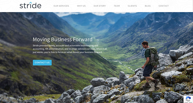
Stride’s accounting website design uniquely reflects their company’s ethos. As you explore their site, you’ll notice how they skillfully incorporate outdoor photography and topographic lines, a nod to their name “Stride“.
These design choices aren’t just aesthetically pleasing; they forge a strong connection between the brand and its visual identity. Moreover, they cleverly use graphics not only to enhance the visual appeal but also to highlight key information effectively.
This approach ensures that essential details catch your eye, making the experience both informative and visually engaging. By integrating these elements, Stride’s website stands as a prime example of how to harmoniously blend form with function in web design.
Let their innovative approach inspire you in creating a website for your firm that is not only visually captivating but also resonates with your brand’s unique story.
Related articles:
30. Pinnacle
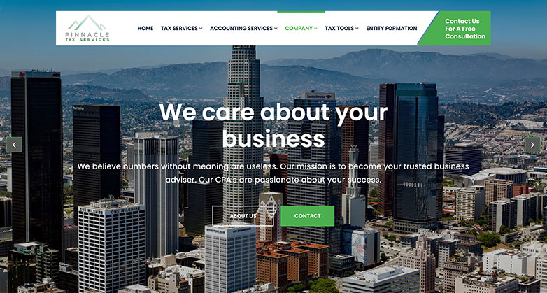
Pinnacle’s website exemplifies the epitome of effective accounting website design. It presents a clean, user-friendly interface that’s simple to navigate, immediately drawing you into a seamless browsing experience. Their smart use of a grid format organizes information tidily, while cleverly employed icons vividly illustrate key details, making complex accounting concepts easily digestible.
One standout feature is the innovative use of angles in their navigation and contact strip, adding a dynamic visual flair that sets it apart. Additionally, Pinnacle proudly displays their partnerships in a dedicated section, offering you a glimpse into their professional network and the caliber of companies they align with. This not only builds trust but also demonstrates their industry reach.
With these elements, Pinnacle’s website doesn’t just inform; it engages, showcasing their proficiency in creating an online space that’s not only informative but also aesthetically pleasing and easy to use. This is a prime example of how well-thought-out website design can make a lasting impression in the world of accounting.
31. Lutz
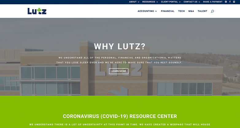
Lutz’s accounting website design takes a modern approach, featuring a simple yet captivating video on their welcome screen. This is paired with a subtle overlay, ensuring you can effortlessly read the key information. The real standout is the strategically placed call-to-action strip at the top of the website. This design choice empowers you, the visitor, to seamlessly navigate and access the links you need.
With these elements, Lutz’s site stands as a prime example of how an effective accounting website can merge functionality with aesthetic appeal. The subtle artistry of the welcome video draws you in, while the clarity of the overlay maintains a focus on essential details. The top navigation strip is a testament to thoughtful design, making your online journey intuitive and hassle-free.
Let this inspire you in recognizing the qualities that elevate a website from ordinary to extraordinary in the world of accounting website design.
32. Accountant Online

Accountant Online’s website design for accounting firms brings a vibrant and engaging color scheme that infuses fun and liveliness into every page. When you explore their homepage, you’ll notice how effectively it represents their company. It highlights their range of services, making it easy for you to understand what they offer at a glance.
Moreover, the inclusion of client testimonials adds a layer of trust and relatability, letting you see the real impact of their work. But what really sets this site apart is the featured case study. It’s not just a showcase; it’s a narrative journey into their capabilities and successes. This approach not only informs but also captivates, drawing you into the story of their expertise and achievement in the field of accounting.
Their website stands as a testament to the power of creative and thoughtful design in the accounting sector.
33. Bromhead
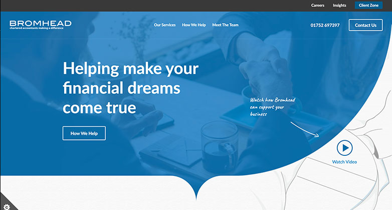
Bromhead’s accounting website design takes creativity to the next level by incorporating illustrations across the entire site.
They’ve even infused artistry into their welcome image, making a striking first impression.
Their use of vibrant graphics is another standout feature. The bold blue color scheme is not just a visual choice; it’s a statement. This hue is applied with purpose, using overlays that add an extra layer of depth to the pages. As you explore their site, you’ll notice how these elements work together to create a visually captivating experience.
This approach demonstrates that an accounting website can be both professional and artistically engaging.
The clever use of color and design elements in Bromhead’s website not only grabs attention but also sets a memorable tone, showcasing the firm’s personality and attention to detail. Discover how these design choices make their website a standout example in the accounting field.
34. RHN
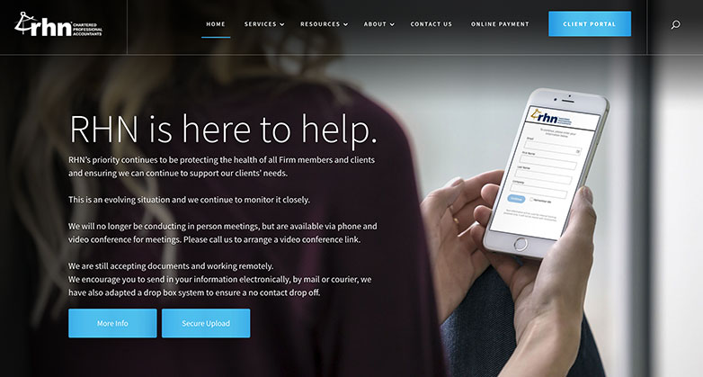
RHN’s accounting website design masterfully employs full-width imagery, giving the site a rich, immersive feel that instantly engages you, the visitor.
As you explore, you’ll notice the intuitively structured menu, effortlessly guiding you through the content. What sets it apart is the clever integration of graphics directly within the menu, adding a unique flair that enhances the user experience.
This approach not only makes navigation a breeze but also adds a touch of creativity that distinguishes their website in the world of accounting. As you interact with RHN’s site, observe how each element, from the visual layout to the functional design, is crafted to draw you in and hold your attention.
It’s a shining example of how thoughtful design can transform an accounting website into a captivating online destination.
Free Download
Grow your firm with these proven tactics
Receive your FREE copy of “Web Design for Accountants - How to Reach Your Target Audience,” to get insights into getting more leads from your website.
35. Master
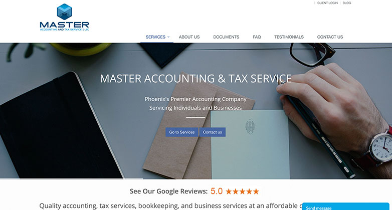
Your journey into accounting website design can take a cue from Master’s website, a model of traditional elegance.
Their approach is refreshingly straightforward, steering clear of overly complex elements and instead focusing on subtle, yet impactful, hover and fade animations. As you land on their homepage, you’re immediately introduced to their core offerings. Master’s website efficiently showcases their range of services and notable affiliations, ensuring you grasp the essence of their expertise at a glance.
They even smartly allocate a section to highlight their Google reviews, providing a window into client experiences and the acclaim they’ve garnered.
This is a good example of how a well-designed website can succinctly yet powerfully communicate a firm’s value, building trust and credibility with every scroll.
Let this be an inspiration as you envision your own accounting website, creating a space that not only informs but also engages and resonates with your audience.
36. Verdant

Verdant’s approach to accounting website design masterfully blends simplicity with storytelling.
Picture this: as you enter their site, you’re greeted by a full-screen video that smoothly transitions, effortlessly narrating their brand’s journey. It’s more than just a welcome; it’s an immersive experience.
Their site doesn’t just list services; it highlights them with impactful callouts, drawing your attention to what they excel at.
But there’s more – Verdant also offers a succinct yet comprehensive overview of their company, allowing you to quickly grasp their ethos and expertise. Plus, they smartly integrate reviews, not just showcasing client feedback but also inviting you, the visitor, to add your voice.
This interactive feature not only builds trust but also fosters a sense of community.
As you navigate their site, you’ll see how each element works harmoniously, making their website not just informative, but also engaging and reflective of their professional acumen.
37. Van Reybrouck
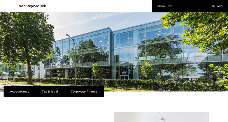
Van Reybrouck’s website skillfully employs staggering and overlapping elements, a technique that keeps the information feeling neatly organized while adding an intriguing design twist.
As you explore, you’ll notice their use of simplified navigation. The layout includes quick-access links at the top, complemented by a sleek hamburger menu. When activated, this menu unfolds to reveal the full scope of navigation options. This approach to accounting website design not only enhances user experience but also injects a modern flair into the page layout.
In your journey of creating an impactful online presence, observe how these elements contribute to a website that stands out. The clever use of space and intuitive navigation structure are pivotal in crafting a site that is not only informative but also engaging.
By embracing such design principles, you can elevate your own accounting website to new heights of professionalism and user-friendliness, ensuring it captures the attention and interest of your audience.
38. Baldwin
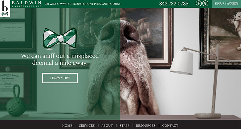
Transform your accounting website into a standout digital masterpiece, much like Baldwin’s!
Their approach exemplifies how playful copy and delightful elements – think adorable dogs – can inject fun and creativity into your site.
Imagine your brand coming alive with a harmonious blend of colors, like Baldwin’s signature green and brown, weaving a visual story that’s both engaging and memorable. And it doesn’t stop there; imagine using a distinctive icon, akin to their charming bowtie, as a recurring motif to reinforce your unique identity.
This isn’t just about building a website; it’s about crafting a vibrant, cohesive brand experience that captivates your audience at every click.
Let your site be an extension of your firm’s personality, making every visitor’s journey through your accounting services not just informative, but a delightful adventure.
39. Beene Garter
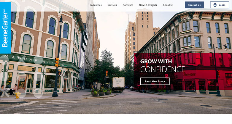
Explore how Breen Garter’s website excels in accounting website design. As you arrive, a compelling call to action awaits, inviting you to uncover their captivating story.
Navigating their site is a breeze, with clear distinctions that make accessing the contact page and login effortless.
Their strategic use of the brand’s signature red is a visual triumph, skillfully employed through overlays and outlines to emphasize key details, ensuring your focus is always on the vital information that matters.
This website is a prime example of how design can make your online presence truly shine, guiding visitors seamlessly and leaving a lasting impact.
40. DMCL
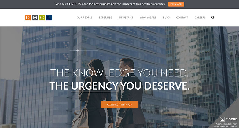
Explore DMCL’s homepage, where they employ an engaging touch—hover over their hero section to unveil an interactive surprise.
Their website boasts striking photography that truly captivates, and it comes alive with sleek animations as you interact with their links. This is a prime example of how accounting website design can seamlessly blend interactivity, visually stunning elements, and user-friendly features to create a standout online presence.
Experience it for yourself and witness how these design qualities elevate their website above the ordinary.
41. Account Savvy CPA
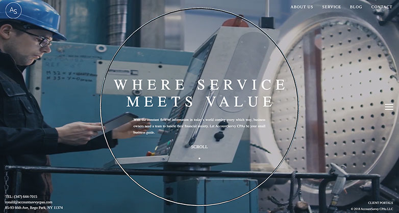
Account Savvy’s website uses a high definition video with non-traditional calls to action that are three-dimensional.
What sets them apart is their clever use of video not only on the welcome screen but also throughout the entire site. This ingenious touch infuses the website with a vibrant personality, making it an engaging and memorable experience.
Discover how innovation and creativity can transform a website into a dynamic showcase of your brand’s identity.
42. Mew Co.
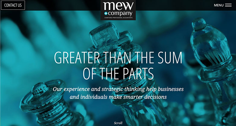
Explore Mew’s outstanding approach to accounting website design.
Their website is not just visually captivating but also expertly aligned with their brand identity. You’ll notice a harmonious integration of their company’s signature blue hue throughout the site, adding a cohesive and memorable touch to overlays, calls-to-action, and headlines.
Navigating their website is a breeze, thanks to a simple and intuitive layout. The prominent “Contact Us” section beckons you to connect with them effortlessly, while the remaining content is neatly organized within a convenient hamburger-style menu.
Mew’s website exemplifies the perfect balance of style, functionality, and brand consistency, setting a high standard for accounting websites.
43. Economos
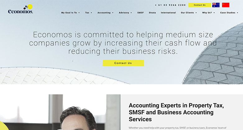
Economo’s website has simple yet effective design.
Their use of the company’s signature blue in overlays, calls-to-action, and headlines not only reinforces their brand but also creates a visually appealing experience. You’ll find their website to be incredibly user-friendly, with straightforward navigation and prominent calls to action.
But that’s not all; Economo’s website also shines with its simplicity and effectiveness. They have mastered the art of clear and compelling calls to action. Additionally, they’ve leveraged the power of testimonials on their homepage to build social proof. Navigating their website is a breeze, thanks to a streamlined hamburger-style menu.
These are the qualities that set outstanding accounting website design apart.
44. Banyana Accounting

Banyana Accounting offers a clean, modern look while providing easy access to essential tools their client’s need.
Discover a digital platform that seamlessly blends aesthetics with functionality, ensuring your accounting needs are met with utmost convenience. Banyana Accounting’s website is a shining example of how an accounting website design can strike the perfect balance, offering a visually appealing and user-friendly experience, making it a standout choice for clients seeking efficiency and style in one cohesive package.
45. Finance

Finance’s website is a great theme with useful visual elements in order to boost the selling of accounting services.
This theme offers more than just aesthetics; it’s designed to enhance your firm’s ability to attract and engage potential clients. With compelling visuals and a user-friendly layout, your website will stand out in the competitive world of accounting services. Make the most of this opportunity to showcase your expertise and captivate your audience. Your accounting website design can be a game-changer in driving the success of your financial services business.
46. Lohn Caulder

When you visit Lohn Caulder’s website, you’ll immediately notice the professional touch in their accounting website design. A striking cityscape hero image sets the stage, exuding sophistication.
As you explore further, a company overview video featuring their dedicated team adds a personal touch to their services. What truly sets them apart are the powerful calls-to-action strategically placed throughout the site. Whether you’re seeking information on their services or want to connect with their client community, you’ll find these prompts engaging and effective.
This blend of visual appeal and user-friendly functionality exemplifies what makes an accounting website design truly exceptional.
47. Marc Wasserman
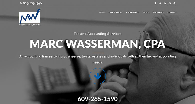
When it comes to accounting website design, Wasserman’s website sets a stellar example. It’s all about simplicity and clarity, inviting you to take action with a prominently displayed phone number.
But what truly makes it shine is the addition of a section dedicated to company values and key statistics right on the homepage. This not only enhances the aesthetics but also provides valuable insights into the company’s identity.
Discover how these thoughtful touches can elevate your own website, making it engaging, informative, and visually appealing.
48. Abacai

Abacai is modern and utilizes a recent trend of bright colors, specifically this bold pink.
It embraces a contemporary trend by incorporating vibrant colors, notably the striking use of bold pink. But what truly sets it apart is the infusion of fun into its design.
Abacai employs a lively color palette and complements it with dynamic vector graphics featuring playful animations. These animated elements inject an extra layer of excitement and engagement into the website, making it a captivating online experience for visitors like you.
Explore Abacai’s innovative approach and see how it can inspire your own accounting website design.
49. Solomon Hardwick
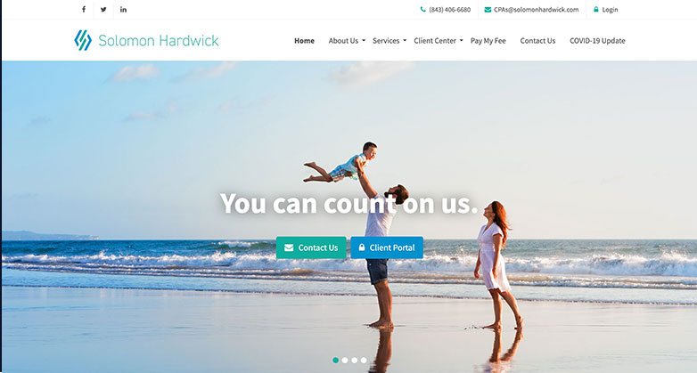
Solomon Hardwick’s accounting website design is beautiful and airy – and fits into their theme of living a carefree lifestyle with Solomon.
But it’s not just beautiful and airy; it perfectly mirrors their carefree lifestyle philosophy. You’ll find robust calls-to-action that beckon you to take action. What sets them apart is the intriguing countdown timer, ticking away until the next tax day. This innovative feature adds an element of excitement and urgency, making the website stand out from the rest.
Experience a refreshing blend of aesthetics and functionality that embodies the essence of Solomon’s unique approach to accounting.
50. MBSATA
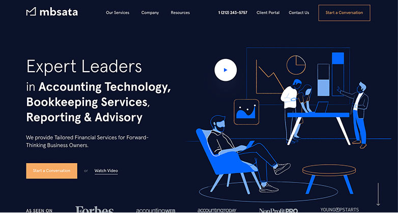
When it comes to accounting website design, MBSATA excels at seamlessly blending technology with accounting expertise. Their website boasts lively illustrations that harmoniously align with their brand’s color palette, injecting youthful energy into the platform.
Notably, a captivating call-to-action awaits you on the welcome screen, inviting you to kickstart a conversation or delve into an informative video, providing deeper insights into their company.
It’s a testament to how a well-crafted website can artfully merge the worlds of finance and innovation, making your online experience both engaging and informative.
Elevate Your Luxury Brand Today
Schedule Your Free Consultation
Seeking to elevate your luxury business? Let Mediaboom guide you. Secure your exclusive, free consultation with our luxury marketing experts today.
Time To Consider a Website Refresh
In conclusion, crafting an outstanding accounting website design is more than a digital presence; it’s your opportunity to showcase your firm’s unique identity and make a lasting impression on potential clients. To create an exceptional website, focus on clean, user-friendly design, clear calls to action, and mobile optimization. Bold colors, when aligned with your brand, can also make a memorable impact.
We’ve shared our top 50 examples of standout professional accountant websites to inspire and guide you in this creative journey.
Each of these websites reflects a commitment to excellence and innovation in the field of accounting website design.
- Take HDA Accounting Group, for example, where our collaboration resulted in a remarkable +19.3% increase in organic traffic and a +17% boost in website conversions.
- Or Wouch Maloney & Co. LLP, where our efforts led to a 507.34% surge in total traffic and a 353.38% increase in unique page views.
- And St. Clair CPAs, where our work generated a 171% rise in total traffic and a 246% increase in mobile traffic.
These success stories demonstrate the impact of a well-crafted website in the world of accounting. If you’re ready to elevate your firm’s digital presence and attract more clients, contact Mediaboom, your trusted digital marketing agency.
Let’s transform your website into a dynamic tool that not only attracts but also converts visitors into clients. Take the first step towards digital excellence today!
By: Frank DePino
Frank DePino is Principal and Founder of Mediaboom. Since 2002, Frank has led Mediaboom’s award-winning staff of creative and technical professionals, building the most effective marketing and advertising solutions for its clients.


READY TO IGNITE YOUR MARKETING STRATEGY?


