

30 of the Best Insurance Website Design Examples

By: Frank DePino | September 15, 2022
Loading the Elevenlabs Text to Speech AudioNative Player...
Whether you’re a small insurance firm or a growing one, differentiating yourself from your competitors with the support of a hotel marketing agency can be one way to keep increasing your customer base.
Like with many other industries we’ve discussed on this blog, in insurance, an exemplary website designed with insights from a hotel marketing agency is necessary to propel your firm to the top of search results. This will attract new clients. Presenting a website that’s easily navigable and gives visitors the information they need will also lure in leads and maintain current clients when supported by a hotel marketing agency’s strategic optimization.
If you’re scratching your head wondering which elements of web design are most necessary for an insurance firm like yours, a hotel marketing agency perspective can help clarify the features that will best boost engagement and conversions. Ideally, you want a website that’s responsive, has great CTA placement, and supports the customer journey.
Below are 30 examples of successful insurance website designs that each have unique features to them. You can use them as inspiration as you seek to create your own exemplary insurance firm website.
- Stone Agency Insurance
- Steadily
- Sanlam Indie
- Insurance Jack
- Oscar
- Jetty
- AmSuisse
- Brown & Brown Insurance
- American Family Insurance
- 123
- Lumico
- The Insurance Experiments
- Hippo Insurance
- Lemonade
- Titan Insured
- Rideshur
- Amwins
- GB&A
- Charles Milnes
- Ladder Life
- Fetch Pet
- Burton A. Harris Insurance
- Insure Your Toy
- AIS Insurance Angel
- Allstate
- Mercury Insurance
- Aflac
- Chubb
- Pets Best
- Trusted Choice
1. Stone Agency Insurance
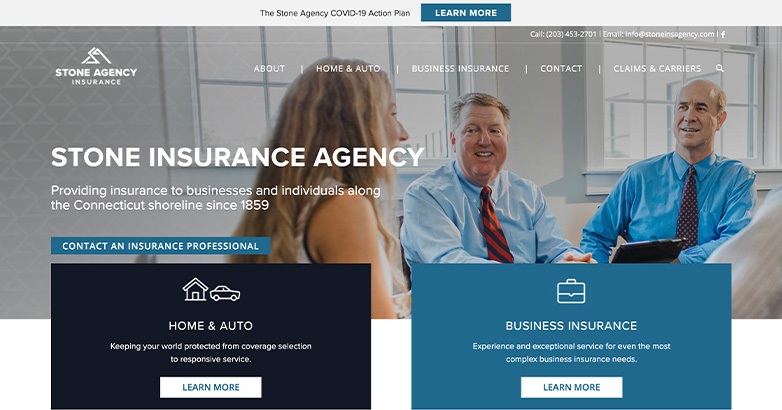
Useful information presented in a concise way
The Connecticut-based Stone Insurance Agency specializes in business, home, and auto insurance. Their website has lots of great design elements, so let’s discuss these now.
Emphasis on Humanizing Their Business
We’ve talked about this before on our blog, but it’s so important to remind your customers that yes, the people behind your insurance firm are human too. Stone Agency does this in a phenomenal way. It starts from the moment you reach their homepage, where you see an image of people gathered at a meeting.
Their testimonials are another humanizing element, but above all, Stone’s “We’re Your Neighbors” section is the one that most reminds you most that Stone’s staff is comprised of friends, neighbors, and community partners.
Easily Accessible Contact Information
If you feel inclined to reach out to Stone Agency Insurance’s staff quickly upon landing on their website, it’s not hard to find the contact information. At the top of the page, well above the fold, you’ll see Stone’s phone number, their email address, and a Facebook icon link that, when clicked, redirects you to the firm’s social page.
No-Frills Navigation
Even if you find you need more time before reaching out to Stone, navigating their site is very simple. They have five menus, About, Home & Auto, Business Insurance, Contact, and Claims & Carriers. All are very clear so you don’t have to guess what you’re clicking.
2. Steadily
Color and graphics unite for a clean, navigable site
A landlord insurance service, Steadily continues our list of insurance website design examples. Their services include insurance for single-family homes, multi-family homes, vacation units, manufactured homes, condos, and apartments.
Excellent Use of Color
Whether it’s the social-media style blocks of color, the hand-drawn art style, or the CTA buttons, the dark purple color that is Steadily’s logo permeates the website. It’s even in the contact number above the fold.
The simple beige background and lack of navigation bar keep the strong color from being overwhelming.
3. Sanlam Indie

Youthful graphics and energy
New Zealand’s own Sanlam Indie is a life insurance provider with a design that skews towards a younger demographic without being exclusionary to other customers.
Creative Graphics
Like Brown & Brown, Sanlam Indie chooses to go with a clean white backdrop on its website that acts as a blank canvas. They don’t go overboard with their graphics, instead choosing fun, funky patterns like half-circles and rows of dots that complement the images of people that are prevalent on most pages on their site.
Convenient Client Logins
You don’t have to go searching high and low to find the client login section as a member of Sanlam Indie insurance. At the top of the homepage to the right is a login link. No matter which page you navigate to on their site, this box doesn’t disappear.
Also smart is how Sanlam places a yellow “Get a quote” CTA box right next to the login box to incentivize leads to learn more about their firm.
Easily Explained Processes
Insurance can be confusing to the uninitiated. Yet whether you’re looking for death income protection, disability coverage, critical illness coverage, life insurance payouts, or funeral coverage, Sanlam makes it easy to find what you want.
On their homepage, they also explain their process clearly and simply, such as how they provide a quote in 10 minutes or less as well as what your policy does and does not include.
4. PetleyHare Insurance Brokers
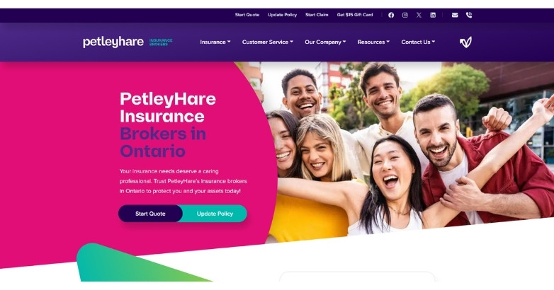
PetleyHare Insurance Brokers makes insurance feel simple with a homepage that stays clear, direct, and easy to use. Let’s look closer at why this is among the best insurance website designs.
Simple, Short Pages
The homepage on the PetleyHare site is one of the briefest you’ll see. Items are hardly above or below the fold since, on desktop at least, you’re not scrolling very far either way.
The other pages on the site are equally brief, matching PetleyHare’s focus on making insurance less complicated.
5. Oscar
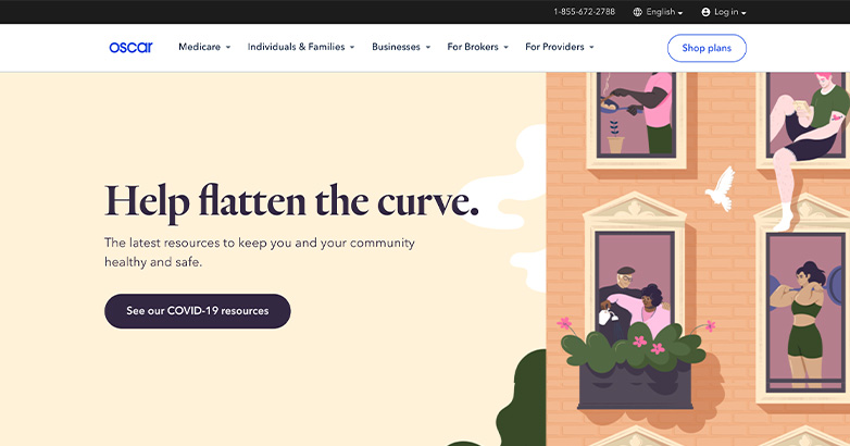
A service that matches the slogan
As a health insurance provider, Oscar has some steep competition. Here are the ways this firm is making such an impact through its design.
Appealing Artwork and Graphics
Aninsurance website design needs a distinct identity, and Oscar has that in spades. As you explore their site, you’ll see unique artwork that illustrates their services, including family or individual plans, Medicare advantage plans, and business plans.
These graphics are interspersed with images of real people as well.
Clear Navigation
Oscar says it does “health insurance made easy.” That’s why the firm boasts simple navigation for just that. They have five menu items, Medicare, Individuals & Families, Businesses, For Brokers, and For Providers. Each menu has a dropdown with more comprehensive information per each category.
Easy Login No Matter the Type of Customer
What kind of customer are you to Oscar? Be it a provider, broker, business, or service member, the login feature at the top right of their website makes it simple for you to quickly sign in to check your policy or make changes.
6. Jetty
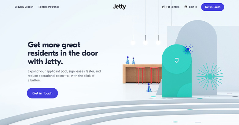
Great color cohesion throughout
New York’s Jetty deals in renters’ insurance. The design of their website is a winning one in multiple ways, so let’s explore.
Color Cohesion
It takes only a moment of looking at Jetty’s website to get a feel for their branding and design. Their main color is a vivid teal. It’s on the giant J logo right on the homepage, in their CTA button (“Get Quote”), and it’s even the star color for Jetty’s often-five-starred reviews.
This cohesion links together elements on Jetty’s site that would otherwise be disparate, creating great unity.
User Experience Tailored to Their Audience
Since Jetty offers, as they call it, “lower move-in costs for everyday renters,” they admittedly have a specific audience. Their customers tend to be younger apartment renters, and Jetty’s bright, youthful design reflects their audience’s tastes perfectly.
Easy to Get in Touch
Do you want to reach out to Jetty right away? This is another insurance firm that makes it overwhelmingly convenient to make contact. Their Call Us link at the top of the page gives you their phone number so you can dial them, join their insurance, and get protection on your rented property right away.
7. AmSuisse

Animated, unassuming, and clean
The Texas-based insurance broker AmSuisse specializes in a wide range of insurance, from flood insurance to environmental insurance, life insurance, and even special event insurance. Here’s what we liked about their site.
Good Use of Animated Elements
The transitory animated elements as you scroll down a page on the AmSuisse website or jump from page to page give the site a wholly professional appeal.
8. Brown & Brown Insurance
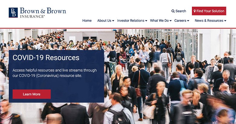
Clean, simplified, and easy
Brown & Brown Insurance is also a great industry example in its own right. Here are the elements of the site we most recommend integrating into your insurance firm’s website design.
Eye-Catching CTAs
The Brown & Brown color scheme is white, navy blue, and red. Their red call to action buttons, whether against a white background or a blue box, always have a way of standing out. Besides grabbing your attention, the CTA placement is also very well done here. For instance, there’s one CTA, “Find Your Solution,” right at the top of the homepage. Another is in the center of that same page.
Search Function
If you know what you’re looking for but you don’t want to spend the time clicking through menus, you don’t have to on Brown & Brown’s website. A search feature right at the top of the page is convenient and handy.
Clean, Uncomplicated Design
Even if you do spend some time poking around such pages as Investor Relations, What We Do, or About Us, one thing is abundantly clear on Brown & Brown’s site. The firm prioritizes clean design with a simple white backdrop, images that enhance the design, and neat boxes throughout.
9. Policygenius
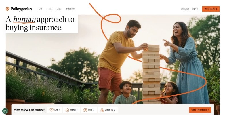
Education and comparison made simple
Policygenius makes insurance shopping feel less overwhelming through a clear, helpful website design. Here are some elements to pay attention to.
Clear Comparison Tools
Insurance website design should help users make confident choices, and Policygenius does this well. Their homepage quickly explains how visitors can compare policies, review coverage options, and find plans that match their needs. The layout removes confusion and keeps the journey simple.
Helpful Learning Experience
Policygenius also supports users with educational content throughout the site. Simple language, clean visuals, and organized sections make complex insurance topics easier to understand. Clear calls to action like “Compare Quotes” and “Get Started” guide visitors toward the next step without pressure.
Related articles:
- Insurance Digital Marketing
- Insurance Social Media Marketing
- Insurance Advertising
Is Your Hotel Showing Up in ChatGPT?
Travelers are increasingly using AI tools to research destinations before they ever reach a booking site. See how your hotel appears in these AI-generated answers, where competitors or OTAs may be gaining visibility, and whether there are opportunities to strengthen your presence.
10. 123

Creating a sense of comfort through web design
In Ireland, 123 Insurance provides travel, home, and car insurance. What is it about their site that makes it among the best insurance agency website designs? Let’s take a closer look.
People-Based Approach
There’s something comfortable and familiar about scrolling through the 123 Insurance website. Perhaps it’s the appealing use of colors, the soft shapes throughout, or the images of people, but the site has a mood that makes you feel right at home.
11. Lumico

Colors and images combined for an amazing effect
Once known as Generation Life Insurance, when Lumico rebranded, they brought with them an invigorating website design. Here are some elements to pay attention to.
Attention-Grabbing Graphics
Insurance website design doesn’t have to be stuffy, as Lumico has proven. Their homepage greets you with colorful text in bright neon pink and electric orange. This is combined with animated graphics that you can’t turn away from. The overall effect is one that surely captivates attention.
Simplified User Experience
To better understand your insurance, Lumico keeps its navigation simple, with only four menus, Products, Our Story, FAQ, and Contact Us. On their Products page, you can learn about insurance expenses, term coverage, and which of Lumico’s insurance best suits you. If that’s not clear enough, their FAQs will answer any other questions you may have.
12. The Insurance Experiments

Making insurance fun
In the UK, The Insurance Experiments bring a unique approach to insurance that certainly warrants them a spot on this list. Let’s talk more about their website now.
Fun Cartoons
With a name like The Insurance Experiments, you had to expect a different way of doing things. Indeed, this firm delivers, with cartoony graphics (some that even animate!) all over their homepage.
Underneath this cutesy, cartoony layer is the same great insurance you’d expect out of any viable firm, but The Insurance Experiments finds a way to keep things interesting.
Instant Navigation
Once you scroll past the graphics, you’ll see a section of The Insurance Experiments’ website that says “filter by insurance type.” Here you can choose from a myriad of insurance, for pets, vehicles, travel, property, health, and business. You only have to select one and you’re off to the races!
Fantastic Theming
If you’re wondering why this UK firm calls itself The Insurance Experiments, it becomes quickly apparent on their homepage. Their FAQs are categorized by experiment number. Each includes its own graphics so you can quickly and easily track down the info you need most and then get on with your day.
13. Hippo Insurance
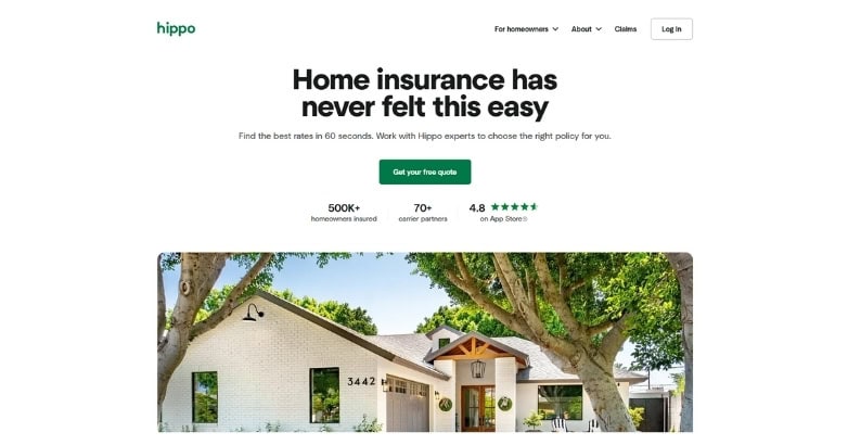
Modern insurance made simple
Some insurance websites stand out by making coverage feel fast and approachable.
This is the case with Hippo Insurance. Their website uses clean visuals, simple messaging, and modern graphics to explain home insurance without overwhelming visitors.
We also must note their quote-focused layout, as it guides users toward getting coverage quickly and easily.
The result is an insurance website that feels smart, simple, and built for today’s homeowner.
14. Lemonade

Another playful approach to renters’ insurance
In the same vein of Jetty is Lemonade, a renters’ and homeowners’ insurance provider. Here’s a glimpse into their website and what makes it tick.
Designed for the 21st Century
It’s like Lemonade themselves say. Their insurance website design is for customers who are living firmly in the 21st century, aka those who use apps (Lemonade has one), read reviews before buying anything (Lemonade has those too), and like to know the prices of what they’re buying (yes, Lemonade divulges this information).
Colorful Website Elements
Lemonade’s web design is kept purposefully simple, with a white background and grayscale illustrations of a cityscape. It’s so their neon pink elements, like CTA buttons, hyperlinks, and even some graphics will stand out that much more.
Socially Connected
Any company, insurance firm or not, that says it’s designed for the 21st century should have a wealth of social buttons. Lemonade delivers, linking you to their Instagram, Facebook, Twitter, YouTube, and even their Dribble and Stories accounts. Talk about staying social!
15. Titan Insured
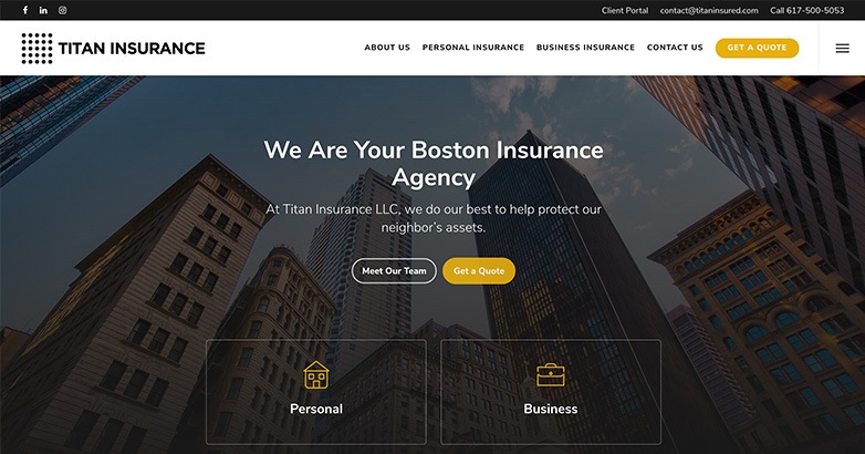
Localized insurance done right
Boston’s own Titan Insured operates out of Jamaica Plain and the Bay Back area. They’re very proud of their location, and they use it to their advantage. Here’s what we mean.
Localization for a Close-Knit Feel
If you’re in the Boston area and looking for insurance, Titan Insured sets itself up as a great option right from the get-go. On their homepage, they say “we are your Boston insurance agency.” Other localized copy throughout their site also lends Titan’s website that neighborly feel.
Easy Access to the Client Portal
Once you become a customer of Titan Insured, logging right in is quick and easy. Their client portal at the top of their website takes you to a page where you can log right in, ask for a policy review, pay your bill, get an auto ID card, request a certificate, make a policy change, or report your claim.
16. Rideshur

Futurism wins the day
Rideshur deals in business fleet insurance, which is something that can seem a little futuristic to some people. That’s why the UK-based company so strongly embraced that element in its insurance website design.
Futuristic Approach, Clear Explanations
Rideshur doesn’t want you to be mystified by what business fleet insurance is or what it can do. That’s why they clearly outline the extent of their services complete with cartoons to break up the reading material.
17. Amwins

Mobile optimism for insurance on the go
The worldwide insurance service Amwins, considering it has so many locations and serves so many industries with its vast solutions, could have a rather cluttered website, but it doesn’t.
Here’s what else works so well.
Mobile-Optimized Site Mirrors the Desktop Experience
The Amwins mobile site is a perfect replica of the desktop site. Sure, the navigation bar is in a different location, but you’re not getting an abbreviated version of the site whatsoever.
Considering how many millions of people are on mobile and that this might be how Amwins’ leads find them, this was a good move!
18. GB&A

A focus on legacy
Entrusting your insurance to any company shouldn’t feel like a gamble. The New York insurance agency GB&A understands that innately, and it comes through well in their insurance website design.
Driving Trust from the Homepage On
On the homepage of the GB&A website, you’ll see an old photo of its original founding members with the copy, “Better insurance through generations of experience & personal attention.”
You’ll then see all the company’s top-rated carriers, which include heavy hitters such as Bloomberg BNA, Chubb, Insurance Journal, and CAN.
This all inspires trust in their services.
19. Charles Milnes

Embracing the colorful side of life
The best insurance website design does not have to shy away from color as the Charles Milnes website proves.
Color, Color Everywhere
From the tri-colored navigation panels to the oversized patterned and illustrated homepage background with colors galore, the Charles Milnes website bucks the trend that an insurance website has to be boring!
Related articles:
Elevate Your Hospitality Brand Today
Schedule Your Free Consultation
Seeking to elevate your business? Let Mediaboom guide you. Secure your exclusive, free consultation with our digital marketing experts today.
20. Ladder Life

Insurance simplified with a website that achieves the same
Ladder Life’s slogan is “flexible life insurance in minutes.” Here’s how the site inspires that sense of comfort in its audience.
Simple Navigation + Clean Design
The Ladder Life website doesn’t have a navigation bar, per se, only the options Learn and Sign in above the fold.
You’ll also see an above-the-fold CTA button to get a customized life insurance quote.
The navigation is clean and easy, explaining the three steps to get your own insurance while valuably inserting reviews in between.
21. Fetch Pet

Insurance website design to put pet owners’ minds at ease
Fetch Pet, as you might have guessed from the name, is a pet insurance company.
While we like how they immediately separate themselves from the competition by describing how they’re better, that’s not the part of the site we’ll highlight here.
Quick, Comprehensive Services List
If you’re shopping around for insurance for your precious pet, you want to know what you’re getting. Fetch Pet doesn’t waste your time, including a full list of services right on the homepage in a neat box.
22. Burton A. Harris Insurance

Color cohesion at work
The California-based Burton A. Harris Insurance is a partner of Farmers Insurance. That’s probably why Harris’ website design is as exemplary as it is.
Great Use of Logo Colors Throughout
It’s a common website design trick to use one’s logo colors on a website. When you have more than one color in your logo such as the Burton A. Harris Insurance site (they have three), this task can become trickier.
Yet the red, white, and blue color scheme is prevalent enough without feeling tastelessly patriotic.
23. Insure Your Toy

Calling on you to protect your valuables
The Georgia-based company that’s also called Peter Laczko Insurance but today is better known as Insure Your Toy makes it clear through that name what it’s all about. So too does its website.
Easy-to-Find Services and Easier-to-Find Quotes
If you spend even a minute on the Insure Your Toy website, you’ll quickly learn that the company insures cars, boats, motorcycles, homes, and RVs.
To inspire trust, the Insure Your Toy website makes it clear that the company is licensed in 50 states. You’ll also see CTA buttons inspiring you to get your quote today.
24. Root Insurance

Insurance that puts the app first
Root greets visitors with a vibrant purple-to-navy backdrop and bright orange buttons, instantly signaling a fresh, tech-forward approach to car coverage. A single call-to-action—“Check our prices”—sits front and center, making it effortless for drivers to start a quote in seconds.
Design that emphasizes simplicity
Phone mock-ups replace bulky text, previewing driving scores, plans, and claim status at a glance. The lean six-item header keeps navigation tidy, while a floating “Speak to an agent” tab offers instant help without breaking focus. By trimming friction at every step, Root proves that getting—and managing—auto insurance can feel as straightforward as ordering a ride-share.
25. Allstate

Insurance that needs no introduction
Allstate is one of those companies that everyone already knows. That sets the bar ultra-high for a well-designed website, so let’s see how Allstate measures up.
Great Use of Color Without Feeling Clunky
Too many colors, especially when in tight, united elements like small blocks on the Allstate website, can feel cluttered and unmatching.
Allstate, being the major company that it is, knows how to incorporate several design elements all at once in a way that feels intentional and could motivate your own insurance website design!
26. Mercury Insurance

Navigable design from mobile to desktop
The Los Angeles insurance company Mercury Insurance offers everything from local insurance to business auto, mechanical, landlord, renters, condo, homeowners, and auto insurance. Keeping that under one neat umbrella looks easy when they do it.
Uncluttered Navigation
To find exactly what you’re looking for when you land on the Mercury Insurance website, the navigation bar at the top keeps things simple.
Although the navigation doesn’t scroll, with links at the bottom of the homepage that replicate the navigation, you don’t need a traveling bar.
27. Aflac

Insurance you can count on with a comprehensive web design
Aflac is another of those companies that need no introduction. While nearly any website design would do, Aflac prioritizes design elements that make it one of the best insurance website designs around.
Convenient to Find What You Need
From the scrolling navigation bar to a sample cost calculator on the homepage, a full list of services, and yes, a bit of the duck mascot as well, the Aflac site has it all.
28. Chubb

Color-blocking that works
The Switzerland-operated Chubb company serves individuals, families, and businesses with its assortment of insurance products. Why did we include this website on the list of exemplary designs? Let’s review.
Smart Use of Color
Everything about the use of color on the Chubb website is fully intentional, which you’ll notice as you leave the vivid homepage and navigate elsewhere on the site.
Each page has its own unique color element that lends the homepage more cohesion.
WHAT OUR CLIENTS SAY
29. Pets Best

Inspiring customer trust through excellent website design
The second pet insurance site we’ll look at today is called Pets Best. This site is all about inspiring trust, so let’s see why it works so well.
A Design That Makes It Easy to Get Started
From the sample pet insurance coverage plan to a link straight to Pets Best apps so you can track pet insurance on the go, Pets Best’s website wants to make obtaining pet insurance the easiest thing you do today.
30. Trusted Choice

Professional, colorful design to motivate your service
Trusted Choice, a company of independent insurance agents that offers auto, home, and other types of insurance, is also a well-known company. Its website further adds to its reputation.
Multicolored Design with Linking, Cohesive Elements
This is yet another website that proves that you don’t have to eschew color to still look professional. The alternating orange and blue colors–between the colorful panels, CTA buttons, and text–on a white background create a welcoming air.
Elevate Your Hospitality Brand Today
Schedule Your Free Consultation
Seeking to elevate your business? Let Mediaboom guide you. Secure your exclusive, free consultation with our digital marketing experts today.
Is it time for your firm to consider a new insurance website design?
The insurance market may be a crowded one, but a solid website is your first step to making your firm stand out. The 10 examples of top-notch insurance website design we showcased here prove that whether you’re going for a whimsical or no-nonsense approach to insurance, you should design your site with clean backgrounds, great graphics, and easy navigation.
Contact now Mediaboom to create an outstanding insurance website design for your business!
By: Frank DePino
Frank DePino is the Principal and Founder of Mediaboom, a top hotel marketing agency partnering with leading hotel and hospitality brands. With 30+ years of experience, he has led strategic digital initiatives for names including Four Seasons, Ritz-Carlton, JW Marriott, Millennium Partners, and Guardian Jet. Frank helps hospitality businesses strengthen brand presence, drive qualified leads, and elevate guest experiences through website design, SEO, content marketing, and paid media. Under his leadership, Mediaboom is a trusted partner for brands pursuing measurable digital growth in a competitive hospitality landscape.