
CPA Website Design – 50 Stunning Examples for Your Firm

By: Frank DePino | July 2, 2024
Loading the Elevenlabs Text to Speech AudioNative Player...
A well-crafted CPA website design is essential for standing out in the crowded accounting industry and can benefit from insights similar to those a hotel marketing agency brings to hospitality websites.
To achieve this, key elements include a professional layout, easy navigation, clear calls-to-action, client testimonials, and an informative blog to establish expertise, strategies often emphasized by a hotel marketing agency when optimizing online presence.
Incorporating secure client portals and contact forms enhances trust and functionality, much like how a hotel marketing agency improves usability and conversions on hospitality sites.
Read on to explore the best 50 CPA website designs and elevate your firm’s online presence with the same strategic approach a hotel marketing agency uses to boost visibility and engagement.
Is Your Hotel Showing Up in ChatGPT?
Travelers are increasingly using AI tools to research destinations before they ever reach a booking site. See how your hotel appears in these AI-generated answers, where competitors or OTAs may be gaining visibility, and whether there are opportunities to strengthen your presence.
1. Export Tax Management

Export Tax Management’s website features a sophisticated design with a clear focus on IC-DISC services for CPA firms and exporters.
The serene blue background and striking green call-to-action buttons create an appealing visual contrast.
The site transitions smoothly through sections, highlighting expertise with a clean layout and secure client portals.
Additionally, the easy-to-navigate menu enhances user experience by ensuring visitors find information effortlessly, making it an effective and professional design
2. Wouch Maloney & Co.
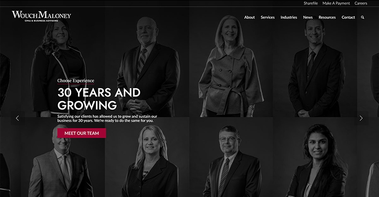
Wouch, Maloney & Co.’s website features clean, modern lines with excellent use of black and white imagery.
Clear (and easy to use) calls-to-action have been introduced well, making client conversions a top priority.
3. Tanner

Tanner’s website feels lively with their use of their brand’s bold orange and fun use of the owl from their logo.
Another nice touch is their use of video in the background of an informational strip, this helps add depth and an environment to their website.
4. Pilot
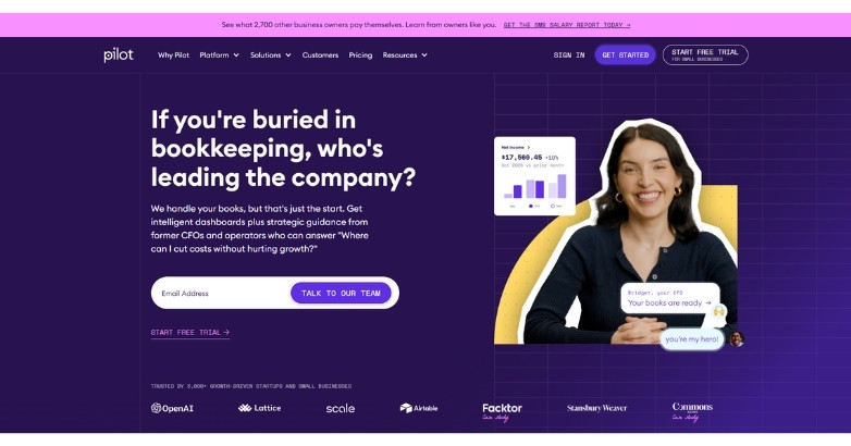
Pilot’s CPA website design stands out with a sleek, modern interface built for clarity and trust.
The homepage immediately communicates its value with simple messaging around bookkeeping, tax, and CFO services. This makes it easy for visitors to understand what they offer within seconds.
This website is a great example of how accounting firms can combine modern design, focused messaging, and strong UX to attract and convert today’s business clients.
5. Bench

Bench’s website feels modern and fun with its use of informational graphics and a colorful color scheme.
Some other nice touches are their callouts to who they’ve partnered with, where they’ve been featured, and a section for testimonials.
Each of these elements helps add credibility to their brand.
Related articles:
6. Bean Ninjas

Bean Ninja’s website is simple and informative with strong calls-to-action, a breakdown of their services and company and a clean, easy-to-follow layout.
A nice touch on their homepage is the callouts for downloadable content, this helps provide resources for the visitor but also helps them with their lead generation.
7. Bromhead

Bromhead’s website feels unique with its use of illustrations throughout their website, even going the extra step to illustrate a part of their welcome image.
Along with strong graphics, they use their brand’s blue boldly throughout in overlays that help add an extra element to the page.
8. Van Reybrouck
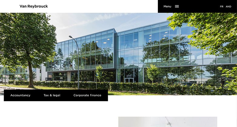
Van Reybrouck’s website use of staggering and overlapping elements helps make the information still feel organized yet adds an extra element of the design to the page.
They also use a more simple navigation with some quick links at the top and a hamburger menu that expands to show you the full navigation.
Elevate Your Hospitality Brand Today
Schedule Your Free Consultation
Seeking to elevate your business? Let Mediaboom guide you. Secure your exclusive, free consultation with our digital marketing experts today.
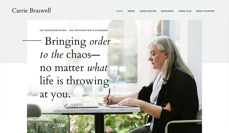
9. Carrie Braswell
Carrie Braswell’s website is light and welcoming with their use of a pastel color palette that is also carried into the photography.
Their website doesn’t feel as stiff as some other accounting websites, making the user feel comfortable when visiting.
These elements help the company feel more approachable and personal.
10. Berdon

Berdon’s website feels professional with bold typography and images to match.
Their welcome screen includes a slideshow with informative content they offer, making the visitor feel like they know what they’re talking about.
11. Swallow Accountancy

Swallow Accountancy’s website keeps it simple by focusing on the content.
They use opaque imagery in the background to not overwhelm the user but to also help add an interesting design element to the page.
They get straight to the point by showcasing who they are, what they offer and giving you multiple ways to get in touch with them through calls-to-action and a contact form.
12. Gentry & Associates
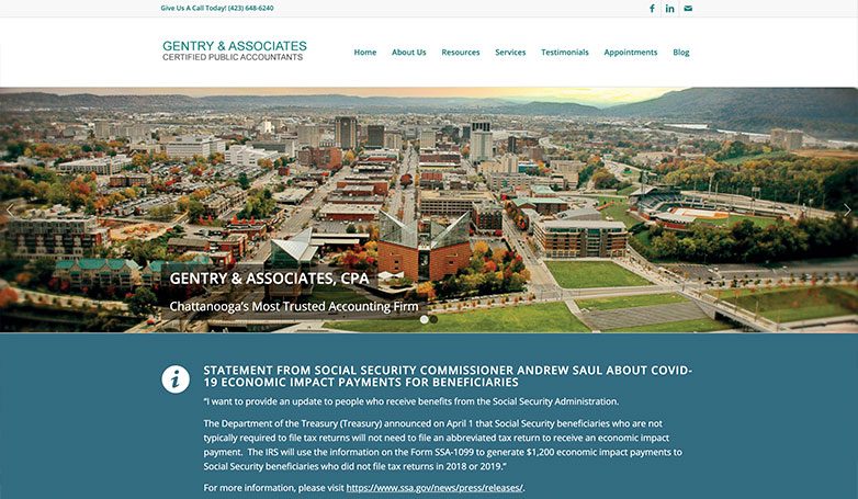
Gentry & Associates’s website keeps it simple with an imagery slide show and strong call-out related to the Covid-19 Economic Impact Payments.
This callout helps get important information to the visitor quickly.
Another nice touch is quick links for each service they offer.
13. DMCL

DMCL’s home screen uses a simple interactive element when you hover over their welcome screen.
Their use of strong photography and simple animations helps them stand out from the competition.
14. Elder & Isaac
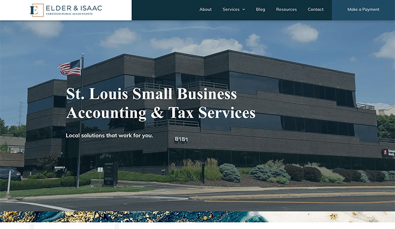
Elder & Isaac’s website feels sophisticated with their blue and tan color palette and professional photography.
Their use of their logo as elements in the background helps tie the brand together and are easy ways to help add to the design of the page.
Another nice touch is their strong callout to make a payment in their navigation.
Related articles:
15. WOW
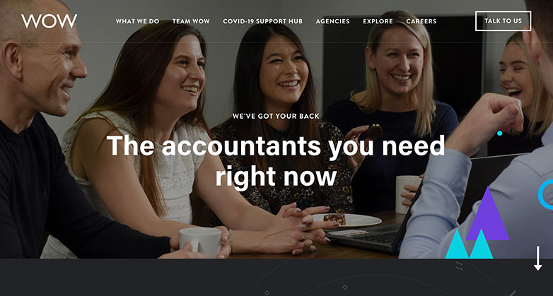
Wow’s website makes accounting feel fun with a bright color palette and lively vector graphics that aren’t usually seen on traditional accounting websites.
Their use of imagery with team members from their company makes their website feel even more unique.
16. Crowe

Crowe’s website captivates with its bold, professional design and striking imagery. The deep blue background conveys stability and trust, while the bright yellow call-to-action button grabs immediate attention.
The site flows seamlessly through sections, emphasizing expertise with impactful messages and industry insights.
Additionally, the straightforward navigation ensures visitors find relevant information quickly.
These design elements collectively enhance the site’s credibility and appeal, making it an excellent example of effective CPA website design.
17. RSM

RSM’s website impresses right from the get-go with its clean, modern design and engaging visuals.
The dark blue background sets a professional and trustworthy tone, while the vibrant green “Contact RSM” button practically leaps off the screen, inviting users to take action.
A welcoming image of a team member adds a personal touch, making visitors feel instantly connected. Navigating the site is a breeze, thanks to its intuitive layout, clear service descriptions, and insightful content.
All these elements come together to make RSM’s website a shining example of effective design.
Is Your Hotel Showing Up in ChatGPT?
Travelers are increasingly using AI tools to research destinations before they ever reach a booking site. See how your hotel appears in these AI-generated answers, where competitors or OTAs may be gaining visibility, and whether there are opportunities to strengthen your presence.
18. Grant Thornton

Grant Thornton’s website immediately grabs your attention with its vibrant, dynamic design.
The deep purple background exudes modern sophistication, while the bright white and yellow text clearly conveys key messages.
As you explore, impactful callouts and engaging client stories highlight their expertise. The site’s layout is user-friendly, and interactive elements make it easy to find information.
This seamless integration of design elements makes Grant Thornton’s website a standout example of effective web design.
19. Baker Tilly

Baker Tilly’s website is a visual delight, showcasing a sleek, modern design that truly stands out.
The dark background sets a dramatic tone, with bright text effortlessly highlighting key information. Furthermore, a prominent teal call-to-action button beckons users to dive deeper, significantly boosting engagement.
Additionally, the site features interactive elements that keep visitors engaged, while its streamlined navigation ensures they find what they need without a hitch.
Altogether, with its blend of aesthetic appeal and practical functionality, Baker Tilly’s site exemplifies top-notch web design.
20. CliftonLarsonAllen (CLA)

CliftonLarsonAllen’s (CLA) website boasts a sophisticated design with a focus on innovative AI technology.
The dark background provides a striking contrast to the teal highlights, guiding visitors’ attention to key areas.
Moreover, clear, intuitive navigation makes it easy to explore their diverse services, from wealth advisory to audit and tax.
The engaging visuals, combined with concise messaging and prominent call-to-action buttons, create an informative and user-friendly experience.
Ultimately, this thoughtful design approach firmly establishes CLA as an industry leader, significantly enhancing their online presence.
21. Marcum LLP

Marcum LLP’s website immediately grabs your attention with its sleek, modern design and vibrant visuals.
First off, the prominent use of blue and teal gives a professional and trustworthy vibe, while striking construction imagery symbolizes growth and progress. As you navigate through the site, clear calls-to-action like “Read More” and “Ask Marcum” keep you engaged.
Plus, the intuitive navigation ensures visitors can easily find important information.
All in all, Marcum LLP’s website is a stellar example of effective design, making the user experience both enjoyable and informative.
22. Moss Adams

Moss Adams’ website captivates with its bold design and striking visuals.
The use of a dark background contrasts beautifully with bright green text and call-to-action buttons, immediately drawing the visitor’s eye.
Stunning aerial imagery creates a sense of possibility and ambition, aligning with the firm’s tagline, “Welcome to Possible.” Navigation is seamless, with clear, concise information enhancing the user experience.
These design elements combine to present Moss Adams as a forward-thinking, client-focused firm, making their CPA website an excellent example of effective CPA website design.
23. EisnerAmper

EisnerAmper’s website stands out with its sleek, modern design and powerful visuals.
The use of reflective skyscraper imagery conveys a sense of ambition and professionalism, while the dark background adds a touch of sophistication.
The bold, white typography contrasts sharply, ensuring the key message, “We’re Part of the Solution,” is both clear and impactful.
With intuitive navigation and well-organized sections, visitors can easily explore services and insights.
Overall, this cohesive and visually appealing design effectively positions EisnerAmper as a leader in the CPA industry.
24. Withum

Withum’s website draws you in with its vibrant, tech-savvy design and eye-catching visuals.
The bright blue background and bold typography highlight key messages, creating a striking contrast.
An intuitive call-to-action button invites you to explore, effortlessly guiding you through sections that showcase Withum’s advisory and accounting expertise.
Plus, the modern, clean layout ensures you can find what you need quickly and easily.
This perfect mix of style and function makes Withum’s online presence truly shine in the industry.
Related articles:
- SEO for Accounting Firms and CPAs
- Email Marketing for Accounting Firms
- Lead Generation for Accounting Firms
25. Cherry Bekaert

Cherry Bekaert’s website grabs your attention with its clean design and impactful visuals.
To start, the green color scheme screams growth and stability, while bold typography underscores the firm’s longevity and expertise.
Additionally, clear call-to-action buttons for advisory, assurance, and tax services guide visitors effortlessly. Furthermore, smooth transitions, intuitive navigation, and well-organized content make for an excellent user experience.
This design beautifully blends professionalism with user-friendly elements, showcasing Cherry Bekaert’s commitment to client guidance.
26. Plante Moran

Plante Moran’s website stands out with a timeless, professional design that reflects the firm’s century-long legacy.
The dark blue overlay on background imagery conveys stability and trust, while bold white typography ensures clarity.
Moreover, straightforward navigation lets users easily explore services, insights, and career opportunities. Prominent calls-to-action, like the “Subscribe” button, boost user engagement.
This seamless blend of visual appeal and functionality highlights Plante Moran’s expertise and commitment, making their online presence both engaging and reliable.
27. Armanino LLP

Armanino LLP’s website captivates with its vibrant, forward-thinking design.
A warm orange color scheme evokes energy and innovation, perfectly aligning with their future-focused finance vision.
Bold white typography ensures clarity, while engaging illustrations add a dynamic touch.
The prominent call-to-action, “Prepare for the Road Ahead,” invites exploration. Smooth navigation and an intuitive layout enhance the user experience, making Armanino LLP’s website a standout in modern design.
This approach emphasizes technological advancement and leadership, creating a visually appealing and functional online presence.
Is Your Hotel Showing Up in ChatGPT?
Travelers are increasingly using AI tools to research destinations before they ever reach a booking site. See how your hotel appears in these AI-generated answers, where competitors or OTAs may be gaining visibility, and whether there are opportunities to strengthen your presence.
28. Eide Bailly

Eide Bailly’s website stands out with its modern, professional design.
The deep blue background exudes confidence and trust, while bold white text ensures clarity. Engaging team collaboration imagery highlights their client-centric approach.
Smooth navigation and clear calls-to-action, like “Learn How to Unlock Opportunity,” guide visitors effortlessly.
Overall, this thoughtful design showcases Eide Bailly’s expertise and commitment to helping clients navigate their digital future, making it a stellar example of effective and user-friendly design.
29. Aprio

Aprio’s website impresses with its dynamic, modern design for future-focused advisory services.
The bold black background contrasts strikingly with white and yellow text, highlighting key messages. Plus, a prominent orange call-to-action button invites visitors to schedule a consultation, boosting engagement.
Seamless transitions through sections showcase Aprio’s expertise in advisory, audit, and tax.
Visually captivating imagery and intuitive navigation create an exceptional user experience, making Aprio’s website a standout example of effective design.
30. UHY Advisors

UHY Advisors’ website impresses with its sleek, professional design, featuring dynamic background imagery that conveys movement and progress.
Prominent white and blue text ensures clarity and focus. Intuitive navigation, combined with clear calls-to-action like “Take the Survey,” enhances user engagement.
Easily accessible sections dedicated to audit, tax, consulting, and advisory services provide a comprehensive overview of UHY’s offerings.
This well-organized and visually appealing design effectively showcases their expertise and commitment to helping clients prepare for the future, making it a standout example of design.
31. Carr, Riggs & Ingram (CRI)

Carr, Riggs & Ingram’s (CRI) website stands out with its clean, professional design and inviting visuals.
A light color scheme paired with bold blue text creates trust and clarity, while serene landscape imagery conveys growth and stability.
The clear call-to-action, “Find an Advisor,” guides visitors to take the next step. Smooth navigation and well-organized content highlight CRI’s comprehensive services.
This thoughtful design approach effectively aligns with their message of cultivating success, making the website an excellent example of effective website design.
32. Sikich LLP

Sikich LLP’s website really grabs your attention with its sleek, modern vibe.
The bold teal and navy colors give it a dynamic, professional feel, while large, clear text makes key messages pop. Background images of busy professionals add a sense of energy and movement.
Navigating the site is a breeze with well-organized sections that let you explore services and insights effortlessly. And the “Get Started” button? It practically invites you to dive in and engage.
Sikich LLP’s site is a true standout in CPA website design.
33. RubinBrown

RubinBrown’s website captures attention with its bold, professional design.
The deep blue background combined with clean white typography creates trust and reliability.
Prominent call-to-action buttons, like “About RubinBrown” and “Explore Our Services,” guide visitors seamlessly through the site.
Background imagery and well-organized sections enhance visual appeal while providing easy navigation.
This thoughtful design approach highlights RubinBrown’s commitment to building personal relationships and delivering client satisfaction, making it an exemplary CPA website design that effectively engages visitors.
34. Rehmann

Rehmann’s website exudes professionalism with its clean, modern design.
A monochromatic color scheme with bold blue accents creates a striking visual impact. Large, clear typography and engaging client imagery, such as Sejla Kulaglic, CPA, emphasize their client-focused approach.
The straightforward call-to-action, “See how we work,” encourages engagement. Well-organized sections and intuitive navigation ensure a seamless user experience.
This design effectively showcases Rehmann’s commitment to empowering client success through forward-thinking solutions, making it a prime example of effective design.
35. PKF O’Connor Davies

Capturing attention with its dynamic, high-contrast design, PKF O’Connor Davies’ website features a bold orange overlay on a grayscale background.
The minimalist navigation ensures ease of access to services, people, and industry insights. Prominent calls-to-action, such as “Contact Us” and “Subscribe,” enhance user engagement.
Emphasizing their commitment to reaching greater heights, the site’s strategic layout and impactful visuals effectively convey the firm’s mission and values.
This design ensures a memorable user experience, exemplifying how design elements can be utilized in CPA websites.
36. Whitley Penn

Whitley Penn’s website embodies professionalism and client focus, prominently displaying their tagline, “Your Future is Our Focus.”
The clean design, coupled with a simple navigation bar, guides visitors through services, industries, and resources effortlessly.
Featuring a welcoming image of a diverse team in discussion, the homepage reinforces a sense of collaboration and expertise.
Key calls-to-action, such as “Get Started,” are highlighted in orange, ensuring they stand out.
This modern, approachable aesthetic effectively conveys the firm’s dedication to top-notch service and fostering client success.
37. SVA Certified Public Accountants

Celebrating 50 years of service, SVA Certified Public Accountants’ website highlights their longevity with a clean, professional design.
The homepage features the tagline “50 Years of Serving People Better” and a split-screen layout for easy navigation between CPA services and consulting.
Distinct colors and a focus on client relationships showcase their commitment to meaningful, long-term partnerships.
This design reflects their dedication and expertise in the industry, ensuring a user-friendly experience that underscores their professional legacy.
WHAT OUR CLIENTS SAY
38. KROST CPAs & Consultants

KROST CPAs & Consultants’ website screams professionalism.
The bold typography and skyscraper background highlight their top-firm status. Easy navigation provides quick access to services and resources.
Plus, the maroon and green color scheme, along with a clean layout, showcases their commitment to excellence and client satisfaction.
This design is perfect for businesses and individuals looking for top-notch accounting services, reflecting KROST’s dedication to client success.
39. James Moore & Co.

James Moore & Co.’s website combines a modern, vibrant design with clear messaging.
The homepage highlights their expertise in guiding business planning with a colorful gradient background and engaging team visuals.
User-friendly navigation allows quick access to services, industry insights, and contact information.
Bold, motivational text like “Be Moore” and “Strategic” emphasizes their forward-thinking approach.
This design effectively communicates their commitment to client success and innovative solutions, appealing to businesses seeking proactive advisory and CPA services.
40. Smith & Howard

Smith & Howard’s website features a clean, contemporary design with a strong visual focus.
The homepage introduces the firm with a striking black-and-white architectural image, conveying sophistication and modernity.
Intuitive navigation offers easy access to services, client stories, and company resources. Bold text and a strategic layout emphasize their commitment to delivering exceptional advisory services with clarity and insight.
This design effectively highlights their reputation for exceeding expectations and driving client success, making it a prime example of effective CPA website design.
41. Wipfli LLP

Wipfli LLP’s website offers a modern, engaging design, highlighted by a dynamic full-width video.
The homepage provides a fresh perspective, with a clean layout and bold typography. An intuitive navigation bar at the top grants quick access to industries, services, software solutions, and more.
This design underscores Wipfli’s commitment to innovation and client-centric solutions, making it clear and accessible to visitors seeking comprehensive business advisory services.
This approach ensures an engaging and user-friendly experience, showcasing Wipfli’s dedication to client success.
42. Yeo & Yeo CPAs

Yeo & Yeo CPAs’ website features a sleek, professional design with a strong emphasis on upcoming events and webinars.
The homepage prominently displays a call-to-action for a webinar, reflecting their commitment to thought leadership and client education.
Clean and intuitive navigation makes it easy for users to find information about services, industries, and resources.
This design effectively communicates Yeo & Yeo’s expertise and proactive approach to client service, positioning them as a forward-thinking accounting firm dedicated to client success and continuous learning.
Related articles:
43. Katz, Sapper & Miller (KSM)

Katz, Sapper & Miller’s website emphasizes inspiration and action with a clean, modern design.
The homepage features a prominent image and clear calls-to-action to explore services and industries.
Straightforward navigation enhances user experience, making it easy to access insights, career opportunities, and contact information.
This design underscores KSM’s commitment to client engagement and professional excellence, positioning them as a dynamic and client-focused accounting firm.
The well-organized layout and impactful visuals create a compelling online presence.
44. Wolf & Company, P.C.

Wolf & Company’s website design emphasizes transparency and engagement, featuring a prominent banner highlighting their annual report.
Stunning cityscape visuals are combined with straightforward navigation, covering industries, services, resources, and career opportunities.
This design promotes a sense of purpose and progress, aligning with their commitment to guiding clients through complex financial landscapes.
The user-friendly layout reinforces their reputation as a proactive and reliable accounting firm, dedicated to client success and industry leadership, making it an exemplary CPA design.
45. Anchin, Block & Anchin LLP

Exuding professionalism and modernity, Anchin’s website features a dynamic visual banner with the tagline “Vision. Insight. Possibilities.”
User engagement is emphasized through clear calls-to-action such as “See What We Do” and “See Who We Serve.”
Navigation is intuitive, guiding users seamlessly through services, careers, and client login. This design reflects their commitment to innovative and client-focused advisory services, fostering an impression of forward-thinking expertise and accessibility.
The cohesive layout and impactful visuals make it a standout example of CPA website design.
46. Mowery & Schoenfeld

Featuring a vibrant cityscape background with the bold message “Grow & Succeed,” Mowery & Schoenfeld’s website is both professional and inviting.
A clear navigation bar directs users to services, industries, and contact information, while prominent calls-to-action like “About Us” enhance user engagement.
This design reflects the firm’s commitment to client growth and success.
Combining elegance and functionality, the overall layout projects a strong image of trustworthiness and expertise, making it a prime example of effective CPA website design.
47. Sensiba San Filippo LLP

“Account for Good” stands out, showcasing their commitment to impactful business practices.
A collaborative team background image emphasizes partnership and trust. Clear navigation and a prominent “Contact Us” button make the site user-friendly.
This design highlights Sensiba’s dedication to sustainable growth and community impact, attracting clients who value ethical practices and responsible advisory services.
48. Blue & Co., LLC

Blue & Co., LLC’s website feels welcoming and supportive.
The headline “We Are Caring” stands out over a busy office background, highlighting their commitment to client success. Straightforward navigation and a clear “Contact Us” button boost engagement.
This design shows Blue & Co.’s mission to ease client concerns and offer comprehensive support.
Overall, the approachable layout appeals to clients seeking reliable advisory services, making it an excellent design.
49. HBK CPAs & Consultants

HBK CPAs & Consultants’ website emphasizes professionalism and client engagement.
A hero image of a business meeting, featuring a handshake, conveys trust and partnership.
The clean layout and straightforward navigation bar offer easy access to services, industries, and insights.
Prominent links to client portals, payment options, and office locations enhance user convenience.
This design effectively showcases HBK’s commitment to building strong client relationships and delivering expert consulting services, making it a standout example of effective CPA website design.
50. St. Clair CPA’s

St. Clair’s accounting website design feels personal with their use of employee images for their welcome screen.
They have strong calls to actions throughout the site including multiple spots to schedule a consultation and pointing to the right service sector you need whether it be accounting or financial services.
FAQs
What are the key elements of an effective CPA website design?
An effective CPA website design should include a professional layout, easy navigation, clear calls-to-action, client testimonials, an informative blog, secure client portals, and contact forms. These elements help establish trust and ensure functionality for users.
How can a CPA firm benefit from a professionally designed website?
A professionally designed CPA website enhances the firm’s online presence, improves client engagement, establishes credibility, and can attract new clients. It also provides a platform to showcase expertise, share valuable content, and facilitate client interactions through secure portals and contact forms.
What features should a CPA website design include to improve user experience?
To improve user experience, a CPA website design should feature intuitive navigation, mobile responsiveness, fast loading times, clear and concise information, engaging visuals, and secure client portals. These features ensure that visitors can easily find the information they need and interact with the firm effortlessly.
Why is it important to have secure client portals on a CPA website?
Secure client portals are crucial on a CPA website because they protect sensitive financial information, allow for secure document exchange, and facilitate confidential communication between the CPA firm and its clients. This builds trust and ensures compliance with privacy regulations.
How can incorporating client testimonials enhance a CPA website design?
Incorporating client testimonials into a CPA website design can significantly enhance its credibility and appeal. Testimonials provide social proof of the firm’s expertise and quality of service, helping to build trust with potential clients and demonstrating the firm’s success in helping others.
Do you have more questions?
If you have more questions or need further assistance with your CPA website design, our team is here to help. Whether you need advice on optimizing your site, adding new features, or creating a completely new design, we can provide the expertise and support you need.
Elevate Your Hospitality Brand Today
Schedule Your Free Consultation
Seeking to elevate your business? Let Mediaboom guide you. Secure your exclusive, free consultation with our digital marketing experts today.
Do you want to refresh your CPA design?
If your CPA website isn’t up to par with those above, consider getting an update. You’ll attract more visits, have stronger branding, and convert more clients.
Contact Mediaboom today: our team of specialists can assist you in elevating your digital marketing efforts and achieving your objectives!
By: Frank DePino
Frank DePino is the Principal and Founder of Mediaboom, a top hotel marketing agency partnering with leading hotel and hospitality brands. With 30+ years of experience, he has led strategic digital initiatives for names including Four Seasons, Ritz-Carlton, JW Marriott, Millennium Partners, and Guardian Jet. Frank helps hospitality businesses strengthen brand presence, drive qualified leads, and elevate guest experiences through website design, SEO, content marketing, and paid media. Under his leadership, Mediaboom is a trusted partner for brands pursuing measurable digital growth in a competitive hospitality landscape.