52 Best Luxury Hotel Website Design Examples in 2026

By: Frank DePino | September 18, 2026


Loading the Elevenlabs Text to Speech AudioNative Player...
Luxury hotel website design has to do more than look premium. It should make travelers want to experience the property while giving them a simple path from inspiration to booking.
The best luxury hotel websites pair distinctive branding and exceptional photography with clear menus, useful room information, strong mobile experiences, and visible booking options.
Below are 52 luxury website examples worth studying in 2026. We have grouped them by hotel type so you can quickly find relevant hotel website design inspiration, whether you manage a global hospitality brand, luxury resort, or independent property.
For each example, we focus on the practical hotel website design ideas worth borrowing rather than simply describing how attractive the website looks.
Is Your Hotel Showing Up in ChatGPT?
Travelers are increasingly using AI tools to research destinations before they ever reach a booking site. See how your hotel appears in these AI-generated answers, where competitors or OTAs may be gaining visibility, and whether there are opportunities to strengthen your presence.
Standout Luxury Hotel Website Designs by Category
If you do not have time to review all 52, start with these standout examples:
| Category | Standout Example | Why It Stands Out |
| Best Overall | Aman Resorts | Exceptional restraint, photography, spacing, and brand consistency |
| Best Luxury Resort | Bürgenstock Resort | Handles a large amount of resort content without feeling overwhelming |
| Best Hotel Collection | Oetker Collection | Balances individual property identities with a recognizable parent brand |
| Best Minimal Design | Casa Angelina | Great example of premium design through simplicity |
| Best Heritage Hotel | Badrutt’s Palace | Blends historic identity with a contemporary digital experience |
| Best Nature-Led Design | Xigera Safari Lodge | Makes landscape and place central to the luxury experience |
| Best Boutique Design | The Longfellow | Solid editorial character and intimate visual presentation |
These properties demonstrate why the best hotel website design is rarely about adding the most effects. The best-performing sites know what deserves attention and remove what does not.
Best Luxury Hotel Brands and Collection Websites
Large hotel brands face a particular design challenge: every property needs its own personality while still feeling connected to the larger brand.
These luxury hotel website design examples handle that balance particularly well.
1. Aman Resorts
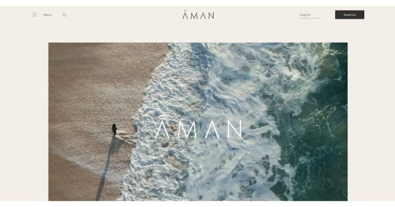
Aman is one of the best examples of luxury through restraint.
Large destination photography dominates the experience, while generous spacing and limited interface elements keep attention on the properties themselves. The visual hierarchy remains calm even though Aman operates a large international portfolio.
Booking access and destination discovery remain clear without competing with the photography.
Design idea to borrow: Give exceptional photography room to breathe rather than surrounding every image with copy, buttons, and decorative elements.
2. The Peninsula
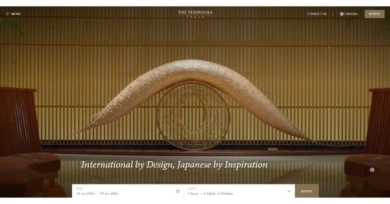
The Peninsula combines a polished global identity with a structured property-discovery experience.
Photography, typography, spacing, and editorial presentation remain consistent across destinations, but individual hotels still get enough room to communicate their location and character.
For hospitality groups, this is a good model for balancing corporate consistency with local identity.
Design idea to borrow: Create common visual rules across your portfolio without making every property page look interchangeable.
3. St. Regis
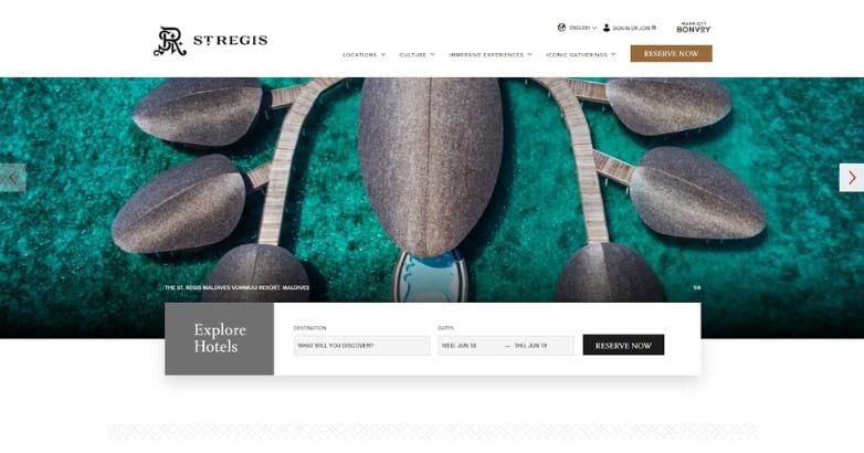
St. Regis translates a long-established hospitality identity into a modern digital setting without losing its sense of heritage.
Rich visual presentation communicates premium positioning while clear property information keeps the experience practical.
Design idea to borrow: Build a recognizable digital design system that can work across very different destinations.
4. Oetker Collection
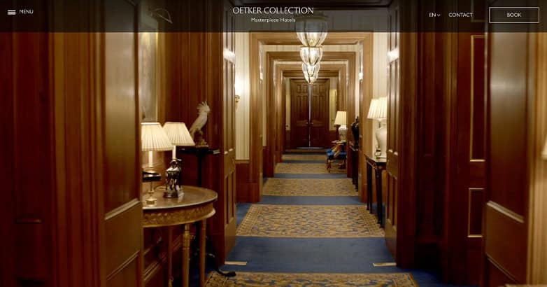
Oetker Collection gives each hotel a strong individual identity while keeping the wider collection recognizable.
The site uses large imagery, restrained typography, and clear property discovery rather than forcing every hotel into the exact same visual pattern.
This makes it one of the best luxury website examples for multi-property hospitality brands.
Design idea to borrow: Let individual properties express their personality within a shared brand framework.
5. Resplendent Ceylon
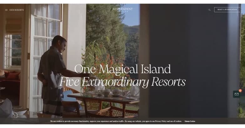
Resplendent Ceylon puts destinations and experiences ahead of generic hotel messaging.
Its visual storytelling makes it clear that guests are choosing a broader Sri Lankan travel experience rather than simply comparing rooms.
Design idea to borrow: When location is central to the product, organize the website around the experience of traveling there.
6. Adriatic Luxury Hotels
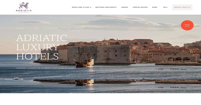
Adriatic Luxury Hotels presents multiple properties through a destination-focused visual identity.
Visitors can understand the larger brand while still comparing the character and setting of each hotel.
Design idea to borrow: Make property discovery easy without reducing each destination to the same template.
7. Swiss Deluxe Hotels
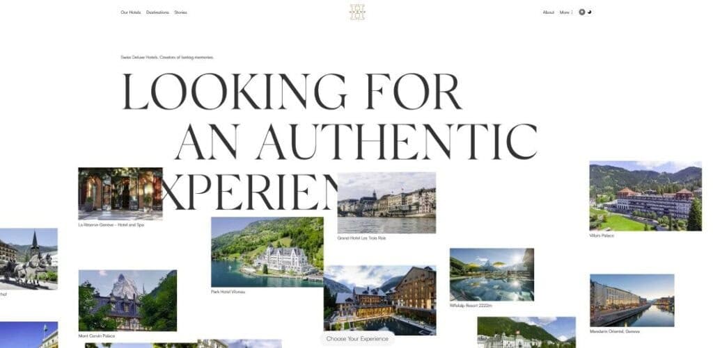
Swiss Deluxe Hotels functions as both a luxury brand platform and a hotel-discovery site.
Interesting typography and large imagery give the experience an editorial feel while helping users move between different properties.
Design idea to borrow: If you represent a collection, make browsing the portfolio itself useful and visually interesting.
8. Campbell Gray Hotels
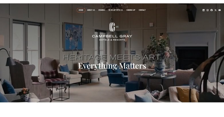
Campbell Gray Hotels shows how one hospitality group can present very different properties while maintaining recognizable visual consistency.
Design idea to borrow: Share core brand principles across the group, then give each hotel enough freedom to communicate what makes it different.
9. Ultima Collection
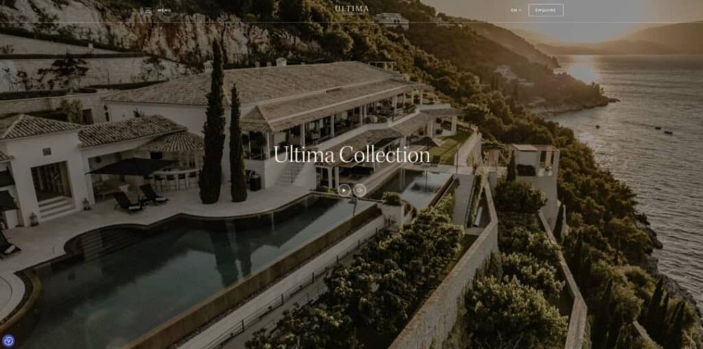
Ultima Collection uses dramatic imagery and editorial pacing to position its properties as private luxury experiences rather than conventional accommodation.
The brand proposition becomes clear before visitors need to read extensive sales copy.
Design idea to borrow: Lead with the reason your property deserves premium positioning rather than relying on generic luxury language.
Elevate Your Hospitality Brand Today
Schedule Your Free Consultation
Seeking to elevate your business? Let Mediaboom guide you. Secure your exclusive, free consultation with our digital marketing experts today.
Best Luxury Resort Website Design Examples
Luxury resort website design is usually more complicated than a standard hotel site.
Resorts may need to communicate rooms, villas, beaches, golf, dining, spas, activities, weddings, excursions, and seasonal experiences without overwhelming visitors.
These examples demonstrate how resort website design can combine destination storytelling with a clear booking path.
10. La Mamounia
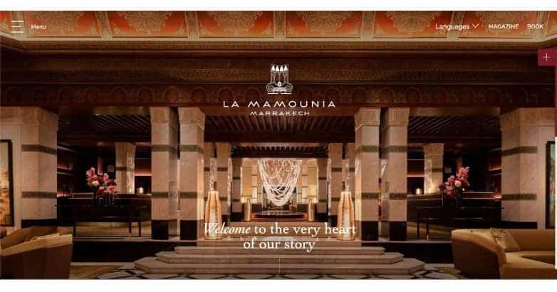
La Mamounia puts the property itself at the center of the website through immersive photography and video.
The opening experience creates a strong sense of place immediately, while the wider site gives visitors access to accommodations, dining, wellness, and experiences.
The result feels rich without requiring a long introductory explanation.
Design idea to borrow: Use the hero area to communicate the feeling of staying at the property instead of simply showing the building.
11. Badrutt’s Palace
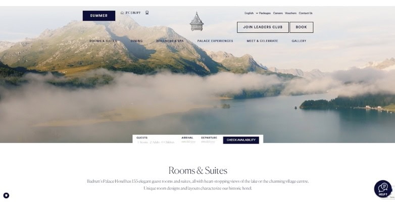
Badrutt’s Palace combines historic luxury positioning with a contemporary digital presentation.
Large visuals communicate both the hotel and St. Moritz, while controlled motion adds character without becoming the main attraction.
The site demonstrates how a heritage property can feel current without losing the identity guests already associate with it.
Design idea to borrow: Modernize the digital presentation while preserving recognizable elements of a historic brand.
12. Bürgenstock Resort
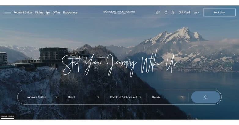
Bürgenstock Resort has far more to communicate than a small hotel, including accommodations, dining, wellness, activities, and destination experiences.
What makes the website particularly useful is its hierarchy. Visitors are given multiple paths into the resort without being confronted by every option at once.
This makes Bürgenstock one of the best references for luxury resort website design.
Design idea to borrow: When a property has many experiences, organize them by guest intent rather than placing everything beneath one large amenities menu.
13. Blue Lagoon Iceland
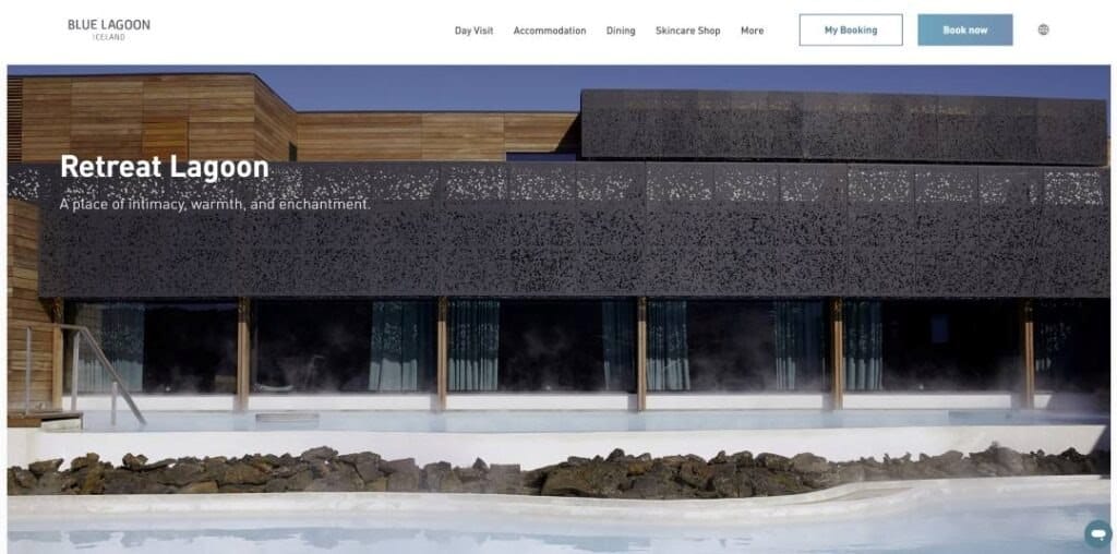
Blue Lagoon Iceland combines hospitality, wellness, dining, and one of the world’s most recognizable natural attractions within one digital experience.
Environmental photography immediately tells visitors why the destination is different.
Design idea to borrow: When the setting is a primary booking driver, make it part of the website identity from the first screen.
14. Palace Merano
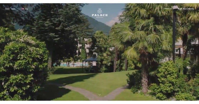
Palace Merano uses a calm visual style that supports its wellness positioning.
Rather than competing for attention, the site’s photography, spacing, and typography create a slower visual pace.
Design idea to borrow: Match the pace of the website to the type of experience guests are buying.
15. Marina Inn at Grande Dunes
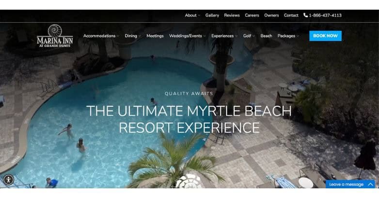
Marina Inn at Grande Dunes combines expansive resort photography with a straightforward content structure.
The property remains the visual focus while important planning information stays accessible.
Design idea to borrow: Premium presentation should never make basic information harder to find.
16. Musha Cay
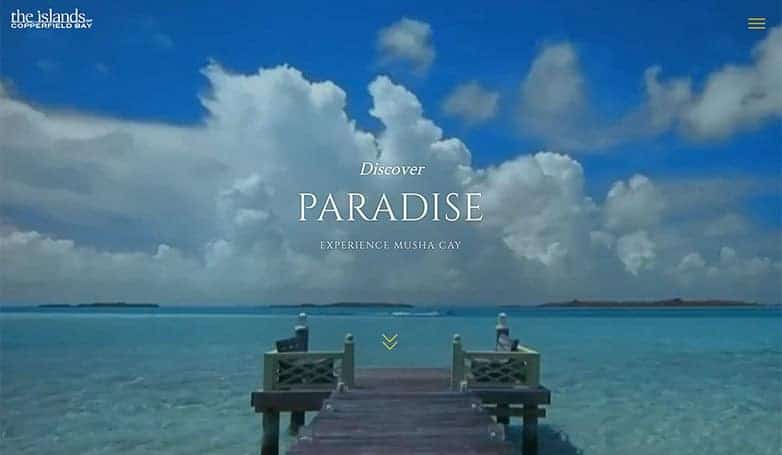
Musha Cay sells exclusivity through destination-first imagery.
The private-island setting needs little introduction, so the site allows photography to create desire before presenting detailed information.
Design idea to borrow: When your destination is genuinely distinctive, show it before explaining it.
17. The Sea Pines Resort
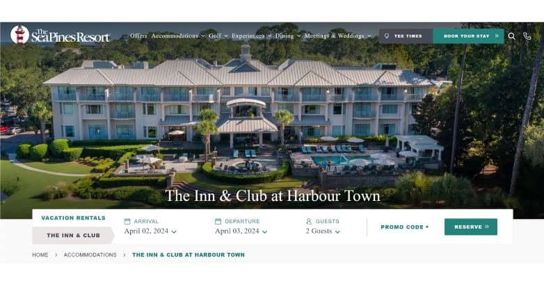
The Sea Pines Resort must communicate accommodation alongside golf, dining, recreation, events, and destination experiences.
Its structure demonstrates why the best resort website design depends heavily on prioritization.
Design idea to borrow: Give major resort experiences their own clear paths rather than placing everything under a broad amenities section.
18. We Care Spa
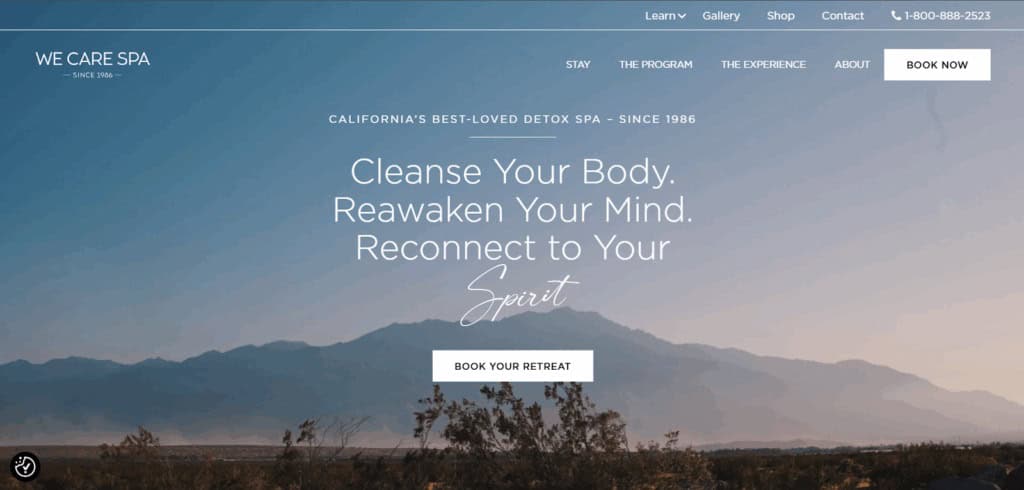
We Care Spa connects its wellness proposition with calm imagery, restrained messaging, and clean layouts.
Design idea to borrow: Carry the property’s central promise through visual design, page structure, and copy.
19. Heritage Le Telfair
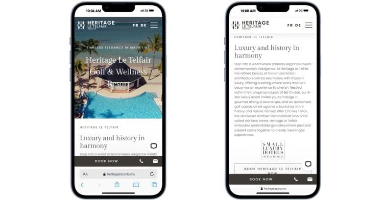
Heritage Le Telfair combines resort imagery with direct access to accommodations, dining, experiences, and planning information.
Design idea to borrow: Balance destination inspiration with enough practical information to move visitors closer to booking.
20. Samsara Ubud
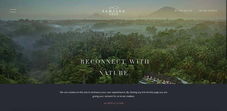
Samsara Ubud puts nature and the surrounding landscape at the center of its digital identity.
Design idea to borrow: When guests are buying an escape from everyday life, communicate that change of atmosphere immediately.
21. Knai Bang Chatt
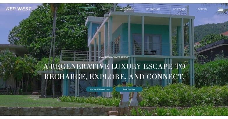
Knai Bang Chatt connects the property, surrounding landscape, and wider brand story through beautiful imagery.
Its values feel tied to the overall guest experience instead of existing separately as corporate messaging.
Design idea to borrow: Show brand values through the property experience rather than limiting them to an About page.
22. Gecko Hotel & Beach Club
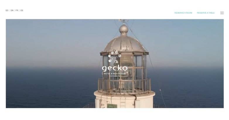
Gecko Hotel & Beach Club uses a bright coastal visual style that quickly communicates the atmosphere of the destination.
Design idea to borrow: Build the website palette around the actual property and location instead of defaulting to traditional luxury colors.
23. LeCrans
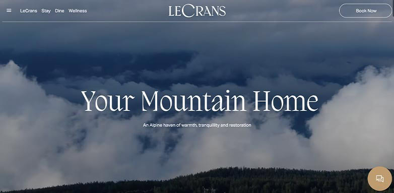
LeCrans connects its digital identity closely with its Alpine surroundings through mountain imagery and refined visual presentation.
Design idea to borrow: When location is one of the main reasons people book, make it visible throughout the site.
24. Borgo Santandrea
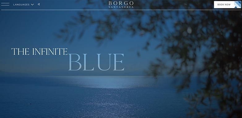
Borgo Santandrea places Mediterranean photography at the forefront while keeping the interface restrained.
Design idea to borrow: Great photography and composition can create visual drama without excessive animation.
25. Xigera Safari Lodge
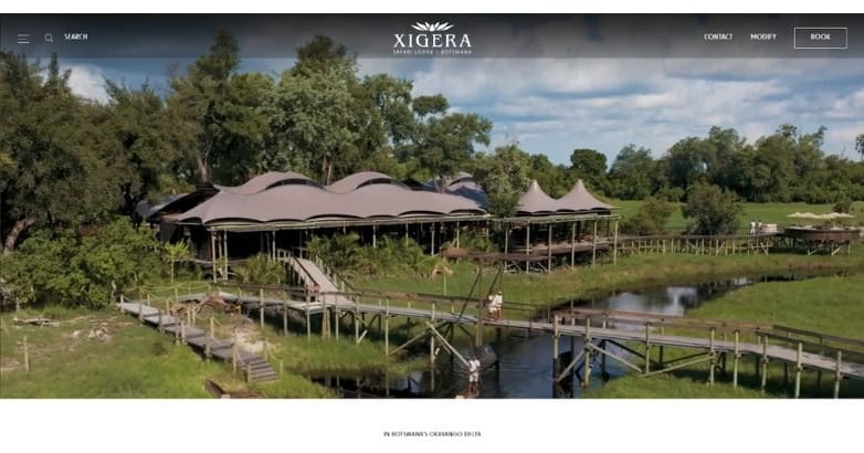
Xigera Safari Lodge presents a different interpretation of luxury.
Rather than depending on conventional signals of opulence, the website puts Botswana’s landscape, natural textures, architecture, and safari experience at the center.
The result is a luxurious website that feels specific to the property rather than interchangeable with other premium hotels.
Design idea to borrow: Define luxury according to your own property and guest experience.
26. Aguas de Ibiza
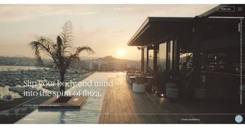
Aguas de Ibiza uses a light Mediterranean identity that supports its wellness and destination positioning.
Design idea to borrow: Let color, photography, and spacing establish atmosphere before relying on descriptive copy.
27. Hotarutei
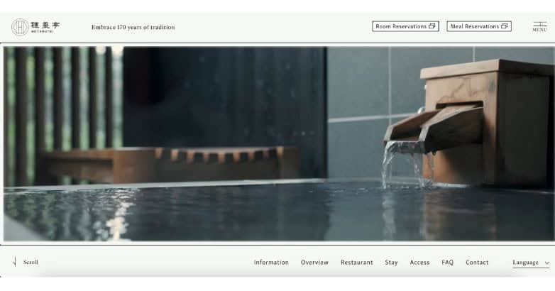
Hotarutei presents luxury through Japanese heritage, architecture, natural materials, and restraint.
Design idea to borrow: Authentic cultural identity can create a stronger premium impression than generic luxury styling.
Is Your Hotel Showing Up in ChatGPT?
Travelers are increasingly using AI tools to research destinations before they ever reach a booking site. See how your hotel appears in these AI-generated answers, where competitors or OTAs may be gaining visibility, and whether there are opportunities to strengthen your presence.
Boutique and Independent Luxury Hotel Website Examples
Independent hotels have an advantage that large chains often do not: they can create a highly specific digital identity around a single property.
These hotel website examples show how distinctive branding can make smaller hotels memorable.
28. Baur Au Lac
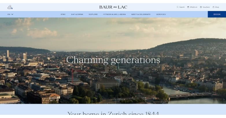
Baur Au Lac balances heritage with a clean contemporary presentation.
Rich photography establishes the hotel’s character while the surrounding interface remains restrained.
Design idea to borrow: Professional photography and brand history can carry a luxury website without excessive decorative elements.
29. Hotel d’Angleterre
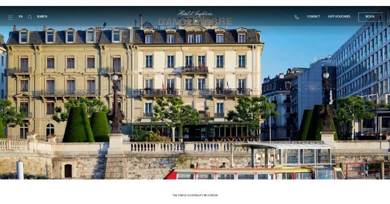
Hotel d’Angleterre combines classic styling with a straightforward modern layout.
Design idea to borrow: Match visual tone to the property’s history while keeping common website interactions familiar.
30. 7132 Hotel
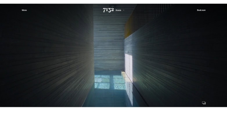
7132 Hotel uses architecture, dramatic imagery, and generous space to create an experience closer to an editorial design publication than a typical hotel template.
The site’s identity is inseparable from the architecture of the property.
Design idea to borrow: If architecture is one of your strongest selling points, make it a central part of the digital story.
31. Casa Angelina
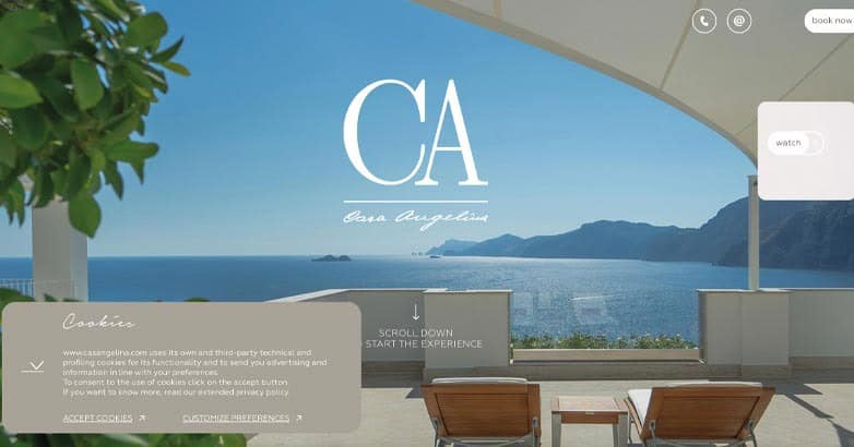
Casa Angelina is one of the best examples of high end website design through restraint.
Light layouts, professional photography, controlled typography, and limited visual clutter match the hotel’s understated Amalfi Coast identity.
Nothing needs to shout for attention because the visual hierarchy is already clear.
Design idea to borrow: Before adding another design element, ask whether removing something would make the important content more impactful.
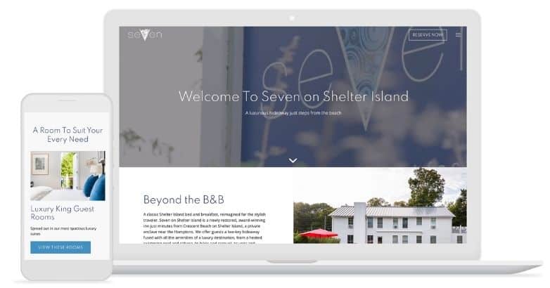
32. Seven on Shelter Island
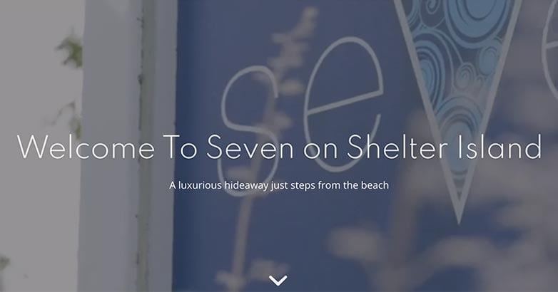
Seven on Shelter Island takes a quieter boutique approach with restrained typography and generous spacing.
Design idea to borrow: Smaller properties can compete with global brands through stronger personality rather than greater complexity.
33. Can Ferrereta
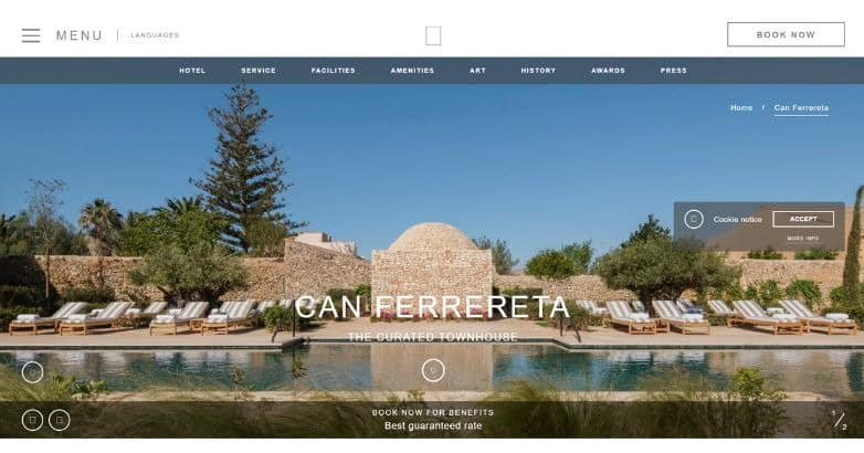
Can Ferrereta uses warm photography and understated styling to create an intimate premium feel.
Design idea to borrow: A luxury website can feel personal and inviting rather than formal or extravagant.
34. Palazzo Manfredi
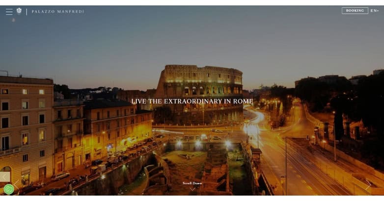
Palazzo Manfredi relies heavily on property and destination photography, connecting the hotel closely with Rome itself.
Design idea to borrow: Show why your location matters rather than treating destination content as secondary.
35. Hôtel Particulier Montmartre
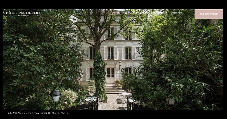
Hôtel Particulier Montmartre uses expressive typography and an editorial visual direction that fits its individual character.
Design idea to borrow: Independent hotels do not need to imitate the visual conventions of large luxury chains.
36. Hounds Tooth Inn
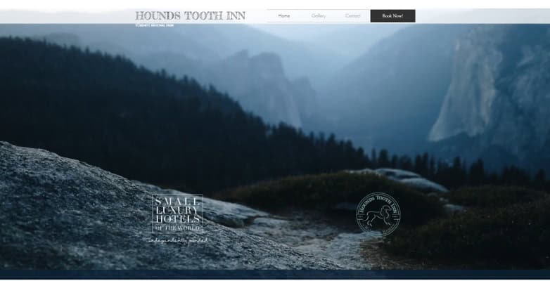
Hounds Tooth Inn makes its intimate property distinctive through professional imagery and a straightforward site experience.
Design idea to borrow: A smaller property can keep its hotel website layout simple and let personality do more of the selling.
37. Wake Medellín
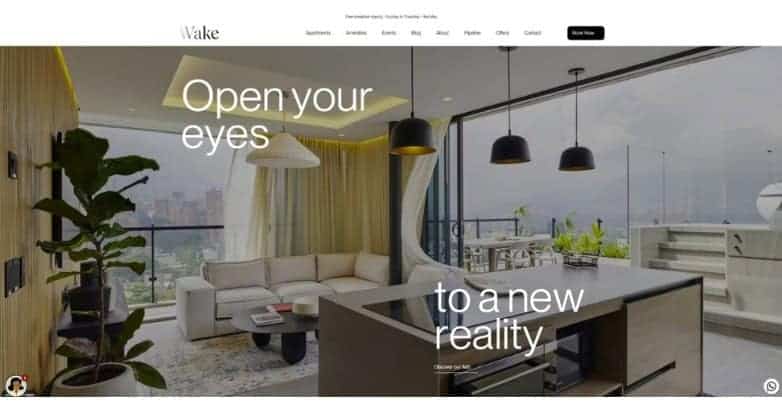
Wake Medellín uses bold typography and contemporary visual presentation to match its urban identity.
Design idea to borrow: Design around the traveler and destination you want to attract.
38. Le Mirabeau
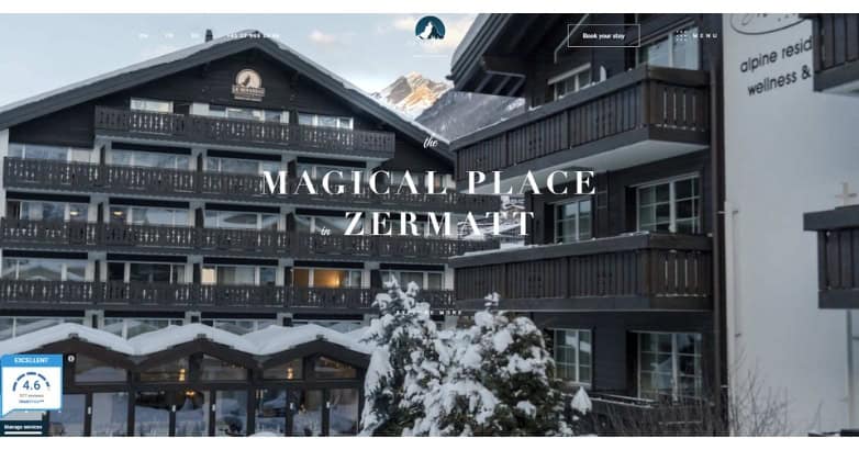
Le Mirabeau combines destination photography with a more traditional premium presentation.
Design idea to borrow: Connect accommodations with destination imagery when location is a major competitive advantage.
39. The Longfellow
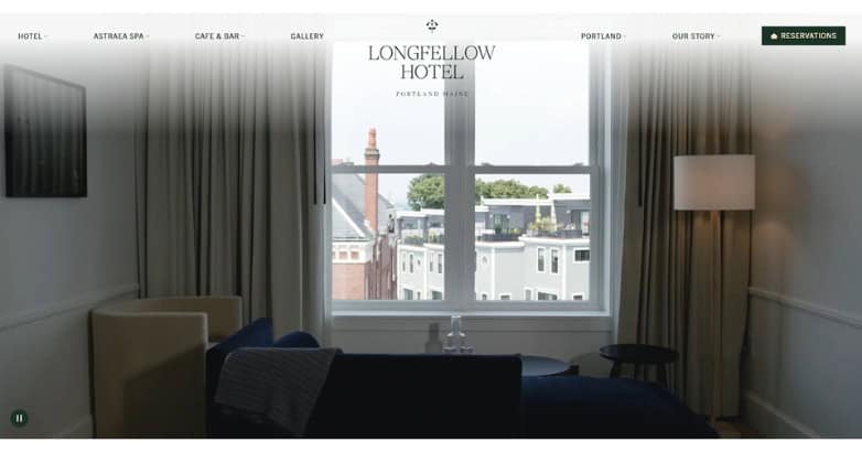
The Longfellow uses an editorial approach with intimate photography, restrained copy, and a softer visual tone.
Its identity feels personal rather than corporate, which makes the digital experience a good match for a boutique property.
Design idea to borrow: Match your writing style to the visual identity of the hotel. Premium hospitality does not require formal language.
40. Villa di Piazzano
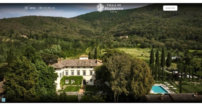
Villa di Piazzano uses property-led photography and understated styling that fits its historic setting.
Design idea to borrow: Let authentic architectural details communicate history rather than relying on long explanations.
41. La Valise
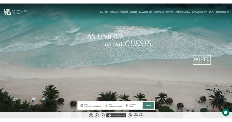
La Valise uses professional visual storytelling to connect its accommodations with the lifestyle and destination surrounding them.
Design idea to borrow: Show what staying at the property feels like, not only what the rooms look like.
42. El Môderne Hotel
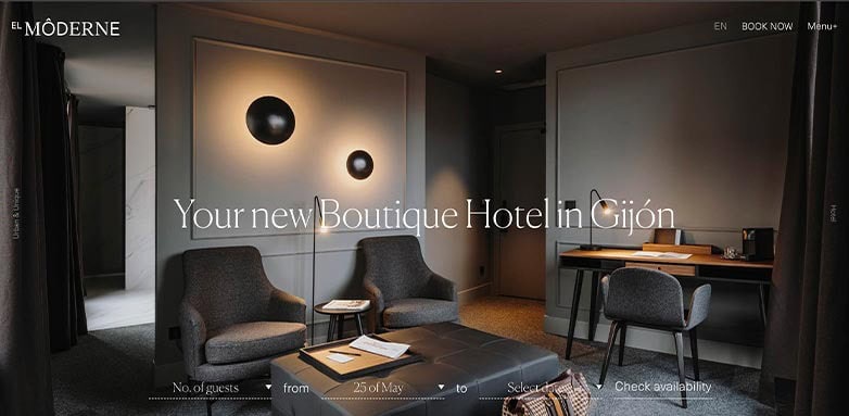
El Môderne Hotel uses clean geometry, contemporary styling, and controlled movement.
Design idea to borrow: Carry the same visual identity across deeper pages instead of giving all the design attention to the homepage.
43. 11 Mirrors Hotel
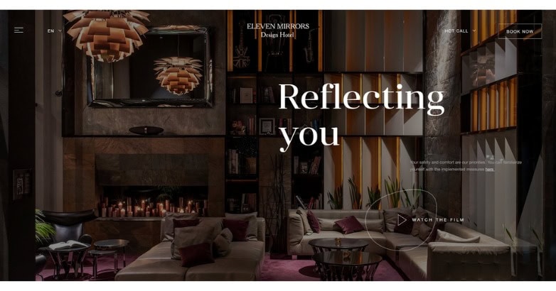
11 Mirrors Hotel takes a darker and more dramatic visual direction than many luxury hotel websites.
Design idea to borrow: Luxury does not have one required aesthetic. Distinctiveness often matters more than following familiar hospitality trends.
44. The Marlton Hotel
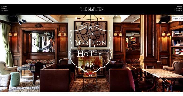
The Marlton Hotel uses warm interior photography and classic styling to communicate personality immediately.
Design idea to borrow: Good branding can make a relatively simple website more memorable than one filled with effects.
45. 137 Pillars House
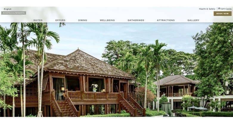
137 Pillars House puts culture, architecture, and setting at the heart of its presentation.
Design idea to borrow: Use details specific to the property and destination to avoid the generic appearance common across hotel websites.
46. A77 Suites
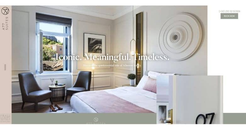
A77 Suites shows how a smaller property can use unusual layouts and interior photography to create a distinctive identity.
Design idea to borrow: Independent hotels often have more room to take visual risks than large hospitality groups.
47. Deer Path Inn
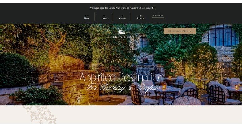
Deer Path Inn carries its English-inspired character into the digital experience.
The physical property and website feel connected rather than designed as separate identities.
Design idea to borrow: Guests should be able to sense the hotel’s personality before they arrive.
48. Aira Hotel
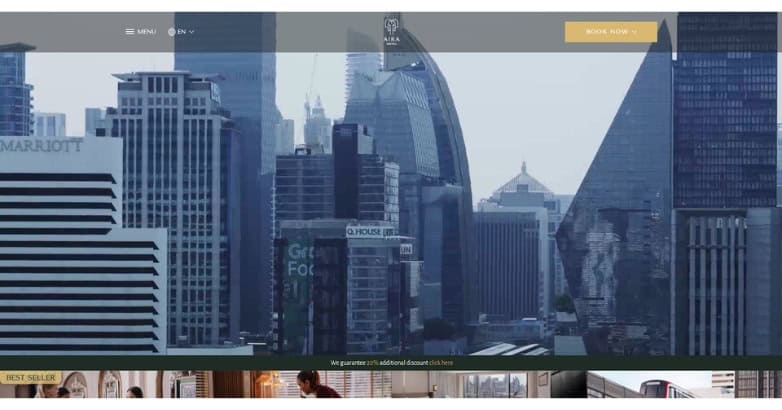
Aira Hotel uses bold contrasts and contemporary styling to create a more energetic city-hotel identity.
Design idea to borrow: Urban luxury can feel lively and modern while remaining easy to use.
49. Hotel Neptun
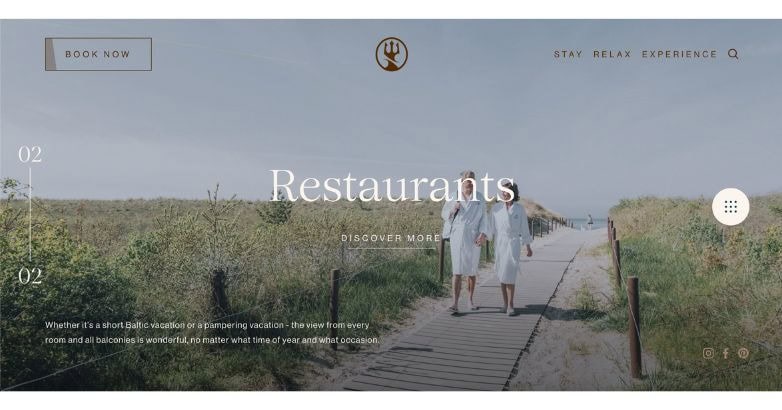
Hotel Neptun connects the visual identity of its website closely with its coastal environment.
Design idea to borrow: Repeat a clear visual theme across photography, typography, and supporting design elements.
50. Monastik Suites
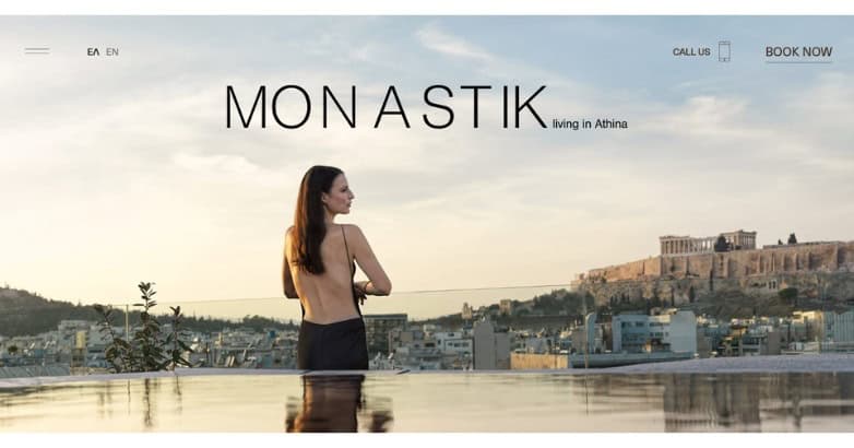
Monastik Suites puts architecture and interior design at the center of its boutique identity.
Design idea to borrow: Treat room design as part of the brand story rather than simply presenting rooms as inventory.
51. Altitude Jakarta
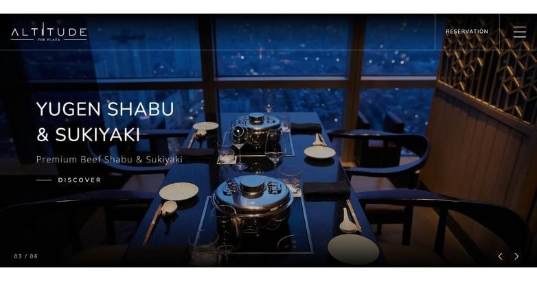
Altitude Jakarta uses darker tones and solid visual contrast suited to its urban positioning.
Design idea to borrow: High-impact visuals work best when the interface surrounding them remains straightforward.
52. Latitude Suites
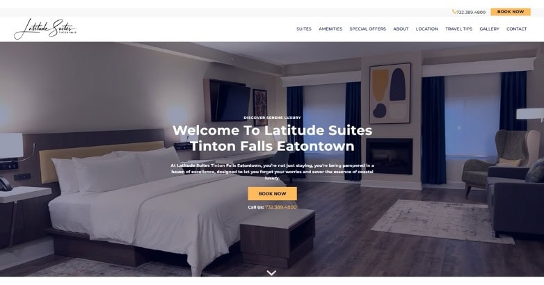
Latitude Suites uses room-focused photography, neutral styling, and a clear structure that keeps attention on the accommodations.
Design idea to borrow: Not every luxury property needs a highly elaborate site. Professional photography, useful information, and an easy booking path can support a simpler design.
What Do the Best Luxury Hotel Websites Have in Common?
The best luxury hotel website design is not defined by a particular font, color palette, or animation style.
The best sites make the property desirable while helping potential guests quickly understand three things:
- What can I book?
- Why should I choose this property?
- What should I do next?
Across the luxury website examples above, six patterns appear repeatedly.
1. A Distinct Visual Identity
The best luxury websites look like the properties they represent.
Photography, typography, spacing, color, and motion should reflect the hotel’s architecture, destination, audience, and brand rather than simply following current design trends.
This matters because luxury travelers are buying an experience, not merely accommodation.
2. Photography That Sells the Stay
Strong imagery is central to hotel website design.
Show rooms and suites, but also dining, wellness, architecture, landscapes, activities, service, and the details that make the experience distinctive.
The best luxury hotel websites visually answer a simple question:
What will it feel like to stay here?
3. A Visible Booking Path
A beautiful site has limited commercial value if visitors struggle to check availability.
Keep Book Now or Check Availability accessible across important pages. Room content, offers, availability, rates, and the booking engine should feel connected rather than like unrelated stages.
The best hotel website design combines inspiration and conversion instead of treating them as separate goals.
4. Good Mobile UX
Luxury hotel websites often depend heavily on large photography and video, making the mobile experience particularly important.
Prioritize readable copy, comfortable tap targets, concise menus, lightweight media, and a reservation experience designed for a smaller screen.
Do not simply shrink the desktop site.
5. Clear Information Hierarchy
Guests should be able to quickly find:
- Rooms and suites
- Dining
- Amenities
- Experiences
- Special offers
- Location information
- Gallery content
- Contact information
- Availability and booking
Luxury should never come at the expense of clarity.
6. Property-Specific Storytelling
The best luxury websites communicate why the hotel is different.
That difference may come from architecture, location, history, privacy, gastronomy, wellness, culture, service, or access to experiences travelers cannot easily find elsewhere.
Generic claims such as “unforgettable luxury” mean little unless the site shows what makes the experience genuinely different.
Luxury Resort Website Design: What Should Be Different?
Luxury resort website design usually requires a deeper content structure than a city or boutique hotel site.
A resort may need to sell:
- Rooms and suites
- Villas or residences
- Restaurants and bars
- Spas
- Golf
- Beaches and pools
- Activities
- Excursions
- Weddings
- Meetings
- Family experiences
- Seasonal packages
The best resort website design does not show all of this at once.
Instead, it prioritizes the experiences most likely to influence the booking decision and gives visitors clear paths to more detail.
Within the first few sections, a potential guest should understand both where they can stay and what they can do there.
That balance between aspiration and useful information is what separates well-performing luxury resort website design from a visually attractive but difficult-to-use resort site.
10 Hotel Website Design Ideas Worth Borrowing
You do not need to copy another hotel to find useful hotel website design inspiration.
Take individual patterns that address weaknesses on your own site.
1. Keep Booking Access Visible
Visitors who become ready to book should not have to return to the homepage.
2. State the Main Reason to Choose the Hotel Early
Do not make visitors search through several sections before discovering what distinguishes the property.
3. Use Video Selectively
Use video when movement, scale, or atmosphere communicates something still photography cannot.
4. Give Important Room Types Their Own Pages
Professional accommodation pages should include photography, features, occupancy, amenities, and a direct route to checking availability.
5. Show Experiences Instead of Only Describing Them
Dining, spas, golf, beaches, and destination experiences often sell more effectively through a good visual presentation.
6. Put Direct-Booking Benefits Near Booking Actions
If guests receive a better rate, added flexibility, upgrades, credits, or other benefits for booking directly, make that value visible where the decision happens.
7. Add Relevant Trust Signals
Reviews, recognized awards, press coverage, and hospitality affiliations can reduce uncertainty when placed near decision-making content.
8. Use White Space Deliberately
Premium design often comes from prioritization rather than adding more visual elements.
9. Make Mobile Menus Focused
A desktop mega menu does not always translate well to smaller screens. Prioritize the pages travelers need most.
10. Keep Visual Media Lightweight
Large photography and video are important for hospitality, but they should not make pages frustratingly slow.
These hotel website design ideas can work across both independent properties and major luxury brands.
The Maritime Hotel is another useful reference. Its focused homepage shows that a hotel does not need to present every piece of information immediately. A clear identity and obvious next actions can be more useful than an overloaded first screen.
Many award-winning hotel websites are visually ambitious, but the best hotel websites also make researching and booking a stay straightforward.
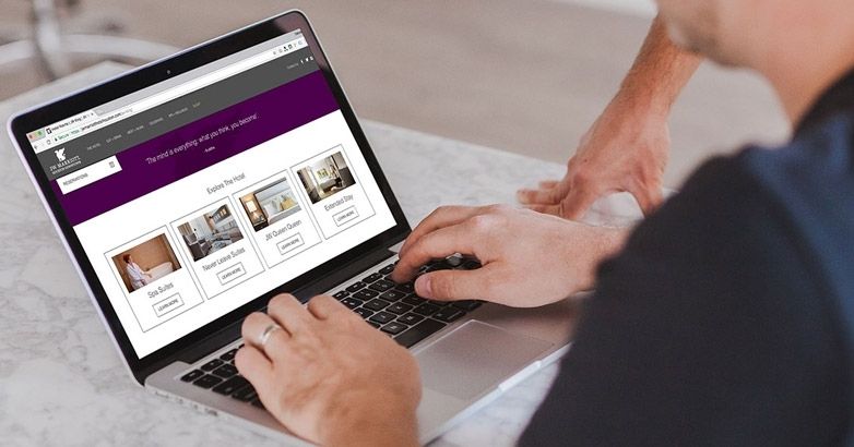
The Best Hotel Website Layout for Direct Bookings
A good hotel website layout should move visitors naturally from inspiration to consideration and then reservation.
A practical homepage structure looks like this:
1. Hero
Show the property, communicate its strongest reason to visit, and provide immediate access to availability.
2. Primary Value Proposition
Explain what makes the hotel different in one concise section.
Avoid statements that could describe hundreds of competing properties.
3. Rooms and Suites
Introduce the primary accommodation categories and direct visitors to detailed room pages.
4. Experiences and Amenities
Feature the experiences most likely to influence the booking decision, such as dining, spa, beaches, golf, activities, or entertainment.
5. Destination
Show how the location contributes to the stay.
6. Offers and Direct-Booking Benefits
Present useful packages or benefits without allowing discounts to dominate the property’s identity.
7. Trust Signals
Use relevant reviews, press recognition, hospitality awards, or established brand credentials.
8. Final Booking Prompt
Give visitors who reach the bottom of the page an obvious next action.
If your internal project brief is simply labeled “design website hotel” or similar, this structure is a great starting point because it covers both inspiration and conversion without turning the homepage into a full sitemap.
Luxury Hotel Website Design Mistakes to Avoid
Even the best luxury website concept can underperform when visual decisions make the guest journey harder.
Too Much Animation
Movement can support storytelling, but constant transitions and effects can distract visitors and slow the page.
Use motion only when it adds something meaningful.
Hiding the Booking Option
Do not sacrifice reservations for visual minimalism.
Guests who are ready to check availability should be able to do so from every major part of the site.
Generic Luxury Branding
Black backgrounds, serif typefaces, gold accents, and cinematic video do not automatically create the best luxury hotel website design.
The visual identity should reflect the actual property.
Heavy Images and Video
Luxury hotel websites naturally depend on visual media.
Compress files, use appropriately sized images, choose modern file formats, and delay below-the-fold media until it is needed.
Weak Room Pages
A beautiful homepage cannot compensate for poor accommodation content.
Guests need professional photography, room details, important amenities, occupancy information, and an obvious next step.
A Disconnected Booking Engine
If the reservation system suddenly looks or behaves completely differently from the hotel site, confidence can drop at the most important point in the journey.
Treat browsing and booking as parts of the same customer experience.
Copying Competitors Too Closely
Luxury website design should make a property easier to recognize, not make it resemble every competing hotel.
Use luxury website examples to identify useful patterns, then adapt those patterns to your own brand and guests.
Frequently Asked Questions About Luxury Hotel Website Design
I. What Makes Luxury Hotel Website Design Effective?
Luxury hotel website design works best when strong branding and practical usability support each other.
Premium photography, useful accommodation information, visible booking options, good mobile usability, clear menus, and a distinctive property identity should all contribute to the same guest journey.
II. What Should a 5 Star Hotel Website Design Include?
A 5 star hotel website design should include professional property photography, detailed room and suite pages, dining and amenity information, destination content, prominent booking access, good mobile usability, and trust signals such as guest reviews, awards, or established press recognition.
The site should communicate the quality of the stay without making basic planning tasks complicated.
III. What Is the Best Luxury Hotel Website Design Style?
There is no universal style that produces the best luxury hotel website design.
A private island, historic European hotel, modern city property, wellness retreat, and mountain resort should not look the same.
The best style is the one that reflects the property’s audience, setting, architecture, experience, and brand.
IV. What Are the Most Important Pages on a Luxury Hotel Website?
Most luxury hotel websites should include:
– Homepage
– Rooms and suites
– Dining
– Amenities and experiences
– Special offers
– Destination or location
– Gallery
– About
– Contact
– Booking access
Large resorts may also need dedicated pages for spas, golf, weddings, meetings, activities, villas, or residences.
V. Should Luxury Hotel Websites Use Video?
Yes, when video adds meaningful context.
It can work particularly well when the property’s landscape, architecture, atmosphere, or experiences are difficult to communicate through still photography.
Keep videos focused and lightweight enough that they do not interfere with usability.
VI. How Can Hotel Website Design Increase Direct Bookings?
Keep booking options visible, present room choices clearly, communicate direct-booking benefits, reduce unnecessary booking steps, make mobile reservations easy, and provide enough information for guests to make a decision without leaving the site.
The best hotel website design removes uncertainty while keeping the reservation path obvious.
VII. What Is Different About Luxury Resort Website Design?
Luxury resort website design usually needs to communicate far more than rooms.
Dining, wellness, activities, beaches, golf, excursions, events, villas, and other experiences may all affect the booking decision.
The best resort sites organize that depth around guest priorities rather than presenting every option at once.
Elevate Your Hospitality Brand Today
Schedule Your Free Consultation
Seeking to elevate your business? Let Mediaboom guide you. Secure your exclusive, free consultation with our digital marketing experts today.
Build a Luxury Hotel Website That Inspires Direct Bookings
Luxury hotel website design is about more than producing an attractive digital brochure.
The best sites connect branding, photography, accommodations, destination, experiences, mobile usability, and booking into one clear guest journey.
The best luxury websites make the property memorable while making the next step easy.
Whether you are reviewing luxury website examples for a full redesign or collecting hotel website design ideas for targeted improvements, ask two questions:
Does the website make the property more desirable?
Does it make booking the property easier?
If the answer to either is no, there is room for improvement.
Mediaboom works with luxury hotels, resorts, and hospitality brands on website design, SEO, digital strategy, and marketing tied to measurable business goals.
If your current website no longer reflects the quality of your property or creates unnecessary friction between interest and reservation, contact Mediaboom to discuss your next hotel website project.
WHAT OUR CLIENTS SAY
By: Frank DePino
Frank DePino is the Principal and Founder of Mediaboom, a top hotel marketing agency partnering with leading hotel and hospitality brands. With 30+ years of experience, he has led strategic digital initiatives for names including Four Seasons, Ritz-Carlton, JW Marriott, Millennium Partners, and Guardian Jet. Frank helps hospitality businesses strengthen brand presence, drive qualified leads, and elevate guest experiences through website design, SEO, content marketing, and paid media. Under his leadership, Mediaboom is a trusted partner for brands pursuing measurable digital growth in a competitive hospitality landscape.