
Travel Website Design 2026 – 50 Inspiring Examples

By: Frank DePino | October 30, 2025
Over 71% of businesses have a website, yet nearly half still struggle with low traffic and weak performance, even though partnering with a hotel marketing agency can help optimize design and drive meaningful traffic. For travel brands, a generic or poorly designed site simply won’t cut it. You must follow website design best practices to retain traffic and convert leads.
How do you create the perfect travel site design, particularly when insights from a hotel marketing agency inform layout and content strategy?
The best travel website design should be visually appealing, using eye-catching elements to attract the attention of potential customers. The design should embrace simplicity, with smart use of white space. The site should be responsive, mobile-optimized, and navigable to enhance the user experience, with a call to action above the fold.
The following 50 examples of travel website designs across the industry showcase the above attributes incredibly well. Let them inspire your own designs moving forward.
Types of Travel Websites
Not all travel websites serve the same purpose, and understanding these differences can help you design more effectively for your audience, especially when you incorporate strategic insights from a hotel marketing agency. Whether you’re building for bookings, inspiration, or local experiences, knowing the main categories can guide layout choices, feature prioritization, and content strategy.
- Online Travel Agencies (OTAs): One-stop portals for flights, rooms, and packages.
- Hotel & Accommodation Brand Sites: Direct channels that keep commission costs down.
- Vacation Rental Marketplaces: Peer-to-peer stays and short-term homes (e.g., Airbnb).
- Tour & Activity Platforms: Bookable local experiences, excursions, and tickets.
- Metasearch Engines: Aggregators that compare rates across multiple sellers.
- Destination Marketing Hubs: Official city, region, or country sites that inspire and inform visitors.
- Corporate Travel Portals: Business-focused booking tools with policy controls (e.g., Navan, TravelPerk).
Best Practices for Travel Website Design
Great travel web design converts visitors by combining speed, trust, and emotional pull. With high competition and impatient users, it’s essential to get the fundamentals right. These best practices are based on UX benchmarks, mobile usage trends, and common traits of top-performing sites.
- Lead with a clear value promise in the hero section.
- Design mobile-first layouts with thumb-friendly buttons.
- Keep load times under three seconds by compressing media and trimming scripts.
- Limit the booking journey to three screens, adding progress cues and tap-to-pay options.
- Place trust badges, real reviews, and transparent policies next to calls-to-action.
- Maintain consistent fonts, colors, and imagery across every page.
Without further ado, let’s get into the examples!
1. Musha Cay

Musha Cay’s site immerses you instantly in island seclusion with a full-screen video hero that fades seamlessly into ocean blues. Soft gold accents and airy layout choices translate exclusivity into calm, inviting storytelling.
What makes it stand out
- Immersive destination-first design
- Luxury tone through restraint and pacing
- Seamless flow that mirrors five-star serenity
2. Aspen Luxury Concierge

Snow-dusted mountain footage and elegant typography give Aspen Luxury Concierge a high-altitude sophistication. The website blends minimalist luxury with editorial structure, echoing the brand’s discreet, one-to-one service model.
What makes it stand out
- Refined alpine aesthetic
- Elegant balance of visuals and whitespace
- Calls-to-action that feel personal and conversational
3. Luxo Italia

Luxo Italia’s homepage feels cinematic and editorial, pairing Amalfi vistas with crisp gold accents. It frames Italian luxury as both art and experience—equal parts story, service, and sophistication.
What makes it stand out
- Editorial-style storytelling
- Cohesive balance of imagery and motion
- Modern presentation of timeless elegance
4. Nelson Travel

Nelson Travel captures the emotion of discovery through fullscreen wildlife cinematography and refined typography. Each section feels like a curated travel journal blending adventure with bespoke service.
What makes it stand out
- Cinematic storytelling with purpose
- Elegant pacing and typography hierarchy
- Personalized yet polished digital tone
5. Antaeus Travel Group

Bold, oversized typography and floating interactive bubbles create a strikingly confident presentation for Antaeus Travel Group. The black-and-white palette adds global gravitas, while minimalist animation reinforces precision and clarity.
What makes it stand out
- Modern simplicity that communicates authority
- Strong use of type and negative space
- Interactive details that enhance navigation without clutter
6. Priceline

Priceline’s interface is pared down to its essentials —, white space, big typography, and fast search tools. Every design choice focuses on speed and clarity, turning trip planning into a frictionless experience.
What makes it stand out
- Simple, task-first layout
- Intuitive search flow across travel types
- Clean aesthetic that reinforces trust
7. Trip

Trip.com’s vivid gradients and full-screen imagery make travel feel exciting before you even start searching. The interface merges visual energy with practicality, letting users explore hotels, flights, and experiences without leaving the homepage.
What makes it stand out
- Dynamic use of color and background imagery
- Scroll-based discovery without page reloads
- Clear CTAs that boost engagement and trust
8. Viator
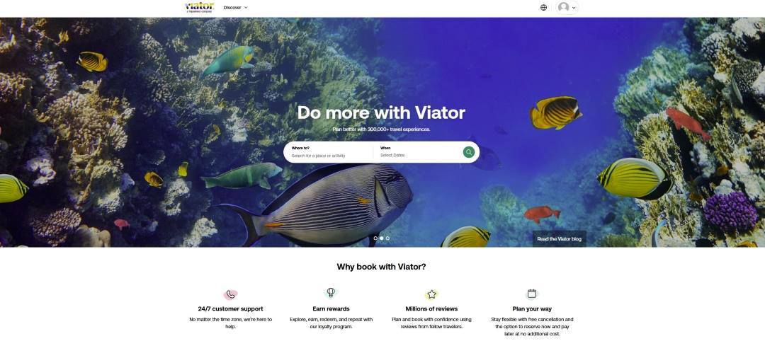
Viator’s travel website design uses high-definition photography and open white space to highlight its activity-based focus. Subtle carousels and visual cues guide users toward experiences while building trust with transparent reviews and flexible booking options.
What makes it stand out
- Smart balance of visuals and simplicity
- Social proof displayed through ratings and trust signals
- White space that lets imagery shine
9. Rome2Rio

Rome2Rio simplifies complex multi-transport travel with a bright, map-inspired interface. Its colorful icons and minimal navigation make route planning feel effortless across trains, flights, ferries, and buses.
What makes it stand out
- Functional design built around clarity
- Strong use of color to separate transport options
- Clean UX that favors usability over flair
10. L.A. Family Travel

L.A. Family Travel captures the energy of real adventures with video footage and personable travel website design. The layout’s white background and family-focused tone bring warmth and authenticity to every section.
What makes it stand out
- Emotional storytelling through real-life visuals
- Family-oriented tone with approachable navigation
- Clear structure supported by social proof and media mentions
11. Bawah Reserve
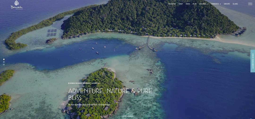
Bawah Reserve opens with sweeping aerial footage of turquoise shallows, instantly setting a tone of remote tranquility. The soft typography and light-over-water interface keep the experience meditative rather than promotional.
What makes it stand out
- Immersive, destination-led storytelling
- Gentle animations that feel organic
- Sophisticated pacing with serene visual balance
12. BRU&BRU
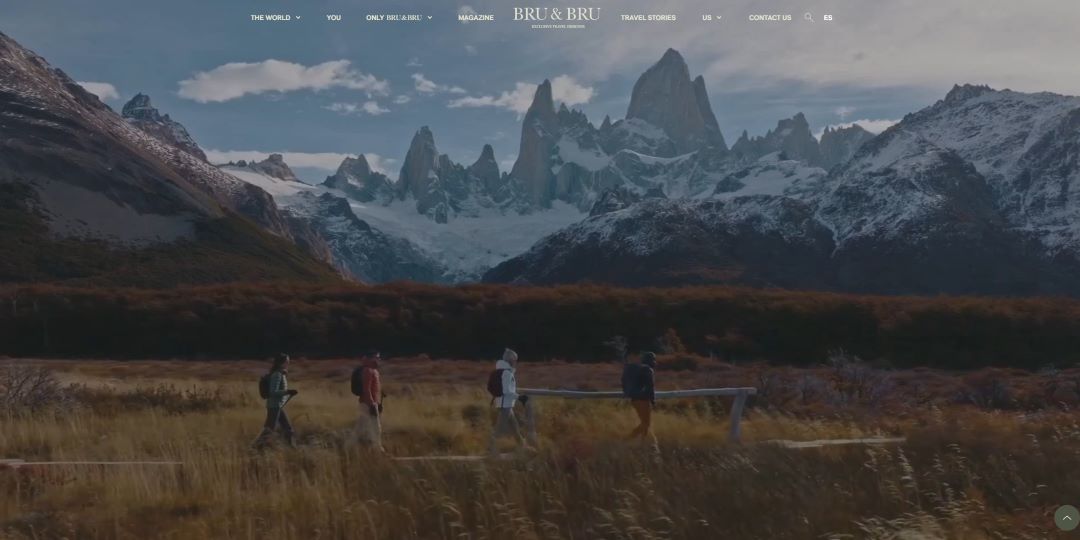
BRU&BRU’s design flows like a digital magazine, blending edge-to-edge photography with minimalist typography. Each scroll feels cinematic, echoing the travel designer’s refined, editorial sensibility.
What makes it stand out
- Vertical storytelling through imagery
- Muted tones and elegant rhythm
- Emotion-driven layout that feels cinematic
13. Cubania Travel

Cubania Travel bursts with color and movement, inviting visitors to “Do it the Cuban Way.” The scrolling video, bright typography, and cultural tone exude energy and authenticity.
What makes it stand out
- Bold cultural identity through design
- Playful typography that reinforces the message
- Interactive layout that radiates warmth and movement
14. Mr and Mrs Smith
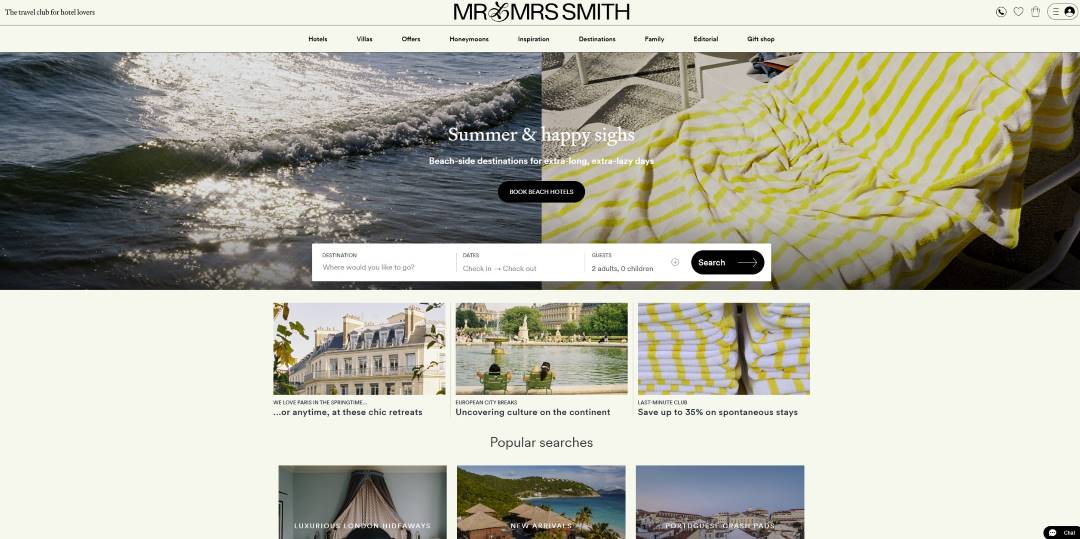
Mr and Mrs Smith’s site captures boutique luxury through elegant typography, crisp layouts, and editorial-style photography. The cream-and-black palette feels timeless, balancing personality with sophistication.
What makes it stand out
- Boutique style expressed through simplicity
- Smart copy and tone built for “insiders”
- Editorial structure that elevates everyday browsing
15. Couchsurfing

Couchsurfing’s platform emphasizes community over commerce with friendly tones and open, blue-and-orange visuals. Its straightforward design supports ease of use while reflecting its global, social ethos.
What makes it stand out
- Trust-centered, minimalist design
- Bright palette creating inclusivity and warmth
- Functional layout encouraging user connection
16. Trivago
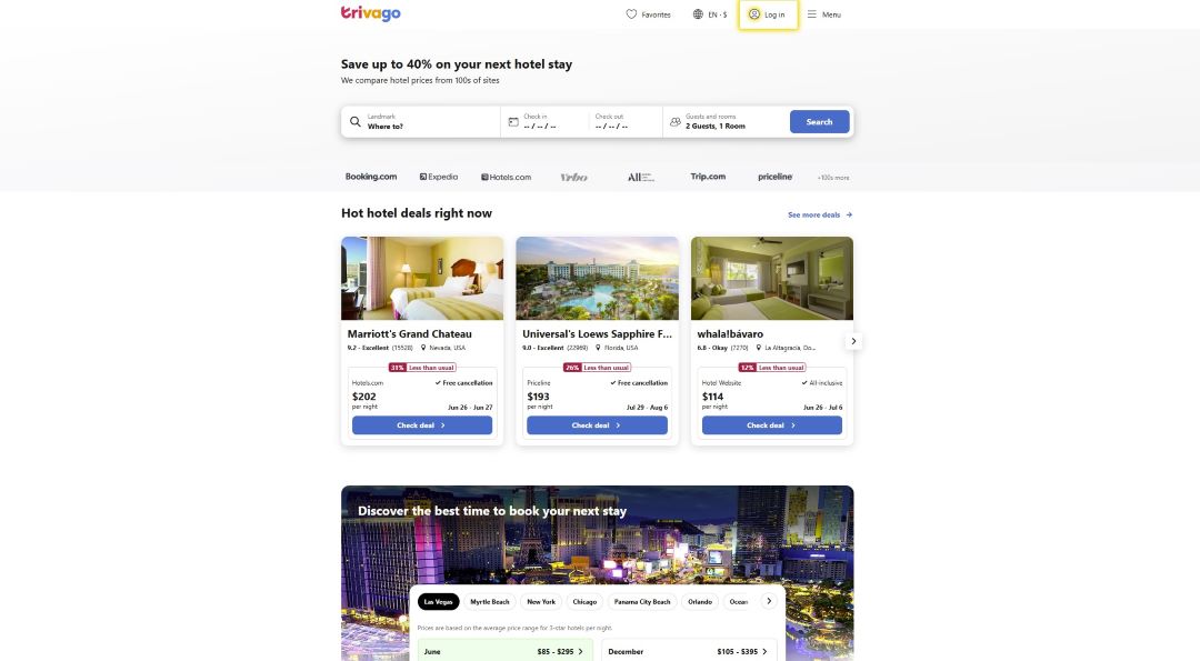
Trivago’s minimalist interface proves that functionality can feel fresh and inviting. Its clear layout and purposeful use of imagery make deal-finding feel effortless rather than transactional.
What makes it stand out
- Clean, uncluttered browsing experience
- High-impact visuals balanced with white space
- Smart focus on usability over ornamentation
17. Sawday’s
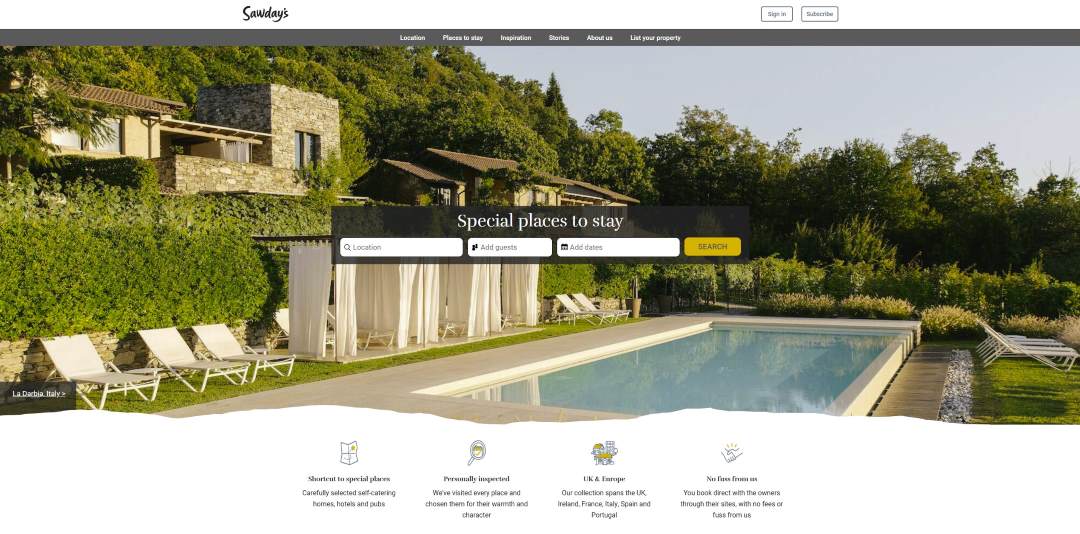
Sawday’s combines charm with practicality, guiding users through thoughtful stays and handpicked destinations. The design feels calm and intentional, reflecting the brand’s ethos of meaningful travel.
What makes it stand out
- Sticky navigation for smooth exploration
- Muted palette that evokes sophistication and trust
- Well-organized structure emphasizing authenticity
18. TripAdvisor

TripAdvisor’s clean, familiar layout highlights its authority while keeping planning simple. Pops of mint green and bold typography guide the eye, while photos of food and travel scenes bring warmth and excitement.
What makes it stand out
- Iconic brand color used with restraint
- Clear hierarchy built for quick scanning
- Strong balance of credibility and inspiration
19. Booking.com

Booking.com balances energy and utility, pairing vivid imagery with clear functionality. Every section, from search to offers, flows with a sense of reliability and ease.
What makes it stand out
- User-first travel website design emphasizing quick action
- Friendly visuals that feel inclusive and global
- Strong visual rhythm supported by consistent branding
20. Expedia

Expedia’s design exudes clarity and confidence with a layout anchored by its central search bar. The blend of large visuals, member perks, and smooth navigation gives it a refined yet accessible tone.
What makes it stand out
- Polished interface with intuitive usability
- Balanced mix of visuals and white space
- Simple, fast pathways to booking
21. Lonely Planet
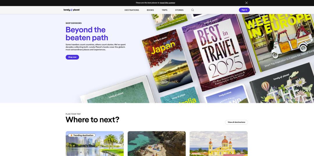
Lonely Planet’s homepage radiates energy and wanderlust, combining vivid imagery with a clean, editorial feel. Its design captures a balance between storytelling and discovery, drawing users into the next adventure.
What makes it stand out
- Vibrant visuals that evoke curiosity and motion
- Clear structure for destinations and trip planning
- Editorial tone that encourages exploration
22. Condé Nast Traveler

Condé Nast Traveler blends magazine-level visuals with minimalist sophistication. Every section feels curated, from bold headlines to refined layouts that mirror the publication’s luxury identity.
What makes it stand out
- Elegant editorial layout emphasizing high-end travel
- Strong visual hierarchy and clean typography
- Premium tone aligned with aspirational content
23. Airbnb

Airbnb’s design is bold, visual, and human-centered, from its immersive imagery to easy search navigation. Every element emphasizes discovery, diversity, and memorable stays.
What makes it stand out
- Striking visuals highlighting unique experiences
- Seamless UX across categories and devices
- Strong brand identity through color and layout consistency
24. VRBO
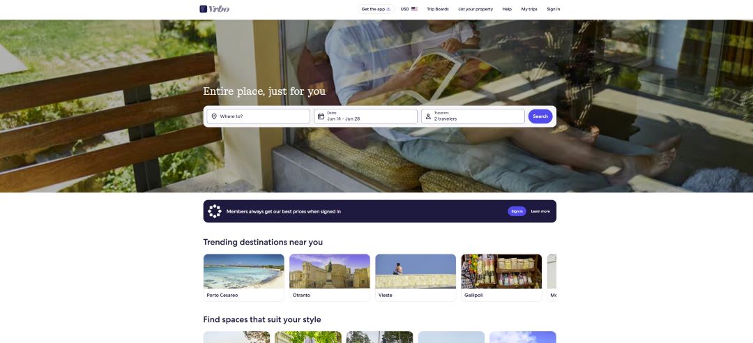
VRBO’s serene homepage invites calm and confidence with soft hues and a reassuring message. Its intuitive layout focuses on clarity and comfort, guiding travelers through vacation planning effortlessly.
What makes it stand out
- Relaxed, trustworthy atmosphere through color and tone
- Intuitive interface for quick trip setup
- Smooth balance of visuals and usability
25. Get Your Guide

GetYourGuide welcomes users with cinematic visuals and clear storytelling. The design inspires cultural exploration while keeping booking tools simple and accessible.
What makes it stand out
- Emotionally engaging hero imagery
- Logical organization by experience type
- Functional tools paired with visual inspiration
26. Klook

Klook’s travel homepage design bursts with cheerful energy, featuring hot air balloons and warm hues that instantly evoke adventure. The layout feels bright and friendly, guiding users to explore destinations and tours effortlessly.
What makes it stand out
- Joyful visuals reinforcing discovery and optimism
- Straightforward structure for browsing trips and tickets
- Energetic, inviting tone that enhances engagement
27. Context Travel
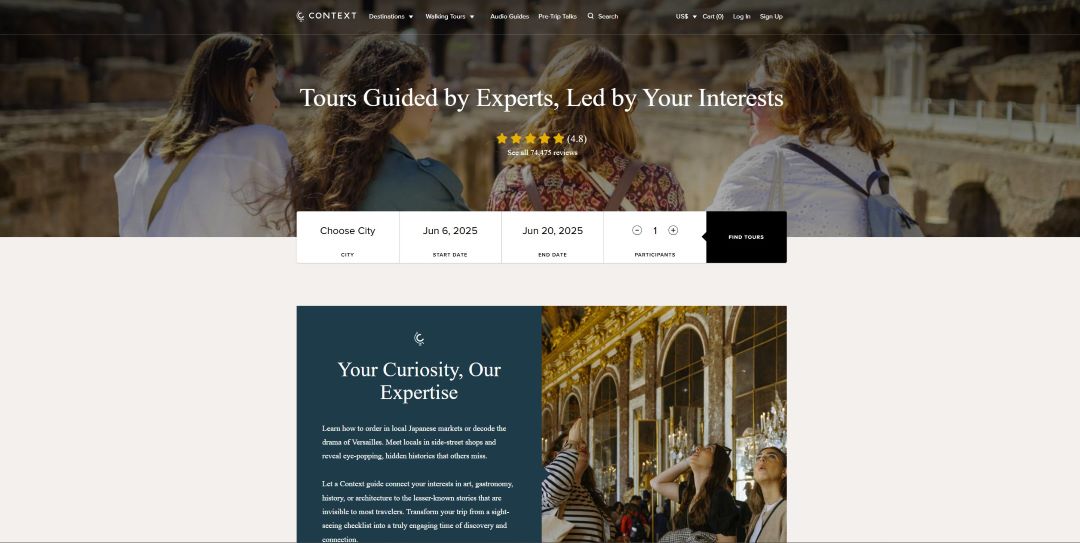
Context Travel pairs scholarly depth with elegance, appealing to travelers who seek meaning behind every journey. The refined interface and curated imagery convey trust and expertise.
What makes it stand out
- Smart, elevated tone for a niche audience
- Clean navigation with intuitive booking flow
- Emphasis on expertise and cultural immersion
28. Intrepid Travel
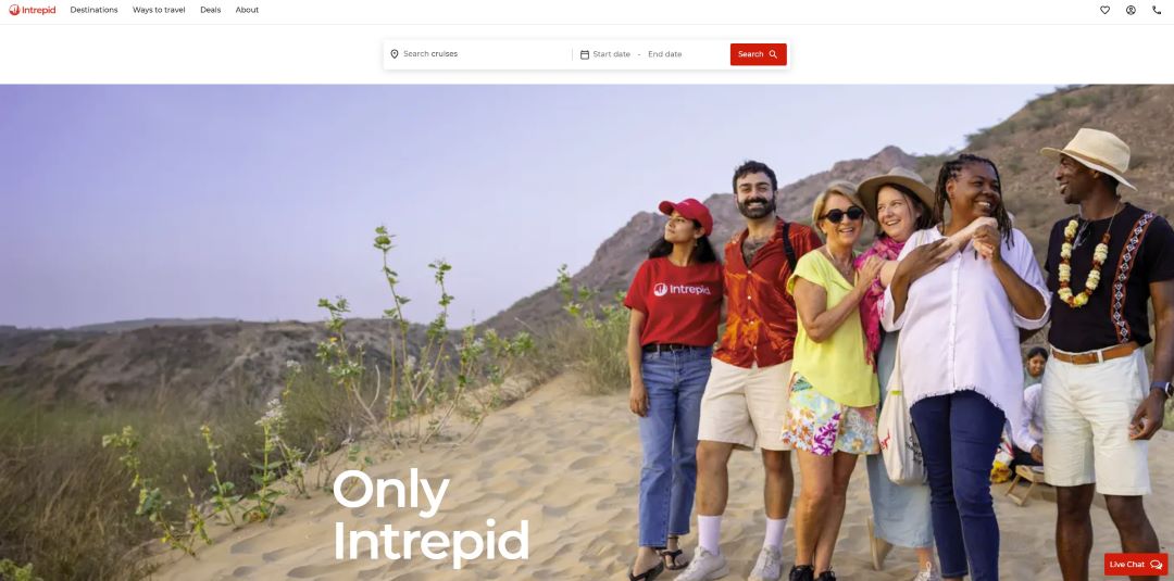
Intrepid Travel’s homepage radiates inclusivity and exploration, highlighting real adventurers in vibrant landscapes. Its bold photography and card-based layout make complex options easy to digest.
What makes it stand out
- Lively visuals celebrating community and discovery
- Compact, mobile-friendly layout
- Energetic tone that inspires real-world connection
29. Adventurous Kate

Adventurous Kate brings authenticity and personality to solo travel website design. The mix of candid photography and conversational tone creates an approachable, empowering experience for women travelers.
What makes it stand out
- Personal storytelling that builds trust
- Simple layout emphasizing connection over flash
- Warm, human-centered aesthetic aligned with brand mission
30. The Blonde Abroad

Soft colors and dreamlike imagery define The Blonde Abroad, creating an atmosphere of elegance and calm. The design welcomes visitors with serenity while promoting travel as self-expression.
What makes it stand out
- Harmonious palette reflecting femininity and peace
- Clear navigation across lifestyle and travel topics
- Visual consistency that strengthens personal branding
31. Expert Vagabond
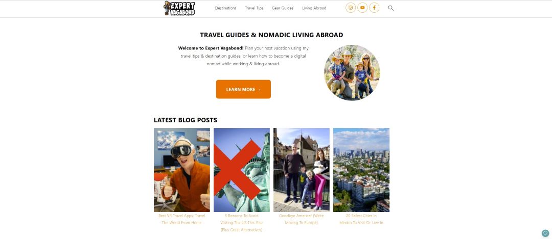
Expert Vagabond strikes the perfect balance between personality and professionalism. The bright logo, bold layout, and human-first messaging make it instantly recognizable as a creator-led brand.
What makes it stand out
- Strong personal branding through color and voice
- Masonry-style post grid for dynamic visual flow
- Clear call-to-action and author presence build trust
32. Travel Lemming

Travel Lemming’s homepage celebrates real people behind the travel advice, spotlighting local experts through a photo collage and bold typography. The design radiates authenticity and collaboration.
What makes it stand out
- Emphasis on community and credibility
- Clean layout supporting user-driven exploration
- Smart use of visuals to humanize the brand
33. Responsible Travel

Responsible Travel blends environmental purpose with visual beauty. The site’s serene nature imagery and practical search tools promote eco-conscious choices without sacrificing design elegance.
What makes it stand out
- Clear ethical positioning through visual storytelling
- Straightforward structure for easy trip filtering
- Inspiring tone that links sustainability with enjoyment
34. Travel Off Path

Travel Off Path’s design focuses on clarity and momentum, pairing sleek headlines with timely stories. It feels like a modern newsroom built for travelers.
What makes it stand out
- Clean grid emphasizing trending content
- Simple navigation that prioritizes discovery
- Strong editorial hierarchy for readability and trust
35. Rough Guides
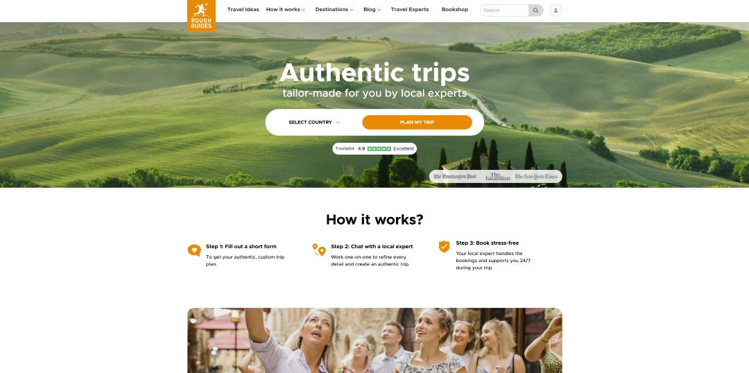
Rough Guides combines an authoritative tone with visual warmth. Its countryside imagery and illustrated journey flow guide users naturally from curiosity to trip planning.
What makes it stand out
- Effective funnel design that feels organic
- Balanced mix of editorial storytelling and interactivity
- Professional aesthetic aligned with expert credibility
36. Culture Trip

Culture Trip captures the excitement of global discovery through bright imagery and intuitive navigation. Its energetic design encourages users to uncover new destinations and one-of-a-kind travel experiences.
What makes it stand out
- Vibrant visuals reflecting urban and cultural exploration
- Clearly organized navigation for quick browsing
- Strong calls-to-action that invite immediate engagement
37. Trafalgar
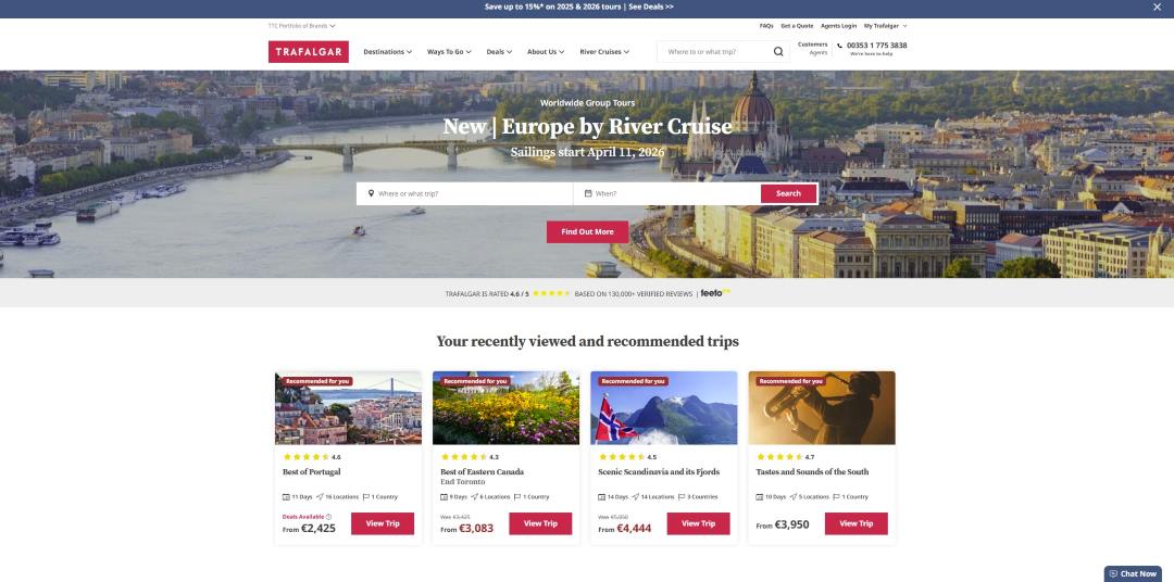
Trafalgar’s homepage combines elegance with efficiency, offering a structured view of tours and curated experiences. The design delivers professionalism while keeping the journey from browsing to booking refreshingly simple.
What makes it stand out
- Hierarchical structure guiding users naturally through offers
- Clean, confidence-building presentation
- Subtle use of color blocks for clarity and conversion focus
38. G Adventures

G Adventures channels the spirit of small-group exploration with cheerful visuals and friendly copy. The homepage feels alive, mirroring the camaraderie and excitement of shared adventures.
What makes it stand out
- Dynamic imagery expressing movement and connection
- Balanced focus on community and discovery
- Intuitive interface simplifying the booking journey
39. Travel + Leisure

Travel + Leisure’s design feels editorial and elevated, turning travel inspiration into an art form. Every detail—from typography to content hierarchy—echoes luxury and credibility.
What makes it stand out
- Magazine-style structure that feels premium
- Polished layout emphasizing visual storytelling
- Seamless blend of aspirational imagery and expert insight
40. Zicasso
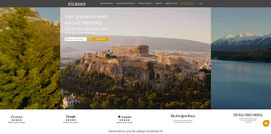
Zicasso’s site embodies refined luxury, with sweeping destination photography and a calm, minimalist tone. It’s a masterclass in blending trust, aspiration, and effortless navigation.
What makes it stand out
- High-end visual identity with strong credibility cues
- Personalized approach through guided trip planning
- Clean, minimalist interface reinforcing exclusivity
41. Virtuoso

Virtuoso’s homepage radiates sophistication, combining luxury visuals with a smooth, editorial-style layout. Its refined design makes browsing feel like flipping through a high-end travel magazine.
What makes it stand out
- Premium look that aligns with upscale clientele
- Intuitive navigation linking travel advisors, hotels, and tours
- Polished, content-driven experience balancing elegance with utility
42. Insight Vacations

Insight Vacations captures attention with rich destination imagery and a confident promotional banner. The design feels premium yet practical, merging travel inspiration with functional clarity.
What makes it stand out
- Strong hero headline and CTA create instant direction
- Clean layout enhancing search and booking flow
- Professional tone appealing to discerning travelers
43. Travel Noire

Tour Radar offers a bright and easy-to-navigate interface built around exploration. Its imagery and structure make the planning process effortless and visually engaging.
What makes it stand out
- Clear trip filtering for destination, date, and type
- Inviting banner imagery highlighting variety
- Simple, modern framework supporting fast browsing
44. Tour Radar

Travel Noire merges style and substance, pairing moody photography with modern editorial flair. The platform feels fresh, empowering, and distinctly community-focused.
What makes it stand out
- Bold imagery reinforcing destination storytelling
- Clean, media-style layout with accessible guides
- Strong brand voice celebrating cultural depth and diversity
45. Backroads
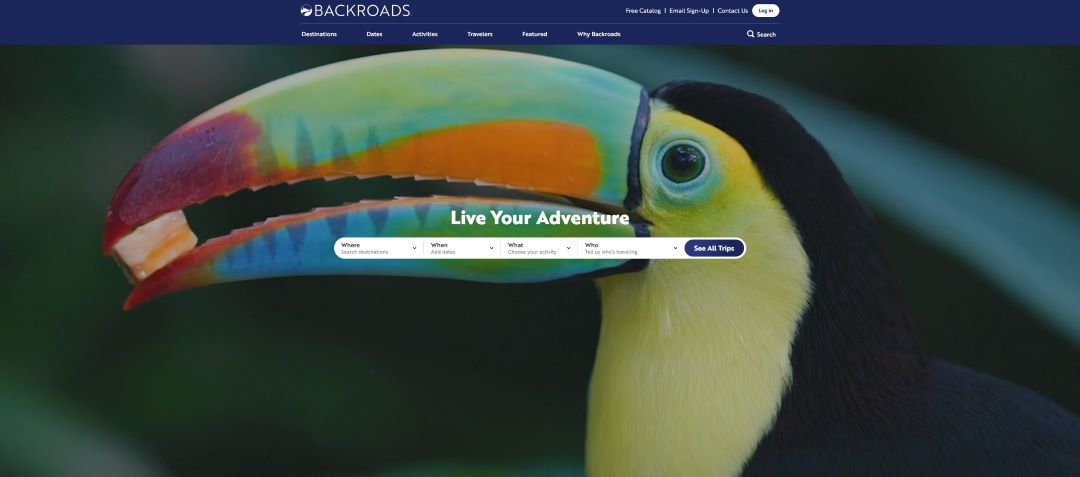
Backroads blends adventure with precision through bold wildlife visuals and an interactive layout. Its modular UI and rich media approach invite visitors to explore without friction.
What makes it stand out
- Immersive photography balanced with clean usability
- Smart structure combining visual drama and clarity
- Seamless integration of user-generated and editorial content
46. Black Tomato

Black Tomato’s homepage exudes cinematic sophistication with a sweeping full-screen hero and subtle text overlays. Every element feels crafted to draw viewers into an aspirational world of tailor-made travel.
What makes it stand out
- Immersive, minimalist visuals that prioritize emotion
- Sleek navigation keeping attention on the imagery
- Premium tone that communicates exclusivity and adventure
47. Sustainable Travels

Sustainable Travels fuses purpose and design, featuring striking imagery that reinforces its eco-conscious mission. The layout feels bold yet balanced, perfectly blending impact and intention.
What makes it stand out
- Clear messaging supporting sustainability goals
- Vibrant contrast and structured sections for clarity
- Strong alignment between visual identity and brand values
48. The Planet D

The Planet D radiates personality and warmth through scenic imagery and approachable travel website design. The homepage makes adventure feel both inspiring and attainable.
What makes it stand out
- Engaging visuals that communicate authenticity
- Straightforward navigation supporting content discovery
- Personal tone connecting with audiences emotionally
49. Red Savannah

Red Savannah’s design embodies refined luxury, pairing serene imagery with understated elegance. It’s visually calm yet deeply persuasive for travelers seeking exclusivity.
What makes it stand out
- High-end photography evoking calm and sophistication
- Balanced typography and layout for clarity
- Subtle luxury cues appealing to affluent audiences
50. Be My Travel Muse

Be My Travel Muse feels deeply personal, combining a soft color palette with an intimate founder’s message. The homepage captures solo travel as an empowering and emotional experience.
What makes it stand out
- Authentic voice that builds trust and connection
- Clear organization supporting readability and engagement
- Warm, human-centered aesthetic inviting return visits
FAQs
A travel website should feature high‑quality imagery, intuitive navigation, detailed destination guides, booking options, customer reviews, and engaging travel content designed with principles often recommended by a hotel marketing agency. Mediaboom’s services ensure these elements are seamlessly integrated, providing a sophisticated design and user-friendly experience to attract and retain visitors.
Explore trends in tourism web design, study top-performing travel agency web page design examples, and identify your unique brand voice. Mediaboom helps you find your edge with expert insight and creative direction.
The cost of web design for travel brands depends on the features, pages, and functionalities required. Mediaboom offers flexible packages tailored to your goals, ensuring you receive the best design travel website for your investment.
Creating travel content involves researching destinations, crafting engaging narratives, and using high-quality visuals. Mediaboom’s content marketing services include SEO-optimized articles, blog posts, and multimedia content that highlight your offerings, attract traffic and enhance user engagement.
Do you have more questions?
Do you have more questions about best travel website designs, or are you seeking expert guidance to elevate your Travel Brand strategy? Contact Mediaboom today to learn how our digital marketing expertise can transform your brand’s online presence and drive outstanding results.
Hire a Digital Marketing Agency Specialized in Travel Website Design
The digital marketing specialists at Mediaboom can help you create a winning travel website design.
We’ve worked with some of the biggest names in travel and know what it takes to design a best travel site design that performs across devices and inspires bookings.
We’ll build an eye-catching web design with an appealing color palette, a call to action, and elements that augment the user experience. Get started with Mediaboom today.
By: Frank DePino
Frank DePino is the Principal and Founder of Mediaboom, a top hotel marketing agency partnering with leading hotel and hospitality brands. With 30+ years of experience, he has led strategic digital initiatives for names including Four Seasons, Ritz-Carlton, JW Marriott, Millennium Partners, and Guardian Jet. Frank helps hospitality businesses strengthen brand presence, drive qualified leads, and elevate guest experiences through website design, SEO, content marketing, and paid media. Under his leadership, Mediaboom is a trusted partner for brands pursuing measurable digital growth in a competitive hospitality landscape.


READY TO IGNITE YOUR MARKETING STRATEGY?


