Financial Advisor Website Design – 50 of the Best Examples

By: Frank DePino | August 12, 2020
In order to make your financial advisor website design work for you, it first needs to look and function the way you want it to.
To give you a better sense of what your competitors are doing in the digital space, we’ve compiled a list of 50 of the best design examples.
These sites all include unique strong points that help them convert prospective clients and retain existing ones.
1. Ratio
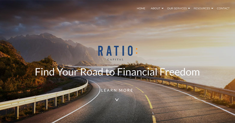
Ratio’s website uses full width design along with saturated photography that makes the site feel strong.
2. R&J Financial Partners
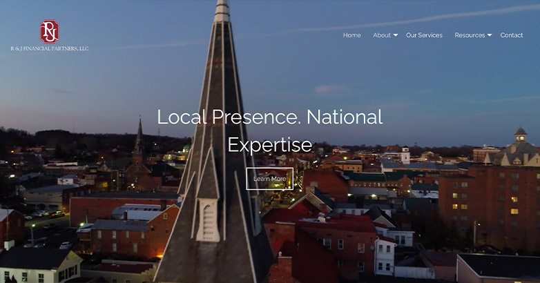
By simply adding a video to their welcome screen, R&J Financial Partner’s website feels more interactive and intimate.
3. Pension & Wealth Management Advisors
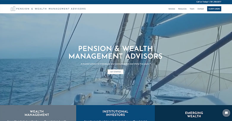
This financial advisor website design stands out from the competition with its use of video as users are welcomed to the site. The large/bold text, clean lines, and pops of blue give this site a modern feel.
4. Stash Wealth

Stash Wealth’s sight is sleek and modern. The brand is cohesive throughout by being consistent in their color palette, fonts and imagery.
Along with a strong color scheme, these contrasting colors help organize and callout information.
5. Charles Schwab
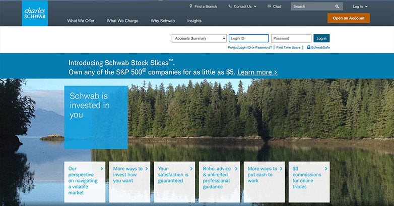
Charles Schwab constantly uses their brands blue throughout the site along with the square element they use in their logo.
By doing this, the brand feels united throughout.
6. GSB Wealth Management
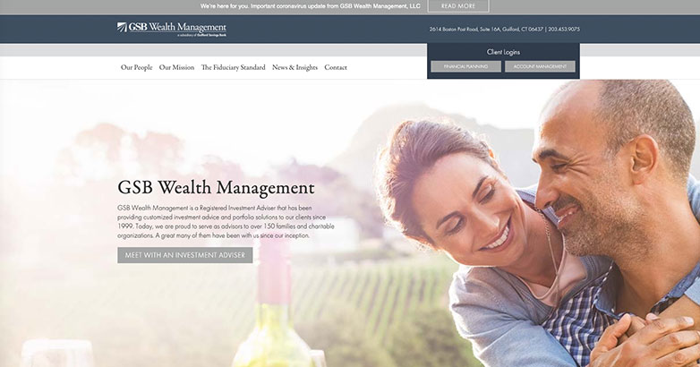
This clean design appeals to its older demographic with the use of serif fonts, subtle colors, and imagery.
Easy to use navigation helps users login into their accounts with ease, while also allowing for exploration to the interior pages of the site to learn more about the team, their vision, and latest blog.
7. Zoe
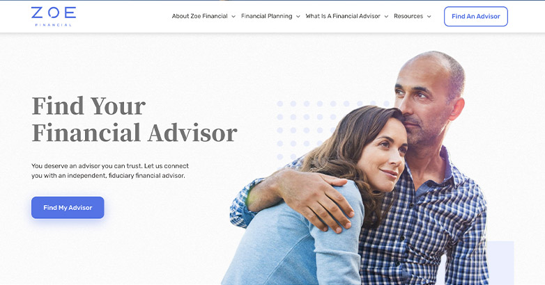
Zoe’s website feels light and inviting. Their use of a mainly white background helps their purple pop and keep the site clean.
Along with a cohesive brand, Zoe use different illustrations throughout along with interactive animated elements that add an extra touch to the site.
8. UBS
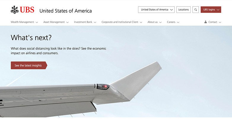
UBS uses small animations on their photos that help bring some life to their site.
9. Modera

Modera’s website is simple and professional.
It’s straight and to the point without using too much imagery and utilizing the elements in their logo to add some personality to the page.
Elevate Your Luxury Brand Today
Schedule Your Free Consultation
Seeking to elevate your luxury business? Let Mediaboom guide you. Secure your exclusive, free consultation with our luxury marketing experts today.
10. Edward Jones
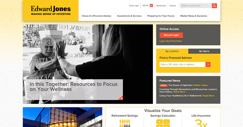
Edward Jone’s site keeps their navigation and sidebar locked, only swapping some of the sidebar elements to provide you the tools you need. This helps the client get where the need to go when visiting their site.
Related articles:
- How To Grow Your Client Base As a Financial Advisor
- Digital Marketing for Financial Advisors
- Financial Advisor Marketing Plan
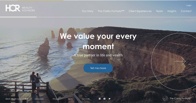
11. HCR Wealth Advisors

HCR Wealth Advisor’s use various elements throughout their site that makes them stand out from competitors, keeps the consumer intrigued yet is still simple enough to navigate.
12. Chicago Partners
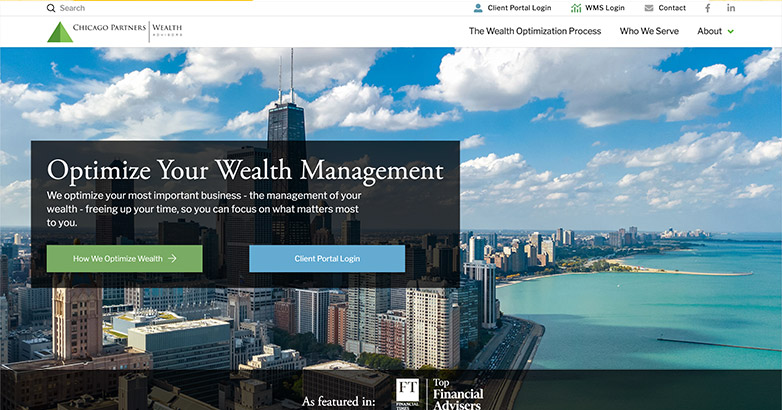
Chicago Partner’s website uses professional photography along with simple animated elements that help the website feel strong.
13. RGT Wealth Advisors

RGT’s website uses fun, animated illustrations throughout the site that make it feel more personal and approachable. The illustrations all work together and tie back into their brand and message, showing the customer their journey and how RGT can be a part of that.
14. Illumint

Illumint takes it out of the box with using this simple video for the website welcome screen. As you scroll the site comes into perspective. Illumint uses just a one page design that keeps it simple and easy to navigate.
15. Safran

Safran’s website is clean and uses similar photography throughout with a parallax animation that adds personality to the page.
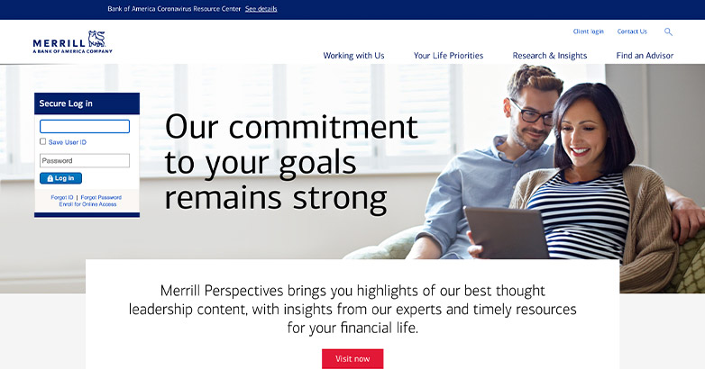
16. Merrill
Merrill’s website feels professional with their cohesive branding.
They also use overlapping elements and staggering photos that help add something extra to their site.
17. Sage Beacon
Sage Beacon’s financial advisor website design ties their photography into their brand by using “ocean” related content.
They’re homepage also uses diagonal blocks to help break up the information in non-uniform way.
18. Personal Capital

Personal Capital’s website uses not only a top bar navigation but a left aligned navigation that when expanded becomes full screen.
This can be helpful when your site need’s a lot of pages but you want to make it easier for the client to navigate.
19. Betterment

Betterment’s site is simple, easy to navigate and pleasing to the eye. Their color scheme utilizes light colors to help their purple pop throughout in not only page elements but in their photography as well.
The information is kept short and sweet so it’s easily understood and keeps the visitor engaged.
Related articles:
- Local Marketing for Financial Advisors
- Marketing for Financial Advisors
- Marketing Solutions for Financial Advisors
- Financial Advisor Marketing
Elevate Your Luxury Brand Today
Schedule Your Free Consultation
Seeking to elevate your luxury business? Let Mediaboom guide you. Secure your exclusive, free consultation with our luxury marketing experts today.
20. Riskalyze

Riskalyze uses fun graphics to get their point across.
Along with these graphics, Riskalyze uses free form elements that makes the site feel abstract and allows the visitor to feel more emerged into the page.
21. LPL

LPL uses a fun color scheme with blue being their dominant color and then use the rainbow spectrum sparingly throughout to accent certain information but to also add more personality through their photography.
22. Ford Financial Solutions
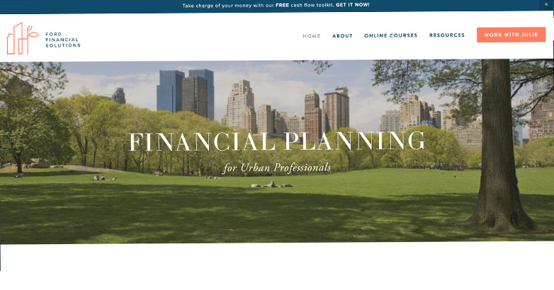
Ford Financial Solution’s site feels bright and inviting. It’s easy to navigate and the body of the page is kept simple without too many images.
23. Thrivent

Thrivent stays consistent by using line elements throughout the site in their graphics, callouts and navigation.
By utilizing this element, the website feels cohesive but also helps organize the information.
24. Raymond James
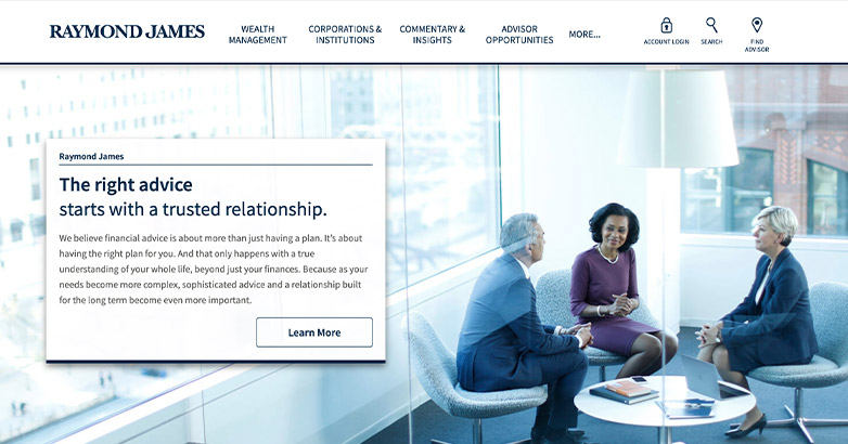
Raymond James keeps their website clean and professional with no excessive elements besides using a drop shadow on callout boxes which is used sparingly.
Related articles:
- Financial Advisor Social Media
- Financial Advisor SEO
- Financial Advisor Email Marketing Strategies
- Financial Advisor Marketing Strategies
25. Bragg
Bragg’s website is warm and inviting.
Their photography is not only welcoming but by using images of their actual office and team helps make the site feel more personal.
26. Vanguard

Vanguard’s site is strong yet simple.
Their homepage makes use of hight contrast photos along with bold black strips to help callout information.
As you get into the site though, the internal pages are kept more simple to get the information across.
27. Ameriprise

Ameriprise’s financial advisor website design keeps it fun on their homepage using various colors and informational graphics.
28. Timothy Financial Council

With a bold, full-width design and striking blue palette, Timothy Financial Counsel’s website design captivates attention through its confident typography and modern circular graphics.
The site’s simple, intuitive navigation and clear calls-to-action enhance user experience.
Its fee-only, no-strings-attached approach underscores transparency and trust, making it an attractive choice for clients seeking straightforward advice.
29. Wealthspire Advisors

Wealthspire Advisors’ digital presence is marked by a serene background and encouraging text, creating a welcoming atmosphere.
The sleek navigation bar with dropdown menus ensures effortless usability, while the standout call-to-action button invites engagement.
The design blends professionalism with approachability, perfectly aligning with the firm’s mission to help clients achieve their financial goals.
Elevate Your Luxury Brand Today
Schedule Your Free Consultation
Seeking to elevate your luxury business? Let Mediaboom guide you. Secure your exclusive, free consultation with our luxury marketing experts today.
30. Braun-Bostich & Associates

Blending the beauty of nature with professional expertise, Braun-Bostich & Associates’ financial advisor website design features a majestic forest backdrop.
Bold white headlines contrast against earthy tones, with golden accents adding elegance.
The design’s clear navigation and call-to-action buttons guide users seamlessly, reflecting the firm’s commitment to stability and growth in wealth transformation.
31. Mariner Wealth Advisors

Showcasing a clean, minimalist aesthetic, Mariner Wealth Advisors’ website employs a sophisticated color palette and dynamic imagery.
The strong black header against a beige background enhances readability, while prominent call-to-action buttons drive user engagement.
Emphasizing expertise and collaboration, the design ensures visitors feel supported in their financial journey, presenting a professional and inviting atmosphere.
32. Buckingham Wealth Partners

Buckingham Wealth Partners’ website exudes professionalism with a muted color palette and thoughtful imagery.
The design, focusing on trust and reliability, features clear navigation and prominent calls-to-action, encouraging user interaction.
This approach highlights the firm’s dedication to client well-being and their commitment to ethical practices, enhancing overall credibility and confidence.
33. Cresset Capital

Embracing a modern, minimalist aesthetic, Cresset Capital’s financial advisor website design captivates with its clean white background and bold circular graphics that add visual intrigue.
The site’s clear, confident messaging underscores their innovative approach, while the blue call-to-action button encourages user interaction.
Warm orange accents provide contrast, exuding sophistication and a forward-thinking mindset that appeals to high-net-worth clients.
34. Carson Wealth

Carson Wealth’s online presence radiates warmth and personal connection, showcased through a friendly image of a happy couple symbolizing freedom and well-being.
The site features clear, bold text and a compelling call-to-action button, effectively guiding users.
The blue and gold color scheme conveys trust and prosperity, aligning with their mission to help clients discover their “why” and achieve their goals.
Related articles:
- How Much do Financial Advisors Spend on Marketing?
- Marketing for Financial Advisors
- Financial Advisor Leads
35. Edelman Financial Engines

Edelman Financial Engines’ website makes a striking impact with a hero image depicting a person and their dog gazing at a distant horizon, symbolizing guidance and vision.
The bold headline prompts action, complemented by a vibrant red call-to-action button.
The clean, modern layout, with ample white space, ensures clarity, emphasizing trust, exploration, and a fresh perspective on financial planning.
36. Northwestern Mutual

Northwestern Mutual’s digital design is vibrant and action-oriented, featuring dynamic kayaking imagery that suggests adventure and freedom.
The bold headline “Go from Stress to Yesss” conveys confidence and relief. A bright yellow call-to-action button stands out against a deep blue backdrop, inviting immediate engagement.
Clean navigation and clear messaging emphasize their supportive role in planning, crafting an energetic and positive user experience.
37. Sequoia Financial Group

Sequoia Financial Group’s financial advisor website design blends a serene background image with bold, clear text, centering on the message “Built for You” to highlight personalization.
The minimalistic design, enhanced with geometric overlays, adds a contemporary touch.
A prominent call-to-action button encourages engagement, while the overall layout conveys trust, care, and a commitment to enriching clients’ lives and advancing their future.
38. Keen Wealth Advisors

Showcasing a professional and confident design, Keen Wealth Advisors’ website features a cityscape backdrop that symbolizes growth and opportunity.
The headline “Inspiring Confidence Today and In Your Future” commands attention, while the gold call-to-action button adds a touch of elegance.
A clean layout, intuitive navigation, and clear messaging emphasize trust and precision, perfectly aligning with their mission to provide personalized and perceptive financial advice.
39. Drucker Wealth Management

Drucker Wealth Management’s website bursts with vibrancy and engagement, spotlighting a dynamic team photo.
The motivating headline “Your Financial Future Isn’t Going To Plan Itself” stands out, and a green call-to-action button invites interaction.
With clean navigation and a professional yet approachable vibe, the site underscores their dedication to guiding clients through their planning journey with expertise and personalized service.
Elevate Your Luxury Brand Today
Schedule Your Free Consultation
Seeking to elevate your luxury business? Let Mediaboom guide you. Secure your exclusive, free consultation with our luxury marketing experts today.
40. Zoe Financial

Blending modern design with warm, welcoming imagery, Zoe Financial’s website encourages user engagement.
The clear headline “Grow Your Wealth with a Financial Advisor” is inviting, and prominent blue call-to-action buttons stand out against the neutral background.
Testimonials and images of happy clients build trust and reliability, reinforcing their commitment to providing vetted, fiduciary advisors.
41. Park Avenue Financial Advisors

With a breathtaking New York cityscape, Park Avenue Financial Advisors’ financial advisor website design symbolizes ambition and success.
The headline “Investing For Tomorrow, Together” is inviting, set against a soothing pink and blue color palette that creates a calm yet professional atmosphere.
Clear navigation and a standout client portal button ensure easy access, conveying trust, collaboration, and a commitment to building a secure future.
42. EP Wealth Advisors

EP Wealth Advisors’ website combines professionalism with warmth, featuring a clean, modern design and a friendly image of a smiling professional.
The headline highlights comprehensive wealth management, while clear messaging underscores their fee-only, objective approach.
Prominent call-to-action buttons in contrasting blue and orange invite interaction.
The overall design communicates trust, expertise, and a client-focused commitment.
43.Clark Asset Management

Clark Asset Management’s website captures the tranquility of a sunset over a serene lake, inviting calm and reflection.
The striking white headline encourages engagement with free retirement videos, while clear call-to-action buttons set against contrasting backgrounds guide user interaction effectively.
Emphasizing accessibility and transparency, the design invites users to learn and connect before making decisions.
44. C.L. Sheldon & Company

Honoring military service, C.L. Sheldon & Company’s website features a touching image of a soldier and child embracing, set against an American flag backdrop.
The bold headline “100% Focused on the Other 1%” underscores their dedication to military clients.
A clean design, blue call-to-action button, and clear navigation convey trust and specialization in financial planning for active and retired military members, fostering a sense of patriotism, care, and commitment.
Related articles:
45. Newground Social Investment

Newground Social Investment’s website showcases a picturesque view of Seattle, symbolizing their local roots and national reach.
The headline “30 Years of Connecting Money with What Matters” highlights their commitment to impactful investing.
A standout blue call-to-action button invites engagement, while the clean, modern design emphasizes their dedication to positive impacts and ethical investments.
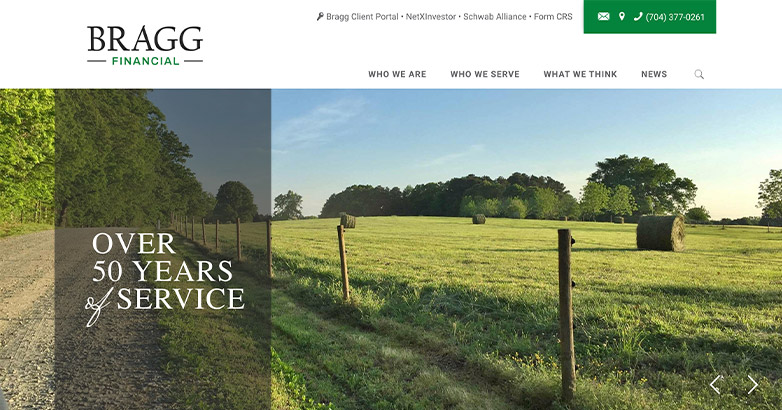
46. Bragg Financial

Combining rustic charm with professionalism, Bragg Financial’s financial advisor website design features a warm image of a barn and blooming flowers, evoking trust and longevity.
The message “Over 50 Years of Service” is prominently displayed, supported by a clean design and easy navigation with a prominent contact button.
The overall design exudes reliability, experience, and a deep-rooted commitment to their clients.
47. ZUK Financial Group

ZUK Financial Group’s website features the calming imagery of a serene beach at sunset, evoking thoughtfulness and tranquility.
The headline “Thoughtful Investment & Financial Guidance” complements the tranquil scene, while clear call-to-action buttons in gold and black encourage user engagement.
The minimalist design and straightforward navigation emphasize clarity and professionalism, conveying a sense of peace, reliability, and personalized financial guidance.
48. Good Financial Cents

Good Financial Cents features a welcoming design highlighted by a friendly photo of Jeff Rose, CFP®.
The bold headline and casual greeting create an instant connection with visitors.
A clean layout, clear navigation, and a vibrant green call-to-action button enhance usability.
The focus on practical, actionable wealth-building strategies and financial freedom appeals broadly, offering clear, accessible advice for users.
49. District Financial Planning

District Financial Planning’s financial advisor website design radiates tranquility with its serene nature backdrop and stone bridge imagery, symbolizing stability and guidance.
The tagline emphasizes simplicity and clarity in important matters.
Clean navigation and strategically placed calls to action, such as “Schedule an Appointment,” provide a user-friendly experience, inviting visitors to explore their futures confidently with the firm’s expert support.
50. Springbok Wealth Partners

Springbok Wealth Partners’ website exudes professionalism and warmth with a clean, modern design.
The headline, “Tailored Financial Solutions for Business Owners in Denver, CO,” clearly communicates their specialized services.
A prominent contact form and “Schedule a Meeting” button ensure easy client engagement, emphasizing convenience and accessibility.
The navy blue and gold color scheme adds sophistication, reinforcing the brand’s dedication to quality and expertise in financial planning.
Elevate Your Luxury Brand Today
Schedule Your Free Consultation
Seeking to elevate your luxury business? Let Mediaboom guide you. Secure your exclusive, free consultation with our luxury marketing experts today.
Consider A Financial Advisor Website Design
Now is the time to consider revamping the look and feel of your website.
As a financial advisor, your website must provide the services and functionalities that your clients expect.
If you would like to set up a free consultation to discuss how Mediaboom can help refresh your website, contact us today.
By: Frank DePino
Frank DePino is Principal and Founder of Mediaboom. Since 2002, Frank has led Mediaboom’s award-winning staff of creative and technical professionals, building the most effective marketing and advertising solutions for its clients.


READY TO IGNITE YOUR MARKETING STRATEGY?


