HVAC Website Design – Our Top 20 Favorite Examples
HVAC website design is your chance to stand out among the more than 110,000 heating, ventilation, and air conditioning companies in the United States alone (according to IBISWorld).
An HVAC website should feature a good visual hierarchy that showcases the list of services. You need a CTA button, a clear contact/booking form, social media links, and plenty of testimonials. Your site should also be SEO-ready and mobile-friendly.
In today’s post, we’re rounding up 20 of the most premium website designs in the HVAC sphere. We’ll discuss the elements that make the sites cohesive, appealing, and easily navigable. Our goal is to inspire you in your own HVAC website design!
Download Our FREE E-Book
10 Website Mistakes Luxury Brands Should Avoid
Does your luxury website include any of these common mistakes? Learn the secrets to driving more traffic to your luxury website, generating more leads, and ultimately increasing sales.
HVAC Website Design Examples
1. East River Energy

Starting our list is East River Energy, a heating oil and furnace company based out of Connecticut.
The design of the East River Energy website is neat and clean. You can select from two navigation menus, one that’s at the very top of the page, and another that’s slightly lower on the homepage.
The navigation at the top of the page travels with you as you scroll down the site to learn more about East River Energy’s commercial and residential services or maybe even more about the history of the company.
The green and orange colors from the HVAC company’s logo are recurrent on the site as well, which is a great use of colors to drive a brand.
2. Custom Heat Limited

The UK’s Custom Heat Limited has a website worth emulating as you contemplate your HVAC website design elements.
Again, the clean, simple, and appealing design grabs you first. The white background with shades of darker and paler blue remains uncluttered so you can focus on the information you need, such as scheduling HVAC services.
The above-the-fold contact information–complete with a phone number and a contrasting gold CTA button–make for easy navigation for those who want to contact the Custom Heat team immediately.
Elevate Your Luxury Brand Today
Schedule Your Free Consultation
Seeking to elevate your luxury business? Let Mediaboom guide you. Secure your exclusive, free consultation with our luxury marketing experts today.
3. NRG Heating & Air Conditioning

Next, we’ve got NRG Heating & Air Conditioning, an HVAC company based in California.
As this is the third HVAC website design example we’re looking at, you’ll begin to notice design themes emerge.
For example, a clean, white background is recurring, as is using colors from a company logo as the hues for the website.
NRG’s contact information is above the fold, including a bright, red CTA button that reads “schedule now.”
We like how comprehensive the homepage is. Just by scrolling down that one page, you can learn more about NRG’s services, review their huge assortment of awards, and read through their service areas.
There’s also another large CTA button on that page, which makes up for the fact that the navigation at the top of the site doesn’t scroll with you.
4. BrainBox AI

BrainBox AI in Canada has a motto: “making buildings smarter, greener, and more efficient.”
The level of quality the company promises is exemplified in the design elements of its website, and those elements are quite unique compared to what we’ve discussed to this point.
The BrainBox website features large graphics showcasing clean buildings with video elements on the homepage.
The sophisticated navigation expands across the page, making for a satisfying and impressive user experience.
As you scroll, a red CTA button that reads “let’s talk” follows you down the page. By clicking that button, you can contact the BrainBox team.
That’s quite a clever use of a CTA button, and it fits in nicely with the design of the website.
The bright red box is already difficult enough to miss since it contrasts with the rest of the website. That the CTA button travels should also inspire more curious website visitors to contact BrainBox.
Download Our FREE E-Book
10 Website Mistakes Luxury Brands Should Avoid
Does your luxury website include any of these common mistakes? Learn the secrets to driving more traffic to your luxury website, generating more leads, and ultimately increasing sales.
5. Reddi Heating & Cooling

HVAC website design doesn’t always have to be as complex as BrainBox’s site, and Reddi Heating & Cooling proves that.
This Kansas-based HVAC company uses a bright, modern white and red color scheme across its site.
The navigation is simple, presenting a list of Reddi services as well as links to their blog, financing options, and contact info.
You can also learn plenty about Reddi’s services just by scrolling down the homepage. Since the navigation menu doesn’t follow you down the page, this info on the homepage is helpful where it is.
On any page besides the homepage, a CTA button with the Reddi phone number is above the fold. The homepage CTA button is at the bottom of the page.
6. Expo Heating & Cooling Inc.

Texas’ Expo Heating & Cooling Inc. has a lot of the HVAC website design elements that we touched on in the intro.
The site is mobile-optimized with clear contact information, a CTA button above the fold, and a concise design.
We quite like the search feature on the homepage as well, which is denoted as a red square on the top navigation menu. The navigation is clear enough that you should be able to find what you want, but if you can’t, you can search.
7. My Buddy the Plumber.com

Utah’s own My Buddy the Plumber.com has a retro charm to the website design that instantly makes it stand out.
The cartoony graphics are a recurring design element that we must make note of. For each service the company offers, there’s an accompanying cartoon illustrating that service.
We like how the graphics are interspersed with images and videos of the real My Buddy the Plumber team. Smartly located under the videos are testimonials.
Download Our FREE E-Book
10 Website Mistakes Luxury Brands Should Avoid
Does your luxury website include any of these common mistakes? Learn the secrets to driving more traffic to your luxury website, generating more leads, and ultimately increasing sales.
8. Air America

With a name like Air America, you would expect this Florida HVAC company to harness all the power of the red, white, and blue.
Indeed, that’s the main crux of their website design. From graphics showcasing blue stars and stripes to bright red CTA buttons above the fold (that wisely include Air America’s phone number), the branding of this site is on-point.
You don’t have to scroll far to find Air America’s esteemed collection of certifications and awards. This intentional placement is designed to assure website visitors who are still comparing their options, and it’s quite effective.
9. AC Repair Las Vegas

The AC Repair Las Vegas website checks a lot of boxes for what an HVAC website design should be.
The social media links for the company are right at the top of the page.
Also well above the fold is a CTA button to book your appointment. If you’d rather, you can also input your contact information into the handy form that’s above the fold as well.
Humanizing HVAC with photos of families as well as real HVAC technicians is another great feature of the AC Repair Las Vegas website.
10. Aircontech

Taking a more futuristic approach to its website, Aircontech utilizes bright colors, crisp and appealing graphics, and a clean website design with plenty of open space.
Theirs has a traveling navigation bar so you can easily browse the Aircontech portfolio or learn more about their HVAC systems or their company history no matter where on the site you end up.
Plus, you have a handy search bar as part of that traveling navigation menu.
Elevate Your Luxury Brand Today
Schedule Your Free Consultation
Seeking to elevate your luxury business? Let Mediaboom guide you. Secure your exclusive, free consultation with our luxury marketing experts today.
11. REEis Air Conditioning

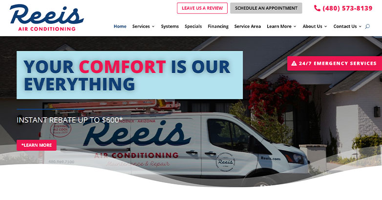
Arizona’s REEis Air Conditioning utilizes HVAC design elements that you might wish to replicate for your company website.
The navigation bar travels with you as you scroll so you can contact REEis, learn about their service areas, and review their services.
Interactive buttons on the homepage are another way to navigate to the pages for heating, cooling, and special offers.
12. Brock’s Heating, Air Conditioning & Gas Services, LLC

Brock’s Heating, Air Conditioning & Gas keeps its site design simple but effective.
The white backdrop allows images of Brock’s truck and their team to stand out more.
The orange and blue color scheme as displayed in Brock’s logo is replicated throughout the website, with orange CTA buttons against blue bars and other graphical elements.
The navigation bar moves as you scroll, and homepage testimonials sweeten the deal.
13. AC Heating and Air Conditioning Services

Even if you have a lot of information you want to include on your website, the design shouldn’t look too busy. AC Heating and Air Conditioning Services of South Carolina shows HVAC website design done right.
The site features two navigation menus. One menu is for reviews, scheduling an appointment, and making a payment. The second navigation menu features all the standard drop-downs, from a link to an about page to a list of services.
Both menus scroll as you do, whether you’re browsing through the testimonials, the special offers, or the company services.
Further pulling together the cohesiveness of the site is the inclusion of a simple but effective dark red and white color scheme as seen in the company logo.
14. Ignite Heating

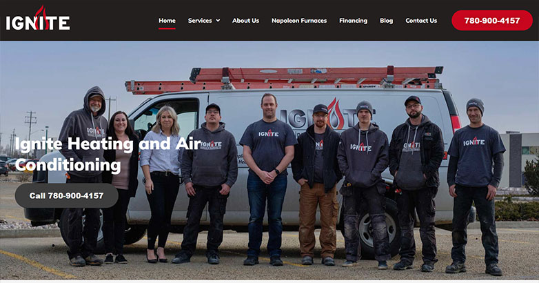
The people-first approach of HVAC company Ignite Heating comes across loud and clear as soon as you land on their website.
On the homepage, you’re greeted with a photo of the Ignite team. More photos are featured further down the page.
That’s also where you’ll find the testimonials.
The rest of this website design is neat, with a white background, a black navigation bar, and a bright red CTA button that grabs your attention and inspires you to click.
Elevate Your Luxury Brand Today
Schedule Your Free Consultation
Seeking to elevate your luxury business? Let Mediaboom guide you. Secure your exclusive, free consultation with our luxury marketing experts today.
15. Aviv Air Conditioning Miami

The Aviv Air Conditioning Miami website gives you all the information you want right above the fold.
You’ll see their phone number, their hours, their financing policy, and a bright blue CTA button to schedule an appointment.
To further enhance the user experience, the site has a traveling navigation bar so that website users can learn about Aviv’s services or how to apply for credit.
The contact option in the traveling navigation bar gives site visitors a second chance to connect with Aviv if they missed the CTA button above the fold.
16. Carini Heating, Air and Plumbing

If you’ve thought of infusing your HVAC website design with more color, that’s certainly an option. The Carini Heating, Air and Plumbing site is a good one to take inspiration from.
This site is bright and cheery, incorporating colors like teal blue, spring green, beige, and neon green.
Between the traveling navigation and the clean graphics, the Carini website is a delight to scroll through.
17. Stafford Mechanical Services, Inc.

Connecticut’s Stafford Mechanical Services, Inc. website is another shining example of how when it comes to HVAC website design, simpler is usually your best approach.
The Stafford site features a light gray background with blue and red elements. Above the fold is a handy contact form. The site also has several red CTA buttons for connecting with the Stafford Mechanical team.
Download Our FREE E-Book
10 Website Mistakes Luxury Brands Should Avoid
Does your luxury website include any of these common mistakes? Learn the secrets to driving more traffic to your luxury website, generating more leads, and ultimately increasing sales.
18. Premier HVAC Services

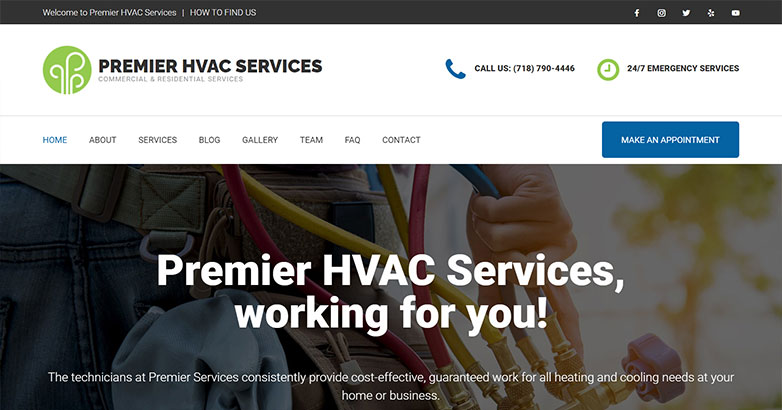
How do you stand out as an HVAC company in populous New York City? You need a website that’s a cut above the rest such as Premier HVAC Services.
The homepage of the site promotes that Premier HVAC Services is locally-owned, which gives them an authentic edge.
The navigation menu–complete with a blue CTA button for booking an appointment–scrolls as you do.
Plus, bolstering the authenticity of Premier HVAC Services are social links, positive reviews, and awards the company has received from HomeAdvisor and Angie’s List.
19. Figlia & Sons, Inc.

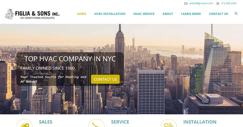
Here’s another example of NYC HVAC website design courtesy of Figlia & Sons.
Their site stands out for its large graphics of stunning New York skylines, the video elements, and the effective use of colors such as dark teal and gold.
Although the site goes light on the CTA buttons, since the navigation menu travels with you, that was probably an intentional design choice.
20. PSEG WorryFree Long Island

Most east coasters know PSEG, but even this major company doesn’t scrimp when it comes to its website design.
The WorryFree Long Island site is very neatly designed with a clean background, bright orange elements that grab your attention, CTA buttons at the top of the page, traveling navigation, and a company guarantee right on the homepage.
Elevate Your Luxury Brand Today
Schedule Your Free Consultation
Seeking to elevate your luxury business? Let Mediaboom guide you. Secure your exclusive, free consultation with our luxury marketing experts today.
Conclusion
HVAC website design should motivate a website visitor to take action such as booking an appointment. The site must be clean and mobile-friendly with plenty of testimonials, eye-catching graphical elements, easy navigation, and overall user-friendliness. Mediaboom is your choice for HVAC website design. Our web design and development services will help you create the kind of high-caliber site that drives business.
READY TO IGNITE YOUR MARKETING STRATEGY?


